
You can invest months into building a powerful feature, announce it across every channel, and still see almost no change in user behavior. The release goes out, the tooltip appears, the email is sent — and yet adoption barely moves, even after multiple product updates.
Meanwhile, some users continue struggling with manual workarounds, unaware that a better solution already exists inside your product. Others briefly notice the feature but abandon it before it becomes part of their workflow. The functionality is there. The value is there. The usage isn’t — users fail to find features that could actually help them within the user interface.
Case in point, here’s a real talk from founder on Reddit:
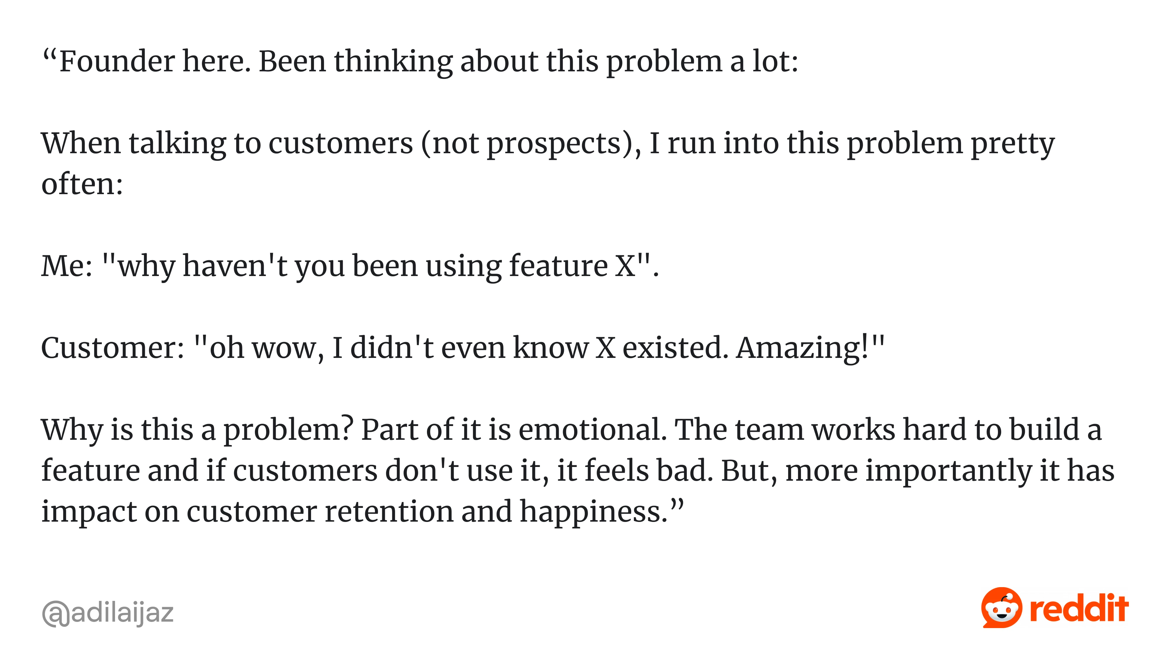
That founder clearly didn’t lack effort. Later on, he mentioned that they had tried tutorials, trainings, and feature announcements — and still hadn’t achieved much.
So what actually goes wrong in situations like this?
Oftentimes, features are introduced without a clear logic for when they should appear and in what context they should be discovered. When there isn’t a deliberate structure behind how and when functionality is surfaced inside the product, discovery turns into scattered efforts that users notice briefly — if at all — but rarely translate into consistent usage. That’s exactly the pattern the founder describes.
Yes, patterns like tooltips, walkthroughs, and release notes do support discovery — but only when they are designed to be timely, relevant, and connected to what the user is trying to accomplish.
In this guide, we’ll break down what feature discovery actually means, why users miss features, and how to improve feature discovery so you can turn overlooked functionality into consistent product usage.
Understanding what is feature discovery
Essentially, feature discovery definition describes the process through which users become aware of a product capability, understand what it does, and recognize when it is relevant to their goals. It’s not just about noticing a button or reading a tooltip — it’s about connecting a feature to a real task in a meaningful way.
In practical terms, feature discovery happens when a user thinks, “This helps me do what I’m trying to do right now,” rather than “That’s interesting, maybe I’ll look at it later.”
Feature discovery vs feature adoption
And by the way, it’s also important to distinguish feature discovery from feature adoption.
Discovery is about recognition: the user sees the feature and understands its purpose. Adoption is what comes later, when that feature becomes part of the user’s routine and delivers repeated value.
Your job isn’t just to make features visible. It’s to ensure they appear in the right context, at the right moment, and in a way that aligns with what users are already trying to complete.
And that’s the foundation everything else in this guide builds on.
Why users miss features in the first place
When teams notice that certain features remain unused, the first reaction is often to increase visibility, but in most cases, the issue runs deeper than simple exposure.
If you look closely, the reasons tend to fall into a few recurring patterns.
Users are focused on completing a job
Most users don’t open your product to explore it. They log in with a specific, desired outcome in mind — send an invoice, export data, review feedback, update a record.
Once they’ve learned a workflow, they tend to repeat it. They don’t usually pause to reconsider whether there’s a better or faster way. New functionality and even existing features compete with developed habits — and habits often do win.
Banner blindness and prompt fatigue
As products grow, so does the number of nudges: tooltips, banners, badges, pop-ups, modals, and announcements. Over time, users learn to filter them out.
This “banner blindness” doesn’t mean users are disengaged — it means they’ve adapted. Repeated exposure trains them to dismiss prompts automatically, including the ones that might actually help.
Timing mismatches
Even well-designed prompts fail when they appear at the wrong time.
Sometimes features are introduced before users understand the surrounding workflow, making the message feel premature. Other times, prompts appear after users have already built manual workarounds, making the feature feel unnecessary.
Visibility alone doesn’t create relevance. Timing does.
High setup cost and perceived risk
Noticing a feature is only the first step. Trying it is another decision entirely.
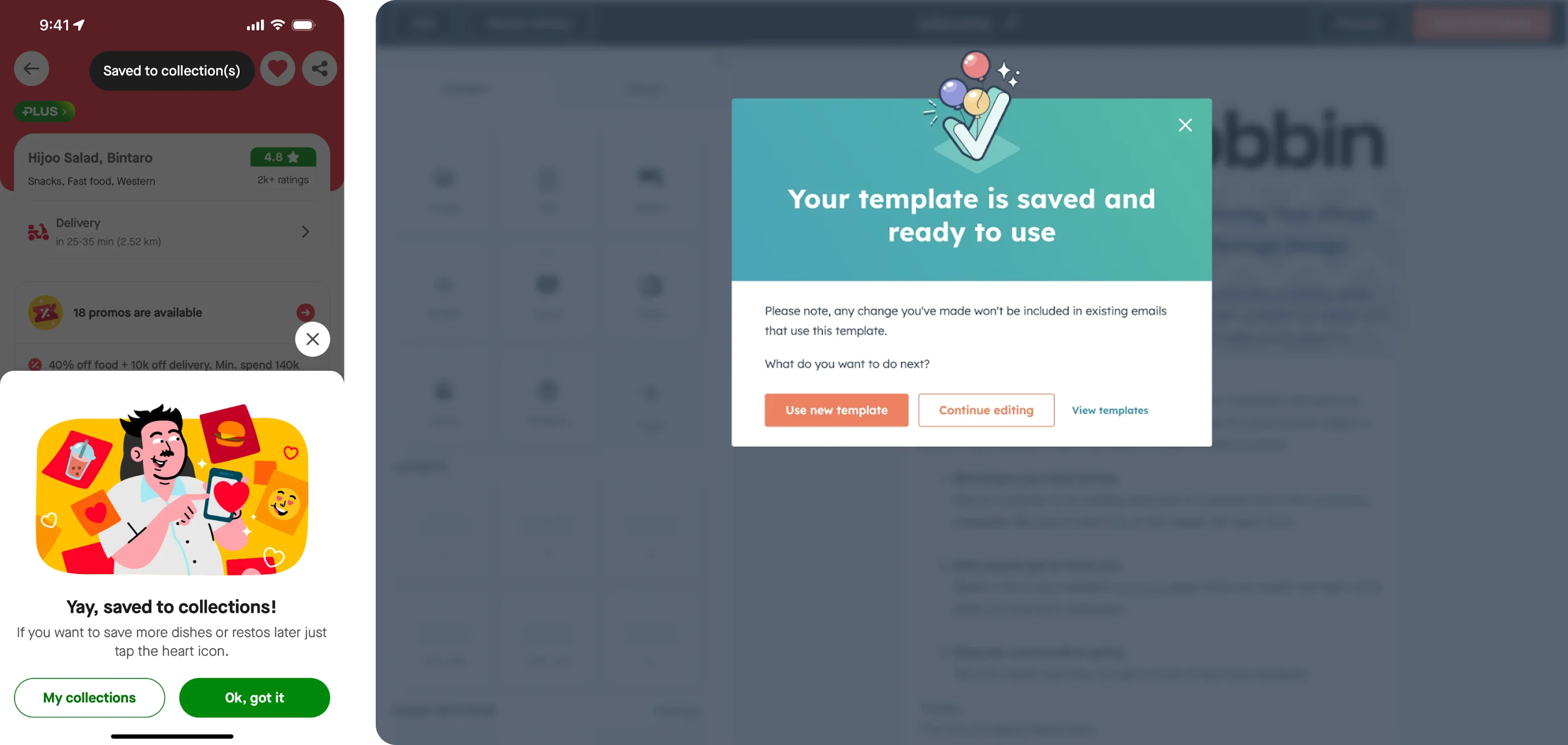
If first use feels complex, risky, or unclear, users postpone it. And postponed discovery often turns into forgotten discovery. Quite often users just mindlessly hit the skip button and never actually get back to it.
In our work with SaaS teams, fragmentation often turns into a silent discovery problem. When Sessionboard approached Eleken, their product sought to scale and launch AI capabilities, but the feature discovery UX design was fragmented, and the interface was clunky and outdated:
- Similar actions appeared differently across screens
- Related tools weren’t grouped in a way that supported natural exploration.
As a result, multiple features were disconnected from the core workflow and were quite easy to miss.
So instead of adding more visibility to features, we focused on restructuring navigation and unifying interaction patterns.
By improving information architecture and visual consistency, our designers made feature discovery a byproduct of clarity rather than promotion.
Rethinking the feature discovery process: from broadcast to context
When a new feature ships, the default reaction for many is to announce it broadly inside and outside the product.
A pop-up appearing after login, a banner stretching across the dashboard, or release messages arriving in Slack or email – such a broadcast approach may create awareness, but it rarely changes behavior because it operates outside the user’s immediate intent.
Many teams neglect the importance of feature discovery and treat it as something to announce — not something to design into the workflow. Without making feature discovery important on deeper level, teams often fall into broadcast discovery mode.
Broadcast discovery: awareness without intent
Broadcast discovery delivers the same message to everyone, regardless of context. It assumes that visibility leads to usage.
But effective discovery should respond to a specific action taken by the user — not interrupt it.
In practice, users acknowledge the update and return to their task, and the workflow continues unchanged.
Contextual discovery: relevance inside the workflow
Contextual discovery works differently. It surfaces a feature when user behavior signals that it is relevant.
If someone repeats a manual action several times, the interface suggests automation. If a workflow stalls, the system introduces a capability that removes friction. The feature appears as part of the task — not as a separate message about it.
This is the structural shift: broadcast assumes visibility drives usage; context assumes relevance drives usage.
In that sense, the success of discovery depends less on presentation format and more on timing that aligns with user intent.
For example, when working with Network Innovations, we found that many powerful tools were technically available but practically invisible. Users didn’t lack features — they lacked structure. The interface treated all roles the same, which buried relevant functionality under clutter.
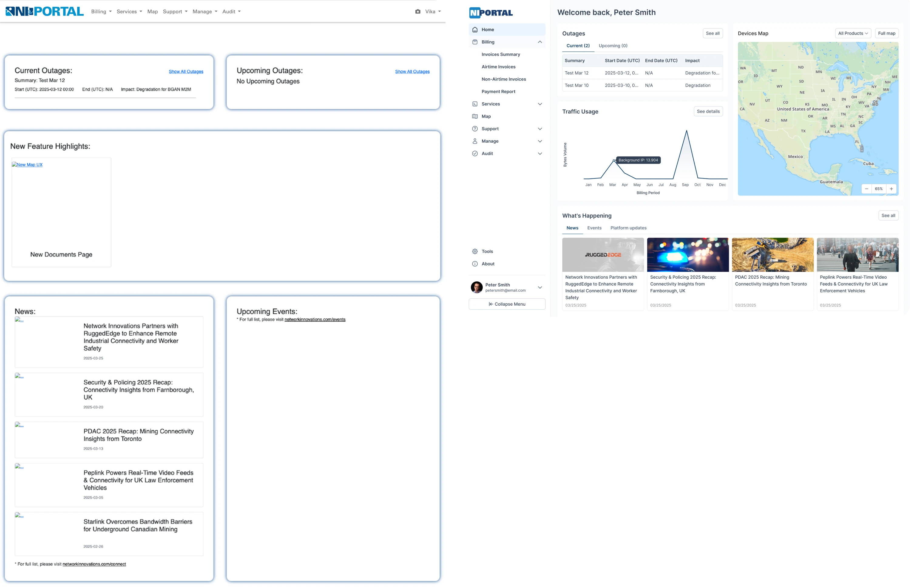
We redesigned the sidebar into clearer logical groups and introduced a role-adaptive homepage that surfaces different data depending on the user’s responsibilities. Instead of broadcasting features equally to everyone, discovery became contextual and role-aware.
Structuring contextual discovery inside the product
If contextual discovery is the principle, triggers are the mechanism that makes it work.
That means deciding when a feature trigger should appear based on clear signals, so it becomes part of the product experience rather than something added on top of it.
In practice, most effective triggers fall into a few predictable categories.
Action-based triggers
These are activated after a specific user action. For example, if a user invites teammates, the interface can surface collaboration controls. The feature appears because the user has already signaled intent through an action.
Threshold triggers
These activate after repeated behavior. If a single action (some manual task) is performed three or four times, it may indicate friction or inefficiency. At that point, the system can suggest a shortcut, template, or automation. The repetition itself becomes the signal that the feature is relevant.
State-based triggers
These respond to the user’s current situation inside the product. Empty states, stalled onboarding steps, usage limits, or error messages are natural moments to introduce functionality. Instead of pushing features randomly, the product reacts to a defined state.
Lifecycle and segment-based triggers
Context is not only about what users are doing, but also about who they are. Not all users are the same – new users, power users, and administrators have different needs and permissions.
Discovery can be triggered based on role, maturity level, activation milestones, renewal windows, or feature releases for existing accounts.
Together, these trigger types ensure that features appear when intent, repetition, state, or user profile signals that the moment is right.
As a result: noise decreases → relevance increases. Features appear when there is a clear use case, and discovery feels timely rather than intrusive.
All in all, these signals allow teams to identify the right moment when discovery becomes helpful instead of distracting.
Unpacking the best UX patterns: best practices feature discovery edition
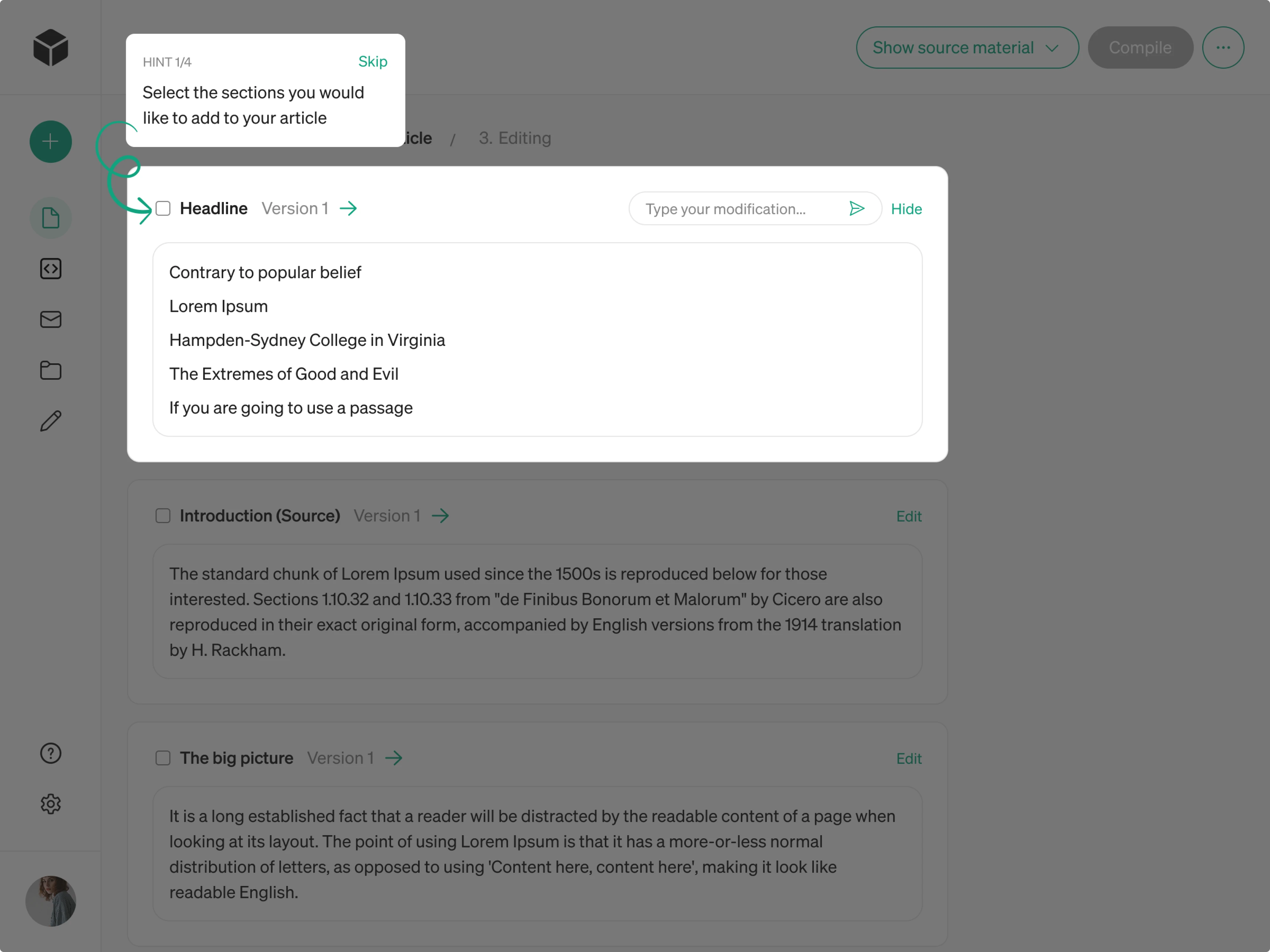
Once discovery is structured around clear triggers, the next question is how it should appear in the interface. Different UX design patterns — tooltips, inline hints, empty states, walkthroughs, and other feature discovery prompts — can all support essential discovery, but they don’t work equally well in every situation.
The pattern itself isn’t the deciding factor. What matters is how it fits the trigger and the moment. A well-timed hint inside a workflow will outperform a perfectly designed prompt shown at the wrong time.
In that sense, discovery is not about adding more UI elements,, but about placing the right ones at the right moment.
With that in mind, here are the most effective UX patterns for in-app discovery and when they work best.
Inline hints and micro callouts
Inline hints work best when tied to a clear action trigger. Because they are placed directly next to the task in progress, they engage users because it all feels like guidance rather than interruption.
For example, after a user manually repeats an action, a small prompt like “automate this” beside the relevant control aligns perfectly with the trigger. And this way, the feature appears inside the workflow, not outside it.
We applied this principle in our work with Bering Lab, a powerful legal AI translation tool. Despite its powerful functionality, the generic-looking interface led to a high bounce rate. Instead of adding pop-ups or tutorials, we visually highlighted the main translation field and used auto-focus to guide users to the core action. We also improved usability and introduced a “Saved Translations” sidebar to surface overlooked functionality.
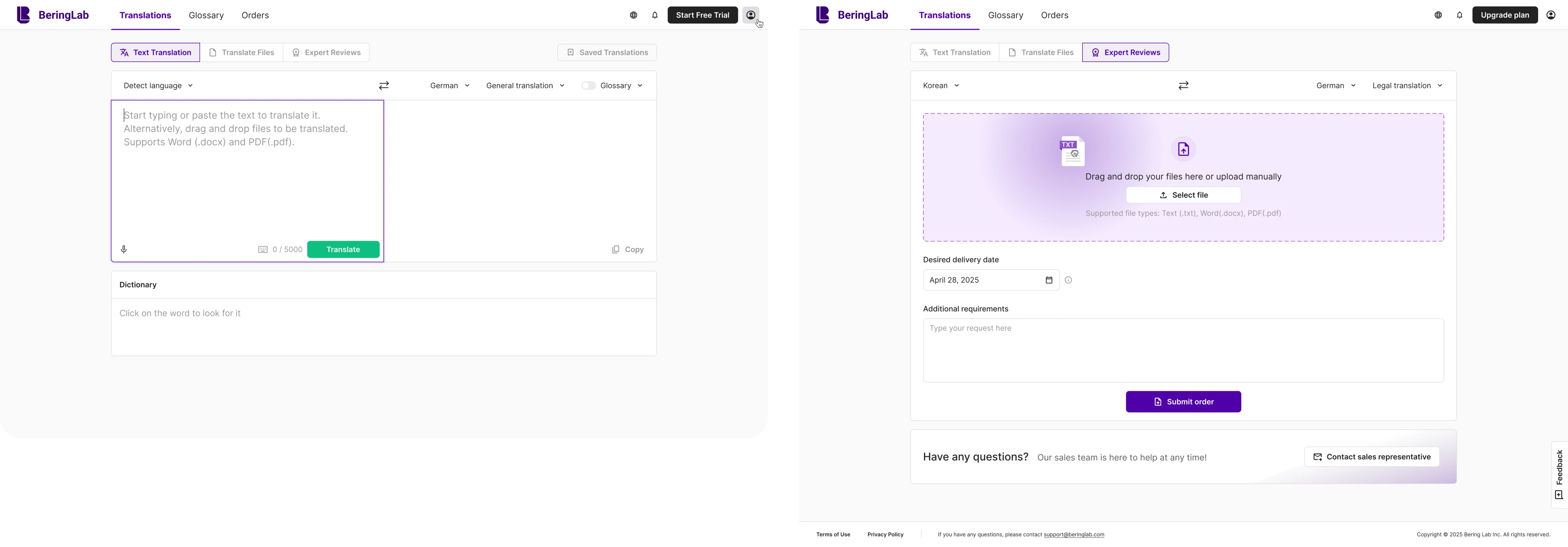
By embedding cues directly into the workflow, we improved feature discovery. As a result, the company raised $2.3M in pre-Series A funding.
Inline patterns are most effective when the trigger is behavioral and specific. The more closely they sit to the action, the more naturally discovery fits into the task.
Empty states that guide next steps
Empty states align naturally with state-based triggers. When a page has no data, users are already looking for direction. So the absence of content becomes the trigger itself.
Instead of displaying a neutral message, the interface can introduce valuable functionalities that help move the workflow forward — templates, imports, integrations, or automation.. Because the user is already at a transition point, discovery feels timely rather than promotional.
Contextual tooltips
Tooltips are most effective when activated by behavior or repetition, not shown automatically after login.
A tooltip that appears after a user hovers repeatedly over a control or performs a task multiple times supports the trigger logic established earlier. It clarifies a capability at the moment curiosity or friction is already present.
The same tooltip shown too early feels intrusive. But when aligned with time and behavior, it becomes an effective way to guide users.
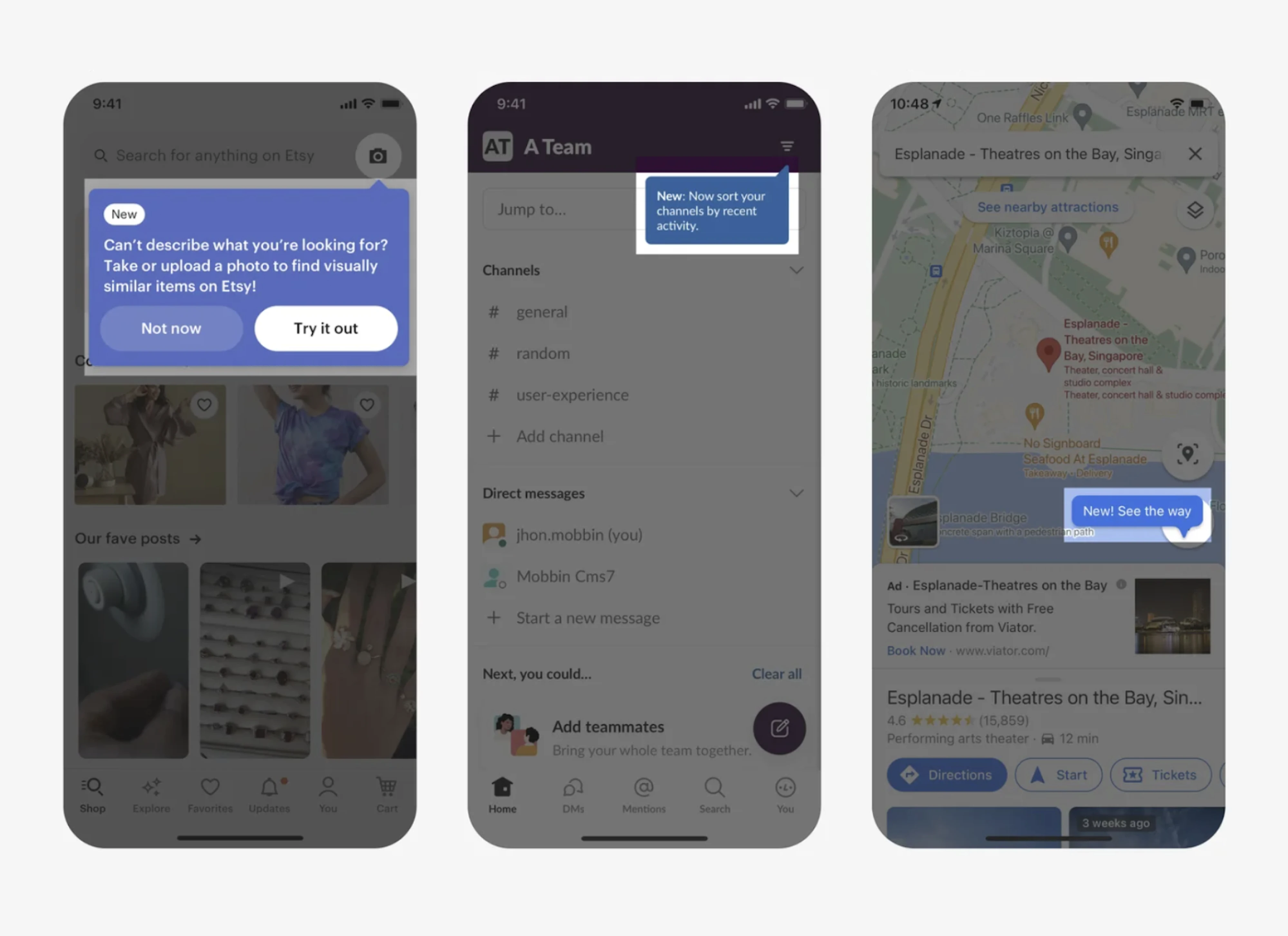
Optional walkthroughs
Walkthroughs work best when they are user-initiated or triggered by clear onboarding milestones.
If tied to lifecycle triggers — like first-time setup or activation stages — walkthroughs provide structured guidance without overwhelming experienced users. And if done optional, they also respect autonomy and account for different learning styles.
Used without a clear trigger, however, they quickly become a noise that users click through just to move forward
Subtle visual cues and beacons
Badges, highlights, or subtle indicators can support discovery when tied to meaningful changes or role-based triggers.
For example, a small “New” tag next to a feature relevant to administrators signals value without interrupting workflow. When these cues are limited and intentional, they reinforce contextual discovery rather than compete with it.
Core takeaway: alignment determines impact
Across all these patterns, the underlying rule stays consistent. The design pattern does not create discovery on its own — it supports the trigger behind it.
A tooltip without a clear behavioral signal feels random. A walkthrough without a lifecycle moment feels forced. A badge without relevance blends into the interface.
When the trigger is clear, and the pattern fits the moment, discovery feels integrated rather than imposed. That alignment — between signal and presentation — is what makes in-app discovery effective.
Making your feature discovery work effectively
Structuring discovery around clear triggers and choosing the right UX patterns are foundational steps. But even well-timed discovery can fall short if the experience around it is poorly designed.
Below, we’ll focus on what supports discovery beyond timing alone.
Make first use frictionless
Noticing a feature is only the first step; using it successfully is what determines whether it becomes part of the workflow.
Badges, highlights, or subtle indicators can support discovery when tied to meaningful changes or role-based triggers.
For example, a small “New” tag next to a feature relevant to administrators signals value without interrupting workflow. When these cues are limited and intentional, they reinforce contextual discovery rather than compete with it.
1. Zero-setup first run
Whenever possible, remove the need for configuration upfront. Templates, opinionated defaults, and pre-filled sample data allow users to experience value immediately instead of facing an empty screen.
The goal is to deliver more value immediately and let users see how the feature works before asking them to define how it should work.
2. Safe exploration
First use should feel reversible and low-risk. Previews, undo options, and trial states reduce hesitation. When users know they can experiment without permanent consequences, they’re more willing to engage. Afterall, when exploration feels risky, discovery loses impact.
3. Micro-reinforcement
After the first successful action, the experience shouldn’t go silent. A small success message, confirmation toast, or subtle “next best action” prompt reinforces progress and guides momentum forward.
Without reinforcement, the first use can feel isolated. With it, the feature begins to integrate into the workflow.
The overall goal is not to simplify the feature itself, but to simplify the first step. When users experience value quickly and safely, discovery transitions naturally into continued use.
This becomes especially important in products built around complex workflows powered by AI models. When Modia came to Eleken, they were building a complex AI-powered workflow that risked overwhelming first-time users. The challenge wasn’t visibility — it was clarity and confidence.
Our designers introduced contextual tooltips that guided users step by step as they interacted with the AI system, explaining actions at the moment they became relevant. At the same time, we added a clear “Skip” option for experienced users, reducing friction for those who didn’t need guidance.
Besides that, we also differentiated interfaces for administrators and other roles, ensuring discovery is seamlessly aligned with role responsibility and maturity level.
Segment discovery by role and maturity
Ease alone isn’t enough. Discovery needs to reflect who the user is and where they are in their journey to create a personalized experience.
There are three dimensions to consider.
1. Role-based differences
Admins, end users, and power users operate with different motivations and permissions.
An admin may care about reporting, governance, or configuration settings. An end user may focus on completing daily tasks efficiently, while a power user often looks for shortcuts, automation, or advanced capabilities.
Surfacing the same feature prompts to all three groups creates noise. Aligning discovery with the concrete roles ensures relevance and reduces unnecessary interruptions.
2. Stage of experience
Discovery should evolve with experience – new users and existing users face completely different problems.
For someone onboarding, discovery should support orientation and foundational actions. For an experienced user, discovery often means rediscovery — introducing advanced capabilities once the basics are mastered.
What feels helpful during onboarding can feel redundant months later. Structuring discovery around maturity keeps it timely.
3. Adoption-aware prompting
Discovery should account for what the user has already adopted. Repeating prompts for features already utilized adds friction and undermines credibility.
Once a feature is in regular use, discovery should shift toward reinforcement or adjacent capabilities — not repeat exposure.
Don’t rely on one channel
Even well-designed in-app discovery has limits. Different channels serve different purposes, and relying on just one weakens the overall effect.
The key point here isn't about just adding more touchpoints – it’s about ensuring that each one supports the right moment.
1. In-app for the moment of need
In-app cues should appear inside the workflow, tied to clear triggers. This is where discovery feels most relevant and actionable.
2. Email or Slack for targeted reinforcement
Out-of-product channels work best when behavior-based and specific. A targeted follow-up on external channels like email, Slack or even social media can reinforce value when used thoughtfully; a generic blast adds noise.
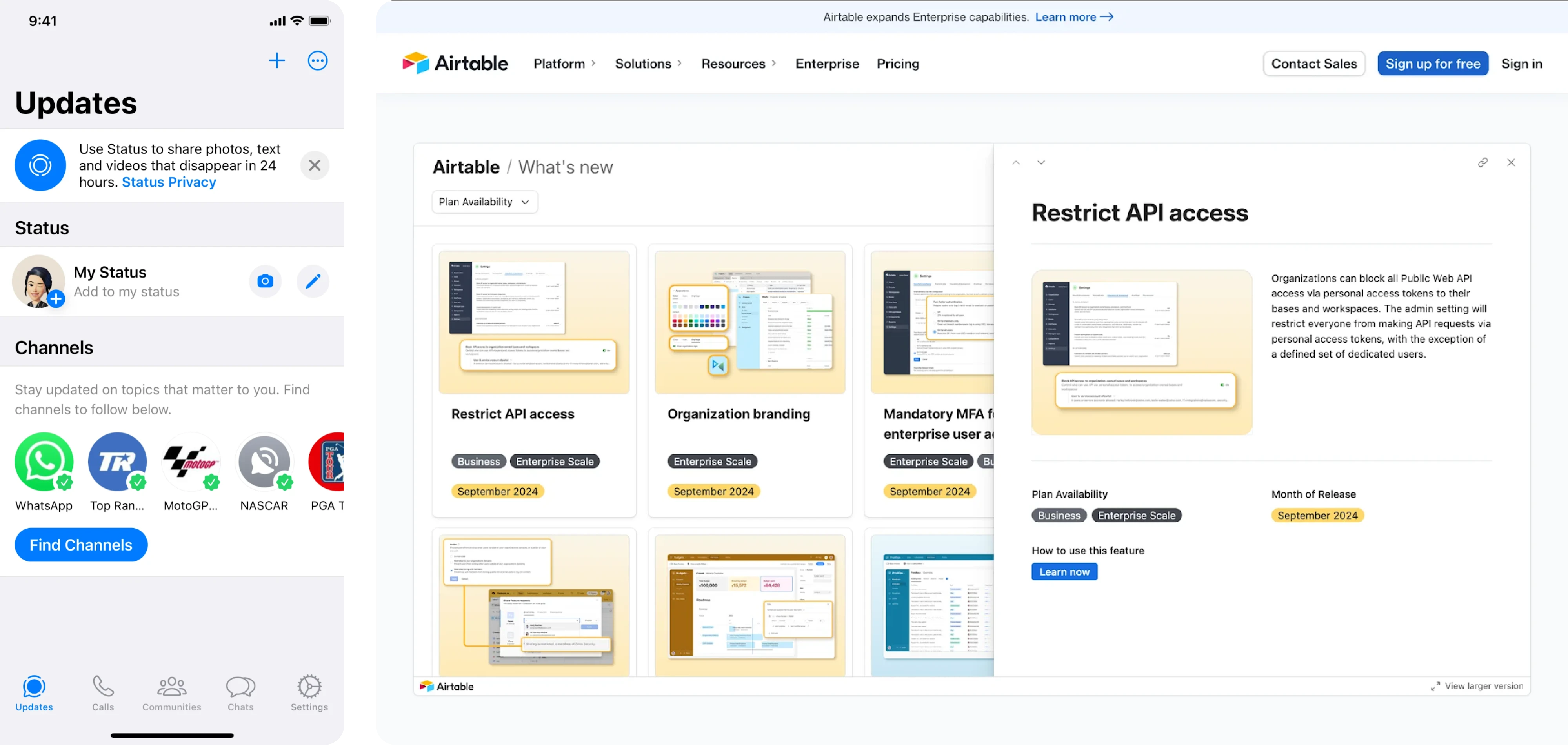
3. A “What’s new” space for passive discovery
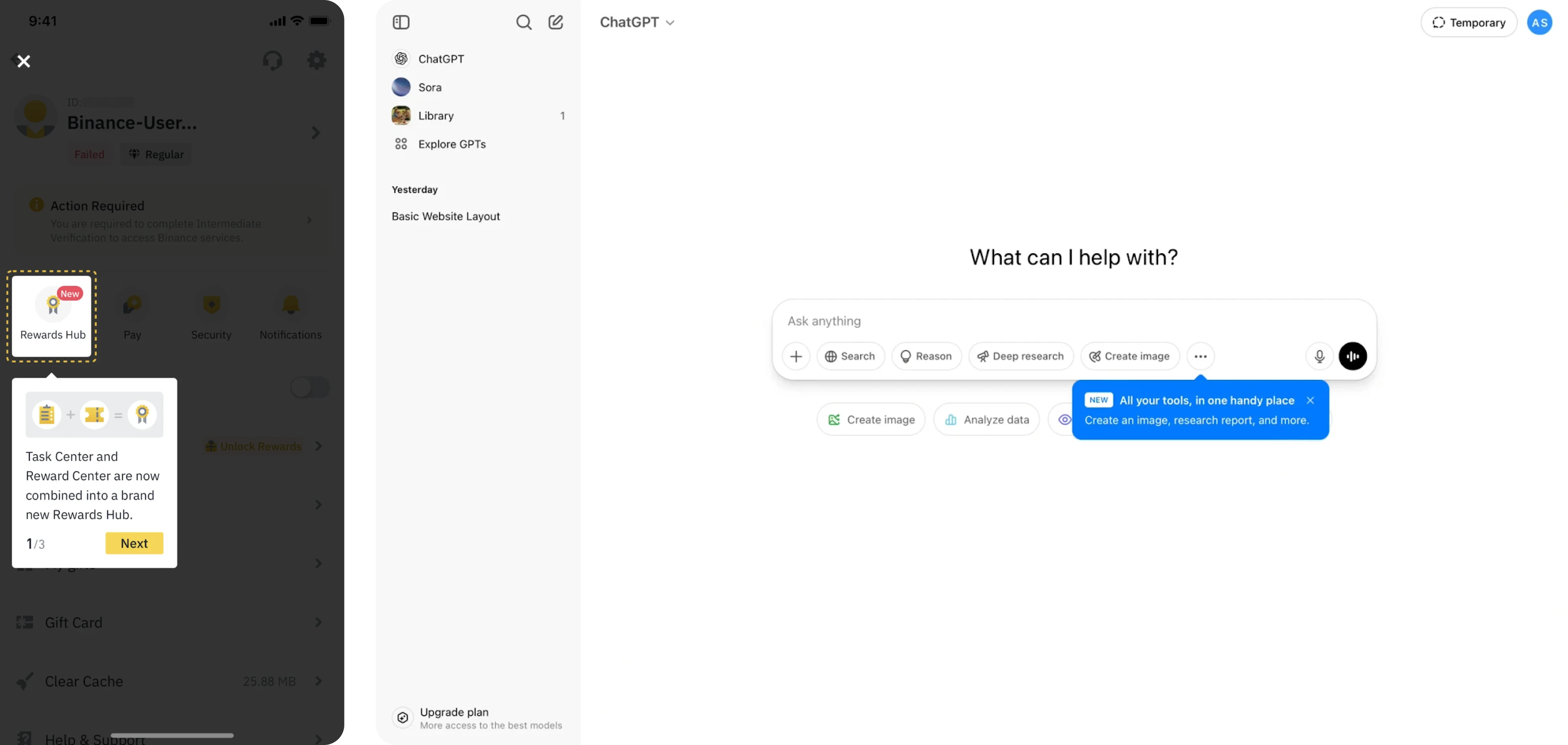
Not every update requires interruption. A small “What’s new” section with a subtle badge — not a modal — allows users to explore updates on their own terms.
The key is coordination, not volume. When channels reinforce each other without repeating the same message excessively, discovery feels coherent. When everything pushes at once, it quickly becomes noise.
Anti-patterns to avoid in feature discovery
Oftentimes, feature discovery fails because small, reasonable decisions add up in the wrong direction.
Feature discovery rarely breaks down due to inaction — when UI/UX design decisions work against user attention and timing. So what’s meant to help users notice value can instead break it.
Be aware of the following patterns that undermine the very engagement they aim to drive:
✗ Big pop-ups for minor features
Not every release deserves center stage. Using a large pop-up to announce a minor feature creates friction before users even reach their task.
Interrupt users only in case of critical updates, not otherwise. Over-communication doesn’t increase adoption — it trains users to ignore prompts.
✗ Tutorials that fire before relevance
Timing determines whether a tutorial clarifies or interrupts. Walkthroughs shown before a user encounters a problem or expresses intent result in noise, not guidance.
Trigger tutorials only when relevance is established — once a user initiates a related action or demonstrates intent.
✗ Generic feature announcement emails
Mass emails announcing every new feature may create awareness, but they rarely drive meaningful usage.
Tie messages to behavior or role, so they reinforce value, not compete for attention.
✗ Overloading onboarding flow with everything at once
Introducing many features at once can overwhelm new users and kill completion rates. At the onboarding stage, they're just trying to navigate the core workflow — not master functionality holistically.
Introduce features progressively instead, surfacing functionality in stages as users gain context and confidence.
✗ Overloading the interface with cues
Badges, tooltips, banners, and highlights lose meaning when overused. When everything is emphasized, nothing stands out.
Restraint is part of effective discovery — thoughtful prioritization ensures that signals remain meaningful and attention is directed where it truly matters.
Beyond views: measuring if discovery is truly working
Effectiveness of discovery shouldn’t be measured by visibility alone – seeing a tooltip or opening an announcement is only the starting point. What matters is whether discovery translates into meaningful behavior and long-term impact.
To evaluate that, look at three levels of metrics.
1. Discovery metrics: awareness and engagement
Discovery should rely on summary statistics and real behavioral signals, not just impressions. These metrics indicate whether users noticed and interacted with the prompt.
- Feature awareness proxies (views, impressions)
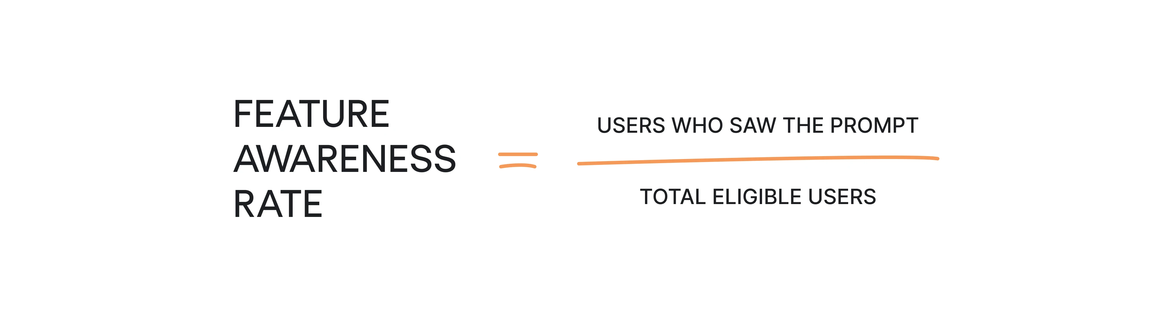
- Prompt click-through rate (CTR)

They show whether discovery is visible and compelling enough to generate initial interest. However, they do not tell you whether users actually adopted the feature.
High CTR with low follow-through often points to friction after the click — unclear value, heavy setup, or mistimed prompts.
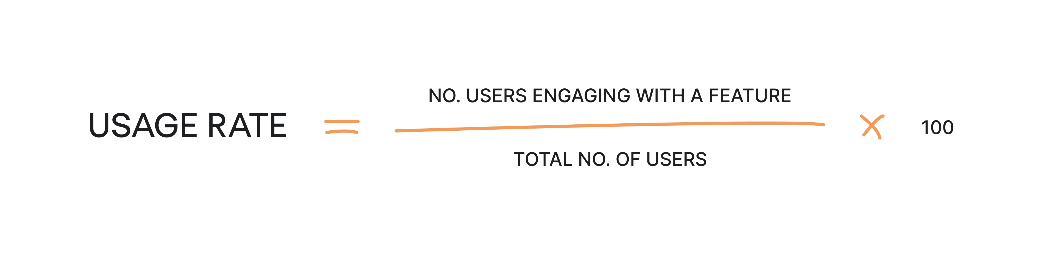
2. Adoption metrics: behavior and value
Tracking data from multiple data sources helps teams understand whether users actually adopt features. This is the stage where discovery proves its effectiveness.
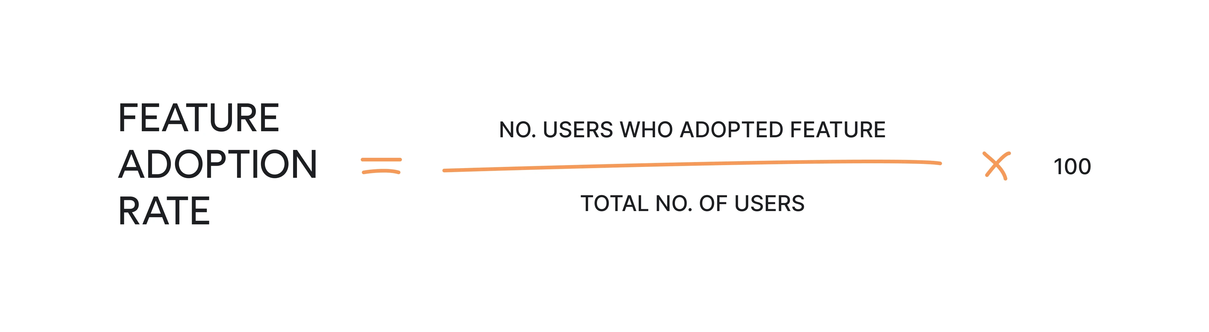
- Feature usage rate
If your CTR is high but first use is low, it may suggest that your users are interested enough to click but face friction when trying to use the feature. If CTR is low but first use is high, the feature itself provides value, but the discovery message may not be compelling enough to attract attention.
However, when both metrics are high, then the discovery funnel is working smoothly.
- Repeat use over time (adoption)
Low results here show that the feature is curiosity-driven, and users may not find it valuable enough. When it shows high, it indicates that feature perfectly fits users’ workflows.
The first successful use shows whether the discovery was converted into action, while repeat use indicates whether the feature became part of the workflow.
If users try a feature once and never return, the issue is rarely visibility. It’s usually relevance or friction.
3. Continuous experimentation
Looking at recent data ensures decisions remain up to date and reflect real usage patterns.
Discovery is rarely optimized in one iteration. Small experiments using A/B testing can reveal what improves impact: you can test copy, adjust trigger threshold or test placement inside the workflow.
Since discovery depends on timing and user context, even minor adjustments can significantly change results.
But remember – at the end of the day, the goal isn’t to maximize impressions. It’s to ensure that discovery leads to meaningful engagement and sustained value.
Getting feature discovery the right way
Feature discovery isn’t about announcing what you’ve built. It’s about introducing the right features at the right moment, inside the right workflow, for the right user.
For SaaS teams, especially growing SaaS companies, this often requires significant changes in how discovery is approached — from broadcasting updates to designing contextual experiences.
Whether you're working with product teams, data scientists, or engineering, aligning discovery with user behavior is essential.
If you want to start small, conduct a UX audit and focus on a few high-value features that aren’t getting enough usage, and improve how they’re introduced:
- Embed a contextual nudge directly into the workflow where intent is visible.
- Reduce first-use friction with templates, safe exploration, or sensible defaults.
- Measure adoption and repeat usage
And from there, refine feature discovery through iteration — by testing trigger thresholds, adjusting placement, segmenting more precisely, and measuring real impact beyond visibility metrics.
With the right structure, teams can easily implement feature discovery that feels natural, supports adoption, and turns your product into a great platform users return to.
Feature discovery works best when it’s designed into the product from the start. With over 10 years of experience designing SaaS products, Eleken designers know the right way of turning SaaS feature discovery into a cohesive system that works for sustainable adoption.
If you’re rethinking how new capabilities surface — and how they convert into real adoption — our designers would be glad to step in and help.


