
Product-led growth or PLG is quite a compelling strategy. Your product turns itself into a superb engine of sustainable growth — driving cost-effective acquisition and revenue without heavy reliance on sales. These sheer benefits are the reason so many SaaS founders like it.
But let's face it – strong user acquisition doesn’t equal success. In a product-led model, onboarding becomes the decisive moment.
Your marketing team may execute flawlessly, engineering can ship awesome features, but if users never reach meaningful value, those efforts simply go in vain:
- Free accounts don’t convert to paying customers.
- Many users never get far enough to see what makes your product truly useful.
- Over time, your app fills up with inactive accounts that churned after the first session.
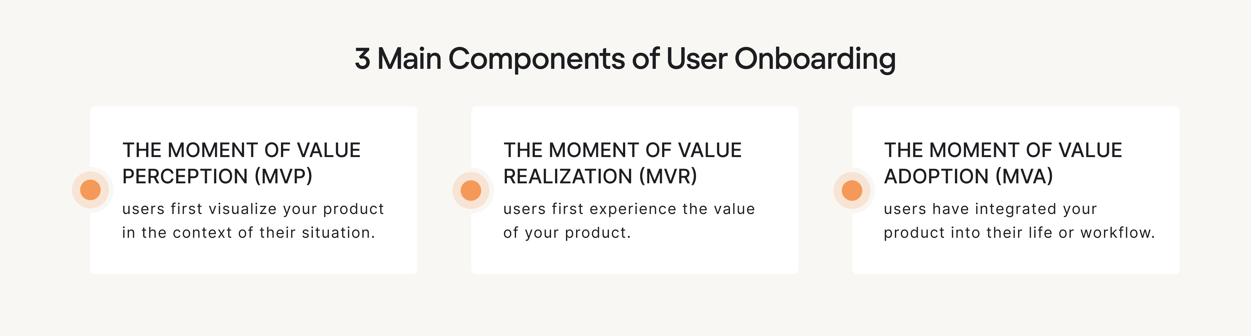
Because users are hungry for instant value, onboarding in a product-led model must be intentionally designed to guide users through three key components – value perception, value realization, and value adoption.
But designing great product-led onboarding that truly works is no easy feat — and many SaaS teams struggle to get it right. At Eleken UI/UX design agency, we’ve seen firsthand how common this is, and know this challenge from both sides — identifying it and fixing it.
In this guide, we’ll share practical frameworks to help you design and optimize onboarding that guides users toward meaningful outcomes and sets your product up for sustainable growth.
Unpacking the best frameworks and how to apply them
Below, we break down three frameworks that work especially well in product-led environments. Used together, they provide a flexible foundation for onboarding that drives real product adoption rather than checklist completion.
The EUREKA framework — a structured system for onboarding creation
The EUREKA framework is a six-step system for how teams should approach the user onboarding process. The ultimate strength of this framework is that it gives structure without locking you into a rigid flow, so it becomes an operational backbone for product-led growth onboarding.
Here’s a brief overview:
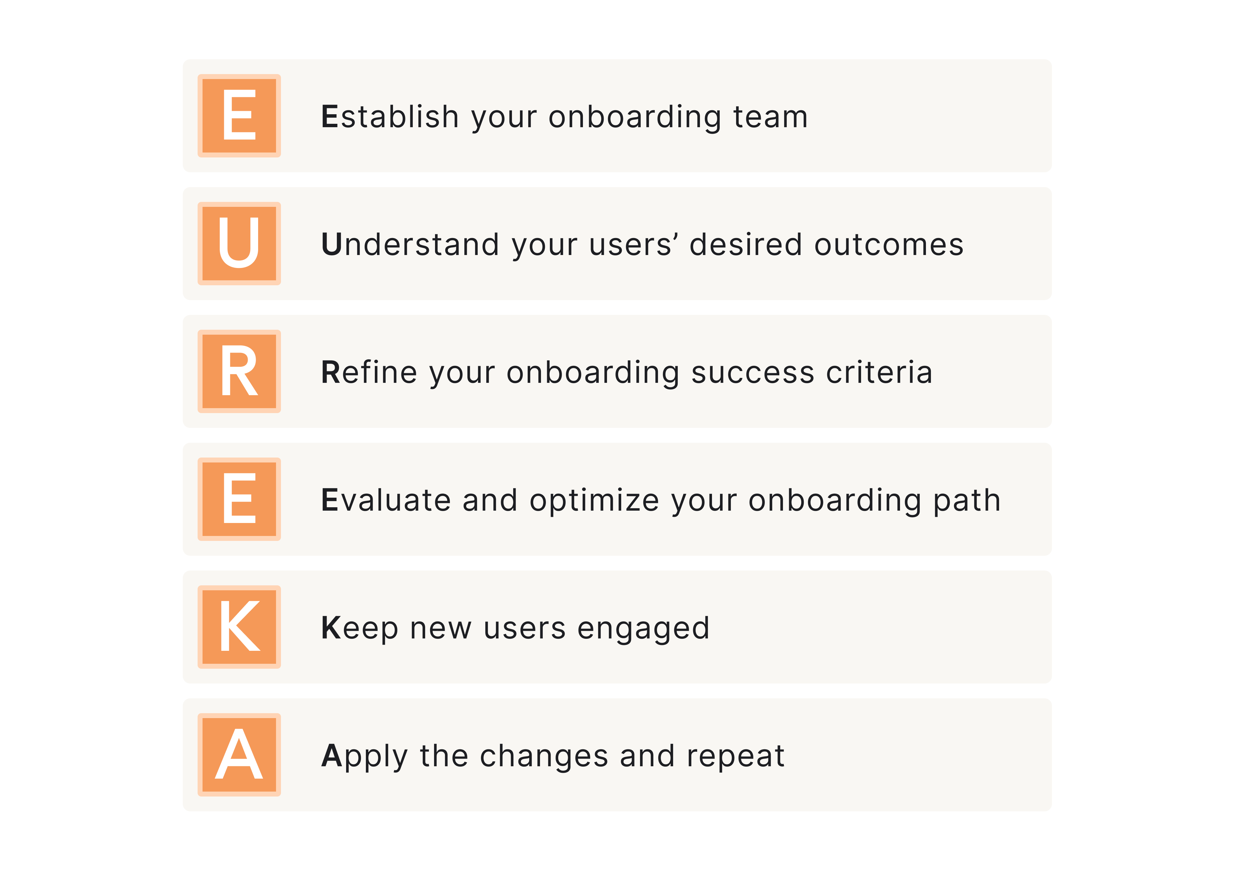
Step 1: Establish your onboarding team
Effective product onboarding begins with something most companies overlook: ownership. Define an onboarding team to ensure the experience isn’t stitched together from disconnected efforts.
Clarify who is involved and what their primary responsibilities are. Typically, the team should involve product, marketing, growth, and customer success because without this shared accountability, new users can feel fragmentation.
Here’s how it usually plays out:
Step 2. Understand your users’ desired outcomes
Next comes clarity. You must understand your users’ desired outcomes.
Why did users sign up in the first place? What job are they trying to get done? What result would make them say, “this works for me”?
Because onboarding should guide users toward what they are trying to achieve — not just what your product can do.
When desired outcomes are unclear, onboarding turns into feature education. But if they’re clear, the user onboarding flow becomes outcome-driven = value-driven and they reach aha moment faster.
Step 3. Refine your onboarding success criteria
Once outcomes are clear, you need to refine your onboarding success criteria.
What does “successfully onboarded” actually mean? Is it completing setup? Performing a key action? Reaching a milestone?
This step requires defining measurable onboarding milestones that indicate meaningful progress. And it also pushes your team to move beyond vanity metrics like “finished onboarding checklist” and focus on behaviors that correlate with customer retention.
Step 4. Evaluate and optimize your onboarding path
Once success is defined, you can evaluate the path that leads to it.
Map the onboarding journey step by step. After that do the following:
- Try to identify and remove possible user friction points
- Check the current set of steps for any redundancy
- Try to simplify decision moments as much as possible
- Delay any advanced features (if present) for later use.
The goal is to shorten the path to meaningful usage — not to shorten the signup form.
Optimization here is continuous. As new features launch or user segments shift, the onboarding path must evolve.
And be aware that friction is often underestimated. For example, when MyInterview came to Eleken with over 90% user churn during signup, the issue wasn’t the number of fields but hidden blockers:: confusing input patterns, unclear multi-select behavior, misleading UI metaphors, and interactions demanding unnecessary cognitive effort.
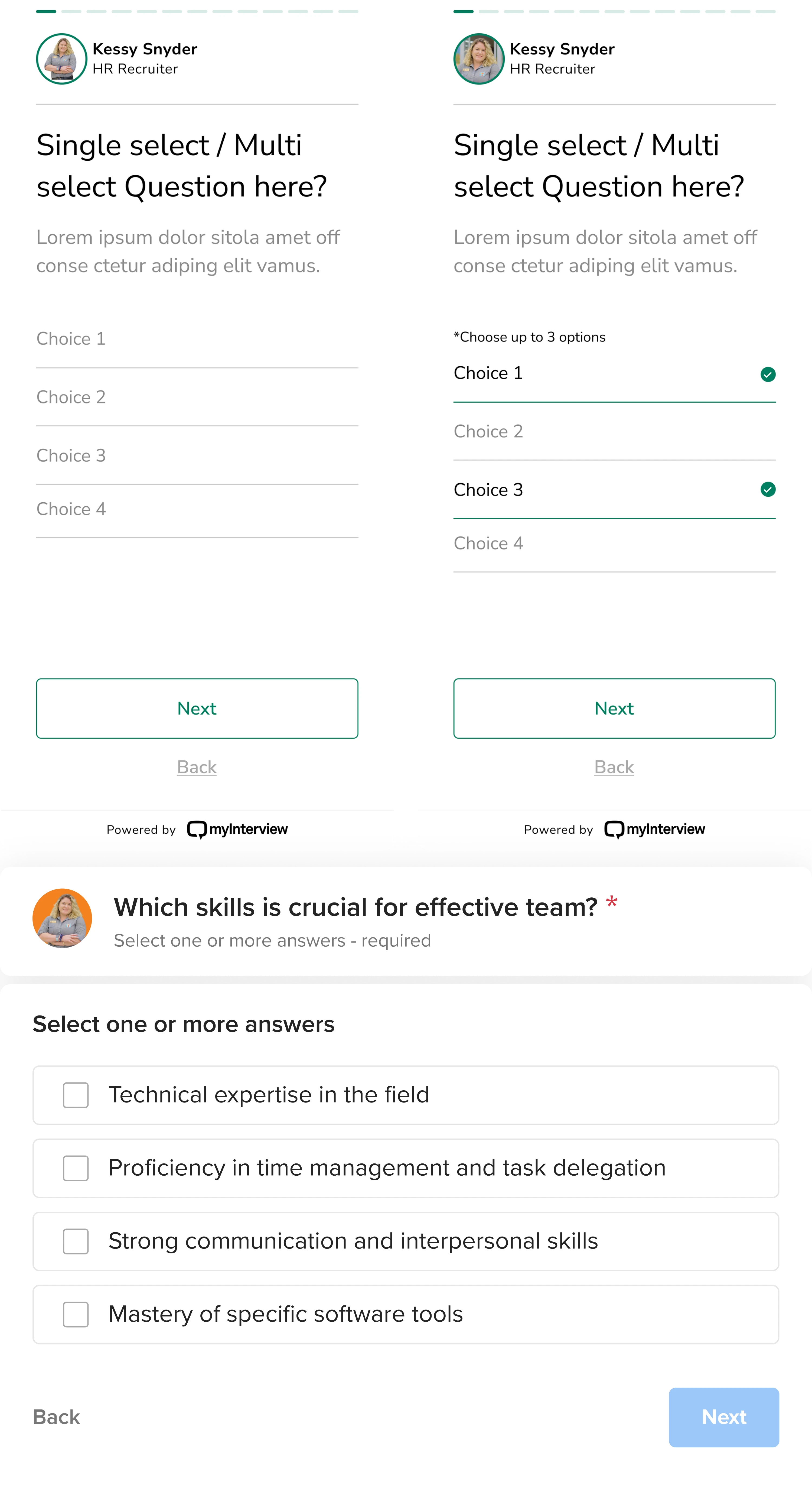
By breaking the flow into essential steps, simplifying interactions, improving clarity with familiar UI patterns, we removed friction at critical moments and helped re-engaged users who had previously abandoned the process.
Step 5. Keep new users engaged
Always remember that momentum matters – even after a quick initial win, users can stall.
Focus on reinforcing user progress through thoughtful triggers – both inside and outside the product.
Well-timed in-app guidance, onboarding emails, progress indicators, and contextual prompts should make it easier for users to move forward — not overwhelm them.
User engagement here is not about adding more nudges. It’s always about sustaining forward motion.
Step 6. Apply the changes and repeat
At the end of the day, onboarding should remain iterative. You analyze data, gather insights, refine milestones, and improve continuously.
Consistently analyze product usage data, gather qualitative feedback and revisit your onboarding success metrics. And based on the insights and metrics you have, optimize onboarding and test it again.
Why it’s helpful?
The ultimate strength of EUREKA is that it gives structure without locking you into a rigid flow, so you can build an onboarding experience intentionally — and evolve it based on what users actually do.
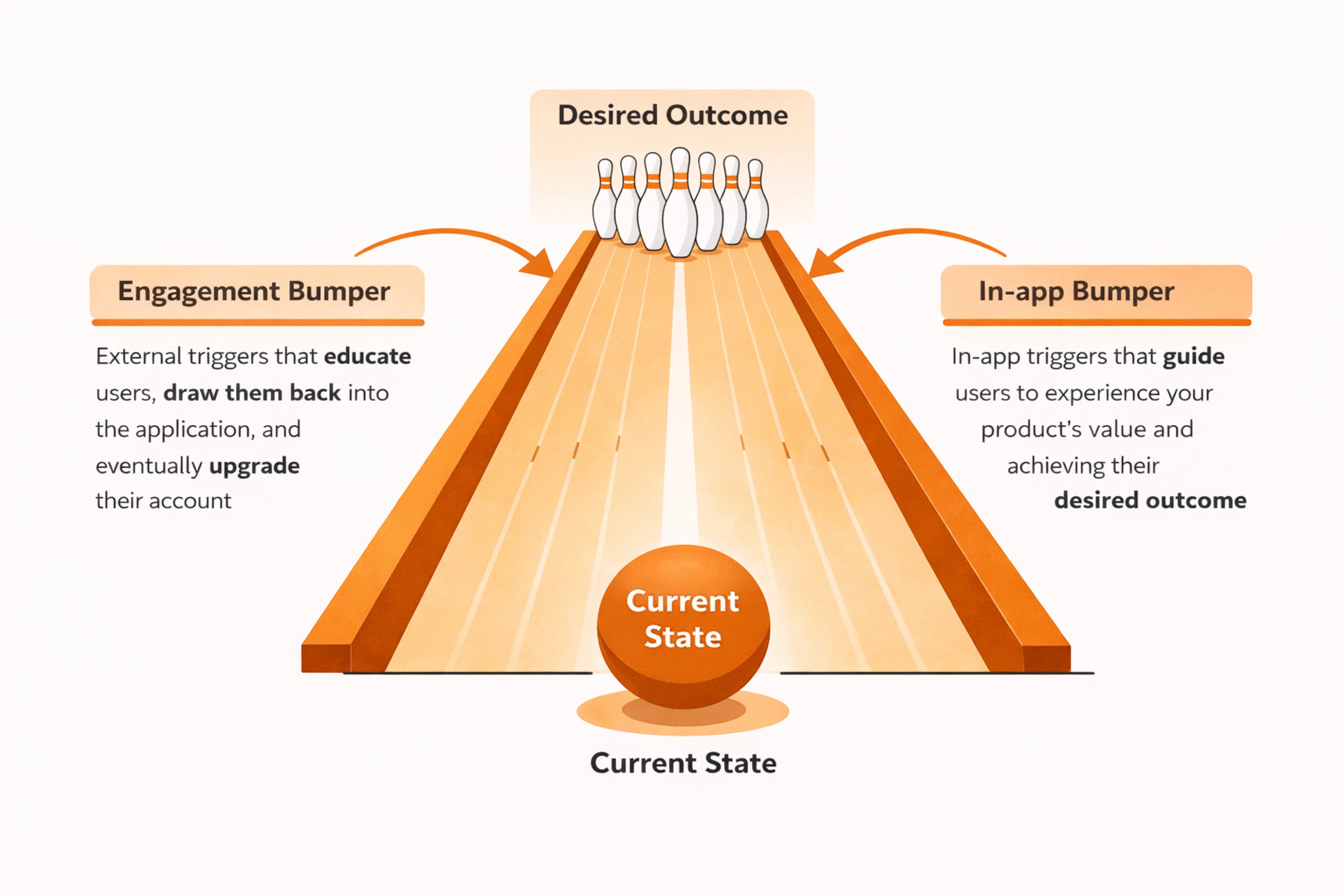
Bowling alley onboarding framework — for reducing time-to-value
In product-led onboarding, users are investing time from the first click. If they don’t see progress quickly, they drift. Not because they lack interest — but because the return on their time feels too slow.
The Bowling alley framework revolves around the idea of reducing time-to-value (TTV), comparing onboarding to a game of bowling: user → the bowling ball, and pins → their desired outcome.
Your job is to help them get their first strike — their first meaningful win inside your product. The faster they reach it, the more likely they are to stay. But just like in bowling, the lane is narrow, there are gutters and it’s easy to drift off course.
In onboarding, those “gutters” are distractions, unnecessary steps, advanced features introduced too early, or decisions that overwhelm new users.
The framework suggests solving this in two parts:
- Designing a straight line to progress.
- Adding bumpers to keep users from drifting.
Here’s how it plays out:
Step 1: Build the straight line
The straight line is the minimum path between signup and the First Strike. To define it, map your onboarding exactly as it exists and pressure-test each step using three criteria:
- Necessity — Is this required to reach the first win?
- Ease — Is this simple to complete?
- Simplicity — Does it introduce unnecessary cognitive load?
This creates a clean onboarding path focused entirely on helping users reach their First Strike as quickly as possible.
Step 2: Add ‘bumpers’
Once the straight line is clear, you add bumpers. These are lightweight supports that keep users moving: in-app guidance, progress bars, onboarding emails, triggered reminders.
Prompts can exist:
- Inside the product — progress indicators, contextual guidance, onboarding checklists
- Outside the product — onboarding emails, reminders, SMS, browser notifications

But here’s the rule: bumpers reinforce a strong path — they don’t fix a weak one. If the user journey to early win is cluttered, more tooltips won’t solve it.
Why it’s helpful?
The key benefit of the framework lies in forcing discipline. You protect the shortest path to meaningful progress and then reinforce it. In product-led settings, reducing time to that first win is what turns initial interest into user retention.
The BJ Fogg model — to reach essential user behavior
The BJ Fogg behavior model helps you diagnose why users don’t complete onboarding. Behavior happens when motivation, ability, and prompt converge. If users stall, one of these is missing.
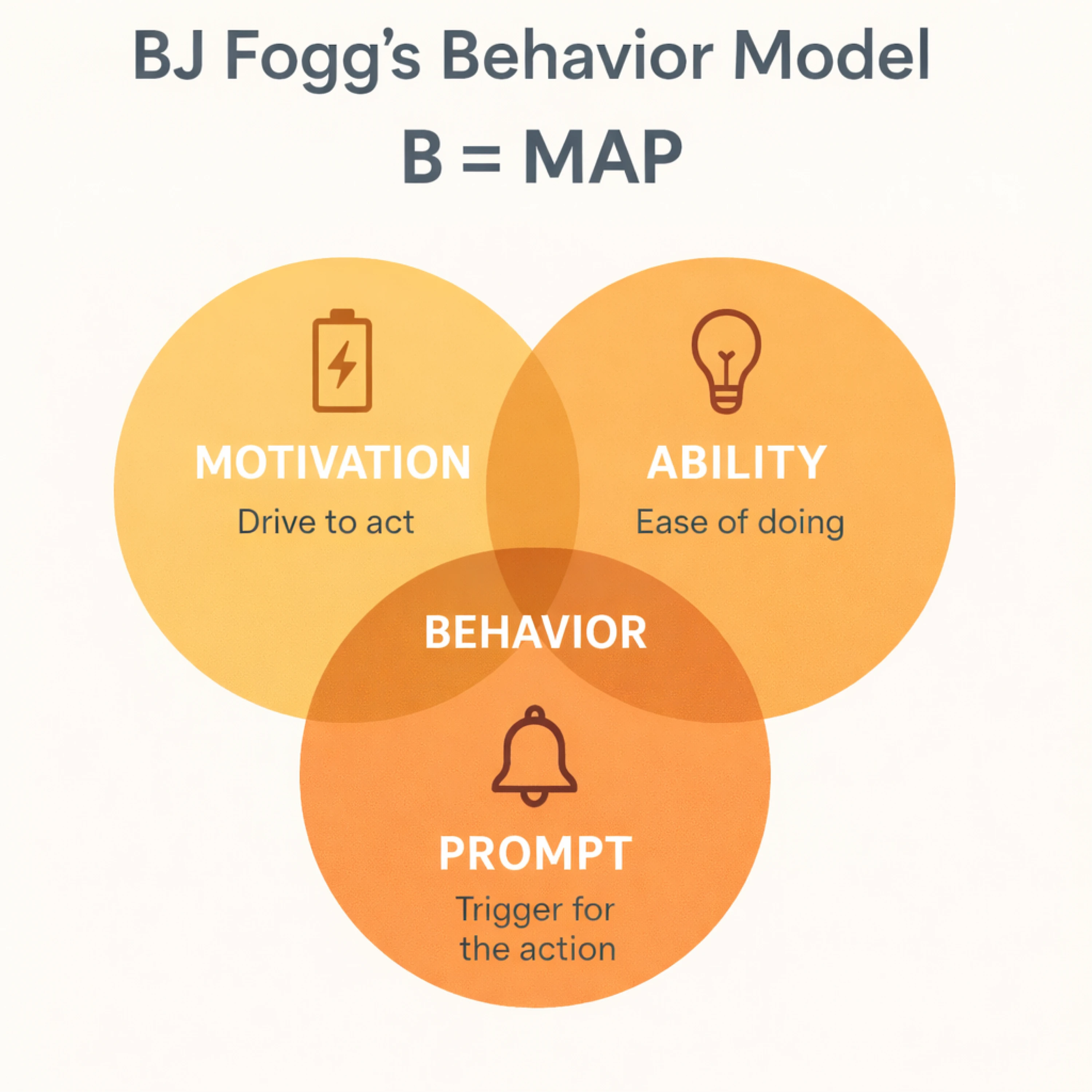
Motivation aspect — does this step feel worth it?
Users need to understand why an action matters. If onboarding feels like busywork instead of progress toward their goals, motivation drops.
Strengthen user motivation by:
- Connecting each step to a clear outcome
- Reinforcing benefits over features
- Addressing doubts and common anxieties
- Using light social proof
- Showing visible progress
Onboarding should continuously remind users what they’re working toward — and why it’s worth their time.
Ability aspect — is it simple enough?
Ability is often the real issue. If a step feels confusing or heavy, users hesitate.
Here you need to define the following:
- Is this action too complex?
- Is the next step obvious?
- Can we reduce decisions?
- Can we pre-fill or automate parts of it?
If friction levels are high, more nudges won’t help – simplify the flow first.
Prompt aspect — are we guiding at the right time?
Even when users are motivated and capable, they still need timely guidance. Use thoughtful prompts both inside the product (progress indicators, contextual guidance) and outside of it (onboarding emails, reminders) to create an engaging environment for the user to discover your product.
But, as we’ve already said, prompts should reinforce clarity — not compensate for friction.
Why it’s helpful?
BJ Fogg model helps you design onboarding holistically — across product experience and communication touchpoints. It shifts your focus from persuasion to structured behavior design, pushing you to identify exactly where users get stuck and why.
What high-performing PLG teams do differently
When you study high-performing product-led companies, a pattern emerges. They don’t try to teach the product first — they prioritize momentum and make it work first.
Here're a few things that consistently set them apart.
One meaningful action, minutes after signup
Instead of structuring the flow around explanations and configuration, guide users toward a focused step that produces visible progress early.
Rather than teaching first and letting users act later, combine guidance and action so users experience progress within minutes.
That action varies by product, but it always leads to something tangible:
- A project created and structured automatically
- Imported data displayed in a usable format
- A workflow successfully run
- An integration connected and actively syncing
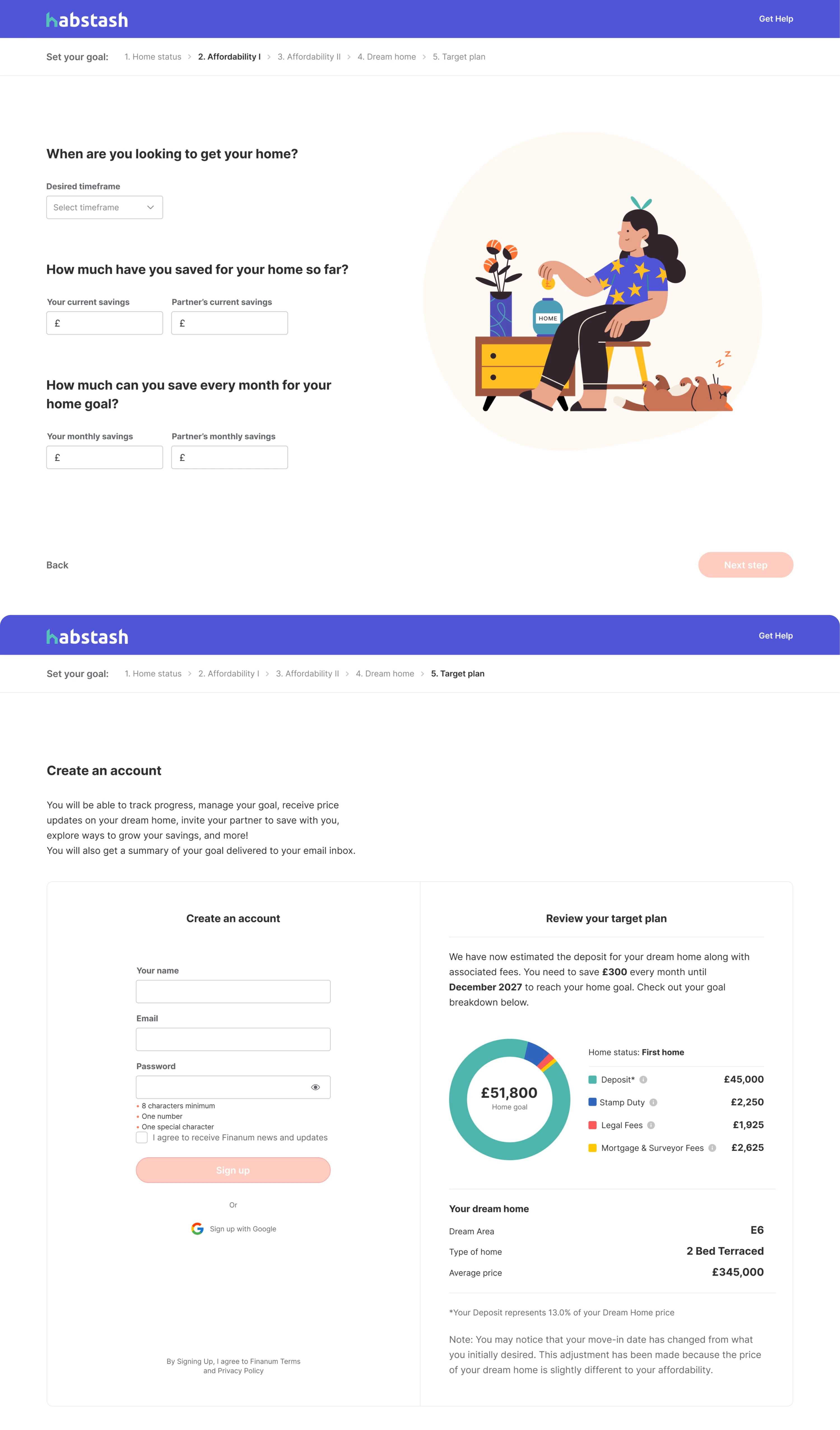
In fintech, for example, when designing a budgeting app for our client Habstash, we focused on turning the traditionally dry setup process into an engaging first-win moment. Instead of walking users through abstract configuration steps, we collected a few key inputs — income, current savings, and desired home-buying timeframe — and immediately generated a personalized savings plan. By the end of the flow, users saw a visual, goal-oriented summary tailored to their situation — proof that the product was already working for them.
Remember, the key goal here isn’t ultimate perfection, but proof in action. Once users see the product working, the rest of onboarding becomes refinement rather than setup. High-performing teams optimize for that early proof moment — because visible progress holds attention far better than completed checklists.
No blank-canvas paralysis
Your product may be powerful, but the first step users take may often feel cognitively expensive. A blank dashboard, an empty project board, or a “Create your first workflow” screen doesn’t feel empowering to new active users — it feels demanding.
Instead of presenting an empty canvas, strong teams reduce that initial burden by giving users something to work with:
- A pre-built draft they can edit
- Sample data that demonstrates how the product works
- An auto-generated setup based on a few simple inputs
- A template aligned with the user’s selected goal
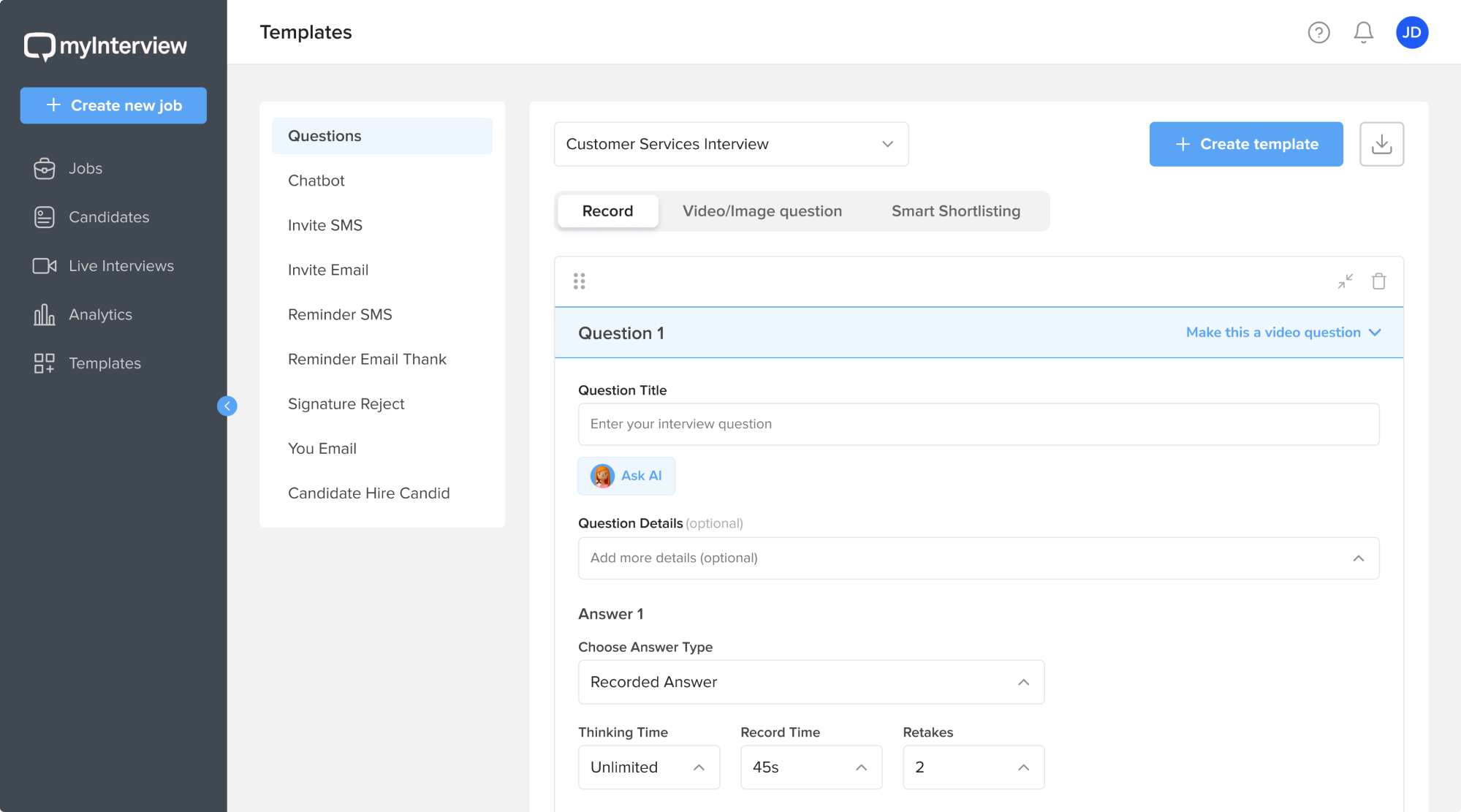
One example of this approach is myInterview, where our designers eliminated blank-page friction for recruiters. We introduced a template system that lets users choose from predefined job templates or create custom ones tailored to their needs. We also designed an AI-powered flow: after the admin provides basic job inputs, the system generates required skills and drafts relevant interview questions.
Such kinds of moves shift the user’s role from creator to curator. Rather than inventing structure, they react to an existing one. Instead of asking “what should I build?”, they think “how can I adjust this?”
The difference is subtle but powerful. Momentum builds faster when you provide structure first — and expand control once your users gain enough confidence.
Designing onboarding that doesn’t feel like onboarding (UX Perspective)
The best onboarding often feels invisible. Most onboarding fails because it’s treated as a layer — something added on top of the product: a tour, a checklist, or sequence of tooltips.
Reduce friction at the structural level
Onboarding improves when structure improves — not when more UI elements are added. If users don’t know what to do next, the solution isn’t another tooltip. It’s a clearer product structure.
Strong onboarding design structure follows simple principles:
Empty states > tooltips
Before adding a pop-up that explains what to do, shape the screen so it communicates the next step on its own. A well-designed empty state can visually guide action through layout, examples, and a clear call to action. Yes, tooltips can reinforce this direction but don't rely on them as a primary guide.
Defaults > choices
Early in onboarding, too many configuration options create hesitation. Users stall not because they lack interest, but because they’re unsure which choice is “correct.” Smart defaults remove that friction by pre-selecting the most logical option and letting users adjust later. This reduces decision fatigue and keeps momentum intact.
Outputs > explanations
Even when users move forward, they may still wonder, “Is this working?” Showing a tangible result — a generated report, a preview, a completed example — builds immediate understanding. Seeing the product produce something meaningful creates confidence faster than any tutorial text can.
Prioritize contextual help over product tours
Front-loaded product tours assume that understanding leads to action. In practice, action creates understanding.
The problem isn't often the tours themselves — it’s timing and density:
✘ Too early: users haven’t formed intent yet, so information feels abstract.
✘ Too much: multiple features explained at once overwhelm working memory.
✘ Too detached from action: information delivered before interaction rarely sticks.
Guidance works best when it’s contextual and timely:
✔A short prompt that appears exactly when a user hesitates is more effective than a comprehensive walkthrough shown at login.
✔Information tied to action is far more memorable than information delivered in advance.
✔Large tours try to front-load knowledge. Effective onboarding distributes it — giving users just enough guidance at the moment they need.
On-demand guidance beats forced flows
Forcing every new user through a fixed onboarding flow assumes a single learning style. In reality, some users explore confidently, others hesitate, and many move in nonlinear ways.
Instead of enforcing a path, build onboarding as infrastructure that users can access when they need it.
Embedded help hubs
Guidance shouldn’t live in a separate support portal. When help is integrated directly into the product, users can resolve confusion without leaving their workflow. This keeps momentum intact.
Contextual walkthroughs
Instead of triggering full tours at login, offer lightweight walkthroughs tied to specific actions. When users attempt something new, guidance appears exactly where it’s relevant — not five steps earlier.
Opt-in checklists
Checklists can be powerful, but only when they’re chosen. When users opt in, the checklist becomes a progress tracker. When it’s mandatory, it feels like homework.
A well-designed on-demand onboarding structure respects user autonomy while preserving clarity and supports exploration without sacrificing direction.
Overall, when users can pull guidance instead of having it pushed onto them, onboarding becomes supportive rather than restrictive — and the product feels easier to adopt as a result.
A brief take on product metrics: activation vs adoption
Activation and product adoption are often treated as interchangeable. The assumption is simple: once a user activates, they’ve adopted the product.
In reality, activation marks an initial success point. Adoption is perhaps the key onboarding success metric, as it reflects repeated behavior over time — the kind that drives retention and expansion.
This distinction matters for onboarding. If you design onboarding only to reach activation, you may stop at a milestone that doesn’t guarantee loyal clients and long-term usage. Designing for adoption means guiding users beyond a first success and toward behaviors they repeat.
Think beyond the onboarding success metric
Many teams reduce activation to a single breakthrough event — the moment a user completes a key action and experiences initial success.
However, reaching that milestone does not guarantee continued usage. A user can activate and still churn. Initial success does not automatically translate into repeated behavior.
Onboarding alone does not create long-term retention. But it can set up the conditions that make continued usage more likely.
That means designing onboarding not only to reach a first success, but to establish triggers for future behavior. This may include:
- Setting up notifications tied to meaningful events
- Encouraging users to invite collaborators
- Connecting integrations that generate ongoing activity
- Configuring recurring workflows or scheduled tasks
These mechanisms create natural reasons to return. Keep in mind, that effective onboarding extends just far enough to initiate the first repeatable behavior — not just the first successful action.
Define your product adoption indicators
Once activation is in place, the next step is to identify what retained users did early on. Those early behaviors often become adoption indicators.
From there, onboarding becomes more intentional. If data shows that users who invite two collaborators within the first week retain at higher rates, onboarding can nudge new users to do exactly that. If repeat usage within 48 hours predicts retention, the early experience can be structured to encourage that second interaction.
The goal is not to push users through steps, but to guide them toward behaviors already proven to correlate with long-term retention.
Product-led onboarding is where growth holds — or breaks
In a PLG model, the SaaS user onboarding experience plays a huge part in product success. It shapes early behavior, builds momentum, and influences whether retention compounds or stalls.
Here are a few core things we’d like to outline:
1. Surface value early, remove unnecessary friction, and guide users toward meaningful progress without overwhelming them.
2. Remember that strong onboarding is a holistic effort. Every interaction, from the first screen to follow-up touchpoints, should work together to create an engaging environment where users can learn the product’s value.
3. Don't treat initial onboarding strategy as a one-time effort – products evolve, user expectations shift and so does their behavior.
When you design with care, user insight, and iteration, product-led user onboarding becomes the system that helps your product stick with users and ultimately drive positive ROI.
At Eleken, we’ve worked with 200+ SaaS companies and have practical know-how in designing user onboarding experiences that reduce churn and support growth. If that’s what your product currently needs, our battle-tested designers would be glad to help you enhance your Saas customer journey and ultimately your product growth.


