

Low feature adoption is one of the most frustrating realities in SaaS. The feature exists, it clearly solves a real problem, yet the adoption rate stays flat.
It’s tempting to think this is a visibility problem. Or a communication problem. But most of the time, it’s neither.
It’s a design problem — one we’ve seen repeatedly while designing SaaS products at Eleken UI/UX design agency.
Users don’t adopt features just because they can see them. If a feature appears at the wrong moment, in the wrong place, or outside the natural workflow, it becomes background noise — even when features in app are technically accessible.
And then there’s also what Nielsen calls momentum behavior. Once users choose a path inside your product, they stick to it. Even if a better option appears, switching feels costly, exploring feels risky, so they follow the familiar route.
Designing for feature adoption means structuring the experience intentionally — placing relevant features in the right context, at the right time, within the right flow.
In this guide, we’ll unpack what feature adoption really means, how it differs from discovery, how to measure it properly, and — most importantly — how to design new features users actually adopt.
What does feature adoption mean
Feature adoption refers to the point at which a new capability becomes part of how users regularly work inside your product. It’s not about whether a feature exists, or even whether users have tried it once. It’s about whether they return to it when the same problem appears again.
A user who clicks a feature out of curiosity has not adopted it. A user who relies on it as part of their recurring workflow has — that’s when users adopt functionality in a meaningful way.
In practical terms, feature adoption happens when three conditions align:
- Recognition of value (aha moment) — the user understands feature value, what it does and why it mattersSuccessful first use — the initial interaction delivers a clear, immediate benefit.
- Successful first use — the initial interaction delivers a clear, immediate benefit.
- Repeated usage — users continue choosing the feature when the situation reappears.
In other words, adoption should reflect a shift in the user's routine.
Feature adoption vs related concepts
Because adoption sits inside a broader user journey, it’s important to separate it from adjacent terms.
- Feature discovery is about visibility and relevance — whether users notice and understand the feature.
- Activation refers to the first successful use.
- User engagement measures ongoing interaction with the product overall.
- Product adoption process describes whether users embrace the product as a whole.
Feature adoption focuses specifically on whether individual features become embedded in behavior.
And that distinction matters. Because increasing exposure may improve discovery, and improving SaaS onboarding may boost activation — but neither guarantees that users will continue using the feature over time.
That continuation is what adoption truly measures.
Why feature adoption is harder than it looks
On paper, feature adoption seems straightforward. If a feature solves a real problem, users should use it. If it saves time or improves outcomes, it should naturally replace inefficient workflows.
In reality, adoption is rarely that linear.
Users operate inside habits. Once a workflow feels “good enough,” they tend to repeat it without reconsidering alternatives. Even when a new feature offers a better path, switching requires effort — and effort introduces friction.
Momentum behavior explains part of this resistance. After choosing a route inside your product, users commit to it. They follow familiar steps, rely on shortcuts, and avoid exploring unfamiliar options. The cost of pausing, evaluating, and learning something new often feels higher than the incremental benefit of improvement.
In practice, several recurring blockers stand in the way of feature adoption:
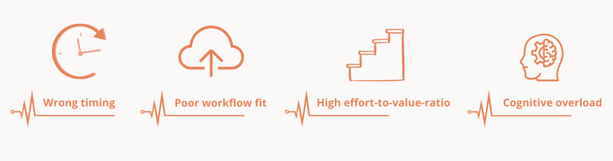
- Wrong timing: the feature appears before the user fully understands the surrounding workflow — or after they’ve already built a workaround.
- Poor workflow fit: the feature exists, but it lives outside the natural flow of work, forcing users to interrupt their rhythm.
- High effort-to-value ratio: setup, learning, or configuration feels heavier than the perceived payoff.
- Cognitive overload: as products evolve, too many product’s features compete for attention, making it harder for any single capability to stand out.
Importantly, adoption fails not because users reject value, but because the perceived cost of change outweighs the perceived benefit.
That’s why feature adoption is fundamentally about balancing effort and perceived value. When the transition feels lightweight and the benefit is obvious, behavior begins to shift. When it doesn’t, momentum wins.
The feature adoption funnel — and why it’s not enough
When teams try to measure adoption, they often rely on tracking feature adoption through funnel stages. It offers a structured way to think about progression: how users move from awareness to activation and, ideally, to sustained usage. The funnel feels logical because it mirrors how we track other product metrics — step by step, stage by stage.
In its simplest form, feature adoption is described as a sequence:
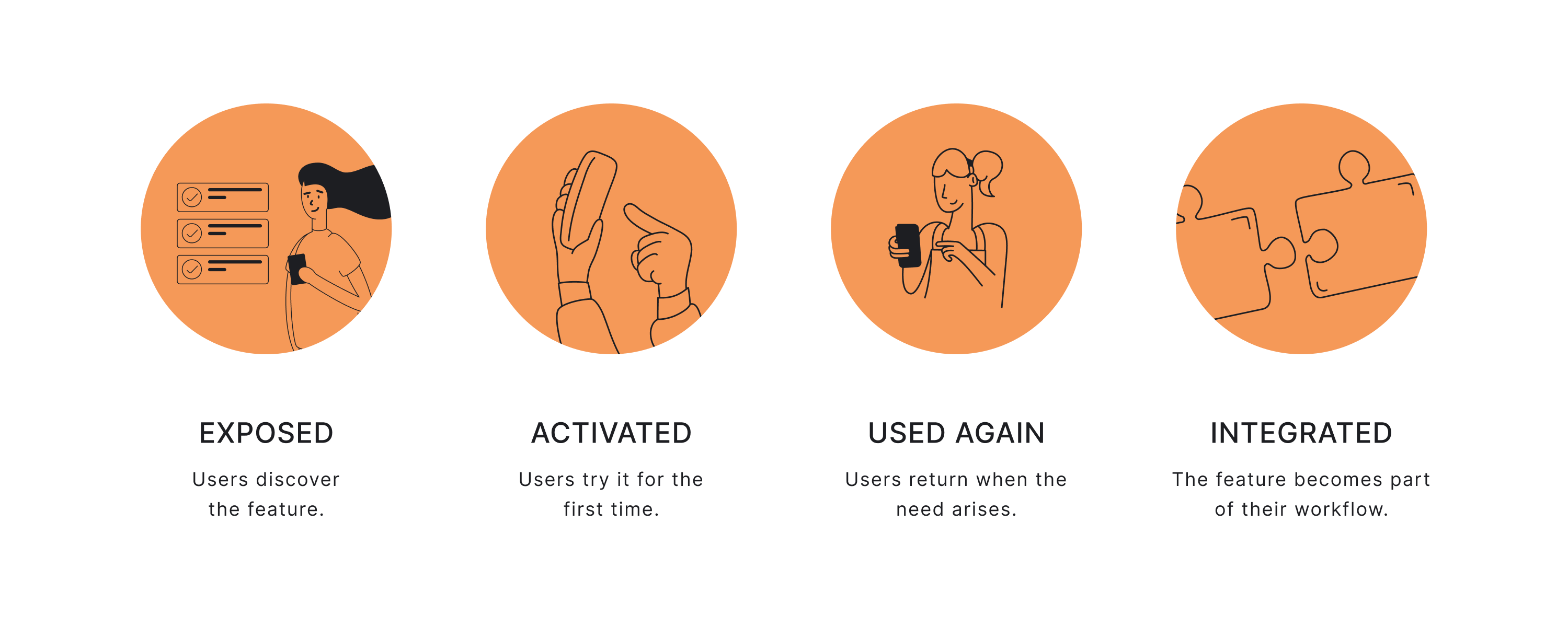
- Exposed — users become aware that the feature exists, whether through in-app messages, contextual prompts, or navigation.
- Activated — a subset of those users try the feature for the first time and complete an initial action.
- Used again — some return to the feature when the same need arises.
- Integrated — over time, the feature becomes part of their routine workflow.
This helps quantify adoption rate and gives visibility into key metrics like conversion between stages.
But the funnel has limitations.
It assumes linear behavior, treats all specific feature types equally, and ignores differences between user segments and intent.
It also fails to explain why users drop off — whether due to poor UX, unclear value, or friction. This is why relying only on funnels can obscure a feature's performance instead of clarifying it.
Where the funnel falls short
The funnel helps you see movement, but it simplifies behavior in ways that can distort analysis.
First, it assumes adoption is linear. In reality, users often jump in and out. They may activate a feature once, ignore it for weeks, and return later when context changes. Behavior isn’t always a straight line.
Second, it treats all features as equal. A reporting dashboard, an automation engine, and a quick formatting shortcut will naturally have different adoption patterns. Comparing them against the same adoption rate benchmark is misleading.
Third, it ignores intent, frequency, and role. Not every user needs every feature. Some capabilities are relevant only in specific situations. Measuring adoption across the entire user base often underestimates success among the intended audience.
And finally, the funnel shows where users stop — but not why. It identifies drop-offs, but it does not explain whether friction came from unclear value, high effort, poor workflow fit, or simple attachment to familiar routines.
The funnel captures progression. It does not explain resistance.
To design for adoption effectively, you need a model that accounts for user behavior — not just stage movement.
Designing for behavior, not just progression
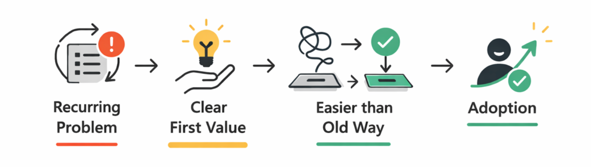
Feature adoption doesn’t happen because users pass through stages. It happens when three practical conditions are met:
- The feature solves a problem that actually recurs.
- The benefit becomes clear during the first meaningful use.
- Switching feels easier than sticking with the old method.
This is where valuable features stand out — not by being visible, but by fitting naturally into how users already work.
In other words, adoption is driven by perceived value and perceived effort.
If the feature reduces steps, removes friction, or saves meaningful time, users have a reason to switch. If it introduces setup complexity, interrupts flow, or demands learning before value is visible, users default to what they already know.
This is why context matters more than exposure — and why effort-to-value ratio matters more than raw activation numbers.
What actually drives feature adoption
Feature adoption strategy is rarely about exposure alone. It shapes how a feature is introduced, how quickly it delivers value, and how easily it replaces existing behavior.
Several design principles consistently determine whether a feature becomes part of a user’s workflow.
Contextual discovery > generic announcements
A feature introduced through a generic banner or release email may be noticed but it exists independently of what the user is doing at that moment. Therefore, it rarely changes behavior and translates into sustained use.
However, when a feature is surfaced dynamically, exactly at the moment of need though thoughtful in-app prompts and in-app notifications it guides users and starts to feel relevant and useful rather than promotional.
For example, if a user exports data multiple times, suggesting automation inside that workflow connects the feature to a real need. The feature doesn’t compete for attention — it becomes the logical next step.
So next time, instead of relying on pure feature announcements, do this instead:
- Highlight features based on behavior, not releases: design prompts to be triggered by user actions, not by the fact that a feature was recently launched.
- Attach prompts directly to relevant UI elements: structure hints appear next to the button, field, or step where the problem occurs — not in a separate message layer.
- Introduce capabilities at the moment of friction: when users repeat a manual action or hesitate in a workflow, design the interface to suggest a smarter path.
This shift — from static visibility to contextual relevance — is what turns discovery into adoption. When a feature is introduced within the flow of work, it feels less like an addition and more like a natural extension.
One feature → one clear activation moment
Your feature may be powerful, but if the path to value is unclear adoption usually fails. The principle here is simple: if users don’t know what to do first, they do nothing.
Designing for a strong activation moment gives users a clear first win. It answers the question, “What should I do right now?” without forcing them to explore.
High-adoption products remove ambiguity, and help users start with a clear first step – a single, unmistakable activation moment.
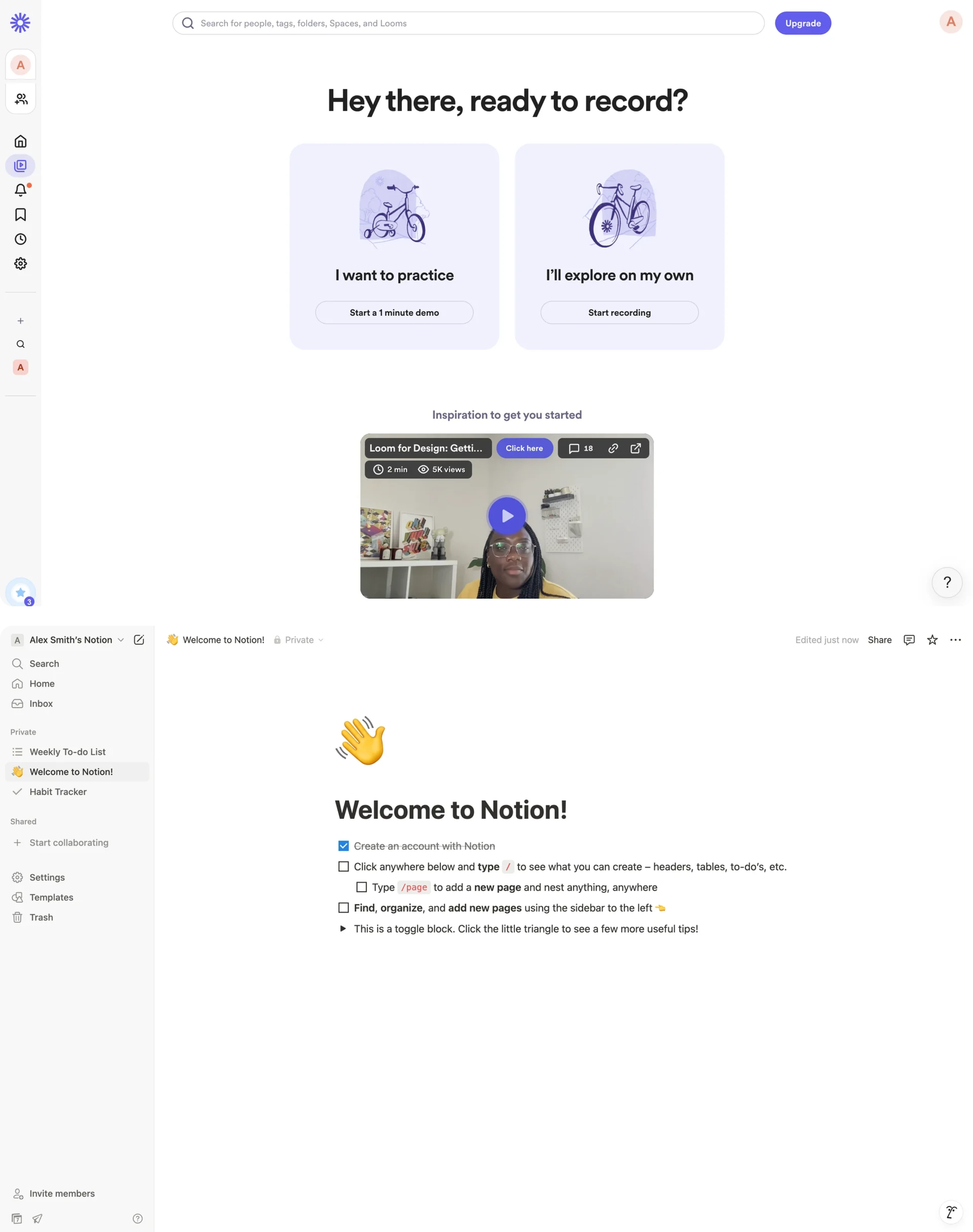
Think of Loom prompting you to record your first video immediately or Notion that replaces the empty page with a clean, thoughtfully designed starter checklist.
Progressive disclosure to prevent rejection
Even when the first action is clear, another risk remains: exposing too many complex features too early. If users see too many controls, options, or paths upfront, the feature starts to feel heavy before it feels useful.
To avoid this, employ progressive disclosure to control what users see at each stage:
- Start with the simplest useful action.
- Keep secondary options subtle or hidden.
- Reveal deeper functionality only after usage signals intent or gains familiarity.
Such an approach keeps users focused and helps encourage users to explore gradually. Besides, this way, you also account for psychological needs of the users, reduce cognitive load, and keep user efforts aligned with perceived value. Adoption improves when users grow into complexity instead of being overwhelmed by it.
Workflow fit > feature quality
Now, even when your feature is well-designed and genuinely useful — it may still struggle with adoption. The reason is simple: users don’t adopt features in isolation. They adopt them inside workflows.
If using a feature requires switching screens, navigating to a separate module, or starting a parallel process, it immediately feels optional.
Instead of asking users to “go use” a feature somewhere else, design for a strong workflow fit to reduce any friction:
1. Embed the feature inside the task already in progress.
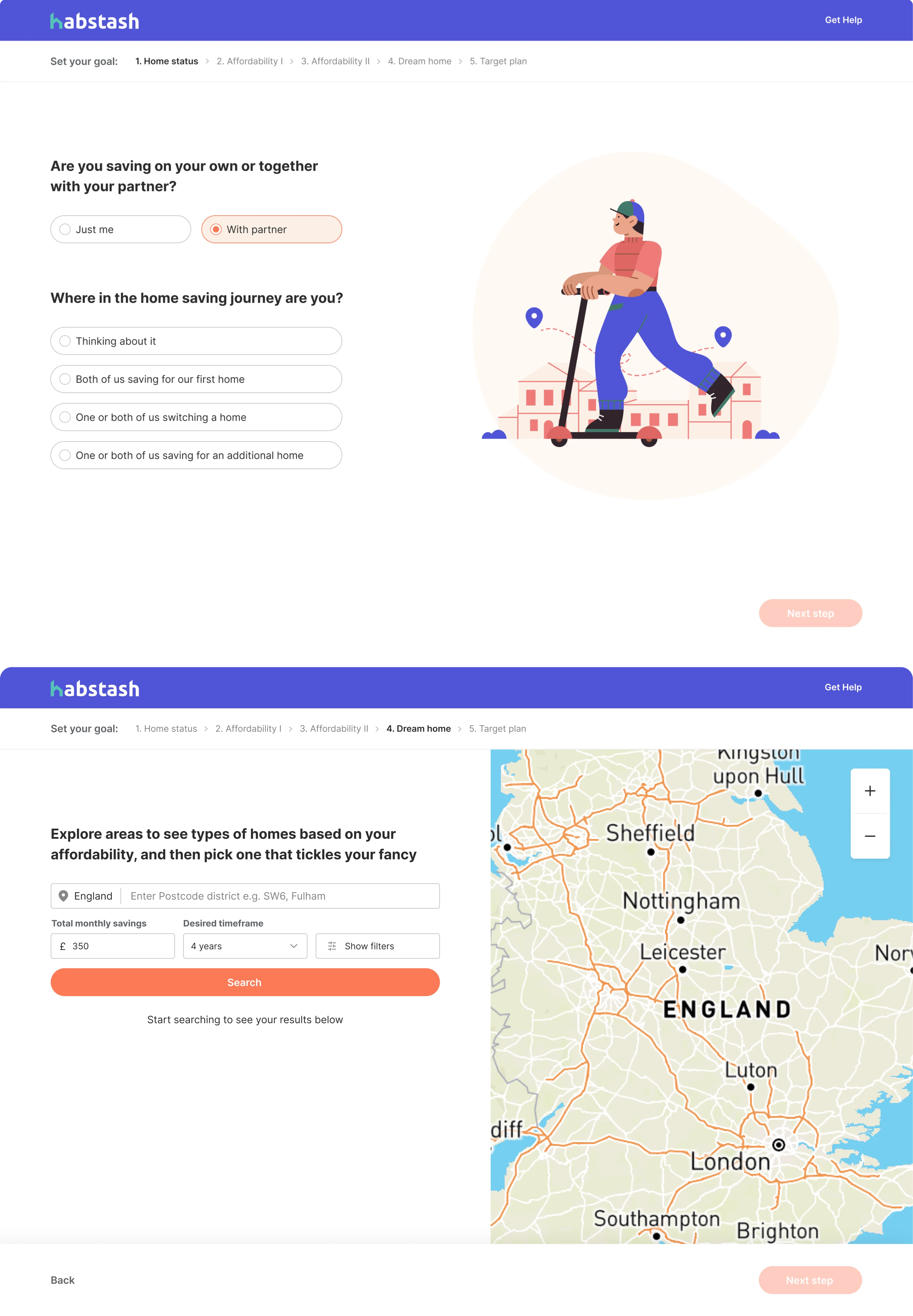
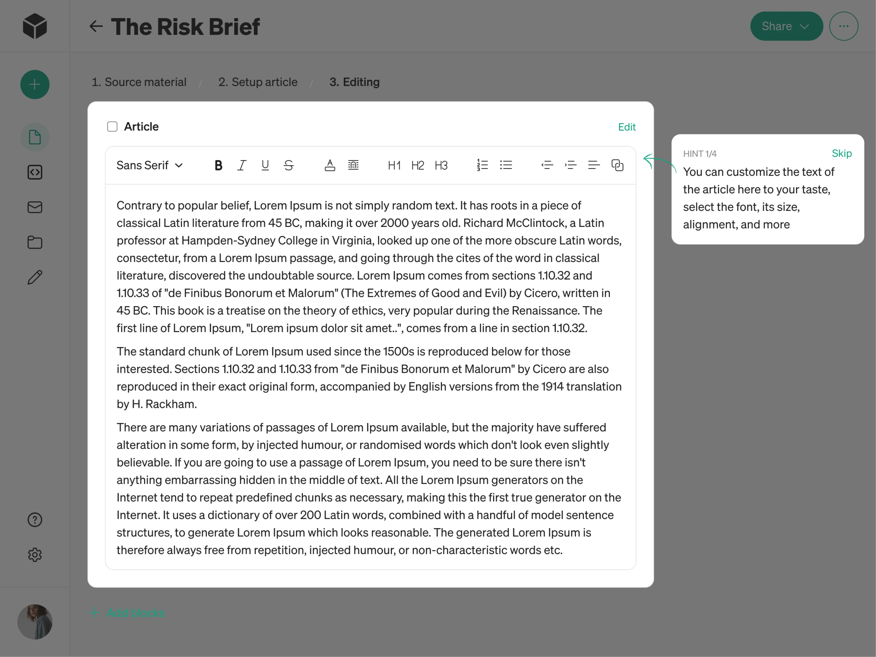
If users are editing a document, the feature should appear in that editing toolbar — not inside some separate “Tools” section. Btw, that’s exactly what we did for Modia, an AI content creation tool. Right in the field when a user is editing written content, we placed a customization feature neatly in the toolbar section and supplied it with a careful tooltip, so the user can notice the feature icon and can try it out. Overall, when such tiny elements are done right, users interact with features naturally, without friction.
2. Reduce navigation decisions.
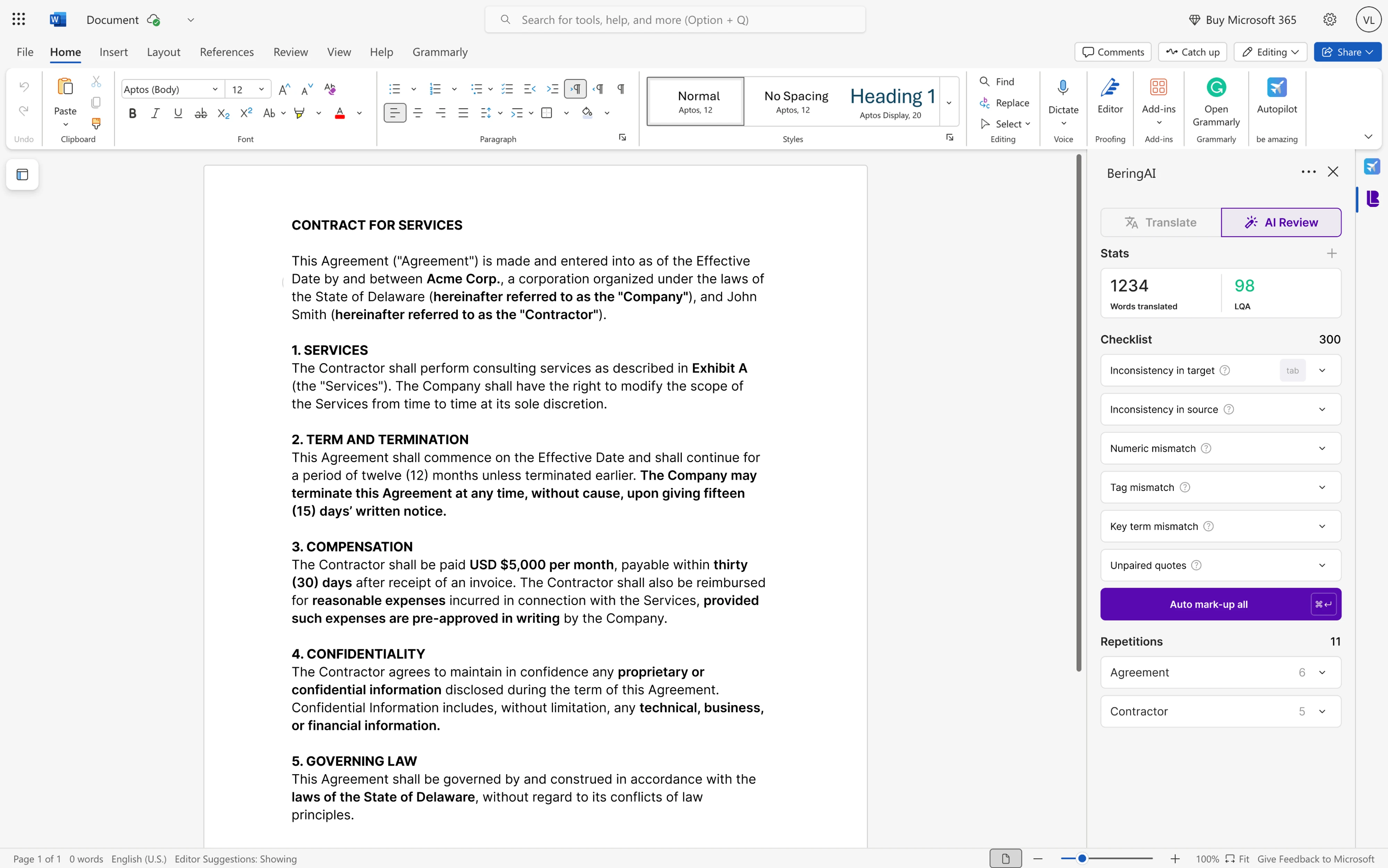
Make navigation explicit and user-friendly, so your users shouldn’t have to think, “Where do I go to use this?”. In our work with Bering Lab, a legal-focused AI translation tool, our designers managed to strike a delicate balance between highlighting its advanced capabilities and delivering a smooth, intuitive user experience for both the product and its Microsoft Word plugin that ultimately turned Bering Lab into a $2.3M pre-Series A success.
3. Replace a manual step instead of adding a new one.
Features gain traction when they remove steps rather than add them — when they shorten a process instead of introducing a parallel one. Case in point – in our work with an eLearning SaaS app, instead of making users manually stack rules or edit raw code, we replaced those steps with a guided drag-and-drop builder and visual editor — making the whole process much easier and less error-prone.
The differences may seem somewhat subtle but decisive. When features improve the workflow users are already in, adoption feels natural. But if they require starting a different workflow, adoption feels optional.
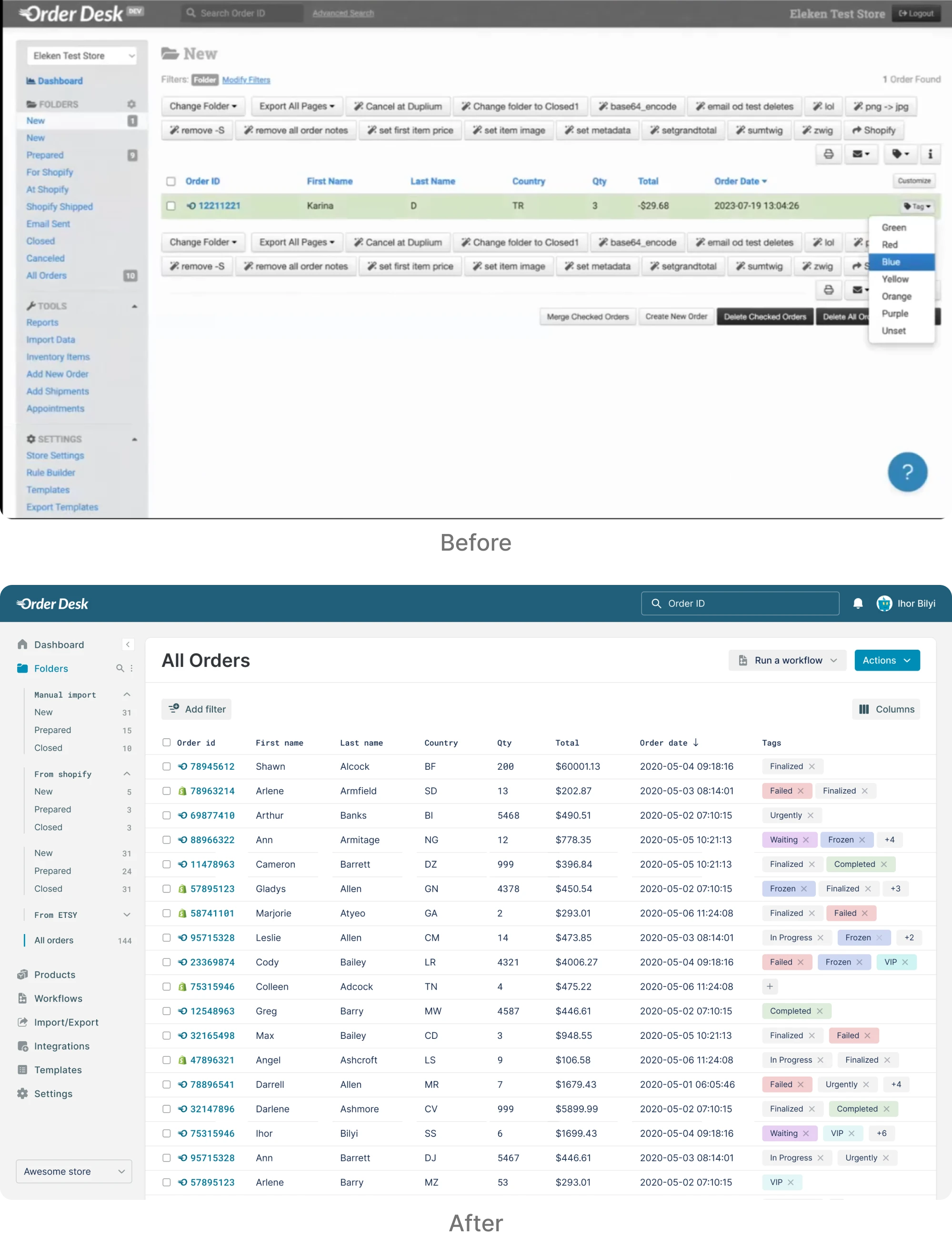
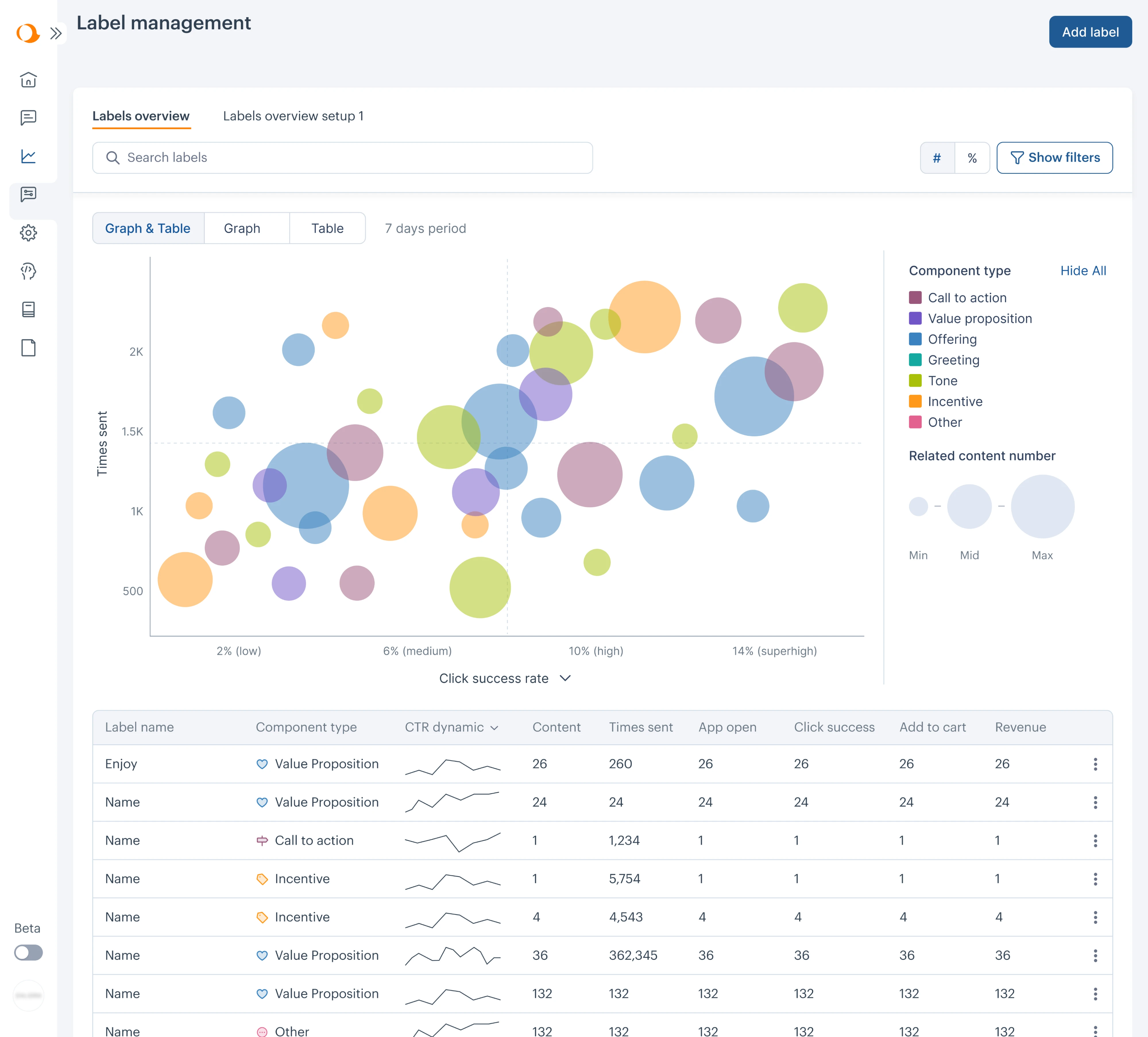
We saw this clearly in our work with Aampe, an AI-powered marketing platform. The product offered advanced AI messaging and performance analytics, but navigation makes it difficult for marketing teams to glean data and get real value. Insights were buried in tables, and important settings lived in fragmented sections.
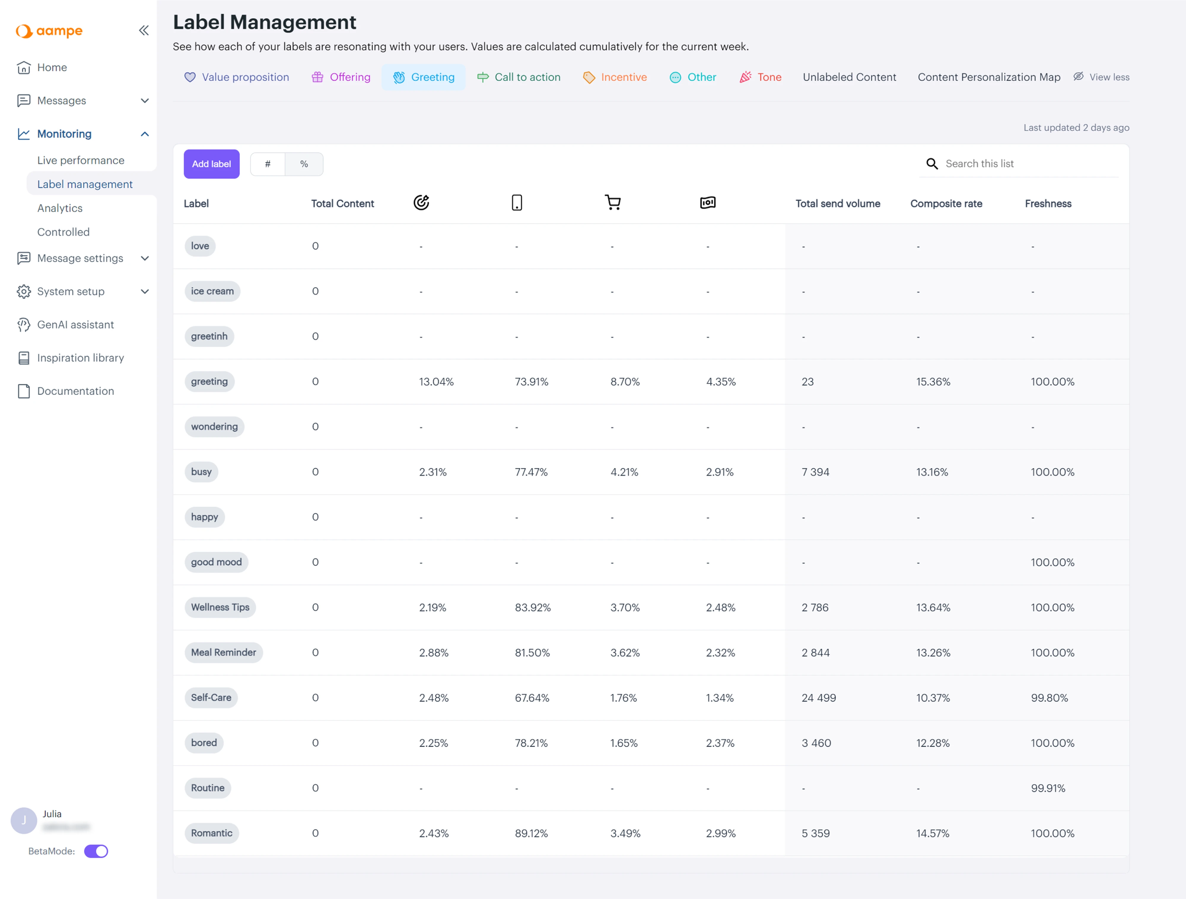
Eleken designers embarked to intentionally solve this challenge: we reorganized the main menu around real usage logic, rebuilt system setup into a dashboard, and redesigned label performance analytics into a visual comparison model that surfaced insights instantly. Once features aligned with user workflows instead of internal architecture, the platform felt more intuitive and strategically powerful — and as the product matured, Aampe went on to raise a whooping $18M in funding.
Keeping effort vs value balance
Every new feature asks the user for some kind of effort. However, even small adjustments feel costly if the value isn’t immediately clear. Those efforts show up in different ways:
- Steps needed before the first result
- Mental energy to understand how it works
- Time required to set it up
- Risk of disrupting an existing routine
If using a feature feels like extra work, most users stick with what they already know.
To improve adoption, focus on reducing the distance between action and reward. Strong design decisions focus on these three things:
- keep setup minimal
- let users see the result quickly.
- make the first success obvious.
This is what leads to successful feature adoption and improves customer satisfaction.
So the smaller the gap between first click and first value, the more likely the user reaches an aha moment and sticks with the feature and the product itself.
We saw this clearly in our work with myInterview. When the client partnered with us to address a 90% candidate churn rate, the core issue wasn’t missing features — it was friction. We clarified hierarchy, restored conventional UI patterns, and reduced cognitive strain to rebuild trust in the interview flow.
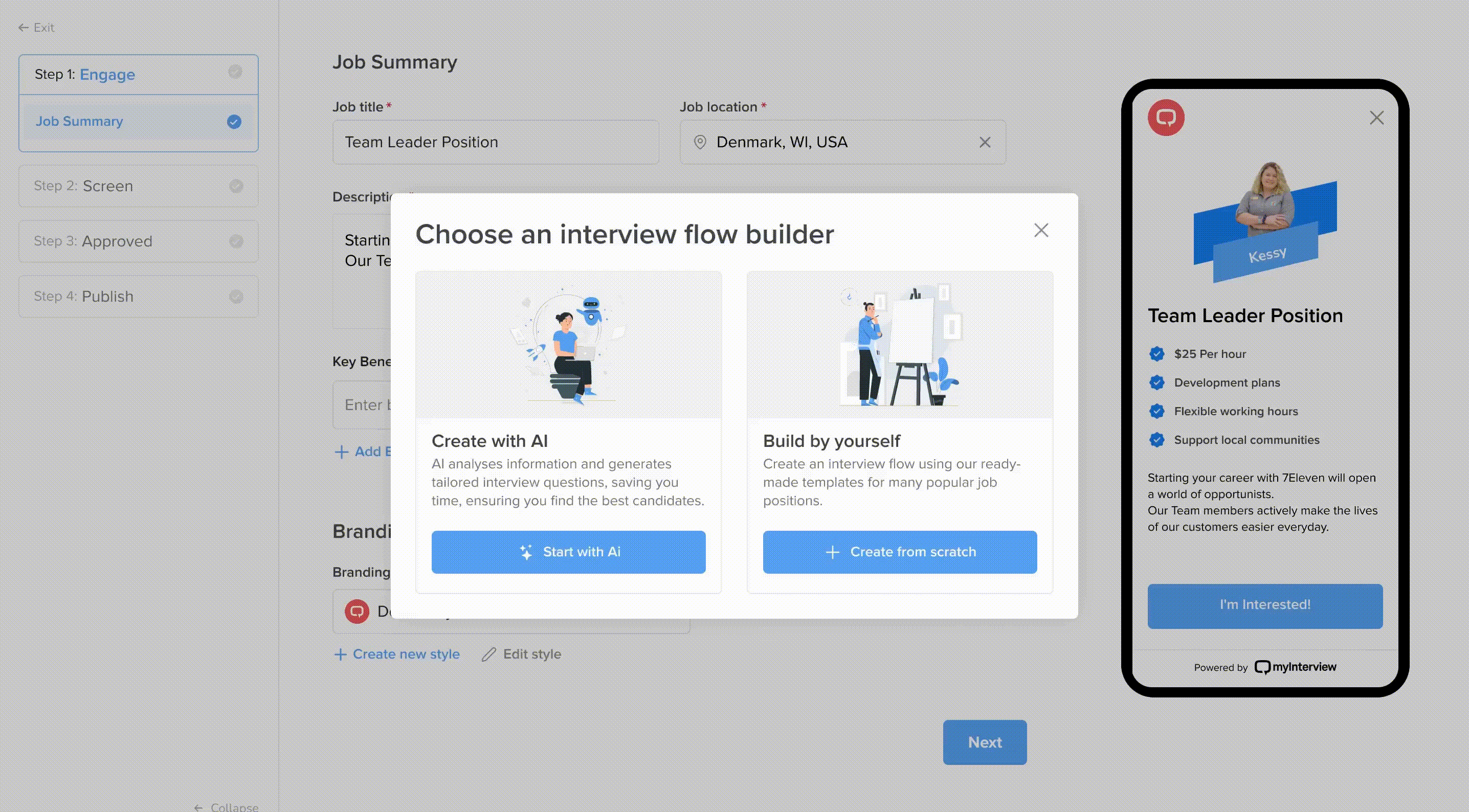
Once we fixed UX issues, the primary workflow felt intuitive, we expanded recruiter-facing features — introducing step-by-step job creation, real-time previews, a template system, and AI-assisted question generation — ensuring that new capabilities felt like natural extensions of a stable foundation rather than additional complexity.
And it worked – workflow redesign helped the product move to enterprise settings.
Feature adoption metrics: what matters and how to measure it
When seeking a benchmark to validate performance, you should realize that a standalone feature adoption rate is rarely meaningful on its own. There’s no universal good feature adoption rate.
Feature adoption numbers can be misleading when they’re interpreted in isolation. Here are the most common reasons:
- Different types of features. Core workflow tools should reach many users. Advanced or admin features are designed for fewer. They shouldn’t be measured the same way.
- B2B vs. B2C dynamics. Consumer adoption can be immediate, while B2B adoption often involves customer training and longer cycles.
- Different usage frequency and intent. Here it's also straightforward – a casual feature won’t behave like a quarterly reporting tool.
So basically, there is no universal “good” adoption rate. In fact, what matters is whether the feature performs as intended within its context.
Contextualizing or how to measure feature adoption meaningfully
Instead of chasing industry averages, focus on signals that reflect how your feature actually performs inside your product. Here’s what matters more:
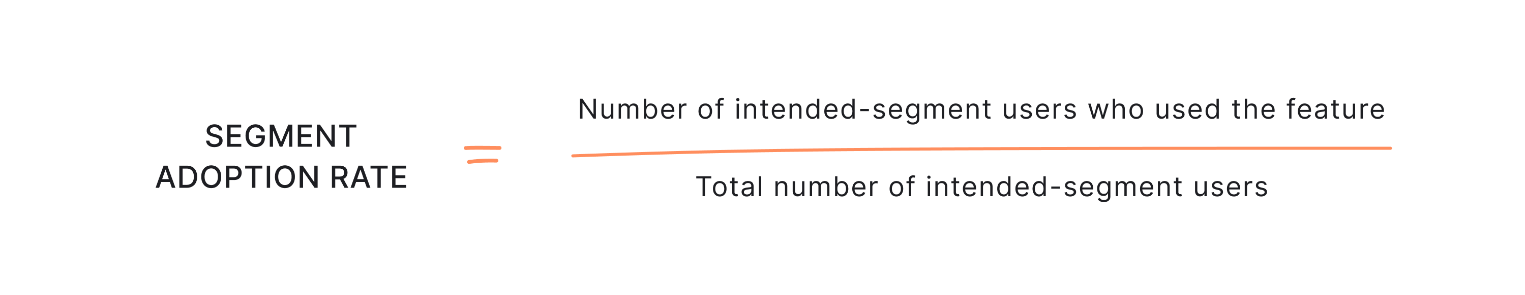
- Adoption within the intended segment. Measure adoption among the users the feature was designed for — not across the entire user base.
- Change over time against your own baseline. Compare performance to your historical data. Improvement relative to your starting point matters more than external comparisons.
- Depth of use, not just breadth. It’s not only about how many target users tried the feature, but how meaningfully they use it. Repeat usage and integration signal real adoption.
- Success events are tied to outcomes. Track actions that indicate real value — not just clicks, but completed workflows or measurable results.
One standalone benchmark rarely tells the full story. Without context, it’s easy to celebrate the wrong signals — or panic over the wrong drop-offs.
These are your key feature adoption metrics — not vanity numbers.
Track both monthly active users engaging with the feature to understand real impact.
How to measure feature adoption without false confidence
Clarity about what matters helps bring more discipline and direction to measurement. Here’s a structured way to approach adoption rate calculation:
1. Define success per feature
Not every feature should be measured the same way. Before looking at any numbers, define what adoption means for that specific capability in the SaaS customer journey. It should be tied to a meaningful action — not just exposure.
For example:
- “Created a project using the new builder”
- “Completed the onboarding workflow”
- “Sent the first automated report”
Success should reflect meaningful completion — not just exposure.
2. Segment before you analyze
One big number feels simple and reassuring, but it flattens reality.
Adoption doesn’t happen the same way for everyone. Different target audiences behave differently, want different things, and use different parts of your product. If you want to understand what’s really going on, you have to zoom in:
- New vs. existing users: new users explore, long-time users optimize.
- Power users vs. casual users: advanced features may excite one group and overwhelm the other.
- Different roles in B2B products: admins, managers, and end users have different needs and permissions.
Also, always collect user feedback to understand why users behave the way they do — not just what they do.
When you look at the right segments, patterns start to make sense. But if you don’t, you risk misreading the story your data is trying to tell.
3. Diagnose adoption problems correctly
When numbers don’t move, resist the urge to jump to conclusions. Patterns can tell a story if you know how to read them properly:
- High exposure + low activation → the value may be unclear, or the UX creates hesitation.
- High activation + low repeat usage → expectations may not match reality, or the feature solves an infrequent problem.
- Low exposure across the intended segment → discovery may be mistimed or poorly placed.
Adoption metrics aren’t just performance indicators. They’re diagnostic tools.
✓Used correctly, they reveal whether the issue is visibility, clarity, workflow fit, or effort.
✗ Used carelessly, they create false confidence.
Bringing it all together: adoption is designed, not announced
Ultimately, adoption is the bridge between functionality and real value — and it’s what turns existing features into outcomes that matter.
If there’s one idea that ties it all together, it’s this: feature adoption doesn’t happen on its own — it’s shaped by intentional design decisions.
Adoption doesn’t improve because a feature is announced more often. It improves when UX design makes it easy, timely, and genuinely useful within the work users are already doing.
Strong products don’t rely on exposure — they engage users through relevance. Such products rely on structured activation moments, contextual placement, and friction-aware flows — all defined at the design level.
And when adoption is low, it isn't a failure. It’s feedback on the experience and a signal to identify gaps in experience, improve design, and better align features with user needs.
At Eleken, we’ve worked with over 200+ SaaS products and have seen firsthand how intentional UX decisions can reshape friction into growth and customer retention. If you’re exploring how to strengthen adoption through better product design, our battle-tested SaaS designers would be glad to help.


