

Dark mode became a mainstream phenomenon in 2018–2019, and surveys consistently show that over 80% of users now enable it on at least one device. On Reddit, countless people confirm that the first thing they look for when opening a new product is a dark mode toggle.
For designers, that means building with both themes in mind. Dark mode isn’t something you can apply in one click (although we’ll show you how we once did exactly that). Designing for it requires a careful approach to avoid usability pitfalls and keep the product accessible.
In this guide, we’ll cover the essentials so you can decide whether dark mode is right for your product, which principles to follow, and where to find inspiration.
Dark mode UI inspiration: real products, real design decisions
Dark mode looks completely different depending on the product it lives in. To show you how this applies in practice, we’ve pulled real examples across five product categories, with notes on what specifically makes each one work.
Media & content
Dark mode feels natural in products built around reading, writing, and consuming content. The interface needs to recede so the content itself can take center stage, and dark backgrounds let users stay focused on what matters.
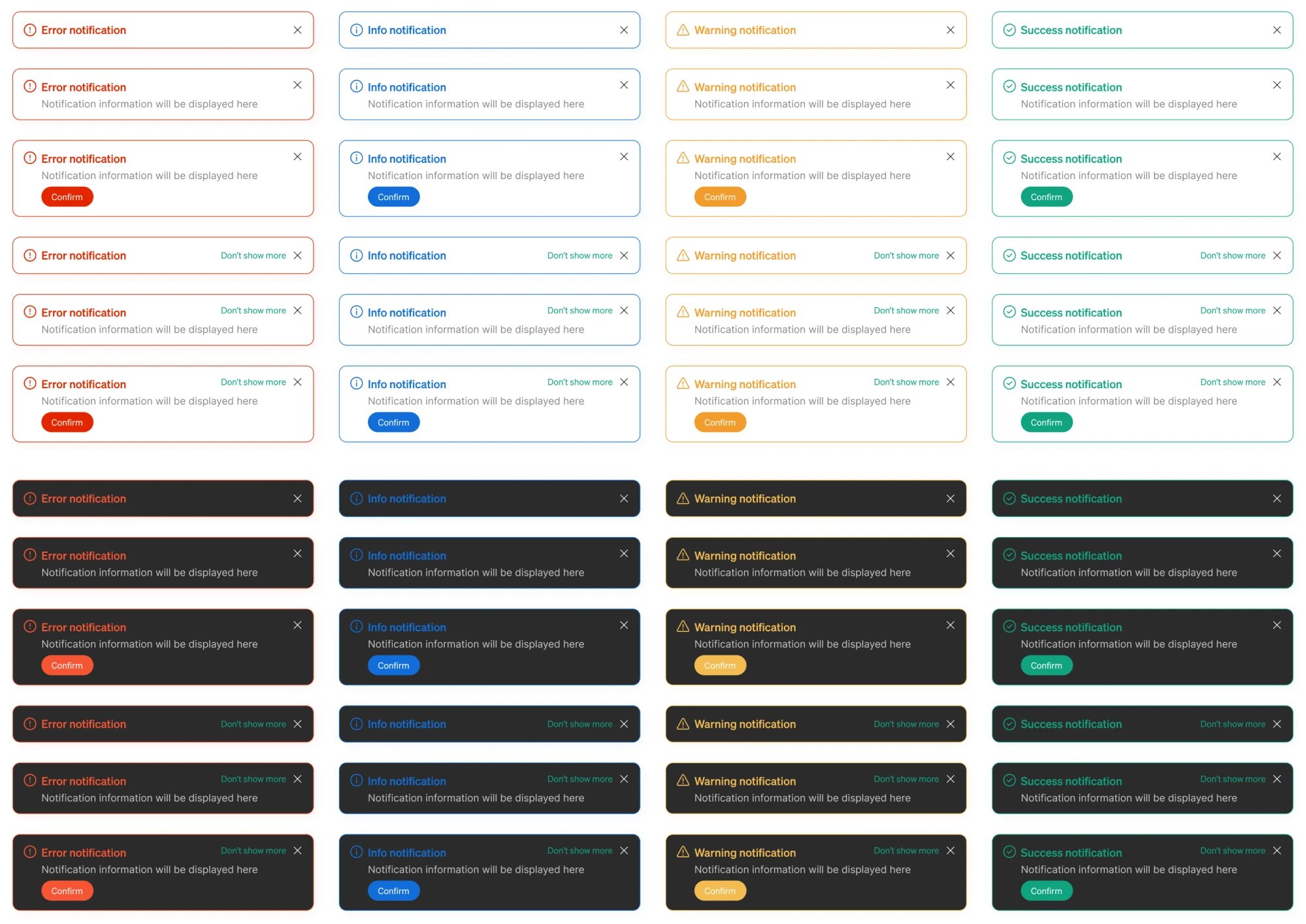
Modia, an AI content creation tool, is a good example of how this decision can happen organically. When the client reached out, dark mode wasn’t part of the original brief at all. It emerged during exploration, when our designer proposed it as one of several palette directions while developing the product’s visual language.
The client loved it so much that what started as a single suggestion became a full theme for the entire user interface.
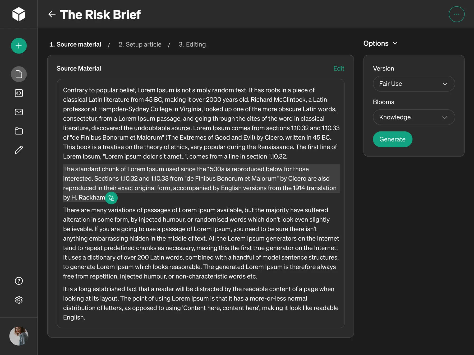
What makes this story interesting is that the dark theme wasn’t retrofitted onto an existing design. It was built as part of a unified UI system from the ground up, which made a real difference in how consistent and intentional the results are.
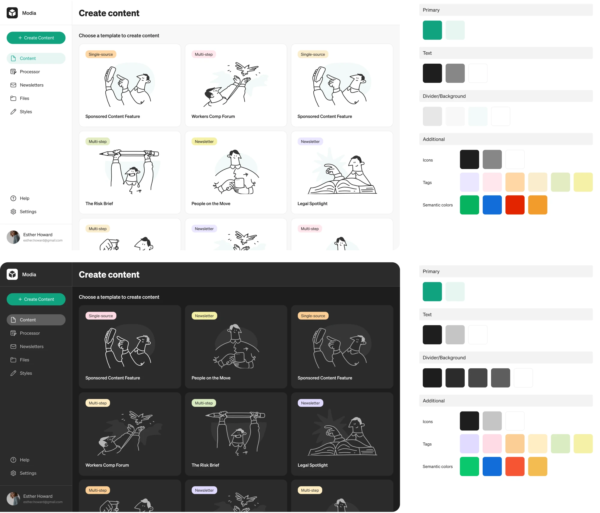
Here are the key design decisions that shaped Modia’s dark theme UI:
- We defined surface colors across multiple gray steps so the interface could communicate hierarchy and elevation without relying on shadows.
- Notification states — error, warning, informational, and success — received distinct color treatments that stay legible and meaningful.
Web3 & finance
In web3 products, the audience is young, digitally native, and accustomed to interfaces that feel premium, immersive, and a little edgy. A bright white SaaS layout would feel like showing up to the wrong party.
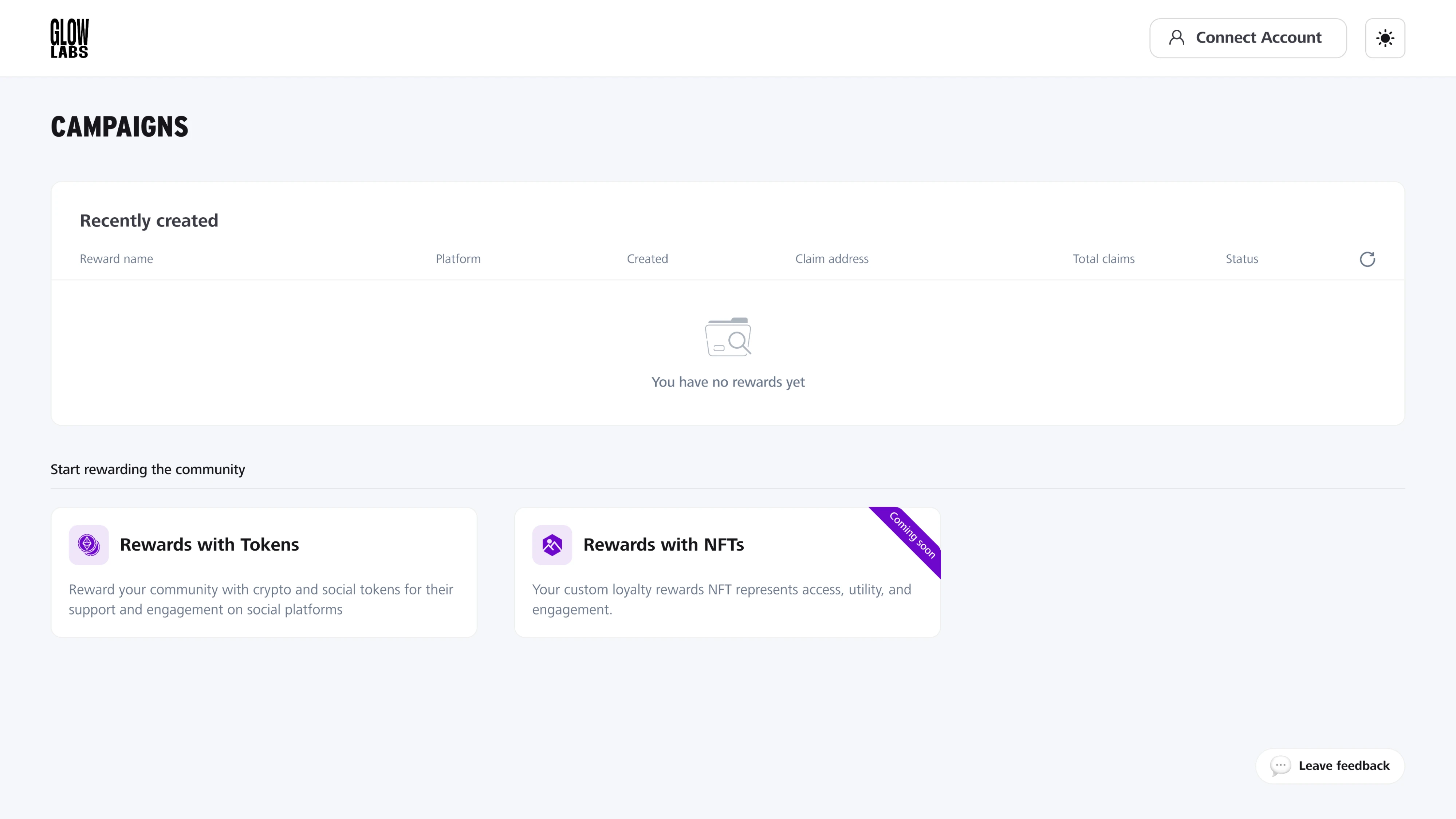
Glow Labs, a web3 loyalty rewards platform we designed at Eleken, gets this right. The existing website already had a dark aesthetic, and we decided to translate that into the product as well. Deep dark backgrounds, neon-accented NFT card visuals, and bold typography created a polished first impression.
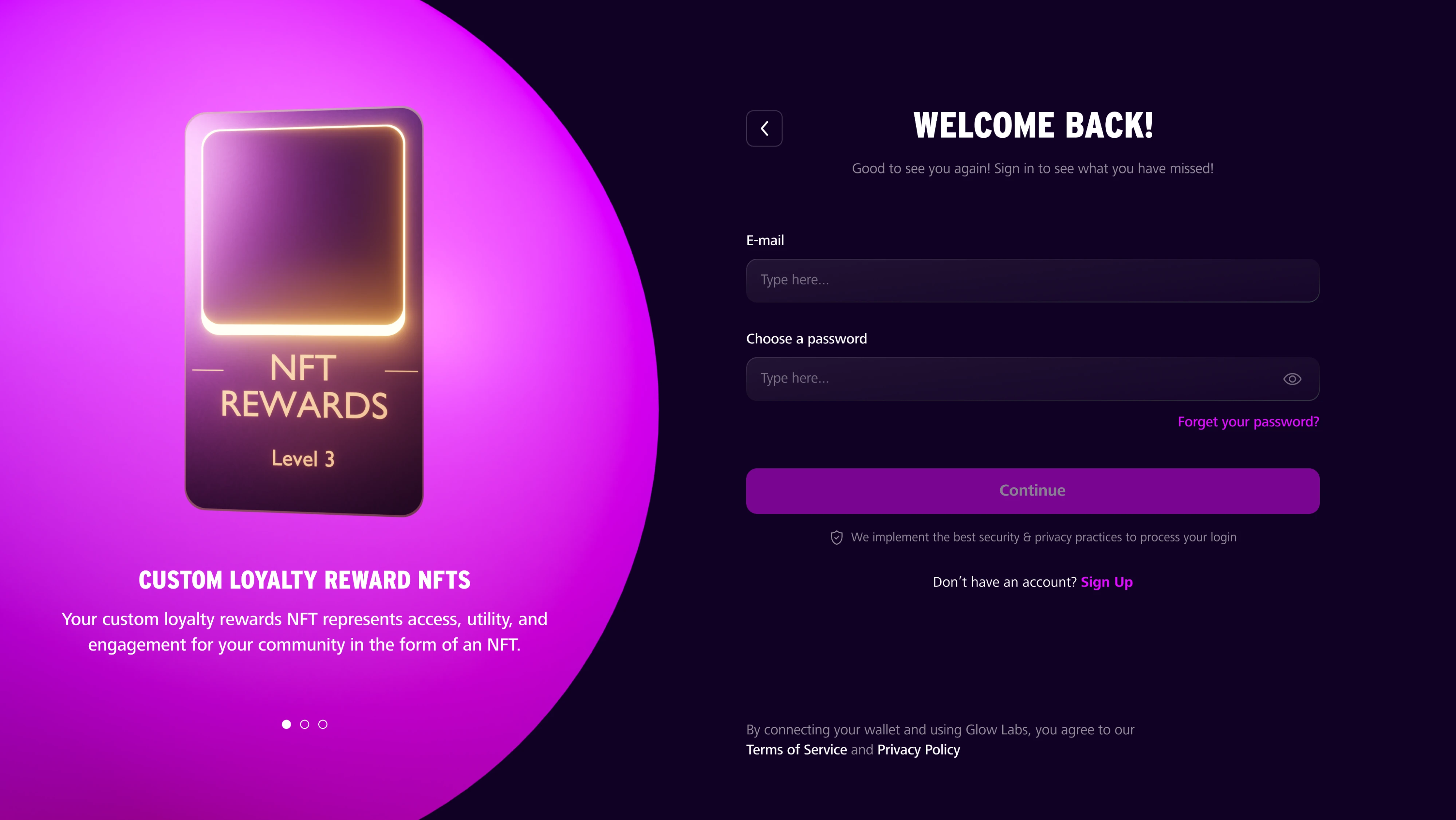
The strategic design decision happened in the background. The main platform MVP shipped in light mode, because that’s what made sense for a data-heavy analytics tool used during working hours. A mode switcher was added to the interface, allowing users to flip the entire product to dark at any point.
A few things that made Glow Labs’ approach work well in practice:
- Accent colors were defined separately for light and dark modes, which kept the playful pink and purple palette from feeling washed out.
- The dark login experience was designed to bridge the gap between the marketing website and the product itself.
- The UI kit included both modes side by side, making it easy for developers to implement and for the team to maintain consistency.
Developer & productivity tools
Developers are probably the one user group that never needed convincing about dark mode. They’ve been staring at dark terminals and code editors for decades, long before the rest of the world caught on.
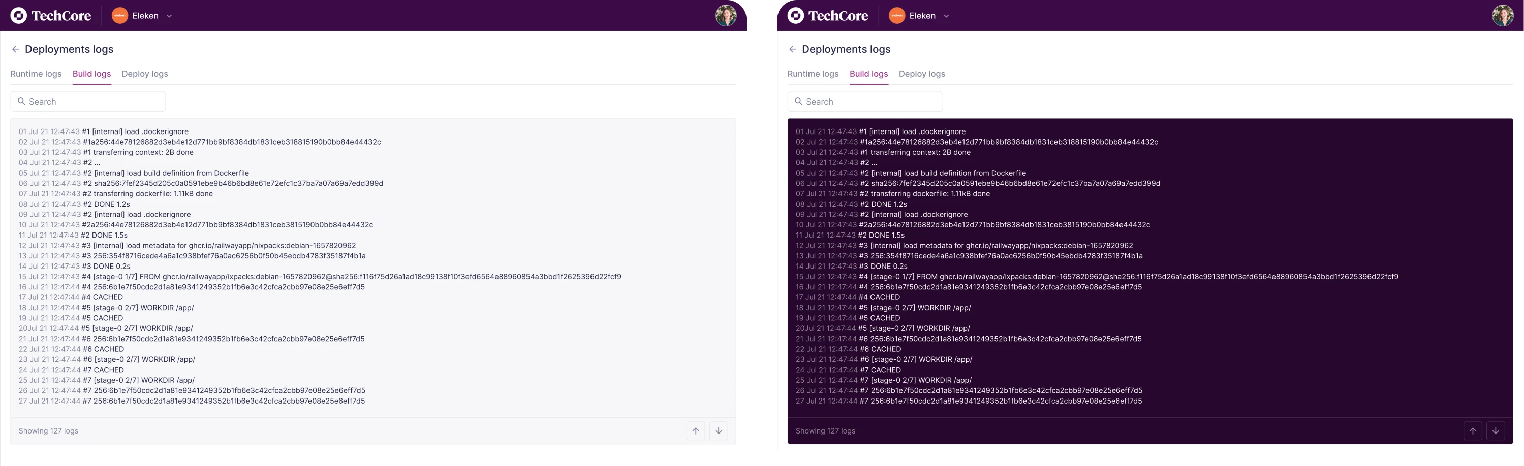
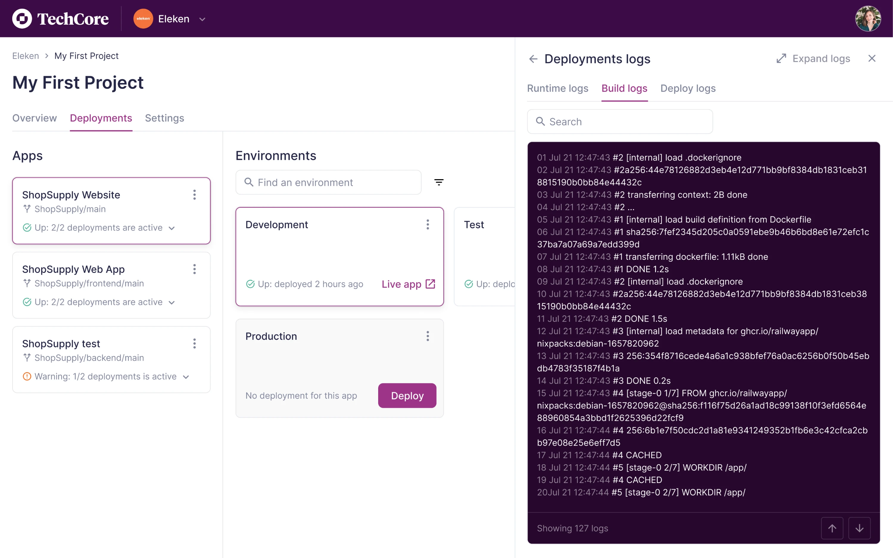
TechCore, a software management platform we designed for developers, took this seriously. Rather than making dark mode a product-wide decision, our team scoped it to the logs page. That’s the screen developers spend the most time on, and it’s where the strain of a bright background is most felt.
When designing it, we considered that not every developer works the same way, and not every environment is a dimly lit office at 2 am. Giving users control over their own experience was a small design call that reflects who the audience is.
A few things worth noting about how TechCore handled it:
- Dark mode was deliberately scoped to the logs page, keeping the overall interface clean and consistent in light mode.
- The toggle gave developers agency over their environment, which matters in a tool built around focus and efficiency.
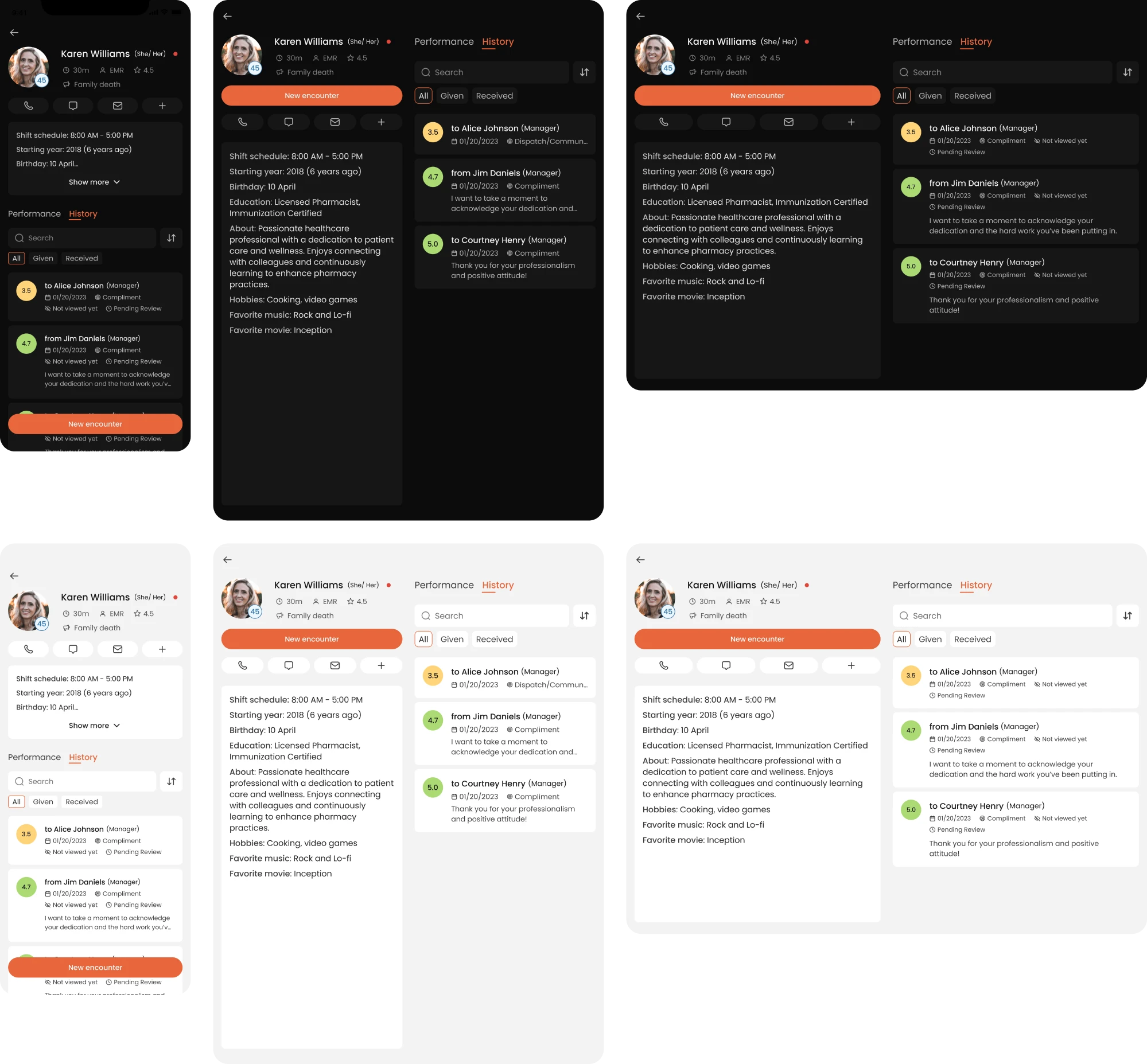
Healthcare & EMS
Healthcare is the less obvious category for dark mode, but it makes a strong case when you think about the context of use. EMS workers are moving between shifts, checking apps in ambulances, dim dispatch rooms, and outdoor settings at all hours. The interface needs to work in all of those conditions without adding friction.
Newton360, a workforce management app for EMS teams, didn’t start with dark mode as a requirement. It earned its place during the design process. When we presented three visual directions in the trial phase, the client chose one of the dark styles and decided to make it the default theme for the entire platform.
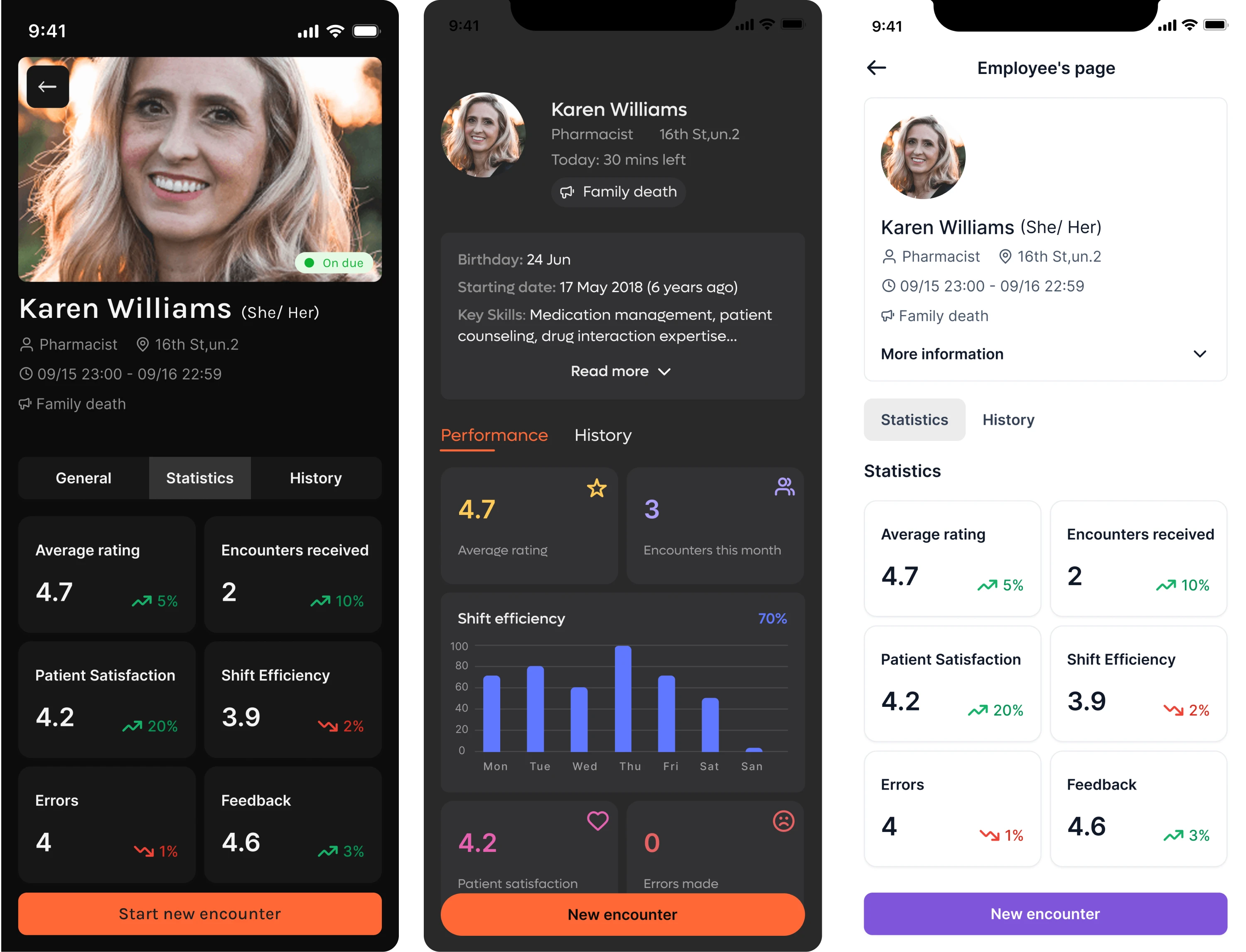
What made it work was the dual-mode approach. The app was designed to support both dark and light themes across mobile, tablet, and desktop, which mattered for a user base with genuinely different working conditions.
However, the default theme was dark from the start. At some point, the client asked for a light theme as well. To avoid rebuilding every screen design manually, our designer set up variable modes in the design system with a separate set of color values for the light theme, and updating the entire product took one click in Figma.
A few design decisions that shaped the dark theme in VLI Tech:
- Color-coded performance indicators were carefully calibrated to remain readable and meaningful against dark backgrounds.
- The overall design system was built to support both themes consistently, so switching between modes never broke the hierarchy.
- Dark mode was treated as the default, which meant every screen was designed with that context in mind first.
Data visualization & dashboards
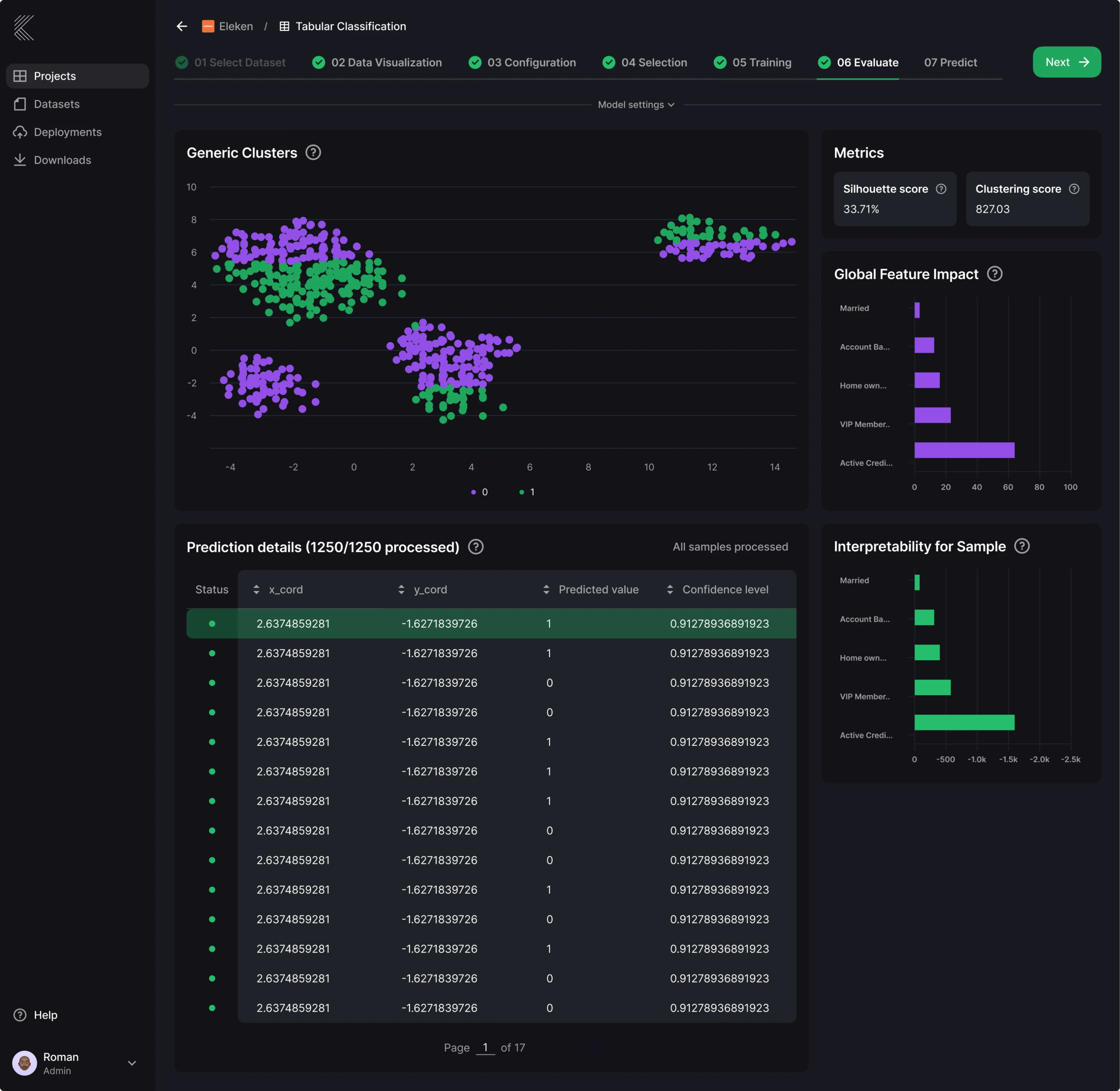
Data-heavy interfaces are where dark mode makes its strongest functional argument. When a screen is built around charts, tables, status indicators, and dense numerical data, the interface should make the data itself the loudest thing on screen.
Kepler, an AI platform for business intelligence from Stradigi AI, shows this clearly across its core screens. The product helps non-technical business users work with machine learning models, which means a lot of information needs to be presented in a way that feels scannable and approachable.
Since Kepler relied heavily on data visualization and long work sessions, dark mode became the foundation of the interface.
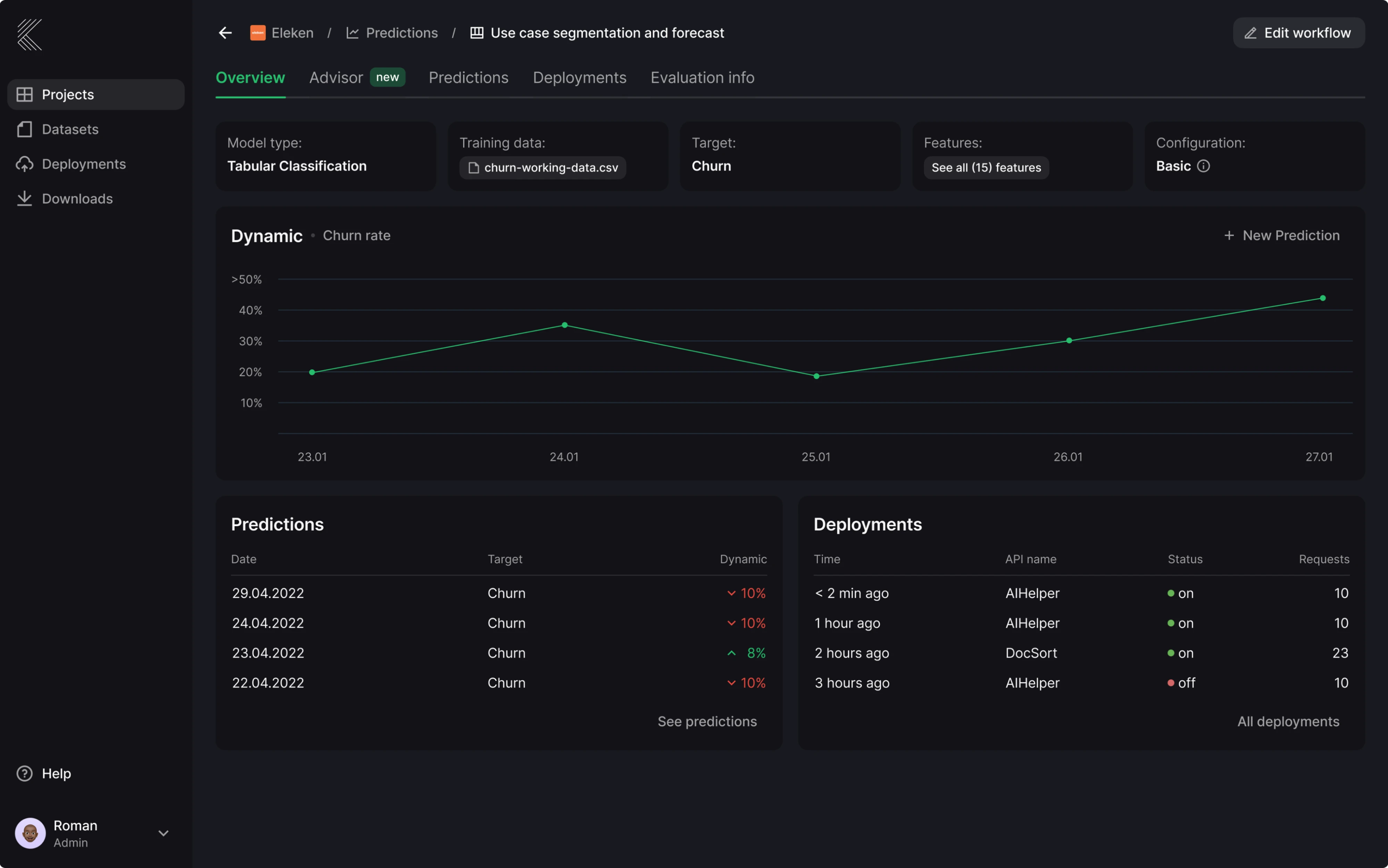
Here are a few specific things about Kepler’s dark UI:
- Important indicators stay visible through high-contrast accent colors, so status and anomalies read instantly without extra labels or styling.
- The background uses a softer dark base rather than pure black, which reduces eye strain during long analytical sessions.
Is dark mode UI actually right for your product?
The dark mode UI examples above make a strong case, but they all share something in common. The decision was grounded in a real understanding of the audience, the context of use, and the type of content being displayed.
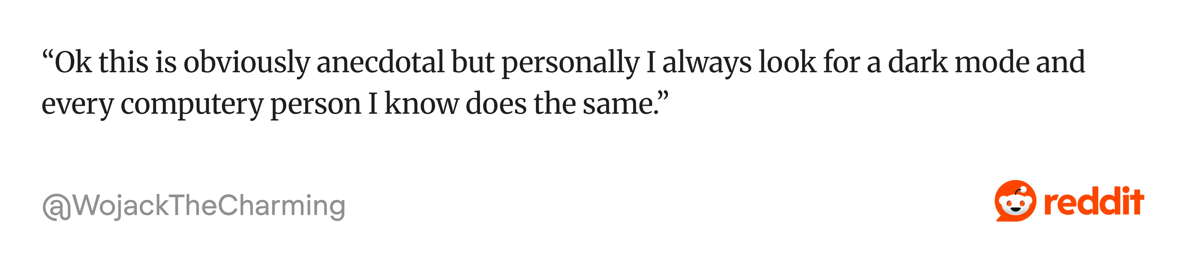
As one designer put it on Reddit:
That’s the honest starting point for this question.
Dark mode works against you in more situations than most articles admit. It reduces the distinction between UI elements, making users work harder to understand layout, hierarchy, and content separation. This becomes especially visible in products with complex forms or long text-heavy flows that were designed for a white background.
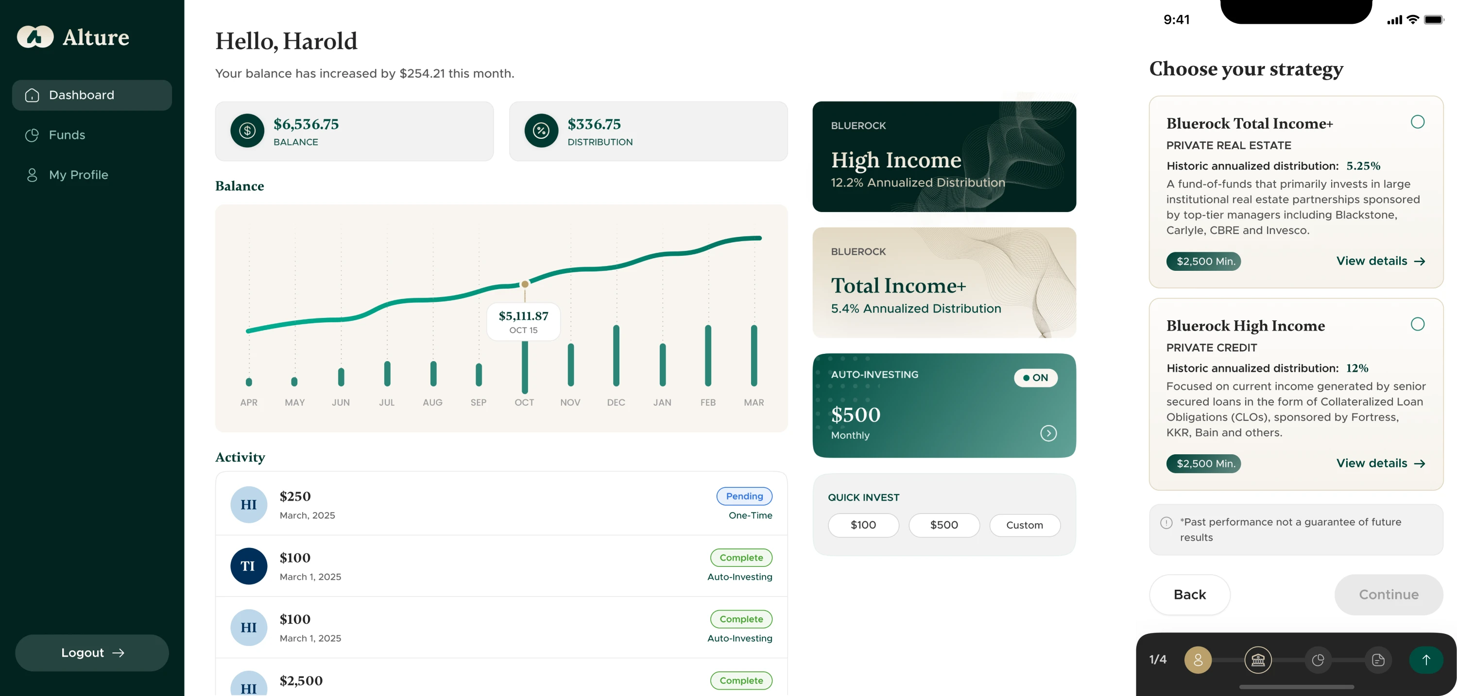
There’s also the question of audience, which designers often overlook. Alture Funds, an investment platform we worked on, is a direct example of this.
The client’s previous product was a Gen Z-focused investment platform with neon accents and a dark theme UI color palette that felt right at home alongside crypto wallets and trading apps. When they decided to build a new platform targeting investors aged 35 to 40+, the dark aesthetic was one of the first things to go.
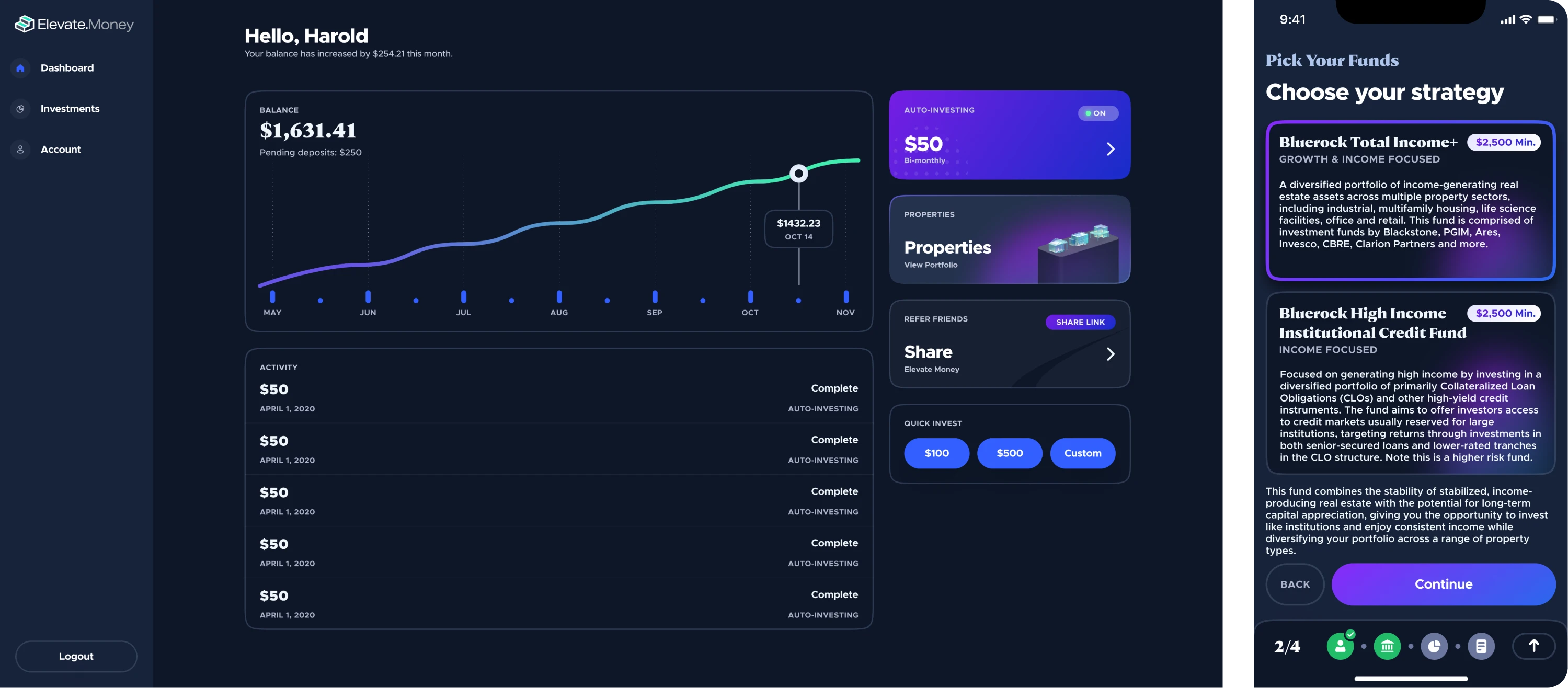
The neon accents, crypto aesthetics, and dark theme didn’t align with the new audience, so we proposed a light theme as the default. It was a practical choice backed by an understanding of what the user group really valued.
So, if you still can’t make the call, go through these three questions:
- What is the primary content type? Data-heavy, visual, or navigational products benefit most from dark mode. Long-form text-heavy products rarely do.
- Who is your audience, and when do they use the product? A B2B tool used during working hours in bright office environments has different needs than a creative tool used late at night.
- What does your brand need to communicate? Dark mode signals premium, technical, and immersive. Light mode signals clarity, trust, and accessibility.
The best UX design requires choosing what helps users succeed. And sometimes, as with Alture Funds, that means deliberately moving away from dark mode even when the trend points the other way.
Dark mode design principles
Getting dark mode right comes down to a handful of decisions that are easy to get wrong. The design principles below cover what actually needs to change when building for dark, and why each decision matters.
Take care of color and contrast
Color is where dark mode UI design can go wrong. The instinct is to keep the same palette from the light theme and drop it onto a dark one, but colors don’t behave the same way when the environment changes.
The eye interprets a color partly by comparing it to its surroundings, and black backgrounds simply don’t push back the same way light ones do.
The fix is to desaturate your dark mode color palette. Colors should have around 20 points lower saturation, which reduces visual vibration while keeping the palette recognizable. This applies to your primary brand color, accents, and semantic colors too.
The background itself also deserves more attention. Pure black creates a harsh contrast that causes eye fatigue. Google’s Material Design recommends #121212 as the primary dark surface for exactly this reason. Many designers also add a subtle dark blue tint to their grays, giving branded dark surfaces more depth.
Before designing any components, it helps to lock in a few things:
- Define background colors across at least four to five gray steps, from the deepest surface to elevated components.
- Desaturate your primary and accent colors and test them against WCAG standards.
- Create separate treatments for semantic colors that stay legible without being visually aggressive.
Build depth without shadows
In light mode, shadows do most of the heavy lifting when it comes to communicating depth and hierarchy. In dark mode, that logic breaks down. Dark shadows simply blend into the background, making them ineffective for showing elevation.
The solution is to use surface lightness. The principle is straightforward: lighter surfaces appear more elevated than darker ones, so hierarchy comes from layering progressively lighter tones rather than casting shadows downward.
In practice, this means building a surface scale with several distinct steps. Interfaces that use just one dark gray for all surfaces — navigation, cards, modals, tooltips — look flat and difficult to parse. Even small lightness increments between layers are enough to create a clear sense of depth once rendered in context.
A simple way to think about the structure:
- Place the deepest background at the darkest value.
- Move cards and content containers one step lighter.
- Push modals and popovers another step lighter above that.
- Reserve the lightest dark surface value for tooltips and the highest elevation elements.
Each step doesn’t need to be dramatic. A subtle tonal shift is all it takes when the background is already dark enough to make those differences visible.
Mind your typography
In the design community, there’s an assumption that if contrast ratios check out, text will be fine. But there’s more to it than that.
Light text on dark backgrounds can appear thicker and slightly blurred, which affects readability. This means font weights that worked perfectly in light mode may need adjusting. Thin and light font weights can disappear or become hard to read in dark mode, so regular, medium, or semi-bold weights tend to work better.
At the same time, very bold headings can tip in the other direction and feel too heavy. The goal is to find a weight that reads clearly without dominating the screen.
Text color is equally important. Bright white on a dark background creates a strong contrast that strains the eyes over time. Off-white or light gray, somewhere around 87% opacity, softens this without sacrificing legibility.
Spacing also deserves a second look. Increasing line spacing slightly and adding a touch of letter spacing for small text keeps letterforms from blending together and improves scanning across dense content.
Design with accessibility in mind
Dark mode is widely perceived as the more accessible option because it’s easier on the eyes, gentler at night, and better for sensitive users. That’s partially true, but the full picture is more complicated.
For users with astigmatism or low contrast sensitivity, dark mode can compromise readability. White text on a dark background causes halation, a glowing effect around letterforms, which makes reading tiring. Dark mode helps some people and makes things harder for others. The only honest answer is to give users control.
That means offering both modes and making the toggle easy to find. One third of users still use light mode or switch between modes depending on the task and lighting conditions. A simple life hack from the design community is to default to light during the day and dark at night.
Beyond the toggle, there are a few things that make dark mode accessible:
- Meet WCAG contrast standards in both modes independently.
- Include icons, patterns, and text labels alongside color-coded elements.
- Test the design with real users in real environments.
Dark mode UI tools, Figma kits, and inspiration sources
Once the design decisions are made, the right tools can save a significant amount of time. This section covers what’s actually worth using, including contrast checkers, Figma kits, and inspiration sources.
Where to check contrast and accessibility
Most designers run a quick check on their main text color and move on, but dark mode introduces new contrast relationships across every component, state, and elevation level. These are the tools that make that process faster and more reliable:
- WebAIM Contrast Checker is straightforward, free, and gives you WCAG AA and AAA results for any color pair. It’s good for quick checks.
- The APCA Contrast Calculator uses a newer model that measures contrast as humans actually perceive it.
- Stark is a Figma plugin that checks contrast directly within UI components, which helps catch issues earlier in the design process.
- Adobe Color’s accessibility tools let you check entire palettes at once, which is useful when building or auditing a full dark mode palette UI.
Where to find Figma kits for dark mode
When building dark mode screens, you can start with a well-built kit. Surface scale, color tokes, and component states are already there, saving you a significant amount of time. Here are a few options worth considering:
- Untitled UI is a free starting point that includes over 10,000 components, 900 global styles and variables, and 420 ready-to-use pages. Both light and dark modes are included and properly structured.
- Frames X is a strong option for teams working on complex products. It comes with 5,500+ reusable components built with Auto Layout and dark mode support, along with colors, icons, and building blocks for web and apps.
- Glow UI is particularly well-suited for SaaS and dashboard products. It focuses on web applications and includes multi-theme support, with dark mode built in as a first-class option.
For more targeted needs, the Figma Community also has a wide range of free dark mode specific kits worth browsing.
Where to find dark mode inspiration
Screenshot galleries are a good starting point, but the most useful inspiration comes from sources that show real products with enough context to understand the design decisions behind them. A few places worth bookmarking:
- Dribbble has a large volume of dark mode UI work, and filtering by color or tag makes it easy to narrow down to specific product types or visual styles.
- Behance tends to show more complete case studies than Dribbble, which makes it useful when you want to understand the thinking behind a design.
- Awwwards has a curated dark mode collection that is useful when you want to see what the best-executed dark interfaces look like across industries.
- Figma Community is worth checking for dark mode-specific files, including annotated UI breakdowns and component-level examples.
Worth saying at the end
If there’s one practical thing to take from this article, it’s that dark mode is worth designing twice. Not as a duplicate of your light theme, but as its own system with its own rules. The extra work upfront is significantly less painful than retrofitting it later.
At Eleken, we’ve helped teams navigate this across very different product contexts, sometimes designing dark mode as the default, sometimes removing it altogether. The right call always depends on the product.
Once you’re figuring out where dark mode fits in your product or need help building it properly, get in touch and tell us about your project.


.webp)


.png)


