As of 2025, 78% of companies have adopted AI technologies, and from what we see, that number will only keep rising.
But while AI capabilities continue to accelerate, the interfaces that support them often lag behind. Traditional usability heuristics start to break down when applied to probabilistic, opaque, and constantly evolving AI behavior.
At Eleken, we witness this shift firsthand. When clients reach out to us, AI is almost always part of the conversation. Through countless projects, we’ve learned what AI usability principles actually work, and in this guide, we’ll share those insights.
Why traditional usability principles fall short in AI design
For years, UX designers have relied on well-established usability heuristics to build intuitive interfaces. These principles worked beautifully. You click a button, you get a result. The logic behind it was visible, traceable, and consistent.
But AI changes human-computer interaction.
The same prompt might return a different result depending on the data, the context, or even the model’s “mood” that day. This unpredictability breaks one of usability’s assumptions that a system should behave consistently and reliably every time.
Classic UX also tells us that users should always understand what the system is doing. But AI decisions often happen inside black boxes. In this context, transparency means designing new explanation forms that help people calibrate trust.
Cognitive load becomes a new kind of problem, too. One of the key principles in traditional UX is to reduce memory demands. But AI systems often expect users to craft prompts, evaluate ambiguous outputs, and interpret novel responses.
Without the right design guardrails, like examples, smart defaults, or previews, we risk leaving users alone with systems they don’t fully understand.
The 9 core AI usability principles
At this point, you might be thinking that classic usability heuristics are useless in the age of AI. But hold back your disappointment, the core principles still matter. They just take on new shapes, which we’ll explore next.
1. Visibility of system status
In classic UX, “visibility of system status” means keeping users informed about what’s happening through timely and meaningful feedback.
This can be done with simple cues such as progress spinners, confirmation icons, or color-coded signals that communicate what stage the process is in and whether it succeeded, failed, or needs attention.
Clear status visibility helps users understand the cause-and-effect between their input and the AI’s output. For example, many chatbots display a “typing” indicator or progress animation, so the user knows the system is working on their request.
We applied this principle when designing Privado Dining, a SaaS platform that helps restaurants manage private dining events. The product includes an AI co‑pilot that analyzes event details and suggests ready-to-use solutions for managers.
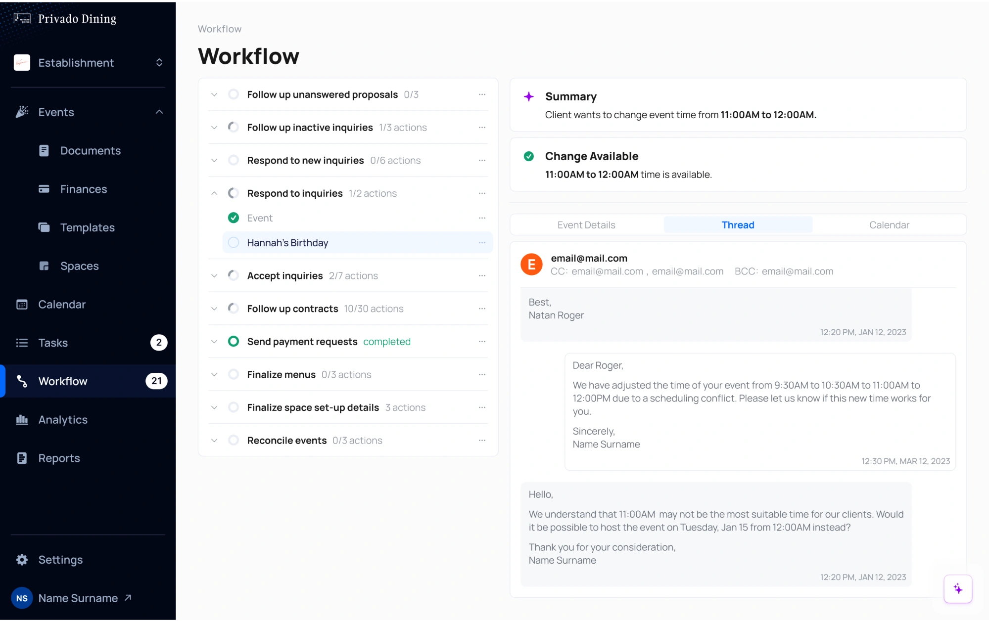
Because so much of the AI’s work happens behind the scenes, we focused on making every step visible and intuitive through these design patterns:
- Loading spinners that correspond to the number of actions being completed, helping users track ongoing processes in real time.
- Green check mark icons that replace spinners once processing is complete, signaling that the task is finished and ready.
- Warning icons with brief explanations to alert users about scheduling conflicts or errors, making issues easy to identify and resolve.
- Purple highlights for AI-generated suggestions, allowing users to quickly spot, review, and evaluate the assistant’s input without confusion.
2. User control mechanisms
When it comes to user control and freedom, AI interfaces should let people reverse actions, exit unwanted states, and stay in charge of the experience at all times.
This includes undo or cancel buttons, the ability to edit or refine AI outputs, and ways to turn off or bypass AI suggestions. Over-automation without escape hatches can make people feel powerless, so design the system to always allow user overrides.
For instance, if an AI writes a sentence, offer an option to undo or adjust it. Many AI writing assistants let users edit or rewrite AI suggestions.
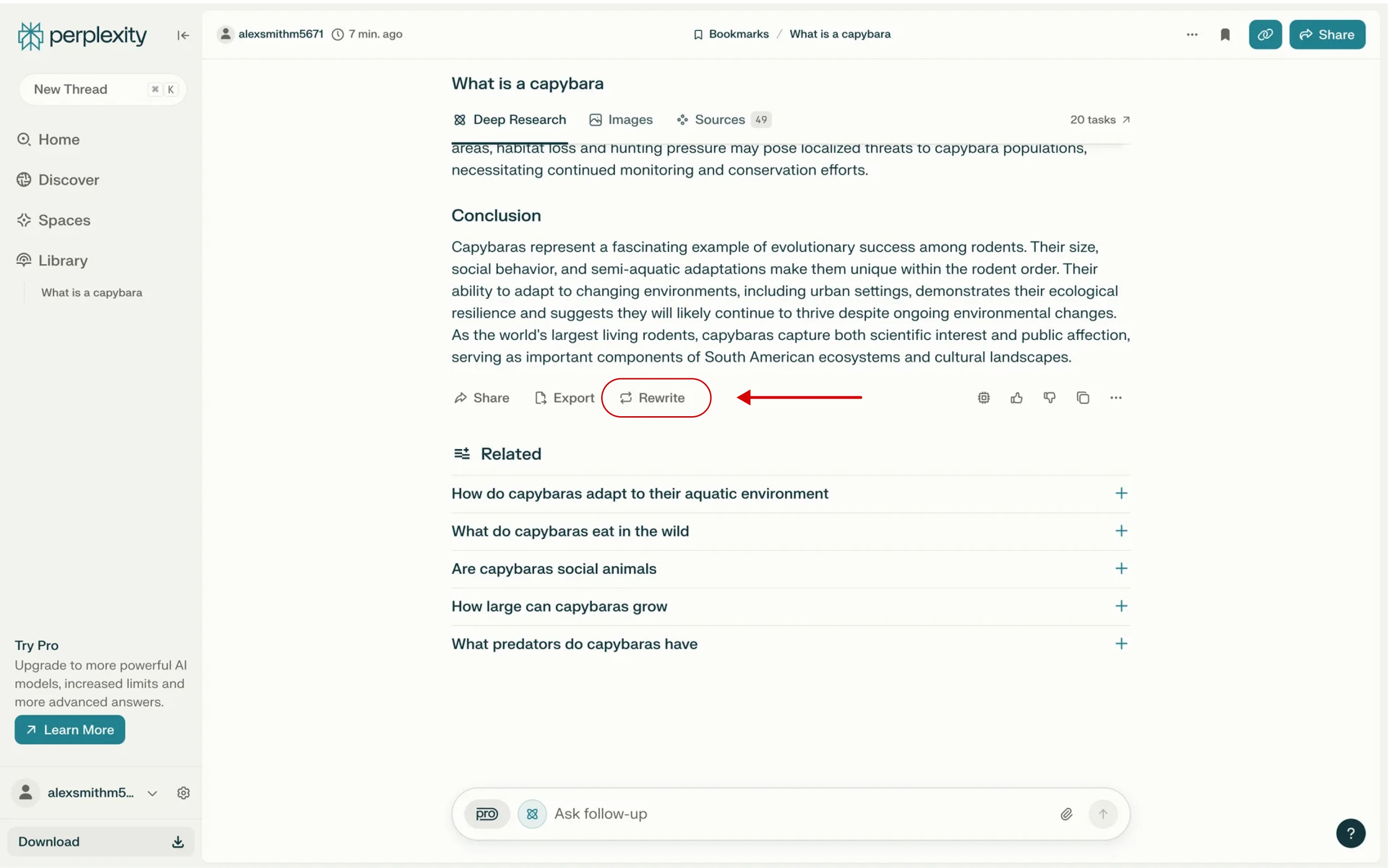
Giving users control also means letting them provide feedback. Include mechanisms to report incorrect outputs, flag problematic behavior, or offer corrections. This helps people feel heard and can also improve the system over time.
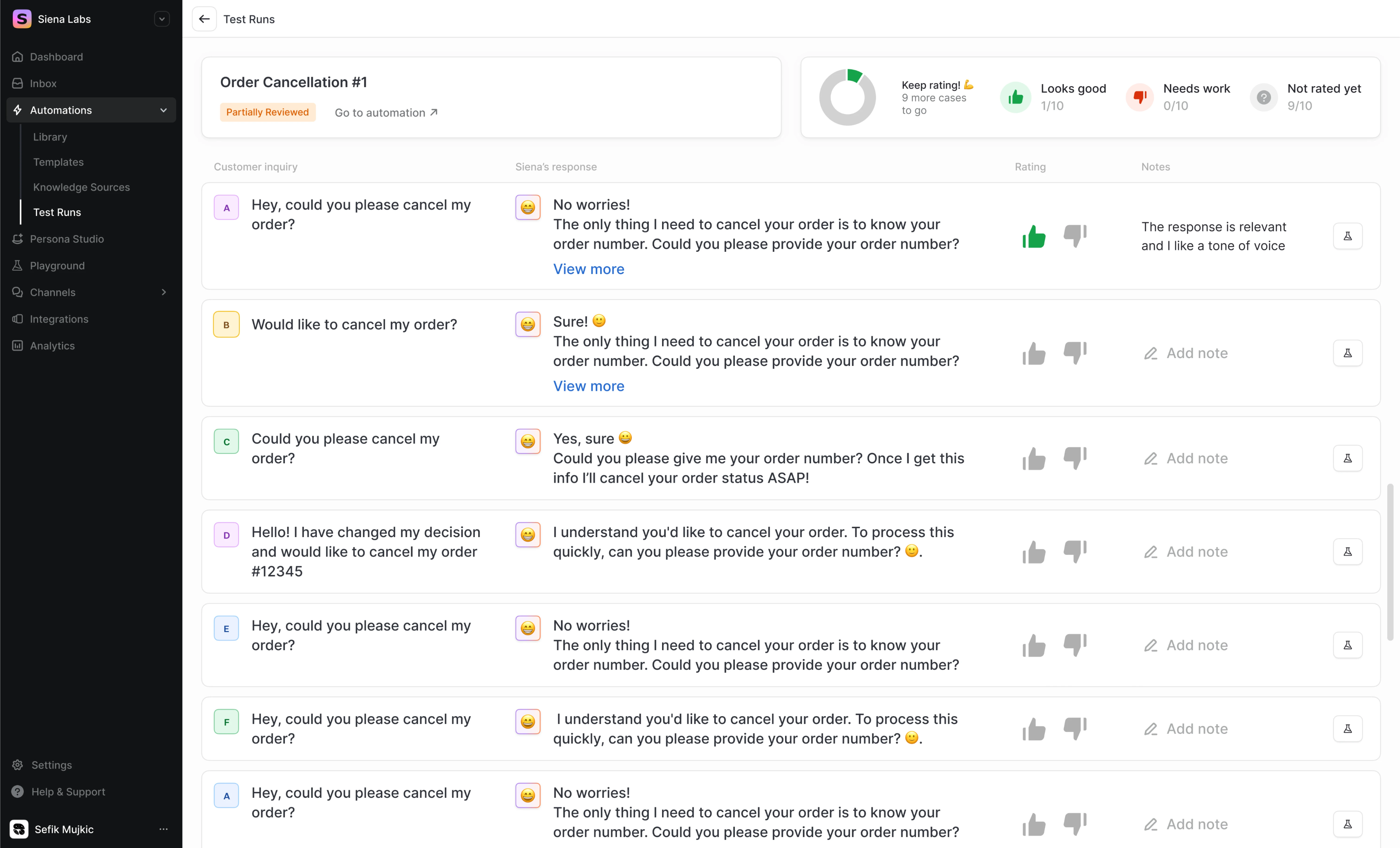
We kept this in mind when designing “Test Automation” screens for Siena, an AI platform for customer experience teams. The goal of this feature is to let CX teams train the system to deliver better responses to customer queries.
To keep users in control, we created a playground-style preview interface where they could input a test request and generate ten AI responses.
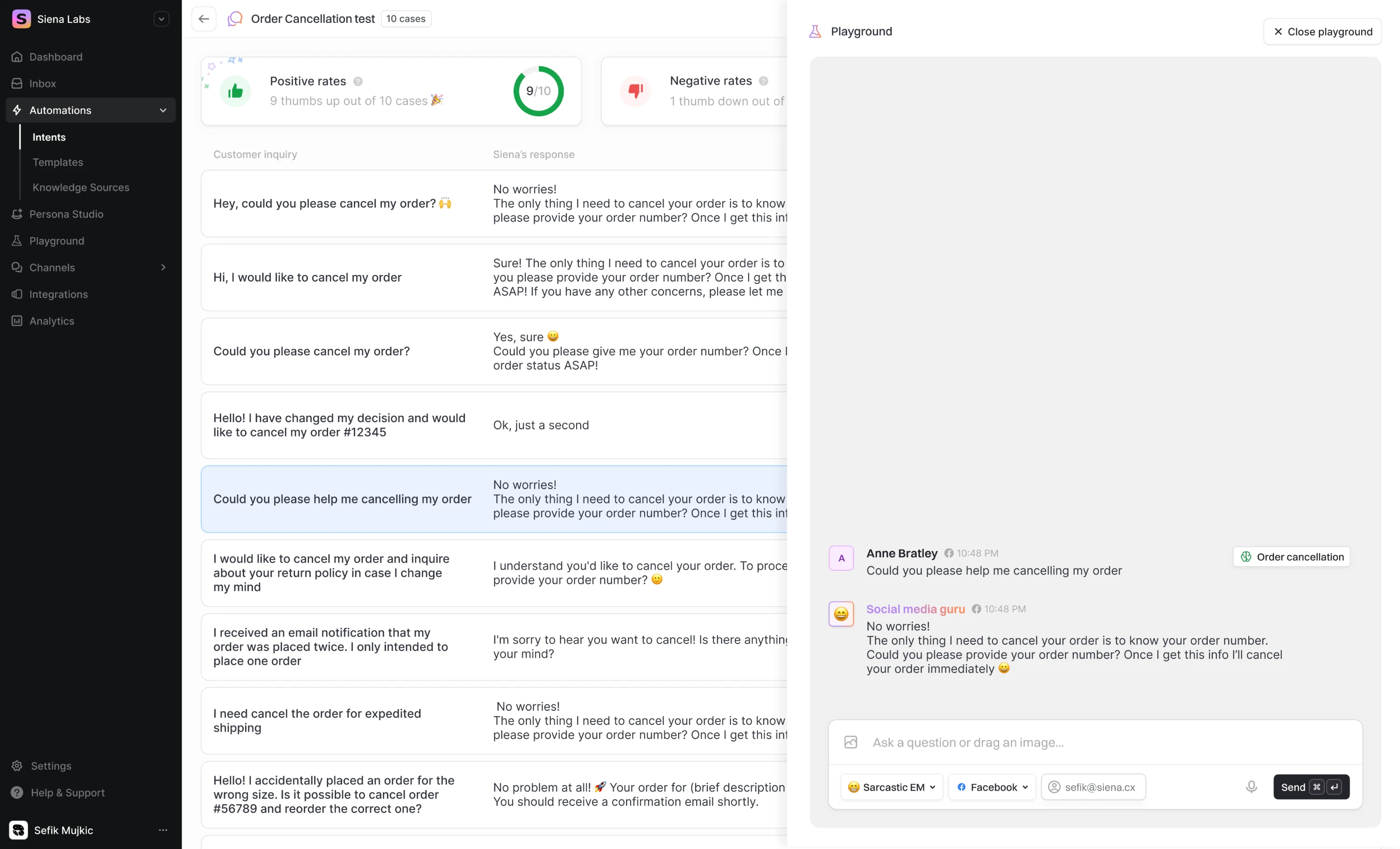
Most importantly, we placed feedback tools directly inside each response. These included a simple rating system (thumbs up or down) and in-line input fields, allowing users to accept, reject, or fine-tune outputs without ever leaving the screen.
3. Consistency and standards
Just as with any interface, the language, visuals, and interaction patterns in AI systems should behave and appear consistently. Users shouldn’t have to guess whether different words, actions, or flows mean the same thing.
Inconsistent experiences can erode user trust super quickly. When the system suddenly shifts tone, generates unexpected types of responses, or relies on terminology that diverges from the rest of the product, users may feel confused.
For example, if your AI assistant typically asks for confirmation before performing a major action, it should always follow that pattern, regardless of device or context.
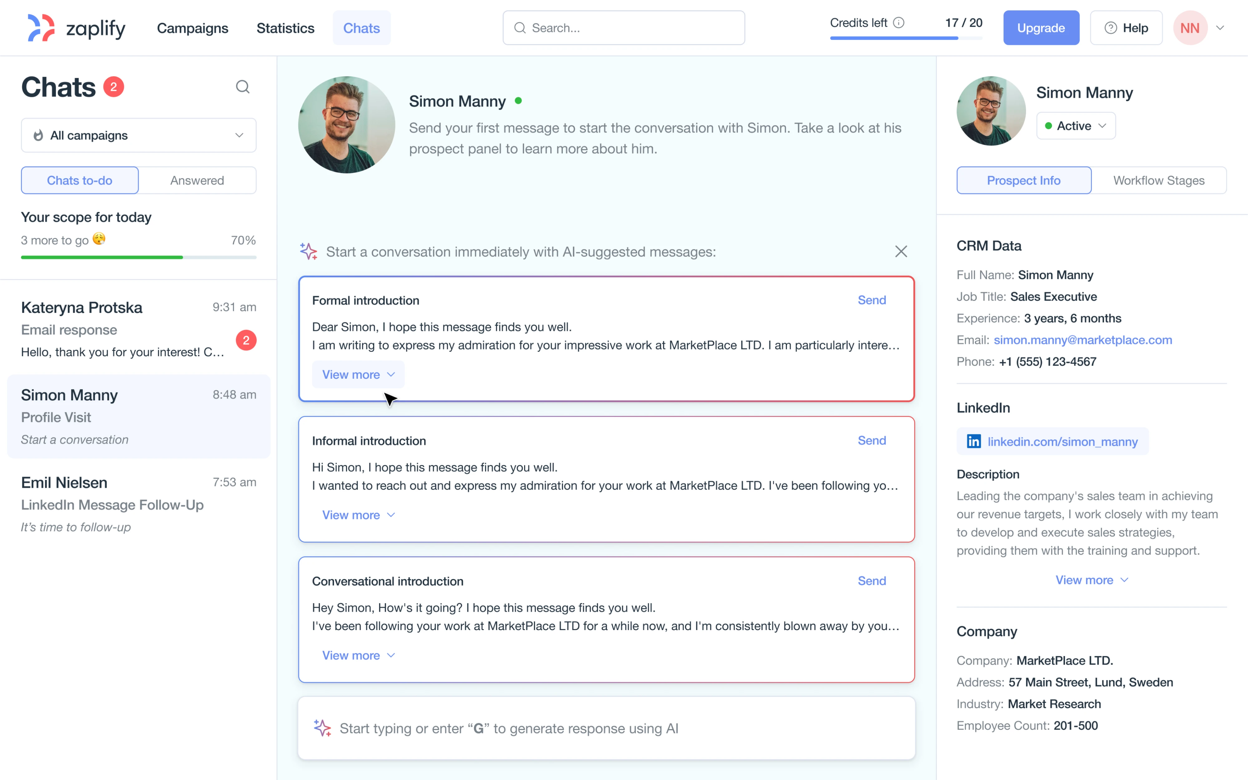
In our work for Zaplify, a sales automation platform, users had to discover value and engage with the product on their own, without support from a sales team. Starting from zero, our Eleken team needed to design a good outbound flow.
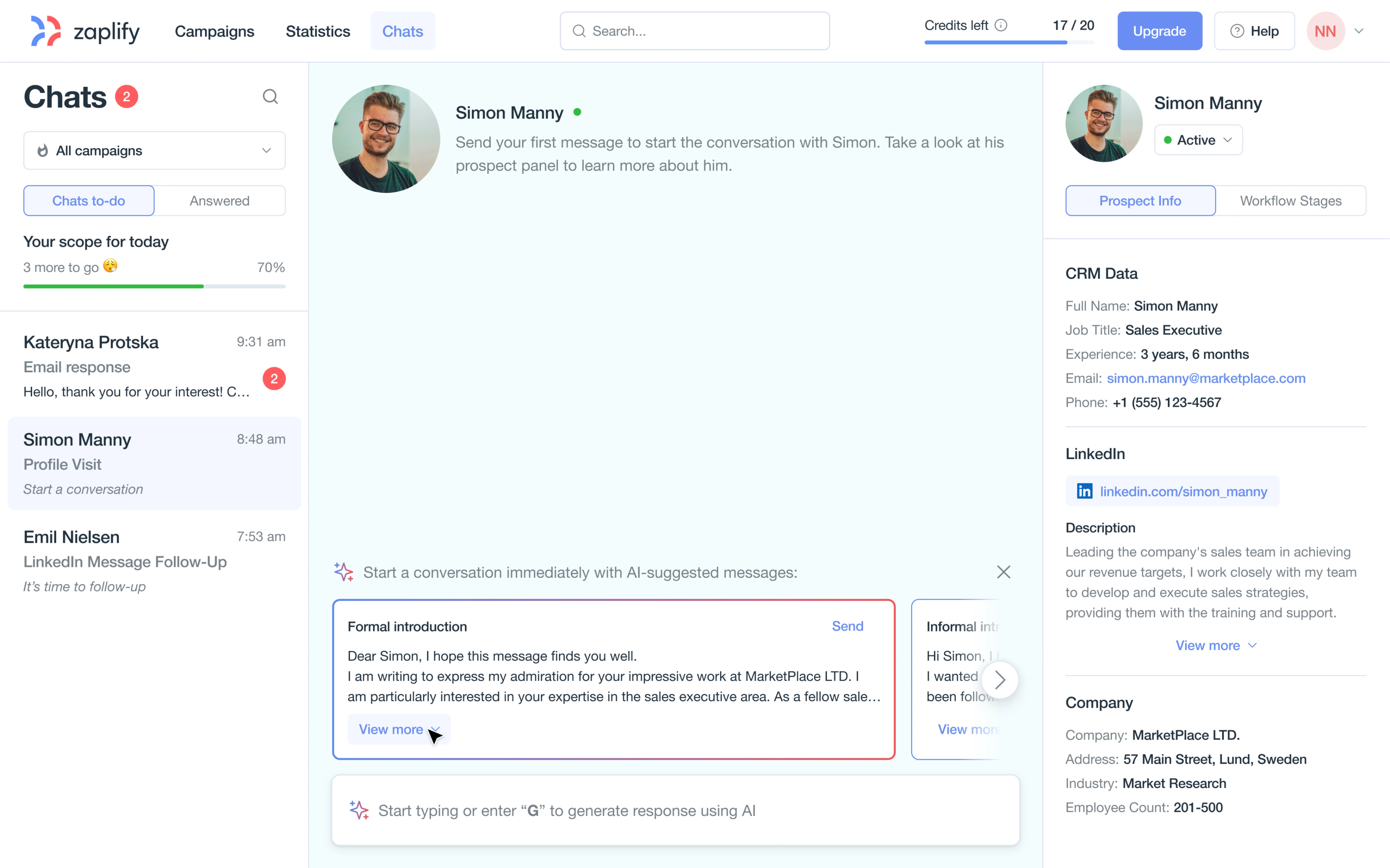
We interviewed real users and reviewed session recordings. In just a short sprint, we delivered an AI-powered chat workspace that included:
- A clean chat interface built for daily sales communication.
- AI-powered message generation and personalization.
- Seamless switching between LinkedIn and email.
- A prospect info panel with contextual data shown right in the flow.
- A gamified checklist that turned each message into a focused action item.
4. Match between the system and the real world
Among usability principles, there’s the idea that a system should speak the user’s language. That means using familiar words, visuals, metaphors, and workflows that mirror how people think and behave in the real world.
With AI interfaces, this principle becomes trickier.
AI-powered flows often introduce new mechanics like “generate,” “suggest,” or “train model.” Yet, users still expect something that feels like what they already know: posting a job, writing an email, or setting up a meeting.
Whenever possible, mirror real-world terms and concepts. If designing a medical AI app for doctors, use medical terminology correctly and in line with user expectations. If it’s for patients, use plain language and examples they understand.
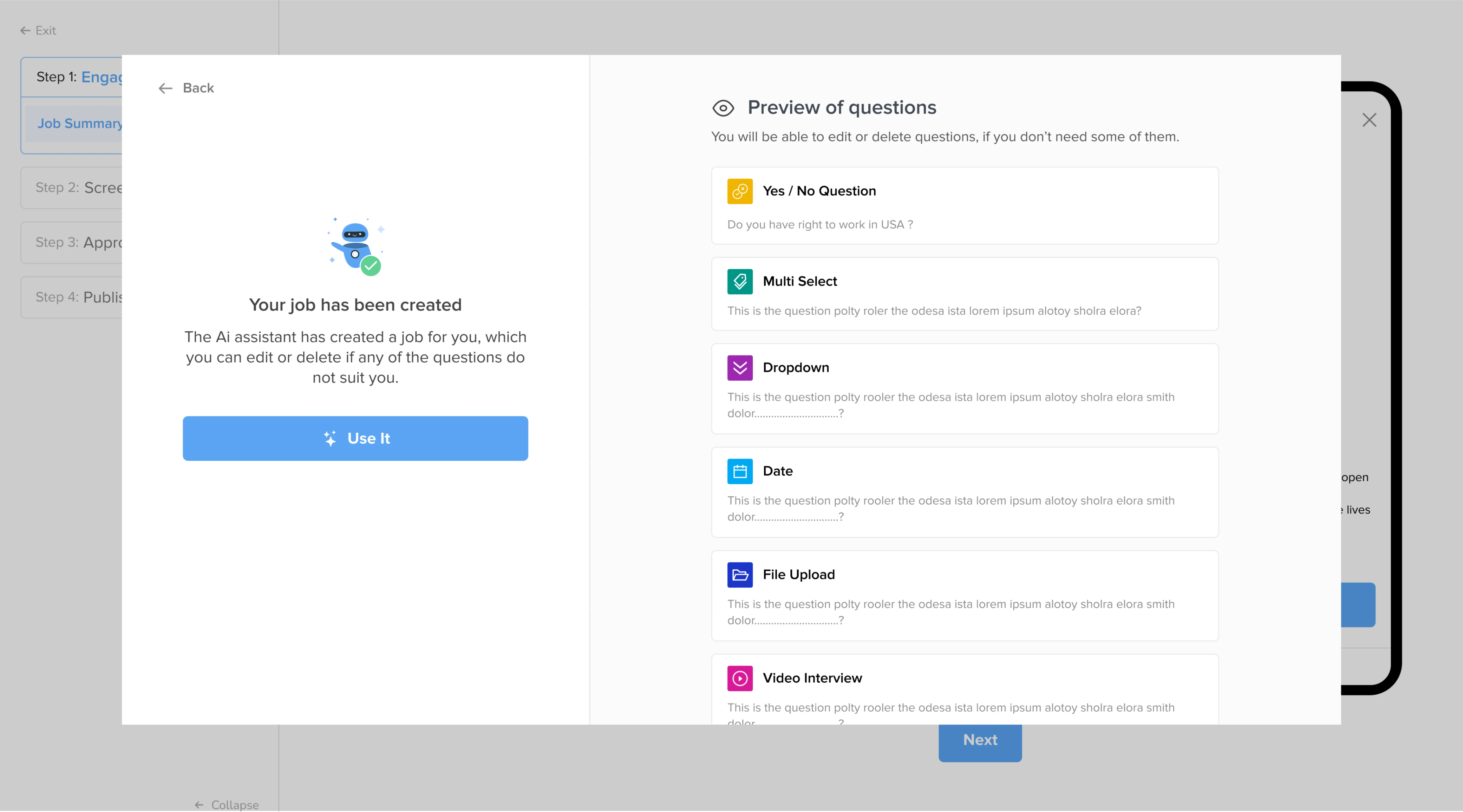
We applied this design thinking in our work with myInterview, a video recruitment platform. The product features an AI workflow where admins can input job data, and the system will automatically identify the skills and generate interview questions.
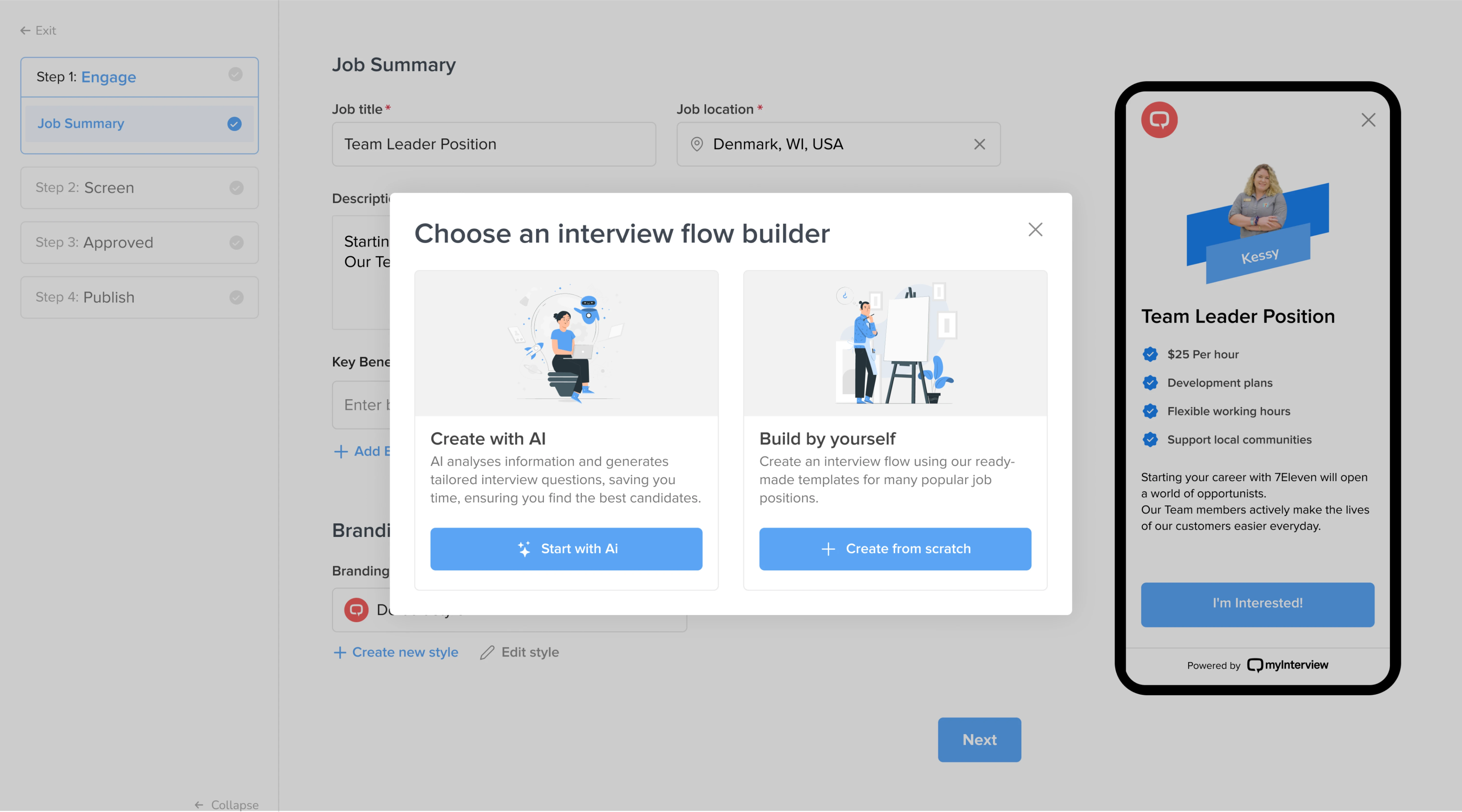
In design terms, we leaned into patterns and messages recruiters were already familiar with. The job-posting experience felt like filling out a standard form, whether users chose to complete it manually or with the help of AI.
5. Error prevention and recovery
AI systems can fail in unexpected ways, which is why error prevention in AI UI is so important. That might mean validating inputs before sending them to the model or guiding users to phrase their requests in a way the AI can understand.
For instance, a generative image app might disable the “Generate” button if the user hasn’t provided enough detail, rather than just producing a random result.
Of course, not all errors can be prevented. When something goes wrong, communicate it clearly. If the AI can’t fulfill a request or produces a flawed output, the interface should inform the user what happened and what to do next.
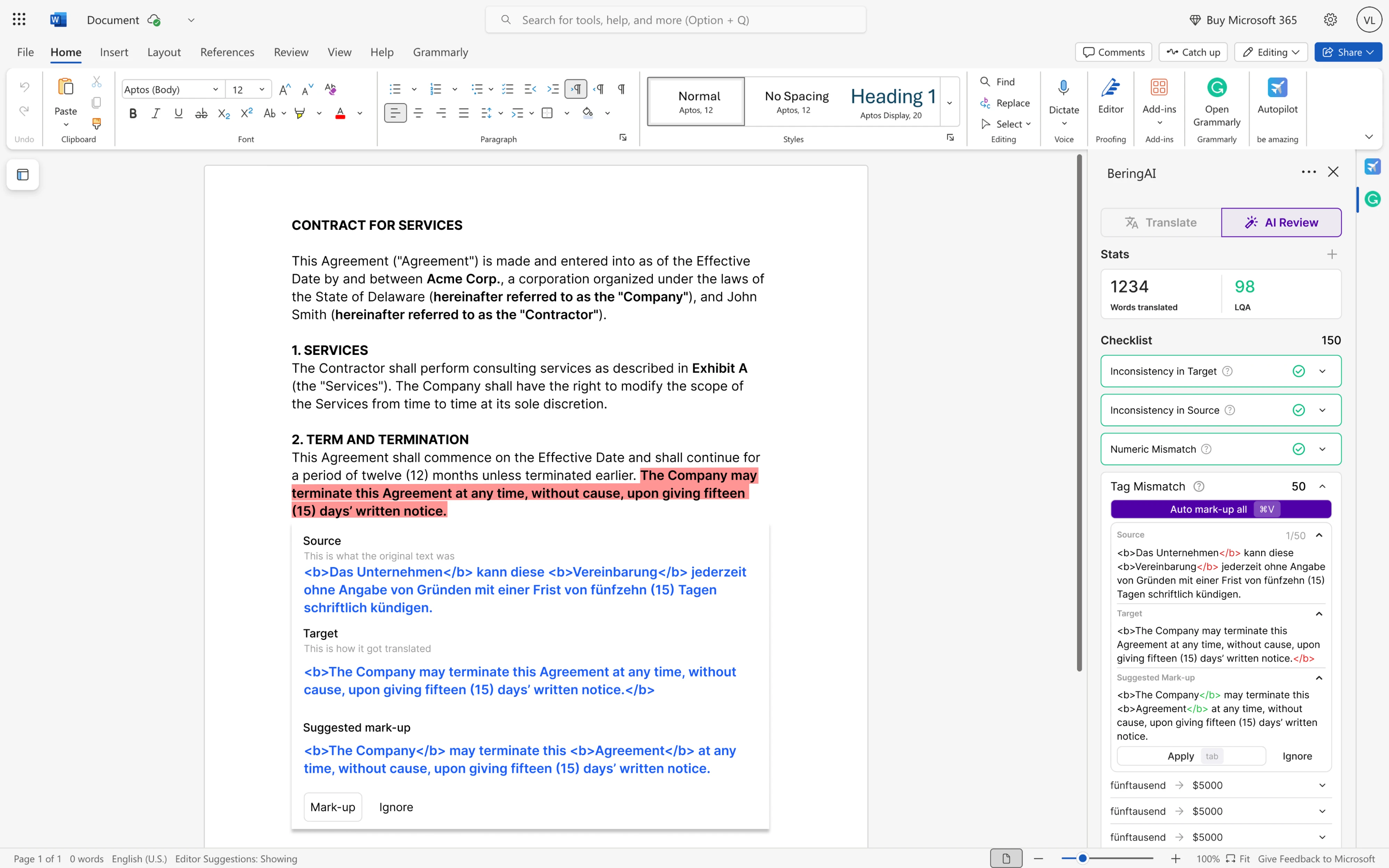
In our work with Bering Lab, an AI-translation platform for legal firms, we applied these principles in a very concrete way. Because most of its users work directly in Microsoft Word, we designed an LLM-powered plugin.
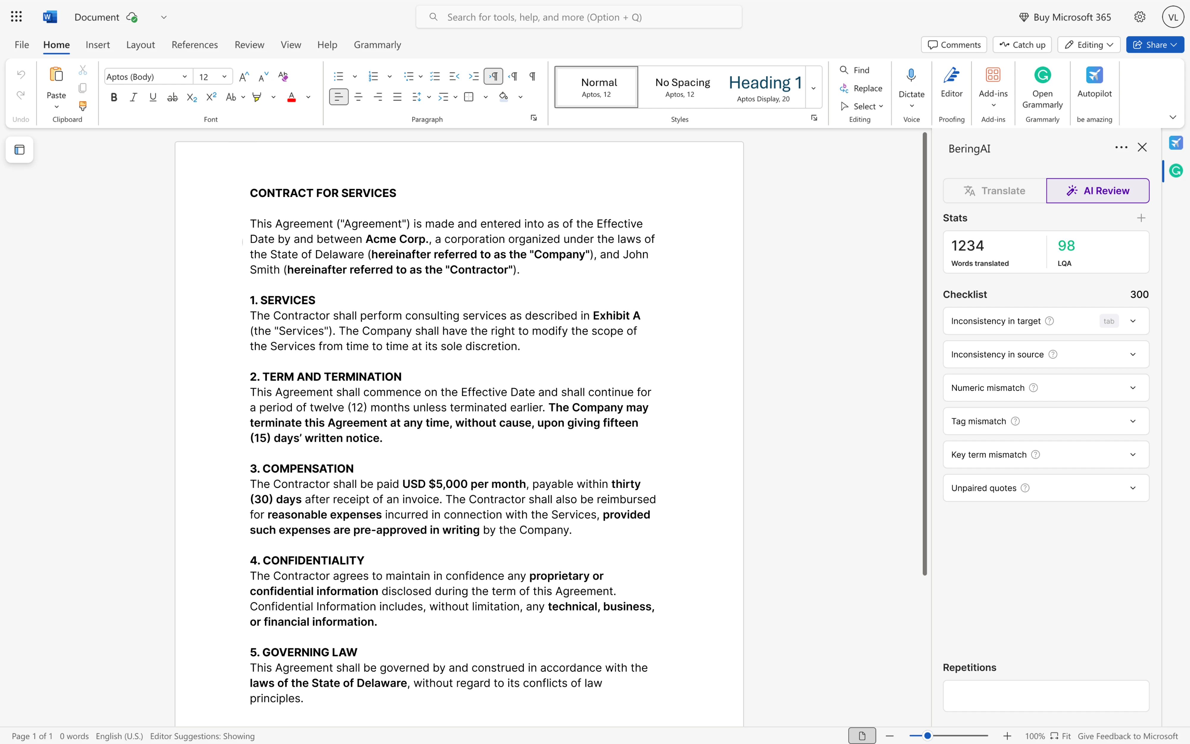
When the AI detected a potential translation issue, the interface responded with a simple visual checklist. Mistakes were highlighted in red, and users could navigate through each one, decide which to correct, and leave others unchanged.
The workflow made errors visible and actionable, and the recovery process felt like a natural part of how they already worked.
6. Support recognition over recall
One of the foundational usability heuristics proposed by Jakob Nielsen is “recognition rather than recall.” In simple terms, the idea is to reduce the user’s memory load by making actions, options, and information visible.
In AI interface usability, one way to do this is by reducing the memory burden. The system should offload tasks from the user’s memory whenever possible.
For example, always display context or options so users don’t have to remember information from one step to the next. Chatbots typically show the conversation history, which is a form of recognition over recall.
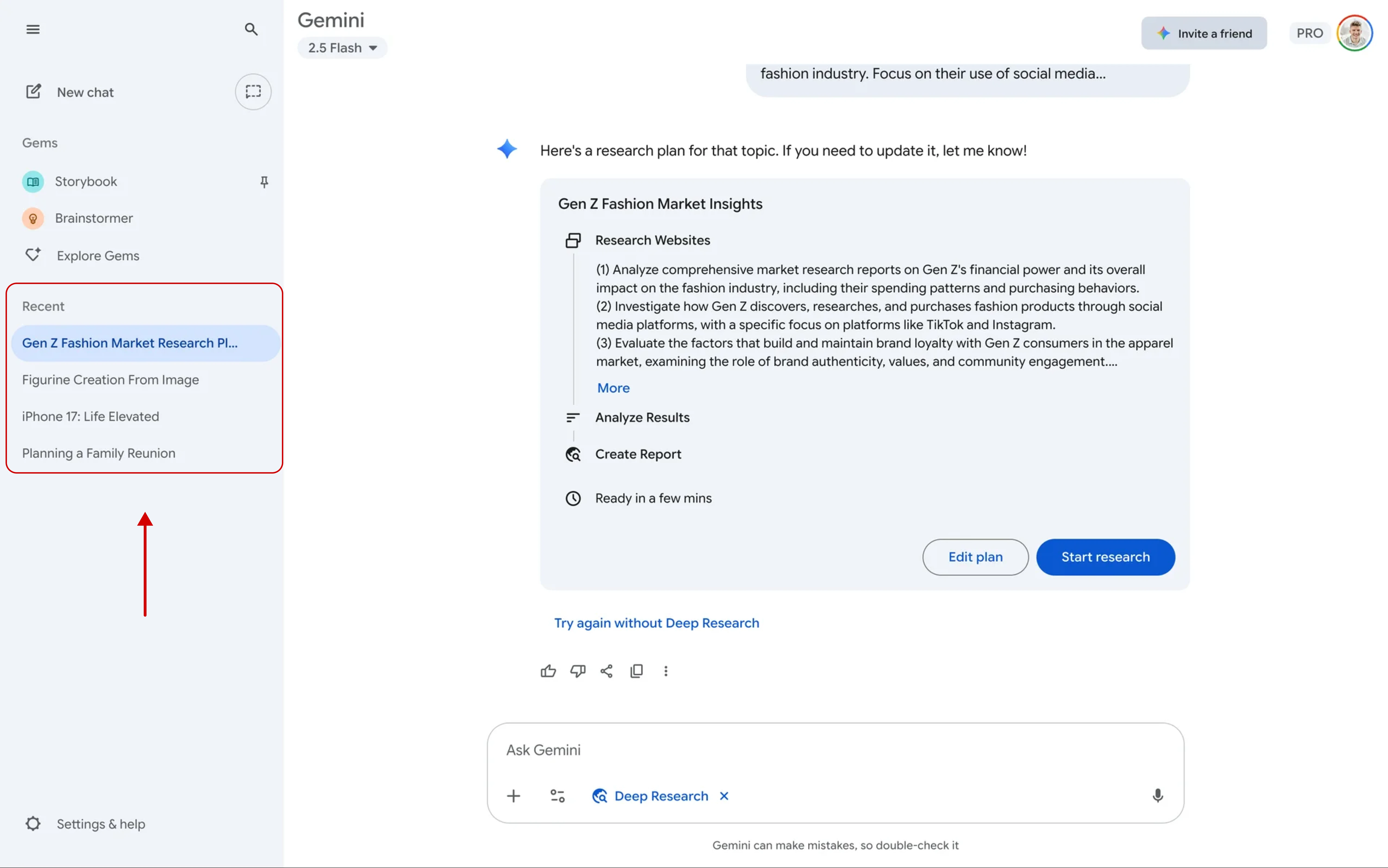
Working with Siena, we applied this reasoning.
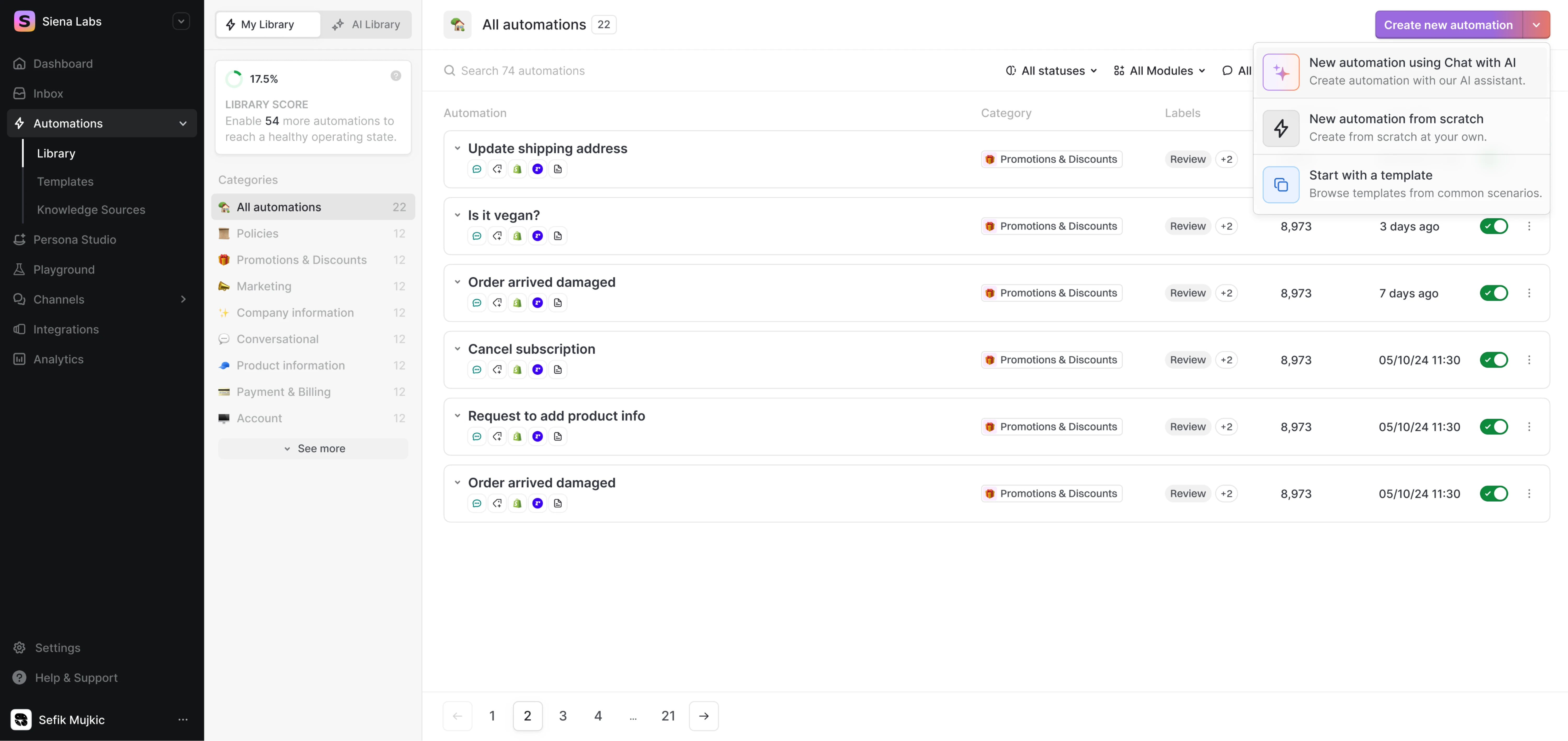
When users open the Automations section of the product, they are greeted with four quick‑request options alongside a free input field. After the system processes a request, everyone can refine the automation without shifting context.
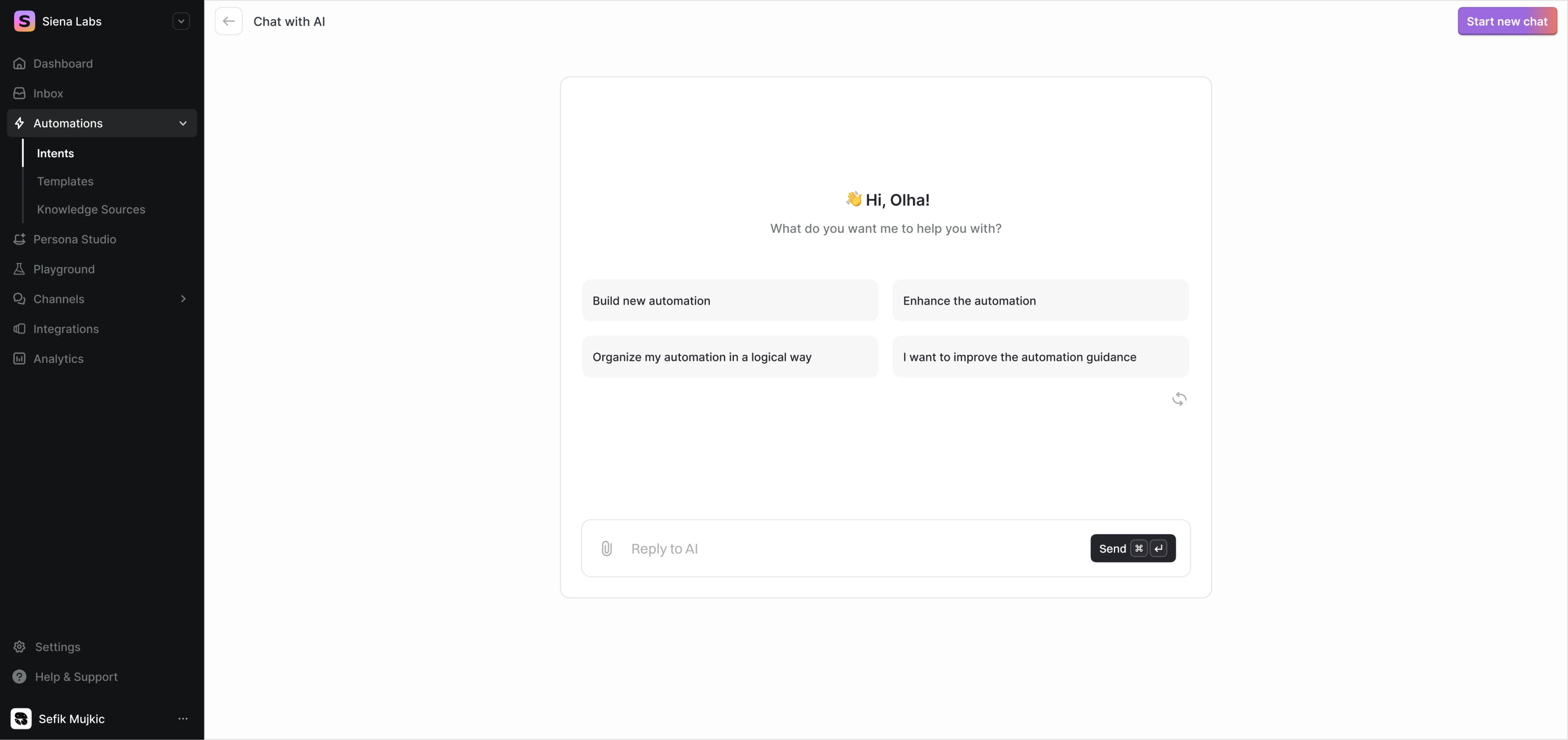
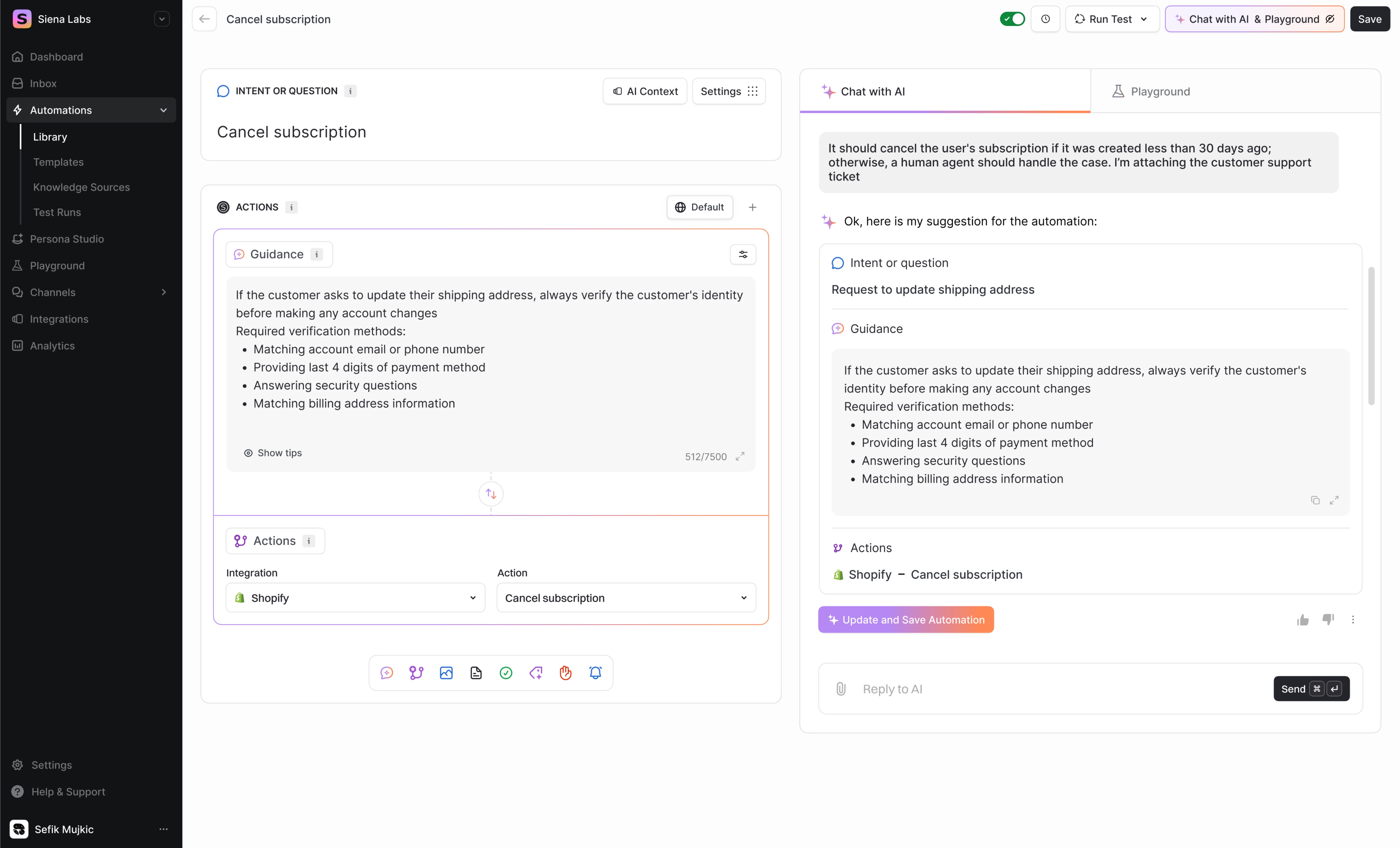
A visible history of automations helps recognise past work and reuse or refine previous flows, rather than having to recall from memory what they did before.
7. Balance of automation and human agency
While AI can automate tedious tasks, too much automation can make users feel out of control or uncomfortable. A well-designed AI interface gives users the choice of how much help they want from the AI.
One approach is to provide adjustable settings or modes, for example, a “manual mode” vs. “AI assist mode,” or a slider to set the AI’s level of autonomy.
Another tactic is to require user confirmation for important AI actions: an “AI co-pilot” can suggest an action, but the user must approve it before it executes.
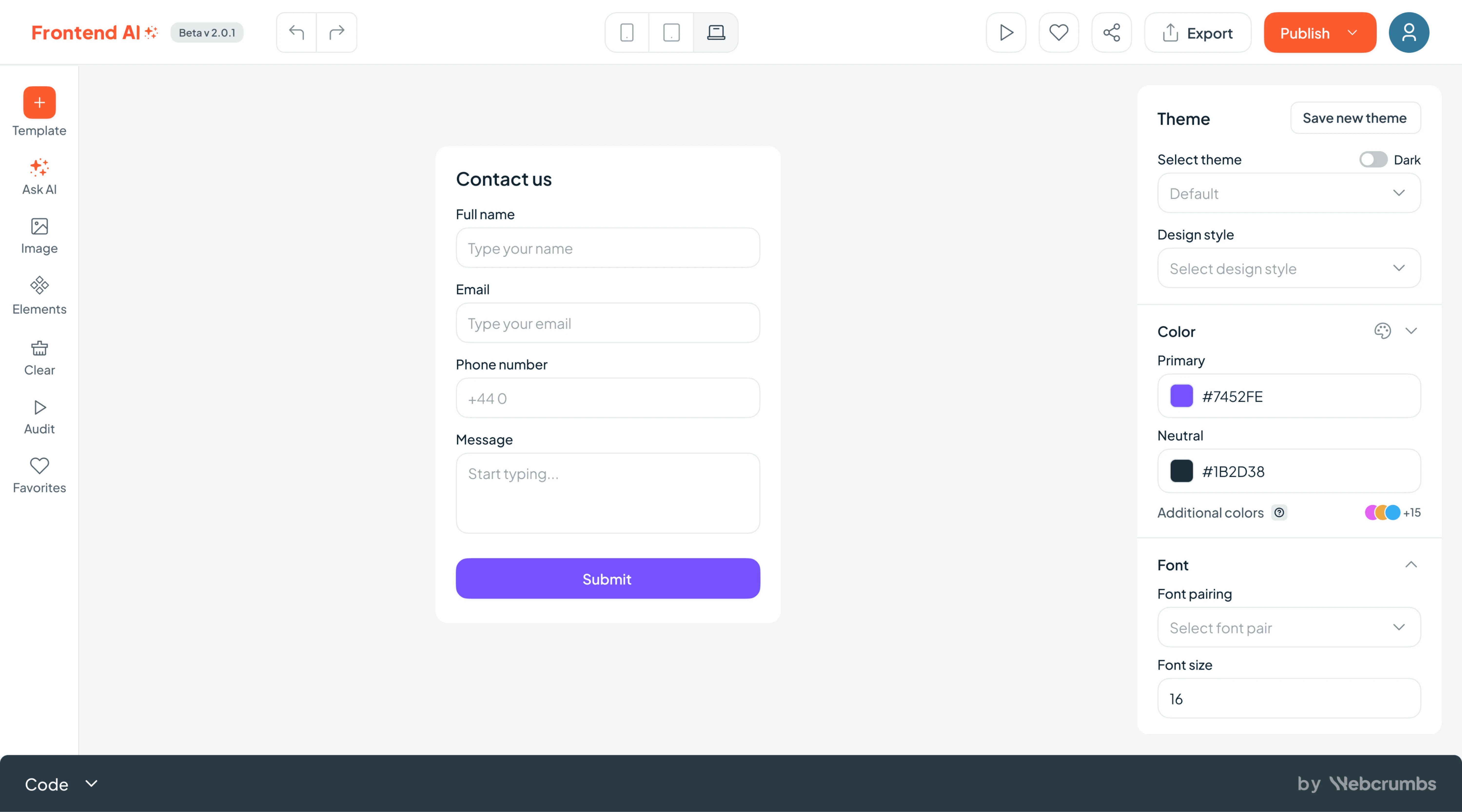
At Eleken, we worked on Frontend AI by Webcrumbs, an open‑source developer tool that generates UI components from simple prompts or sketches. “Ask AI” interaction was the core of the product, and we need to make it clear.
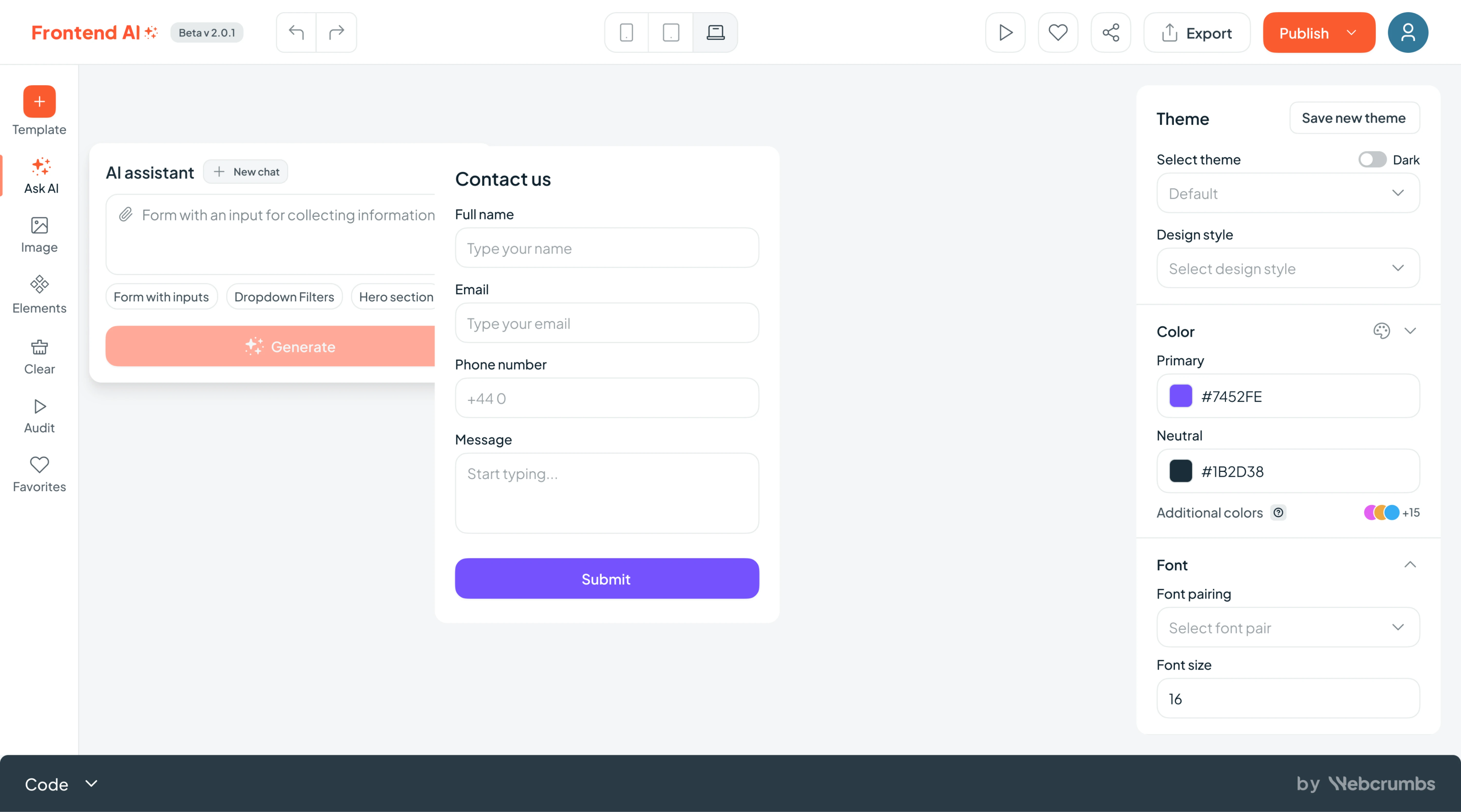
To support human agency, we created a dedicated input area where developers could type prompts, upload screenshots, and view their generation history. While the system processed the request, users received friendly micro‑updates like:
- “Designing your component…”
- “Almost there! Just checking spacing…”
- “Fine‑tuning layout options…”
- “Generating your report…”
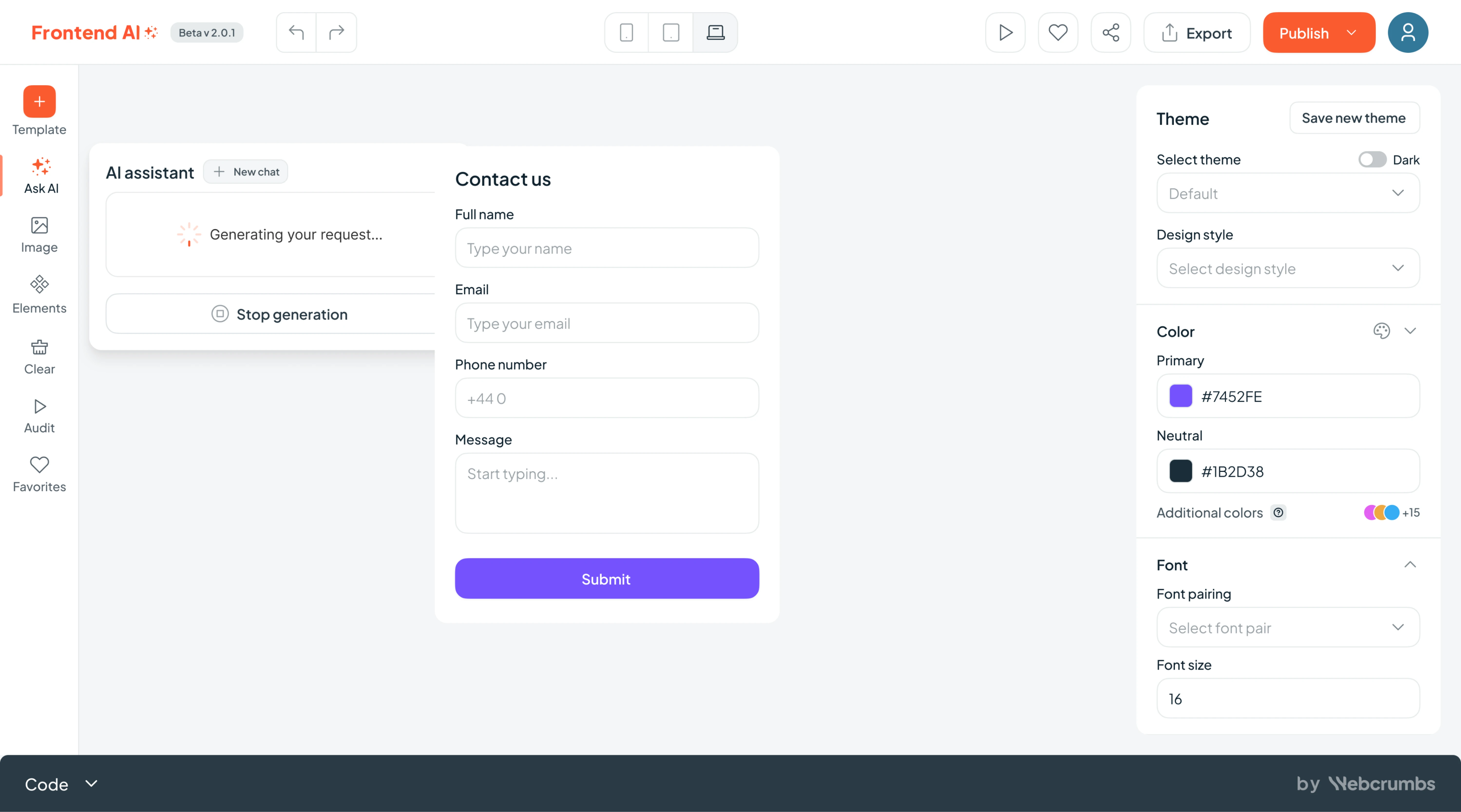
Once the generation finished, users could tweak fonts, colors, spacing, and themes via a smart sidebar, access templates or previous generations, or even start a new prompt from the same screen.
8. User privacy and data security
AI applications often rely on personal data. If users suspect their information is being misused or not handled securely, they’ll hesitate to engage. Thus, a core principle of AI usability is ensuring user data is protected and handled ethically.
To uphold this, be upfront about how data is used.
Clearly communicate what information the AI collects, what it does with it, and who gets to see it. You can also give users the ability to delete their chat history or opt out of data collection for personalization.
Implement robust security measures, such as encryption and secure authentication, to safeguard user data, and consider showing visual cues or notes about security (like a lock icon or a note “Your data is stored securely on your device”).
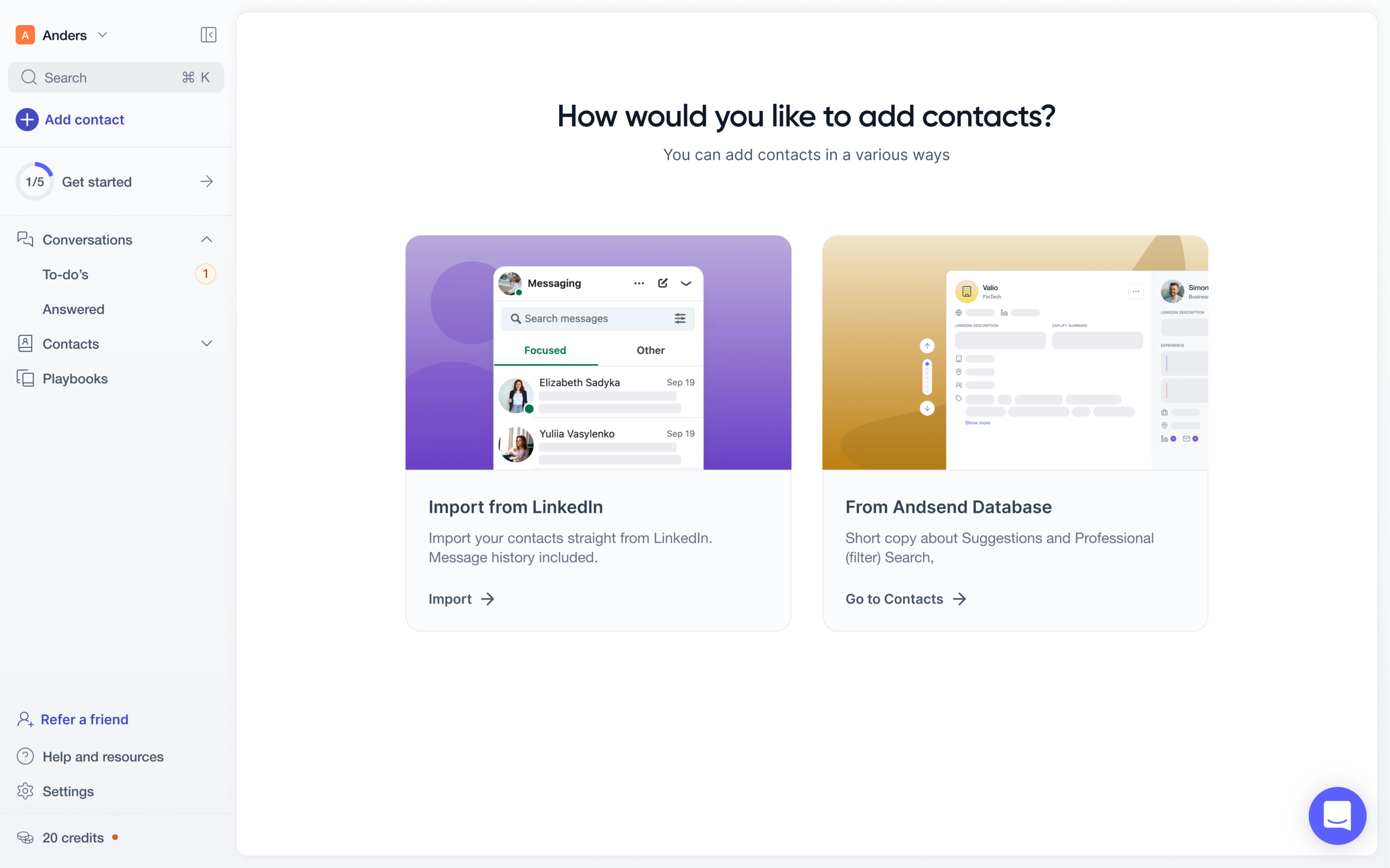
In our work for Zaplify (now AndSend), we applied these principles right from the start. When a user creates an account, there’s a clear “Privacy Policy” link so anyone interested could check how their data will be handled.

We also gave users control over their contact data. They could choose to import contacts from LinkedIn or from the AndSend database, and decide how many to include. On top of that, users could delete any chats they no longer wanted to keep.

9. Contextual guidance and onboarding
Even the most intuitive user interfaces benefit from accessible help and documentation. In this regard, you must provide just‑in‑time guidance, context tooltips, and extra resources so users can recover from confusion and learn.
To support user confidence, structure your help so that it doesn’t feel like a separate manual. Introduce features during the first use, surface short explanatory cues within the UI, and provide more detailed documentation only when depth is needed.
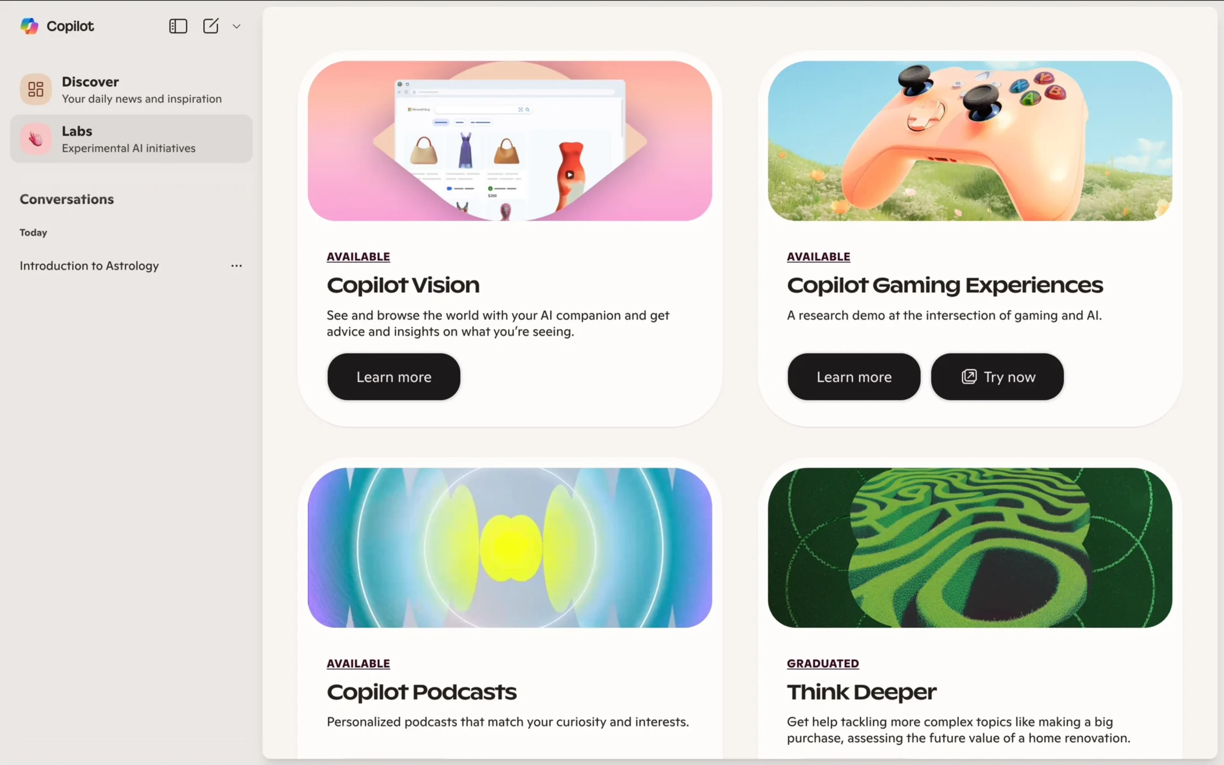
We put this principle in our work with Avid, a fundraising‑CRM platform powered by AI. One of our first assignments was to redesign the onboarding flow, reducing it from four steps to two and keeping everything on a single page.
Our designer simplified the entire process and delivered:
→ A structure that splits flows for nonprofits and agencies.
→ A friendly style that included welcoming imagery.
→ Reorganized error message logic.

As we rolled out a new campaign‑deployment module, a feature that didn’t exist in competitors, we introduced inline tooltips for key metrics so users could hover for instant explanations and avoid guesswork when navigating this functionality.

How to apply usability principles in AI products
When you’re building a product, overlooking AI UX heuristics can quickly lead to unreliable experiences. AI introduces variability and new interaction patterns, so you’ll need a design process and mindset that adapts accordingly.
1. Start by defining user needs and how AI actually adds value. Before adding an AI feature, ask which user problem it’s solving, and whether it could be solved without AI. Simply grafting intelligence onto the product often confuses users.
2. Map the existing workflow and mental model of your users. Observe how they currently do the task and identify where AI can step in. Since AI systems behave unpredictably, aligning with familiar patterns reduces the cognitive load.
3. Prototype early and test with real users. Because AI features evolve rapidly, put user interface design to test early, even with a “dummy” model, to validate how the user feels about its behavior and how they respond to uncertainty.
4. Create lightweight controls and feedback loops. Give users the ability to intervene, adjust, or stop AI actions. Surface what the AI is doing, allow edits, and provide suggestions when the model is uncertain.
5. Iterate based on real usage, metrics, and qualitative feedback. Monitor trust, comprehension, error‑recovery time, and adoption of AI features. Combine this with surveys or interviews to uncover where users felt unsure.
Examples of good AI usability in action
We’ve already covered AI interface usability guidelines and showed how we applied them in real client projects. But these ideas aren’t limited to niche tools or internal platforms. Some of the most popular AI tools out there are quietly doing it right, too.
Grammarly
Grammarly applies AI usability best practices to deliver a strong user experience. Its strength lies in helping people write confidently and improve as they go.
The moment you start typing, Grammarly comes alive. You see underlines in real time, click to reveal suggestions, and have the option to accept, reject, or learn from. This kind of feedback loop keeps users informed without breaking the flow.
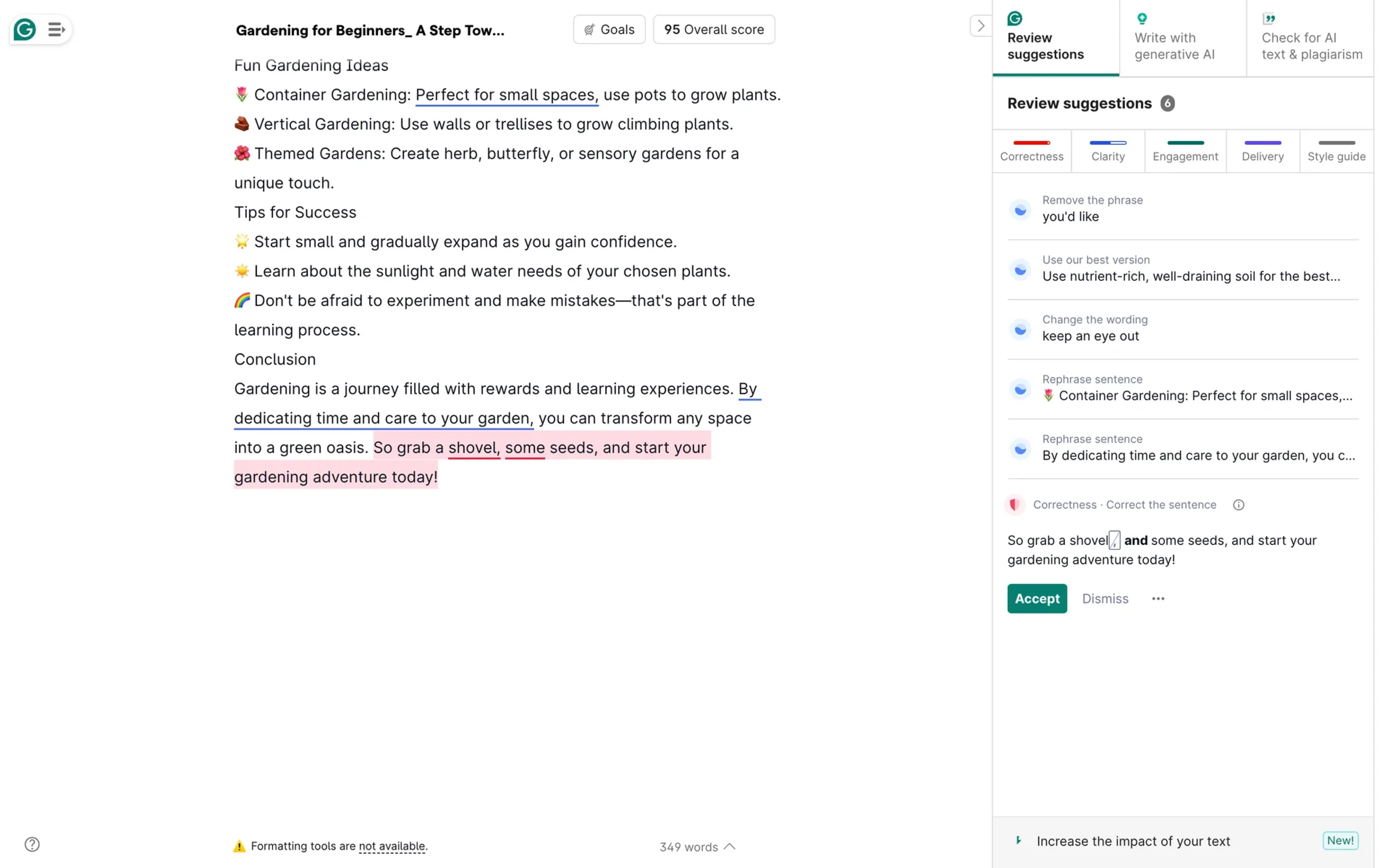
The experience feels intuitive and trustworthy thanks to a few smart design choices:
- Seamless integration into familiar text editors, so users don’t have to switch tools or interfaces.
- Consistent use of color cues, like red for errors and green for correct suggestions, makes scan-and-correct quick and intuitive.
- Clear, actionable suggestions, each with an option to accept, ignore, or dive into a brief explanation.
For example, when a user writes “their” instead of “there” in the wrong context, AI uses natural‑language processing to offer the change with reasoning.
GitHub Copilot
GitHub Copilot serves as an investment in usability as much as in code generation. Rather than treating AI as an isolated module, it embeds suggestions directly into the developer’s workspace and always gives the user the final say.
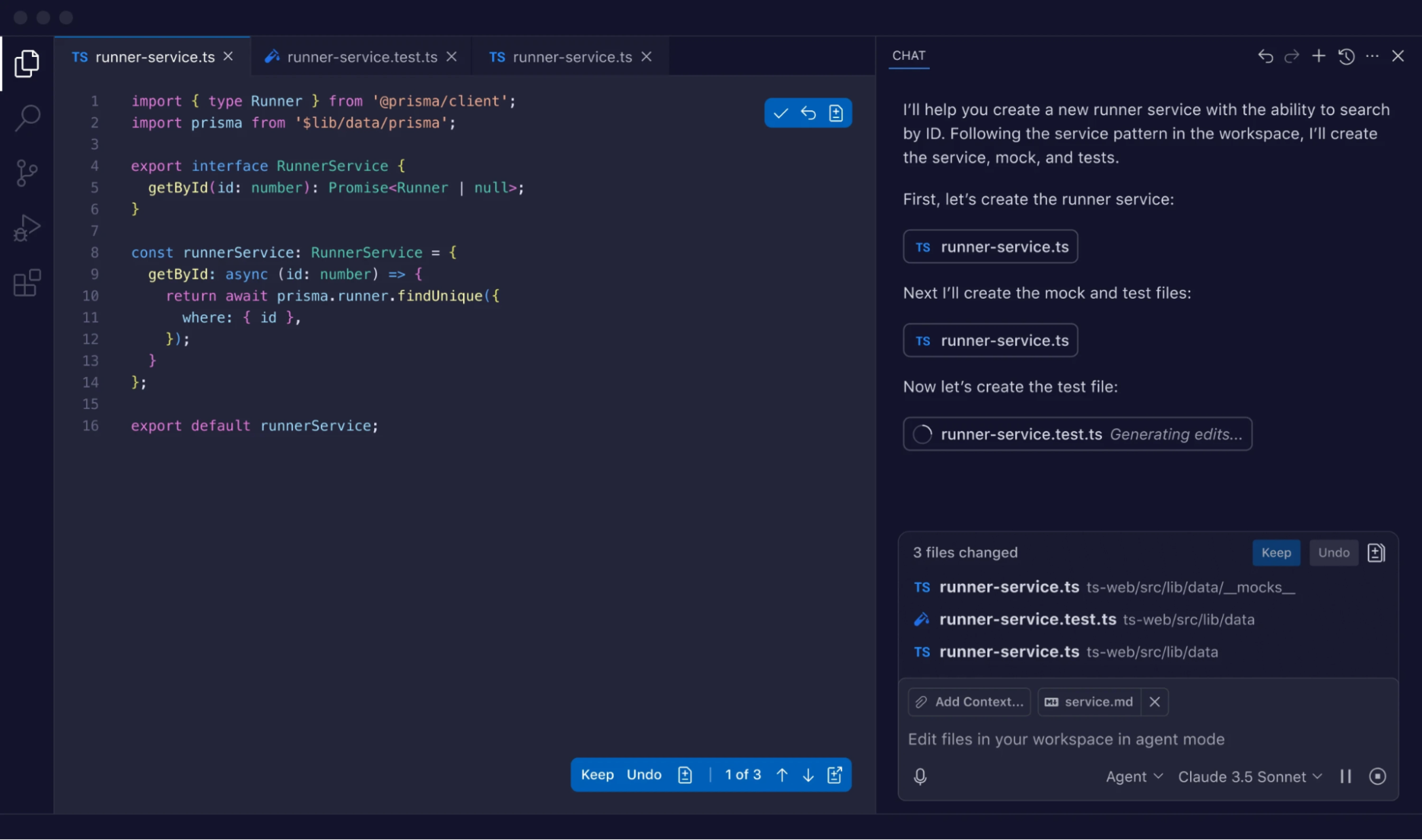
In user studies, teams using Copilot completed tasks 88% faster and reported lower cognitive load thanks to this seamless integration.
From a usability angle, Copilot hits several key design marks:
- Suggestions appear inline where the developer is already working, reducing context‑switching.
- Each suggestion invites acceptance, modification, or rejection, so users feel in control rather than being overwritten.
- The system surfaces previews of “what will happen” (the suggestion) instead of enforcing automation silently.
Copilot blends assistance and agency, exemplifying how an AI can augment human work. When a developer pauses at a partial code stub, the system offers options, highlights differences, allows for tweaks, and keeps the authoring flow intact.
Google Photos
Google Photos introduces features like Magic Editor and Photo Unblur, which use AI to sharpen images or recompose scenes. And you can do all of that in one app without needing expert-level skills.

What makes the experience work is how it blends automation with user agency. The interface still feels like a photo editor: your gallery is there, the toolbar is familiar, and your photo is front and center. But now, there’s more power under the hood.
Here’s how Google Photos keeps AI usability in check:
- Familiar editing environment with traditional UI patterns, so users don’t need to relearn the tool.
- Visible AI suggestions like “Unblur” or “Magic Eraser” are clearly labeled as optional tools.
- Undo and version control, so users can roll back changes anytime and maintain ownership.
- Transparency cues, such as flags in metadata that indicate AI-edited images.
- Smart defaults that let users see results immediately, then adjust or fine-tune as needed.
Google also recently introduced an “Undo device backup” feature, giving users more control over where their data lives.
ChatGPT
ChatGPT empowers users to engage in a conversational interface, offering visible mechanisms to understand what’s happening and influence the outcome.
One key strength is transparency. When ChatGPT answers questions, it often includes links to sources or cites where information came from. That helps users verify claims and understand the reasoning behind a response.
This tool also invites shaping output. After every response, users can give thumbs up or down and optionally explain why. This makes feedback lightweight and creates a loop where everyone helps improve the information.
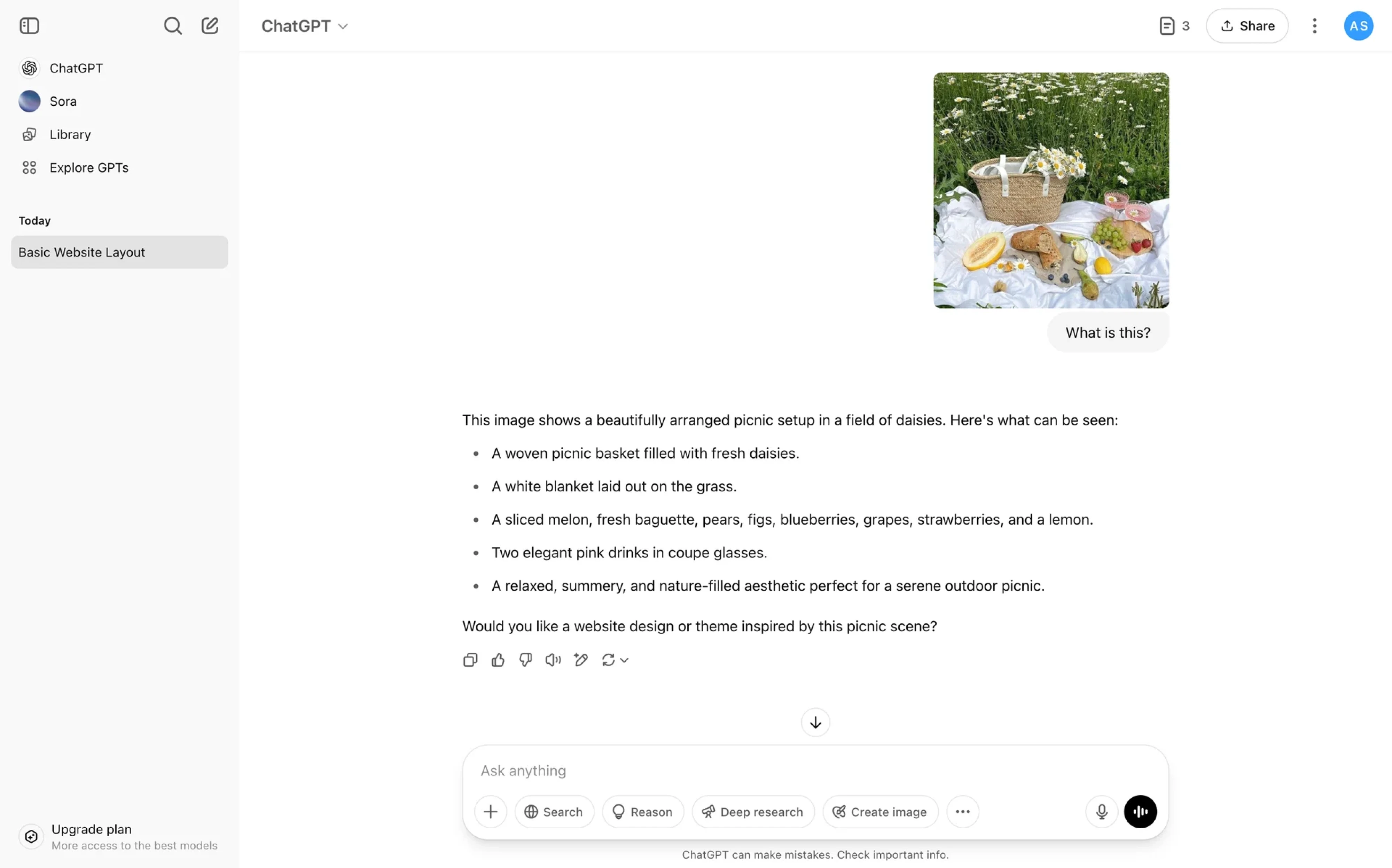
In short, ChatGPT builds usability into its AI experience through:
- Source references that allow users to trace answers and verify credibility.
- Rating feedback to signal whether a response was helpful.
- Optional follow-up prompts make it easier to refine a conversation.
- Simple UI with memory cues, like chat history and editable inputs.
- Tone and response controls (in Pro versions).
Together, these elements make ChatGPT feel less like a black box and more like a flexible tool users can explore, guide, and improve.
Final line
AI keeps getting smarter, and your design has to keep pace. However, no matter how advanced the system is, it’s real people who have to use it. That means your job is to make the experience clear, flexible, and easy to follow.
Of course, that’s easier said than done. Designing around something unpredictable and constantly evolving can feel messy. But that’s also what makes it interesting.
If you’re working on an AI feature and want to make it more understandable and trustworthy, we’d love to help. Just reach out, we’re already in it every day.


