

If you’ve ever searched for best UX practices, you’ve probably seen the same advice repeated: be clear, be consistent, keep it simple, make it accessible.
All true.
But here’s what many articles don’t say: best practices aren’t rules. They’re patterns that work in specific contexts.
And when teams treat UX design best practices as universal truths – instead of flexible guardrails existing in context — they often end up with rigid interfaces, unnecessary friction, and, ironically, poor UX.
The real skill in UX design isn’t memorizing rules. It’s understanding why they work, when they apply, and when to adapt them based on user behavior.
At Eleken, a UI/UX design agency for SaaS, our designers work on complex products every day and mentor designers who are learning to navigate real product challenges. Over time, this experience has shaped a set of internal UX principles and patterns that guide how we approach SaaS design.
In this guide, we’re sharing a selection of those insights — a practical look at some of the principles and patterns our designers rely on when solving real product problems, breaking down user experience best practices into three layers: timeless cognitive fundamentals, adaptable tactics. You’ll learn not just what to do — but how to think.
Without further ado, let's dive in.
Understanding two layers of UX best practices
When people talk about UX standards, they usually mix together two very different things:
- Basic cognitive fundamentals
- Context-dependent (adaptable) design patterns
Some are rooted in psychology laws behavior, and work well because they match how people think and interact with interfaces.
Others depend on context — product complexity, the audience, user expectations, the constraints, and the business goals.
If you don’t see the difference between those two, it’s easy to apply good advice in the wrong way.
So instead of treating UX principles and best practices the same, it helps to think about them in two layers.
Layer 1 – Cognitive fundamentals
These UX practices are the foundations of product experience. They’re rooted in how real users process information, make decisions, and interact with digital products — a fundamental principle of UX.
Basically, you can’t “trend” your way out of them – you should design with them.
Hick’s Law: fewer choices, faster decisions
Hick’s Law states that the more options users have, the longer it takes them to decide.
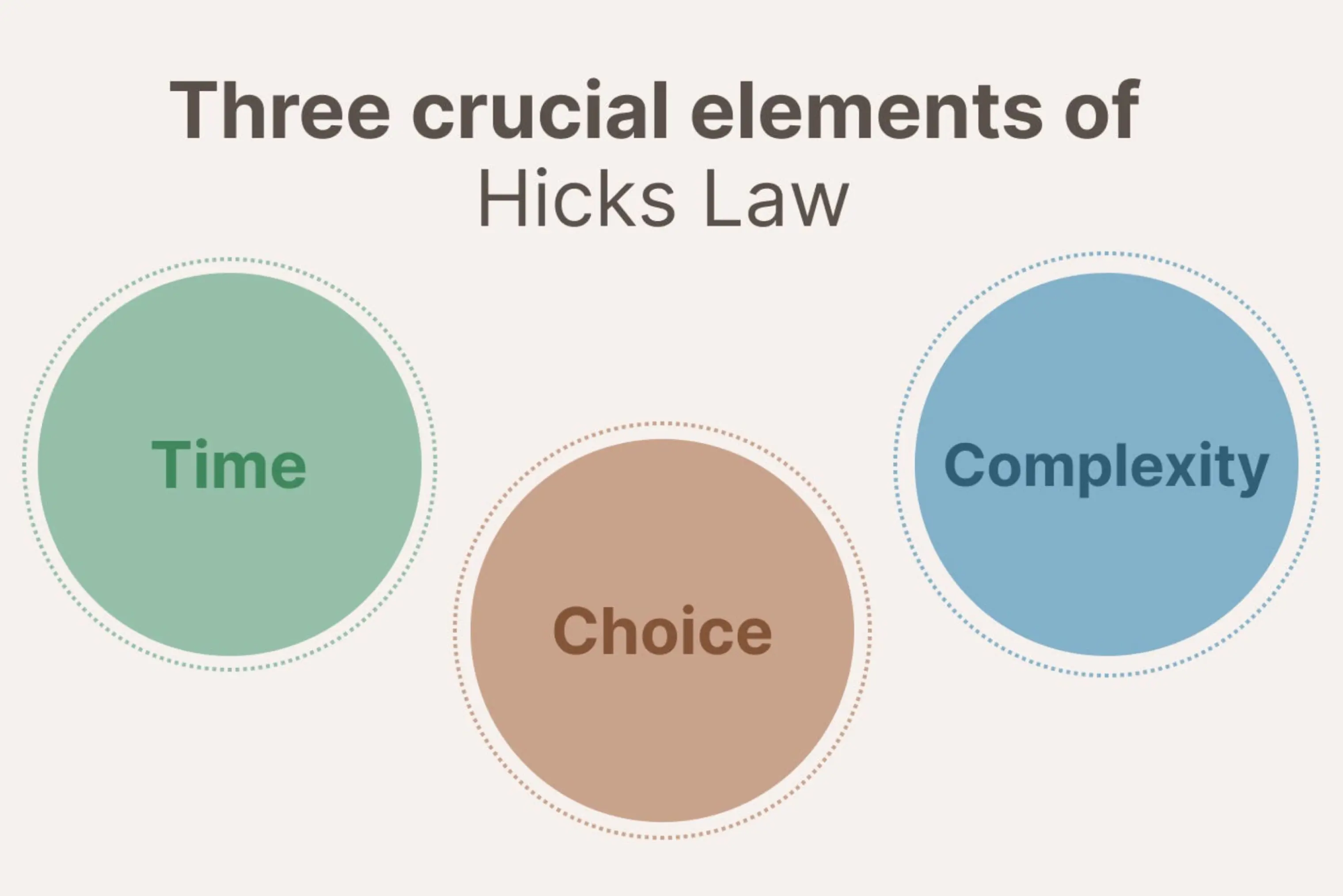
This doesn’t mean you should remove features. It means you should reduce complexity and structure them intelligently.
Good UX design reduces unnecessary decision points by:
- Grouping related options — so users scan faster instead of hunting
- Prioritizing key actions — making the primary path obvious
- Employing progressive disclosure — showing relevant information gradually when needed
- Reducing visual noise — removing distractions that compete for attention
This improves clarity and helps website visitors move forward without hesitation.
Because when users interact with a crowded dashboard or overloaded navigation, their cognitive load increases. The result here is obvious – slower decisions, more hesitation, and lower user satisfaction.
But mind this key point: strong information architecture isn’t about minimalism — it’s about reducing decision friction.
Fitts’s Law: size and distance matter
According to Fitts’ Law, the larger a button is and the closer it is to the user’s focus area, the easier it is for the user to interact with.
This becomes especially critical for mobile users, where touch targets must be sized and spaced with extra care.
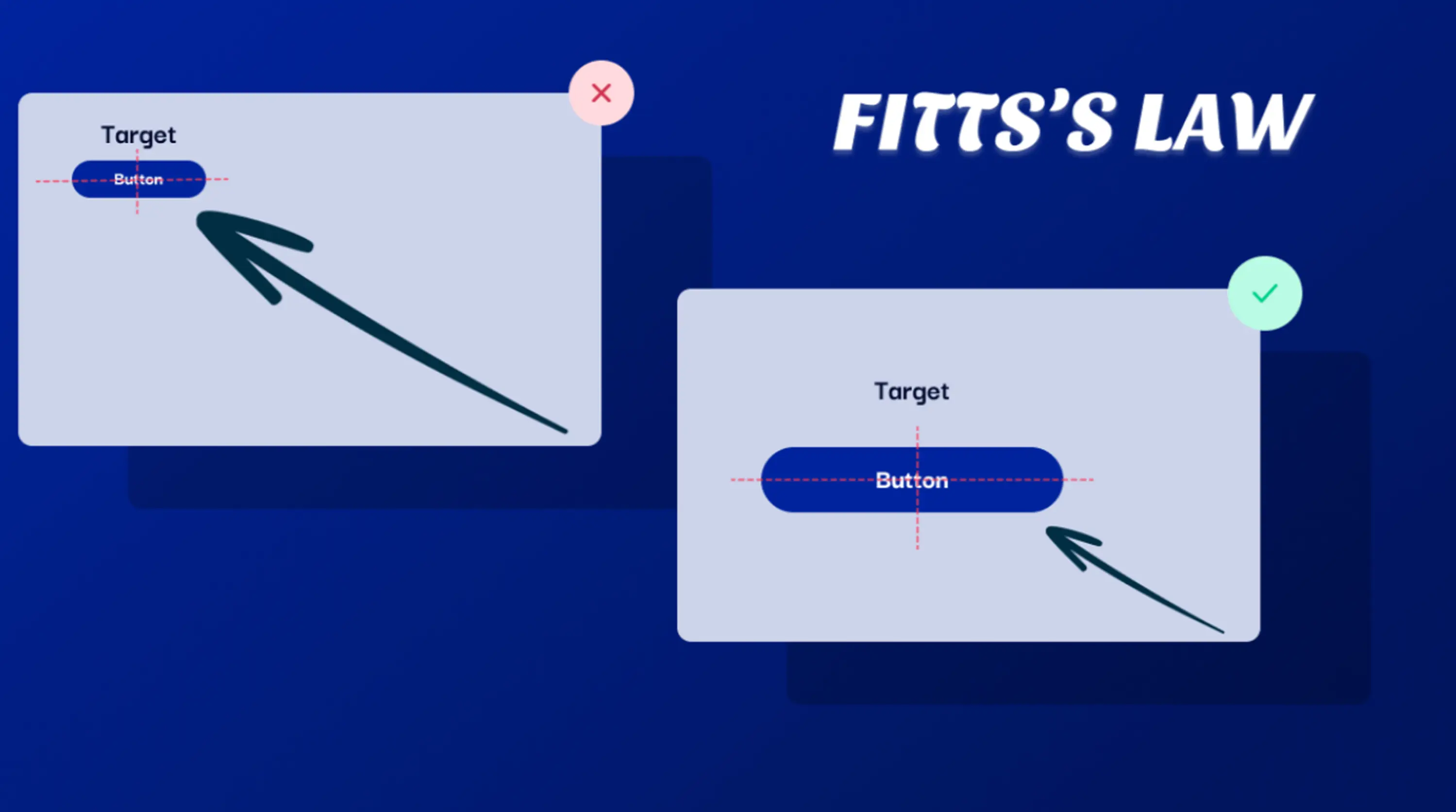
If buttons are tiny, placed in corners, or spaced awkwardly, users need more precision and more movement, which adds unnecessary friction, especially on mobile devices.
In practice:
- Primary buttons should be large enough to tap comfortably — especially on touch devices
- Critical actions should be easy to reach — not buried in menus
- Frequently used controls shouldn’t sit in far corners — distance adds friction
On different devices and screen sizes, this becomes even more critical. A small CTA might work on larger screens but fail completely on mobile.
This is where responsive design comes into play, ensuring usability across devices and supporting a seamless user experience.
Gestalt principles: how users perceive structure
At the core of Gestalt UX design principles lies the idea that people instinctively group visual elements based on similarity, proximity, clear visual arrangement, and uninterrupted alignment.
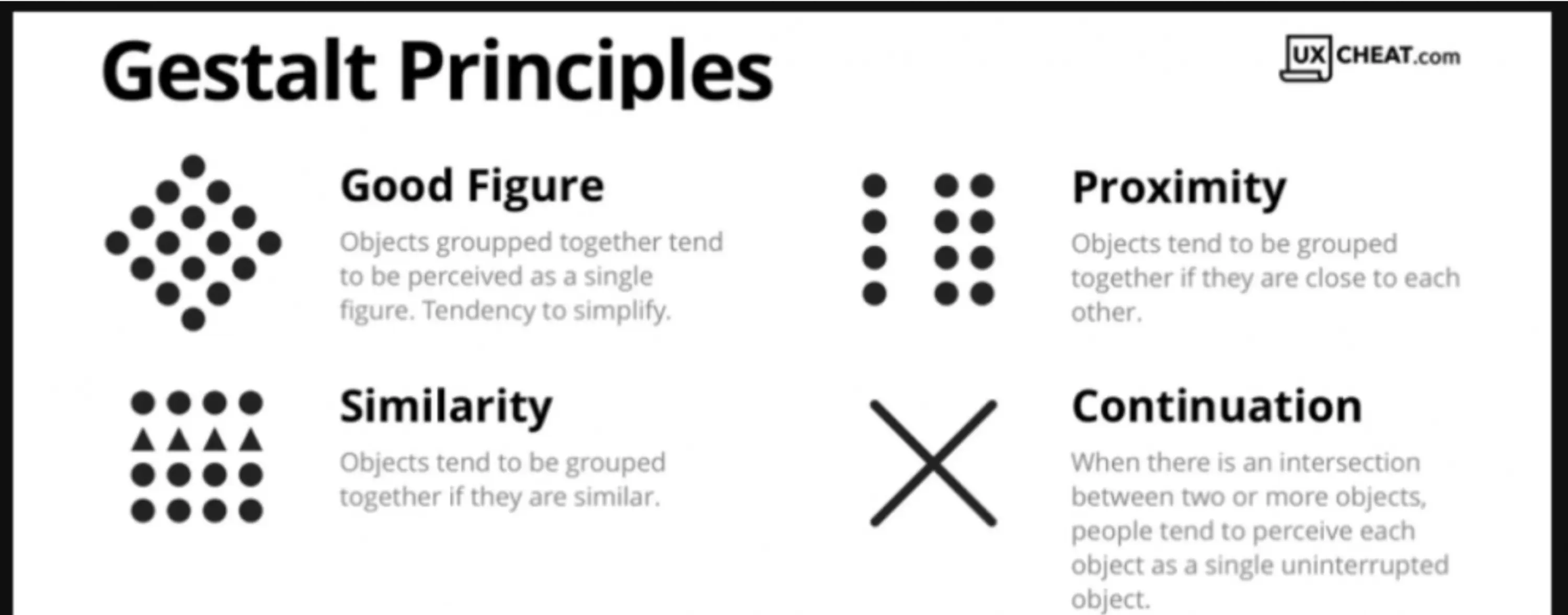
It states that users don’t read interfaces element by element, they perceive patterns.
In interface design, this shows up in how users interpret:
- Similar elements as related — buttons styled the same way, suggest similar actions
- Elements placed close together as connected — proximity signals grouping
- Elements enclosed within the same visual boundary as one unit — cards, containers, or background sections turn separate items into a single figure
- Elements aligned along a shared line or direction as part of the same flow — users naturally follow visual paths and expect continuity
When done right, these principles contribute to a positive user experience and reduce confusion.
But when similar UI elements look different, users hesitate. When unrelated items appear grouped, confusion follows.
Strong visual design hierarchy helps users quickly identify what matters. Yet, poor grouping creates friction — even if every component technically works.
Recognition over recall: reduce cognitive effort
Forcing users to rely on memory to recall info increases cognitive load and reduces usability. Digital product interfaces are most effective when they prioritize visible cues over recall, allowing users to recognize options instead of having to remember them. Designing for accessibility standards also means ensuring these cues are perceivable and understandable for all users.
This is why:
- Navigation menus list categories — so users don’t have to remember the structure
- Search bars suggest search function — reducing typing and guesswork
- Recently viewed items reappear — supporting short-term memory
- Autofill exists — removing repetitive input
This UX best practice becomes especially important in complex digital products, where users juggle multiple tasks and decisions at once. Good UX practices support memory and help users find relevant content faster.
These cognitive fundamentals form the backbone of UX design best practices. They apply whether you're designing dashboards, onboarding flows, forms, or analytics tools.
But here’s the key: while cognitive principles stay stable, the way you apply them does not.
That brings us to the second layer.
Layer 2 – Context-dependent design patterns (adaptable)
If cognitive principles explain how people think, contextual UX design patterns explain how products respond.
Unlike psychological fundamentals, these kinds of patterns are not universal. Contextual design patterns depend on what you’re building, who you’re building it for, and what trade-offs you’re willing to make.
This is where many teams misapply UX best practices.
They hear that modals are bad, that fewer clicks are better, or that minimalism improves usability. And some apply those ideas blindly — without thinking whether they fit the product, the target audience, or the moment in the user journey.
Context changes everything.
This is where judgment separates rigid rule-following from real UX thinking — especially in decisions around:
Onboarding length
You’ll often hear that user onboarding should be as short as possible. Though the real decision here isn’t about length, it’s about readiness:
“What does a user need to understand before they can take meaningful action?”
Yes, when dealing with a simple product, users can explore safely and understand the interface through interaction, so short onboarding is usually a good way to go.
But in complex tools — analytics platforms, financial dashboards, developer products — removing guidance in the name of speed can increase confusion and slow users down later.
In these cases, taking the time to conduct user interviews before finalizing onboarding flows can reveal exactly where users need more support.
Clarity often requires explanation, and efficiency isn’t always about speed — sometimes it’s about slowing users down at the right moment.
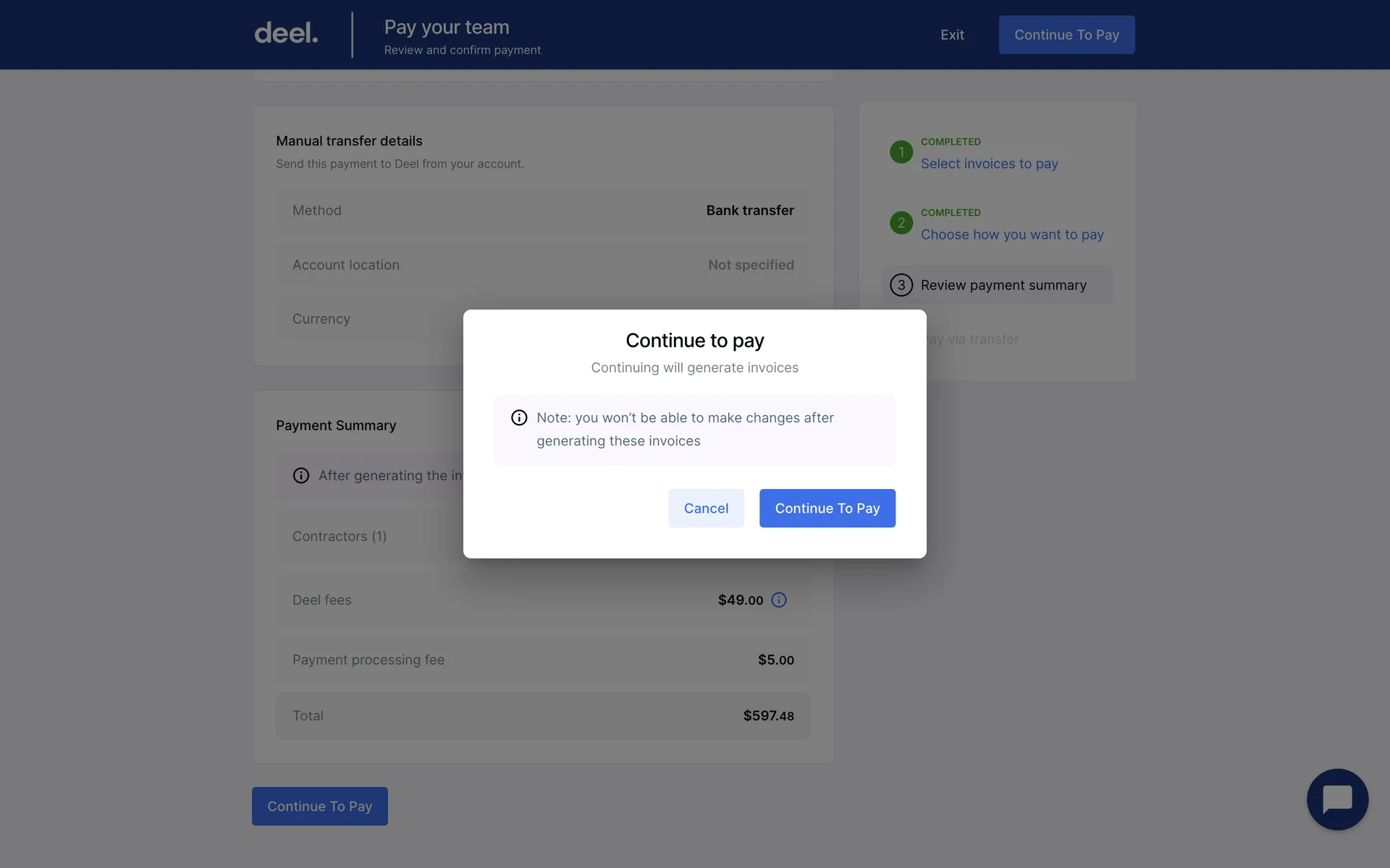
Modal usage
Modals often get a bad reputation in UX discussions. They’re frequently described as disruptive, intrusive, or outdated UI windows. But the problem isn’t the modal itself — it’s when and why it’s used.
A modal UX forces attention – and that’s its power.
Used well, it protects users from costly mistakes. Used poorly, it interrupts momentum and creates friction. Since modals block interaction with the underlying interface, they should be reserved for moments that genuinely require the user’s full attention.
For example:
- A confirmation modal before deleting critical data protects users from irreversible loss
- A modal that blocks simple exploration slows users down unnecessarily
- A required modal for non-critical updates feels like friction, not guidance
The real question isn’t “Are modals bad?” It’s: Is this moment important enough to interrupt the user?
Good modal UX design weighs the risk of the action, the cost of error, and the user’s mental state before deciding to interrupt. When a modal is necessary, it should stay focused on a single task, remain easy to close, and keep content brief so users can quickly complete the action and return to their workflow.
Density vs minimalism
Minimalism is often treated as the default sign of good user experience.
Clean layouts, generous spacing, and fewer visual elements can absolutely improve clarity — especially for new users.
But what feels clean to a beginner may feel inefficient to an experienced user. Power users often prefer denser interfaces because they reduce navigation time and keep more information visible at once.
So the real trade-off isn’t simple vs complex, it’s clarity vs efficiency.
Designing for minimal effort doesn’t always mean removing elements. Sometimes it means organizing more information in a way that’s structured, readable, and easy to scan.
The UX priority ladder
When teams apply UX best practices, they often treat all principles as equally important. In fact, they’re not.
Some design decisions matter more than others. And when trade-offs appear — which they always do — you need a clear order of priorities.
And that’s where the UX priority ladder comes in: Clarity → Efficiency → Consistency → Aesthetics
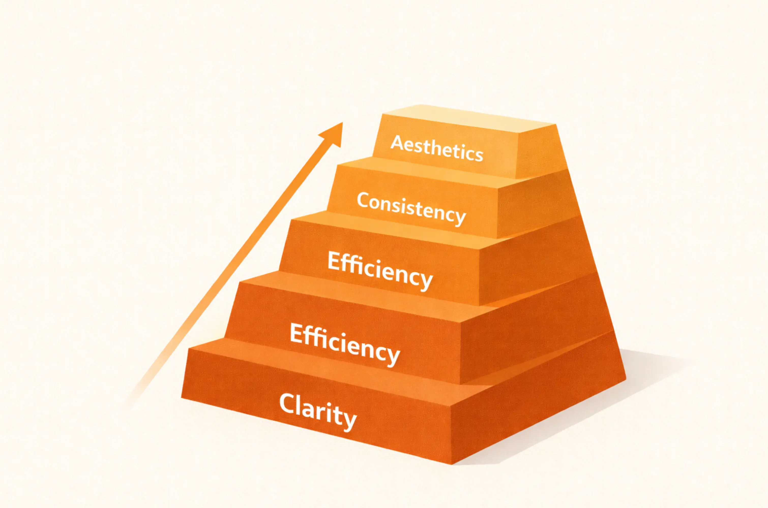
Each level builds on the one before it. If the foundation is weak, everything above it suffers.
If clarity fails → nothing else matters
Clarity is the foundation of user experience. If users don’t immediately understand where they are, what they can do, and what happens next, nothing else matters.
Minimalism can support clarity, but it can also remove meaning. Hiding labels, replacing text with icons, or softening feedback may look cleaner, yet increase cognitive load.
Clarity isn’t about adding more; it’s always about removing ambiguity.
If efficiency improves a confusing interface → it only makes confusion faster
Here, it’s important to draw the line that efficiency is not the same as speed. Fewer clicks can reduce friction in simple flows but increase mistakes in high-risk actions.
For example, skipping confirmation in payments or data deletion may save a second — but cost trust.
Therefore, true efficiency is about reducing unnecessary effort, not necessary awareness, so your users make fewer mistakes.
If consistency reinforces a flawed pattern → it scales the problem.
Design consistency is about strengthening patterns users already understand. However, if a pattern is confusing, repeating it only scales the confusion.
Because ultimately, consistency supports clarity but cannot replace it.
Why beauty comes last
While aesthetics influence perception and trust, no amount of visual polish can compensate for confusion.
A beautiful interface fails if users struggle to navigate it. Because beauty always works best when it amplifies clarity — not when it distracts from it.
Pattern-level UX best practices for SaaS products
In SaaS products, user experience often revolves around a set of core interface elements that appear in almost every platform — authentication flows, navigation, data tables, forms, settings, analytics, and dashboards. These are the essential elements that website visitors and app users interact with most frequently.
Basically, most interfaces include at least some of these components. Because they’re used so frequently, the way they’re designed has a major impact on overall usability.
Within each of them, however, recurring interface patterns emerge. Therefore, it’s essential to recognize the underlying pattern within each area — and apply it deliberately.
Let’s break down how in the UX design process best practices tend to play out across common SaaS touchpoints.
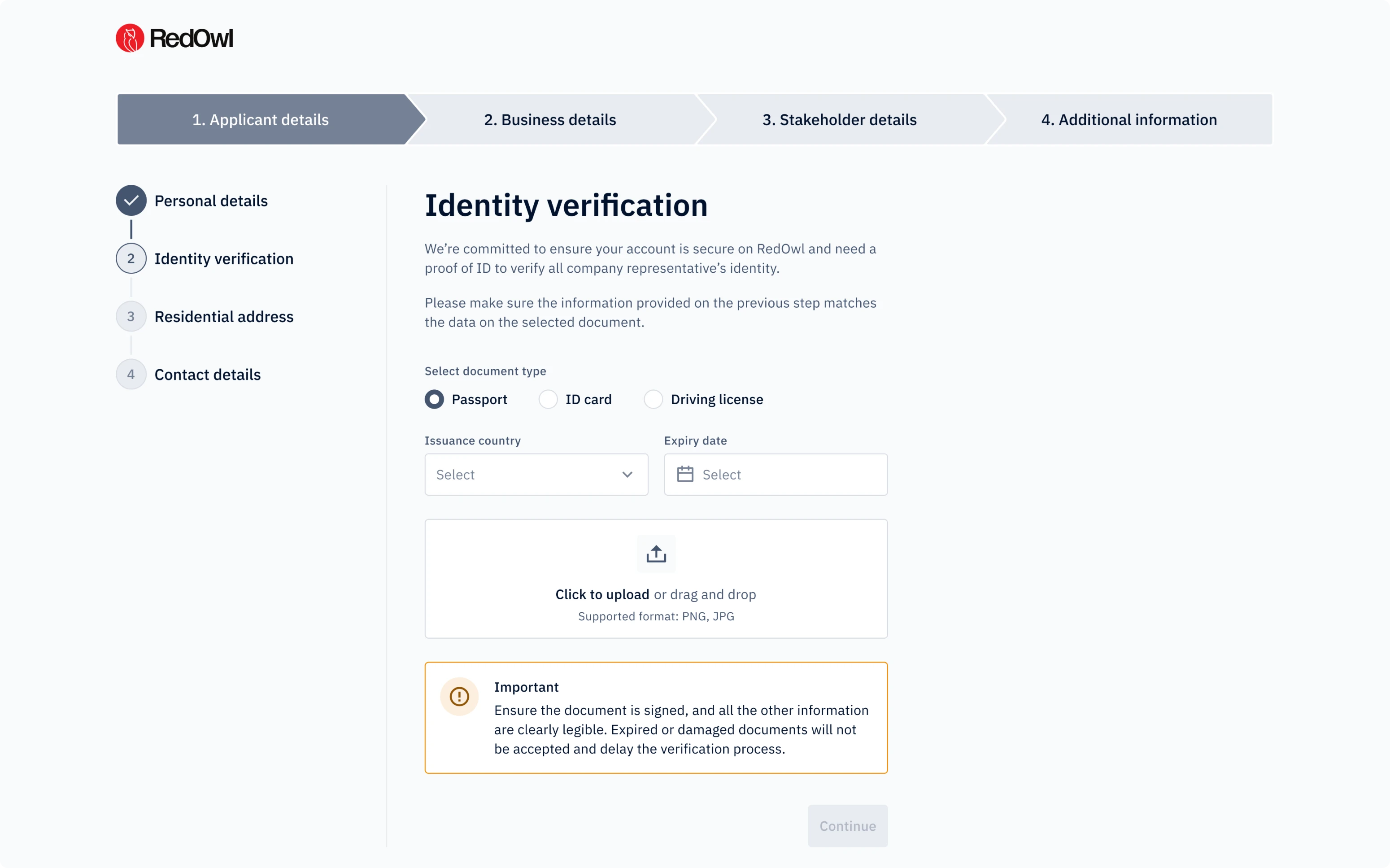
Login and registration
Authentication is often the first real interaction users have with a product. It sets expectations for clarity, security, and ease of use.
Several UX design best practices consistently shape strong login and registration flows:
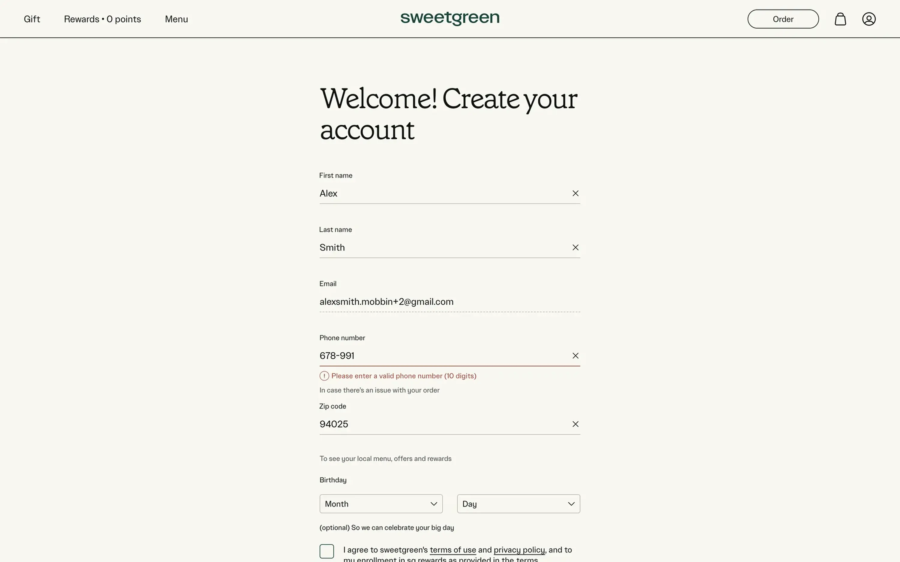
Simple vs multi-step onboarding
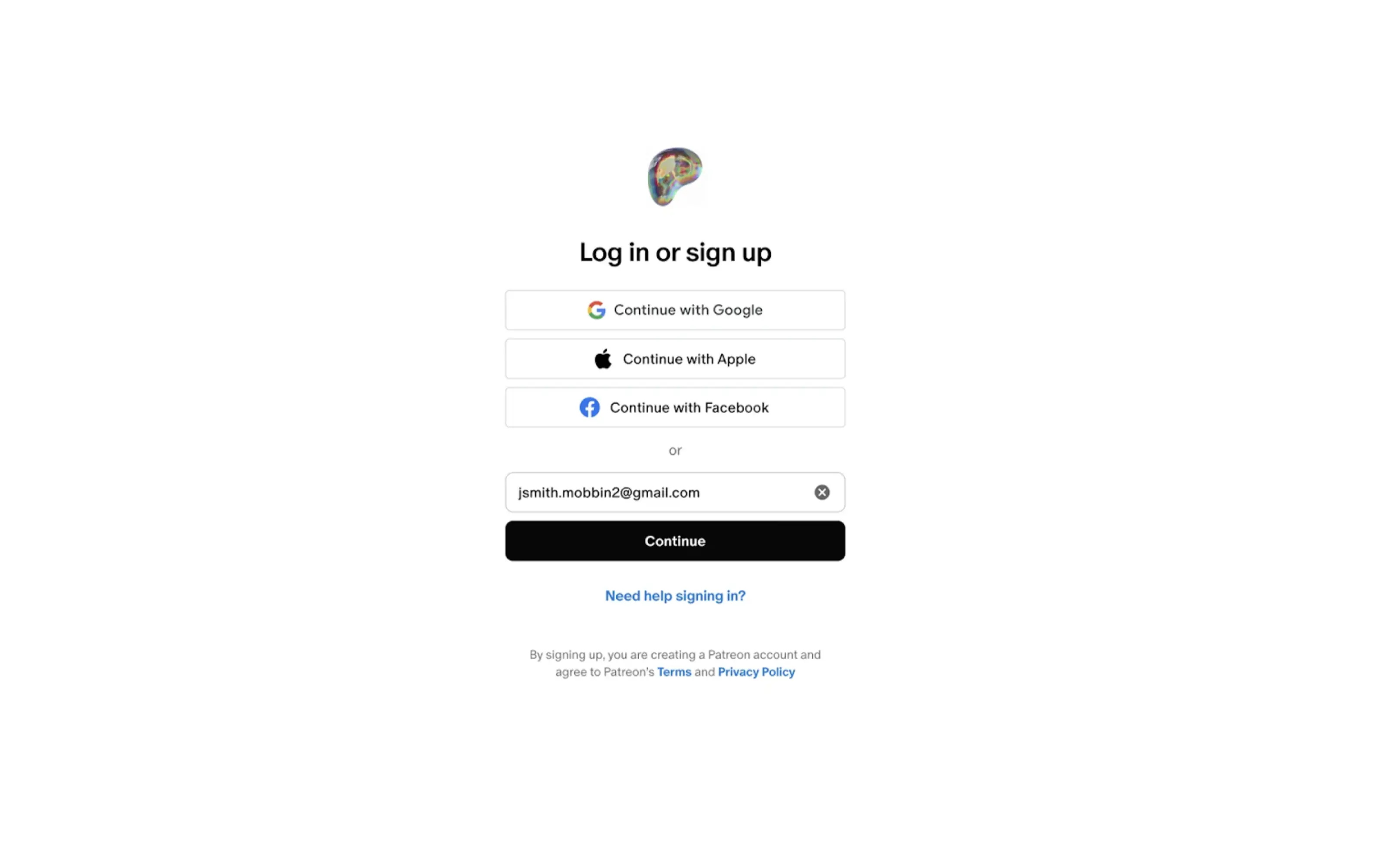
Login flows are usually straightforward and rely on a simple form with an email (or phone) and password combination. Because the goal here is fast access, a common rule is to keep login forms minimal and focused only on essential credentials.
A single-page sign-up works well for simple products with low commitment.
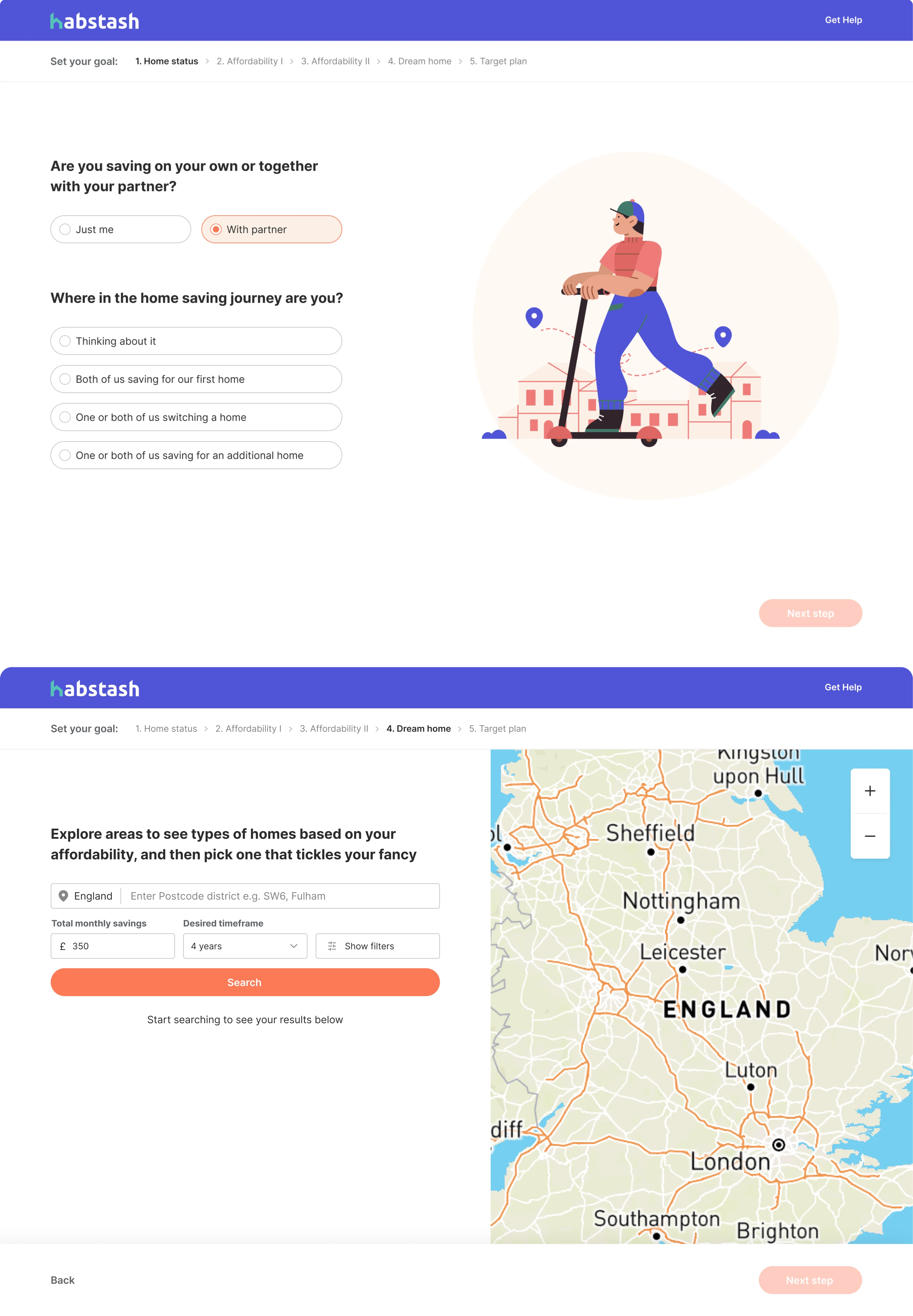
However, in more complex SaaS tools, breaking registration into smaller steps using elements like stepper UI can reduce overwhelm. In practice, multi-step onboarding works best when the registration process requires different types of information and when progress is clearly visible through steppers or progress bars, wizard UI or progress indicators.
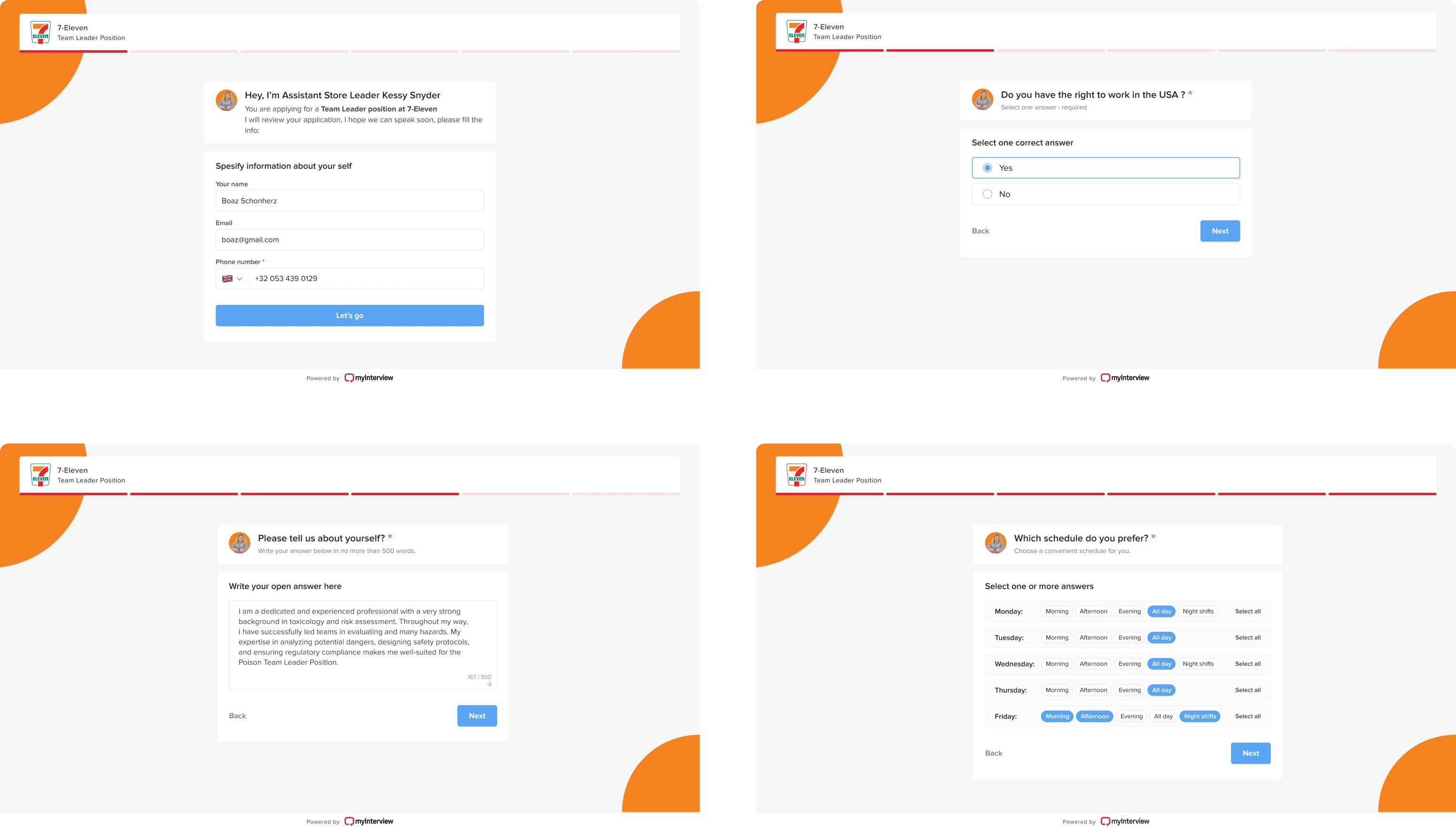
Because multi-step onboarding works well only when each step feels purposeful and progress is visible. One helpful guideline is to structure each step around a single logical group of information rather than mixing unrelated fields. The decision here isn’t about fewer fields — it’s about managing cognitive load.
When to collect information
To get users started, collect only what’s necessary. Asking for too much information upfront usually increases abandonment. A practical approach is to request only the minimum information required to create an account. At the same time, deferring essential setup too long can create friction later.
Progressive data collection — gathering more details as users explore the product — often helps balance usability and business needs.
Many SaaS products apply this by delaying non-critical fields until users reach the feature that actually requires them.
Switching login and sign-up
Most frequently, users land on the wrong form. With that, the ability to easily switch between login and registration without losing entered information is what prevents frustration. A good practice here is to allow switching between the two states without clearing the form fields. Clear visual separation between the two states also reduces confusion.
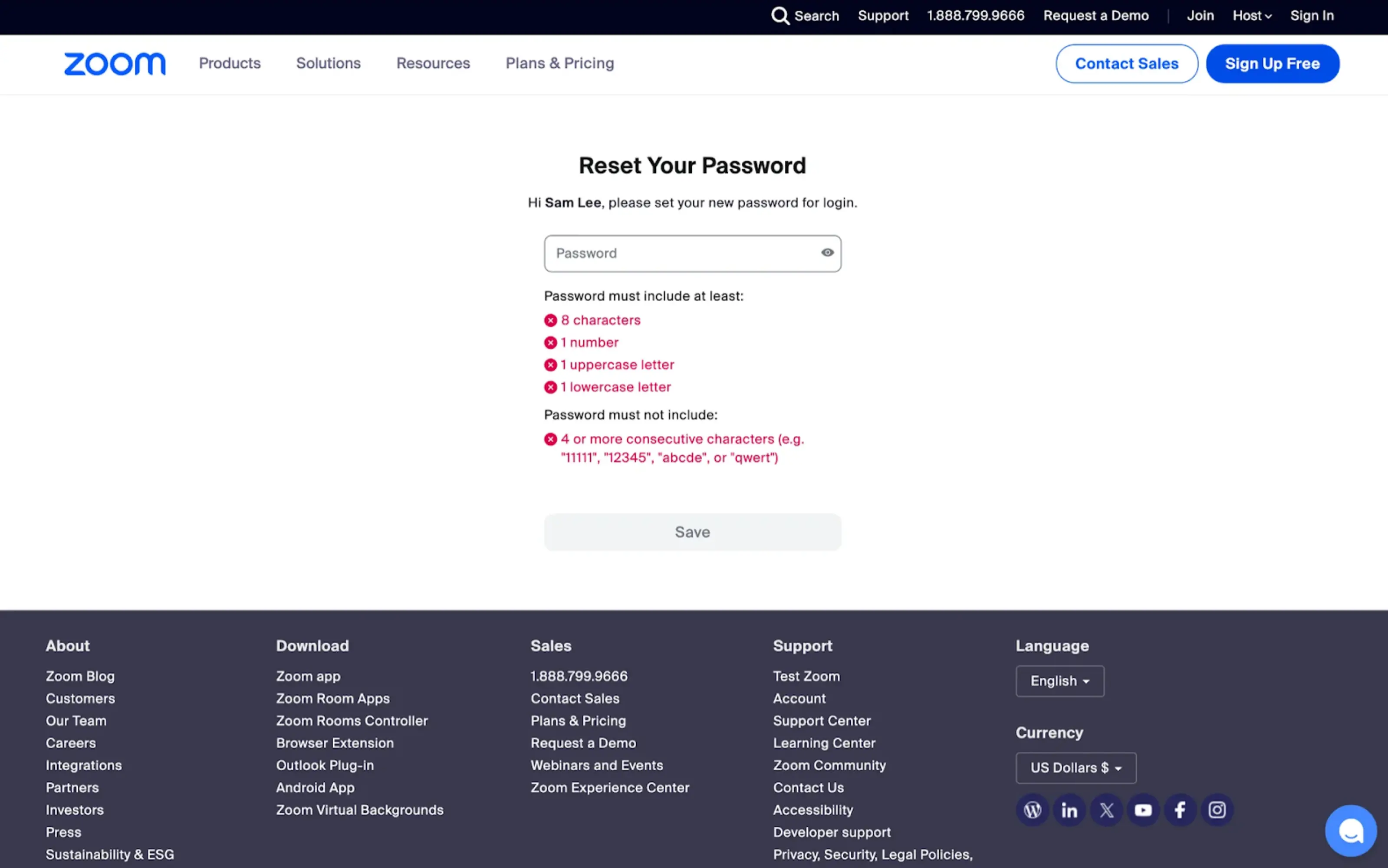
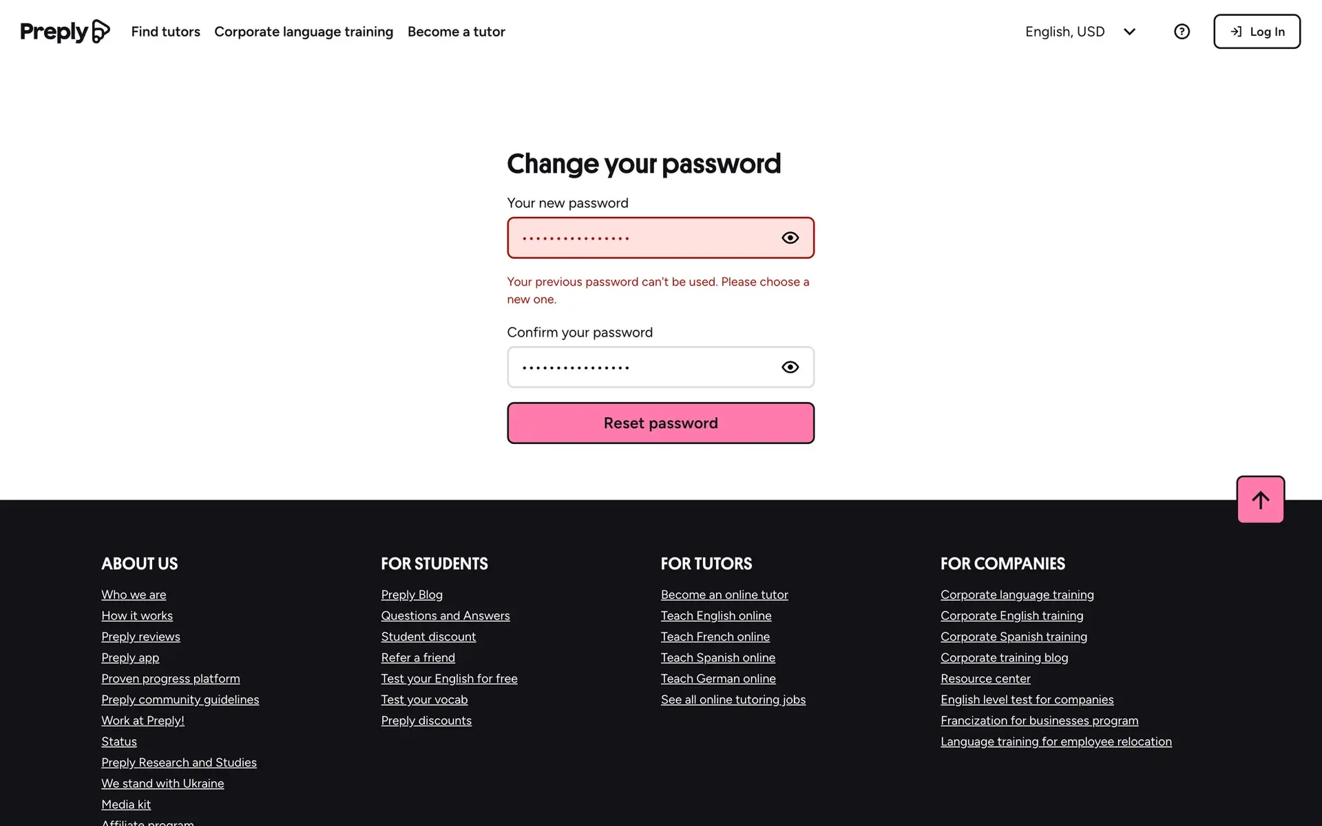
Password guidance
Password requirements should be visible before submission — not after an error. Showing password requirements before users start typing and validating them in real time helps reduce guesswork. Clear criteria, real-time validation, and helpful strength indicators guide users toward a successful submission.
Applying password managers and visibility toggles is also a way to improve usability without compromising the security aspect. Supporting password managers and providing a visibility toggle are small additions that noticeably improve usability.
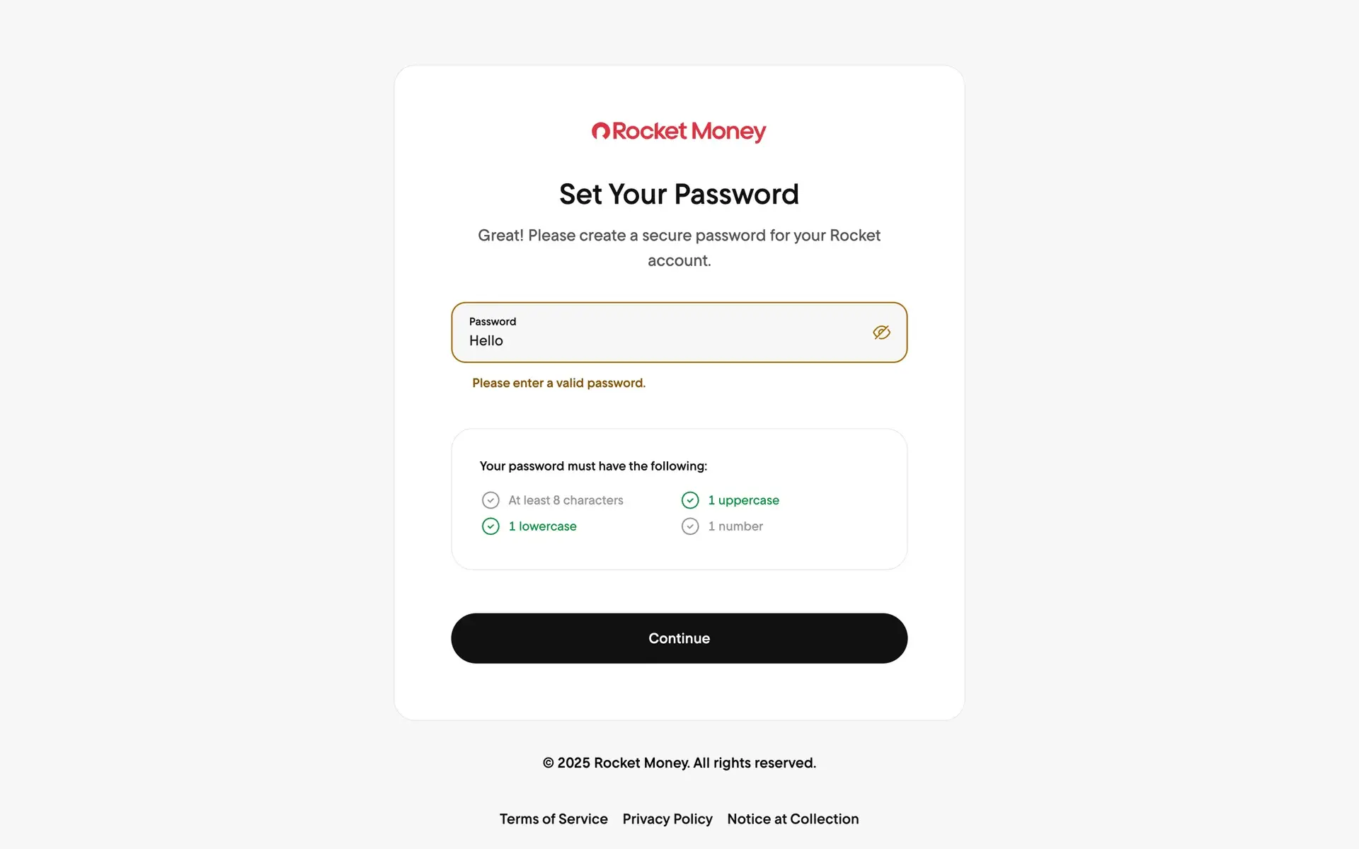
Error handling
Error messages should be specific and actionable.
Instead of “Invalid input,” explain what went wrong and how to fix it. Highlighting the problematic field clearly and preserving previously entered information helps users recover quickly from mistakes. Good authentication UX reduces friction while reinforcing trust.
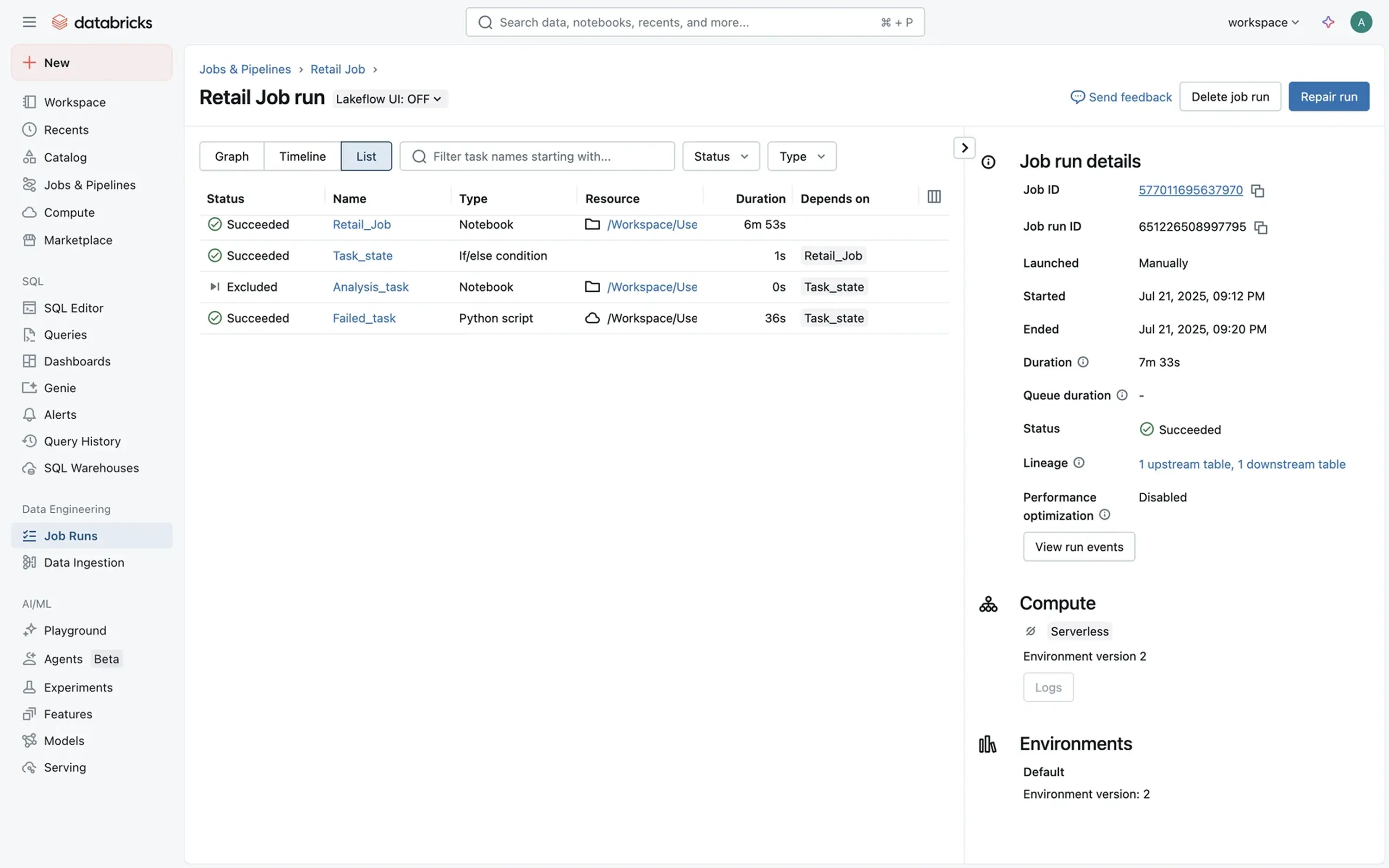
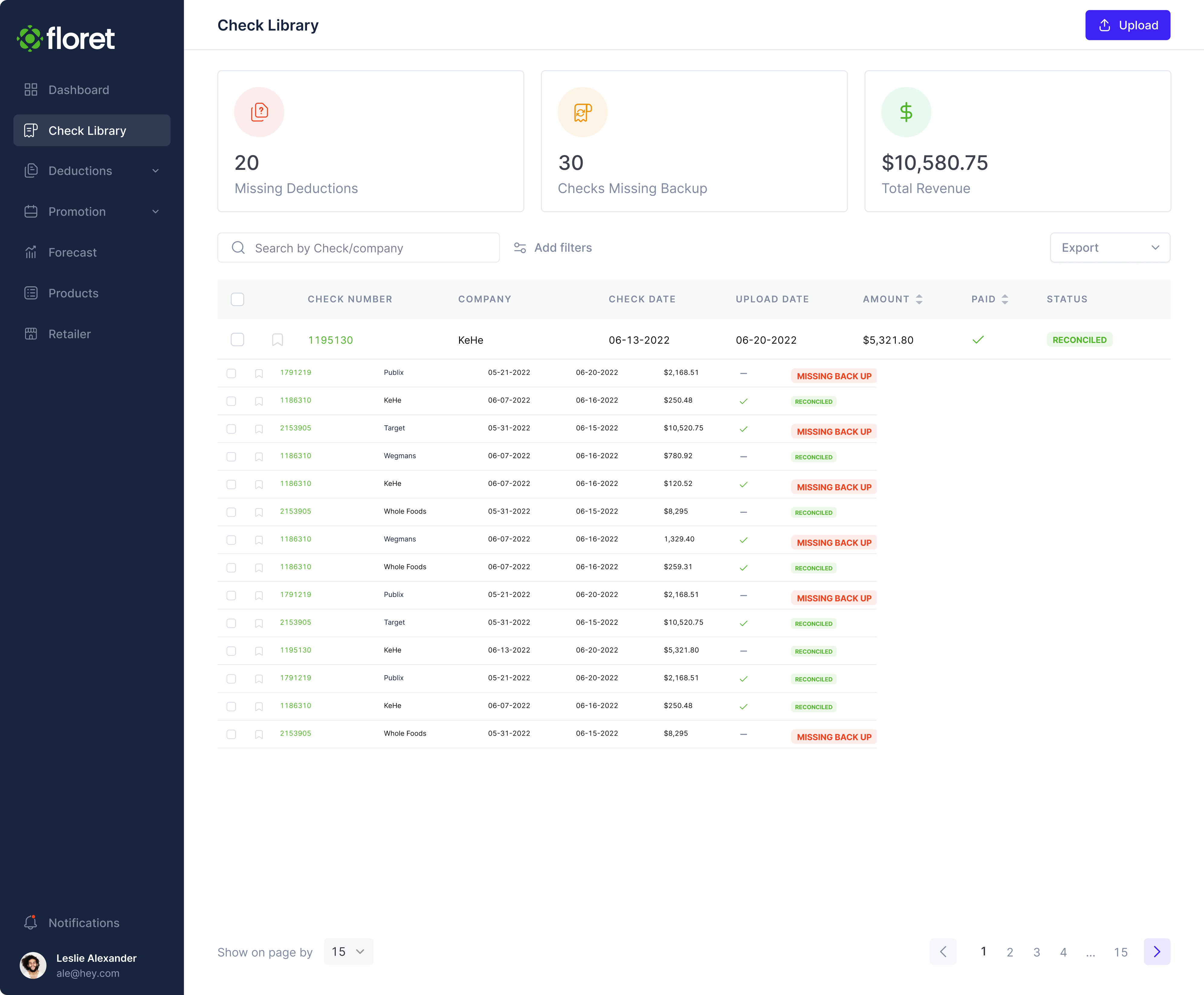
Tables and lists
Tables are central to many SaaS products. They help users scan, compare, and act on structured data quickly — often under time pressure.
However, strong table design isn’t just about displaying information; it’s about giving users control through:
Search & filter functionality
When datasets grow, navigation becomes critical — search and filter functionality can significantly aid in this respect. Make search bars easy to find and responsive so users can quickly narrow large datasets. Filters should be easy to apply and just as easy to reset. Provide clear visual indicators for active filters and sorting states so users always understand how the data is being refined. The overall process should feel predictable and transparent.
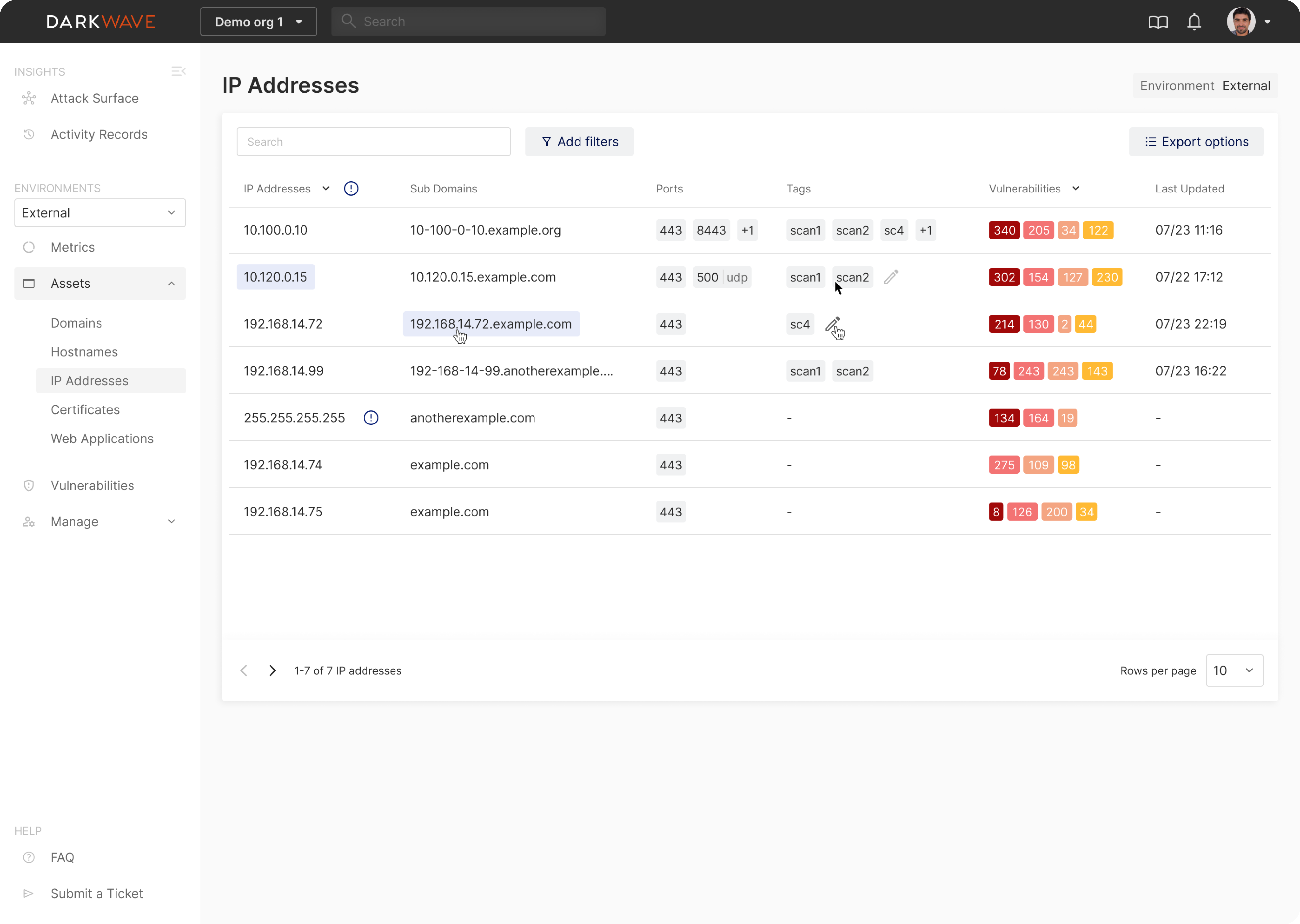
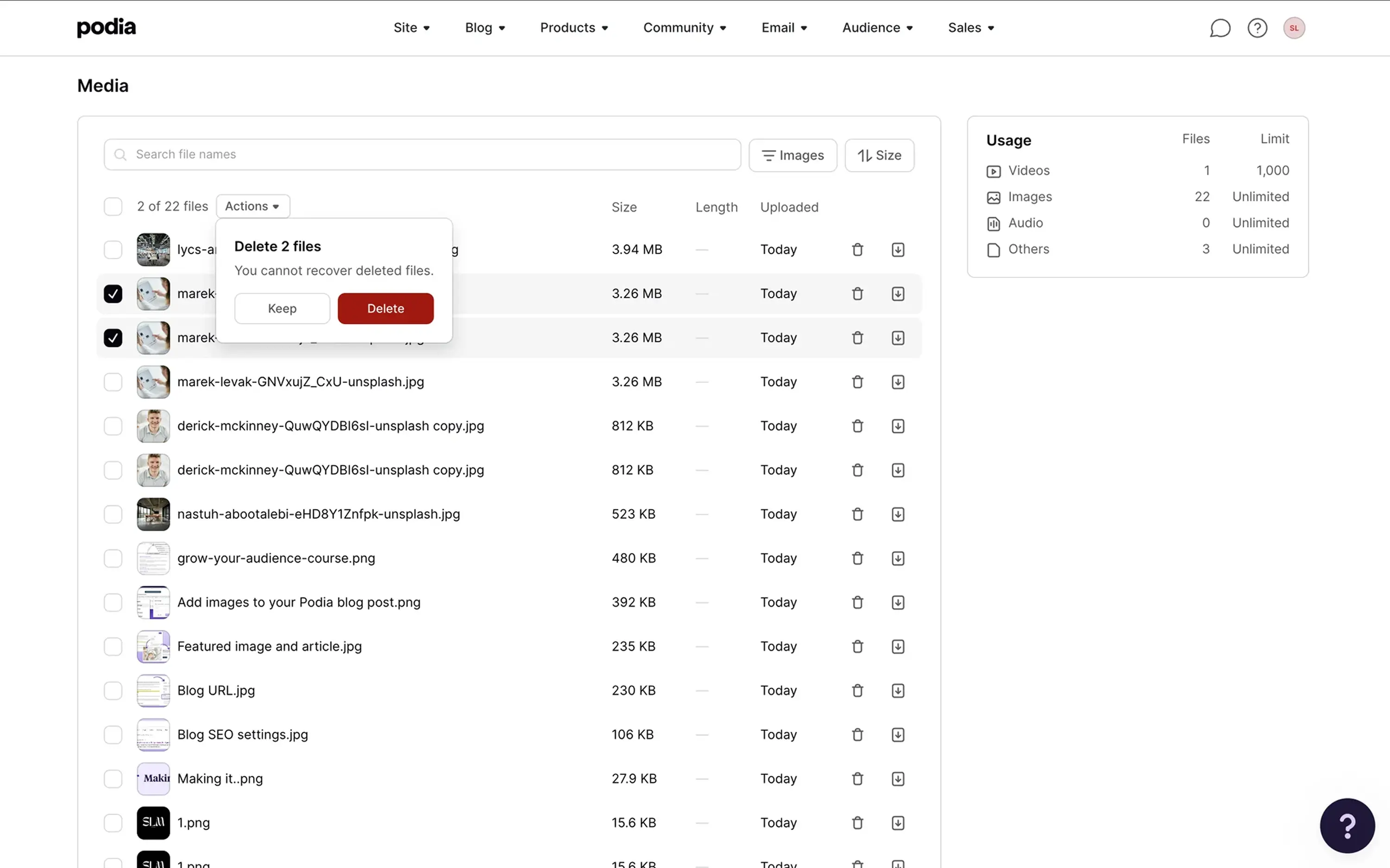
Bulk actions
As soon as users manage multiple items, efficiency matters. Bulk actions reduce repetitive effort, but only when selection states are obvious and controls appear at the right moment.
Allow users to select multiple items and apply actions such as delete, archive, or assign in one step.
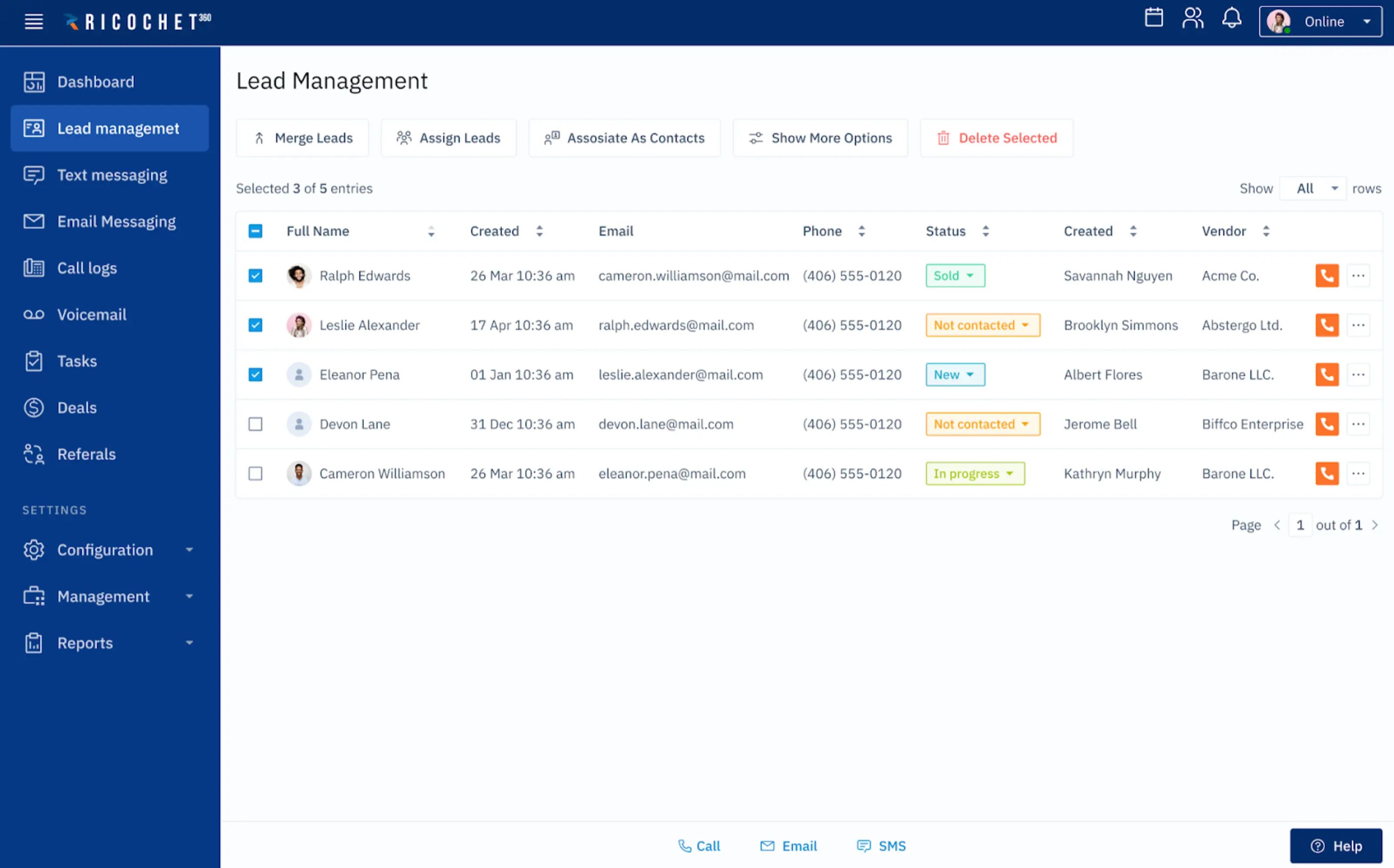
At the same time, show bulk action controls only when items are selected so the interface stays clean and focused.
Row states
Rows should visually change when users interact with them. Hover highlights, clear selection marks, and disabled actions can help users navigate better, see what’s clickable, and avoid frustrating mistakes. Use hover states to indicate interactive rows and highlight selected items clearly so users never lose track of their actions.
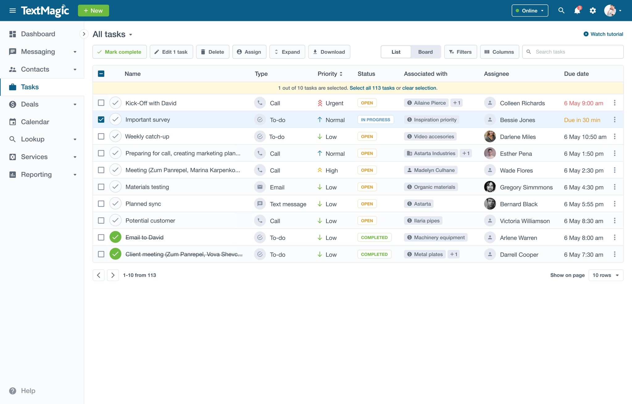
Viewing modes
Different workflows require different levels of detail. Offering compact and expanded views — or list and grid modes — can let users remain flexible and easily adapt the interface to their task.
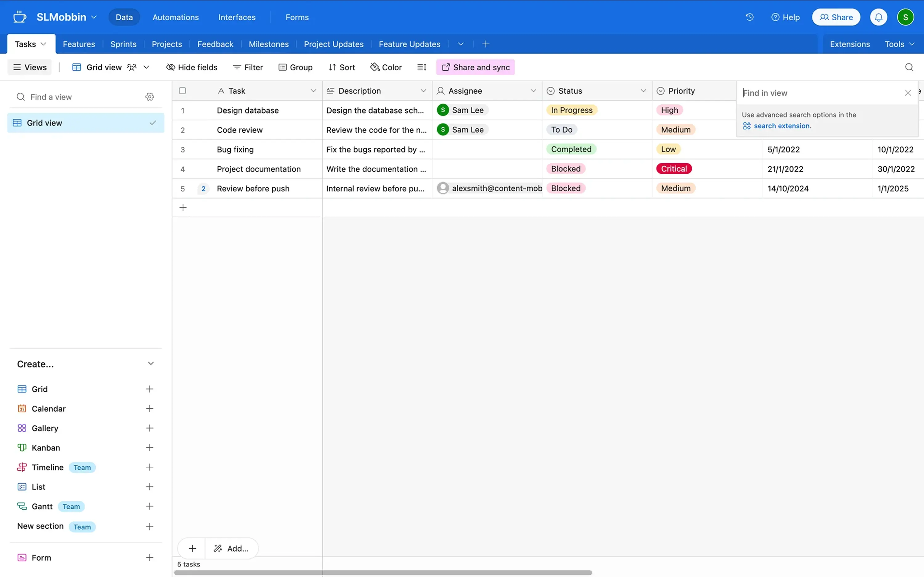
Provide alternative viewing modes when users may need either quick scanning or more visual context.
Empty and loading states
When no data appears, the interface should guide the next step instead of showing blank space. Use empty states to explain what users can do next — for example, creating their first item or adjusting filters.
During loading, employing skeleton screens or progress indicators can help maintain user orientation.
Action clarity
Well-designed tables don’t just present data – they support confident decision-making.
So as for the last aspect, make sure actions within each table row are unmistakable. Keep common item actions — such as edit, rename, or delete — clearly accessible within each row. Icons alone can create unnecessary hesitation, so combine icons with labels or tooltips when clarity matters. Destructive actions should always be visually distinct and, when necessary, confirmed.
Navigation systems
Navigation defines how users move through a product. When it’s clear, users feel oriented and in control. But when it’s not, even simple tasks become frustrating. Therefore, consider the following:
Multi-level logic
Strong navigation often starts with multi-level logic. Overall, sections should reflect how users think about the product, not how teams structure internal features. In practice, keeping navigation to about three or four levels per page helps maintain clarity and prevents users from getting lost.
Design primary categories to feel distinct, while making sure secondary levels group related functionality without overwhelming the layout. Higher levels should define the main product areas, while lower levels surface related tools and actions.
Collapsible sidebars
In complex SaaS systems, sidebars often hold multiple modules. Employing collapsible navigation can help balance density and clarity, allowing users to focus while still accessing deeper levels when needed.
Highlighting active states
Users should always know where they are. Clear active states — through color, weight, or background change — reinforce orientation and reduce cognitive load. Highlighting both the current page and its parent section helps users understand their position in the hierarchy. Without them, navigation often feels ambiguous.
Avoiding over-nesting
Well-designed navigation doesn’t just connect pages. It communicates structure — and helps users move confidently through the product.
Over-nesting forces users to click through multiple layers to reach core functionality. If important actions are buried too deeply, efficiency drops. Whenever possible, keep frequently used sections close to the top level and avoid deep navigation paths.
Forms
Forms are where users commit — creating accounts, updating settings, submitting payments, and configuring systems — and their progress resulits in good conversion rates. Therefore, any small UX issues here quickly turn into frustration and lost opportunities.
Strong form design should begin with clarity through:
Clear labels
Overall, labels should remain visible at all times. Disappearing placeholders force users to rely on memory and increase errors. Yet, employing persistent labels helps reduce cognitive load and improve accessibility in UX.
Active field states
Every field should clearly communicate its state — default, focused, error, success, or disabled. Visual feedback reassures users that the system is responding and prevents user hesitation.
Validation clarity
Validation should guide users, not silently punish them. Real-time feedback helps prevent mistakes before submission and allows users to stay confident. Designing error messages to explain what went wrong and how to fix it — not simply highlight a field in red — helps users feel in control. Whenever possible, validate inputs as users type and use input types that match the data being requested (such as email, number, or phone) to reduce errors.
Logical grouping
Well-designed forms don’t just collect data. They reduce uncertainty — and help users move forward with confidence.
Group together related fields in a way that reflects how users think. By breaking long forms into clear sections, you ultimately make them easier to scan and complete. When forms become complex, consider splitting them into steps or sections so users can focus on one task at a time.
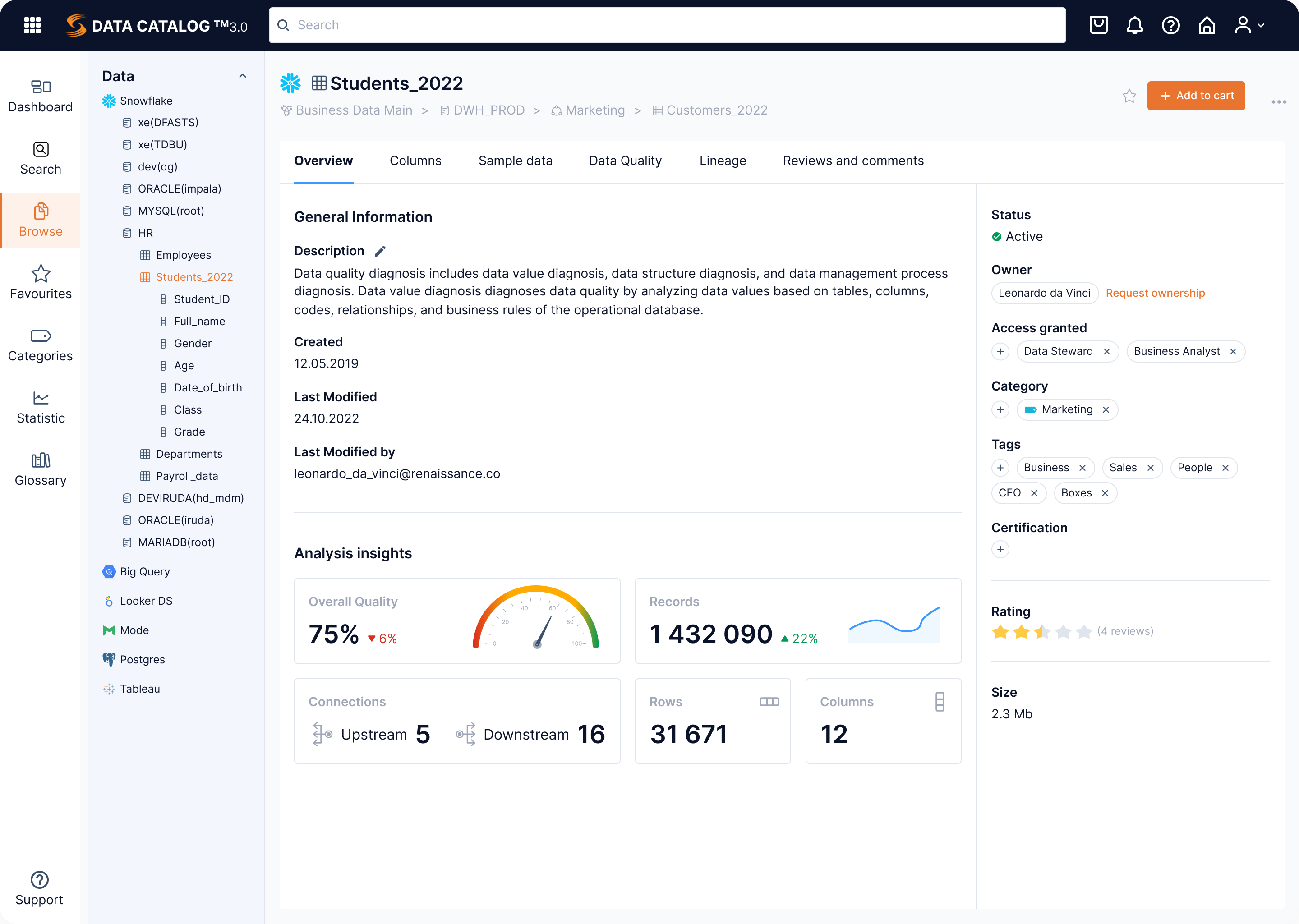
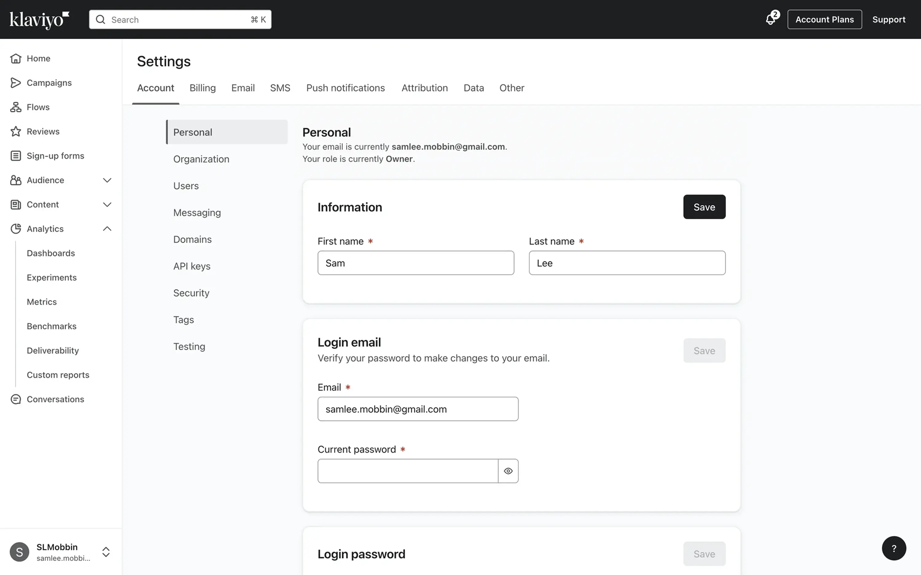
Profile and settings
This section plays a critical role in user centricity and trust. Profile and settings areas often tend to expand over time — and without structure, they can quickly become cluttered.
As you design them, make sure to consider the following:
Security and privacy visibility
Users expect transparency around passwords, sessions, connected devices, and data permissions. Security controls shouldn’t be hidden deep in submenus. Keep core security actions — such as password updates, two-factor authentication, and session management — easy to find and clearly explained.
Clear visibility into account activity, two-factor authentication, and privacy settings can dramatically reinforce user confidence.
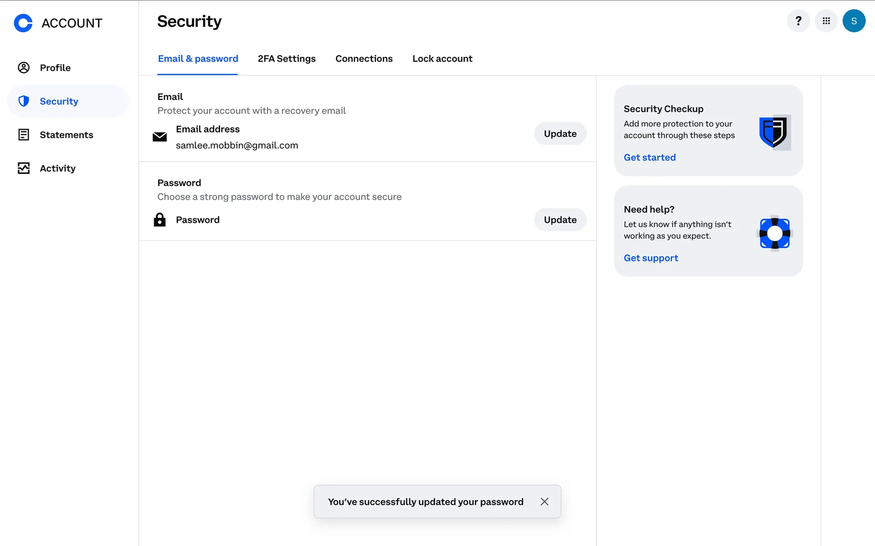
Account vs organization separation
In SaaS products, especially, it’s essential to distinguish between personal settings and organizational controls. Users should clearly understand what affects only their profile and what impacts the entire workspace. Separating these areas into clear sections or navigation levels helps prevent accidental changes to shared settings.
Mixing these creates confusion — and can lead to costly mistakes.
Bonus point: don’t forget an audit in your scope
Settings are often treated as an afterthought, but they shape long-term usability. As products grow, new controls are added without rethinking the structure. Periodically reviewing and reorganizing settings helps keep them understandable as the product evolves.
Regular UX design audits can help maintain clarity and prevent settings pages from becoming fragmented – so they do what they're meant to – communicate control, responsibility, and trust.
Reports and analytics
Dashboards and reports should begin with a simple question: What decision is the user trying to make?
Users don’t open analytics to admire charts. They open them to evaluate performance, identify problems, or choose the next step. Given that, design metrics around clear decisions — not around what data is available. A good dashboard should surface the most relevant signals first and help users quickly move from insight to action.
Avoid decorative-only charts
Visuals should clarify, not decorate. Complex graphs, excessive color, or unnecessary animations can distract from insight. If a chart doesn’t support a decision, it’s noise. Choose visualization types that match the metric — for example, line charts for trends over time, bar charts for comparisons, and tables for detailed datasets.
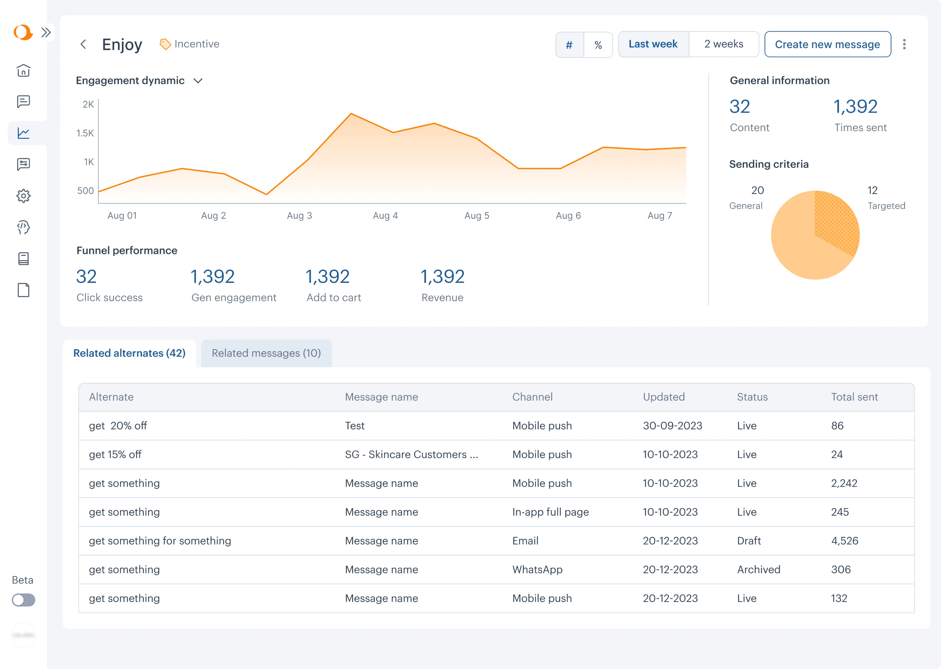
Provide context
Numbers without context are meaningless. Design date ranges, comparison periods, metric definitions, and data sources to always stay visible. Because in dashboards, users should never have to guess what a number represents. Showing change indicators, comparison periods, or targets can help users immediately understand whether performance is improving or declining.
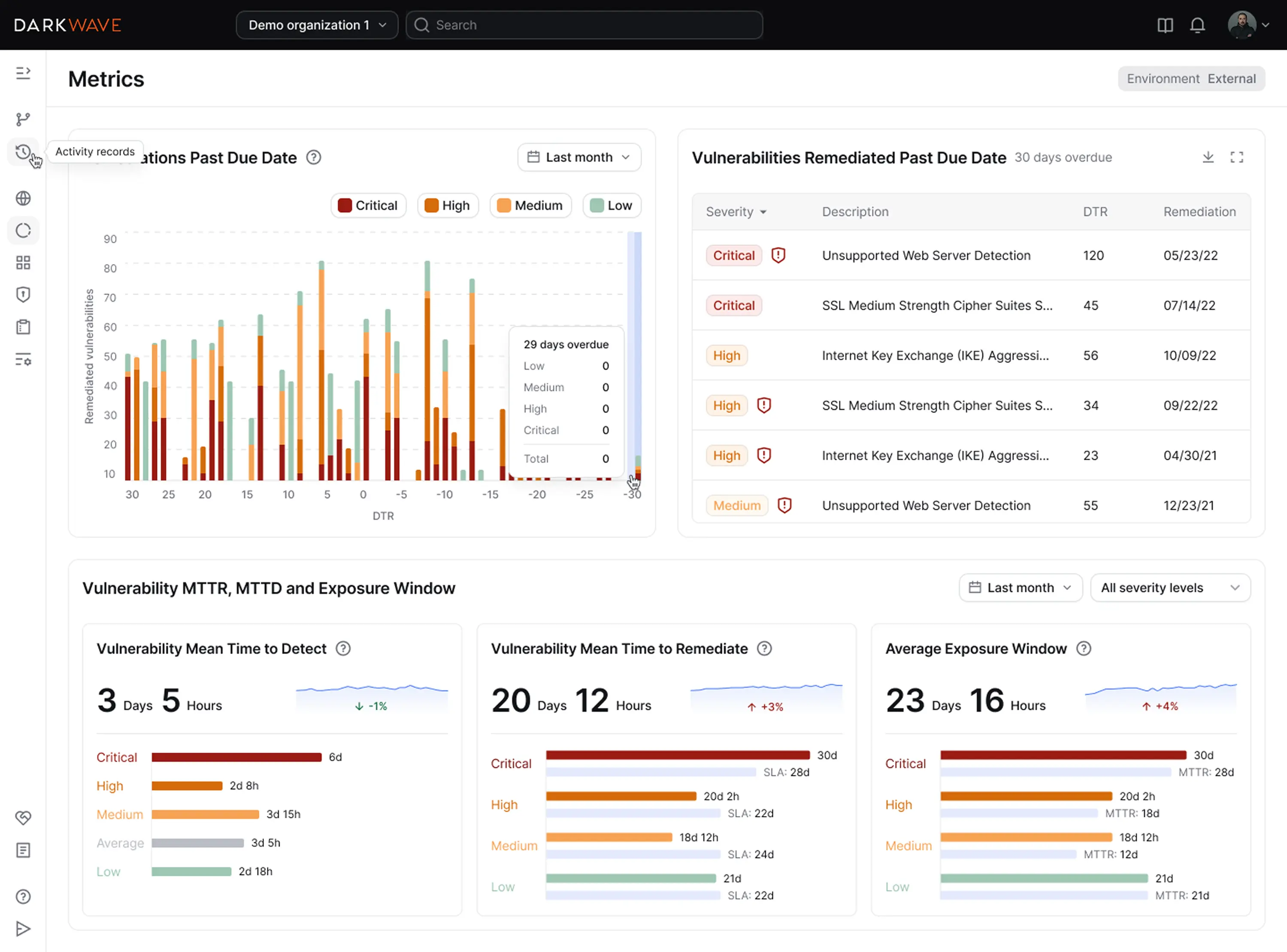
Data density vs readability
Some users need detailed views; others need summaries. The right balance between data density and UX readability depends on the workflow. Too much data overwhelms, but too little forces extra navigation. Your goal here is to achieve a state of structured density — UI that remains easily scannable. Grouping related metrics and organizing charts within a clear grid helps users scan dashboards faster.
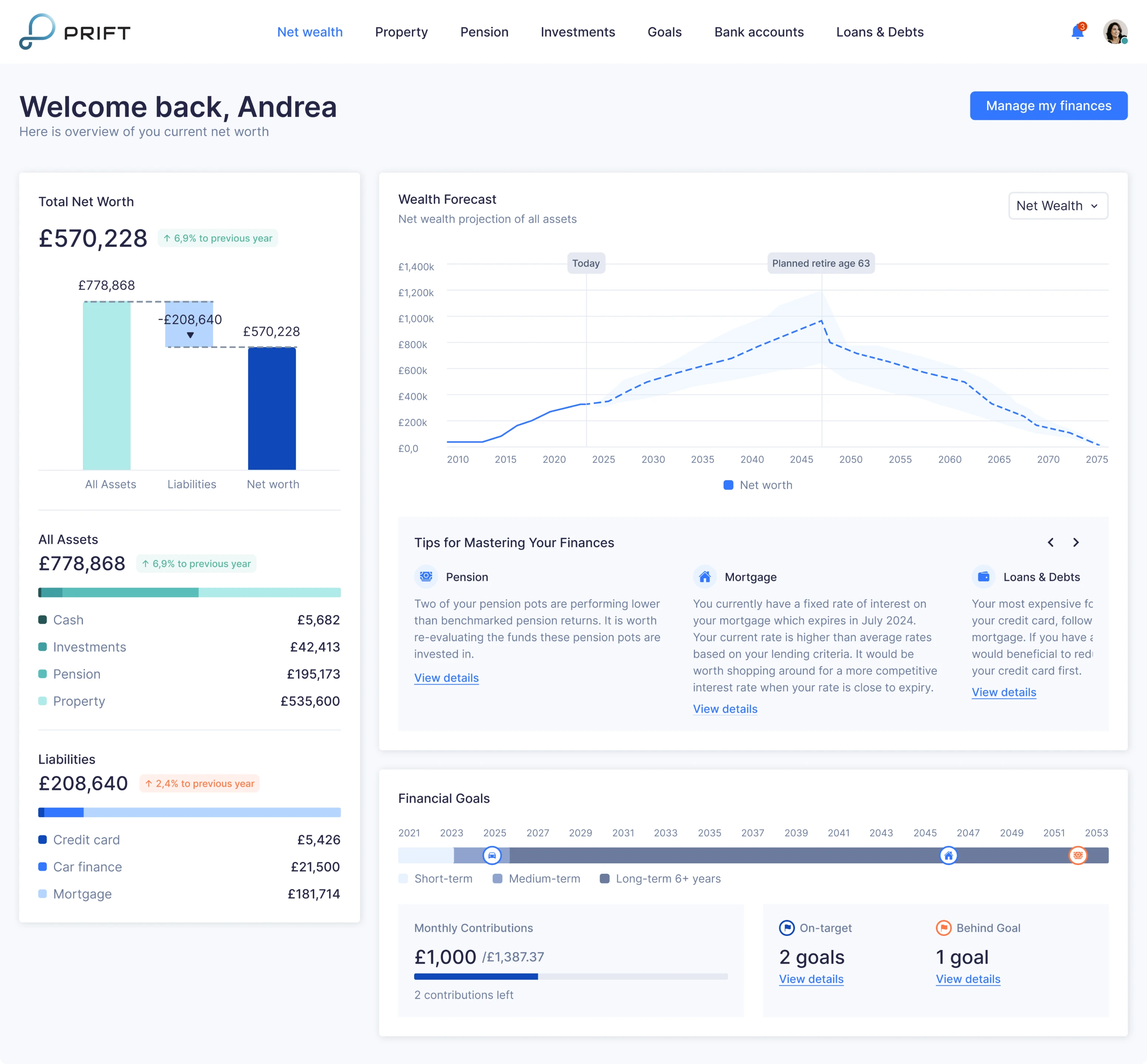
Afterall, minimalism isn’t always the answer in analytics. Hiding filters or collapsing metadata may look cleaner but reduce clarity. But in reporting interfaces, context often matters more than visual simplicity.
When UX design principles and best practices meet context
UX best practices and UI/UX design principles don’t exist in isolation. They come alive only when applied within a specific product, for specific users, solving specific problems.
When done right, UX helps teams create products that feel intuitive, efficient, and aligned with real needs.
Cognitive principles explain how people think. Interface patterns show how those principles take shape. But context — product complexity, user goals, risk, constraints — determines what the right decision looks like in each situation.
That’s why strong UX design isn’t about memorizing rules. It’s about understanding trade-offs.
It’s about knowing when to simplify and when to explain. When to reduce friction and when to introduce it. When consistency helps — and when it hides a deeper problem.
Best practices are most powerful when they’re grounded in psychology, tested against reality, and adapted deliberately.
Because in the end, user experience isn’t about following conventions.
It’s about helping users move forward with clarity and confidence – and good UX design KPI will follow.
Design patterns can significantly improve usability and conversions — we’ve seen this firsthand at Eleken UI/UX agency across over 200+ projects. If you're unsure which direction to take, want to avoid generic templates, or aim to create a truly distinctive interface for your product, please contact us. Our UI/UX designers will identify and implement the solution that best aligns with your specific business needs, helping you enhance user experience by tying together all essential elements your product UX needs.


.png)