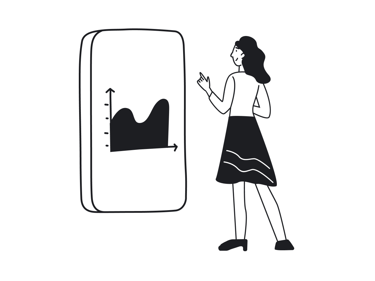
Not every product using data qualifies as a “data product.” Here's what actually sets them apart, and what you should know if you want to design one.
Almost every “serious” product today uses data integration in some way—big data, small data, smart data, you name it. So is it even helpful to single out certain products as “data products”? There’s no absolute answer, but practically speaking, it makes sense to set some boundaries.
Here’s how Simon O’Regan, a data and design professional, defines them:
Data products are those whose primary objective is to use data to facilitate an end goal.
This definition marks the difference between products that simply use data and those truly focused on data. But where does this leave UX design? Are data products subject to traditional human-centered design principles, or is there something else going on?
Let’s dive in and find out.
What exactly are data products? (and what they’re not)
Before we begin designing data products, let's first clearly establish what they really are—and equally importantly, what they’re not.
According to Simon O’Regan’s definition we mentioned earlier, data products have a specific goal: they leverage data directly and primarily to help users achieve specific outcomes.
But that immediately brings up a critical question: does traditional UX design fit here?
Simon O’Regan himself notes that standard human-centered design principles don't always directly apply to data applications. How can that be?
It doesn’t mean successful data products follow entirely opposite rules—just that they’re uniquely sensitive to user context and expertise.
At Eleken, we fully embrace human-centered values, but we also strongly advocate tailoring design to the specific needs and abilities of target users. This often creates a common tension in human-centered design: designers strive to simplify interfaces as much as possible, assuming simpler equals better. But what happens when simplicity gets in the way?
Take a look at this design:

There is so much going on: three graphs, numerous indicators, and just many, many numbers. Based on the principles of human-centered design, this dashboard would be considered cluttered and confusing. If it was a dashboard of a fitness tracker app, for instance, showing so much data would be a disaster for usability. Even if a fitness tracker uses lots of data, it wouldn’t show it all on the same screen.
This screen is an oil & gas drilling dashboard. It is used by professionals who need to see all these graphs and numbers to do their job. If a designer hides it behind a drop-down menu (a classic method of human-centered design), users would be annoyed and it would actually worsen user experience. That's why, as a wiseman once said:
There are products that just need complexity, and we have to understand that.
Ihor Bilyi, UI/UX designer at Eleken
At Eleken, we still think that human-centered design goes first, but it should not be used blindly. Both complex and simple designs need to respond to specific user's needs. Here are some examples of each data products’ group (we use the classification by Simon O’Regan).
Matching design complexity to user expertise
At Eleken, we've learned that data products often serve specialized user groups who value detailed, immediate data access over minimalistic aesthetics. Here are some examples from our own practice, showing how different types of data applications influence design choices:
Raw data products
This one is the most basic treatment of data: it is presented as it is, with almost no processing, prioritization, data analysis, or special visualization. To work with this kind of product, a user is expected to have knowledge of working with data.
Raw data needs input from the user, it doesn’t present any ready solutions. Since our persona here has probably worked with massive amounts of data before, the interface can follow the best practices of “raw data” products instead of trying to be intuitively understandable for everybody.
In our practice, we’ve had a case of working with a raw data product. Reform by Slamdata is a “simple” but highly efficient software that processes data from different sources to transform it into different formats, and makes it ready to be processed at the next level: for example, by analysis software.

For this design, we placed many cards on one screen and added a preview of the database table below. If it was software for data consumers with different levels of user capacities, so having so much information on one screen might not be the best solution. However, with data products, it works perfectly. The design is still less cluttered than most of the professional software that people are used to, which is a key goal when you design data-heavy applications for power users.
Derived data applications
This type of data product presents data with some added relevant information. An example can be a classic CRM software: a user can see data as they are, or sort them by additional parameters, produced by the software (hot/cold client, e.g.).
The task of the design here is to find the opportunities for the use of this derived data, and show it in a way that is more clear and visually appealing. It is likely that people who would be using this software are not professional data users and therefore need some more intuitive solutions. Enhancing the data product UX in this context means making these derived insights the hero of the interface.
Algorithm-based data products
At this stage, we can say that the product is even more algorithm-focused than data-focused. At each step further from raw data products, we shift from users’ data manipulation to automatic data processing. Following the same direction, design becomes more user-friendly (broadening the circle of potential users) and visually understandable.
Shazam is an example of an algorithm product where the data and processing are hidden: we give input and receive the result. Yet, algorithm products can look way more complex.
Let’s take a look at an example of an algorithm from Gamaya, an agricultural data analysis platform. Pictures from drones are processed to find the numberof planting gaps. In our design, we visualized gaps right on the map, separated territory into squares, and showed all the new data about the selected square: percentage of gaps, sizes. This specific approach to geospatial UX allows users to see algorithmic results directly in their physical context.

Gamaya is not solely an algorithm product. It has many functions, data sets, and options for usage. Its job is to collect new data from open sources, process it, analyze it, and present it to the user in a way that helps optimize its business. And here we come to next data types.
Decision-support products
These products show data, analyze it, and present their data analytics. Yet, the decision is to be taken by the user. We have worked with some products of this kind. In the design of decision support products, we focused mainly on the presentation of sets of data to the target audience, visualizing it in a way that is most comfortable for reading, understanding, and data-driven decision making.
Here is a dashboard of Tromzo, a code security app. It gathers analytical data about all the vulnerabilities found in code and shows the situation in each repository, multiple teams, and projects. We used a big font to make an accent on key numbers, such as new vulnerabilities, and percentage of repositories coverage. Green and red numbers show dynamics compared with the previous week, and the graph shows a general trend. This focus on clarity is a hallmark of effective data visualization design, as it allows stakeholders to spot critical shifts at a glance.

Like many other products, Tromzo manages data collection and offers a way to manage it, in this case, set workflows that fix vulnerabilities in code automatically. This is a common thing for many products: serving data while presenting a solution to a specific problem.
Automated decision-making
These products require minimum input from the user. You can receive results without having to make any decisions. This is how all the recommendations work on YouTube Music, Netflix, and so on. Users have no impact on suggestions of films or music.
Automated drones also work on the basis of automatically processed structured data. The range of products can be very different, and so is their design process. Compared to raw data products described above, this category would be much easier to use for people of different levels of tech capabilities.
How to approach designing data products (step-by-step)
Great, we've clarified what data products are and how their UX design differs from traditional digital products. Now, let’s talk specifics: how do you actually approach designing a data product from scratch?
%20-%20visual%20selection.png)
At Eleken, we've found that a clear step-by-step approach helps us consistently deliver valuable, user-focused data products. Here’s our simplified framework you can follow too:
Step 1: Clearly define your use case first
Before even thinking about visuals, data sources, or marketing strategies, do a market research and clearly articulate your use case. This means starting with the end-user in mind:
- Who exactly will be using this data product?
- What specific problem does it solve for them?
- What decision making process will it enable?
For instance, when we designed Tromzo’s security dashboard, the clear use case was:
“Enable product managers and development teams to instantly prioritize and address critical security vulnerabilities in their codebases.”
Without this upfront clarity, you'll likely come to impressive-looking but ultimately ineffective product assumptions.
Step 2: Map out the required data and its sources
Once you know the user's needs, clearly map out:
- What analytical data is needed to solve the identified pain points?
- Where does this necessary data come from? (internal databases, APIs, user inputs, etc.)
- How frequently does this data need updating? (real-time, daily, monthly?)
In Gamaya’s case, we knew our data came from drone imagery and required regular, precise updates. Clear data mapping ensured the right data product architecture, especially for geospatial product design where spatial accuracy is paramount.
Step 3: Determine the right complexity level
Next, decide how much complexity data consumers truly need:
- Raw data product users: Typically expert users who expect deep complexity.
- Decision-support product users: Mid-level complexity balanced with intuitive visual guidance.
- Automated-decision product users: Minimal complexity; typically consumer-oriented, simplicity prioritized.
Remember our oil & gas drilling dashboard example? It perfectly illustrates that complexity itself isn't bad as long as it matches customers' expectations and expertise. High-quality dashboard design isn't about removing data, but about organizing it for the right audience.
Step 4: Prioritize clarity, even within complexity
Complexity doesn’t have to mean confusion.
Your interface should still:
- Clearly highlight critical data points.
- Use visual hierarchy effectively to guide user attention.
- Minimize unnecessary cognitive load—avoid decorative elements or irrelevant visual clutter.
For example, our Tromzo dashboard carefully balanced comprehensive data visibility with visual clarity. Critical information, like new vulnerabilities, was emphasized clearly to help data consumers make rapid, informed decisions.
Common mistakes in data product design (and how to avoid them)
Designing data products isn't straightforward. At Eleken, we've built numerous data products, and through this journey, we've spotted common pitfalls teams repeatedly run into. Here's our structured process, along with practical ways to dodge these traps.
Mistake #1: Oversimplifying interfaces for experienced audience
Designers naturally strive for simplicity, but when designing tools for professionals, oversimplifying can cripple usability.
In designing Vector0, a cybersecurity MVP, we discovered that security analysts required immediate visibility of detailed threat data to rapidly identify patterns and respond to potential issues. Instead of overly simplifying, we opted for clarity within complexity by making essential threat indicators immediately accessible rather than buried behind menus.

How to avoid it:
Understand deeply how experts work. Don’t strip away complexity automatically — ensure experienced audience has crucial details instantly visible.
Mistake #2: Ignoring non-technical user needs
It’s easy to assume that digital products are built only for experts, especially when the product sits in a technical space like data, HR tech, or analytics. But in reality, more and more non-technical users rely on these tools every day.
Take MyInterview, a video interview platform that faced a 90% candidate drop-off rate mid-interview. The issue? The interface was overly technical and confusing for its main users — job candidates, many of whom weren’t tech-savvy.
.png)
The platform’s complex multi-select inputs and unintuitive navigation caused frustration and abandonment. A technically solid implementation completely overlooked the human experience.
After redesigning the input flows, applying familiar UI patterns, and improving responsiveness, the drop-off rate dramatically decreased.
How to avoid it:
Identify who your actual users are, not just what they do, but how comfortable they are with technology. Then, design for their confidence level:
- Use clear, familiar interaction patterns instead of clever or complex ones.
- Simplify workflows and reduce unnecessary decision points.
- Prioritize clarity and predictability over advanced functionality.
A product that feels effortless to use will always outperform one that feels “powerful” but confusing.
Mistake #3: Neglecting clear data context and documentation
Even experienced users need clear context. Without proper labels, documentation, or data context, even powerful tools can become useless or frustrating.
For Data Streams, a data management product expanding globally, clear documentation and structured information were critical. Users across diverse regions required straightforward data handling instructions and clear contexts for data flows, prompting us to prioritize explicit labeling and intuitive documentation within the UI.

How to avoid it:
Always provide contextual clues, clear labeling, and easy-to-access help resources directly within your interface.
After launch: ensuring your data product stays valuable
Designing and launching your data product isn’t the finish line, it’s just the start. Now your job is to make sure it continues delivering value long-term.
At Eleken, we’ve helped multiple data-driven products evolve sustainably post-launch. Here are four essential ways to ensure ongoing success.
Set clear Service Level Objectives (SLOs)
SLOs define clear, measurable targets around data quality, accuracy, and availability. Without them, it’s impossible to objectively determine if your data product is meeting user's business needs.
- Clearly define what “good enough” means for your users (freshness, accuracy, uptime).
- Regularly review these objectives to ensure they remain aligned with user expectations and product usage.
Establish Independent Ownership & Maintenance
Clearly defined ownership is crucial. Without designated owners, responsibility for product updates and quality maintenance quickly becomes unclear.
- Assign a dedicated team or individual responsible for regular updates and overall performance maintenance.
- Empower them with clear decision-making authority and resources to ensure rapid and effective action.
Continuously Gather User Feedback
Constant user input is your best tool for product evolution. Without ongoing feedback, it’s easy to drift out of sync with audience needs.
In the ongoing development of products like Vector0, regular feedback sessions ensured that new features remained tightly aligned with actual peoples' requirements, preventing unnecessary complexity or irrelevance.

- Set up regular feedback loops (interviews, surveys, usability tests).
- Use feedback not just reactively, but proactively, guiding product strategy and future iterations.
Final thoughts
Looking back at our case studies, it seems that as soon as you start analyzing building blocks of software, most products appear to be data products. That is why data products are not solely meant for the use of data scientists.
Designing data products isn’t just regular UX design with extra graphs thrown in—it’s about deeply understanding your audience, clearly defining their context, and balancing complexity with clarity.
To build data products that users truly value, remember these essential takeaways:
- Not every data-heavy product qualifies as a data product.
True data products are serving data to drive specific, meaningful outcomes. - Complexity isn't the enemy, it just needs careful handling.
Your goal isn't necessarily to simplify everything but to provide exactly what your audience need, even if that means embracing complexity. - Always design with context in mind.
Whether your target audience is highly technical experts or non-technical end users, clarity and context are essential. - Avoid common pitfalls by staying user-focused.
Don’t oversimplify unnecessarily, neglect clear documentation, or overwhelm end users with irrelevant complexity. - Keep your product valuable post-launch by:
- Setting clear SLOs.
- Clearly defining ownership.
- Regularly gathering user feedback.
Design solutions presented in this article can be used in different products that use data, as well as in others. Whether we use human-centered principles or not, the most important is to adapt our UX design services for the needs of the product. Contact us to talk about the solution that fits your product best.
FAQs
How to design a data product?
Start by defining a clear use case: identify the specific user needs and desired outcomes. Next, map out the data required and where it will come from. Then, decide on the complexity level based on your users' expertise—like we did with complex dashboards for oil & gas specialists or simplified visualizations for agricultural analytics (Gamaya). Finally, prioritize visual clarity, balancing complexity with ease of use.
What is an example of a data product?
An example from our practice is Tromzo, a decision-support tool that gathers and analyzes data units about vulnerabilities found in code, presenting it clearly so users can quickly understand the security status and act accordingly.
What are the 4 stages of product design?
Based on our approach at Eleken, these stages are:
- Define use case and user context
- Map data and sources
- Determine appropriate complexity
- Prioritize clarity and usability in the UI


