It's not just a coincidence that there are so many articles, courses, and techniques on how to manage your time. In any business or job, especially for a startup or freelancers, your most valuable resource is time.
You track time to understand how many projects you can work on, learn whether you'll manage to complete tasks on schedule, see how productive your employees are, charge your clients accurately, and so on.
While in the past, people used a pen and a notebook as the only time control system, now time tracking applications have replaced this manual method.
Apart from obvious benefits, such as increased productivity and more efficient time management, time tracking tools allow you to find a better work-life balance (which is especially relevant for those who work from home) and learn how to accurately charge for your projects.
But how to create such software that'd bring all the above-mentioned benefits of time tracking?
When our SaaS design team was working on a time tracking app design called Tymewise, we came to the conclusion that “first and foremost, a tool designed to track time should value customers' time they spend to figure out how the tool works”.
With this idea in mind, we wanted to design both functional and user-friendly software with a clear UI. And in this article, we're going to share what we've learned on the way to this goal.
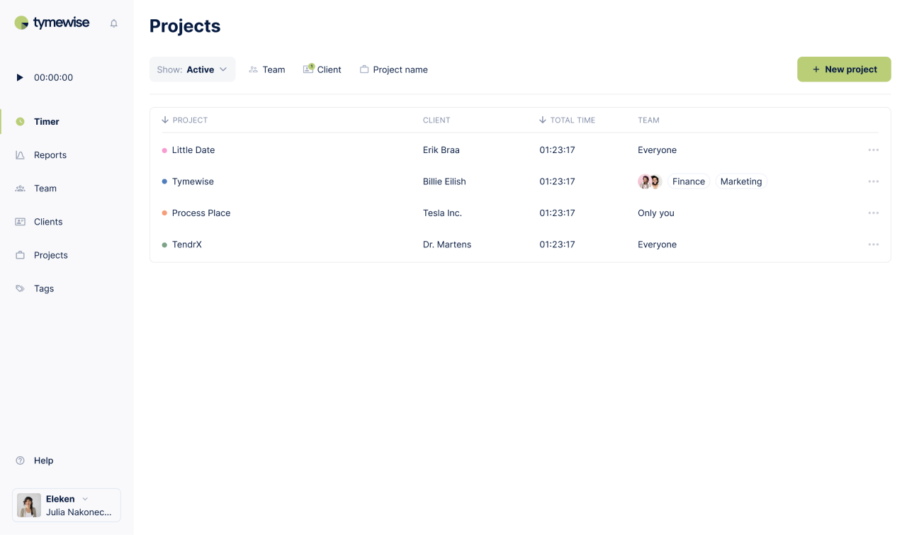
Key functional components of a time tracking app
When users only start searching for a tool that can help them control time, they already have some expectations about what the app's supposed to do. Meeting those expectations is crucial because if your time tracking app has features customers want to see, they take it for granted, but if you forget about at least one of them, it leads to strong user dissatisfaction.
Timer
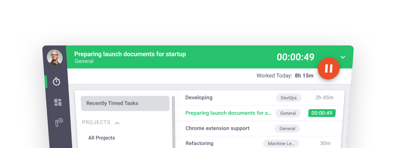
The timer's task is to measure how long it takes you/your employees to complete different tasks.
For better convenience, make sure your software provides a possibility to filter the measurements according to tasks, projects, tags, and others.
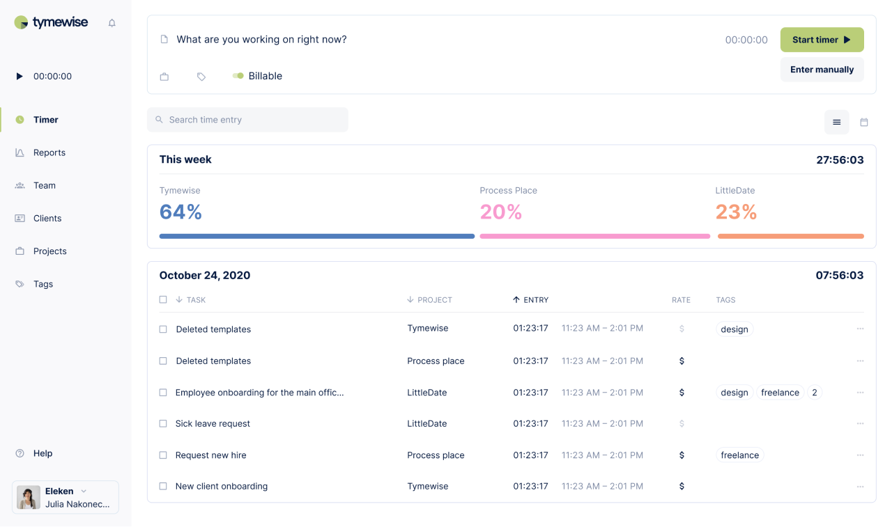
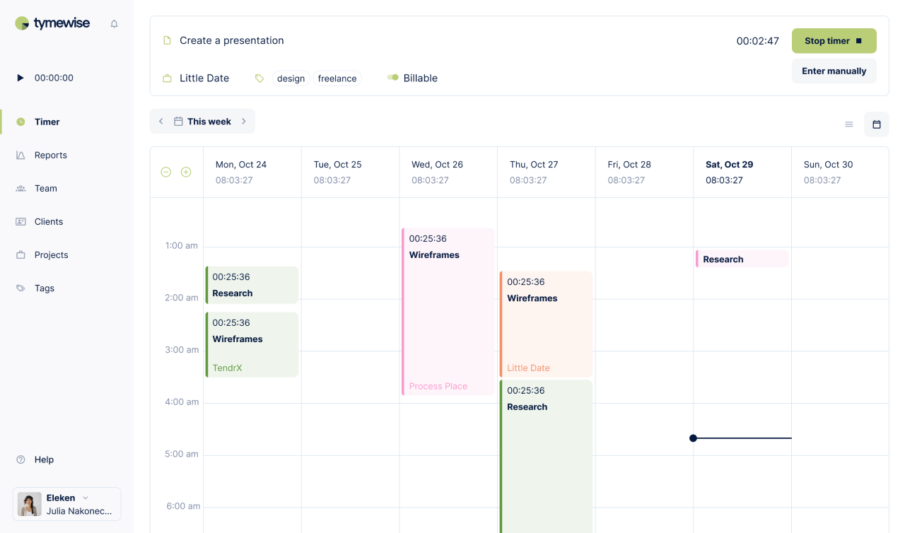
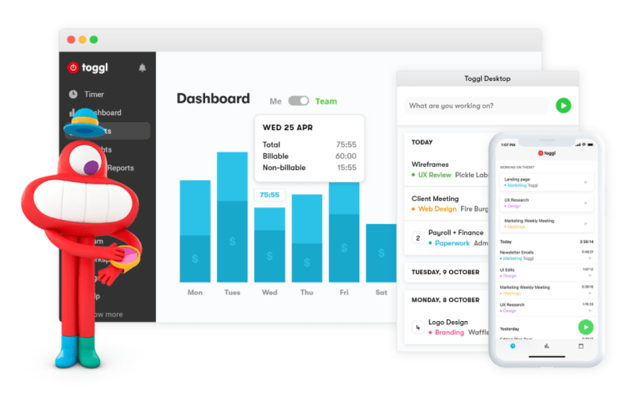
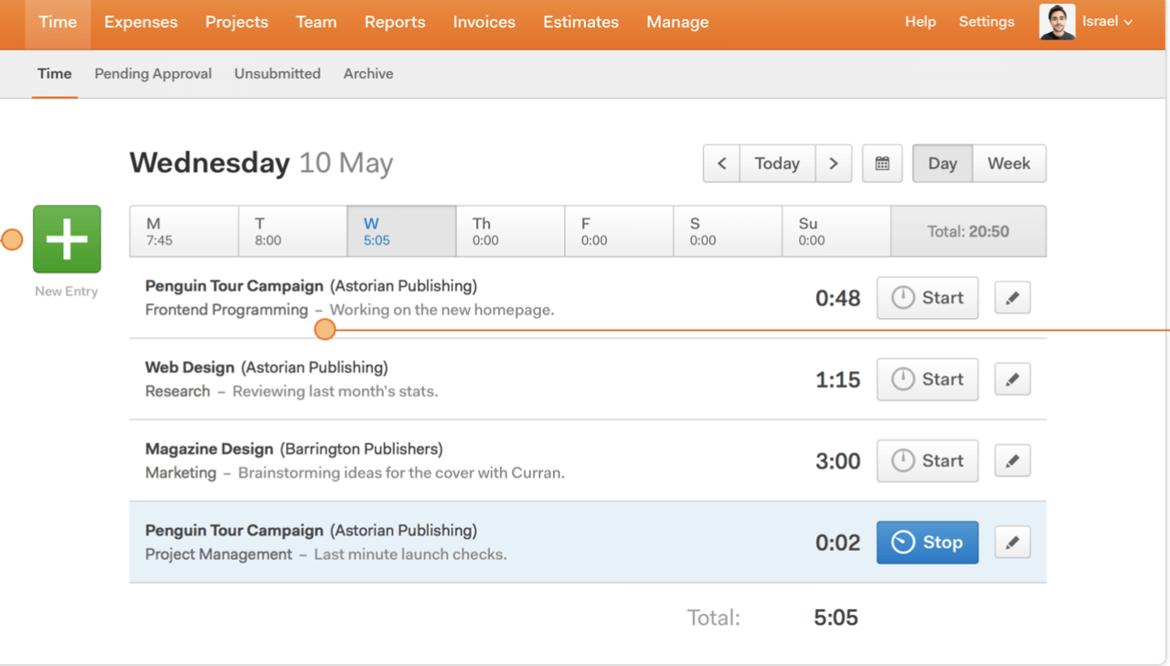
For example, for Tymewise, to provide the best way to track time spent on projects, we at Eleken designed a clear and easy-to-use Timer screen that is not overloaded with any unnecessary information. You can name the task, choose if it's billable or non-billable, create tags, and start a timer with one click on a contrast green CTA button (or enter time manually).
As well, the screen contains a quick overview of the weekly progress in two modes: chart statistics and calendar (see pictures below).
The timer feature allows:
- Increase productivity. By monitoring and then analyzing the time that you spend on various activities/tasks, you can define the greatest time-consumers/distractions and based on this information, understand how to improve your workflow.
- Make better profits. Learning how much time you spent on different tasks within one project lets you figure out what jobs take the most resources and what projects are more profitable. This knowledge helps you put the right priorities on tasks that bring more profit.
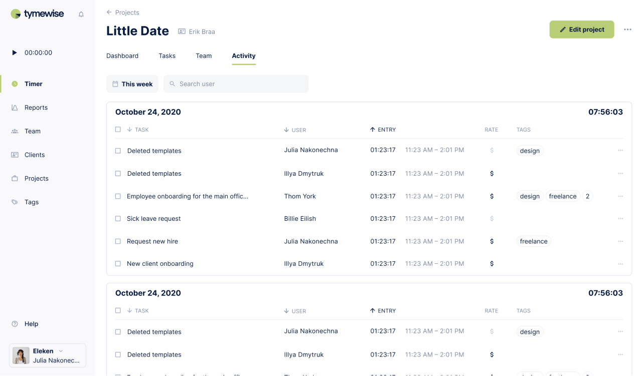
Reports
As we've already mentioned, to come up with ideas on how to improve productivity and eventually profitability, you have to analyze the data you track. For this reason, gathering analytics and generating reports is the next must-have feature of a time tracking system.
Time reports functionality usually provides information on:
- The total amount of work time spent daily/weekly/monthly
- Reports about specific tasks/projects and your employees' contribution to them
- List of tasks you've worked on and the time you've spent on them
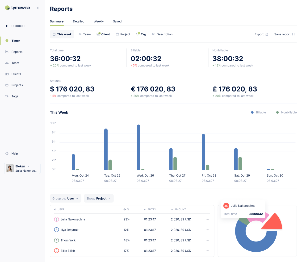
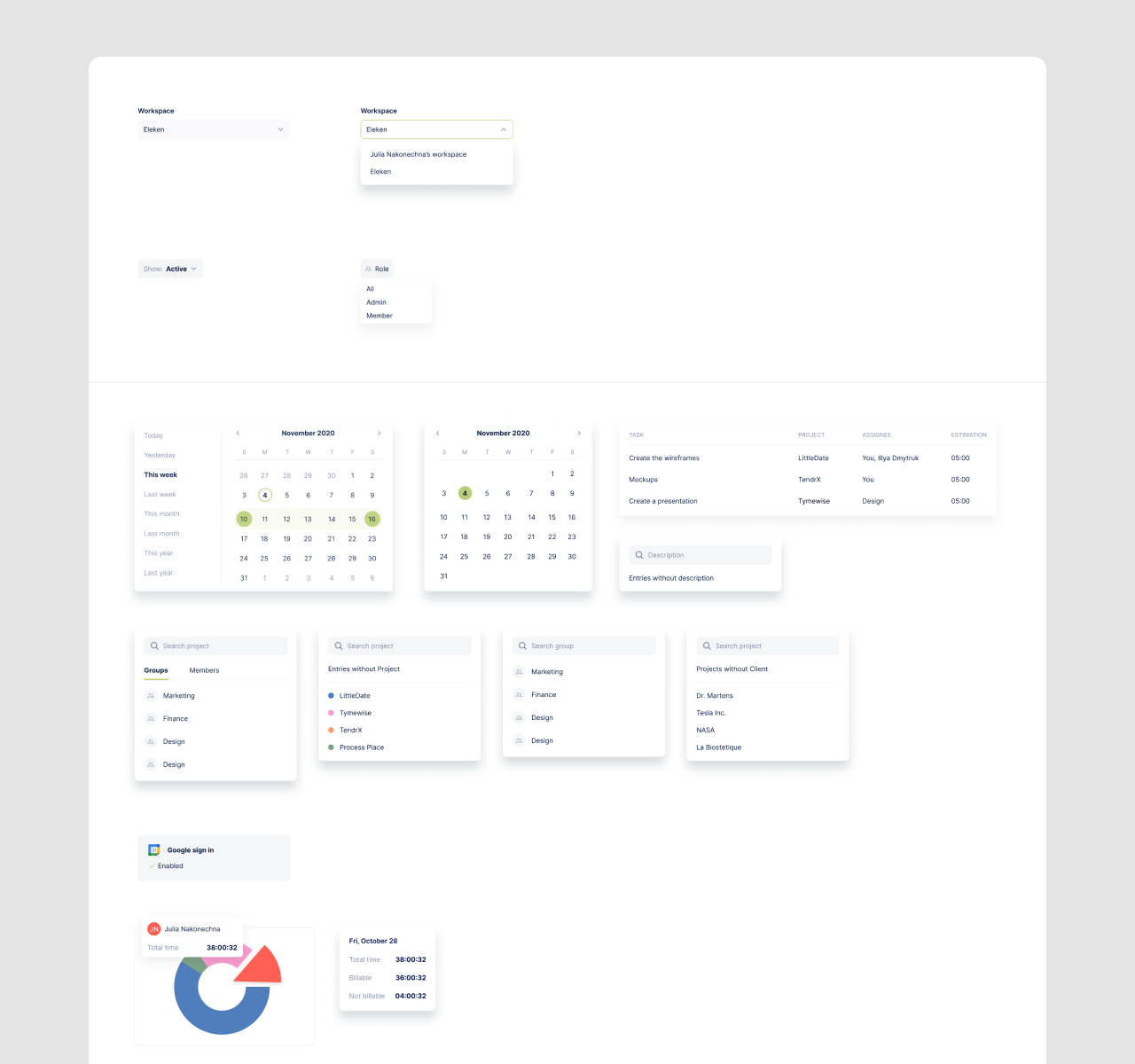
Getting back to our Tymewise case, to make complex analytical data easy to perceive, our product designers thought out different ways of visualization: bar charts for the daily summary and table/pie charts for per-user (project, client, group, user, or tag) data.
As well, except for total time spent, users can view the amount of money earned on the Report screen, and see how the indicators have changed in comparison with the last week in percentage terms. And of course, we included "Save" and "Export" functions to work with data outside the app.
Reports transform indecipherable loads of data into usable information that allows you to:
- Evaluate your/your team's performance to understand if you manage to reach set goals or to identify what prevents you from achieving them.
- Decide if you need to expand your team so as not to overwork your current employees.
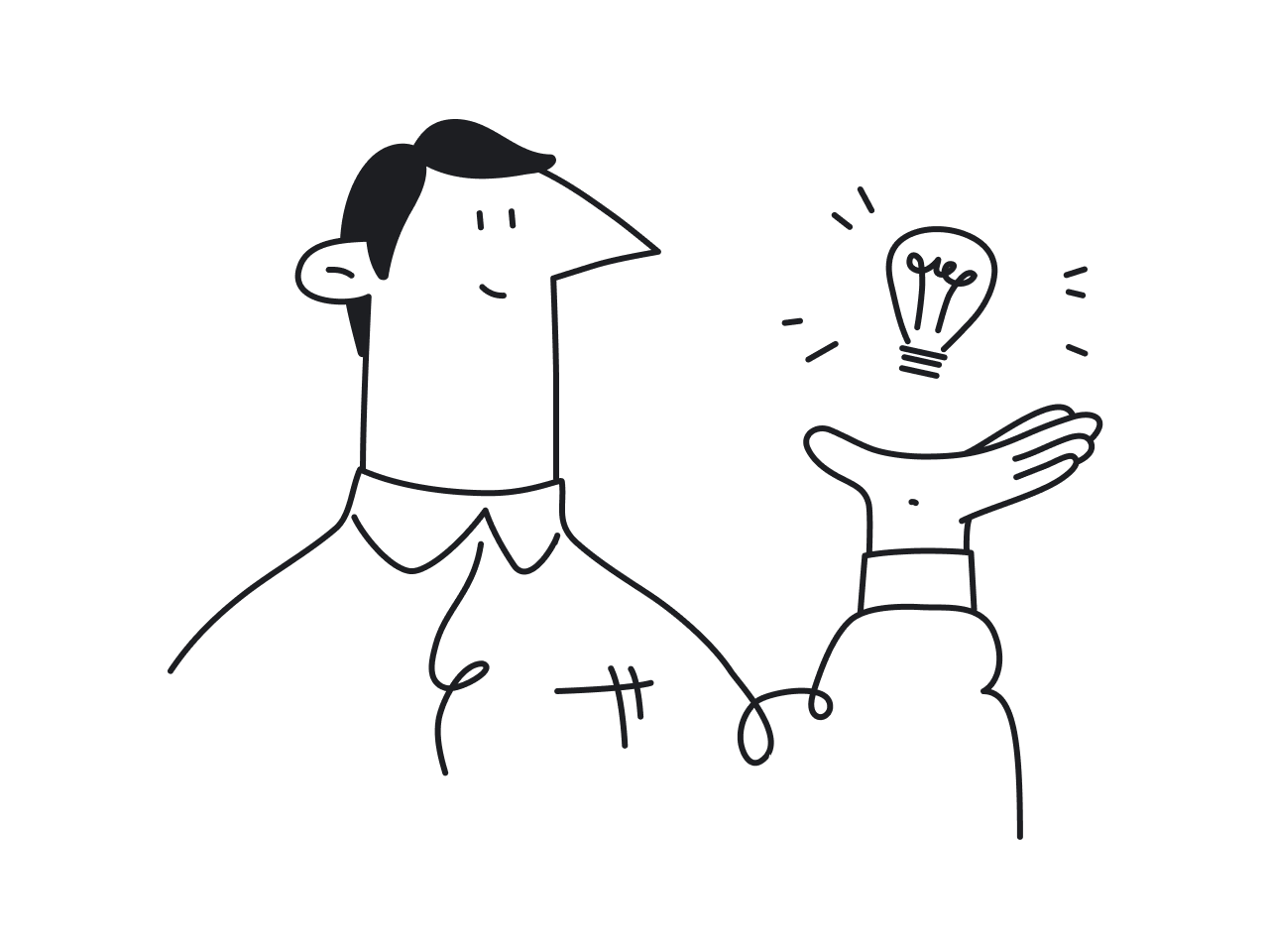
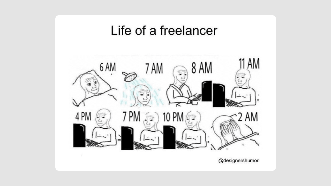
- Find work-life balance. Regularly monitoring what you spend your time on can help you create a better-organized daily routine and prevent you from living like this:
Invoices
This feature is especially relevant for those who charge their clients hourly. Based on your settings (hourly rate, billable time) time tracking app makes calculations and automatically generates invoices.
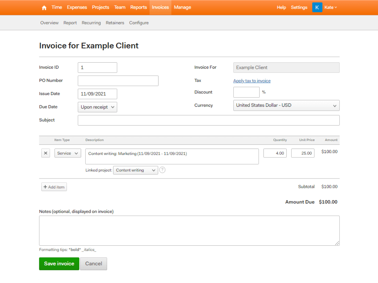
Here's how the generating invoice feature looks at Harvest: you just choose the client, decide what hours/expenses you want to invoice, and review the generated bill.

Ability to generate invoices:
- Saves time. You don't have to create invoices manually.
- Brings transparency to your clients. You don't have to explain to your clients why they were charged this or that way. This level of automated clarity is a fundamental goal of modern CRM system design, ensuring that billing and client relations remain seamless and data-driven.
Project management
Though there are various comprehensive solutions for project management on the market nowadays, adding basic project management functionality to your time tracking system will bring a lot of value to small businesses and freelancers.
Basic project management functions allow you to:
- Add team members and set their roles.
- Create and assign tasks.
- Make time estimations for each task.
- Track your/specific employee's activity.
- Track the project's overall progress.
Integrating these features ensures that your software acts as a centralized hub. Just as an ATS solves hiring problems by consolidating candidate tracking and team coordination into one platform, adding project management to time tracking eliminates the need to jump between multiple disconnected tools.
For instance, let's take a look at how easy it is to manage projects in Tymewise:
- Choose a specific project.
- View quick statistics of project’s progress.

- Go to the Task tab and click “Add task.”
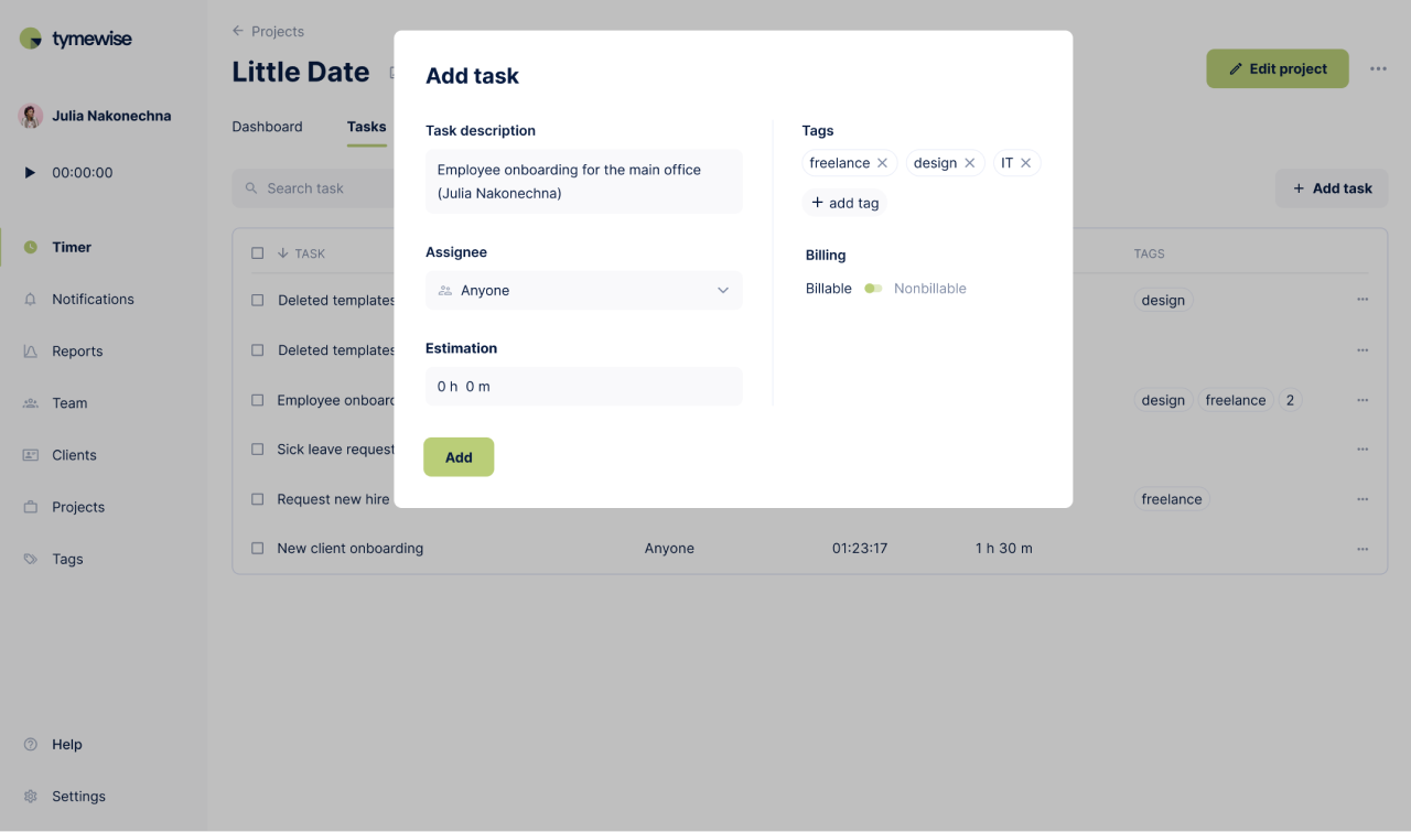
- Monitor general project activity, and more.
Project management features in time tracking apps help users keep track of all their projects, deadlines, employees, and goals.
Integrations
Third-party integrations make time tracking apps more effective. They play the roles of extra features that your users might need. Some of the most popular add-ons may be accounting tools, project management software, CRM system, messengers, emails, GPS trackers, and more.
Most time tracking systems now provide numerous integrations to their users. For example, here is not even the full list of Time Doctor's integrations, an employee monitoring tool:

The availability of trusted integrations makes your app more universal and valuable.
To sum up this whole section about core features, we want to say that it doesn't matter how many add-ons your application includes. The main thing is that it performs the basic functions that are important to each customer properly. This philosophy is central to workflow management software design, where the focus remains on reliability and core utility.
UX principles for designing time tracking apps
To cut a long story short, to bring value to its users, the time tracking system has to be visually appealing, user-friendly, and contain only essential functions. Now, let's dive into more details about what characteristics a good time tracker should possess.
Keep the interface simple
Having basic functionality alone won't make your product valuable. A good time tracking app should be fast and easy to use. You will not use an application that requires you to click five buttons that will take you through five submenus to just start tracking your time. The software should be simple enough and fit seamlessly into your workflow.
And here we'd like to again mention the lesson our team learned when working on the UI/UX design of Tymewise: users don't have to waste time every day managing the app that is supposed to help them spend their time more efficiently. An intuitive and human-centered design is what can bring harmony between the functionality and usability of your time tracker. Much like logistics software UX design, where every second of a driver's or dispatcher's time is critical, simplicity in time tracking prevents operational friction.
For that reason, we didn't want to choose between important features and a simple design. We designed all tabs in the Tymewise app to be clear and self-explanatory. Each of them replicates the Reports' main page design to keep overall consistency and not confuse users with different styles. This structural consistency is also a hallmark of secure software UX design, as it reduces the likelihood of user error that could lead to data mismanagement.
Minimize friction in core actions
Time tracking is a repetitive daily activity. If users need several clicks just to start or stop a timer, they will eventually avoid using the tool. The most critical actions in a time tracking app should require minimal effort and feel almost automatic. This need for efficiency makes it a smart software solution that adapts to the user's natural work rhythm.
Core interactions such as starting a timer, switching between tasks, marking time as billable, or adding manual entries must be:
- Easy to access from the main screen.
- Clearly labeled and visually distinct.
- Executable in one or two steps.
- Supported by shortcuts or quick actions where possible.
The faster users can log their time, the more likely they are to build a consistent habit. A well-designed interface reduces operational friction and keeps attention on work instead of on managing the software.
Establish a clear information hierarchy
Time tracking apps often display several layers of information at once — active timers, daily summaries, billable hours, earnings, project progress, and team activity. Without a clear hierarchy, the interface can quickly feel cluttered and difficult to navigate. Much like a well-organized applicant tracking system that helps recruiters see the most relevant candidate data first, time tracking tools must prioritize the most urgent information.
Users should immediately recognize what requires their attention and what serves as supporting context. The active timer or today’s logged hours should naturally stand out, while secondary analytics and historical data remain accessible but visually restrained. Hierarchy is created through thoughtful spacing, consistent typography, controlled use of color, and logical grouping of related elements.
When the structure guides attention, users do not waste time scanning the screen or searching for key metrics. A well-organized layout reduces cognitive load and makes the product feel intuitive, even as the feature set grows.
Ensure cross-device responsiveness
When 9-to-5 office work is not an option anymore, people are often on the go, and clients are scattered all over the globe, businesses have to run 24/7. The ability to access the app from any device at any moment allows you to get real-time information on projects' progress and employees' performance.
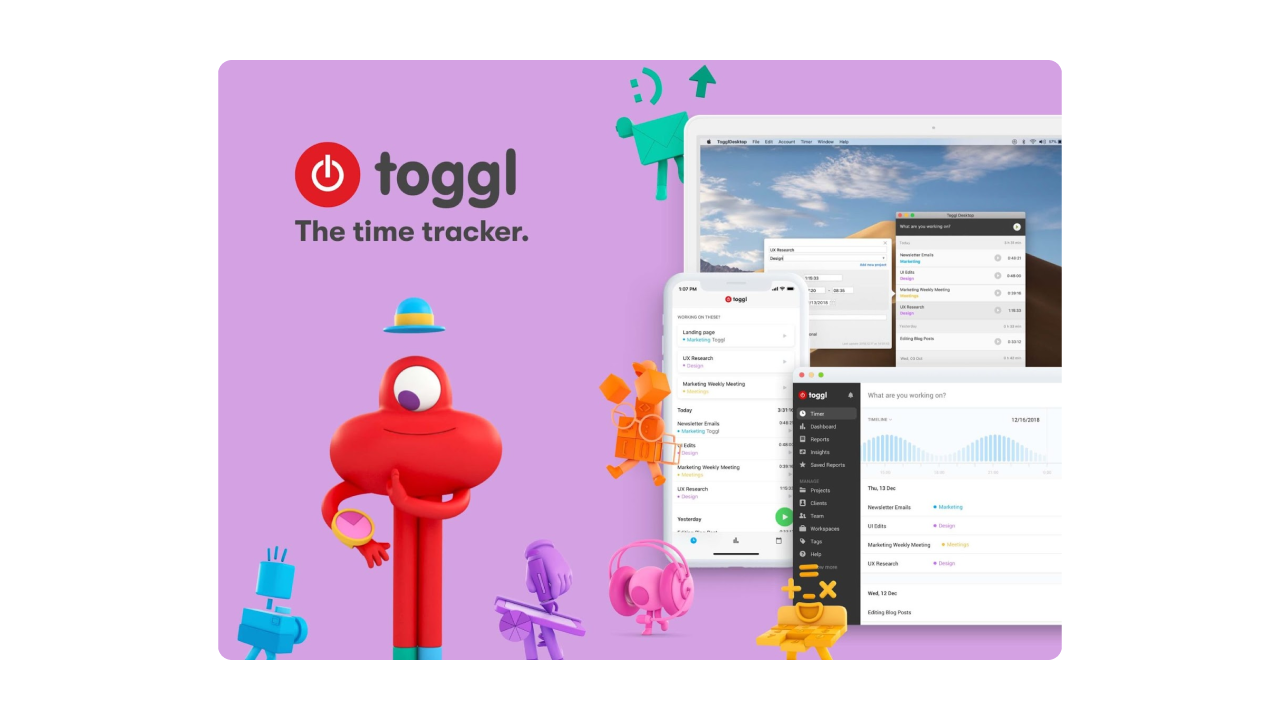
For instance, Toggl, a popular time tracking system, provides intuitive mobile and web design for its time tracker.
Designing a mobile app for your time tracking software makes you flexible and mobile.
Now that you understand how time tracking software is supposed to work, let's see what will help you make such a tool.
How to design a great time tracking application?
To design functional and easy-to-use time tracking software, you will need a devoted design team and a well-established product design process.
We've already discussed how to find a designer for your SaaS product in one of our articles, and here we want to share with you what we consider to be the most crucial ingredients of your app's success.
Research the market
Perhaps, each of our projects starts with competitor research. Competitor analysis helps to understand the situation in the industry, find the niche, and define the direction in which to move.
When designing Tymewise, to answer the question “What is the best time-tracking app?” we analyzed the successful decisions and mistakes of perhaps more than a dozen existing solutions, determining what is popular in this market segment and what new can be offered.
Here is a short overview of the most well-known rivals in the time tracking industry.
Clockify
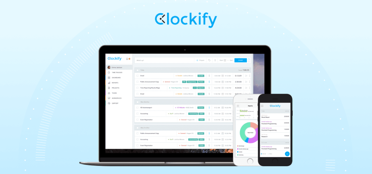
Pros
- User-friendly interface.
- Provides a lot of benefits for teams, allowing businesses of different sizes to take advantage of their free version.
- Offer many features for managers, like reporting and backend dashboards to track how the time was spent, project overviews to see how much time employees devote to a project.
Cons
- No inbuilt invoice feature.
Toggl
Pros
- The ability to specify the customer and the project for each task.
- A variety of filters when generating reports.
- The ability to highlight projects with different colors.
- Accessible via all popular platforms.
Cons
- Billable hours feature isn’t included in a free plan.
- Working hours are not presented clearly.
- Difficult to view in detail the user's activity.
TimeDoctor
Pros
- Precise time tracking.
- Integration with a variety of applications such as Trello, Slack, Asana, GoogleApps, GitHub, Bitrix24, Zoho CRM.
- Works with all popular platforms: Windows, Mac, Linux, Android, iOS.
- Detailed reports about employees’ performance.
Cons
- Browser extension has limited functionality.
- Doesn’t have a free plan.
Harvest
Pros
- Integrates with many tools while providing simple time tracking and reporting functionality.
- It’s free to use (unless you have more than two projects).
- Has a browser extension, that makes it super easy to start and stop the timer.
- Has inbuilt invoice functionality.
Cons
- Complex user interface (it takes too many steps to create a new project).
- Confusing reporting.
Once you’ve analyzed the rivals, it’s easy to decide what features to “borrow” and what new to add.
Study your users
Next, it's time to support and supplement the insights we got from market research with real users' needs. Your task here is to understand how the time tracker is supposed to satisfy specifically those people for whom you create it.
There are a lot of UX research methods, but in Eleken's opinion, the best way to learn from your customer is to talk to them personally. That's why, for Tymewise, we conducted precise user interviews and examination of user interaction with similar products.
Besides defining in what context people are going to use your product, user research helps to come up with a logical and convenient app structure.
Decide on the app structure
Based on the learnings from competitors and user research, you can build a detailed plan on how the time management app UX design will work. Connect your product vision with user needs and technical requirements.
At Eleken, we visualize the structure with the help of:
- Customer journey maps - present touchpoints between a user and an app and describe what a person feels/wants at each interaction.
- User flows - show the steps users take to complete some specific tasks within your product.
- Wireframes - present the location of design elements on each screen and show how they are connected.
Think out the visual part
When designing the UI for a time management app, try to keep it minimalist, clear, and simple to save users' time they spend on managing the app.
Analyze design styles from the entire industry, collect the best ideas into a mood board, and start thinking out the details (icons, typography, buttons, and so on).
The final point (that we decided not to single out into a separate section) is to put together all the mentioned components to receive an actionable and usable time tracking app.
As a small takeaway
Time tracking has gone digital, and whether you are a freelancer looking to track hours or a CEO wanting to manage a remote team, you need software that keeps your business running effectively and on time. If you can't find a suitable solution on the market, maybe it's time to create your own one!
Our designers will gladly help you make a convenient, intuitive, and visually appealing time tracking tool that improves productivity. Contact Eleken today.