

Most SaaS products don’t become confusing overnight. Friction builds gradually as teams add features, roles, dashboards, billing flows, and new user journeys. Eventually, “it works, ship it” becomes the standard—and UX gets attention only when complaints, drop-offs, and support tickets start piling up.
That’s why SaaS UX design is much more than visual polish. It covers the whole experience, from signup and onboarding to navigation, core workflows, dashboards, support, and billing. For SaaS users, all of these touchpoints form a single product experience rather than a collection of separate screens. And as AI makes it possible to ship features faster, maintaining clarity and consistency across that system becomes even harder.
At Eleken, a SaaS product UI/UX design agency we’ve seen that as products grow more complex, keeping the experience clear becomes one of the biggest UX challenges in the SaaS space.
Clarity in SaaS UX design makes complexity manageable. It helps users understand where they are, accomplish tasks with less friction, and feel confident returning to the product. In practice, that means better activation, retention, conversion, and trust—not simply prettier screens.
What makes SaaS UX different from regular UX?
SaaS products aren’t designed for a single interaction. Users return to them repeatedly to complete workflows, manage data, collaborate, and make decisions. That makes activation and retention just as important as helping someone complete an individual task.
The challenge grows with B2B SaaS, where products often need to support multiple roles, permissions, dense data, and advanced features. B2C SaaS typically puts more emphasis on fast self-service activation, but both need to intentionally design the entire journey—from registration and onboarding to navigation, core features, support, billing, and collaboration. How users interact with each of these parts affects how coherent the product feels as a whole.
Poor UX also compounds as a SaaS product grows. One client described their product as “patched together with no good logic behind it”—a common outcome when teams keep adding functionality without maintaining the experience around it.
For Zaplify, a sales automation platform, the impact was measurable. After Eleken redesigned its onboarding and navigation, the product became easier to understand and helped users reach value faster, contributing to an increase in activation from roughly 20–25% to around 40%.
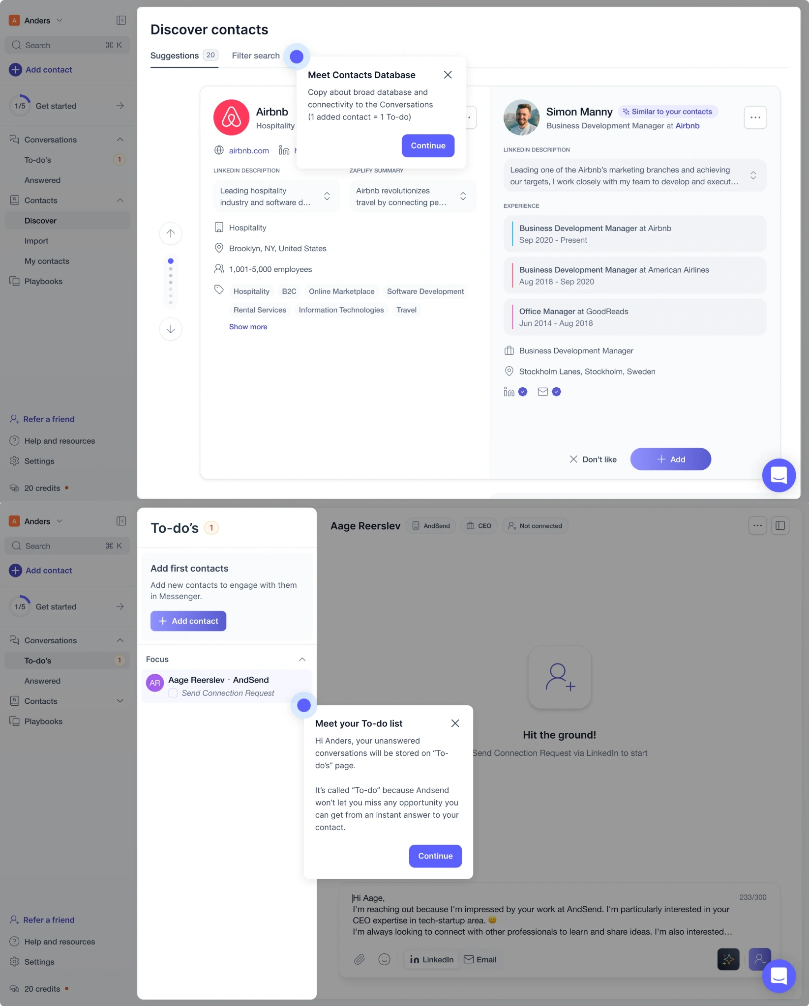
The result shows how UX decisions can translate into business outcomes. In SaaS, helping users understand the product and experience its value sooner can directly influence activation, adoption, and long-term growth.
How do you validate SaaS UX decisions before shipping?
Good SaaS UI/UX design shouldn’t rely on opinions alone. Use a simple test → measure → iterate cycle: test mockups with focus groups, beta-test live experiences, then compare what users say with what they actually do.
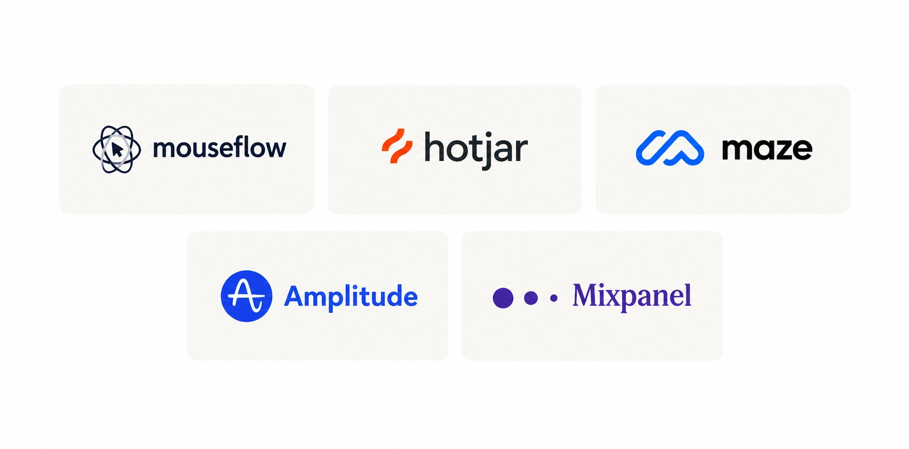
Track quantitative signals such as funnel drop-off, friction events, and task completion rates, alongside qualitative evidence like session replays, rage clicks, surveys, and user interviews. UX audit tools like as Mouseflow, Hotjar, Maze, Amplitude, and Mixpanel can help uncover these patterns.
Most importantly, connect UX problems to business outcomes. Instead of simply arguing that a flow is confusing, show how that friction affects activation, conversion, retention, or support volume.
Eleken’s heuristic audits, for example, evaluate products against Nielsen’s usability heuristics and classify issues as 1 — Cosmetic, 2 — UX Friction, or 3 — UX Catastrophe. Eleken’s work with Datawisp, a no-code data analysis SaaS platform, shows how this process can work in practice. When Datawisp came to Eleken, the product was powerful, but its interface made that power feel intimidating—early reactions suggested that users perceived it as complicated before they had even explored its capabilities.
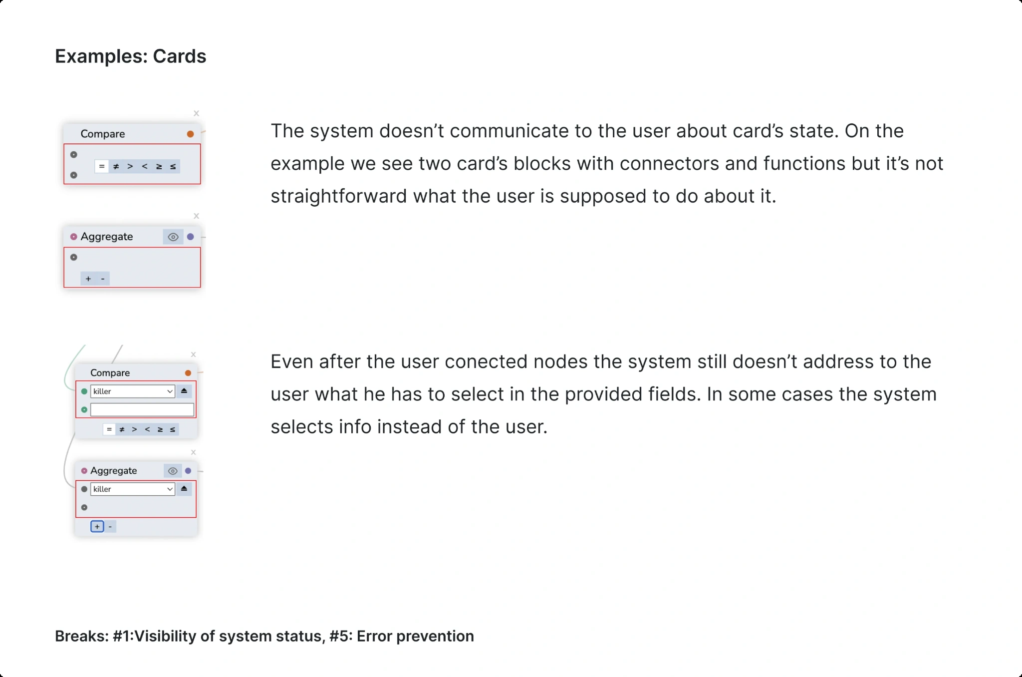
Eleken started with a heuristic audit, evaluating the existing experience against Nielsen’s usability principles and prioritizing issues as 1 — Cosmetic, 2 — UX Friction, or 3 — UX Catastrophe. The findings gave the team a clearer basis for deciding what needed to change and informed the subsequent visual redesign.
After the redesign, user reactions shifted from “looks complicated” to “looks easy.”
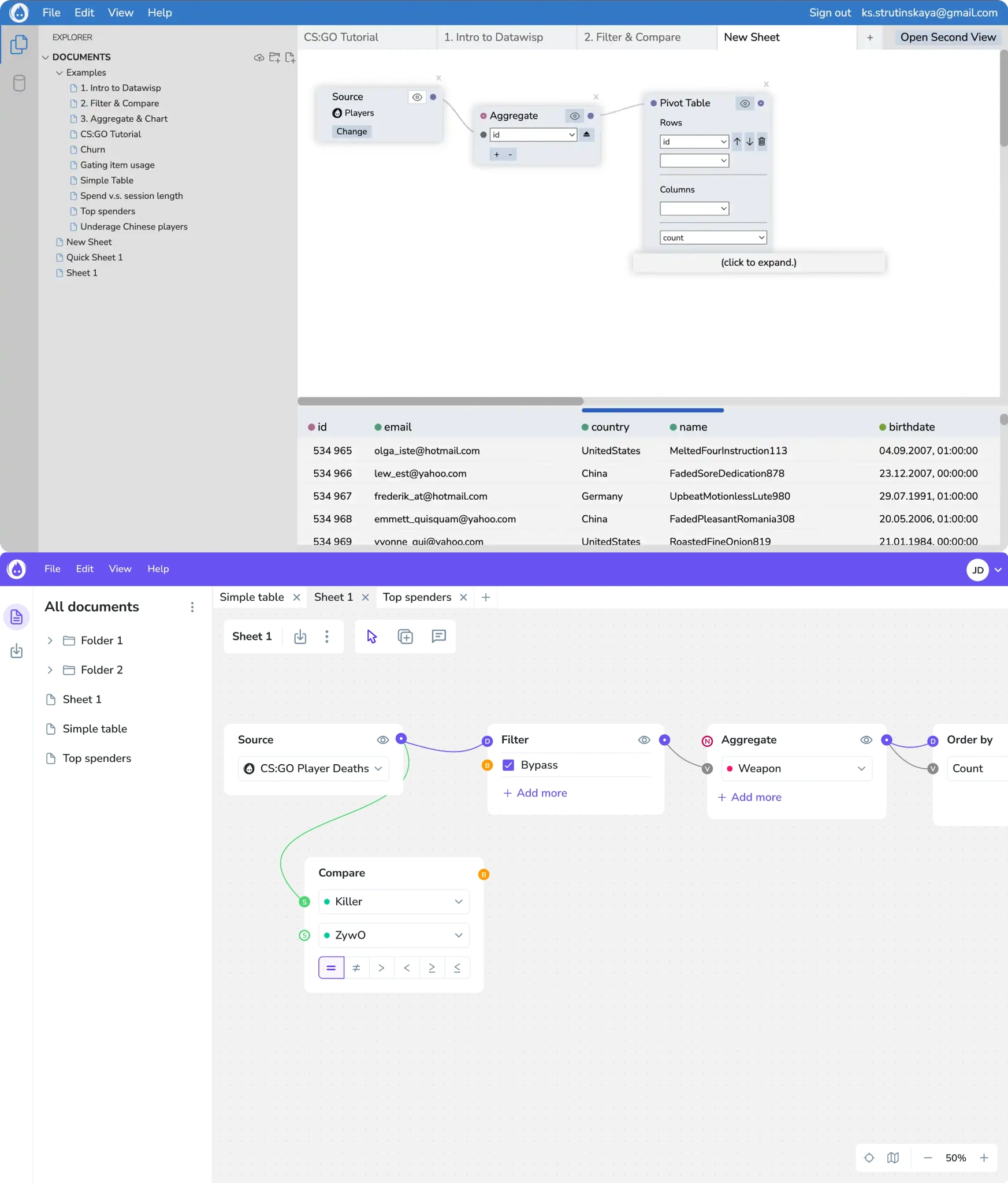
The renewed product experience also helped Datawisp present a stronger product story to investors, contributing to the company’s ability to raise a $3.6 million seed round. It’s a good example of how UX improvements can extend beyond usability, strengthening how a growing SaaS product communicates its value to both users and stakeholders.
What are the core principles of SaaS UX design?
Good SaaS UX design doesn't eliminate every bit of complexity. It makes complexity easier to navigate. As one UX practitioner put it, most great SaaS tools simply “hide complexity really well instead of eliminating it.” Effective SaaS design therefore isn't about simplifying every screen as much as possible, but deciding what users need to see, understand, and act on at each point in their workflow.
The principles that make that possible include:
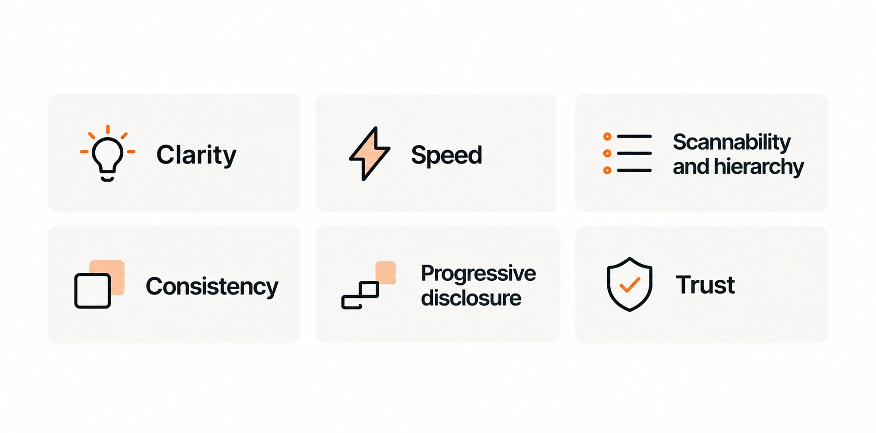
- Clarity: users should understand what they can do and what happens next.
- Speed: common tasks should require as little friction as possible.
- Scannability and hierarchy: important information should stand out immediately.
- Consistency: familiar layouts and UI patterns reduce the learning curve.
- Progressive disclosure: reveal advanced features when users need them instead of showing everything at once.
- Trust: loading, empty, error, and success states should clearly communicate what's happening.
Consistency also needs constraints. Good UI design establishes a few core layouts, a spacing scale, limited typography, and reusable patterns instead of inventing a new interaction for every screen. Novelty is useful only when it genuinely makes a complex process easier.
Finally, accessibility should be built into SaaS UX from the start rather than treated as a later fix. Designing to WCAG 2.2 AA standards means maintaining at least 4.5:1 contrast for normal text, supporting keyboard navigation and screen readers, and making core experiences work across different screen sizes and devices.
These practices make the product easier to navigate and understand for a wider range of users, including those using assistive technologies or interacting with the product in less-than-ideal conditions.
What should UX design SaaS onboarding actually look like?
Good onboarding isn't about showing users every feature. Its job is to reduce time-to-value by helping new users complete something useful as quickly as possible. Long product tours, questionnaires, and tooltip sequences can delay that moment instead of accelerating it.
A better approach combines personalization with progressive disclosure. Use information you already have—such as URL parameters, behavioral signals, and first-session actions—to adapt the experience, then introduce advanced features only when they become relevant.
For example, Kit asks about goals, industry, team size, and previous tools to personalize onboarding. Notion uses templates and an onboarding agent to help users reach a working state without facing a blank canvas, while Freed.ai focuses users on one concrete first task before expanding the experience.
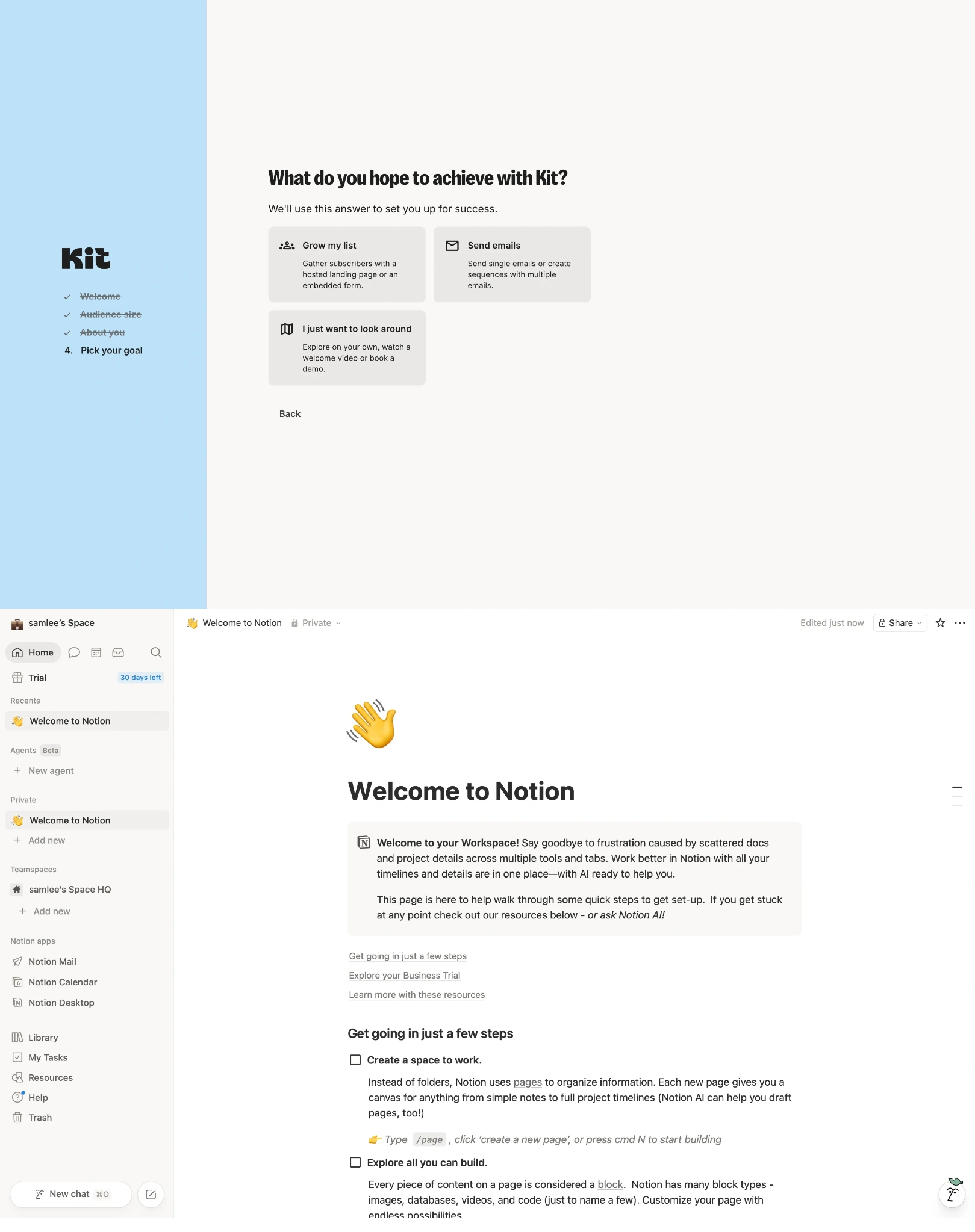
The common thread here is simple: effective SaaS onboarding doesn't explain the entire product upfront—it gives users just enough guidance to reach their first meaningful outcome, then lets the rest of the experience unfold as they need it.
What should empty states and SaaS dashboards do?
Empty states and dashboards have the same basic job: help users understand what's happening and what to do next. An empty state shouldn't stop at “Welcome.” Show users what the product can become through sample data, templates, a progress indicator, or one clear next action.
A useful SaaS dashboard should answer five questions:
- What's the current state?
- What happened recently?
- What needs attention?
- What's on my to-do list?
- What should I do next?
That means prioritizing useful KPI cards, alerts, actionable notifications, and contextual links instead of filling every available space with data. Visual hierarchy matters too: important numbers need more emphasis, while consistent spacing and sufficient padding make dense information easier to scan.
ClearPoint Strategy shows what this can mean in a data-heavy SaaS product. Eleken designers created unified dashboard templates and consistent styling across the platform, making complex performance data easier to scan and helping users move between dashboards without having to relearn how information was structured each time.
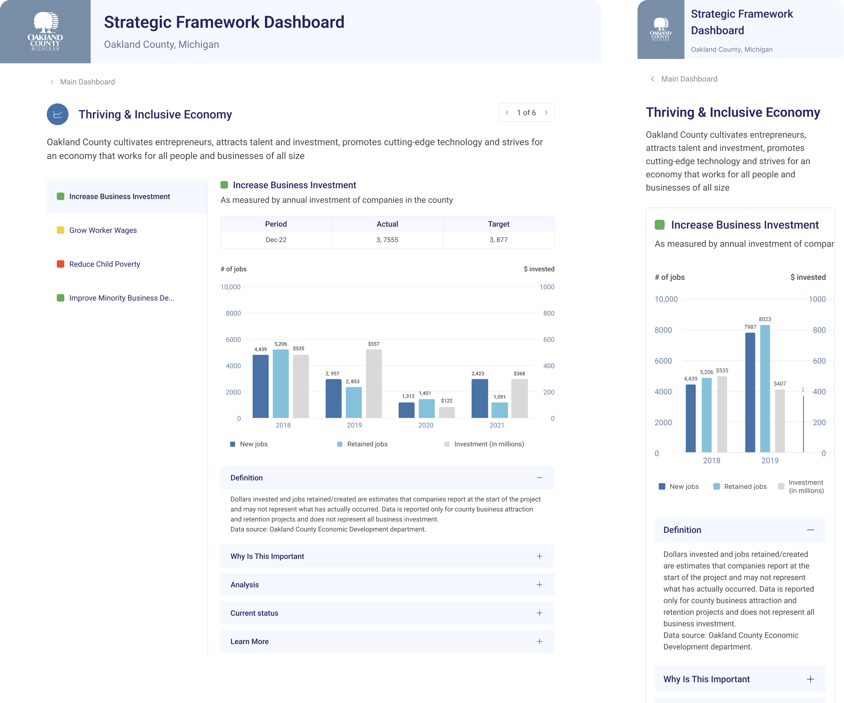
The product later received G2 recognition for Best Usability, Easiest Setup, and Highest User Adoption—strong signals that consistency can affect not only how polished a product feels, but how easily people can learn, navigate, and adopt it.
When does feature bloat become a UX problem?
More features don't automatically make a SaaS product more valuable. Every addition introduces new decisions, navigation, and interface states, increasing cognitive load and making core tasks harder to complete. A useful filter for every proposed feature is: Does this clarify the user's primary job, or does it create a new job?
Information architecture can keep that complexity under control. Menus, feature groupings, and role-based access control (RBAC) determine how much each user needs to process. In a medical records product, for example, clinicians, admins, and billing teams can each see functionality relevant to their workflows rather than navigating the entire system.
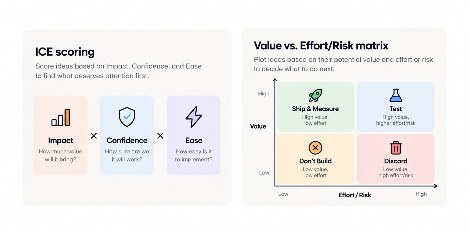
Prioritization frameworks help too. ICE scoring (Impact × Confidence × Ease) can identify which problems deserve attention first, while a Value vs. Effort/Risk matrix separates ideas into Ship & Measure, Test, Don't Build, and Discard.
Sometimes the answer isn't another feature at all. One product in the brief had around 40,000 users but less than 10% engagement; the solution was a UX audit and redesign of its core flows rather than adding more functionality.
How do micro-interactions and gamification drive retention?
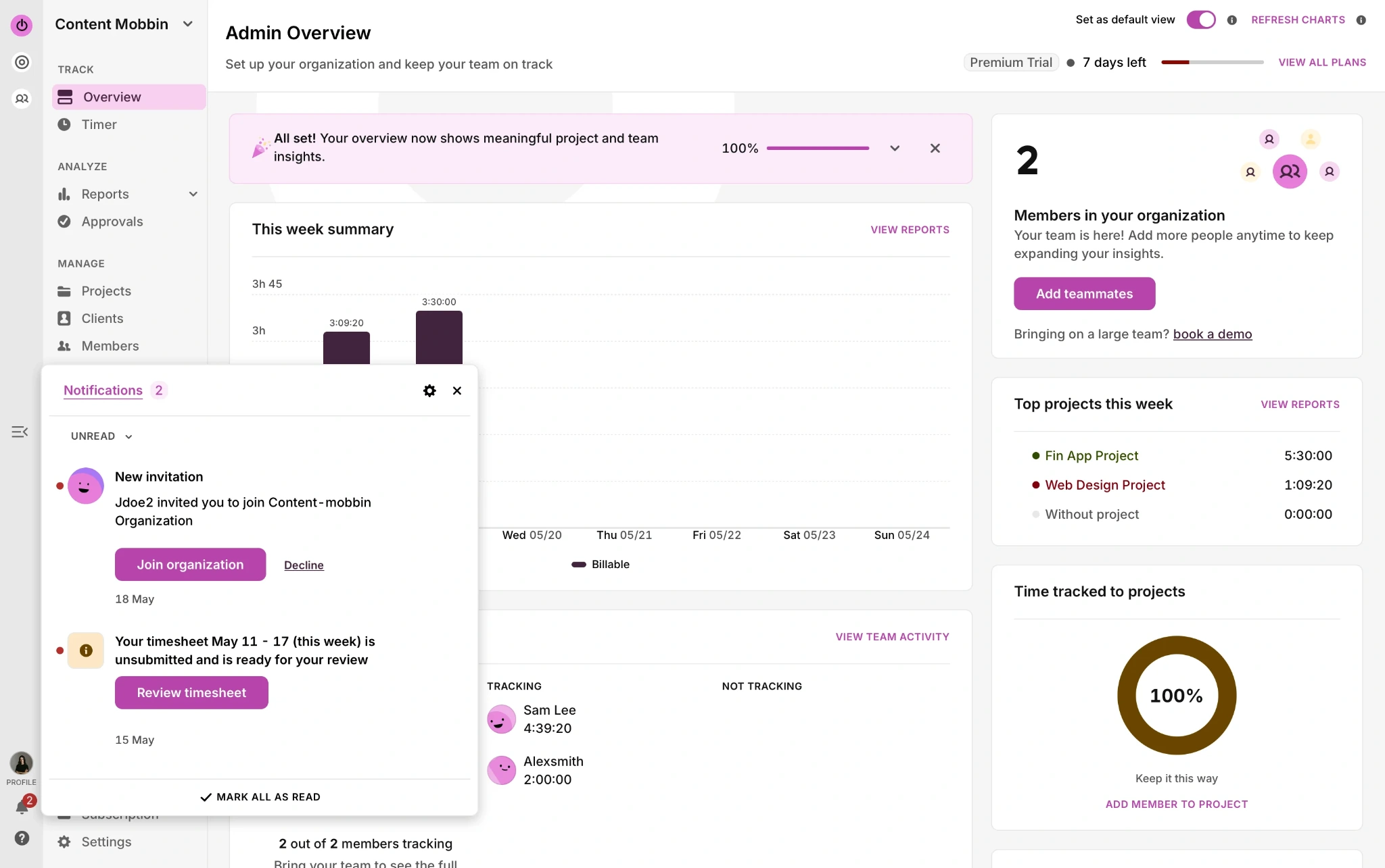
Small interactions can make a SaaS product feel more responsive without adding complexity. Micro-interactions such as status indicators, loading spinners, progress bars, hover effects, and subtle button animations reassure users that the system noticed their action and show what's happening next.
Toggl, for example, uses subtle feedback to make time tracking feel more responsive and less administrative. Micro-interactions can also support feature discovery: a small animation can draw attention to something new without interrupting the workflow with another modal or tooltip.
Gamification goes further by encouraging repeated behavior. Grammarly uses weekly writing scores and streaks, while Duolingo uses streak mechanics to reinforce daily habits. Points, badges, leaderboards, and rewards can work similarly—but only when they support the product's core task.
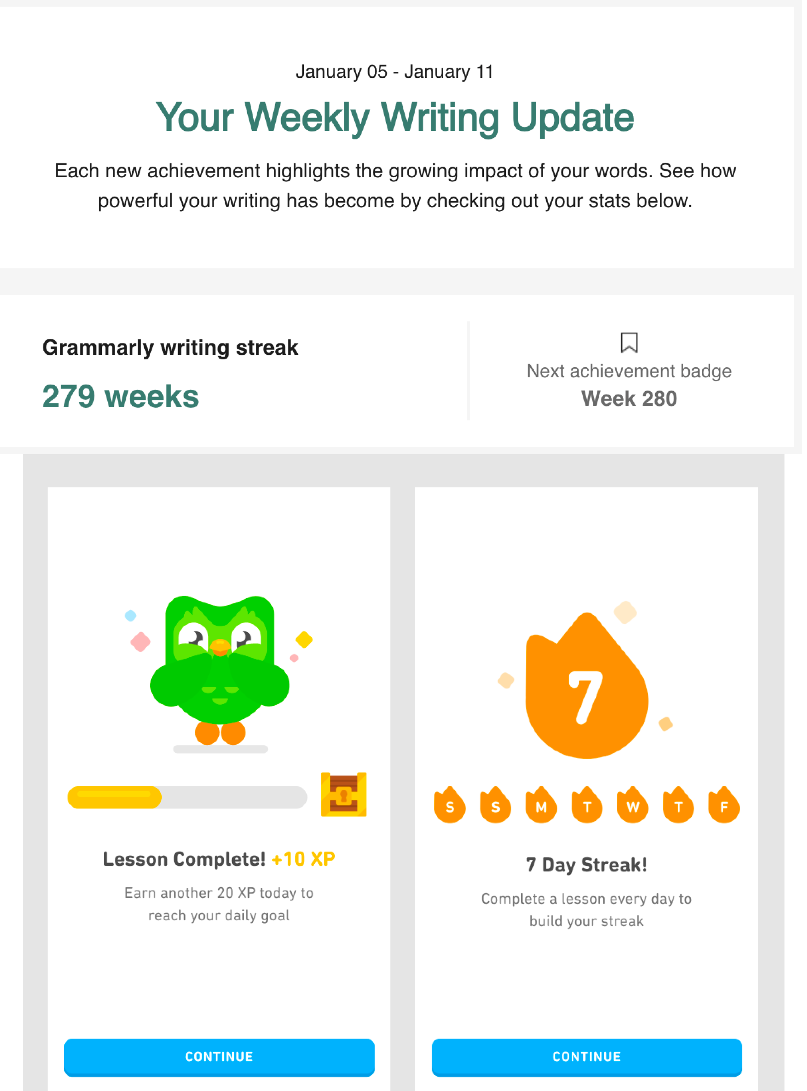
That's the important constraint: retention mechanics should reinforce value, not compete for attention. If gamification adds another layer users have to understand, it increases cognitive load instead of improving the experience.
Where does AI fit into SaaS UI/UX design?
AI copilots, chatbots, and AI-powered analytics are becoming common in SaaS products, but adding AI doesn't automatically improve the experience. In fact, AI often exposes weak information architecture: if data, context, and workflows are already confusing, an AI layer can surface that confusion directly to users.
That makes clear task flows and legible context prerequisites for useful AI features. Teams also need new UX metrics beyond clicks and completion rates, including acceptance rate, override frequency, hesitation time, and reversal rate. These signals show whether users actually trust and benefit from AI outputs.
AI is accelerating design iteration too, making consistent design systems and documented component states even more important. Teams can experiment quickly, but they don't need to document every experiment. As one practitioner in the brief found, keeping AI mockups lightweight and documenting only finalized flows prevented the design process itself from becoming a bottleneck.
What do the best SaaS UX design products actually get right?
The best SaaS UX isn't defined by one visual style. What strong products have in common is that they design around user workflows rather than individual pages, making repeated tasks easier to complete.
A few examples are worth studying:
- Slack uses a clear sidebar, threaded conversations, and mobile parity to keep communication manageable.
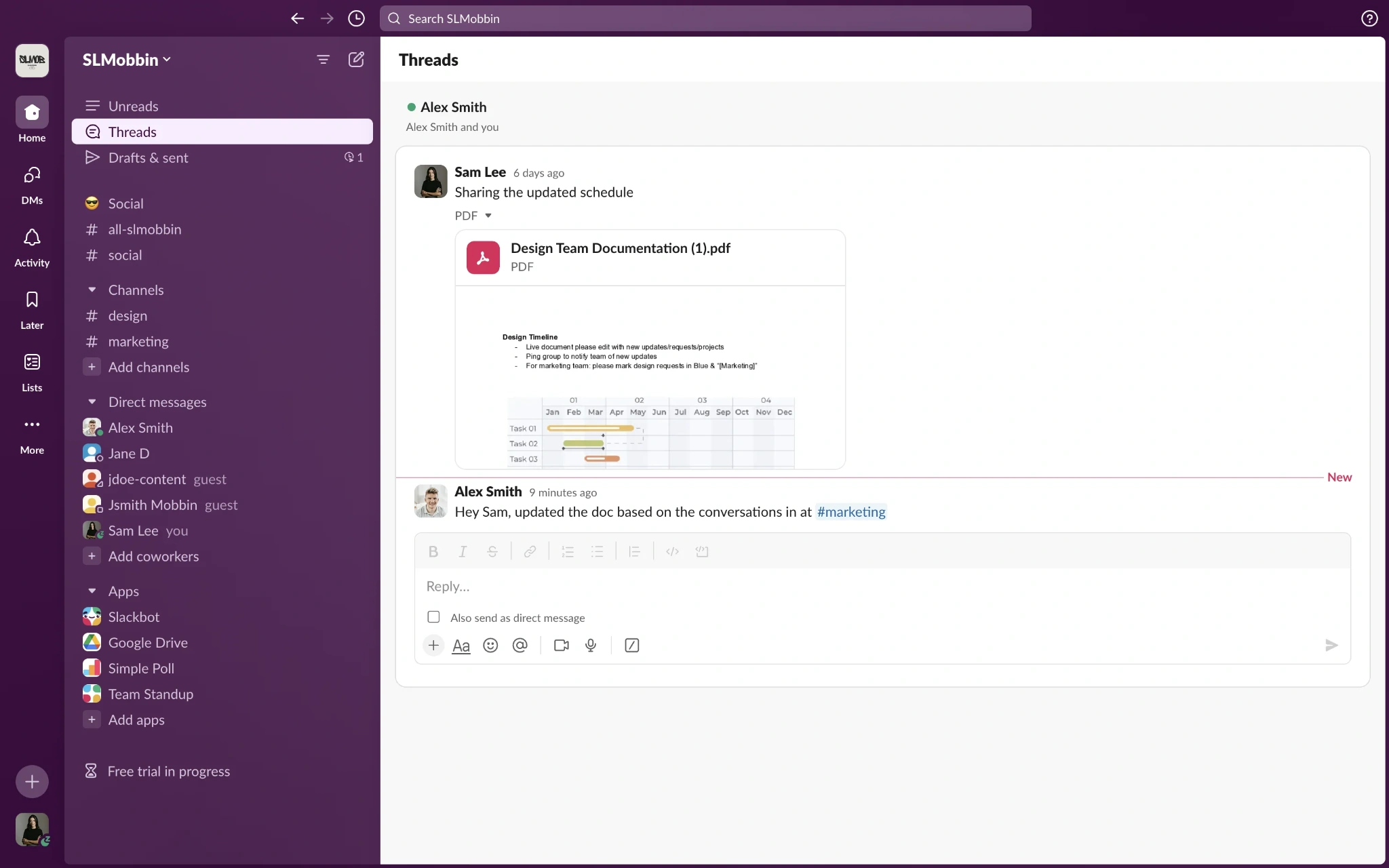
- Figma removes installation friction with browser-based delivery and makes collaboration part of the core experience through live cursors and comments.
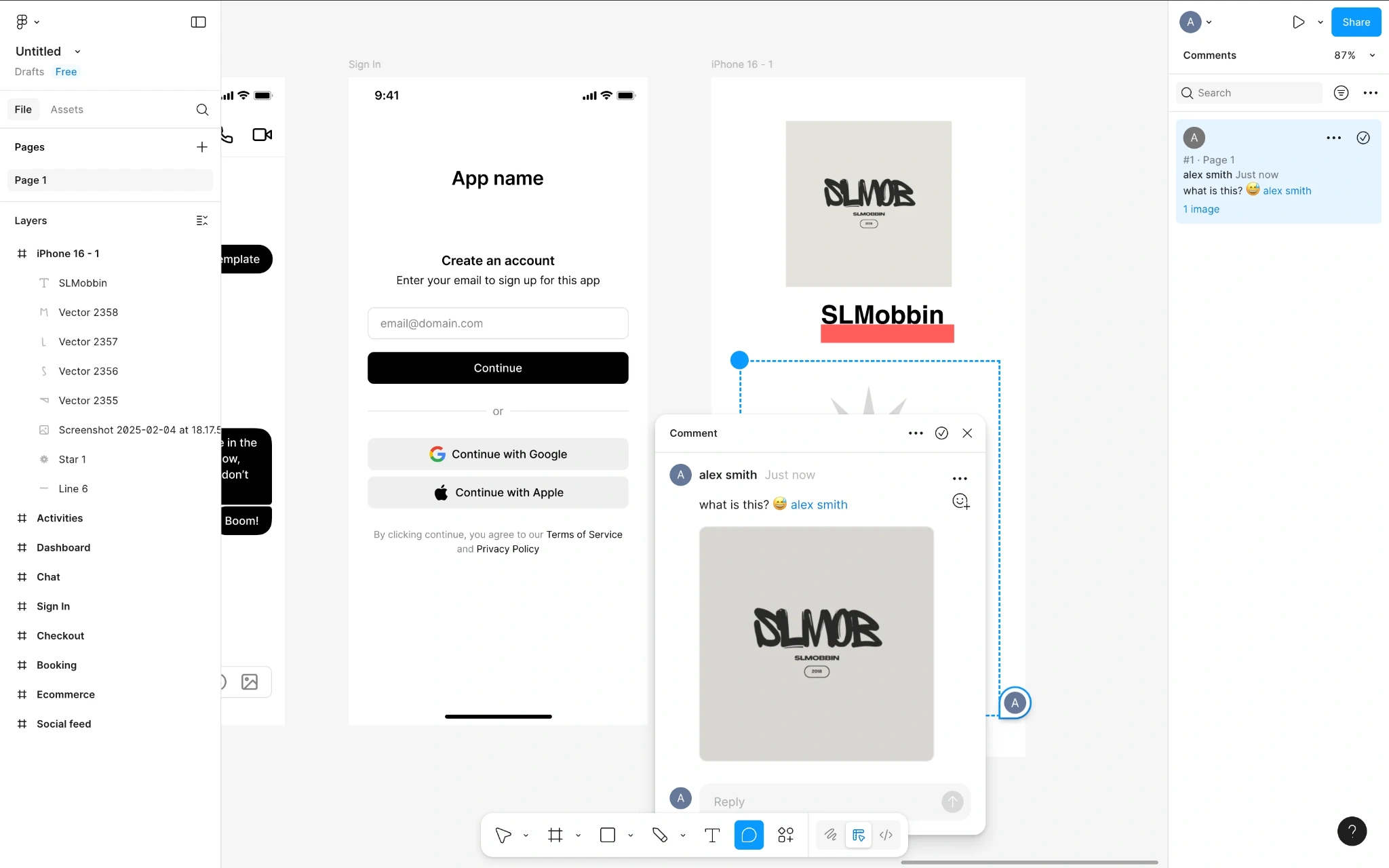
- Notion combines templates and progressive disclosure so new users can get started quickly without seeing every advanced feature at once.
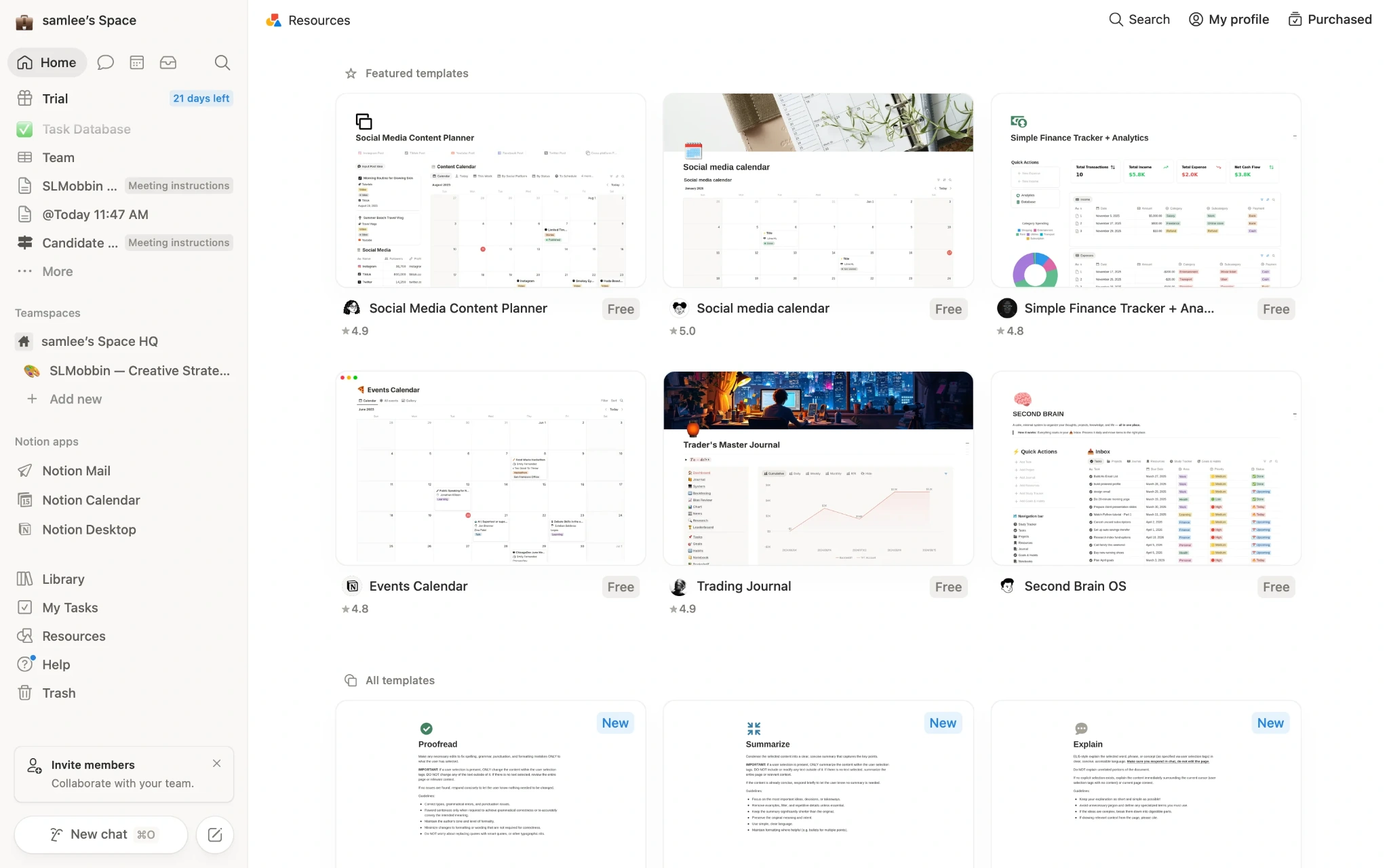
- Linear, Intercom, Airtable, and HubSpot offer useful patterns across navigation, dashboards, settings, and billing.
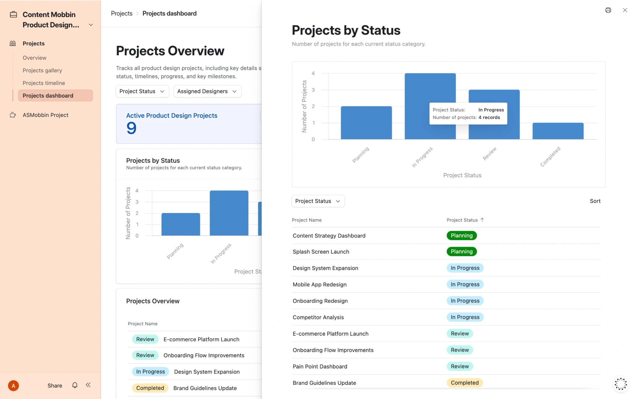
The lesson isn't to copy these interfaces screen for screen. Study how they support the user's task: what they prioritize, what they hide until later, and how they keep users oriented as workflows become more complex.
That distinction can have measurable consequences. SEOcrawl grew from zero to 2,000 users in under four months after a full UI/UX redesign, while MyInterview addressed a 90% mid-interview churn problem by changing its input patterns and breaking the experience into clearer sequential steps.
What should you fix first in a confusing SaaS product?
When a SaaS product feels confusing, don't start by redesigning whichever screen gets the most complaints internally. Start with evidence of where real users are struggling.
Some of the most useful signals are already available:
- Support tickets: Which problems appear repeatedly?
- Sales calls: What does your team constantly have to explain?
- Session recordings: Where do users hesitate, backtrack, or rage-click?
- Funnels: Where do users abandon important flows?
- User interviews and surveys: Why are those problems happening?
Then prioritize issues based on frequency, severity, and business impact. A slightly inconsistent card matters less than an onboarding problem preventing new users from activating or a billing flow damaging user trust.
This is also why a UX audit can be more useful than immediately starting a redesign. It helps separate cosmetic imperfections from genuine friction and identify the problems affecting task completion, activation, conversion, or retention. Fix the highest-impact barriers first, measure the result, and then move to the next source of friction.
How to keep improving UX design for SaaS growth continuously
SaaS UX is never really finished. Products evolve, new features appear, and user behavior changes, so the experience needs continuous improvement rather than a major redesign every few years.
Track signals such as task completion, funnel drop-off, session replays, heatmaps, NPS, SUS scores, and support ticket volume. Support tickets are especially useful: recurring complaint categories often point directly to the highest-friction areas of the product.
The process should stay simple: audit before redesigning, test before shipping, and measure after release. A maintained design system, strong performance, and Core Web Vitals provide the foundation for making those improvements without introducing new inconsistencies.
Most importantly, someone needs to own the experience. As one SaaS practitioner put it, good UX needs a dedicated stakeholder—whether that's a designer or PM—who consistently advocates for users. Eleken follows a similar continuous model by embedding designers into SaaS teams' existing sprints and standups rather than treating UX as a one-off project.
If your team doesn't have that design capacity in-house, Eleken's three-day free design trial provides one or two real product screens before any long-term commitment. Because ultimately, better SaaS UX isn't about polishing every screen at once. It's about continuously removing the friction that keeps users from getting value.