

Most navigation problems don’t look like navigation problems. They show up as low feature adoption, a climbing support load, or prospects who lose the thread halfway through a demo. The natural response is to treat each one on its own terms and reach for a feature fix or a fresh UI.
But when users can’t find what they’re after, the cause is usually the structure underneath. Once you’ve built a menu, you can’t unknow where things live, so the labels that read as obvious to you may be a coin flip for everyone else. And users almost always route around that problem and move on.
UX tree testing is how you expose that blind spot. So, before we get to the step-by-step guide on how to conduct it, it’s worth being precise about what tree testing is, and, just as importantly, what it isn’t.
What is tree testing in UX?
Tree testing is a UX research method that measures how easily people can find things inside navigation, using nothing but the structure itself.
Participants get a text version of your menus, and they’re asked to complete tasks by clicking through the labels. It’s often called reverse card sorting, when instead of asking users to build a structure, you hand them one and watch whether it holds.
That stripped-back setup is the entire point. By removing the visuals, tree testing isolates a single question — — from all the things that take the blame when they can’t.
This approach doesn’t judge your visual design, your page layout, or the quality of your copy. It tests your information architecture, including the way content is organized, labeled, grouped, and nested. If you want to learn what good IA looks like, we go deeper in our guide to information architecture.
At this point, the logical question is “what does a “tree” actually look like?” It’s a pared-down version of your hierarchical menu, built from parent and child nodes and nothing else. It can cover your whole product or just one corner of it.
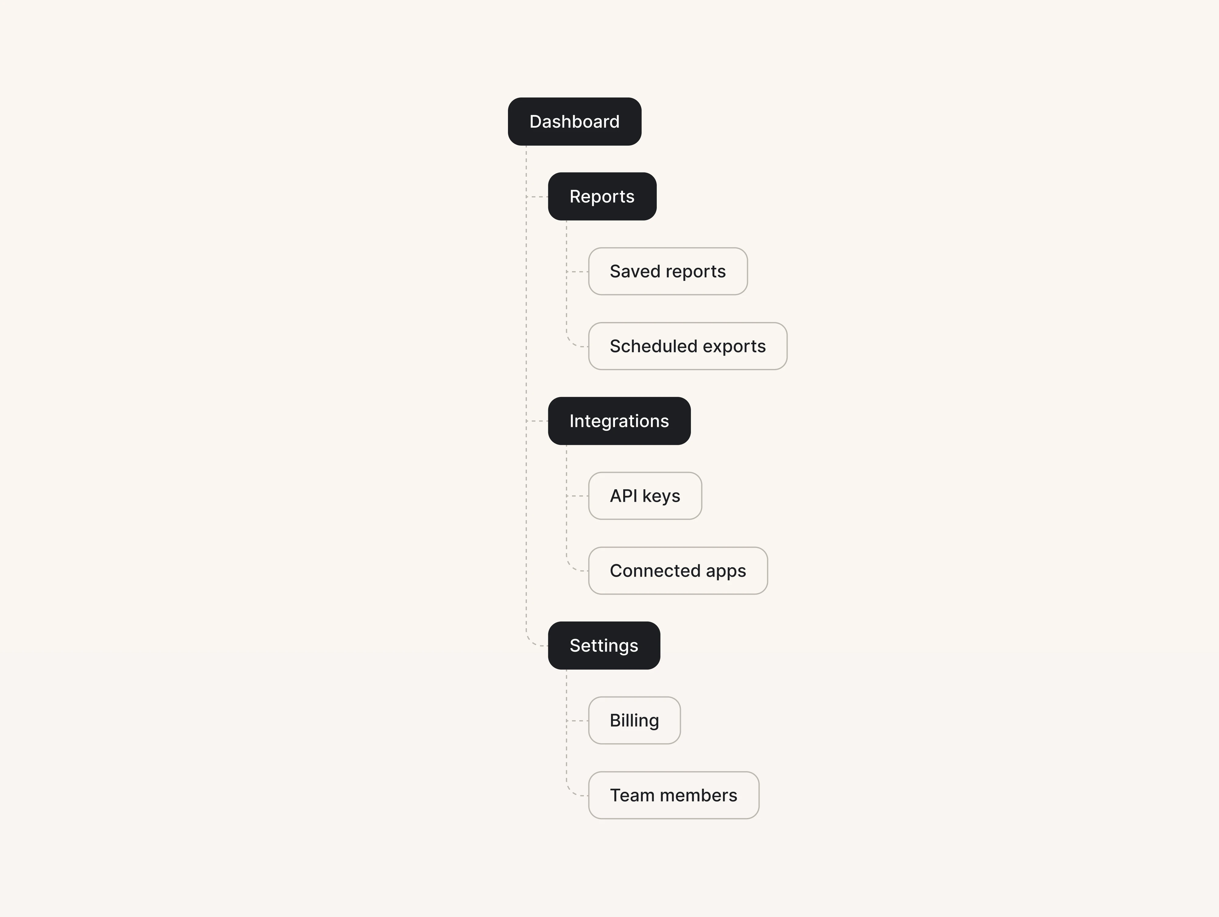
A participant asked to "find where to update the card your company is billed to" either lands on Settings → Billing without hesitation, or detours through Integrations or Reports first, guessing. That detour is the data.
The reason to catch structural problems this early is that users give you almost no runway. Nielsen Norman Group found that people often abandon a web page within 10–20 seconds when it doesn’t quickly show them what they came for.
For a SaaS product, it plays out inside the app. A trial user who can’t find the feature they signed up for just doesn’t come back. Navigation is one of the few causes of that you can pin down precisely and fix before a single screen has been designed.
What can tree testing tell you?
Once users interact with that stripped-down tree, their behavior answers three questions at once: are your labels clear, do your groupings match user expectations, and can they reach the content that matters most?
You see the gap between where someone expects a feature to live and where you’ve filed it as numbers. Tree-testing tools distill all of that into a handful of measures (NN/G breaks them down here). Four do most of the work:
- Success rate — the share of participants who ended on the correct destination, no matter how they got there.
- Directness — the share who went straight to the right place without backtracking or trying other branches first.
- Time on task — how long the average person took. Long times usually mean hesitation, which points to too many plausible-looking options.
- First click — which category people tried first. When most first clicks land on the wrong branch, the label at that fork is where the damage starts.
Optimal Workshop treats a success score of around 80% or higher as a good result for a task. As a rough reading of where a task sits:
But success rate alone will lull you. A task can post a strong success rate while hiding a broken path, because success counts anyone who eventually lands in the right place. Optimal Workshop splits this into direct success (right place, right path) and indirect success (right place, but only after backtracking).
Picture a trial user hunting for billing who pokes into Integrations, then Reports, then finally finds Settings. They count as successes, yet every one of those detours is a real person hesitating within a product. That’s why directness deserves as much weight as the headline number: a genuinely healthy task scores high on both.
When success is high, but directness is low, the content is reachable, but your signposting is wrong, and that’s a fix worth making before the visual design.
The difference between tree testing and card sorting
We called tree testing “reverse card sorting” a moment ago, and that phrase is the quickest way into the distinction.
Using card sorting, you give people the content — usually as a set of labeled cards — and ask them to group it the way it makes sense to them. It comes in three forms: open, where participants create and name their own groups; closed, where they sort into categories you’ve already defined; and hybrid, where they can do either.
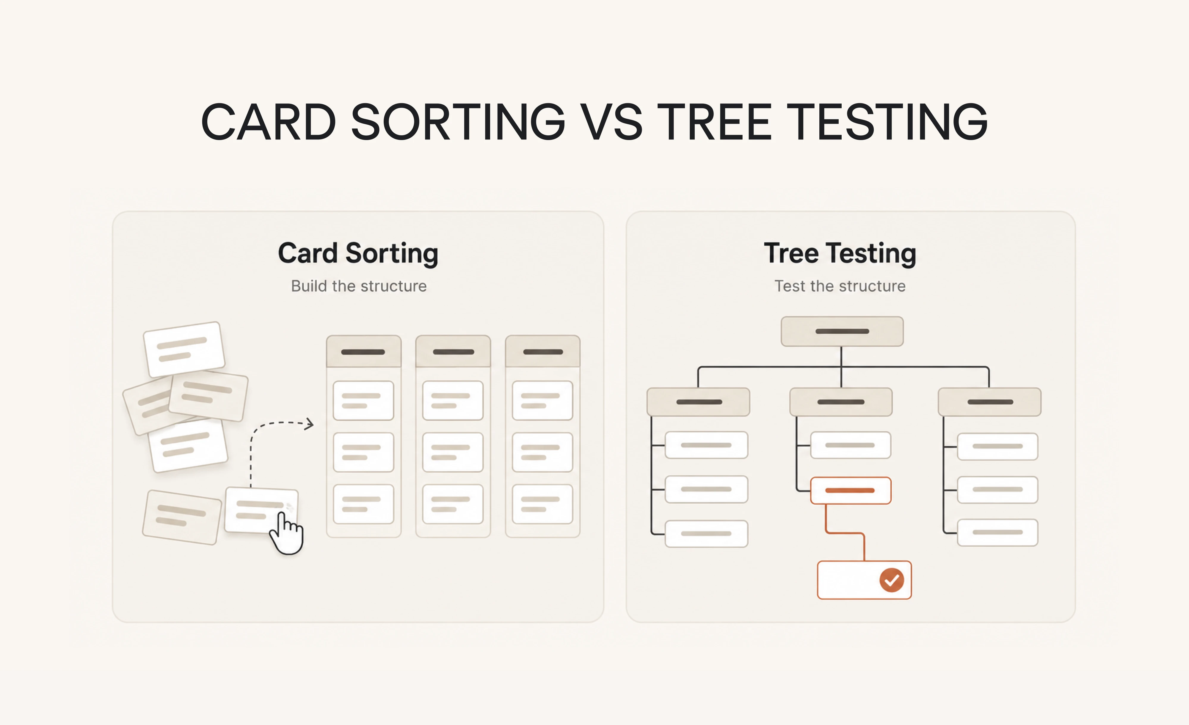
That difference in direction is a difference in job. Card sorting is generative — it helps you build an information architecture out of the way users think. Tree testing is evaluative — it checks whether the structure you landed on holds up.

If you want to find out what a nav structure ought to be, that's a card sort. If you want to know whether people can find stuff in a given structure, that's a tree test.

Here’s how the two line up:
Because they pull in opposite directions, they also don’t share participants well. As one researcher pointed out:
A closed card sort is essentially the reverse of a tree test, so you'll get very little value out of using the same participants to do both.
How to use both methods together
The two methods are a sequence, and running them in order is what makes each one pay off.
First, run an open card sort. This is where you learn how users naturally group and name your content in their language.
Second, draft IA from what you heard. Use the groupings and the exact labels that emerged from the sort to build a structure rooted in your users’ mental model.
Third, validate that draft with a tree test. Aim to clear the ~80% success bar on the paths that matter most.
Finally, fix and retest. Wherever tasks fall short, adjust the structure and re-run a tree test on just those problem areas to confirm the change moved the number.
One field-tested variation adds a baseline at the front. Run a tree test on your current structure first, so you have a real benchmark to beat. Then card-sort. Then tree-test the proposed structure and measure the delta.
That before-and-after is what turns “we think this is better” into a measured improvement you can put in front of stakeholders.
From our experience, if the same people take both methods, conduct a card sort before you tree-test. And if you’re short on participants altogether, split them across the two studies instead of running everyone through both.
When and what should you test first?
Tree testing UX research earns its place at several moments:
- when you’re validating a prototype’s structure,
- when a redesign is on the table,
- when you’re adding a run of new features or content,
- or when you simply want to audit a live product that’s started drawing navigation complaints.
Anywhere the structure is about to change (or is already quietly costing you) is a good reason to use tree testing.
The economics are what make the timing matter. A structural change is cheapest early in the design process, before development begins. Moving a category in a prototype is a spreadsheet edit. Moving that same category in production is a migration, a round of engineering and updated docs.
Tree testing helps you catch issues while they’re still cheap to fix, which is why the payoff is so lopsided in favor of doing it sooner.
That said, tree testing isn’t only a pre-build tool. On a live product, running a test gives you a real benchmark. One designer on Reddit framed the reason plainly:
I wanted a baseline tree test with what they've got now to make sure I'm actually improving things.
Without that starting number, “we made it better” is a hope. This matters most for SaaS products that scaled fast and accumulated IA debt along the way.
Knowing when to test, though, still leaves the harder question: what to test. And the honest answer is that you almost never want to test all of it at once.
A tree can hold hundreds of nodes, but only a handful of paths decide whether your product feels usable. Those are the ones to put in front of participants first:
- Activation paths — the routes a new or trial user has to walk to reach the feature. If these fail, people churn before they ever see your product’s value.
- Revenue-adjacent paths — anything touching billing, upgrades, or plan management. Confusion here costs money and generates support load.
- High-traffic tasks — the three or four things users do constantly. A small friction on a daily path compounds into a large one.
- Recently reorganized areas — wherever you’ve just moved, merged, or renamed things, since that’s where fresh confusion tends to hide.
- Support hotspots — the paths behind your most repetitive tickets, which are essentially free findability data you’ve already collected.
Step-by-step guide to conduct tree testing
A tree test is one of the lighter studies you can run. Most take an afternoon to set up and a few days to gather responses, with no engineering time needed. That low cost is why it pays to be deliberate about each step we’ll cover in the sections below.
Step 1: Start with the decision
A tree test earns its keep when it answers a real question you have about your navigation structure. So start from the decision actually on the table.
Maybe you’re weighing whether a new feature belongs under Settings or deserves its own spot in the top nav. Maybe you’re choosing between two ways of grouping your reports. Write that down as the thing the results need to resolve, because the clearer your objective, the clearer the insights you get back.
From there, turn that decision into a few specific questions you could mark right or wrong once the data lands.
“Can a trial user find where to upgrade their plan?” gets you somewhere useful.
“Is the navigation intuitive?” doesn’t.
And when you’re choosing which paths to prioritize, weight the ones that carry the most risk. The areas where a wrong guess is most expensive, like activation, upgrades, and the handful of tasks users perform daily, are the ones that deserve a spot in the test before anything else does.
Step 2: Scope it down to a slice worth testing
The temptation with a big product is to put the whole tree in front of people and test everything at once. And that’s exactly what you should resist doing.
A sprawling tree wears participants out, and once they have clicked through thirty tasks, they start solving the later ones from memory rather than instinct, which quietly poisons your data. Most tools suggest capping a test at around ten tasks for exactly this reason. So the real skill is choosing the right slice of the tree to test at all.
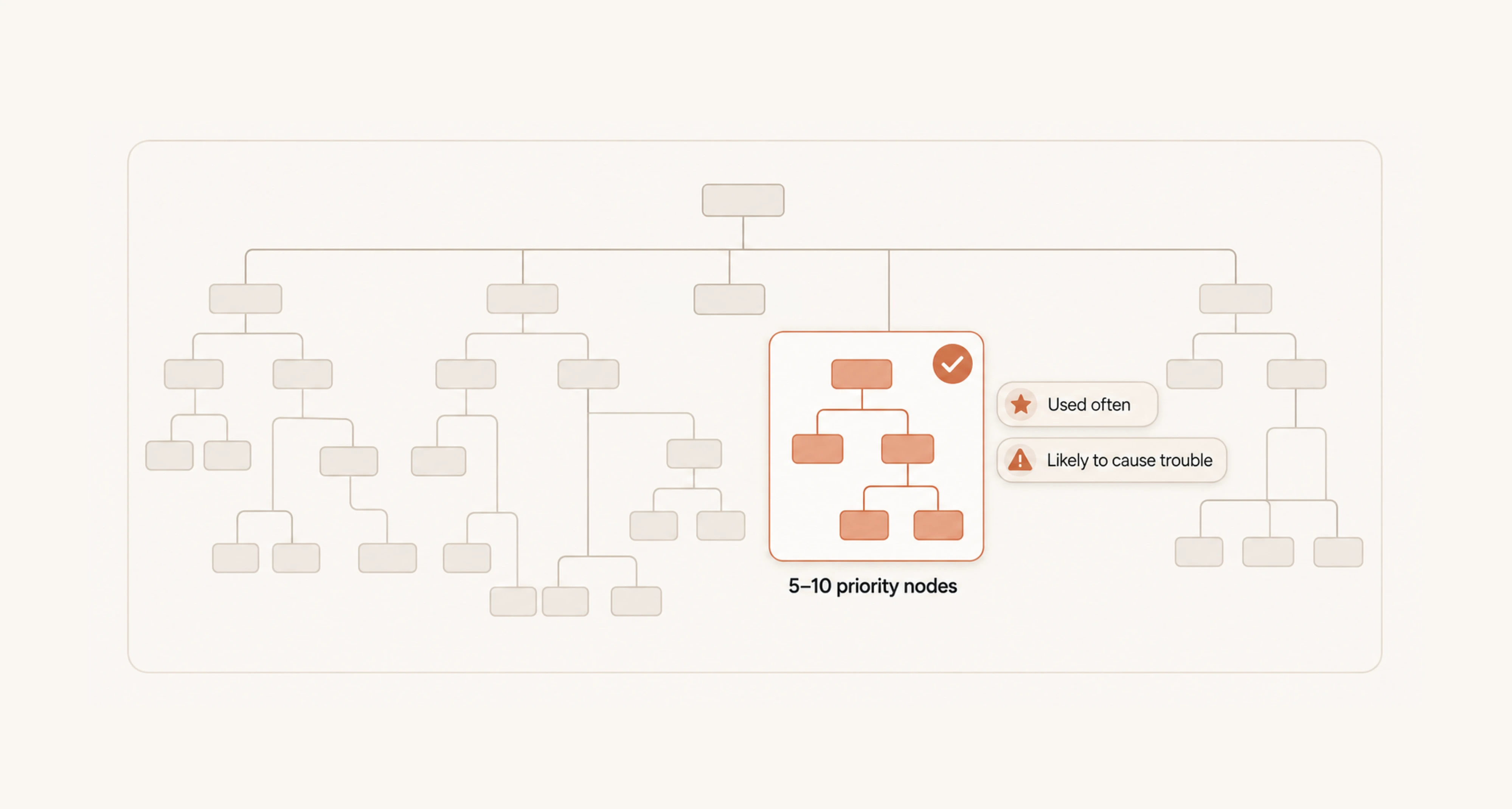
A simple way to find that slice is to score your paths on two things.
- The first is how often people use a path.
- The second is how likely it is to give them trouble, judging by support tickets, analytics drop-off, or areas you have recently reorganized.
Plot those two against each other and a priority quadrant appears on its own. Paths that get used constantly and look shaky are where you start. Paths that are rarely touched and already work can wait. You are aiming for the five to ten nodes that sit high on both counts, not a complete audit of everything you have ever shipped.
Step 3: Build or import your tree
With your slice decided, building the actual tree is the quick part.
- You can type the structure straight into a specific tool like Treejack.
- You can lay it out in a spreadsheet and import it as a CSV.
The spreadsheet route is faster, and if you are testing an existing product, you may already have a sitemap you can drop in with light edits. The format itself is simple. Each column stands for one level of your hierarchy: your top level sits in the first column, and every label gets its own row so the tool reads the nesting correctly.
Two things separate a tree that tests cleanly from one that quietly skews your results. The first is your labels. Use the exact wording you would ship, and keep it tight, because bloated labels either confuse people or hand them the answer.
The second is knowing what to leave out. Resist adding safety-net items like Search, Help, or a chatbot link. In a live product, those are escape hatches, and inside a tree test they give participants an easy way out.
You want to know if people can navigate your hierarchy before they would reach for a shortcut.
Step 4: Write tasks that don’t give away the answer
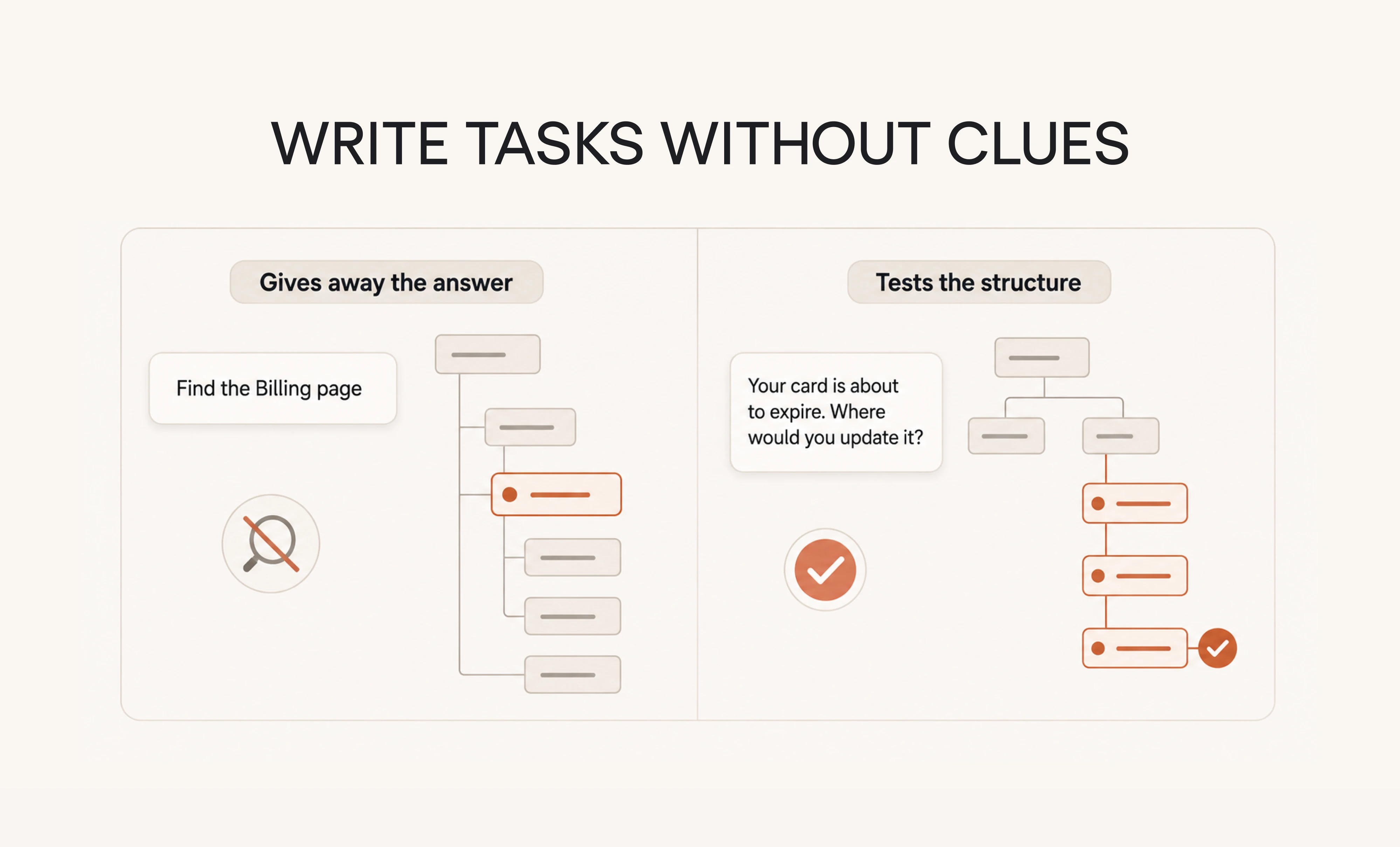
A task is a short scenario that asks a participant to find something, and the one rule governing all of them is that the wording must never contain your label words.
The moment a task says “find the Billing page,” people stop navigating and start word-matching, scanning the tree for the term you handed them. You end up learning whether they can spot a matching word, not whether your structure makes sense.
The fix is to describe the situation instead of the destination. Write the task the way a user would explain the problem to a coworker, with a bit of real motivation behind it. For example, “Your card on file is about to expire, and you want to update it before your next invoice. Where would you go?” That version tests whether people can reason their way to Settings and then Billing on their own, which is the whole point.
A few smaller habits keep tasks honest.
Skip instruction verbs like “click on” or “go to,” since they nudge people toward hunting for a button. Keep the scenario short enough that the key detail does not get buried. And where you can, borrow wording from real support tickets or sales calls, since that language reflects how users describe the problem.
Step 5: Recruit participants who match your real users
A tree testing study is quantitative, so you need enough people for the percentages to mean something. Around 30 participants is a workable floor, but most practitioners point to 50 as the number where clear patterns emerge.
Comparative tests, where you pit two different versions of a structure against each other, need more than that to detect a real difference.
Who those people are matters more than how many you gather. You want participants who look like your actual users, because a generic testing panel will quietly mislead you. Research comparing the two found that panel participants scored higher than real customers, likely because they’re practised at usability tests.
For a SaaS product, you usually have better options. An in-app prompt can catch people who are already using the product, your customer database and mailing list reach users who know your domain, and a post to your community pulls in people who care. Whatever the source, screen for a mix that reflects your real segments.
And before you open it up to everyone, run the test past a couple of colleagues to catch a confusing task or a broken link while it is still cheap to fix.
Step 6: Clean your data before you trust it
Unmoderated tests always pull in a few responses you should not count. Some people click through without reading, some abandon halfway, and a few answer at random. So a quick pass before analysis is worth the few minutes it takes.
Drop incomplete sessions and flag the speeders, meaning anyone who finished so fast they could not have read the tasks. A common rule of thumb treats a response as suspect when it lands under a third of the median completion time.
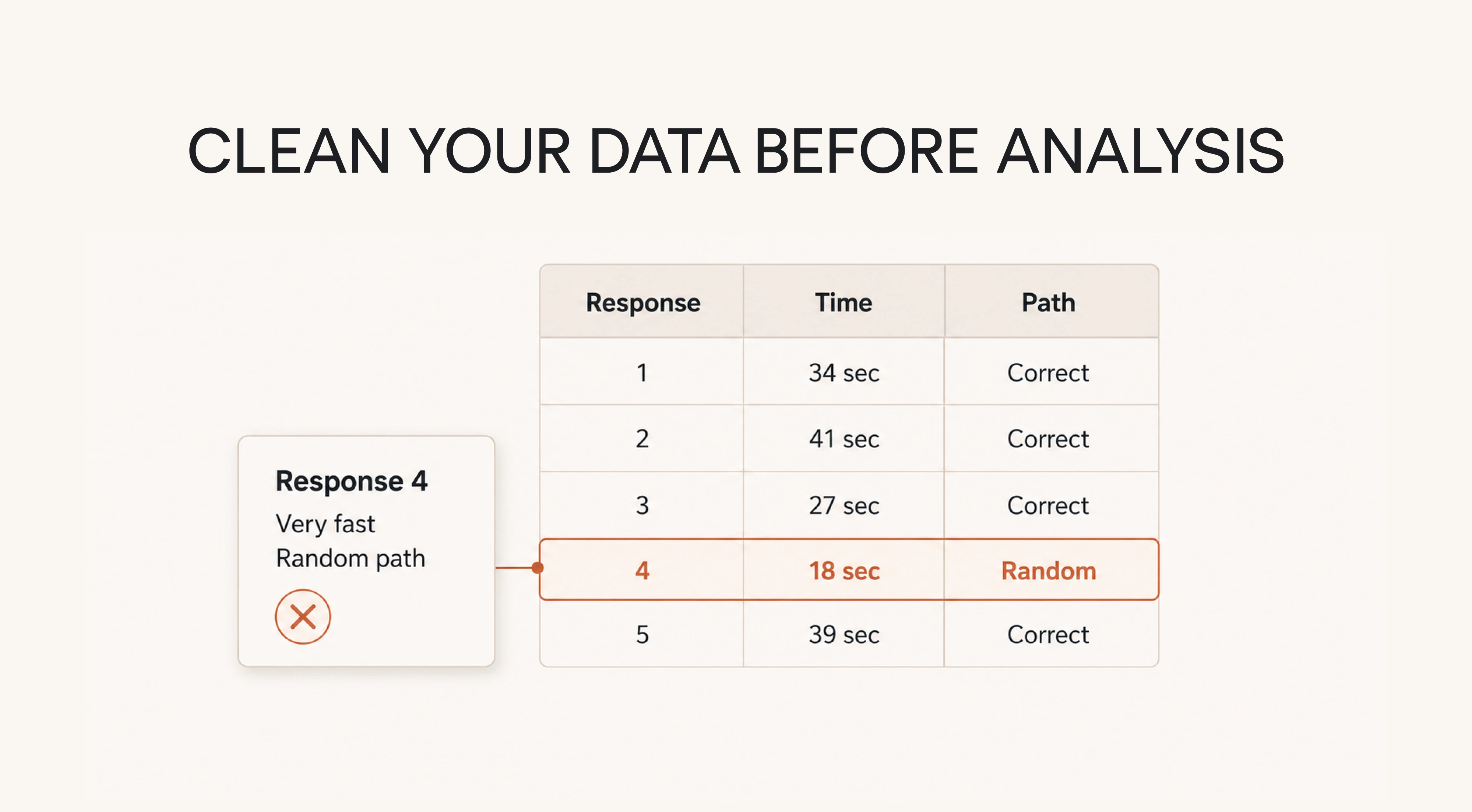
The important thing is to be cautious. One flag on its own is rarely enough to remove someone, since a fast and confident user is not the same as a careless one.
Throw a response out when two signals line up, like a rushed time paired with a random-looking path, and leave the rest in. Over-cleaning quietly bends your data toward the result you already expected, which is the opposite of what the test is for.
Once the junk is out, your tree test results are the numbers you can act on.
Online tree testing tools to use
Plenty of tree testing software can run a tree test, and on the core mechanics they are alike. What separates them is price, how you recruit participants, and whether tree testing comes included or sits behind a higher plan. Let’s compare five options.
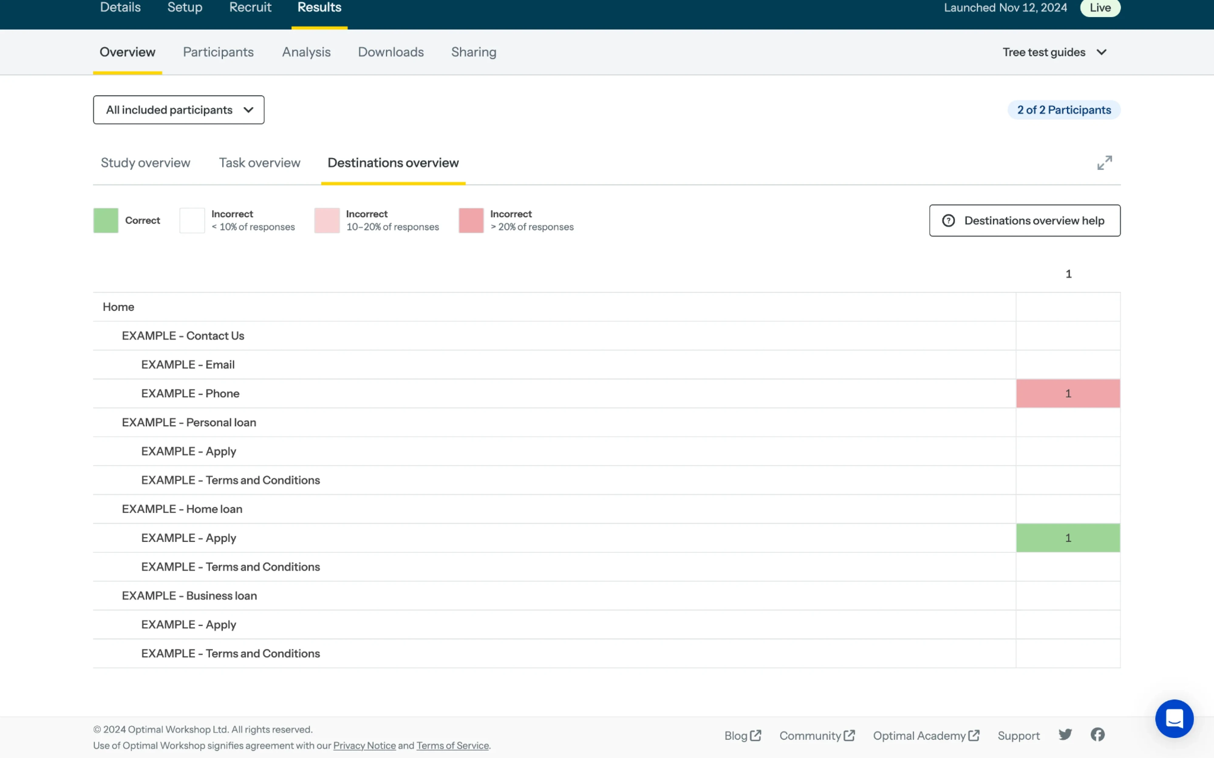
Treejack
Price: from $199 per month, billed annually, with a free trial
Treejack is a tool in Optimal Workshop’s portfolio, known for its path visualizations that show exactly where people branched off course. You can bring an unlimited number of your own participants at no extra cost, or recruit from its panel for a fee.
Maze
Price: free plan available, paid plans for custom pricing
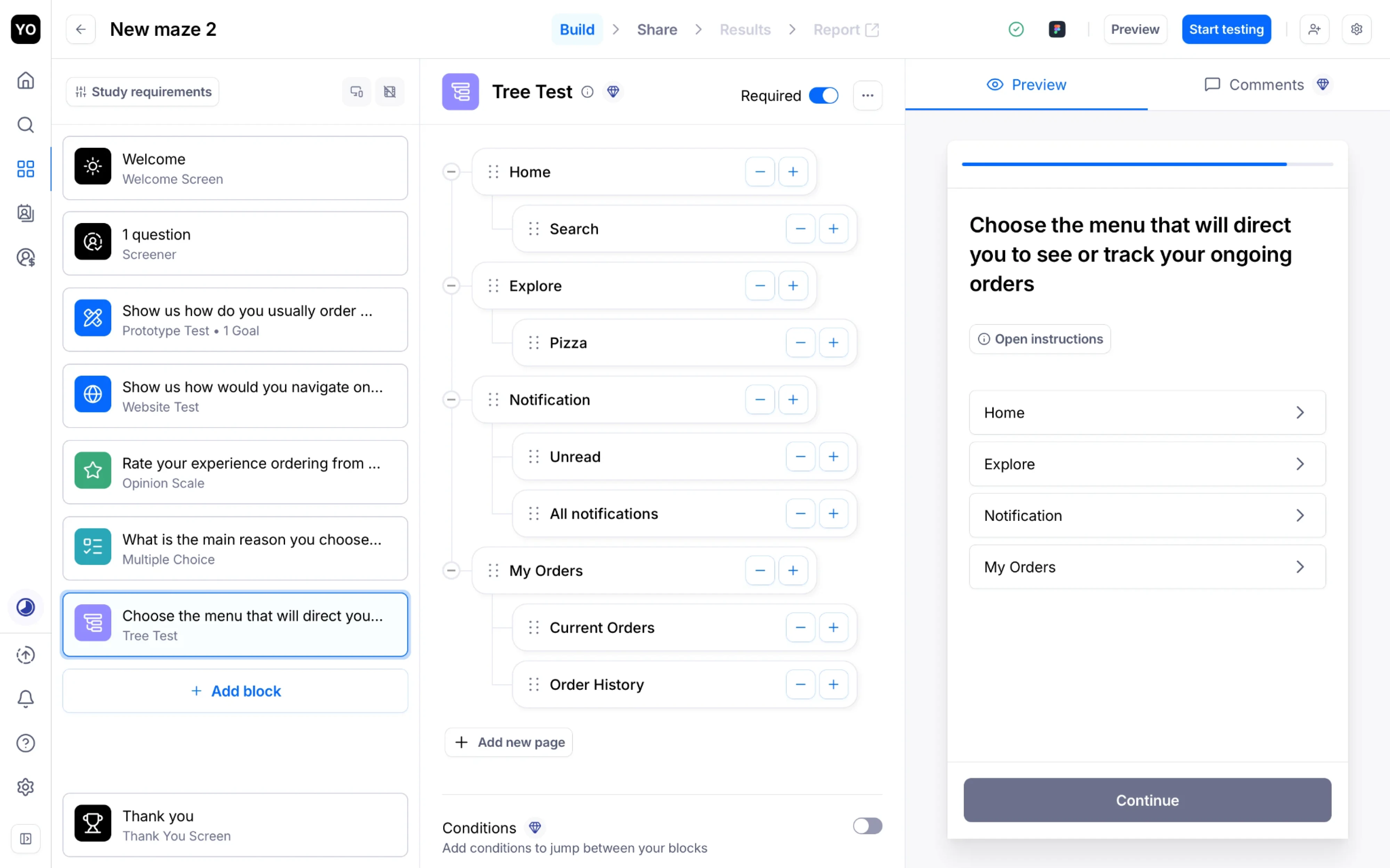
Maze is built for fast, unmoderated testing and is a natural fit for product teams that already prototype in Figma. Its pricing is seat-based, so the real question is how many people need to create studies rather than how often you test.
Lyssna
Price: free tier (excludes tree testing), Growth plan from $165 per month
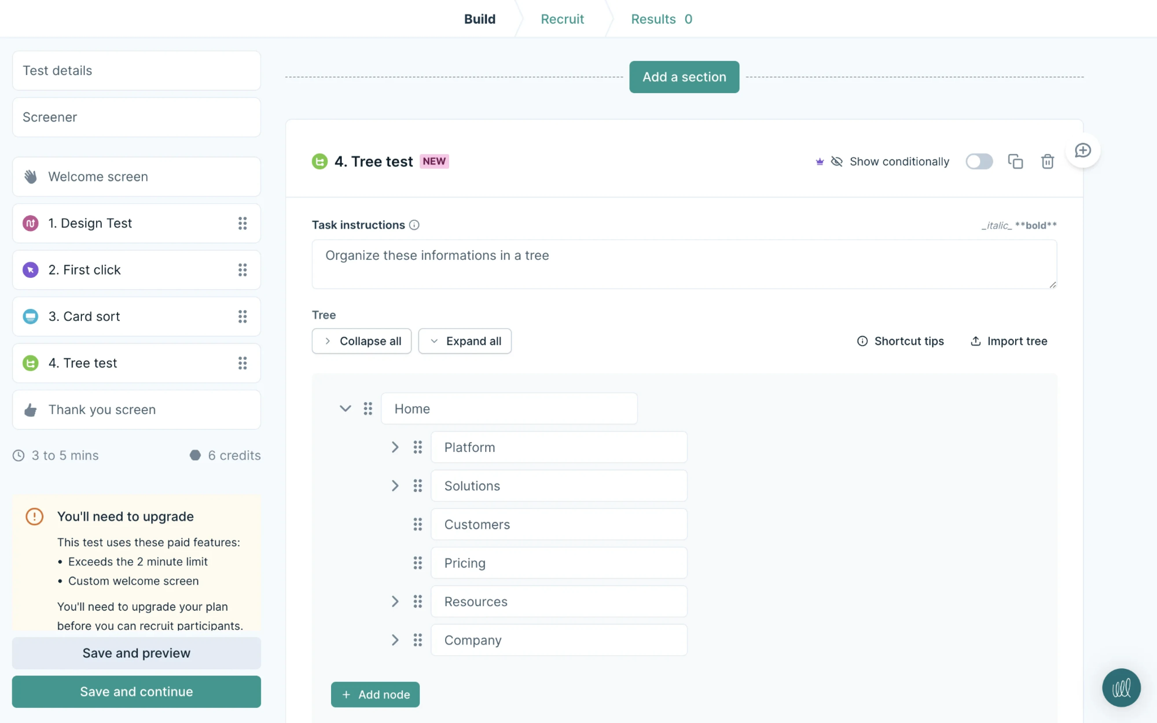
Lyssna sorts its methods into quick studies and in-depth studies, and tree testing sits in the in-depth bucket, so you need a paid plan to run one. Its IA tools are polished, which makes it comfortable for designers who want quick user feedback.
UXtweak
Price: free plan (tree testing with limits), paid plans from $92 to $125 per month
UXtweak is the most budget-friendly all-rounder here, covering tree testing, card sorting, and usability testing in one platform. Its free plan is genuinely usable for a small study, though response caps nudge active teams onto a paid plan before long.
UserTesting
Price: custom pricing for Advanced, Ultimate, and Ultimate+ plans
UserTesting folds tree testing and card sorting into a much broader research and analytics platform aimed at large organizations. Pricing is quote-based and sits above everything else here, so it earns its place only if you need enterprise scale.
The bottom line
The quiet advantage of tree testing is that it settles arguments and tells you plainly whether real users can follow the logic you find so obvious. For a product competing on how quickly people reach value, that is no small thing.
That shift, from opinion to evidence, is where the returns show up.
When Eleken reworked the navigation and translation flow for Bering Lab, the redesign reversed an 89% bounce rate, lifted the repurchase rate above 90%, and helped the team raise $2.3 million in a pre-Series A round, all of it starting from a clear read of where the structure was losing people.
If you suspect your own navigation is costing you more than you can see, get in touch, and we will help you find where users lose the thread.