Most SaaS startups come to this world simple and coherent, in the quiet, pastoral atmosphere with the user experience clear as mountain air. Then startups begin to grow, and this growth is like honey, sweet to the founder’s soul.

But growth has its dark side since it has no limits. The new functionality often goes beyond the original project scope, shattering the app’s information architecture and consistency.
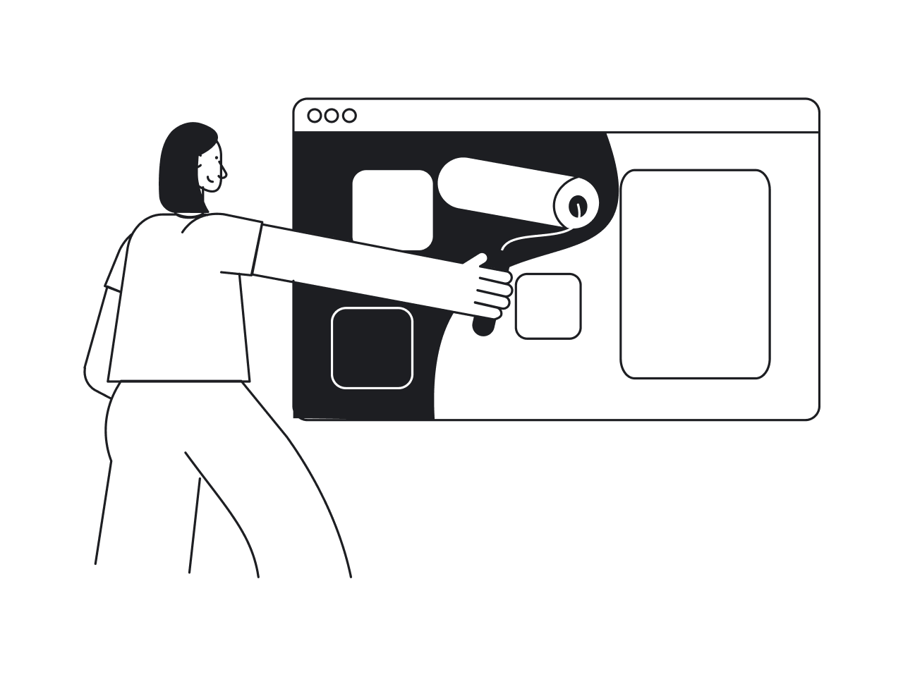
Adding new features to an app is more addictive than smoking. You never know when to stop, and one day, what was a cozy and coherent startup is getting a pretty overloaded scale-up.

- New features, updates, and optimizations turn the app into a mess.
- Customer support notices that users struggle to find what they need and do what they want.
- The marketing team runs a lengthy, costly customer acquisition process, but conversions stagnate.
The symptoms above alert you that it’s time to think of a product redesign — one of the most frequent requests we get at Eleken UI/UX agency. For teams looking for benchmarks before starting that process, Stripe design inspiration is a useful reference point: Stripe has consistently evolved its product without triggering the kind of user backlash that plagues most major redesigns, largely because their changes always serve clarity over novelty.
For instance, recently we’ve redesigned a cloud phone system called Ricochet360. Their main problem was a brutal learning curve. Before the redesign, it took a month for the Ricochet360 team to help clients set up their software. Our other client, Gridle, hired us to refresh their CRM app design and make it more valuable from the user experience standpoint.
We’ve been redesigning SaaS apps since 2015, and we know from experience that redesign is always a challenge. The Adobe buys Figma story is a reminder of just how high the stakes can get: when a product's design experience becomes a genuine competitive advantage, it stops being a feature and starts being the entire value proposition.
Meet the redesign dilemma

A redesign is typically a nasty job. It will cost you a ton of money, it will be incredibly time-consuming and it will take your best talents away from more lucrative goals for a long, long time.
What is more, nobody would ever say thank you for a redesign.
Your aim is to improve users’ experience. But as a reward for this tricky undertaking, you will likely receive outrage and criticism as soon as you roll out the changes. This is the paradox at the heart of every redesign: even turning bad UX examples into good UX examples can feel like a punishment in the short term, because users experience the disruption before they experience the improvement. Understanding why Skype failed puts this in sharp relief: Skype went through several redesigns that each managed to alienate existing users without attracting new ones, a pattern that reveals one of the core secrets of bad design — changing the wrong things while leaving the real problems untouched.
Remember Snapchat’s redesign disaster in 2018? The company shocked its customers with unfamiliar navigation patterns to receive smashing reviews and a historically low growth rate. It became a textbook case of good UI bad UX: the updated interface looked intentional and modern, but it dismantled the navigation logic that millions of users had built their daily habits around, which no amount of visual polish could compensate for.

Another example of a failed redesign was Instagram’s horizontal scroll update. People complained so fiercely that the vertical scroll made its comeback in an unprecedented hour.
In this context, a tiny recent Gmail redesign, that went almost unnoticed, looks like a success story. 1.8 billion people who live inside Gmail would have gone wild if Google had broken anything. That restraint is a lesson in the power of UX: sometimes the most impactful design decision is knowing what not to change, and trusting that incremental improvements compound over time without alienating the people who rely on your product every day.
Gmail’s case history
Once upon a time, Google created a simple and elegant email service. It didn’t make people delete emails and allowed them to search old threads just like they search for information at Google’s main site.
Users: Wow!
Google: Great, but can we foray into messaging services?
*Launches Google Talk*
*Launches Hangouts Chats*
*Kills Google Talk, launches Google Allo*
*Kills Allo, recall the existence of Hangouts Chats*
Google: Now, why don’t we add something to compete with Slack?
*Launches messaging rooms called Rooms*
*Rebrands rooms into Spaces*
Google: We forgot about video chats. Everyone is doing video chats.
*Launches Hangouts Meet*
*Rebrands Hangouts Meet into Google Meet*
Hangouts, Spaces and Google Meet weren’t initially planned as parts of Gmail. Google’s apparent love of launching new services and its inability to combine products under one roof brought what was a simple and elegant email app into a feature creep situation. Any honest Cron app review will raise a similar concern: as the product grows and adds features to compete with established calendars, the risk of replicating this same sprawl becomes very real, and avoiding it will require the kind of editorial discipline that Google clearly struggled with.

Gmail’s menu became a cluttered bunch of squeezed drop-down tabs that all worked in different ways and became totally unusable when you’re flooded with messages, chats, and meetings.
It was uncomfortable to use Gmail because Meet and Hangouts blocked half of the sidebar. So to check spam email, for instance, you had to scroll down to the bottom of your label list, click More, and then scroll down again. This is design and friction at its most accumulated: no single step is catastrophic, but the combined weight of small inefficiencies makes the whole experience feel exhausting over time.
It was also uncomfortable to use Meet and Hangouts as they were floating alongside emails, and worked pretty inconsistently. Meet opened in a new window, and Hangouts opened as a pop-up. Running a product design trial with real users at this stage would have revealed these inconsistencies almost immediately, since nothing exposes broken mental models faster than watching someone try to move between tools they expect to behave the same way.
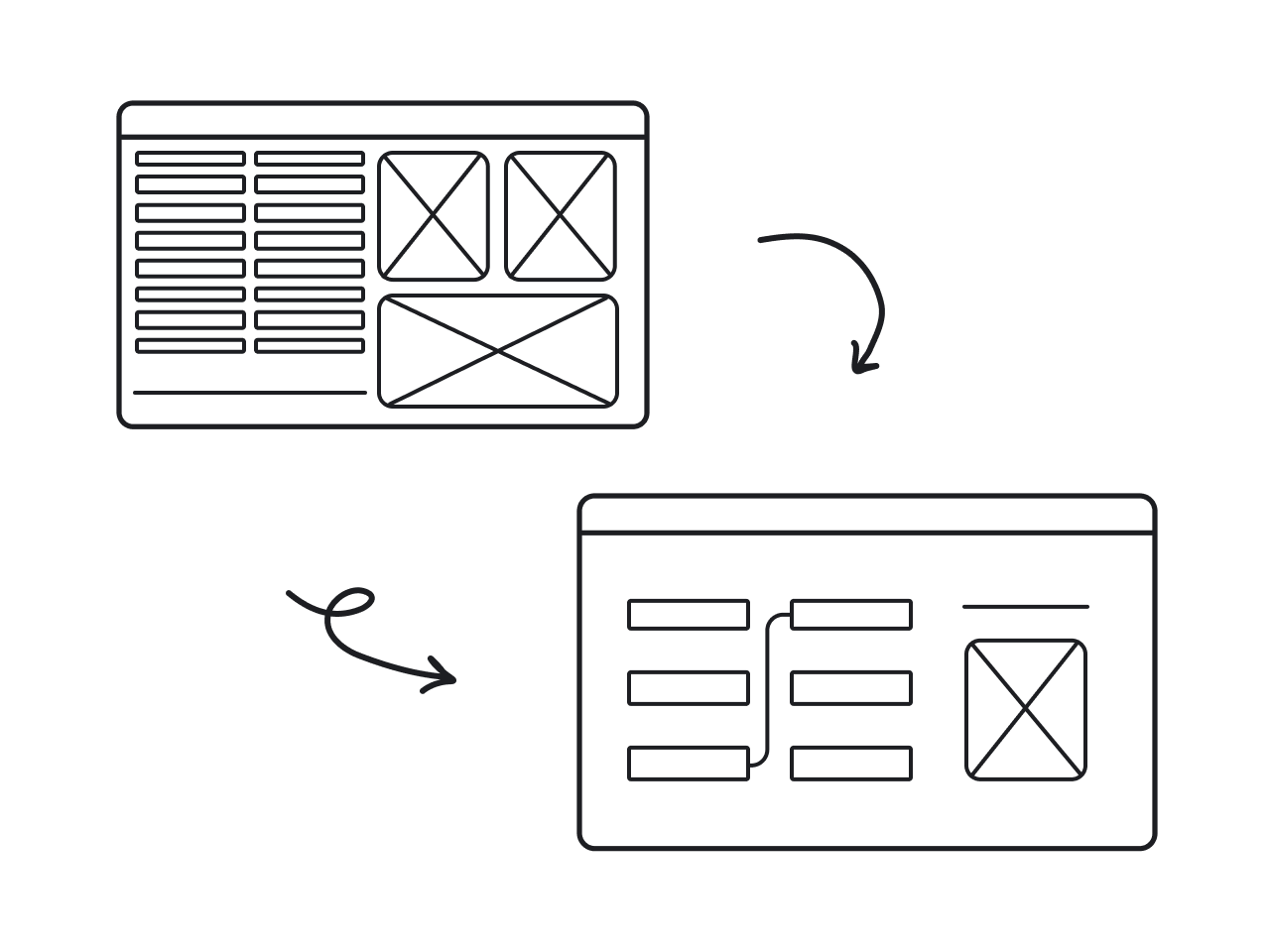
So the key idea of the redesign was to better integrate Meet, Spaces and Chat with Gmail. Let’s see how Gmail coped with this task.
Fix what doesn’t work (but allow customization)
Gmail created a new big left sidebar where you can switch between Gmail, Meet, Spaces and Chat. This novelty finally made all their apps stay out of each other's way. Maksym, Eleken’s Design Director, endorses the new Gmail’s navigation:
“They finally made the main menu which clearly shows you that you are in an email tool, for instance. Next to the main menu, we have a submenu that is entirely dedicated to emails, cleared from any integrations. Chats, Spaces, and Meets are divided from each other, and finally, work in a uniform way — each of them has its own fullscreen window.”

With this new type of integration, Gmail transformed from an email app to a collaboration multitool. And this brings us onto the shaky grounds because some people have no interest in starting video calls or chatting in Gmail. They open Gmail to, you know, use Gmail. For them, the new sidebar is basically a banner ad for Google Chat and Meet. The Google Meet redesign added another layer to this tension: as Meet became more capable and more prominent within the Gmail interface, users who never asked for a video calling tool found it increasingly difficult to ignore.
The redesign made users furious when they faced it for the first time, but only until they realized that Google let them take control over the app. Outrageous posts on Twitter were quickly covered by posts of relief from those who found how to collapse a new sidebar with a very quick search through the Settings.
And speaking of Twitter, remember the platform’s recent redesign fallacy? Back then, Twitter screwed up with the new contrast mode and that made users suffer from headaches. In Eleken’s article about why people hate the Twitter redesign, we admitted the absence of customization capabilities for users to change the contrast to whatever works best for them as the main mistake.
People are different, and you’ll hardly create a one-size-fits-all interface. So be like Gmail, and make your settings as flexible as possible.
Don’t touch what works
With all that hype around the new sidebar, the refresh of an overall Gmail interface had been overlooked. The last Gmail redesign was quite recently, in 2018. Therefore, they didn’t radically change anything in the UI — just did a little facelift, but it did much of a good thing.
For instance, the app's main menu, collapsible panel, and header became gray to differentiate from the email list and message body. That’s a little touch, but it provides clear indicators for where an element starts and where it ends. The Linear app case study demonstrates the same principle at a product level: Linear's visual clarity comes not from bold design statements, but from dozens of small decisions about spacing, contrast, and hierarchy that collectively make the interface feel effortless.
Unlike with the sidebar, the subtle changes to the layout caused no outrage since they didn’t disturb the user flow. Nothing changed in what people have already learned about using the interface. This is precisely one of the core reasons products fail during redesigns: teams underestimate how much users have internalized existing patterns, and overhaul things that were working fine in pursuit of something that looks more impressive in a portfolio.

Gmail redesign was not a DIY job
So, here are the main lessons learned from Gmail’s little redesign:
- Don’t break the logic behind things that work fine;
- If things don’t work fine anymore, rebuild the logic, but give people customization opportunities.
As you might have guessed, a successful redesign takes a little bit more than that. So if you need SaaS redesign experts to revamp your app without pissing everybody off, contact Eleken — we have years of experience in such things.