Running a UX audit is one of the smartest ways to improve your SaaS product’s performance—yet many teams delay it, thinking it’s too time-consuming or complex. The truth is, with the right UX audit tools, you can uncover usability issues, understand real user behavior, and make targeted improvements without draining your resources.
UX audit tools play a crucial role in achieving a positive user experience, which is essential for user engagement and retention.
At Eleken, we’ve worked with dozens of SaaS businesses, and we know that a strong user experience isn’t built on guesswork—it’s built on data. That’s why we’ve compiled a list of the most reliable and insightful UX testing tools to help you run a thorough audit.
Whether you’re just starting out or want to fine-tune an existing product, these tools will help you:
- Track user interactions and drop-off points
- Analyze session recordings and heatmaps
- Gather direct user feedback
- Improve conversion and retention
Integrating UX audit tools early in the design process can lead to better usability and improved product outcomes.
Not all UX audit tools are created equal. Some give you surface-level stats, while others dig deep into how users actually experience your product. Before we walk you through the tools we recommend, let’s look at what features really matter when it comes to running an effective UX audit.
What to Look for in UX Audit Tools for Analyzing User Behavior
Before diving into the list, it’s important to understand what separates a mediocre tool from a truly helpful one. A strong UX audit tool should give you actionable insights, not just raw data. Whether you’re conducting a quick UX review or a comprehensive UX audit, here are the key features to look for:
- Ability to analyze user flows and click paths
The best tools help you understand user behavior by visualizing how users move through your product and analyzing user behavior. This reveals where they drop off, what confuses them, and what keeps them engaged. Often, the most effective customer journey mapping tools allow you to see these paths in high definition, making it easier to spot friction points.
- Heatmaps or session recordings
These features provide a visual layer of insight. Session recordings let you walk in the user’s shoes, while heatmaps highlight where users click, scroll, and spend the most time. Many modern product design tools now integrate these visual analytics to bridge the gap between static layouts and real-world usage.
- Cross-device behavior tracking
A complete UX audit requires visibility into how users interact with your product across different devices—desktop, mobile, and tablet. This is especially important for responsive design and mobile UX.
- Integration with tools like Google Analytics or Firebase
The ability to connect your UX tools with platforms like Google Analytics or Firebase—which are examples of a web analytics tool and a mobile app analytics tool—means more accurate insights and a clearer picture of your mobile app analytics or website performance.
- Support for mobile app analytics
If your product includes a mobile component, your tool should track in-app behavior, session recordings, and even crash reports. Tools like UXCam shine in this category as a dedicated mobile app analytics tool.
- Tracking user actions with event tracking
Look for tools that support event tracking to collect data on specific user actions, such as button clicks, form submissions, and navigation events. To get the full picture, combining these metrics with specialized UX research tools helps validate why users take certain actions.
- Evaluating key elements
Ensure the tool allows you to evaluate key elements such as visual hierarchy, layout consistency, and information clarity during your audit.
- Heuristic evaluation and heuristic evaluations
The best UX audit tools support heuristic evaluation and heuristic evaluations, providing a structured, expert-based method for identifying usability issues based on established usability principles.
- UX audit checklist support
Using a UX audit checklist ensures a comprehensive and systematic audit process, helping you cover all critical aspects of the user experience.
Choosing the right tool depends on your product type, team size, and the depth of audit you’re planning to perform. The ability to access granular data is crucial for identifying specific user bottlenecks and optimization opportunities, allowing for more precise improvements. Keep these criteria in mind as we explore the top UX audit tools available today.
Now that you understand the value of a well-executed audit, let’s explore the top UX audit tools that can help you uncover insights, improve usability, and align your product experience with your business goals.
From analytics data to heatmaps and session recordings, each tool on this list brings something unique to the table.
1. Google Analytics: Web Analytics Tool

Using Google Analytics for the UX audit may seem a bit of an unexpected solution. This web analytics tool typically comes to mind when we’re talking about market research and the digital marketing area. Yet Google Analytics can efficiently serve as a UX analytics tool, providing you with valuable insights regarding your website visitors, which you can utilize for user experience improvement.
Conversion is the most important indicator of website performance, and it’s not a secret that a great user experience has the power to make people take expected actions - leave their contact data, subscribe for a newsletter, or purchase. Based on various metrics, including user engagement metrics, you will be able to better understand your audience’s behavior from the first minute they land on your website. For example, Google Analytics data will tell you where your potential customers come from and how long they usually stay on your landing page.
Behavior reports help you answer the questions:
- How many unique visitors visited your website?
- What were those CTAs customers reacted to?
- Which page performed the best in terms of customer engagement?
Data like demographics, interests, locations, languages, and devices let you adjust your user flow, CTAs, and overall UI. User demographics can be especially useful for tailoring user experience improvements to better match the needs and preferences of your target audience. Our designers know that even the smallest detail in a page design can be a turning point leading either to checkout or to leaving a site.
By understanding users’ behavior, you can enhance a customer journey and ultimately lead more people to conversion.
As for mobile devices, Google offers mobile app analytics for Firebase that provides insights on mobile application use and customer engagement, being a good tool for UX audit.
Additionally, reviewing previous UX audits using Google Analytics data helps identify recurring issues and track the impact of changes over time, ensuring continuous improvement of the user experience.
How to Get Along with Designers and Work Well Together
Find out how designers see a perfect product manager — and how to become the one
Get the free eBook
2. Mixpanel

Unlike Google Analytics that tracks website visitors and is great to have a general understanding of traffic, Mixpanel excels at event tracking, allowing you to collect granular data on specific user actions. This tool is highly effective for analyzing user behavior, providing answers to questions like “how many users pushed the CTA button from the pricing page,” for example. Mixpanel also helps identify where users drop off in key flows, enabling you to optimize conversion and reduce user churn. Additionally, it provides insights into how users navigate through your product, helping designers understand user pathways and interaction points to improve UX and conversion.
However, Mixpanel insights may be too one-sided, being based mostly on UX researchers’ assumptions. Thus, it would be more effective to compare Mixpanel with other analytical tools data to reach unbiased conclusions.
3. Kissmetrics

Kissmetrics is one of the most expensive web analytics tools, but it is definitely worth every penny. The tool offers robust analytics and customer behavior reports that help UX designers better understand customers and improve user experience. Analyzing customer support tickets within Kissmetrics can help identify recurring user pain points and usability issues. Furthermore, the growing role of AI in UX design makes this behavioral data even more valuable for automated pattern recognition.
The Kissmetrics functionality allows to:
- Find out what features customers use the most
- See key business metrics (churn rate, MRR, subscriptions, new trial starts), which easily sync with leading product management tools to align design changes with business goals
- Identify the most viewed webpages
- Track the best customers and cohorts behavior
- Segment users by user personas to tailor experiences for different audience needs
- Discover weak points in the onboarding funnel
Kissmetrics helps uncover user pain points and user opinions through behavioral data, providing actionable user insights for improving the product. For instance, exporting these findings into ChatGPT for UX researcher can help quickly synthesize complex data into clear, actionable audit reports. Being not as detailed as Mixpanel but undoubtedly more profound than Google Analytics, Kissmetrics provides an effective mix of raw and interpreted data. Just press the “Analyze customers behavior” button and get insights helpful for your design audit.
4. HotJar
If you want to understand what people are doing on your website and what elements and information attract them the most, you can have a sneaky peek at their behavior. Nothing illegal, just a smart digital tool! Hotjar creates interactive heat maps of users’ clicks, scrolls, and moves to give you an idea of how users interact with your website. Hotjar helps you evaluate visual elements such as buttons, icons, and layout design, and assess the effectiveness of interactive elements like forms and navigation features.
Hotjar’s line-up consists of four products: heat maps, session recordings, surveys, and real-time feedback pools. However, heat maps are the product Hotjar is mainly associated with. The “heat” is a color scale highlighting the most popular “hot” webpage areas with red color and the least interacted or “cold” - with blue color. By visualizing real user interactions, Hotjar helps you understand whether your product meets user expectations and reveals areas of user frustration, such as rage clicks or repeated actions.
Click maps show which CTAs users click the most. Also, you can find out that some non-CTA UI elements attract more attention and draw users away from taking expected actions. Being aware of these nuances, you’d probably decide to rearrange important buttons to improve user experience and increase conversion.

Scroll maps show how deep to the bottom of the page your website visitors usually go. If users don’t scroll down, it means they can miss some information you want them to know.

Move maps track mouse movements without clicking or scrolling. It can tell us what information a user finds interesting to check on your webpage. Observing real user interactions through session recordings and heatmaps provides valuable insights into usability issues and helps map and optimize the user journey.
Hotjar has a decent competitor with even more robust functionality to facilitate the UX audit.
5. Crazy Egg
Crazy Egg offers five reports analyzing users’ behavior from different sides, providing granular data on user interaction and user engagement. There are no chances something will remain hidden after Crazy Egg’s behavioral analysis.
Heatmap report highlights with different colors the most and least popular areas of your webpage. You can track whether the area where you place your CTA button falls into users’ attention.
Scrollmap report shows how far to the page bottom your website visitors go. If you think about putting your important CTA button somewhere close to a footer, you’d probably change your mind looking at the report’s results.
A lovely Confetti report displays each user’s clicks instead of a total number of clicks, offering granular data for analyzing user interaction and engagement. You can create 22 customer profiles to have deeper insights into how each customer segment is performing.

Overlay report filters clicks by various criteria like new and returning visitors, device type, UTM campaign, and provides granular data to help you gain insights into specific user behaviors. When considering how to choose SaaS tools for your stack, these filtering capabilities are often a deciding factor for data-driven teams.
List report shows you the percentage of users who clicked on each clickable element on the webpage.
With the help of Crazy Egg UX testing, you can get a comprehensive picture of users’ interaction with your website and think about customer journey enhancement. Crazy Egg helps in identifying usability issues by visualizing user actions and click patterns. This makes it a strong contender among popular usability testing tools that focus on visual evidence. The tool allows you to gain valuable insights into user behavior and conversion optimization.
6. UXCam
“UXCam is the market leader in app experience analytics, empowering mobile teams with fast, contextual, and high-fidelity insights,” - states UXCam on the official website, and we have nothing to object to. This tool does have excellent capabilities for app analytics. Session recordings, heat maps, crash logs, and even integration with Firebase, a Google platform for creating mobile and web applications, makes UXCam a great addition to your UX audit toolkit.
As the industry moves toward automation, incorporating product design AI tools like those offered by UXCam can significantly speed up the process of finding patterns in thousands of recorded sessions.
Here is what UXCam can help you with:

- Record, analyze, and share sessions and events to identify if there are any users' behavior patterns
- Track screen flow to overview how users interact with your app and what frictions they have
- Create heat maps to find out whether users encounter complication while using an app
- Log app crashes and UI bugs to communicate the issues to the product team to make necessary adjustments for the next app release
The last tool in our list seems to be the greatest one as not figures, but real people tell you the truth.
7. UserTesting
UserTesting is not a conventional review site. It's a platform where you can get prompt customer feedback on websites, mobile apps, and prototypes user experience.

You receive audio and video messages from your target audience once they will test your product and accomplish another task you assigned to them. Also, it's possible to schedule live conversations, put questions, and get insightful answers with the help of which you can:
- Check market feedback on your design decisions before the product development stage
- Detect the bottleneck in user experience that causes frictions when using your product
- Make clear your customers' needs
Small startups and large enterprises like Facebook and Grammarly are among UserTesting clients, so you can be sure it's worth trying this tool for your UX audit.
Want to take your audit one step further? AI-powered UX tools are changing the game by automating analysis, highlighting usability issues faster, and helping teams make smarter decisions—without endless manual digging. Let’s explore the top AI-powered tools available in 2026.
AI-Powered UX Audit Tools
As UX audits become more data-driven, AI-powered tools are emerging to help product teams conduct a thorough UX audit by combining qualitative and quantitative data. These tools enable teams to analyze user behavior, identify usability issues quickly and efficiently, and prioritize fixes—without spending hours sifting through recordings or spreadsheets.
AI-powered solutions make it easier to perform UX audits at scale, ensuring that any digital product—whether a website, app, or SaaS platform—can be systematically evaluated. By leveraging AI features, teams can conduct periodic UX audits to ensure continuous improvement and keep the product aligned with evolving user needs and business goals. Optimizing the product's user experience using AI-powered insights helps benchmark against industry standards and competitors.
Here are some of the top tools offering AI-powered UX insights in 2026:
1. Microsoft Clarity
A free and surprisingly powerful UX tool from Microsoft. While not fully AI-driven, Clarity uses intelligent algorithms to filter recordings based on rage clicks, quick backs, and dead clicks. Its Smart Alerts and AI-assisted filtering help prioritize UX issues with minimal manual effort.
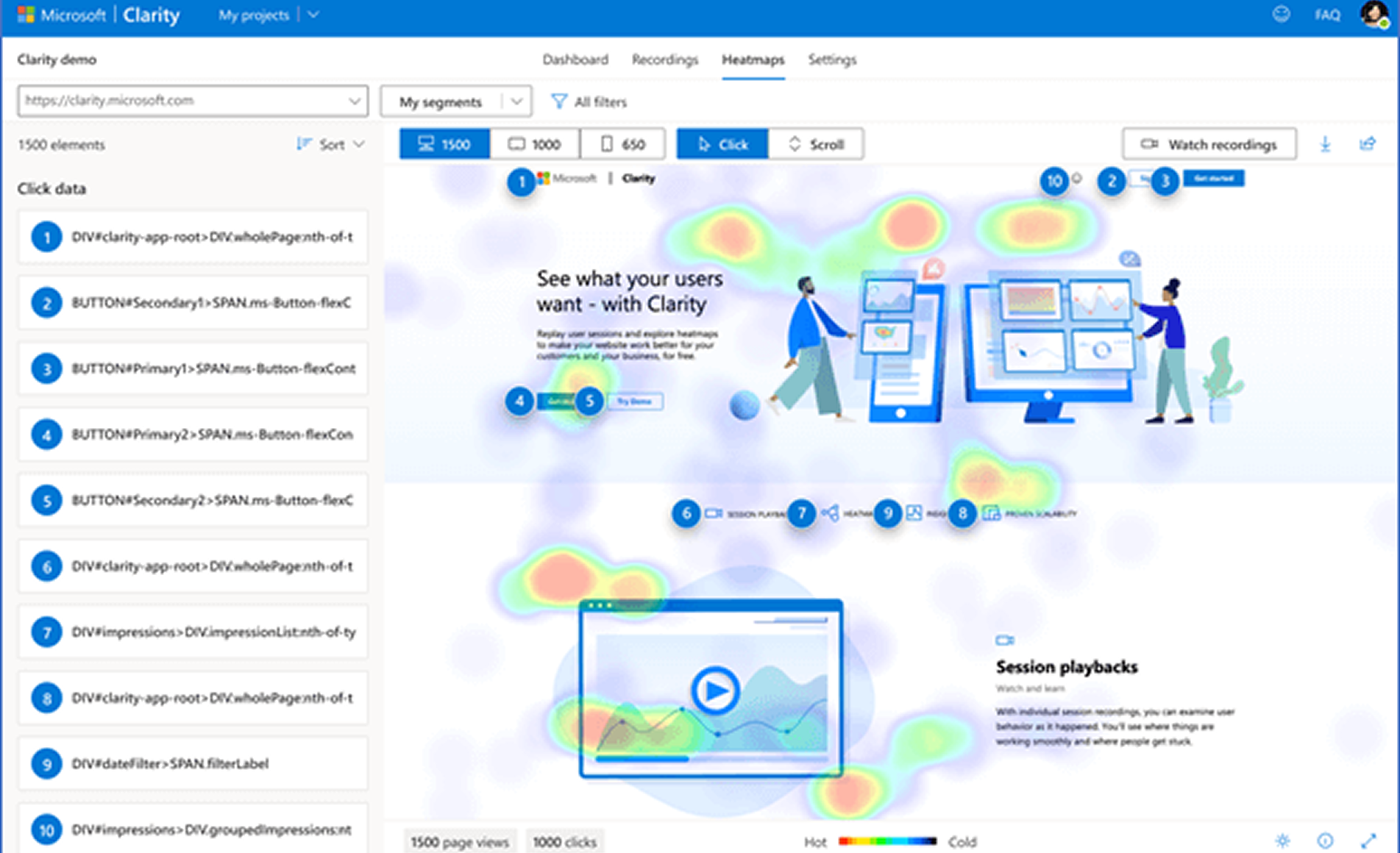
Key AI features:
- Smart session filters
- Behavior-based alerts
- Auto-tagged rage clicks and dead zones
2. VWO Insights (Visual Website Optimizer)
VWO combines A/B testing with heatmaps and session recordings, but the bonus is its AI-based predictive analysis. It can simulate heatmaps for proposed designs and make suggestions based on test results.
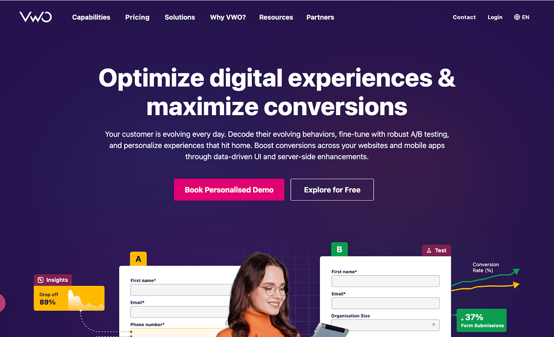
Key AI features:
- Predictive heatmaps
- Smart A/B test insights
- Automated behavioral segmentation
3. Smartlook
Smartlook offers session recording and heatmap tools with advanced filtering. Its AI layers focus on automated user segmentation and event-based behavior triggers, helping you detect friction without watching hours of video.
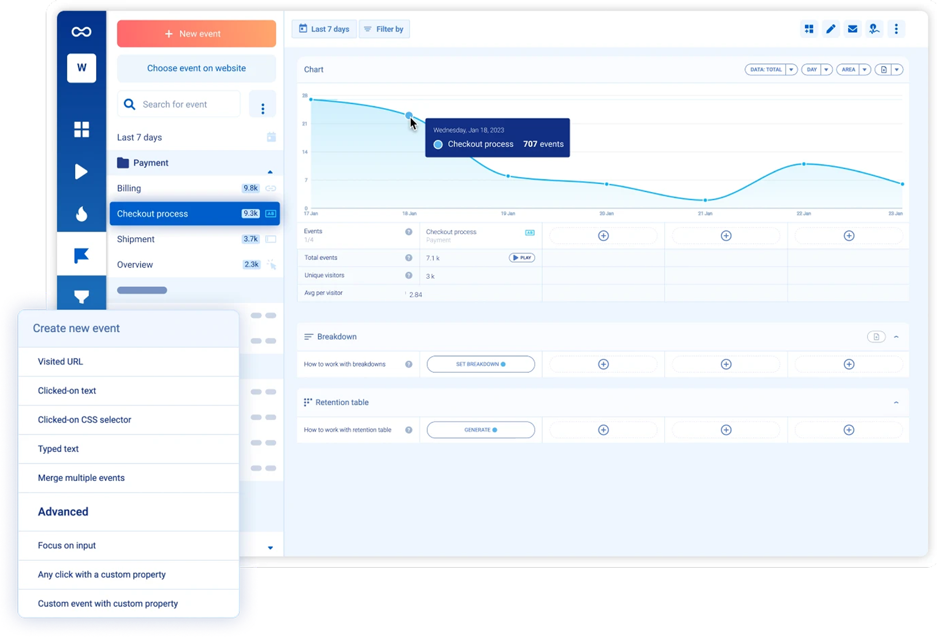
Key AI features:
- Event-triggered insights
- Session filters based on anomalies
- Trend spotting across segments
4. Hotjar AI Features
Hotjar recently rolled out AI capabilities to enhance its session replay and feedback tools. You can now get automated summaries of user sessions and highlights of unusual behaviors — ideal for speeding up the audit process.
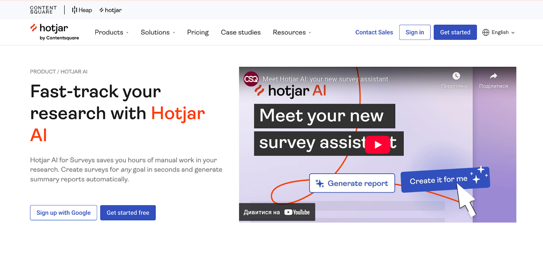
Key AI features:
- AI summaries of session recordings
- Smart highlights in user journeys
- Auto-categorized feedback themes
5. UserTesting AI Tools
UserTesting now includes AI-enhanced summaries and keyword tagging from qualitative user research. It's especially useful for teams running large-scale studies and needing fast takeaways from multiple interviews or tests.
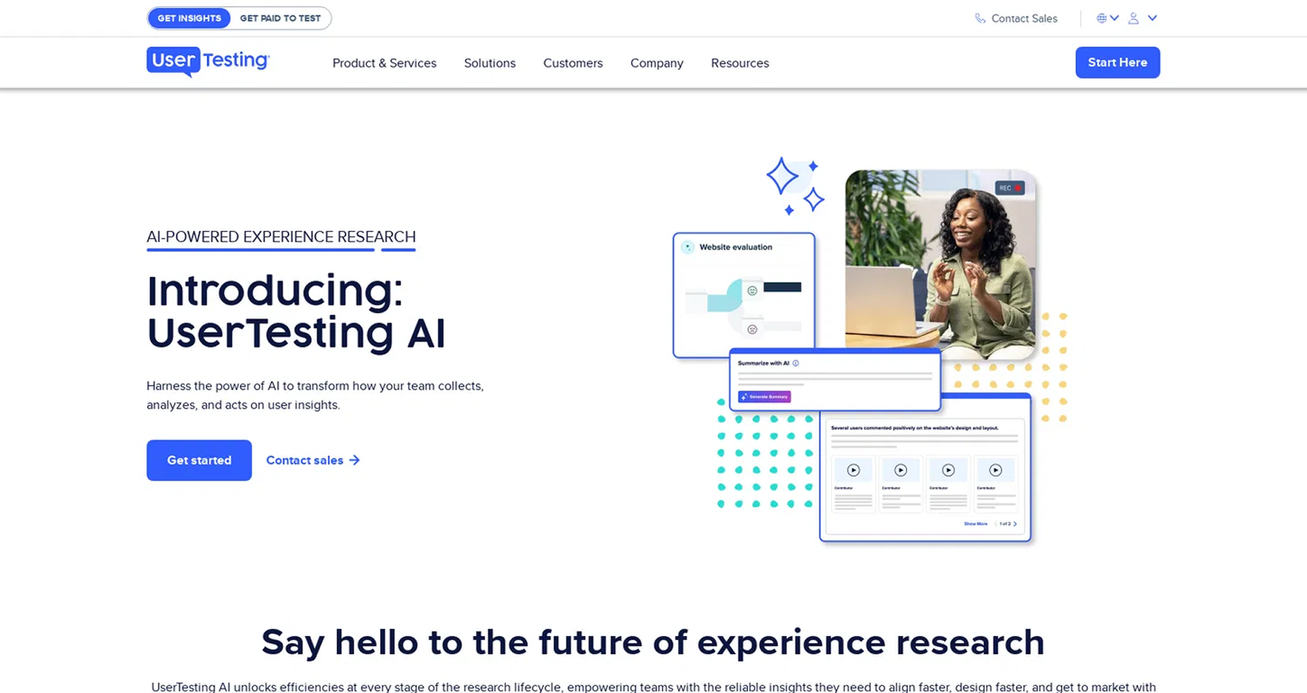
Key AI features:
- AI-generated video highlights
- Keyword clustering from open-ended feedback
- Behavior summaries across tasks
Why Use AI-Powered UX Audit Tools?
If you're conducting a UX audit on a tight timeline—or juggling multiple projects—AI can help:
- Surface high-friction areas quickly
- Reduce time spent watching recordings
- Generate actionable insights faster
- Scale usability testing with fewer resources
That said, AI should enhance, not replace, human judgment. These tools work best when paired with UX expertise and user research context. Even when exploring the latest notion UI debate regarding minimalist vs. functional complexity, human intuition remains the final filter for what actually works for a user.
Professional UX audit services
While conducting a UX audit independently using online tools can provide valuable insights, sometimes you need a more comprehensive analysis to uncover deeper issues across the entire user experience. Plus, tools can’t guide you on what to do next with your findings. Integrating modern AI tools for UX into a workflow can speed up data collection, but we at Eleken can. We help our clients not only identify areas for improvement and user pain points but also give actionable recommendations on possible solutions.
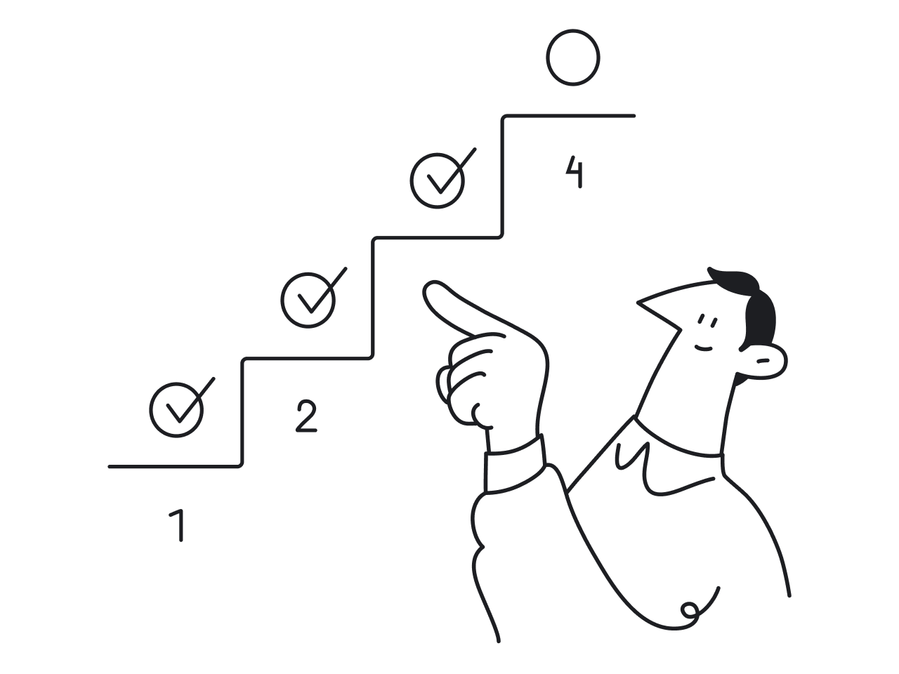
Here’s what our UX audit process looks like:
- Thorough product evaluation. We start by thoroughly understanding your product and business, putting ourselves in the shoes of your customers to evaluate from the user's perspective, interviewing your team, and analyzing user feedback. We often use AI UX audits to parse through large volumes of qualitative data during this discovery phase.
- Page-by-page audit. Using Jakob Nielsen’s 10 usability heuristics, we evaluate each page of your product, identifying issues in architecture, navigation, forms, usability, accessibility, and visual style, while considering the entire user experience from onboarding to retention.

3. Comprehensive UX audit report. We organize our insights into a structured UX audit report, categorizing issues by severity, highlighting key findings, and providing annotated screenshots with clear, actionable recommendations for solutions.

4. Results presentation. We arrange a Zoom meeting to present the audit findings, explain each problem area, provide recommendations, and discuss further redesign plans.
To sum up, we at Eleken have profound experience in doing UX audits for our clients working with various tools. Drop us a line if you ever need our assistance.
If you’re just starting out with UX audits and wondering how the whole process works—not just which tools to use — we’ve got a guide for that.
Check out our companion article, How to Conduct a UX Audit, where we break down each step of the process.