

A button looks one way in Figma and another in production. A developer builds a new version because the existing one is hard to find. An AI tool generates a third. Each feature adds more UI to maintain, even when the product already has the components it needs.
A Storybook design system helps teams see and test the components they actually build with. At Eleken UI//UX design agency for SaaS, we don’t use it just to document components. We use it to connect design decisions with the components developers and AI use to build the product, bridging the gap between design tools and working code.
The goal is one shared product language across design, code, and AI: the same components, states, and usage rules. A Storybook component library makes those decisions visible alongside working components, helping teams spend less time recreating UI and fixing mismatches, and more time shipping features.
This guide explains how Storybook supports that work, how to set it up, and how to keep it useful as your product grows.
What is a design system and why does it need tooling?
A design system is a set of UI standards, design tokens, reusable components, documentation, and rules that guide how a product’s interface is built and maintained. It gives design teams and developers a shared foundation for creating consistent product experiences.
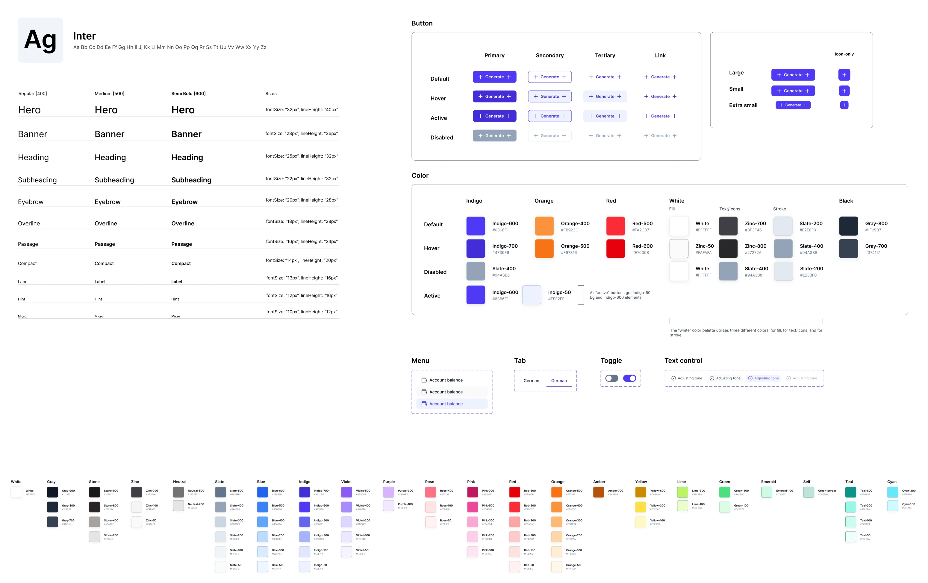
A component library is one part of that system. Teams also need to know which component to use, how it behaves, and when a new pattern is justified. Otherwise, each feature becomes another occasion to make the same UI decisions again.
Those decisions can also drift apart. Figma shows one version, the code contains another, and production may use a third. This is design–code drift, and it makes a simple question difficult to answer: which version should the team follow? Without a reliable source of truth, teams may end up maintaining conflicting versions of the same component.
Storybook makes implemented components easier to inspect and compare with their design references. But it isn’t the design system itself. It cannot decide which patterns your product needs, remove duplicates, or assign responsibility for keeping the system current. A single source of reliable component information only works when teams agree on the rules and keep design and code aligned.
We've seen the impact of this system-level thinking in Eleken projects.
For Newton360, a workforce management app for emergency medical services teams, mobile and desktop interfaces lacked a shared design foundation. Eleken created reusable tokens and documented component behavior, usage, and accessibility requirements.
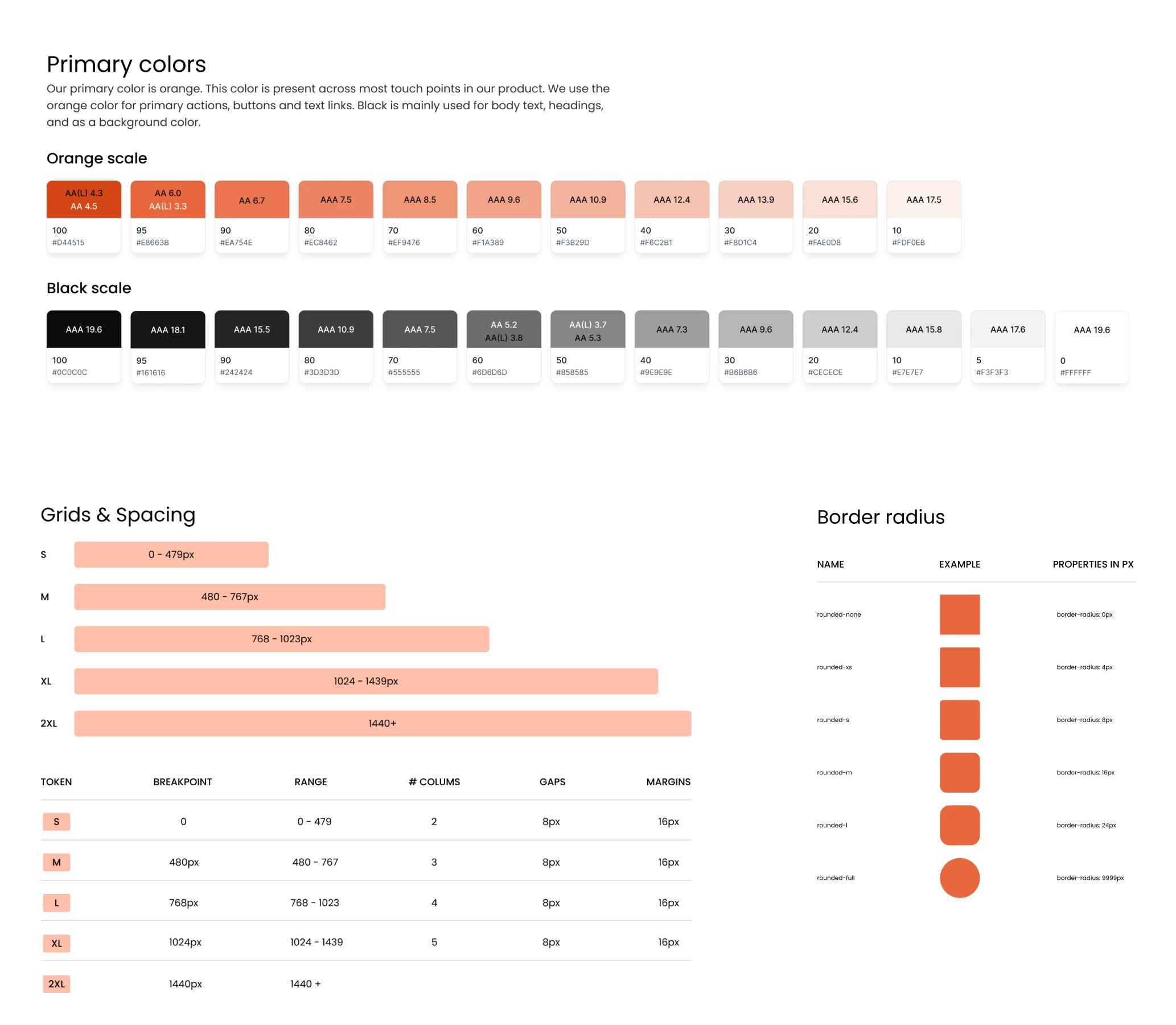
When the client requested a light theme, variable modes let us adapt existing screens without redesigning them individually.
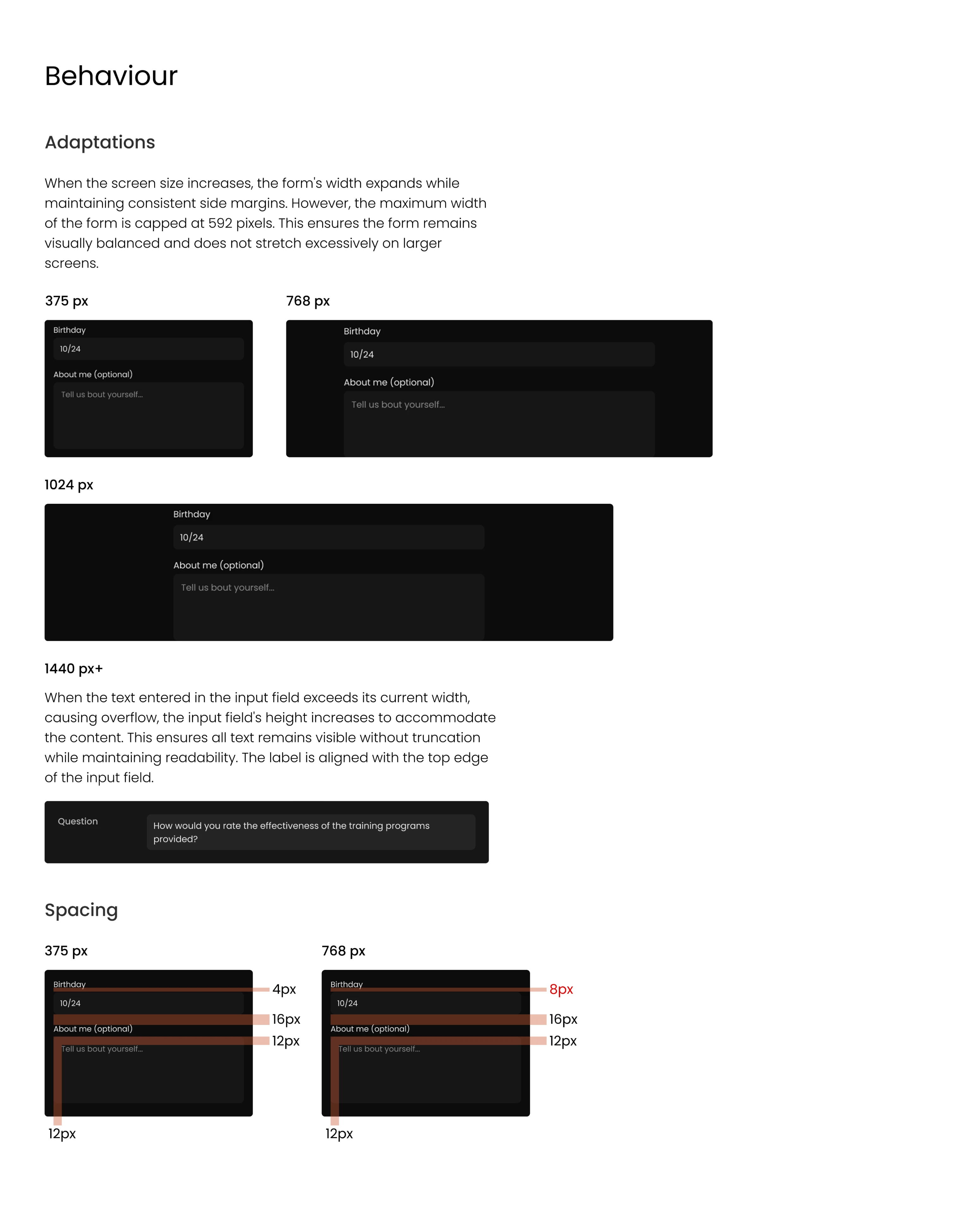
This made updates easier to manage and gave developers clearer implementation guidance.
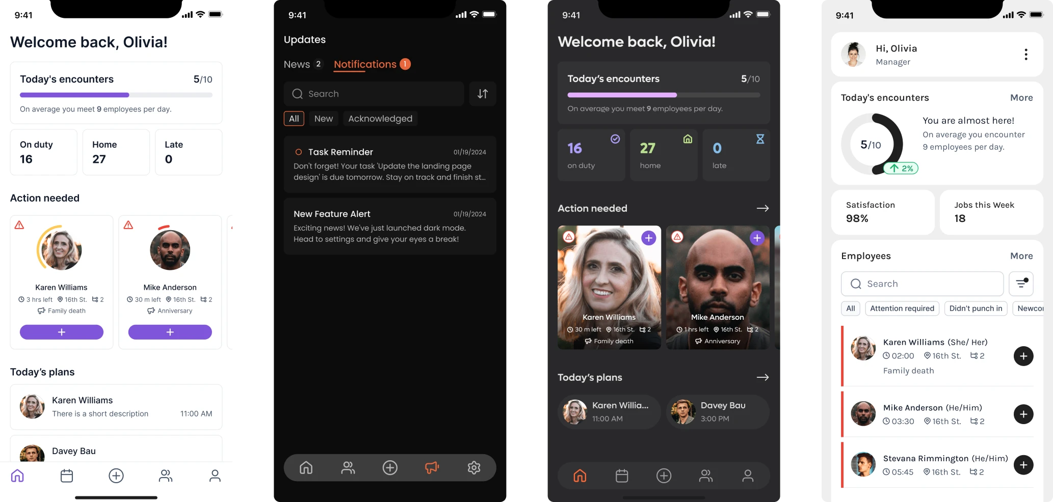
That is the value of a design system: a decision made once can support many screens. Tooling helps teams find, apply, and check that decision as the product evolves.
Why Storybook is the workshop for your design system
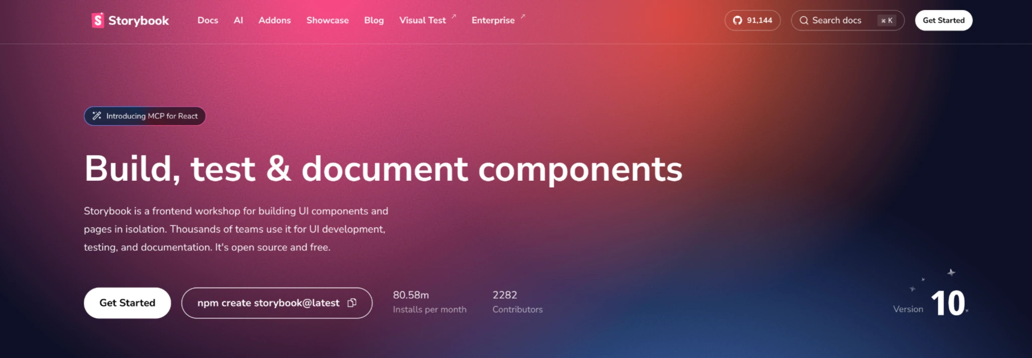
Storybook is a tool for building and testing UI components on their own. It supports component development in isolation, so instead of opening the full application to find a button, form, or menu, teams can view it directly in Storybook. They can see its different states, check its functionality, and document how to use it.
The foundation of this workflow is a story. Each story represents a particular version or state of a component. A button, for example, might have stories for its default, disabled, and loading states. Instead of reproducing each condition inside the actual app, the team can open it directly in Storybook.
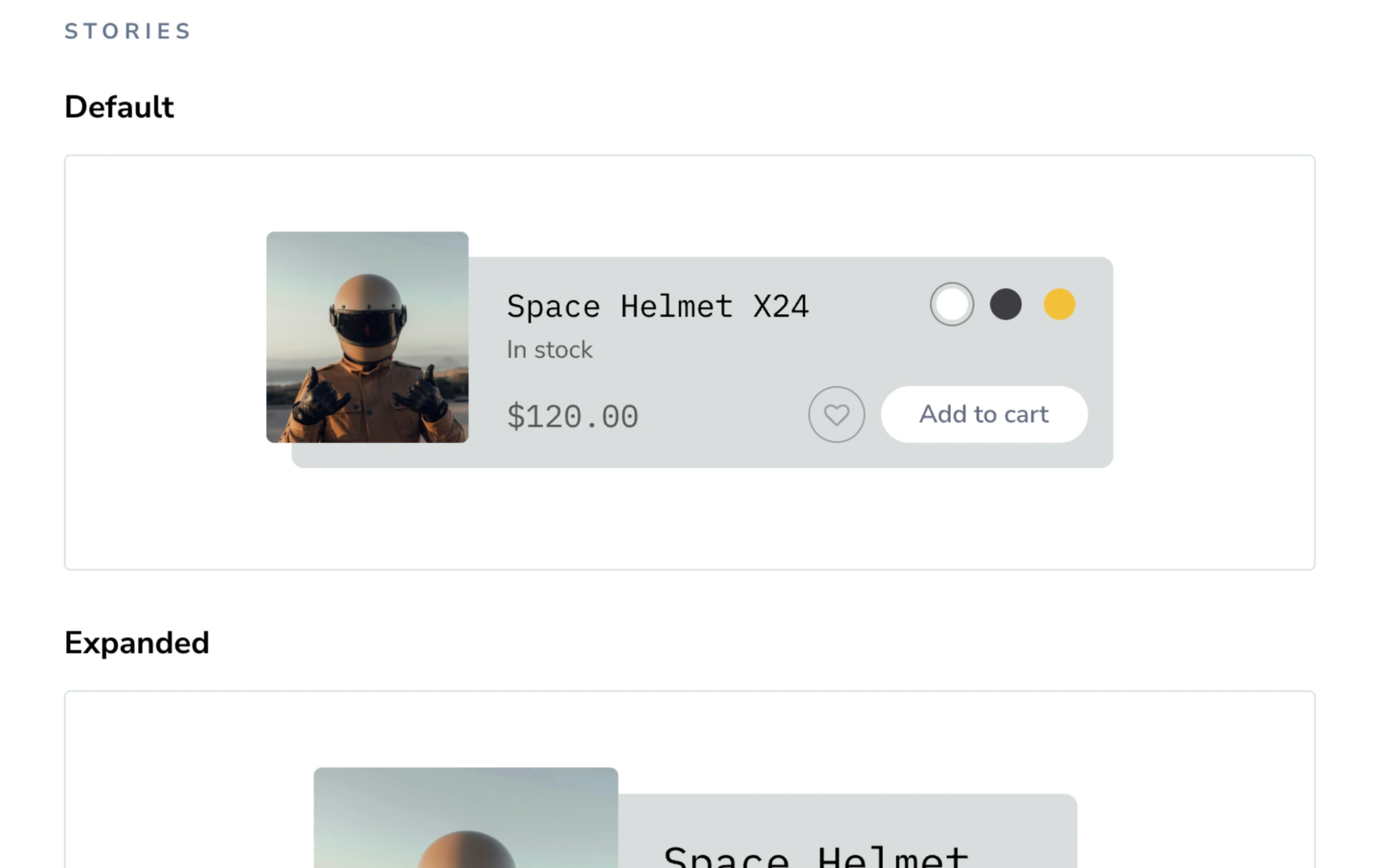
This helps developers discover what already exists before building something new. Designers can review the working component, including states that a static screen may not show. New teammates can learn the library without searching through the whole application.
The business benefit is less repeated frontend work. A documented, working component-driven design process gives the next feature a starting point, including decisions about its appearance and behavior. Developers can reuse an existing UI element rather than recreate it or make the same decisions from scratch.
Eleken’s work with Smartpin, a geospatial SaaS platform developed by Hubble Network, illustrates the value of reusable components. The product handles large volumes of tracking data, so our designers created reusable table cells, filters, and inline-editing patterns aligned with Tailwind. This helped maintain consistency across complex interfaces and gave developers reusable building blocks for future features.
How our design helped a geospatial SaaS platform raise $70M in Series B funding
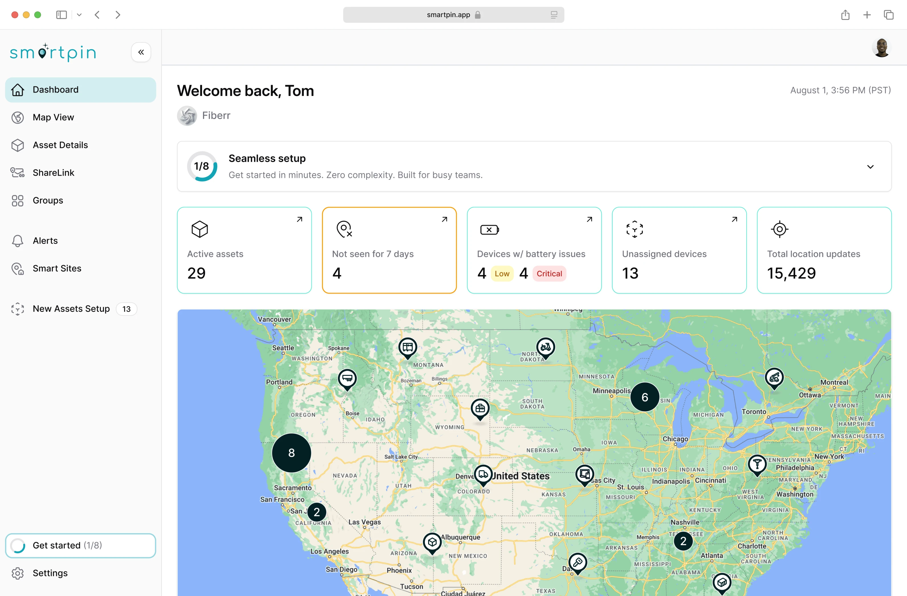
Storybook supports this kind of workflow by giving teams a dedicated place to explore, test, and document coded Storybook UI components before reusing them across the product.
Why Storybook matters for AI-assisted development
AI can generate UI quickly, but it needs access to your product’s existing decisions. Without that context, it may hardcode spacing, recreate a component that already exists, or introduce a pattern that doesn’t fit the rest of the product.
For example, a request to “add a confirmation dialog” leaves several questions open: which dialog component should be used, which action is primary, and how should loading or error states behave? A connected system gives the tool existing components and rules to consult, helping it follow established UI patterns without inventing new business logic.
Storybook can make component examples and documentation accessible to AI through a suitable integration. Storybook’s own AI tooling includes an MCP server, which lets a connected agent retrieve component information and use supported testing tools. These capabilities are currently in preview, and framework support varies.

Access alone is not enough. The repository should also explain where components and tokens live, how to reuse them, and when a new component is allowed. These instructions should be integrated into the team's existing dev workflow so AI-generated changes follow the same conventions as human-written code. Designers and engineers still need to review the output.
At Eleken, making a system useful for AI starts with the product: audit what exists, fix components and tokens, define usage rules, then connect those rules to the tools the team uses. Storybook is part of that connection.
What should every component’s documentation include?
A useful story answers three questions: when should I use this component, what can it do, and which rules should I follow? These answers help developers reuse it and give AI tools clearer context.
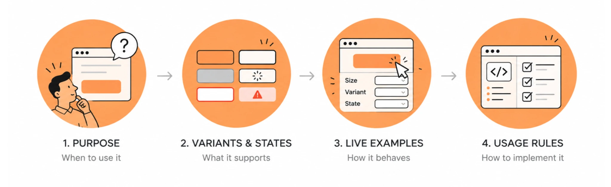
Start with the component's purpose
Document the component name, what problem it solves, and when it should be used. A button story, for example, shouldn't only display buttons — it should make clear when to use primary, secondary, or destructive actions.
Cover variants and states explicitly
Show the sizes, appearance variants, styles, and states relevant to the component, such as disabled, loading, error, or selected. A form input should show how validation works; a data table may need loading, empty, and error examples.
Compare these with Figma designs and the live product. If a state exists in only one place, resolve the difference rather than leaving each developer to interpret it.
Make examples interactive
Live examples are more useful than static screenshots. Storybook controls let teammates change props and immediately see how the component responds.
Use controls that reflect supported options. For example, a size selector should expose the sizes the component actually supports and show how different configurations render.
Add design and code guidance
Include the component’s props, key interactions, responsive behavior, and usage rules. Explain meaningful restrictions: when to use a destructive action, whether a menu needs a label, or how a dialog should handle long content.
Where relevant, link to the corresponding Figma files so developers can compare the implemented component with its design reference without searching through separate resources.
The aim is to make existing decisions reusable. A teammate should not need to find an old Slack conversation to understand how a component belongs in the product.
Which Storybook addons make the system actually useful?
Choose tools around the problems your team needs to solve. A few well-used capabilities are more valuable than a long addon list.
Explore components and document their use
Controls let teammates change props, Actions help inspect interactions, and Viewport shows components at different screen sizes. Storybook Docs adds written guidance alongside live examples. In current Storybook versions, essentials such as Controls and Viewport are built in rather than installed through the older addon-essentials package.
Accessibility checks
@storybook/addon-a11y helps surface WCAG-related issues while components are still being developed. Instead of leaving accessibility review until complete screens are assembled, teams can identify violations at the component level.
Automated checks support accessibility review; keyboard behavior and the experience of complete workflows still need attention.
Figma references
@storybook/addon-designs can connect stories with their Figma references. This gives designers and developers an easier way to compare the intended visual design with the implemented component and spot inconsistencies between the two.
Linking a design doesn’t synchronize it with code. Someone still needs to review differences, agree on the intended behavior, and update the affected files.
Interaction testing
For supported Vite-based setups, @storybook/addon-vitest turns stories into component tests that run in a real browser. This replaces the older experimental test addon named in earlier Storybook guides.
Together, these tools make reuse easier to trust: the team can find a component, understand its rules, and check whether it still works.
How do you test components inside Storybook?
A shared component can affect many screens. Testing it once at the component level helps catch problems before they become repeated fixes across the product.
Test interactions, not just appearance
Storybook play functions can simulate actions such as opening a menu, entering text, or submitting a form. Test the transitions users rely on, including what happens after an error or while an action is loading.
Catch accessibility issues early
With @storybook/addon-a11y enabled, teams can check components for accessibility problems while they’re still being built. Catching issues at the component level is usually easier than finding the same problem repeated across dozens of screens later.
Use visual regression testing
Tools like Chromatic support automated visual testing by comparing screenshots of component stories across versions and highlighting unexpected visual changes. That’s especially useful for shared component libraries, where one CSS update can unintentionally affect multiple products or states.
For example, a spacing change may improve one screen while making a shared input look wrong elsewhere. A visual comparison gives reviewers a chance to catch that difference.
Make tests part of the pull request process
Run component checks as part of code review, and require relevant stories to change with their components. Apply the same review to AI-generated changes.
These tests help protect the system’s agreed states and behavior. Full-page and workflow testing still matters because components can behave differently when combined. Testing complete workflows is also important for identifying performance issues that isolated component checks may not reveal.
Where should your Storybook design system documentation live?
Keep component details close to their implementation, and put broader guidance where the people maintaining it can work comfortably.
You can combine these approaches. The important part is to avoid competing instructions: broader guidance should link to the current component, and component documentation should explain the rules relevant to using it. This helps teams find the right resources without searching through disconnected documentation.
For AI-assisted development, also make sure the tool can access those rules through repository instructions, component documentation, or a supported integration. A page humans can browse is not automatically available to the AI tool generating code.
How do you deploy and maintain Storybook?
Publish Storybook where the team can access it, then update it as part of normal product work. A catalog that falls behind production soon stops helping people make decisions.
1. Build and publish Storybook
Use the project’s generated build script, commonly npm run build-storybook, to create a static site. You can host the output on a suitable static hosting service or use Chromatic for publishing and visual review.
2. Treat component changes like product changes
Update the implementation, stories, and usage guidance together. If components are distributed as a shared package, use a release process that makes fixes and breaking changes clear to the teams consuming it.
3. Make maintenance part of the workflow
The biggest risk isn’t that Storybook stops working. It’s that teams stop trusting it.
Assign responsibility for component updates and design–code consistency. When a feature reveals a missing state, add it to the shared component and its story instead of creating another local version.
We encountered a similar maintenance challenge with Sessionboard, a platform that helps event organizers manage speakers, sessions, and content. Its interface had inherited patterns from an earlier product, and the same components appeared differently across production, design files, and outdated Figma versions. Those discrepancies made it harder to know which version to follow when designing or implementing new features.
Eleken audited the variations and rebuilt a unified design system aligned with the existing product.
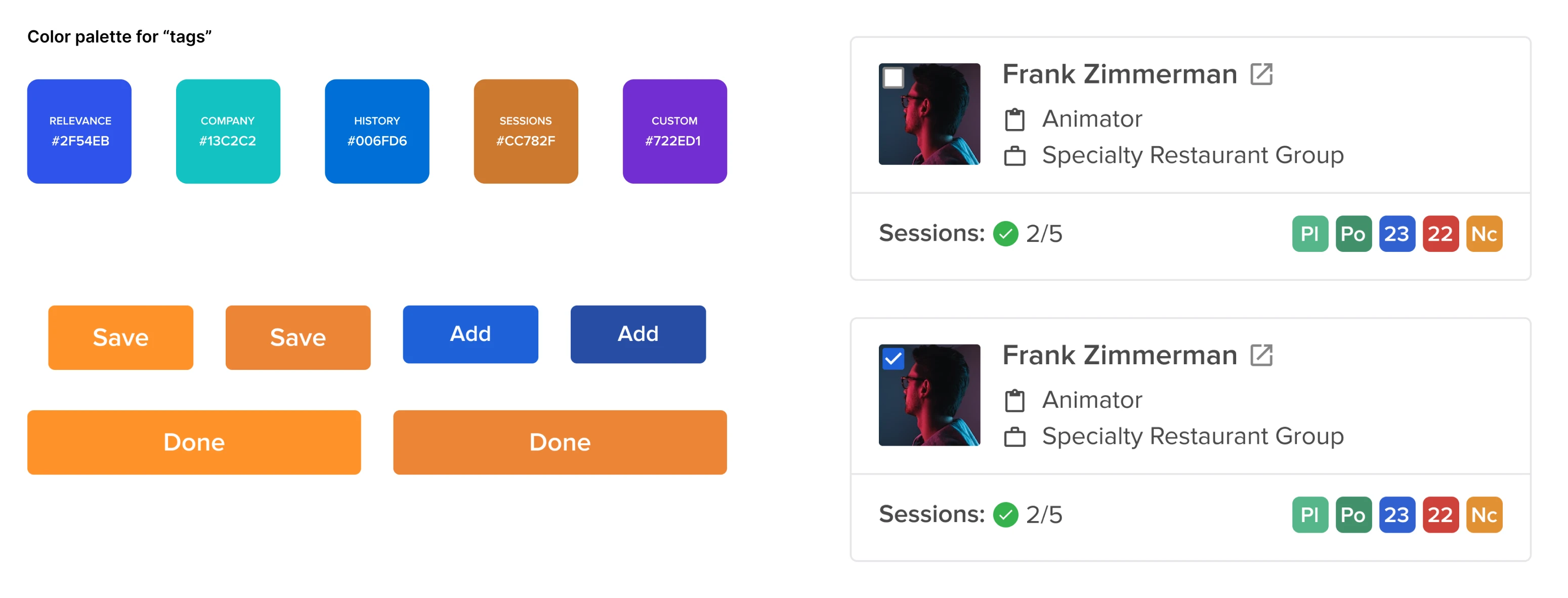
This improved handoff, reduced legacy design inconsistencies, and gave the team a reliable foundation for new CRM and AI features.
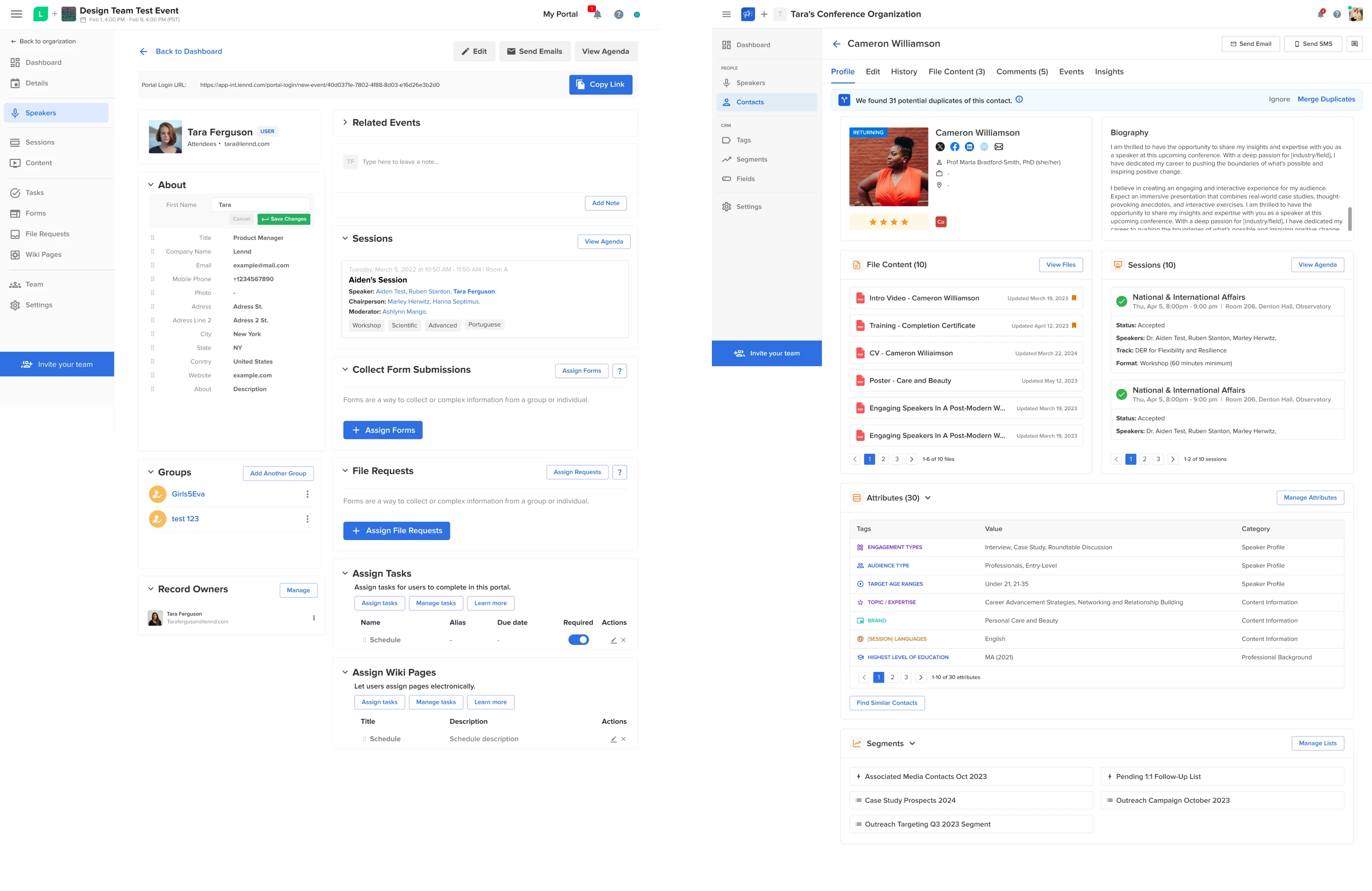
That is why Eleken’s work continues beyond organizing the library. Our designers use the system to design new features, find gaps through real work, and improve the foundation as the product develops.
Is building a design system with Storybook worth it?
Component library Storybook is worth considering when repeated UI work and design–code mismatches are slowing delivery. The question is whether maintaining it will save more effort than your team currently spends finding, rebuilding, and fixing components.
It is especially useful when:
- Several teams or applications share components.
- Developers struggle to find or trust existing UI.
- Figma and production regularly disagree.
- Shared changes cause regressions that are caught late.
- AI tools keep recreating components or introducing inconsistent patterns.
When Storybook may be overkill
For a small single-app product with only a handful of reusable components, the maintenance cost may outweigh the benefits. In that situation, a simpler component library and lightweight documentation may be enough.
The same applies if nobody owns the system. Storybook only helps when stories, tests, and documentation remain current. An impressive component catalog that no longer matches production quickly loses its value in the real world, where teams need reliable components they can actually reuse.
Put the system to work
At Eleken, we start by auditing the real product and its existing design and code. We fix the core components and tokens, define usage rules, connect Figma, Storybook, code, and AI where needed, then use the system while shipping features.
The goal isn’t simply to have nicely documented components. It’s to make product decisions available wherever UI is designed and built, so the team can reuse them instead of recreating them.
If your team has a design system but still spends time resolving mismatches and rebuilding UI, Eleken can help identify what is disconnected and what to fix first. Book a design system consultation to discuss how your current system supports delivery.