

“It’s not working. It’s just a collection of input fields at the moment without any user experience.”
That’s a founder describing his own CRM to us, and it’s the most common version of the problem we hear. Not “we’re missing a feature.” The features are usually there. The screens just don’t add up to something a person can use.
CRMs are unusually good at ending up this way. They grow entity by entity, and each one arrives as another form, another table, another tab. Nobody ever decides the product should be hard to use. It just accumulates, and the problems start to arise.
This article covers the design decisions that prevent that. You’ll find out the principles that cut daily friction, how to structure a CRM people can navigate, how the core screens should behave, and how to work out which one to fix first.
What is CRM UX design?
CRM UX design is the work of making a customer relationship management system usable by the people who have to open it every day.
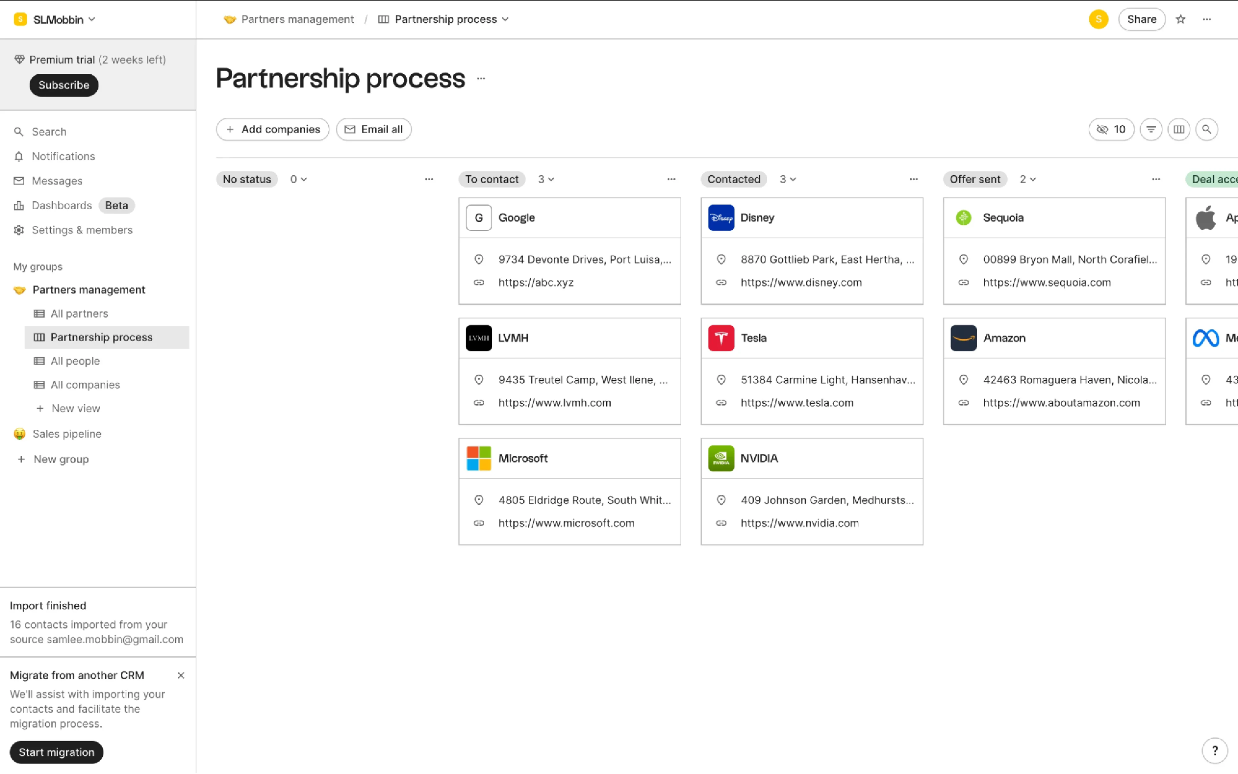
That sounds like ordinary product design, and the craft is the same. What makes CRM user experience different is the situation. When a consumer app is confusing, people leave, but when a system is confusing, people stay and work around it. They keep numbers in a spreadsheet, log calls in batches on Friday, or skip the fields that feel pointless.

I’d say the most annoying thing is when the CRM is too clunky and slow, especially for simple tasks. It feels like it adds more work than it saves.

Part of the challenge is that a CRM system has to serve people with different needs.
A sales rep wants to log a call in seconds and see what to do next.
A manager wants a forecast, which requires extra customer data from the rep.
An admin wants control over how both of them use the system.
Modern CRM UI/UX design has to balance all three without making anyone’s job harder. When it doesn’t, those small points of friction add up and cost you a lot.
The real business case for investing in CRM design
Most teams already know when their CRM platform design is confusing. What’s harder is putting a number on the consequences and showing how poor UX affects the metrics someone in the business is responsible for.
It usually turns up in three places.
The first is onboarding. Every hour a new customer spends being walked through the interface delays the point when the customer starts getting value.
The second is support load. Every ticket or training call caused by a confusing workflow takes time from your support team and shows where the product is unclear.
The third is the shadow work. Every spreadsheet, batch update, or separate record means business processes are running outside the CRM people don’t trust.
Ricochet360 is a clean example of the first two. It’s a cloud phone system and CRM, ten years on the market, and customers liked it, but getting there took about a month of setup, customization, and admin training per client.
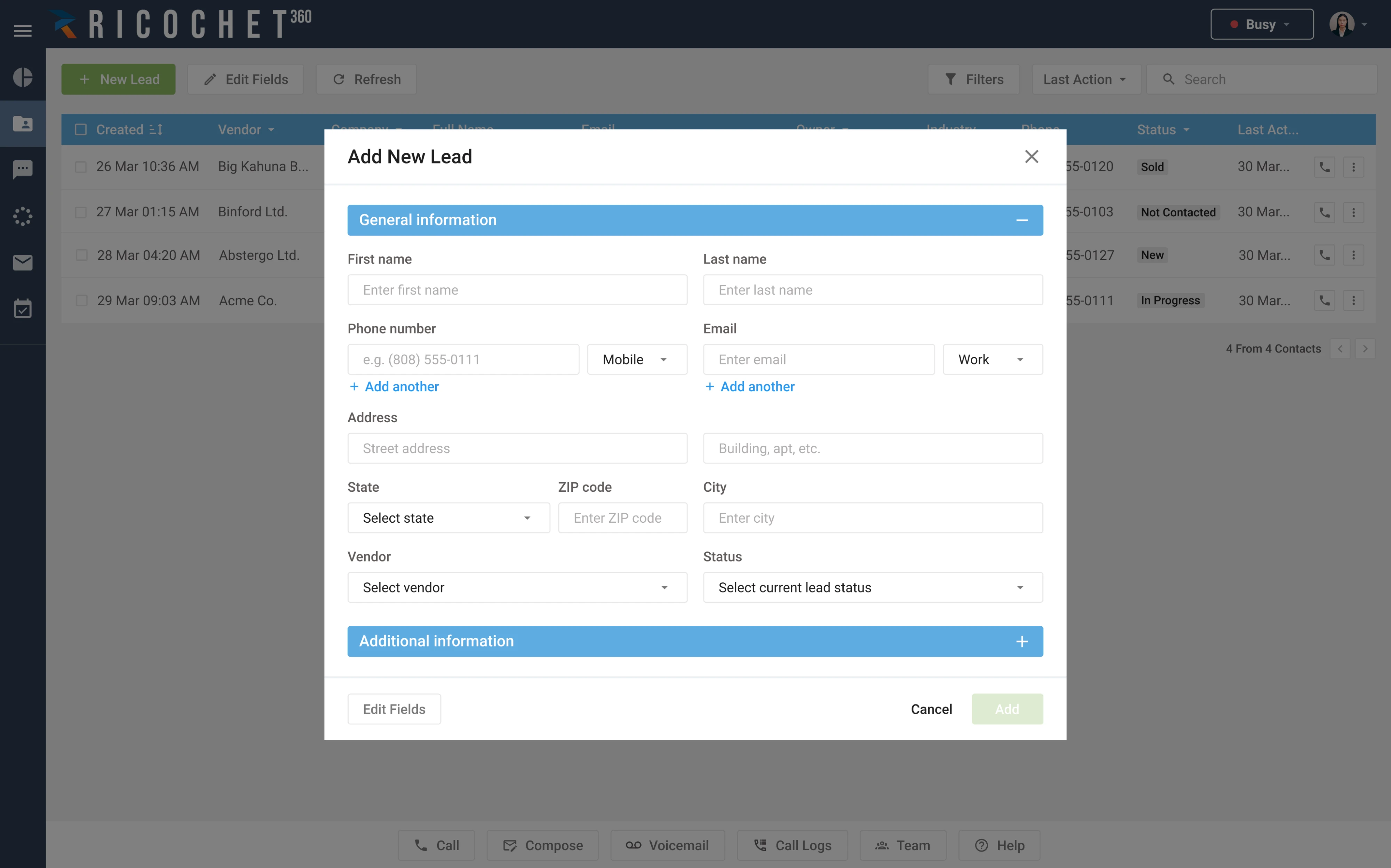
The “add a new lead” form had more than thirty fields with no grouping and no format hints. The delete button on the lead list was the brightest thing on the page, and the configuration menu scattered related settings to opposite ends.
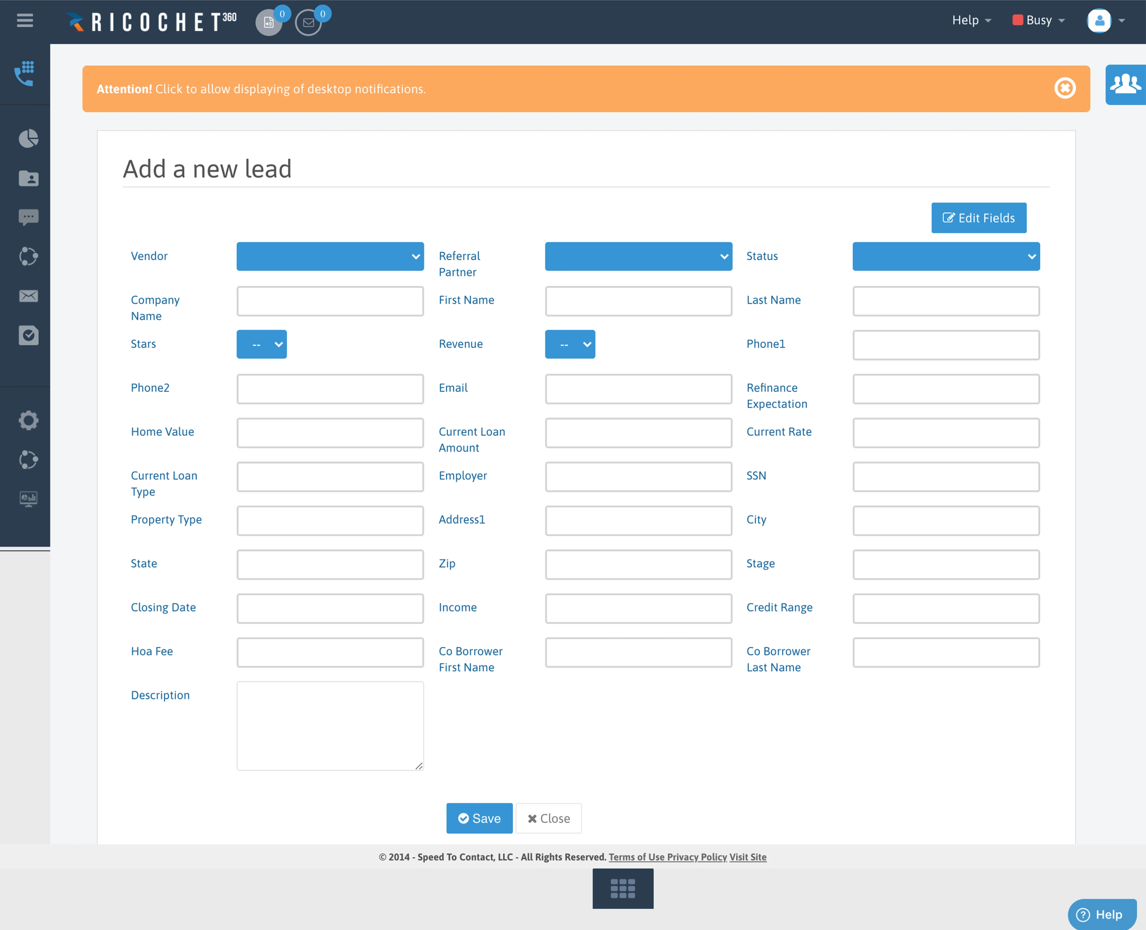
After the redesign, new customers needed less time to learn the product and the support team spent less time teaching it. We added tooltips, field validation, and required-field markers that took two hours to design and a couple more to ship, and improved things before the full redesign was anywhere near done.
The revenue argument follows from the same place, just one step later. Reps who can log a call quickly log calls. Data that gets logged is data a manager can forecast from, and a lead that gets followed up on in an hour.
CRM UX design principles that reduce daily friction
Most CRM friction isn’t dramatic. It’s four seconds here, two extra clicks there, one field a rep has to stop and think about every single time. A few design principles help us catch these small problems before they add up.
Design for the 20% of features used 80% of the time
Every CRM accumulates features over time. One customer needs custom objects, another quote generation, then come territory rules and new reports. Each addition makes sense on its own. The problem is that an action a rep uses forty times a day can end up with the same visual weight as one an admin uses twice a year.
Every CRM I've used had 50+ features. Used maybe 8.
Pendo looked at feature usage across 615 subscriptions over three months and found that roughly 12% of features generate 80% of daily usage volume, while 80% of features are rarely or never touched.
In CRM systems, the daily set is usually short. Most reps spend their day finding records, checking what’s due, logging calls and emails, moving deals forward, and adding contacts or notes. The same few actions repeat throughout the day.
That gives you a simple way to organize features by how often they’re used.
- Daily. Keep it on the default screen and within one click.
- Weekly or monthly. Keep it accessible through a secondary tab, menu, or filter.
- Occasional and administrative. Put imports, permissions, field configuration, and report building in settings.
Nothing needs to disappear. Admins still configure territories and ops teams still build reports. Those features just don’t need to compete with actions reps use all day.
Make logging effort proportional to what it returns
Every field a rep fills in is a small trade. The effort is theirs now, while the benefit often comes later in a report they never see. When that trade stops feeling worthwhile, reps enter the minimum that clears validation, and the data you rely on becomes less reliable.
There are two ways to fix that. First, reduce the effort. Let reps log activity where the work already happens, capture what you can from email, calendars, and calls, and turn common outcomes into one-tap actions.
Then give something back. If logging a call creates a follow-up task or updates a timeline the rep needs for the next conversation, those few seconds have a clear payoff. If nothing changes, logging quickly starts to feel like paperwork.
To find unnecessary work, look at every required field and ask who uses it and what decision it changes. Fields without a clear answer may be there simply because nobody has questioned them in years.
Give each role its own view and permissions
CRM software usually serves sales reps, managers, and admins who work with the same data, but they come to it for different reasons. Giving everyone the same interface makes simple tasks harder and fills screens with controls many people never use.
Start with the user workflows each role runs most often.
The last column matters as much as the others. Most role discussions cover what to show, but deciding what to move out of the way is what keeps each view usable.
You can do this without creating a separate interface for every role. The underlying data and design system components can stay the same while the default view, navigation, and available actions change based on who is using them.
CRMs tends to have a lot of data required by different teams and most teams just don't know how to segment it to get what they need.
Show 2–3 fields by default, reveal the rest on demand
Open a typical CRM record, and you may find a long list of fields competing for attention. Some matter every day. Others are useful only at a certain stage of the deal, and a few exist for reporting or admin purposes. Showing all of them at once makes a simple update feel like a much bigger task.
The better approach is to start with the few fields a user needs. When a rep adds a new lead, that might be the name, company, and contact details. Industry, lead source, company size, and other information can appear when it becomes relevant.
This is progressive disclosure. The information stays available, but the interface reveals it as the user needs it. For CRM tools, that means a few simple patterns:
- Show the essential fields first and place the rest under More details.
- Reveal fields when they become relevant to the current stage or action.
- Prefill information the CRM already has instead of asking for it again.
Keep tables to 4–6 columns, push detail to a side panel
When a rep scans a table for one row, every column that doesn’t help them find it slows them down. Most CRM tables lose sight of this as they grow. A contacts table starts with name, company, owner, and status, then picks up last activity, deal value, source, location, industry, and a few custom fields.
A table UX works better when it helps users answer a small set of questions quickly. And in most cases, four to six well-chosen columns are enough to make that decision.
The pattern that’s worked best for us is treating the table as a summary layer, not the input layer. Keep the visible columns to the 4-6 fields someone actually scans to decide their next action.
The rest of the record can open in a side panel when the user selects a row. That panel has room for contact details, activity history, notes, custom fields, and quick actions without making the main table wider. It also keeps the list visible, so users can check a detail and move straight to the next record.
Give the panel next and previous controls while you’re at it. Reps work down a list, and without those controls the pattern collapses back into open, close, open, close, which is exactly what the side panel was meant to prevent.
Choose the default columns around the decision the table supports. A deals table might show deal name, stage, value, owner, and next activity. Details such as lead source, creation date, or full activity history can wait until someone opens the record.
It’s better to rethink the table rather than expand its functionality. Tables aren’t easy and are generally just forcing the user to interact with raw data when that’s not necessary.
Make frequent actions inline, bulk, and one-click
A CRM feels slow when small actions turn into complex workflows. A rep wants to change a deal stage, but has to open the record, find the right field, edit it, save, and return to the list. Do that dozens of times and the extra clicks become part of the job.
For repeated actions, keep the interaction close to the data. Let reps change a status from the table or mark a task complete from the work queue without opening the full record. Common table UX patterns follow the same approach, keeping frequent row actions inline and moving less common ones into an overflow menu.
The same principle applies when several records need the same change. If a manager wants to reassign 20 leads or move a group of deals to another stage, selecting them once and applying one bulk action is much faster.
Once records are selected, show the available actions along with the number of affected items so the result is clear before the user commits.
One detail that decides whether bulk actions get used at all is what happens to the selection. If it resets when someone paginates or changes a filter, people lose their work once, stop trusting the feature, and go back to editing records one by one.
Designing the screens people live in
The principles above are easier to see in context. Here’s where each one lands, screen by screen, in a CRM most reps open every morning.
- Home or dashboard. A CRM dashboard should answer one question for a rep: what do I do next? Show today’s tasks, overdue work, and deals that need attention, with frequent actions close at hand. Keep charts and broader performance data for the manager’s view.
- Contact and account profile. Make the important context visible at a glance. Show who the customer is, who owns the account, what happens next, and recent activity. Keep related deals, tickets, and documents nearby so a rep doesn’t have to visit several screens before a call.
- Pipeline. Use Kanban when moving deals between stages is the main task, and a table when users need to scan and sort larger volumes. In either view, show enough information to make a decision without opening every deal.
- Lead capture and quick add. Adding a record shouldn’t pull users away from their current task. Use a modal with two or three essential fields, check for duplicates, and reveal additional fields when needed.
- Mobile. A mobile-friendly CRM system is built for quick checks between meetings. Prioritize the few details reps need on the go, such as name, status, and last contact, and move everything else one tap deeper.
CRM software design examples for inspiration
Over the years, we’ve designed CRMs for clients facing very different challenges. Each project shaped the CRM design process differently, depending on how people used the product. Below, we’ll look at a few of those cases and the design decisions that helped improve the experience.
Gridle
Gridle is a client management platform for small agencies and freelancers. It launched in 2013, and by the time Eleken’s designers joined in 2020, the interface had been growing for seven years without a serious rethink.
Our team started with evidence. Gridle recorded user sessions, so the designers watched them to see which features people used and which they ignored, then ran six one-hour interviews with users from the product’s own community.
What came back was practical.
Users wanted to reach their tasks in a few clicks, feel confident they were getting time back, and stop hunting for documents spread across tools.
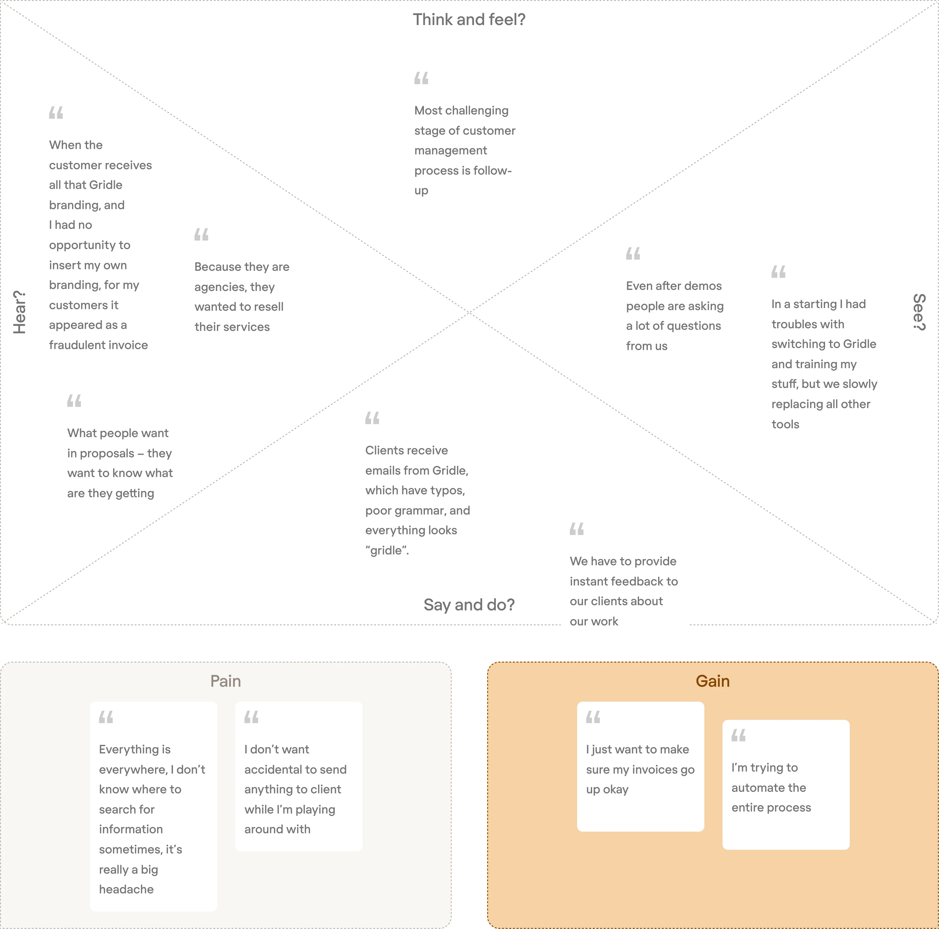
Those findings shaped the UX redesign. New users were walked through one module at a time with a single action per screen. The dashboard showed setup steps for new users and upcoming activities for existing ones. Leads could be viewed as a kanban board or a list, with the key information visible on the card. The customer database got filters, bulk actions, and configurable columns.
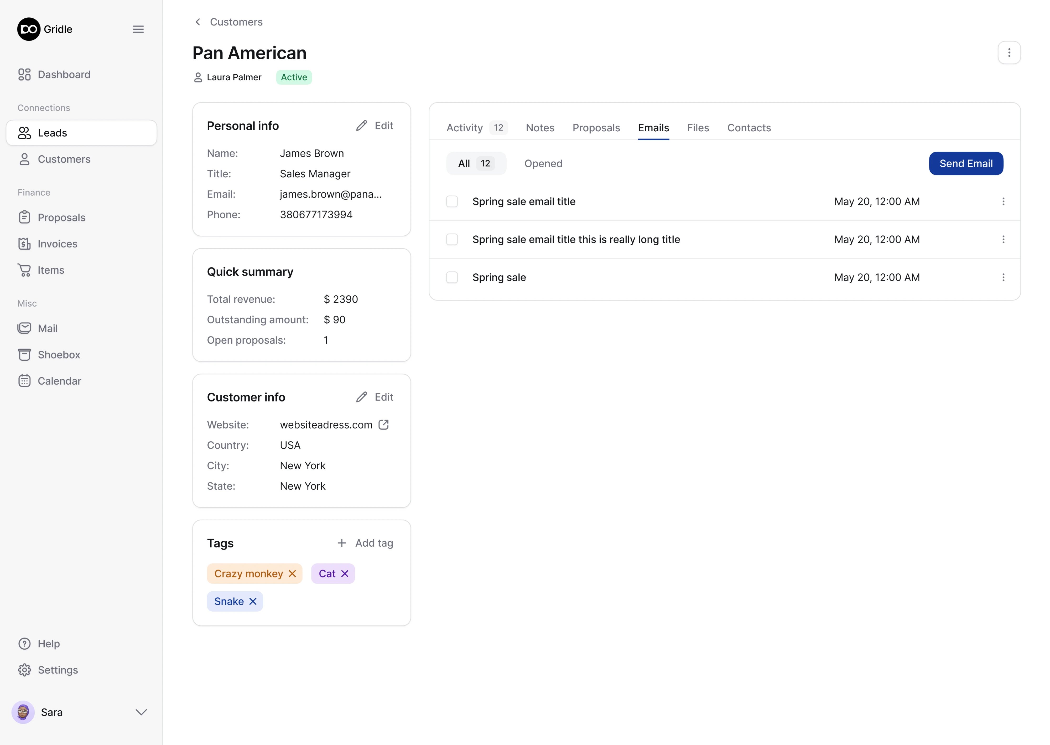
The whole redesign took about three months. When Gridle’s CTO showed it to users, they said they couldn’t wait to start using it.
Avid
Avid combines CRM, email, and donation data for nonprofit fundraising teams, with an AI engine built in. The technology was strong, but the interface wasn’t keeping up with it. Features kept arriving, screens kept getting busier, and nonprofit users struggled to work out what the platform could do for them.
The client also wanted something new. A feature called Playbook that would tell teams what to do next, surfacing timely insights and recommending campaign actions. Nobody in the space offered it, which meant there was no pattern to copy.
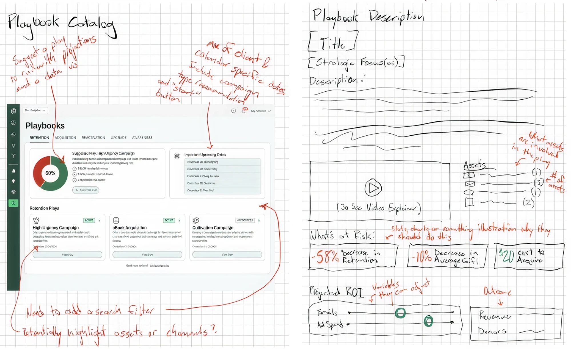
Eleken’s designer worked with Avid’s UX strategist to test the idea before building it. Wireframes first, then prototypes, then interviews with real users. Those conversations narrowed the problem down to four moments when fundraising teams most needed help, and the feature was structured around those.
In the interface, AI recommendations arrived as cards that could be read at a glance, backed by a table view for anyone who wanted to sort and filter the underlying data.
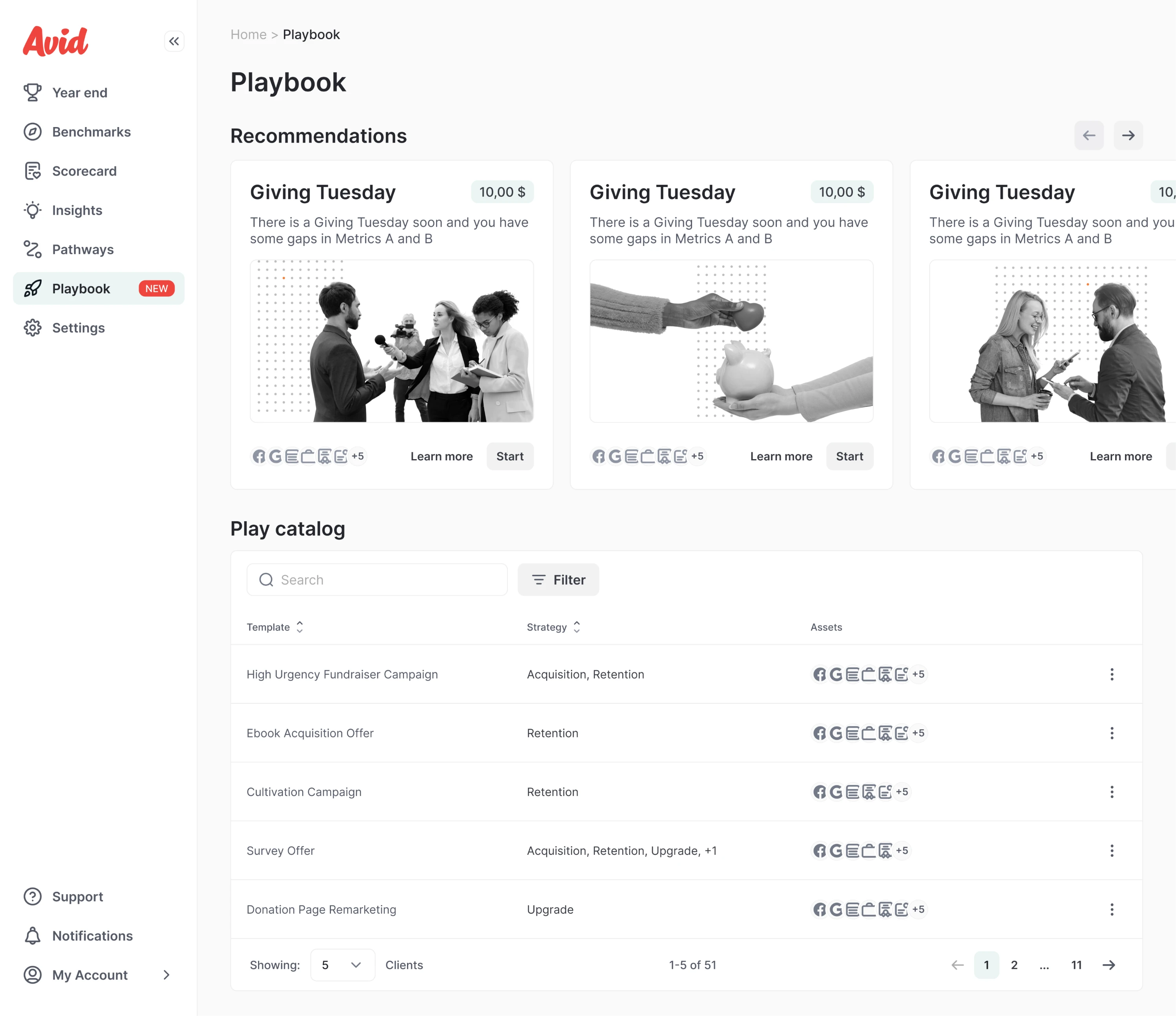
The existing product got attention too. Sign-up had been four steps, and the designer rebuilt it as two on a single page, splitting the UX flow for nonprofits and agencies and rewriting error messages so they explained what to do.
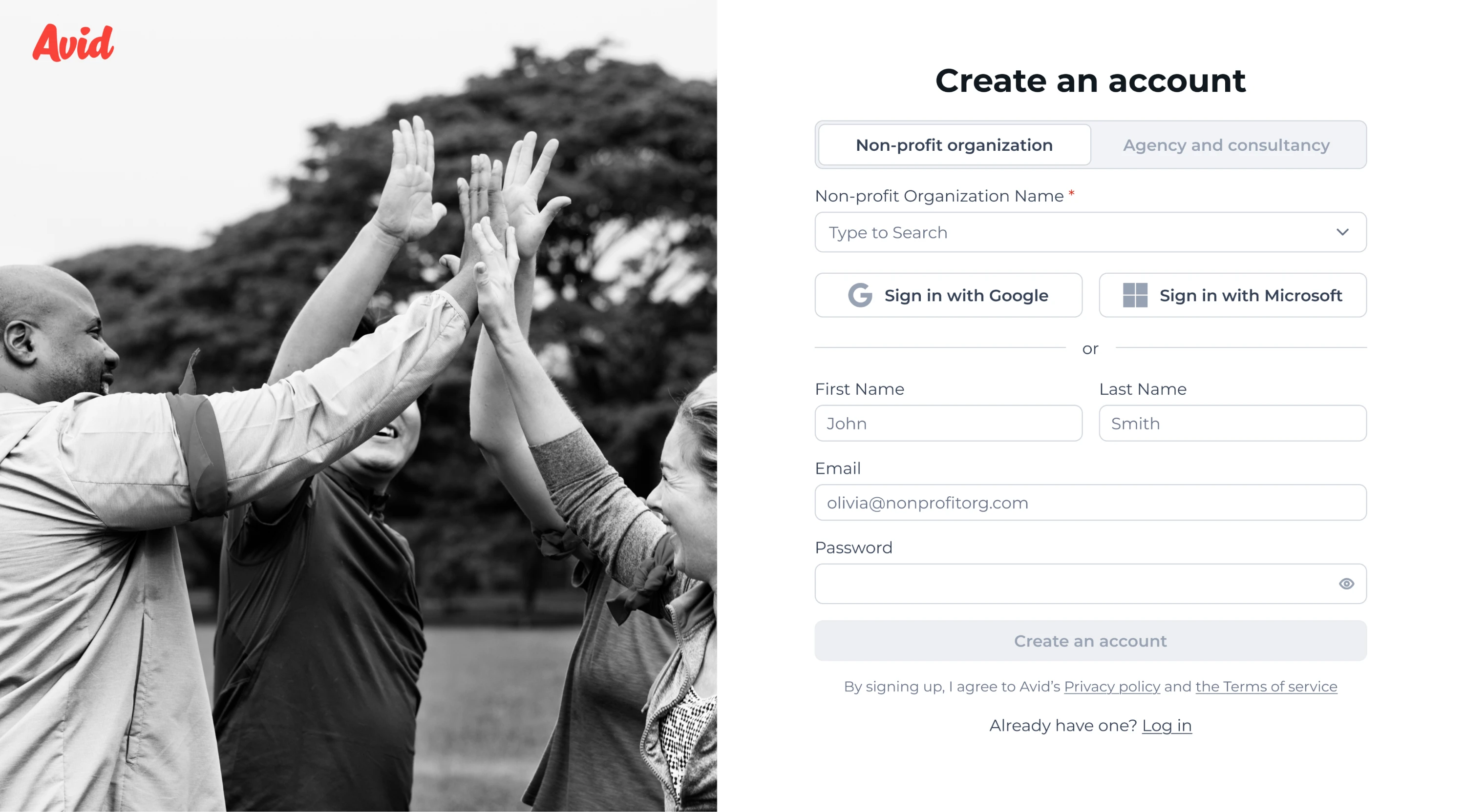
Other screens were simplified the same way, cutting the number of small decisions users had to make.
Zaplify
Zaplify made a risky decision. They let go of their entire sales team and moved to product-led growth, which meant users now had to sign up, understand the product, and find value on their own.
The product wasn’t ready for that. Getting started needed help from a person. Outreach ran on fixed templates, so users picked a preset sequence and sent it, with no way to edit mid-flow or reply naturally.
Eleken started with the core workspace and rebuilt it as a chat interface with the prospect’s context beside it. The bigger change was conceptual. The campaign builder was replaced with Actions, a checklist where each step is one small task. Send a message, follow up, archive. Setting up a campaign became completing a few items, and users could see their progress as they went.
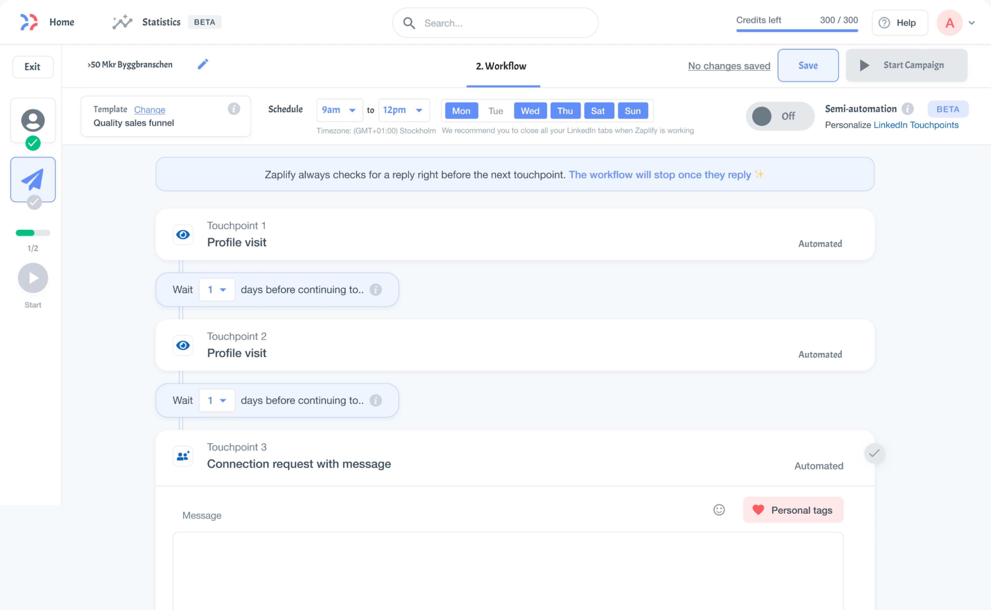
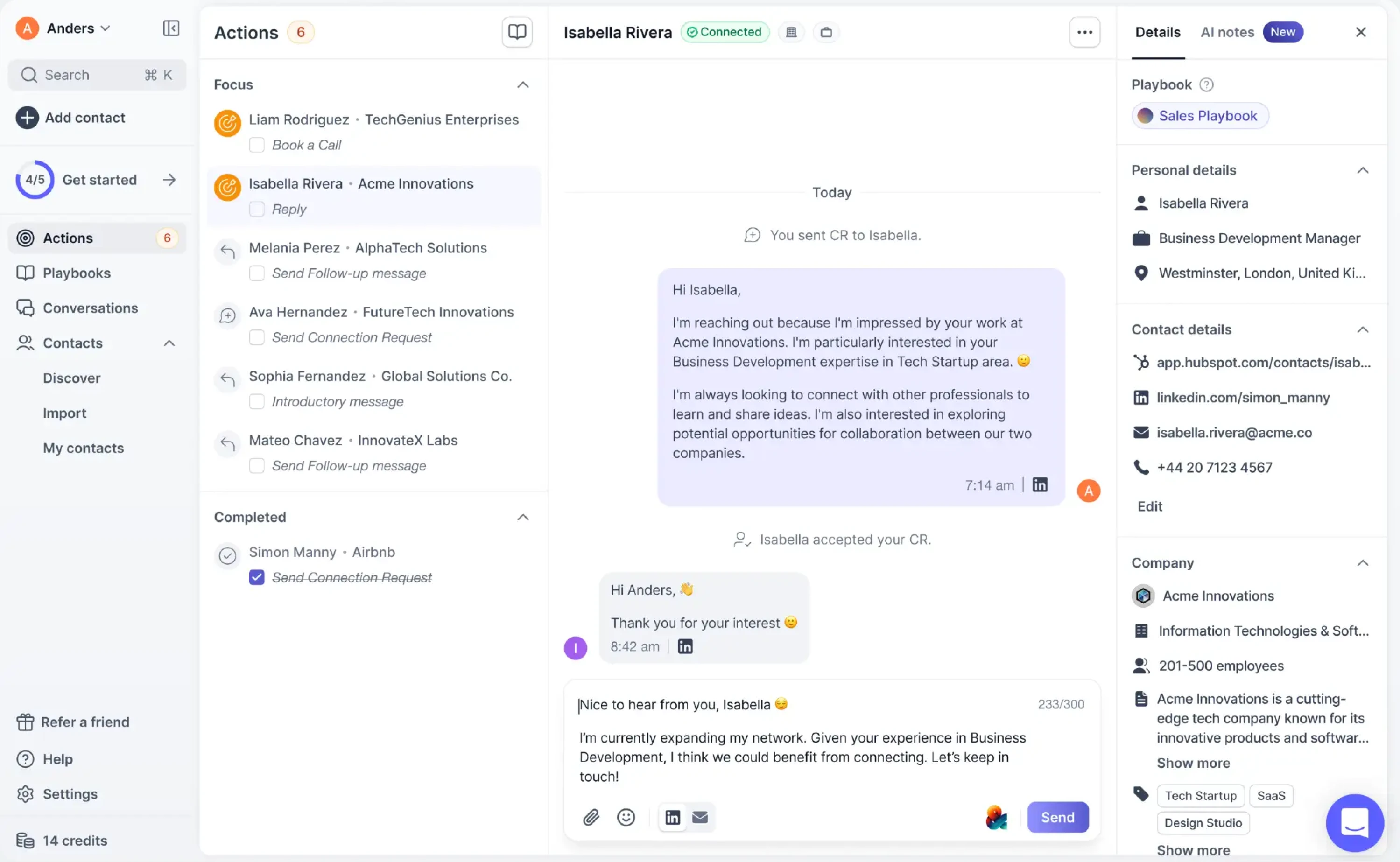
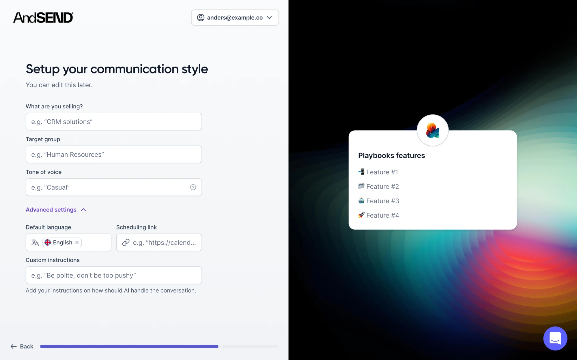
Two other blockers got fixed along the way. Users didn’t know what to write, so the team added Playbooks, simple presets for intent, audience, and tone that gave the AI enough direction to draft something usable.
Also, we redesigned prospecting to enable users to find the right leads faster and more easily. Each lead appeared as a full-screen profile with work history, company details, and a short explanation of why it was recommended.
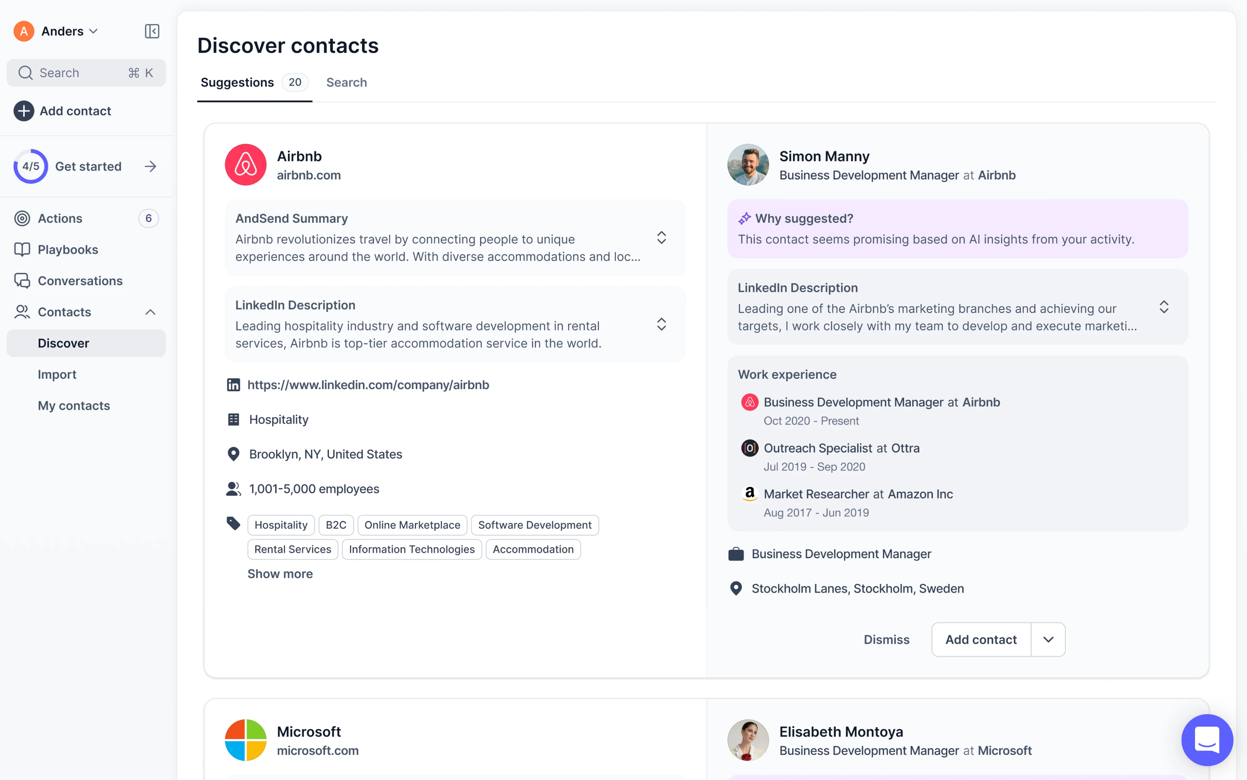
As a result, activation rose from 20-25% to nearly 40% with more users reaching their “aha” moment on their own.
How to measure CRM UX and decide what to fix first
The reason UX work stalls is that everyone has a different list, and no way to argue about which item goes first. Behavioral data gives you a clearer way to decide.
✓ How long it takes a new user to complete their first real task.
✓ How long the three most repeated actions take.
✓ How many licensed users show up in a given week.
✓ How many support tickets and training calls follow each release.
✓ What share of your key fields actually get filled in.
User satisfaction scores like NPS and CSAT are worth having, but they tell you how people feel (not where they got stuck), so they work better as a signal to go looking.
For the looking part, session recordings and heatmaps show you where people hesitate, and product analytics show you which paths get abandoned. They are more useful when you already suspect a screen. Watching five reps work through their morning will usually tell you more in an hour than a dashboard will in a week.
None of this tells you what to fix first, though, and that’s the decision that costs money. A UX audit is the cheapest way to get there.
At Eleken, for example, we go through the product against established usability principles, write down every problem, and rate each one by severity. Cosmetic issues sit at the bottom, friction that slows people down in the middle, and problems that stop users from completing a task at the top. You can run this exercise with your own team, or contact us if you want an experienced pair of eyes.
From there, rank the fixes with the ICE framework. Look at the expected impact, how confident you are in it, and the effort required. High-impact, easy fixes come first, while low-impact changes that take a lot of work can usually wait.
Then ship in stages and check the metric you started with. This is where the baseline earns its keep. If activation was the problem and activation moved, you know what to do next. If nothing moved, you’ve learned something for the cost of one release.
Wrapping up
A CRM is a product people are required to use, which means user adoption problems stay hidden longer than they would anywhere else. Nobody churns. They just enter less, trust the reports less, and the interface never gets blamed. That’s the case for treating user-centered design as an ongoing part of the product.
You don’t need a full redesign to find out where your product stands. Pick the screen your reps open most, watch five of them use it, and fix the one thing that slows all five down. It takes about a week and tells you more than any amount of planning.


