


“SaaS is learning to drive itself — and that’s a design brief, not a doomsday.”
That’s how Maksym Chervynskyi, our lead designer at Eleken UI/UX design agency, puts it — and he would know. He works on AI user experiences every day.
Software used to wait for us to tell it what to do – click here, type that, tap this. But things are shifting fast. Today’s products don’t just respond, they act. They anticipate, decide, and sometimes complete tasks before we even think to ask.
That’s the promise (and challenge) of agentic UX — designing user experiences not for passive tools, but UI/UX design for AI-powered agents that can operate alongside users or on their behalf. It's a new paradigm for interface design, and it goes well beyond what generative AI alone introduced.
And if you’re thinking cool, but what does that actually look like in practice?, you’re not alone. In this guide, we’ll walk you through real-life agentic UX examples and design patterns.
But before we dive into real examples, let’s make sure we’re on the same page about what agentic UX actually means.
What is agentic UX?
Agentic UX is the practice of designing interfaces for software that can decide and take steps toward a user’s goal — not just respond to direct commands. It sits at the intersection of human-computer interaction and AI product design, and it applies to everything from single AI agents to larger agentic AI systems where multiple components coordinate on a user's behalf.
In other words, the product doesn’t wait for exact instructions. It understands intent, proposes actions, and sometimes carries them out — while keeping the user informed and in control.
Think of it like this:
- Traditional UX: You click the button → the app reacts
- Agentic UX: The app notices a problem → suggests or takes action to fix it
As an example, it’s the difference between Google Calendar sending a reminder and an AI assistant that reschedules your meetings when it sees a conflict.
That distinction — between software that waits and software that acts — is where the interesting design problems live. And the best way to understand them is to look at how real products are solving them.
6 agentic UX design patterns with real agentic AI examples
Work on enough AI-powered products and patterns start to emerge. Agent systems acting without warning, users disabling features after one bad experience, interfaces that worked in demos and created anxiety in production…
The well-designed ones tend to have certain things in common. Below are six UX design patterns that keep showing up — and if an agentic feature is failing, usually one of them is missing.
1. Intent preview: Show the plan before acting
Before the agent does anything significant, it shows what it's about to do and asks if that's okay. This matters most for irreversible actions — sending an email, making a booking, deleting data. Anything the user can't easily undo deserves a pause.
The key design detail: give users three options, not two. "Proceed" and "Cancel" forces a binary that doesn't reflect how people actually feel. Add "Edit" — a middle ground that keeps the user in control without abandoning the workflow entirely.
For example, take a look at the AI co-pilot designed by Eleken for Privado Dining — an event management platform for restaurant.
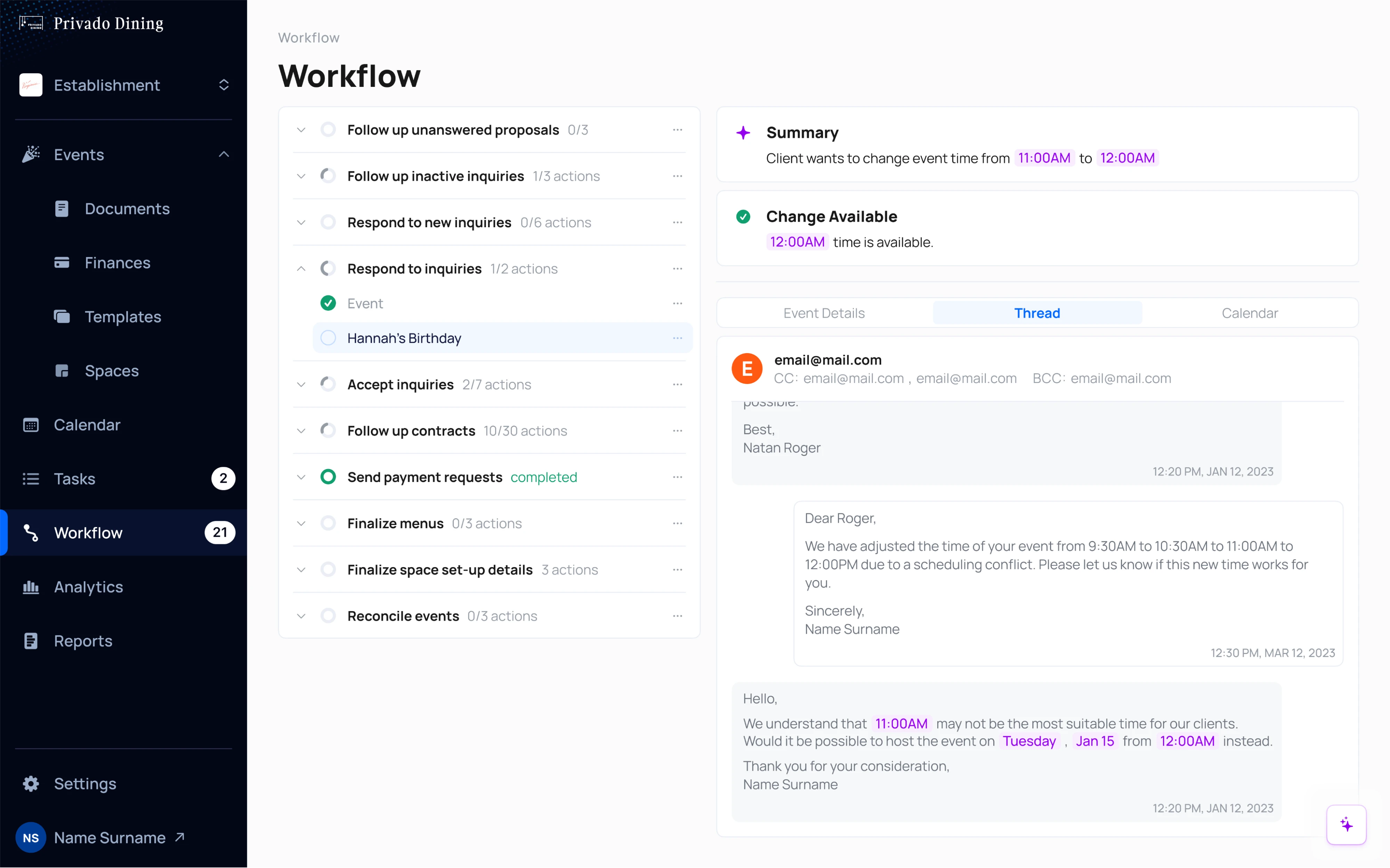
Here’s what you can see on a screenshot (right side of the screen, AI highlighted in purple):
- A client requests a time change.
- The AI confirms availability and stops there.
- The manager reviews and decides.
Intent preview pattern was central to how the feature worked. The co-pilot analyzes event details: schedules, payments, menus — handling the complex workflows that previously required constant manual decision making. But it doesn't act on them. It surfaces a summary, flags conflicts, and waits. All AI suggestions are highlighted in purple so they're easy to spot and easy to dismiss with one click.
2. The autonomy dial: let users set their own comfort level
Trust isn't binary. Someone might happily let an agent auto-schedule low-stakes meetings but want to personally approve every outgoing email. A single on/off toggle doesn't reflect that nuance.
The autonomy dial gives users a spectrum — from "suggest only" to "act and notify me after." Ideally set per task type, not globally.
Booking.com is one of good autonomous agent UI examples in production. As documented in their engineering blog, the agent doesn't treat all incoming guest messages the same way. It has three operating modes:
- return a pre-set template
- generate a custom response
- stay silent when context is insufficient.
Here's what that looks like under the hood — three possible outcomes, chosen based on context:
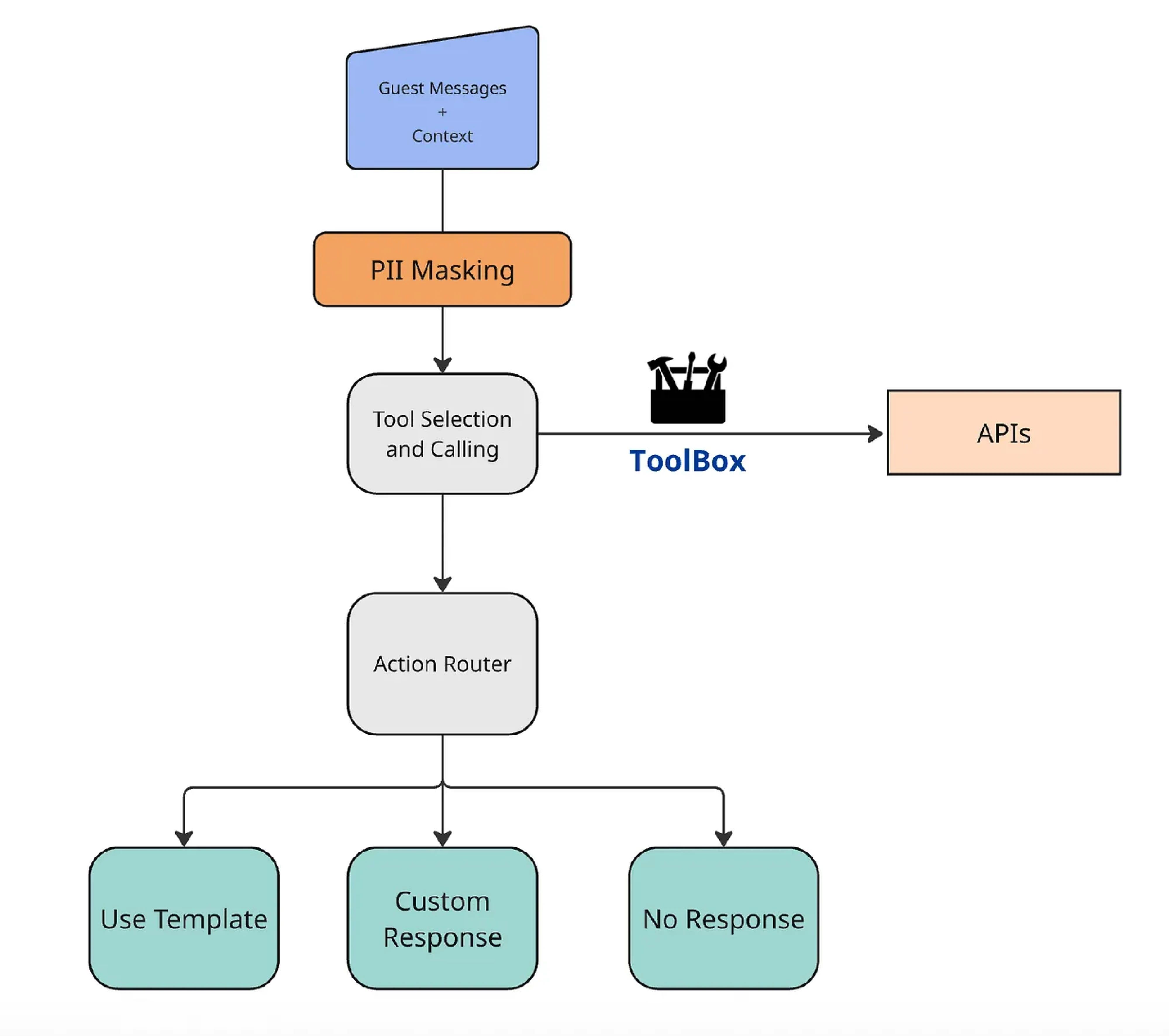
To sum up, partners can tune it. The system adapts to their comfort, not the other way around.
3. Explainable rationale: answer "why?" before it's asked
When an agent acts, especially without being asked, users immediately want to know why. If they have to go looking for the answer, trust erodes fast.
The fix is simple: show the reasoning, briefly, right next to the action. Not a technical log, but a plain sentence grounded in the user's own context. "I escalated this conversation because the customer mentioned a billing dispute, and your guidance flags those for human review." That's enough.
Without it, users interpret valid autonomous actions as bugs. From their perspective, something happened and they have no idea why — which is a reasonable thing to find unsettling.
Intercom's Fin AI agent operates this well. In the Inbox, every conversation includes a visible record of which guidance was applied and which content sources Fin used to generate its response.
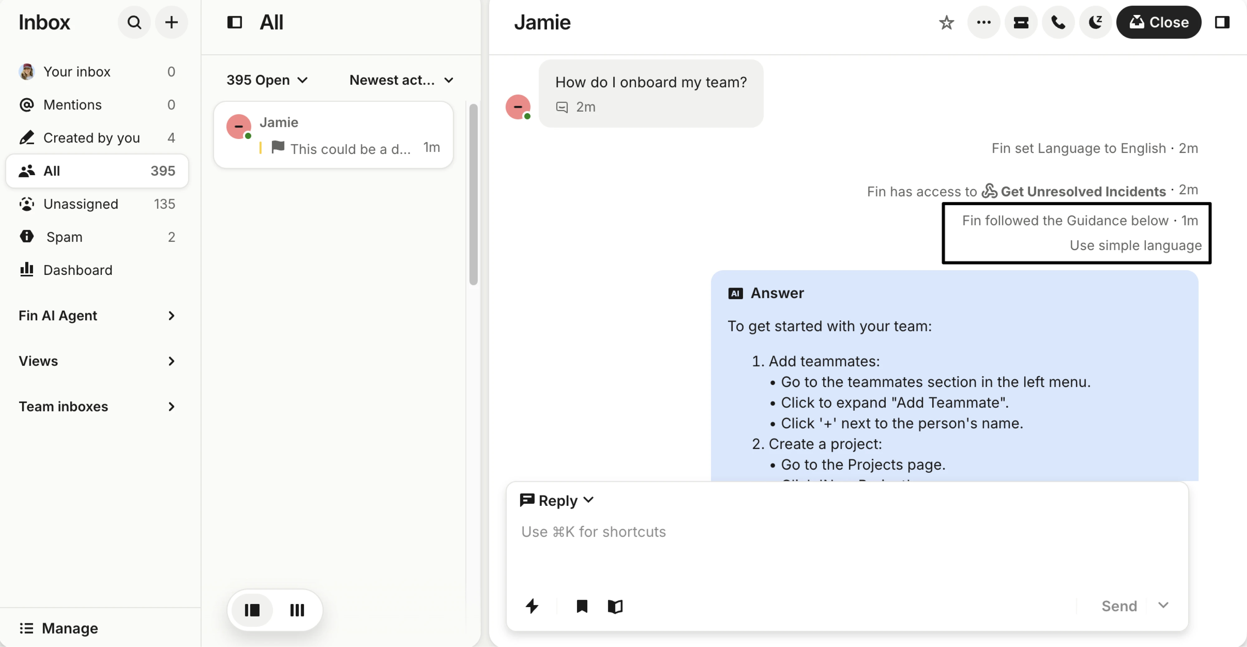
So when Fin escalates or answers in a particular way, support managers can see exactly why — tied back to the rules they set. The agent's behaviour is traceable to decisions the team made. That's what makes it trustworthy rather than mysterious.
To sum up, without this pattern, users interpret perfectly valid autonomous actions as bugs. And they're not wrong to — from their perspective, something happened and they don't know why.
4. Adaptive interface: serve the right UI for the moment
This is the pattern most agentic systems UX content ignores completely. Everyone focuses on what the agent does. Far fewer people think about how it communicates.
Chat-first doesn't mean chat-only. Chat works well for open-ended intent. It's poor for structured data, dense comparisons, or anything requiring multiple specific inputs. Forcing users into a chat thread when they need to review structured output isn't intelligent design — it's a constraint dressed up as a feature.
The better approach: let the interface change shape based on what the task requires.
- A conversation when intent is ambiguous.
- A structured view when users need to review and evaluate.
- Buttons when the choice is simple.
When Eleken designed Siena's Test Automation feature, this was a deliberate decision. Users enter their intent conversationally — a prompt, or one of four quick-request options. But once the automation runs, the interface shifts: results appear in a structured playground view where users can assess the AI response in the context of a real conversation, rate it, and provide inline feedback. The chat got them in. The structured view let them evaluate properly.
Here’s what this AI agent UI pattern looks like:
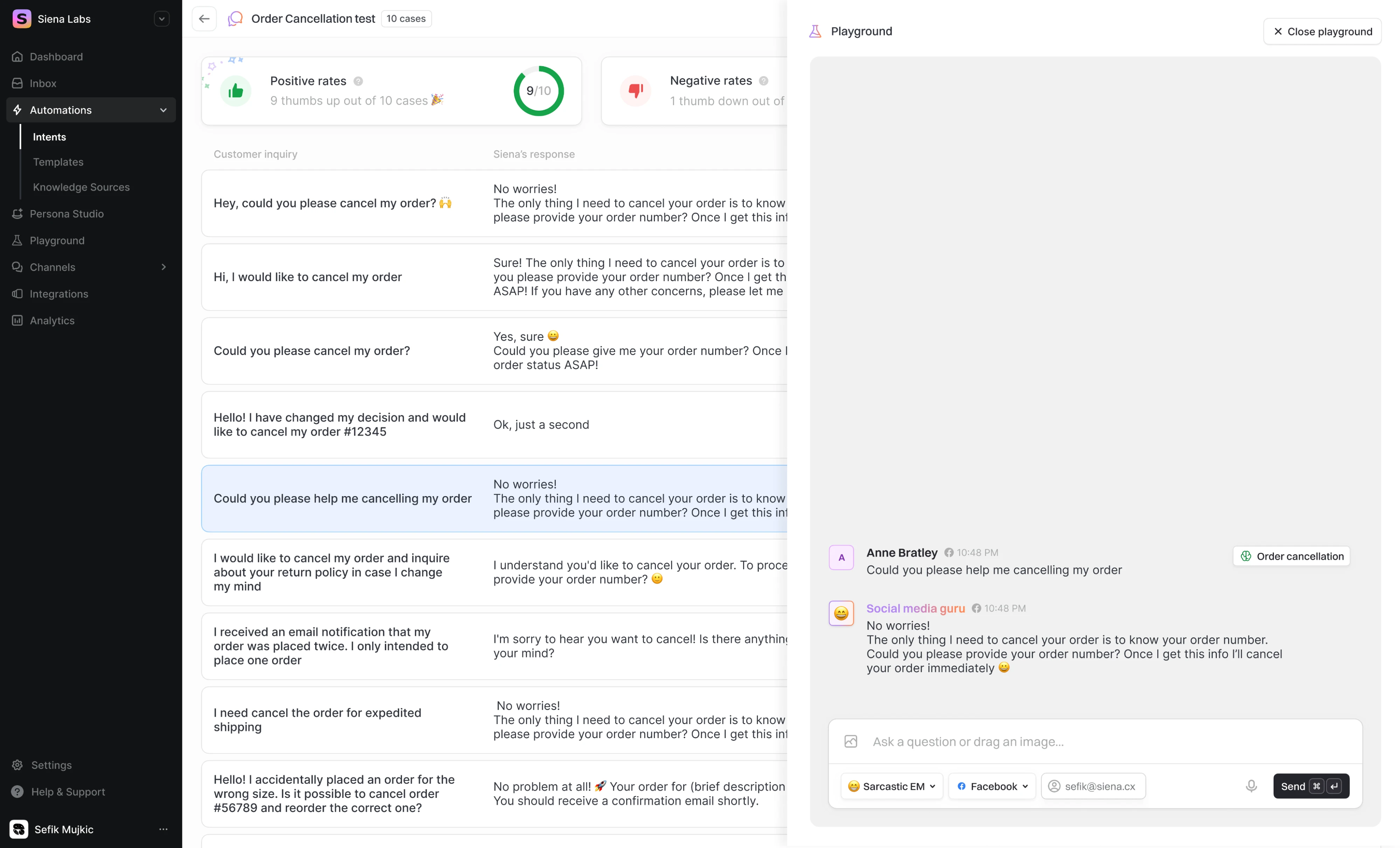
As our design director Maksym Chervynskyi puts it: "We shouldn't be asking conversational or traditional? We should be asking what serves the user best in this specific moment.
5. Action audit & undo: make recovery effortless
Nothing builds confidence in an autonomous system faster than knowing you can reverse what it did.
A clear, chronological record of everything the agent has done — combined with a visible undo option — is the closest thing to a universal trust mechanism in agentic UX. It doesn't just help when things go wrong. It reduces anxiety before things go wrong, which means users are more willing to grant autonomy in the first place.
Salesforce addressed this directly with Agentforce Observability. As their VP of AI put it: "You can't scale what you can't see." The system logs every agent interaction — inputs, reasoning steps, actions taken, and guardrails triggered — in a unified dashboard. When an agent does something unexpected, there's a traceable record of exactly what happened and why.
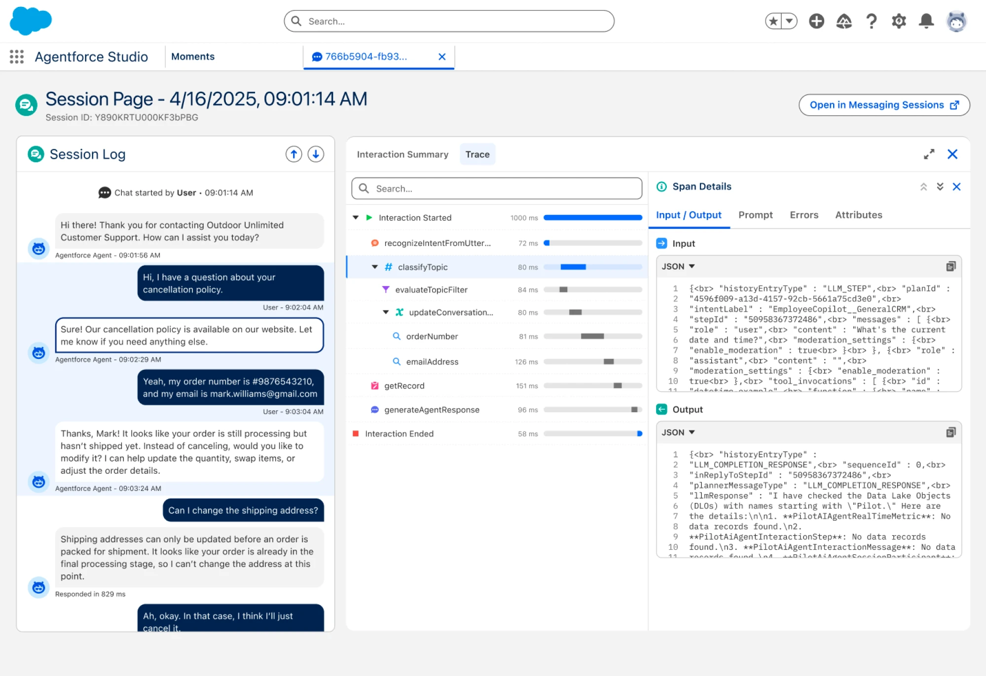
One customer, a tax services firm, said this visibility was a dealbreaker requirement: with sensitive financial data and agents acting autonomously during peak season, they needed to be able to audit every decision.
6. Graceful escalation: know when to stop and ask
A well-designed agent knows its limits. When it hits genuine ambiguity or a decision with consequences too significant to guess at, it escalates, asks, and surfaces options. It hands off rather than proceeding on a hunch.
Google's Jules is a good example of this done right. Before writing a single line of code, it researches the codebase, forms a plan, and stops. The screenshot below shows exactly that moment: a 5-step plan fully laid out, with an "Approve plan?" button at the bottom. Nothing executes until the developer signs off. Jules has done the thinking — but the human makes the call.
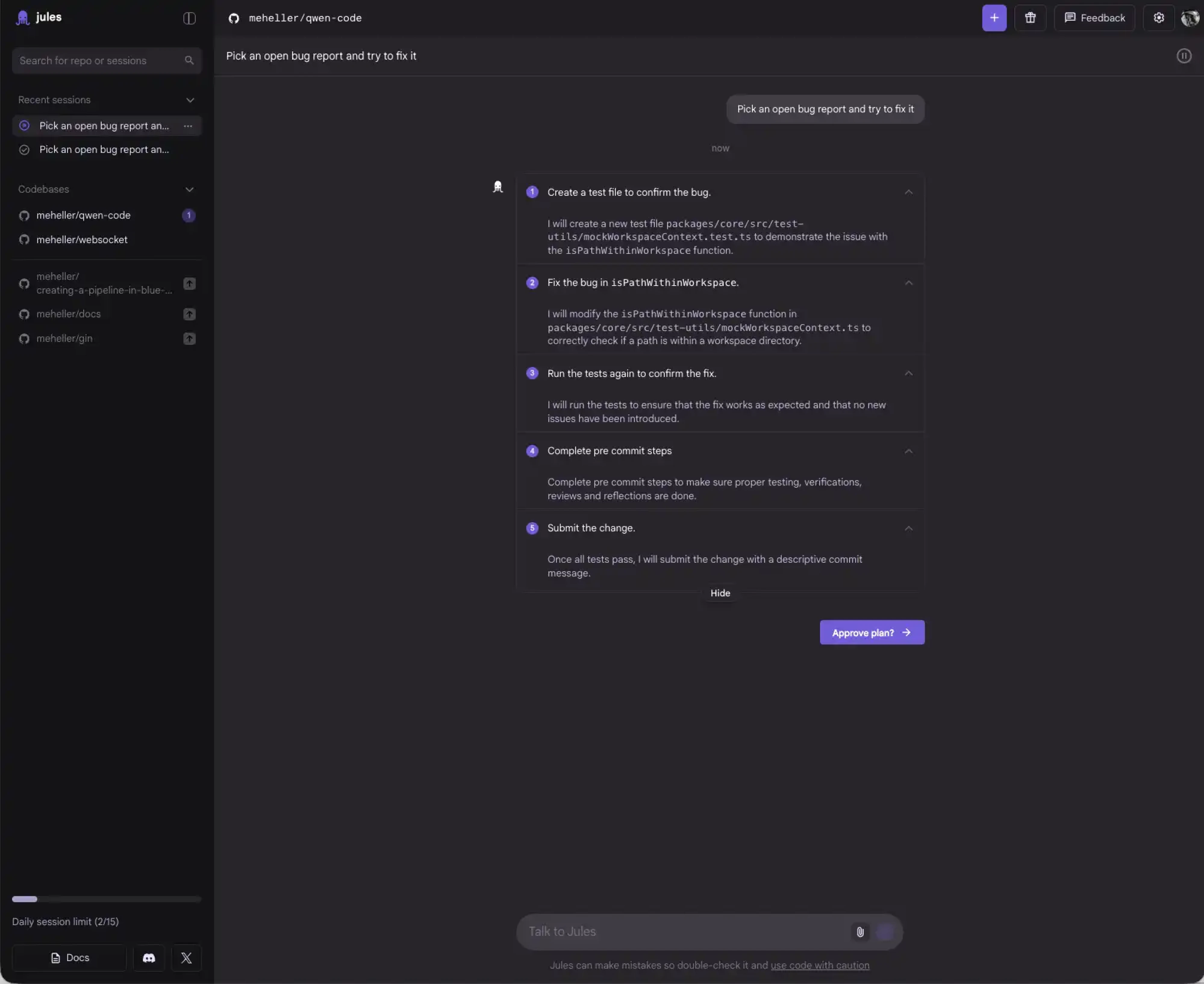
And it's not just a one-time gate at the start. As Jules' own documentation notes, you can chat with the agent while it's working, point out something it missed, answer a question, redirect it mid-task. The escalation is an ongoing conversation, not a single checkbox.
Target escalation somewhere between 5% and 15% of tasks. Too frequent, and users lose confidence in the agent's capability. Too rare, and eventually it makes a very confident, very wrong decision.
When building agentic systems goes wrong
The patterns above describe what good looks like. But it's worth spending a moment on the other side — because agentic features fail in predictable ways as well with most of them comming down to the same root cause: the design assumed too much trust, too early.
Acting without warning
The fastest way to lose a user's trust is to do something they didn't expect. Microsoft learned this the hard way with Recall — a Windows 11 feature that automatically captured screenshots of everything on your screen every few seconds and stored it in a searchable AI database. No preview or explicit consent moment.
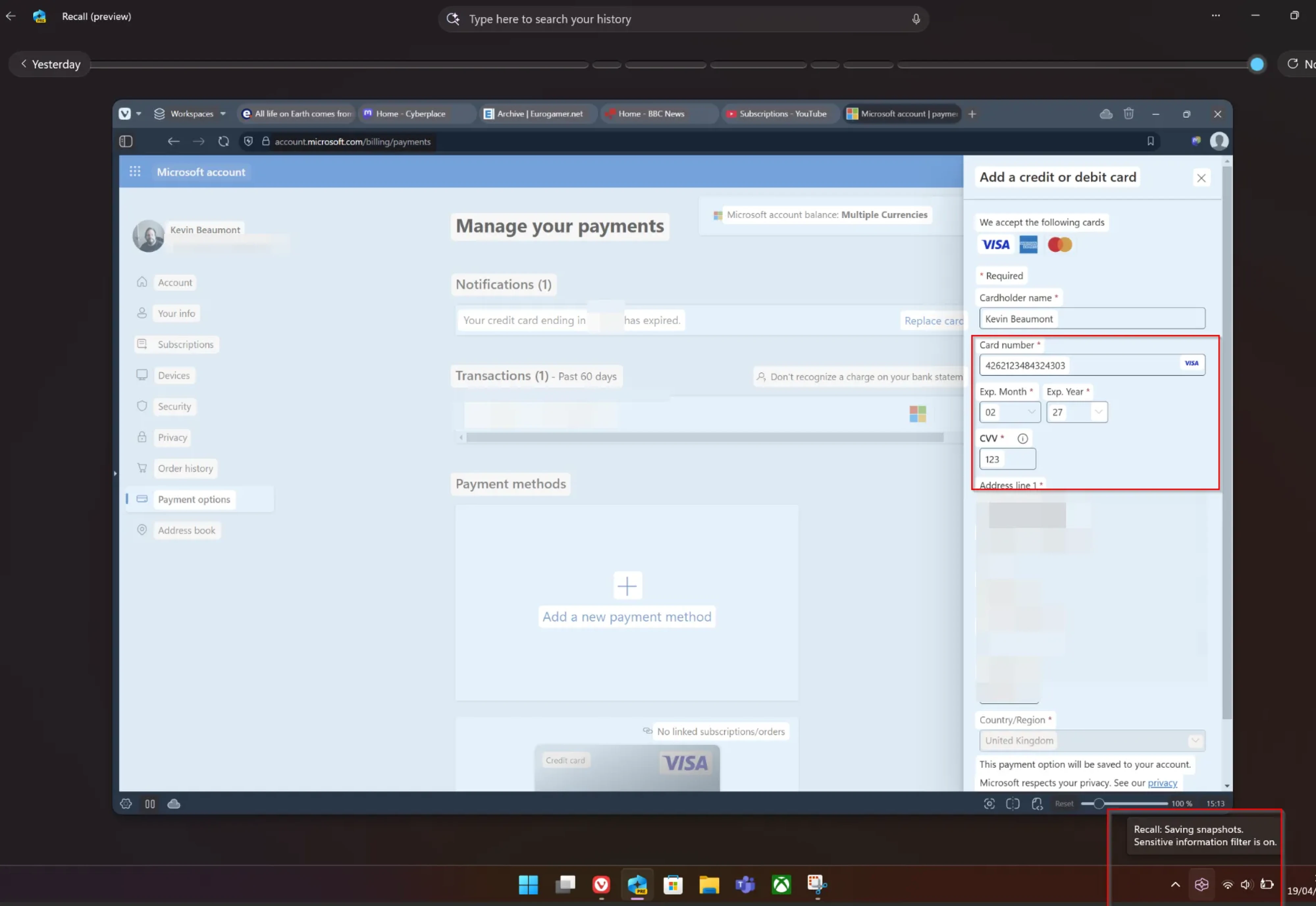
The backlash was immediate and massive. Microsoft was forced to delay the launch, make it opt-in, and spend nearly a year rebuilding trust before attempting to roll it out again.
The feature itself wasn't necessarily wrong. The design process was. There was no moment where users could see what was about to happen and decide whether to proceed. That's all the Intent Preview pattern is (the first one we discussed in a previous section) — a pause before action. Skip it on anything that feels irreversible or invasive, and you'll see the consequences in your reviews, your support tickets, and eventually your churn data.
Personalization that breaks familiarity
Adaptive interfaces are powerful in theory but in practice, they can backfire badly. One Reddit user put it bluntly on agentic UX patterns:
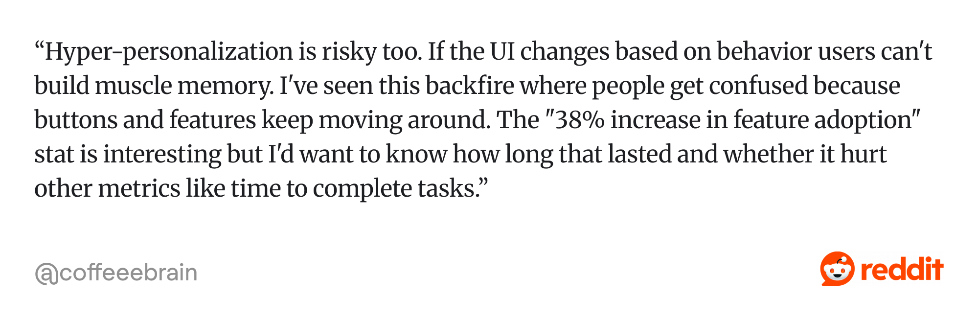
The fix is simpler than it sounds:
- Adapt the content, not the structure
- Keep the skeleton consistent
- Let what's inside be intelligent.
The invisible agent
Users can handle agents making decisions. What they struggle with is not knowing what those decisions were.
As the World Economic Forum notes in their analysis of multi-agent UX: when users perceive AI as a "black box," distrust follows. Users need to understand what the system is doing, why it's doing it, and how much influence they have at each step. Without that visibility, even a correctly-functioning agent feels suspicious.
When there's no activity feed, no status indicator, and no record of what happened, users are left with a simple but damaging experience: something changed and they have no idea why. An action audit log isn't a nice-to-have. For any agent that works in the background, it's the difference between feeling supported and feeling surveilled.
The confident wrong answer
Small autonomous errors compound. Each one makes the next correct suggestion feel slightly less trustworthy and eventually users start reviewing everything manually, which defeats the point of having an agent at all.
GitHub Copilot illustrates this well. As one developer wrote on Medium after three months of daily use: "It can be brilliant and give you better info and code samples than you hoped for. But there is UNCERTAINTY. It can fail." A HackerNoon analysis of 1,355 reported Copilot issues found hallucinated dependencies and subtly wrong API calls among the most common complaints — errors that look correct until they don't compile or ship broken.
The pattern is consistent: when the agent is right you barely notice. When it's wrong and you don't catch it, you start auditing everything it's ever touched. Confidence signals and easy undo are how you stop that spiral before it starts.
Too much escalation
The flip side of Pattern 6. An agent that asks for confirmation on every small decision isn't helpful — it's just a slower version of doing the task yourself. Users stop reading the prompts. They click through automatically. At that point the safety mechanism has failed anyway, just quietly.
The target is somewhere between 5% and 15% of tasks escalated. Calibrate it. An agent that escalates constantly is almost as damaging to trust as one that never does.
What the shift means for you
The six patterns in this article aren't a checklist to implement all at once. They're a map of where trust can break down and where design can hold it together.
The practical starting point is simpler than it sounds.
- Track your work for one week.
- Write down every task that took more than five minutes and required no real thinking. That list is your agentic UX brief (not the flashiest use cases — the boring, repetitive ones).
- Start with suggestions, not actions.
- Build the audit infrastructure before you need it.
- Earn the right to act autonomously on low-stakes, reversible tasks before you touch anything that can't be undone.
Every pattern in this article follows that same logic: the agent earns more autonomy as trust accumulates, not before.
The deeper shift is in how designers and PMs frame the problem. The question is no longer "where can we add AI?" It's more useful to ask: at each step of this user journey, what burden is the user carrying alone right now? Which of those burdens could an agent lift — with the user's trust? And if the agent gets it wrong, how does the user recover?
Those three questions will take you further than any framework.
As Eleken design director Maksym Chervynskyi puts it: the move from reactive to agentic isn't a threat to design — it's the biggest expansion of the designer's role in a decade. The patterns we shape now will define how AI and interfaces coexist for the decade after. SaaS is learning to drive itself. That's not a doomsday. It's a brief — and if you're figuring out what it means for your product, Eleken's team works on exactly this kind of problem every day.


.webp)
.webp)

.webp)
.webp)