.webp)

Loading spinners are everywhere — and most are used badly.
Some flash too quickly. Others block the entire interface for no reason. And sometimes the spinner itself isn’t the problem — it’s the poor UX behind it.
Even the term spinner is confusing. In UI design, it can mean either a loading indicator or a numeric input stepper like the ones used in forms and calculators. This article focuses on the first one: loading spinner UI.
And despite how common they are, spinners are rarely treated as a UX decision. At Eleken UI/UX agency, we see them as part of a much bigger conversation about feedback, perceived performance, and trust in product design.
In this guide, we’ll break down when to use spinner UI design, when to avoid it, and how to design loading states that actually improve the user experience, with spinner design inspiration included.
Design-Driven Development: Build Only What Users Need
What is a spinner UI?
A spinner UI is an indeterminate loading indicator that tells users something is happening in the background — without showing how long it will take.
The word indeterminate matters here. Unlike a progress bar (determinate), a spinner doesn’t communicate how much time remains or when the process will finish. It simply reassures users that the system is still working and hasn’t frozen.
Most spinner UI components fall into a few common patterns:
- classic rotating rings
- pulsing or bouncing dots,
- animated bars or lines,
- and branded custom spinner
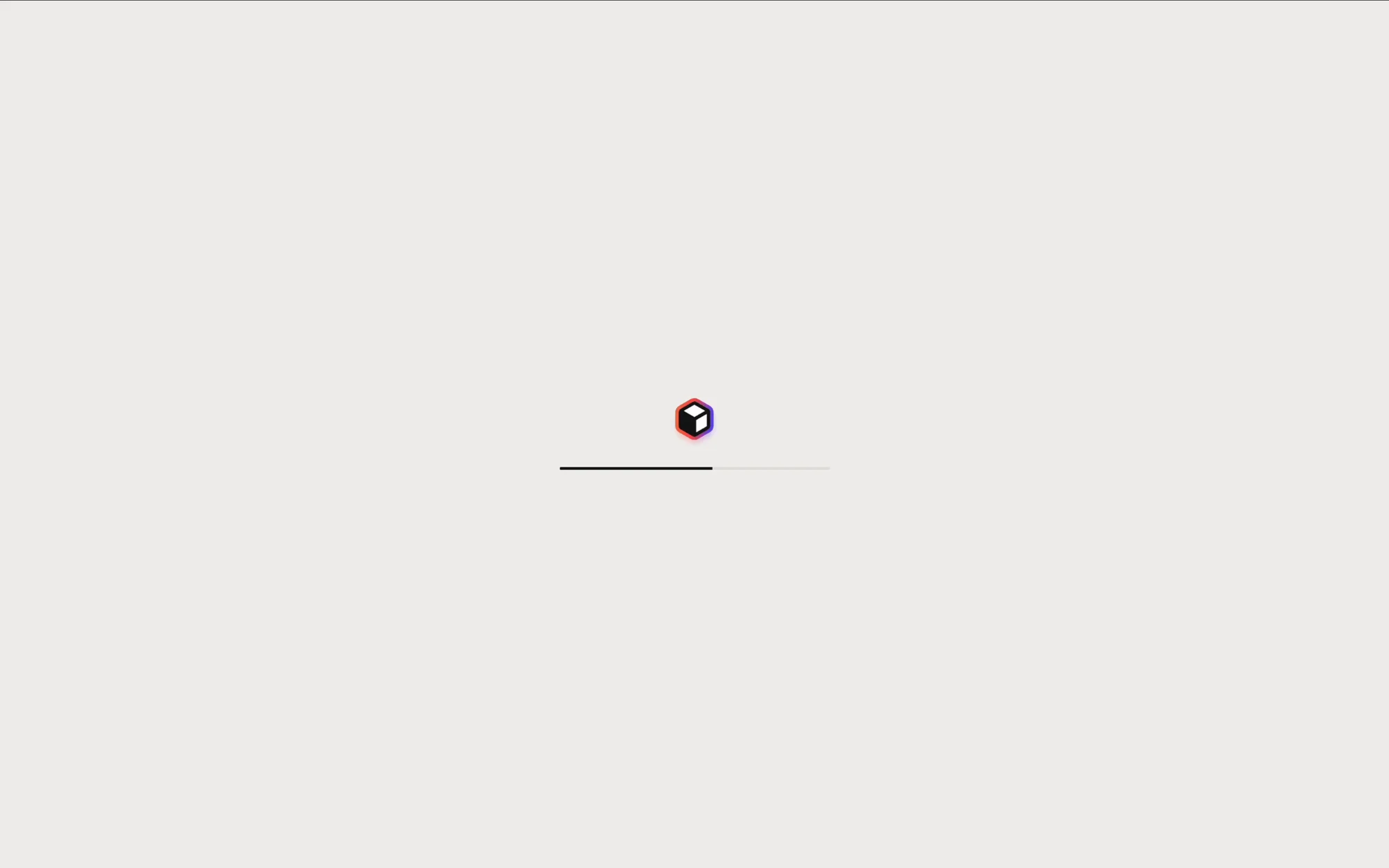
The rotating ring is the most recognizable version and appears across systems like iOS and Material Design.
Dot-based spinners tend to feel lighter and friendlier, while line and bar variants often look more technical or system-oriented. Custom-branded loaders, meanwhile, are usually designed to reinforce product identity through motion and personality.
Despite their visual differences, all spinner UI variations serve the same purpose: they communicate process, not progress.
The spinner decision framework
Most loading spinners aren’t bad because of their animation. They’re bad because they’re used in the wrong situations.
The real UX question isn’t “Which spinner style should I pick?” It’s: “Does this interaction even need a spinner in the first place?”
And the answer mostly depends on one thing: wait time.
The three-tier wait-time model
Different loading durations create different psychological expectations. What feels reassuring at one moment can feel frustrating a few seconds later.
One important detail many teams miss: don’t show a spinner immediately.
If an operation resolves almost instantly, the spinner should never appear at all. A loading indicator that flashes for 80 milliseconds creates more visual noise than reassurance. That’s why many products use a small delay — usually around 250 milliseconds — before rendering the spinner.
✔️Use a spinner when:
- the action blocks interaction,
- the wait time is unpredictable,
- the user needs confirmation their action was received,
- or you need to prevent duplicate actions like double form submissions.
This is especially common in:
- authentication flows,
- payments,
- file processing,
- AI generation,
- and data-heavy SaaS operations.
✗ Don’t use a spinner when:
- the interaction completes almost instantly,
- optimistic UI can handle the feedback instead,
- the content structure is predictable enough for skeleton screens,
- or users can continue interacting with other parts of the interface.
A spinner shouldn’t become a default reaction to every loading event. Sometimes it’s the right feedback pattern. Sometimes it’s just masking a better UX solution.
Spinner vs. Skeleton vs. Progress Bar — when each wins
Not every loading state should use a spinner. Sometimes a different feedback pattern creates a much smoother experience.
The right choice depends on what users are waiting for — and which pattern creates a better user experience in that specific context.
The predictability of the loading state often helps determine whether a spinner, skeleton screen, or progress bar will work best.
Spinners work best for short, indeterminate waits. Skeleton screens reduce perceived loading time by previewing layout structure. Progress bars are better for longer operations where users expect visibility and reassurance.
The key thing is intentionality. A spinner shouldn’t become the default solution for every loading state.
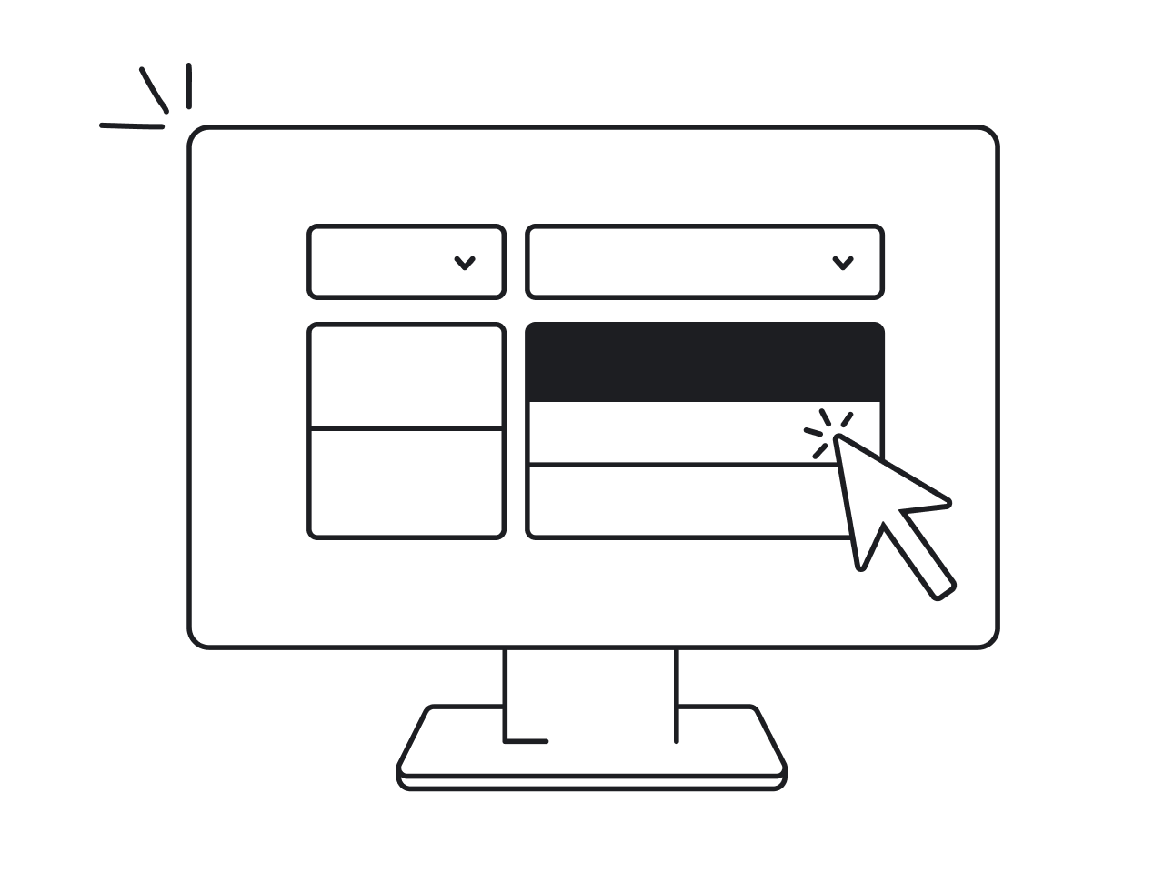
Spinner UI states: placement and scope decision
Where a spinner appears matters just as much as the spinner itself.The scope of a loading state should match the content it needs to display.
A full-page loading overlay creates a completely different experience than a small inline spinner inside a button. And in many products, the biggest UX mistake isn’t the spinner design — it’s using the wrong loading scope.
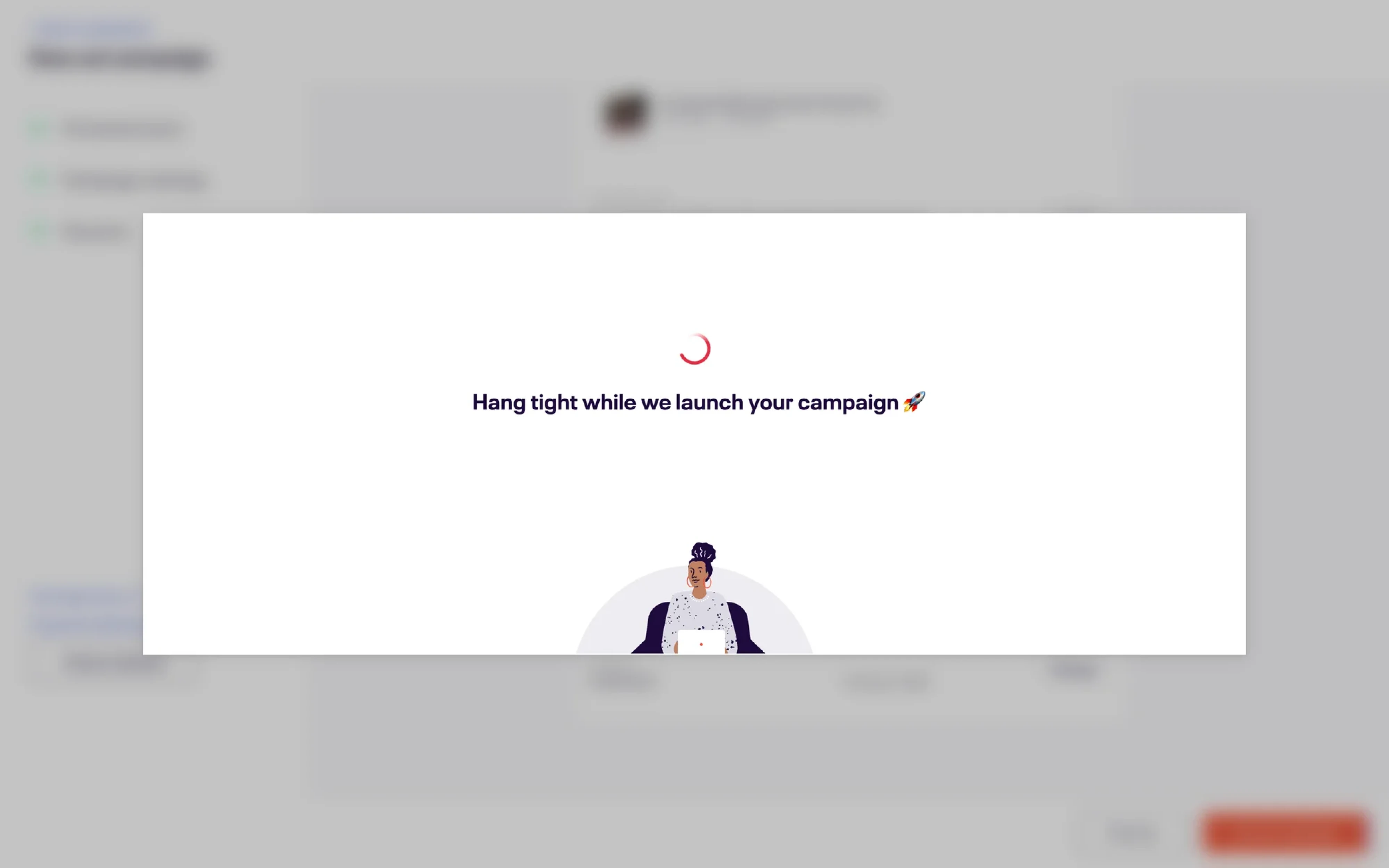
Full-page spinners
Full-page spinners block the entire interface and prevent interaction. They should only be used when the whole application state is unavailable, like:
- app initialization,
- authentication checks,
- or complete page transitions.
Using them for smaller loading events usually feels excessive and disruptive.
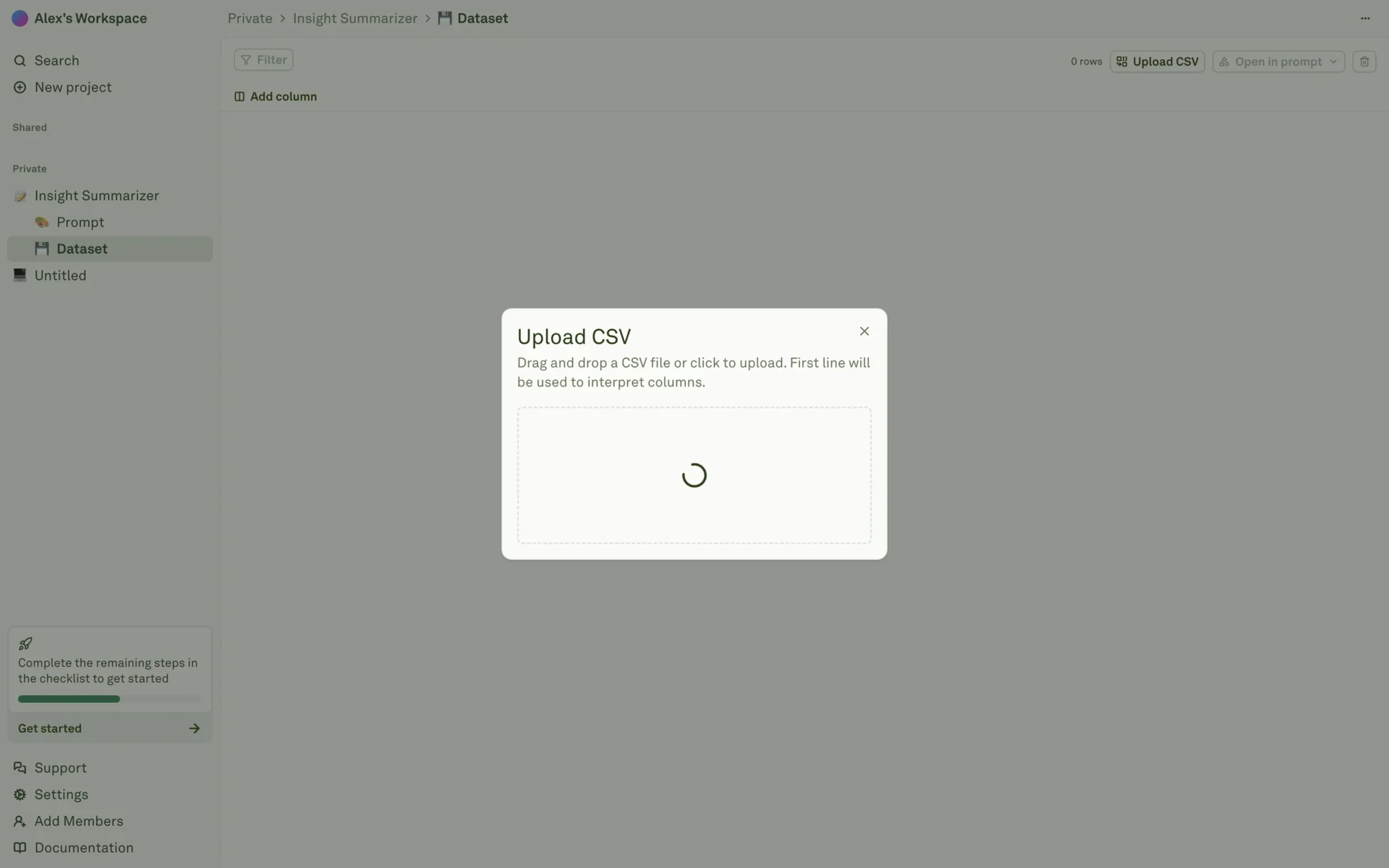
Section-level spinners
Section spinners load a specific panel, table, or widget while the rest of the interface stays usable. This pattern works especially well in dashboards where different components fetch data independently.
In most SaaS products, this is usually a better choice than blocking the whole screen.
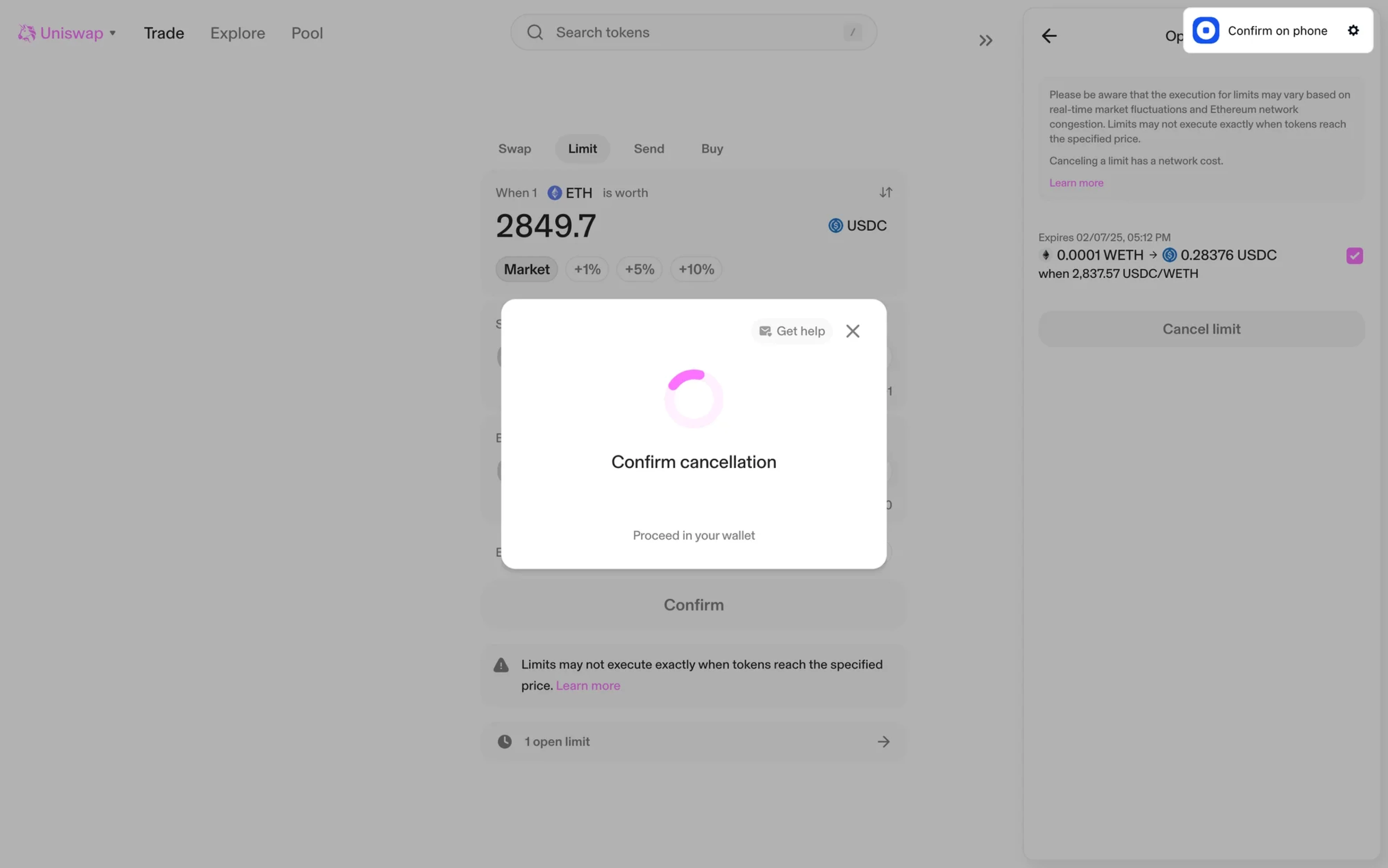
Inline and button spinners
Inline spinners appear inside specific components like forms, inputs, or buttons. They communicate that a single action is processing without interrupting the rest of the workflow.
Button loading states are especially important because they:
- confirm the click was received,
- prevent duplicate submissions,
- and keep layout shifts under control.
This is one of the most common spinner UI patterns in modern design systems — and one of the easiest to get wrong.
Spinner UI best practices: how to design it well
A loading spinner is a tiny UI component — but small design decisions can completely change how it feels.
Animation speed matters
Most spinner animations work best within a 1–2 second rotation cycle. Faster motion can feel stressful or broken, while slower motion makes the interface seem sluggish.
The animation style matters too. Linear motion feels mechanical and stable, while eased motion feels softer and more natural.
Keep size and placement proportional
A spinner should match the scope of the loading state. Tiny loaders inside full-page overlays often look disconnected, while oversized spinners inside buttons feel heavy and distracting.
Placement matters just as much. Center the spinner within the loading area itself — not automatically in the middle of the viewport.
Use color carefully
Good spinner UI design balances visibility with subtlety. Many design systems use currentColor so spinners automatically inherit surrounding text color and adapt to light and dark themes consistently.
The track color matters too. Low-contrast tracks feel lightweight and calm, while stronger contrast makes the spinner behave more like a progress indicator.
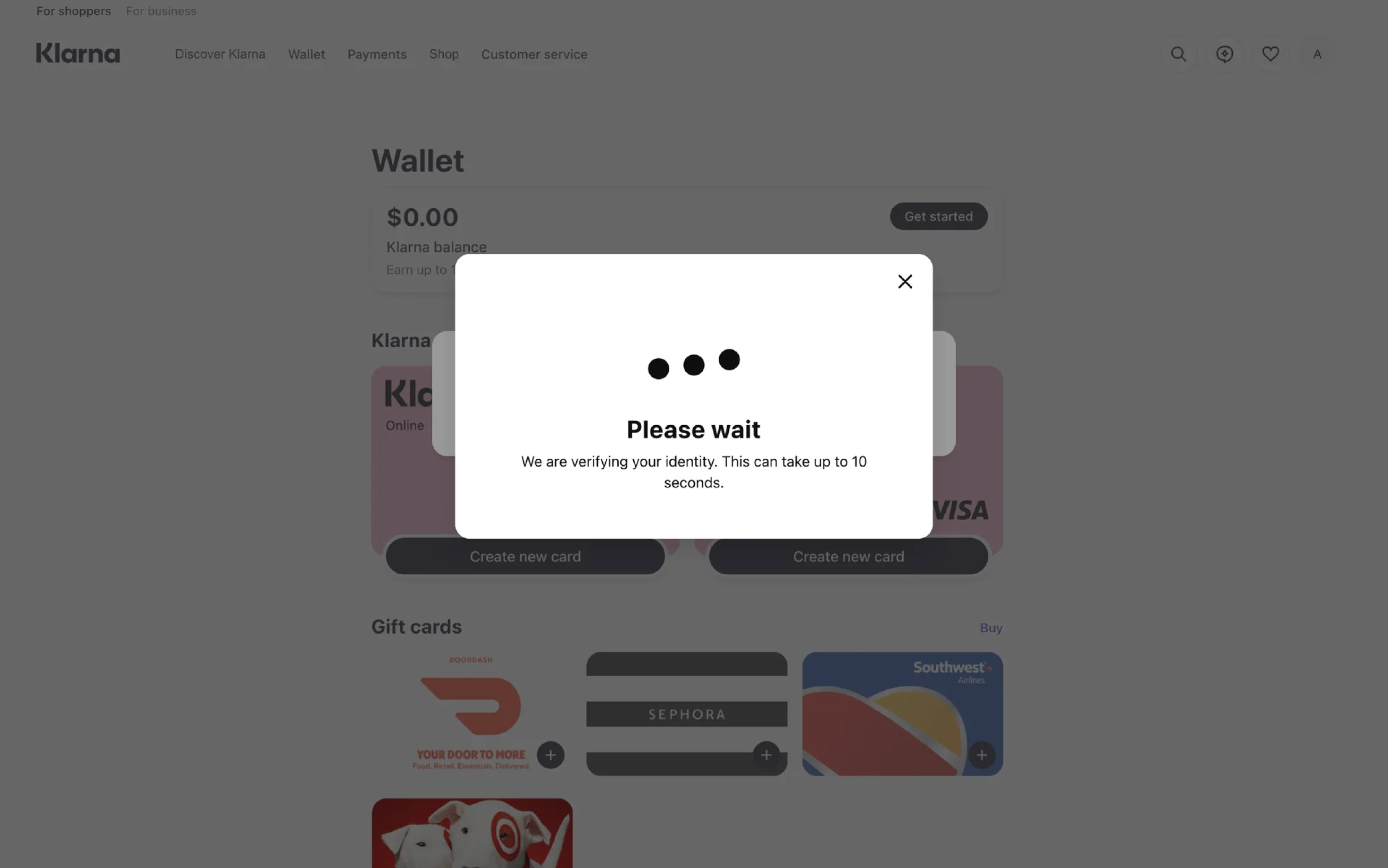
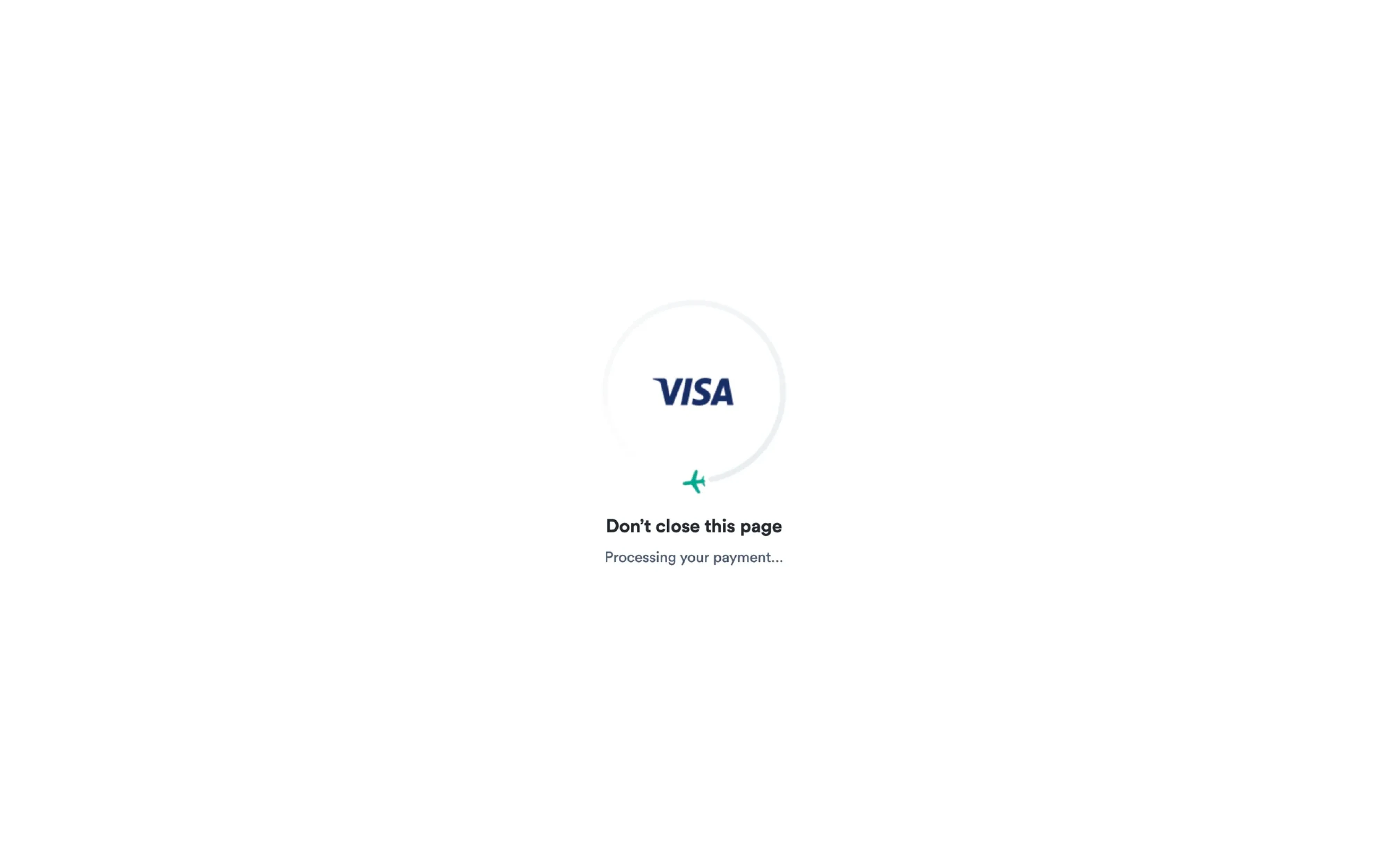
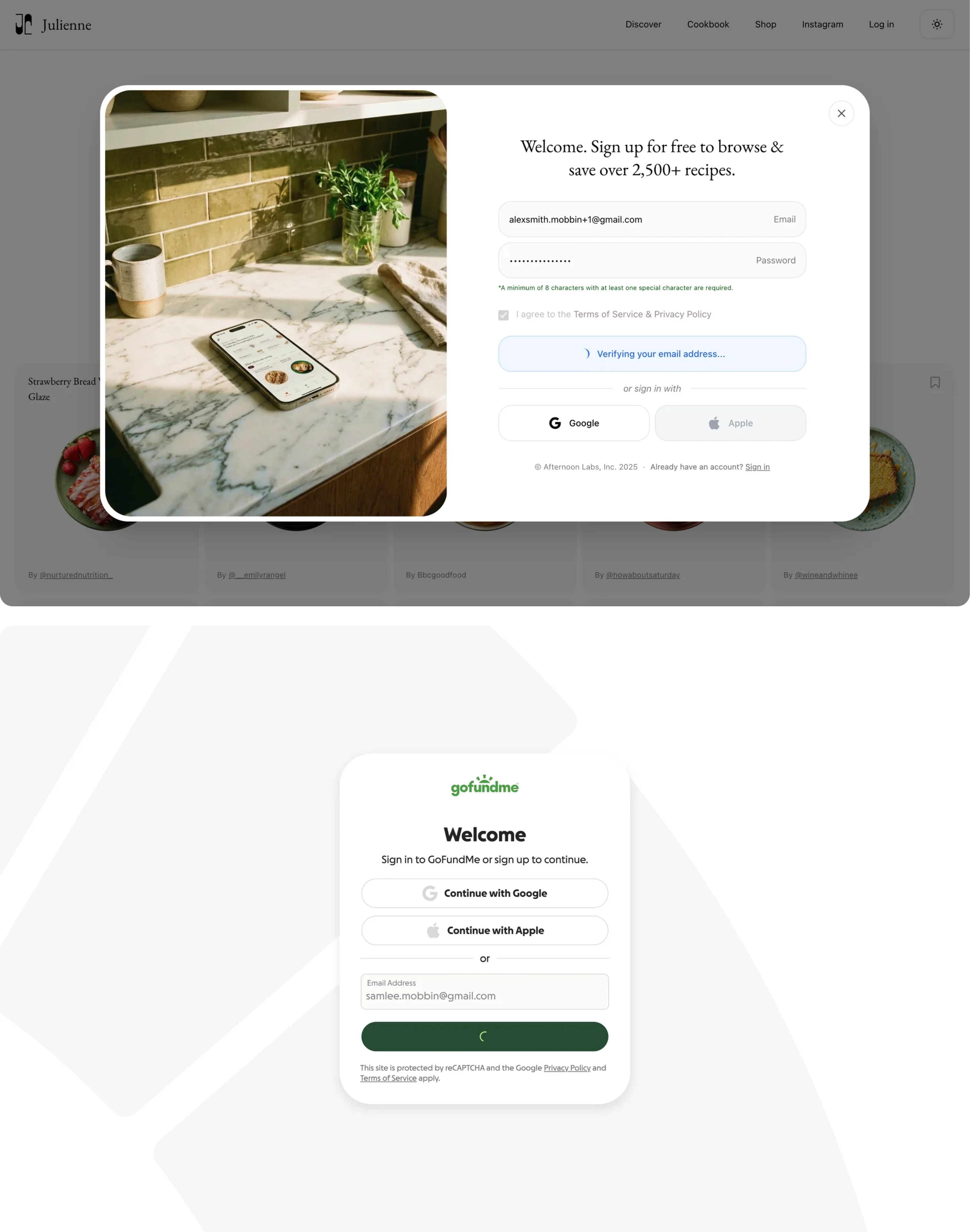
Pair spinners with clear copy
Silent spinners create uncertainty.
“Loading...” is acceptable. “Processing your payment” or “Generating your dashboard” is much better because it explains what’s happening.
For longer waits, contextual feedback becomes even more important. Instead of showing an endless spinner, many products gradually update the message:
- “Still processing…”
- “This is taking longer than expected…”
- “Almost done…”
Always design timeout and error states
One of the biggest loading-state mistakes is forgetting what happens when the process fails.
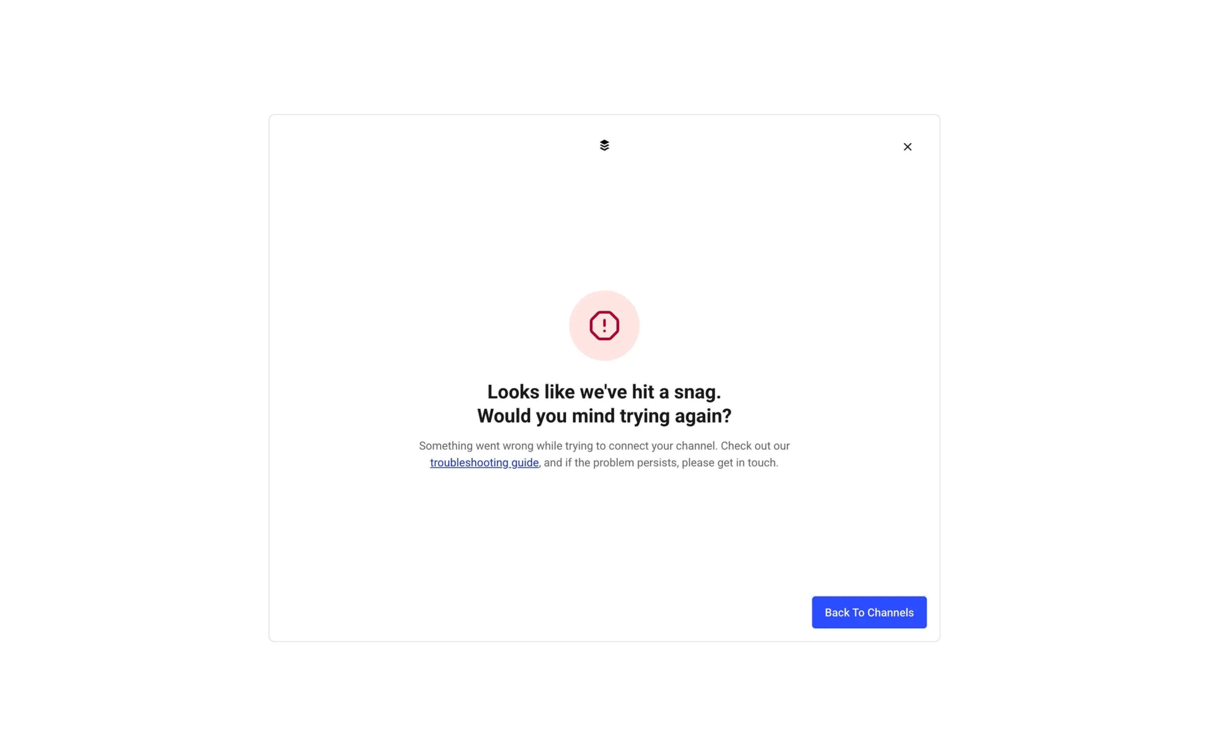
A spinner should never run forever. Good UX plans for the next state:
- timeout,
- retry,
- error messaging,
- or fallback actions.
The loading experience doesn’t end with the spinner itself.
Spinner UI in a design system
A spinner isn’t just a standalone component. It’s part of a broader loading-state system that should stay consistent across the product or a website.
That means defining:
- spinner styles,
- size variations,
- color tokens,
- motion behavior,
- placement rules,
- and accessibility requirements.
Without those standards, products quickly end up with inconsistent loading experiences — different animations, mismatched sizes, and conflicting interaction patterns across screens.
Most mature design systems handle it in multiple ways: Chakra UI prioritizes flexibility and developer control, Radix focuses on minimal, elegant primitives, while HeroUI leans toward simplicity and faster implementation. They all prioritize different things, but follow the same principle: predictable loading behavior across the product.
A good design system should also define:
- when spinners appear,
- when they shouldn’t,
- which loading states use skeletons or progress bars instead,
- what copy accompanies loading,
- and how accessibility requirements should be documented.
When loading behavior is documented this way, spinners stop feeling like random UI elements and become part of a predictable, trustworthy product experience.
Strong loading patterns also improve collaboration between design and development teams by creating predictable behavior across the product.
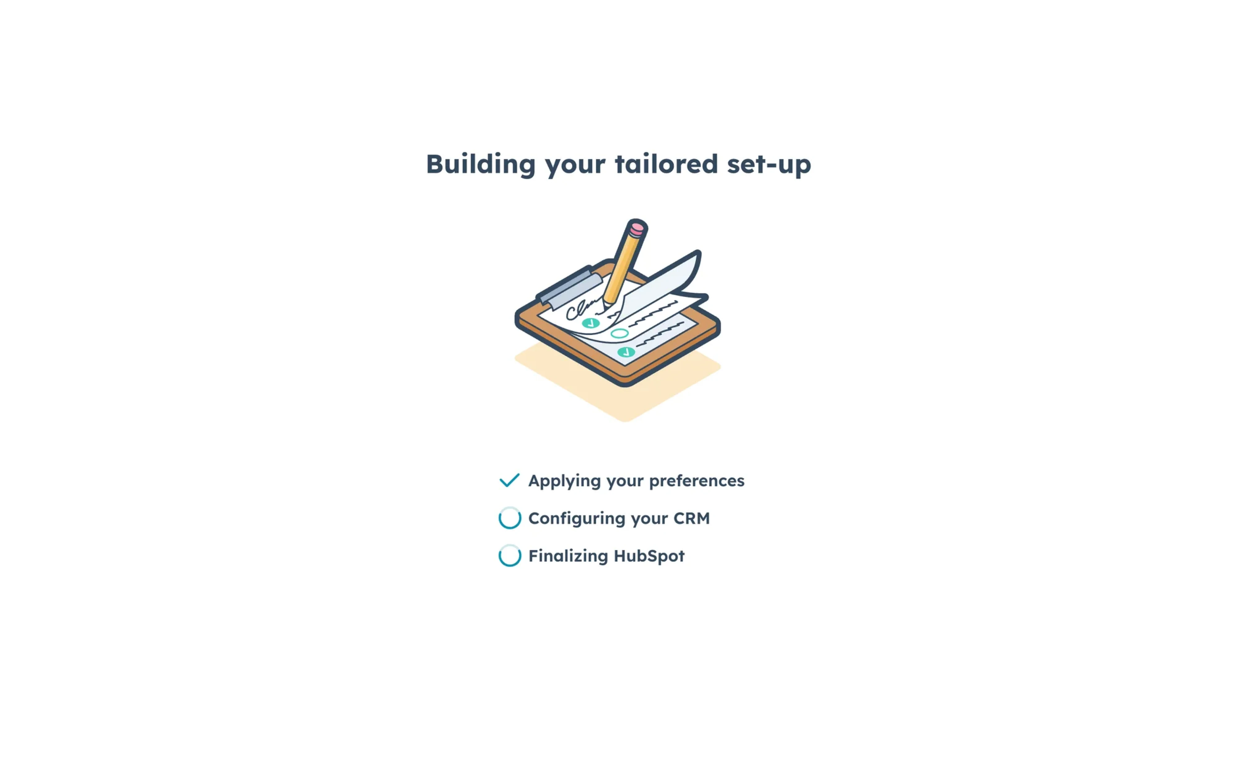
6 Real-world spinner UI examples for inspiration
The best spinner UI variations don’t just communicate loading — they reduce uncertainty without disrupting the workflow around them. Feel free to view the images of spinner component examples below to grab some inspiration for your design.
Button loading states
One of the most common patterns is a spinner inside a button after submission. Instead of shifting the layout or replacing the entire interface, the button enters a loading state while keeping its original width and position.
Button spinners confirm that the user's request has been submitted and help prevent duplicate actions.
This pattern works especially well for:
- form submissions,
- authentication,
- payments,
- and AI generation flows.
Good button spinners also disable repeated clicks, preventing accidental double-submissions.
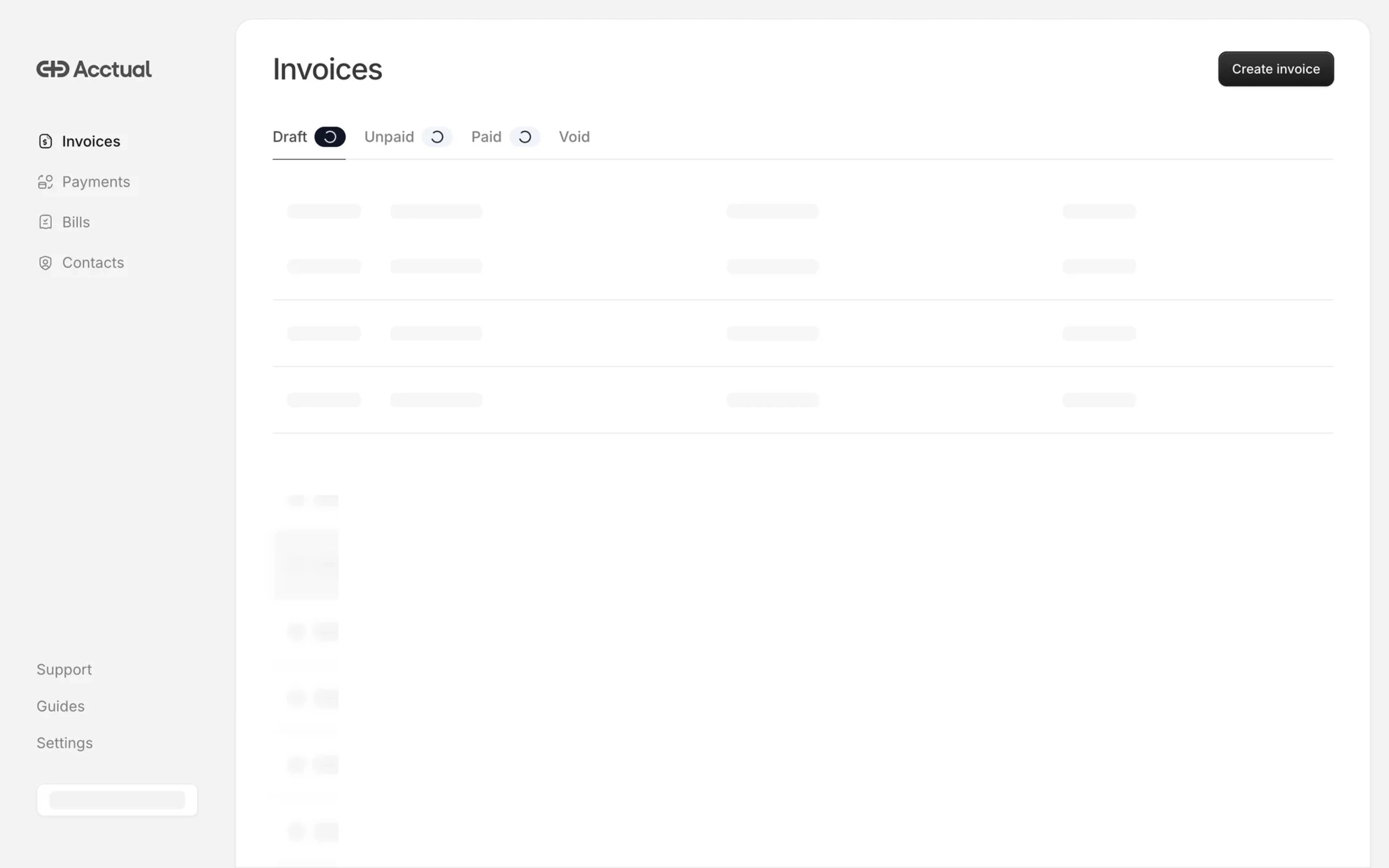
Card and widget loading
In dashboards and data-heavy SaaS products, loading should rarely block the entire page. Section-level spinners inside cards, tables, or widgets let the rest of the interface stay usable while specific content loads in the background.
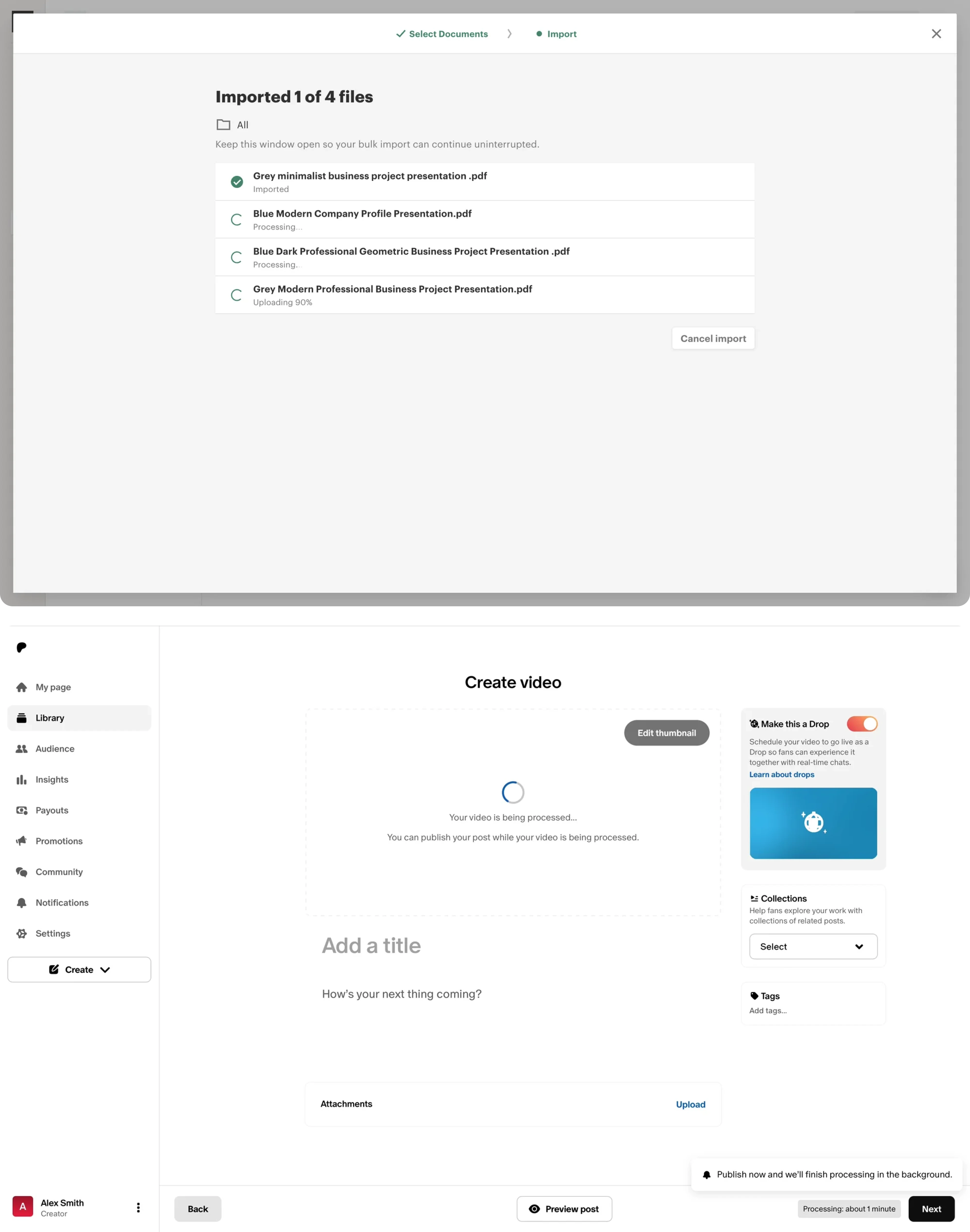
This creates a much smoother experience because users can continue working instead of waiting for everything to finish at once.
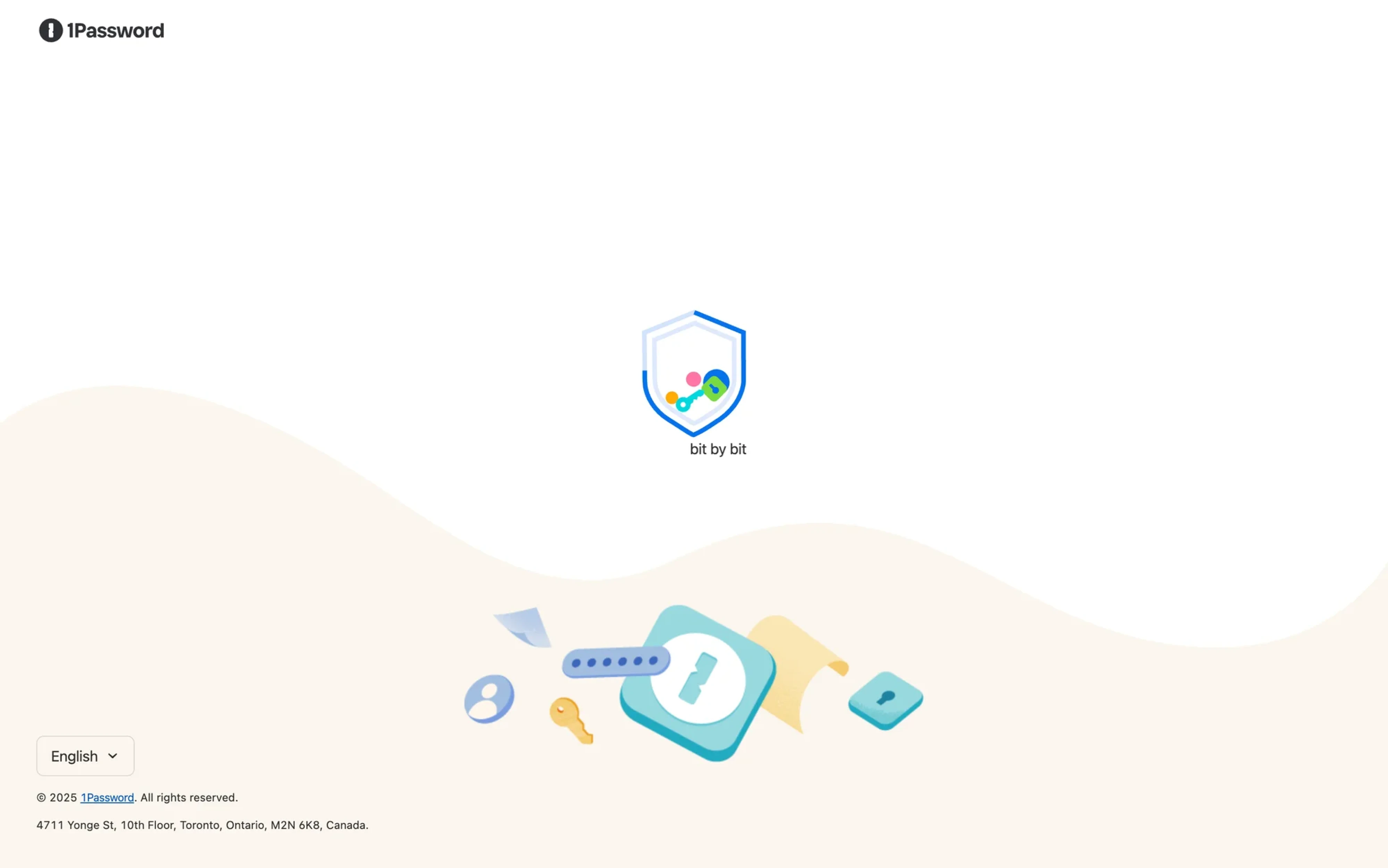
Full-screen initial loading
App boot, authentication checks, and critical initialization flows are legitimate cases for full-screen spinner UI, because the entire application state is temporarily unavailable.
This is also one of the few places where branding can work especially well. Since users often see the loading screen during product startup, subtle branded motion or animation can make the experience feel more polished and intentional.
Inline validation indicators
Small inline spinners are often used during real-time validation flows, like:
- username availability checks,
- search suggestions,
- or API-based form validation.
Because the loading scope stays tightly connected to the affected input, users immediately understand what’s happening.
Spinner-to-success transitions
The best loading experiences don’t end with the spinner disappearing abruptly. Many products transition from:
spinner → success state → confirmation message.
That tiny feedback loop creates reassurance and closure, especially after important actions.
Branded loading experiences
Some products turn loading states into subtle brand moments. Slack, Notion, and similar SaaS tools use custom motion and animation styles to make waiting feel more intentional and recognizable.
But the strongest spinner patterns still prioritize clarity first. Even branded loaders should never distract from the task itself.
The bigger picture: spinners as a symptom
Here’s the uncomfortable truth: heavy spinner usage often points to a deeper product problem.
Sometimes the issue isn’t the loading state itself — it’s the system behind it. Slow APIs, excessive page refreshes, poor data architecture, or workflows that weren’t designed for responsiveness in the first place.
That’s why good UX designers shouldn’t treat spinners as automatic solutions. Before adding another loading indicator component, it’s worth asking:
- Can this interaction use optimistic UI instead?
- Can content preload in the background?
- Would a skeleton screen feel more natural?
- Does the user even need to wait here at all?
In many cases, the best spinner UI examples are the ones users barely notice.
At Eleken, we think loading states deserve the same level of design thinking as any other part of the product experience. Because small UX decisions — especially around waiting, feedback, and trust — typically shape how polished and reliable a product ultimately feels.
Whether you’re building a design system or refining existing flows, thoughtful spinner component design can make complex products feel faster, calmer, and easier to trust.
Looking to improve your product’s UX patterns and loading experiences? Eleken can help you design interfaces that feel responsive — even when the system behind them is anything but.


.webp)

.webp)
.png)

.png)