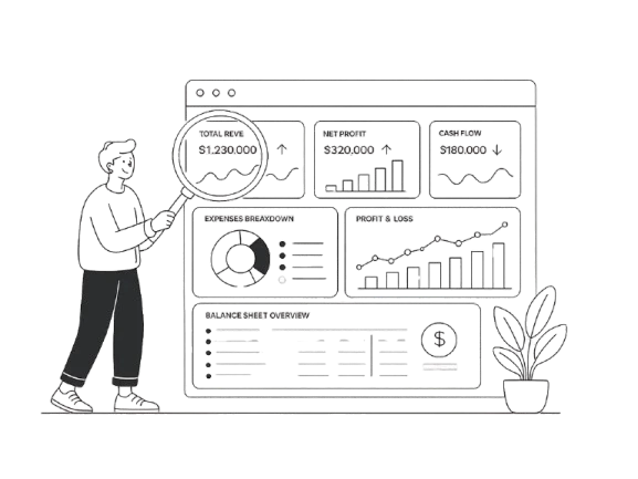

Many companies rely on financial dashboards to monitor performance, but not all dashboards actually support better decisions. In practice, teams often face the same problem: too many metrics, unclear structure, and no clear signal of what matters most.
As a result, even well-built dashboards fail to provide actionable insights. Executives scan them briefly, struggle to interpret the data, and move on without making informed decisions.
A well-designed financial reporting dashboard should do the opposite. It should highlight key performance indicators, reveal trends in financial performance, and help teams understand the company’s financial position at a glance.
At Eleken, we’ve seen that the difference rarely comes from the data itself, but from how it’s structured and visualized.
In this guide, we’ll explore real financial dashboard examples, break down what makes them effective, and show how to design dashboards that turn financial data into clear, usable insights.
Without further ado, let's get started.
Looking into financial dashboard examples
Financial dashboards vary depending on who uses them and what decisions they support. While all dashboards rely on the same underlying financial data, their structure, level of detail, and visual hierarchy change based on the audience — from executives who need a quick overview to finance teams working with detailed reports.
A well-designed financial dashboard does more than display numbers. It helps users understand performance, identify trends, and make informed decisions without digging through raw financial data. Below are the most common types of finance dashboards, grouped by purpose and use case.
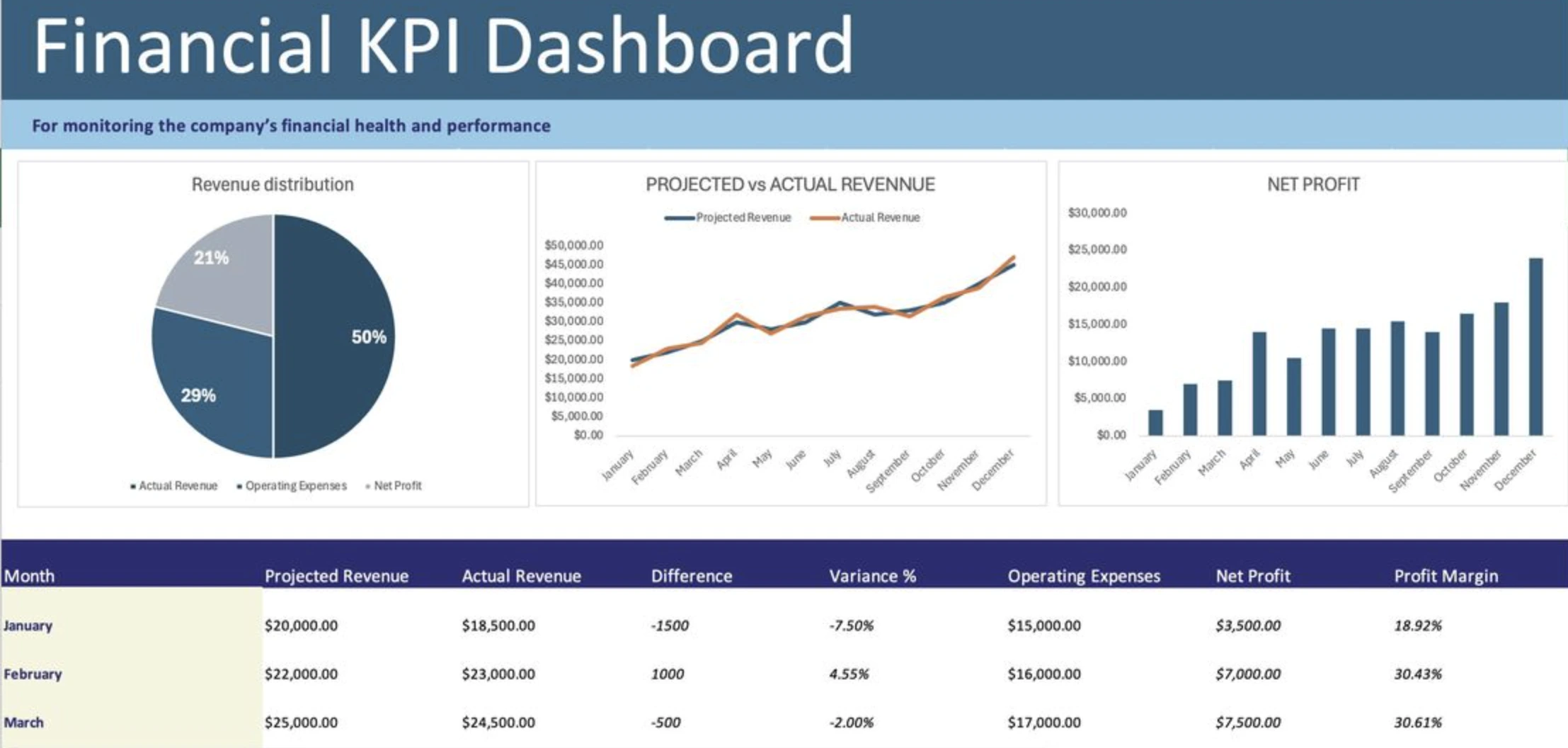
Executive financial dashboard
Executive dashboards are designed for CEOs, chief financial officers, board members and leadership teams who need a high level overview of the business's health. Unlike operational dashboards, they focus on high-level trends and strategic indicators rather than detailed transactions.

The main goal of this dashboard is to help decision-makers quickly analyze the company’s financial position quickly and identify areas that require attention to drive growth and increase profitability.
Common financial KPIs
- revenue
- profit margin
- EBITDA
- cash flow
- expenses
- ROI (Return on Investment)
- net income
- budget vs actual
Because executives often review dashboards under time pressure, the layout should prioritize clarity and hierarchy. KPI cards are typically placed at the top, followed by trend charts and financial health indicators that provide additional context.
Common features
- summary charts
- trend analysis
- financial health indicators
A similar structure was used by Eleken in ClearPoint Strategy, a business performance platform designed to track both financial and strategic KPIs. By combining KPI cards with performance charts, the dashboard helps leadership teams move from a quick overview to deeper insights without losing clarity.

Profit & loss (P&L) dashboard

A Profit & loss dashboard focuses on profitability by showing how revenue compares to costs and expenses over a specific period. It helps finance teams understand whether the business is generating sustainable profit and where financial inefficiencies may exist.
Unlike executive dashboards, P&L dashboards require more detailed financial breakdowns because users often need to investigate what drives profitability changes.
Common metrics
- revenue streams
- cost of goods sold (COGS)
- operating expenses
- gross profit
- net profit
These dashboards are commonly used to:
- understand profitability
- identify cost problems
- compare monthly or yearly performance
Trend charts and variance indicators are especially important here because they help users detect declining margins or unexpected expense increases before they become larger issues.
Cash flow dashboard
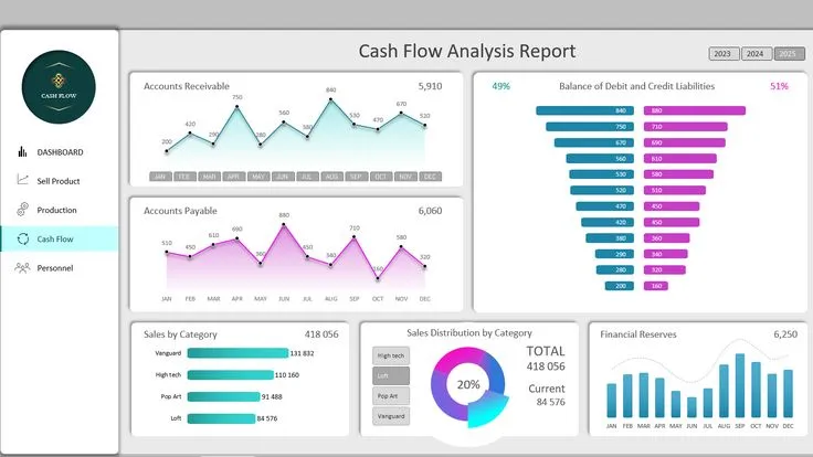
Cash flow dashboards focus on how money moves through a business. While profitability dashboards show whether a company earns money, cash flow dashboards reveal whether the company has enough liquidity to operate effectively.
This distinction is critical because even profitable companies can face serious financial problems if cash flow is poorly managed.
Common metrics
- cash inflows
- cash outflows
- operating cash flow
- free cash flow
- liquidity indicators
Strong cash flow dashboards emphasize movement and timing rather than static balances. Waterfall charts, trend lines, and payment tracking visualizations help users understand where money comes from, where it goes, and how quickly it moves through the business.
For PayUp, a fintech platform focused on payments and transaction management, Eleken designed dashboards that help users monitor overdue invoices, payment flows, and transaction activity in real time.
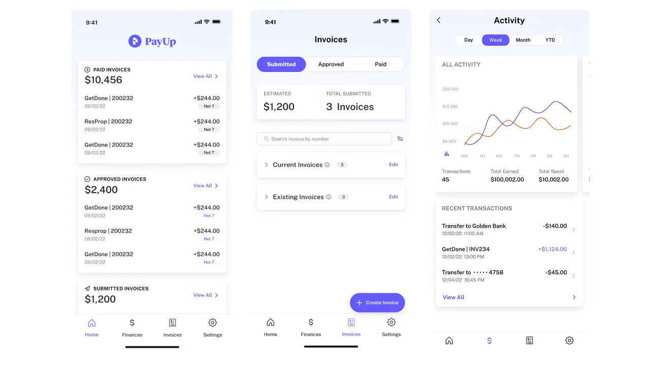
Structuring this information into clear visual blocks makes complex financial movement easier to interpret and act on.
Budget vs actual dashboard
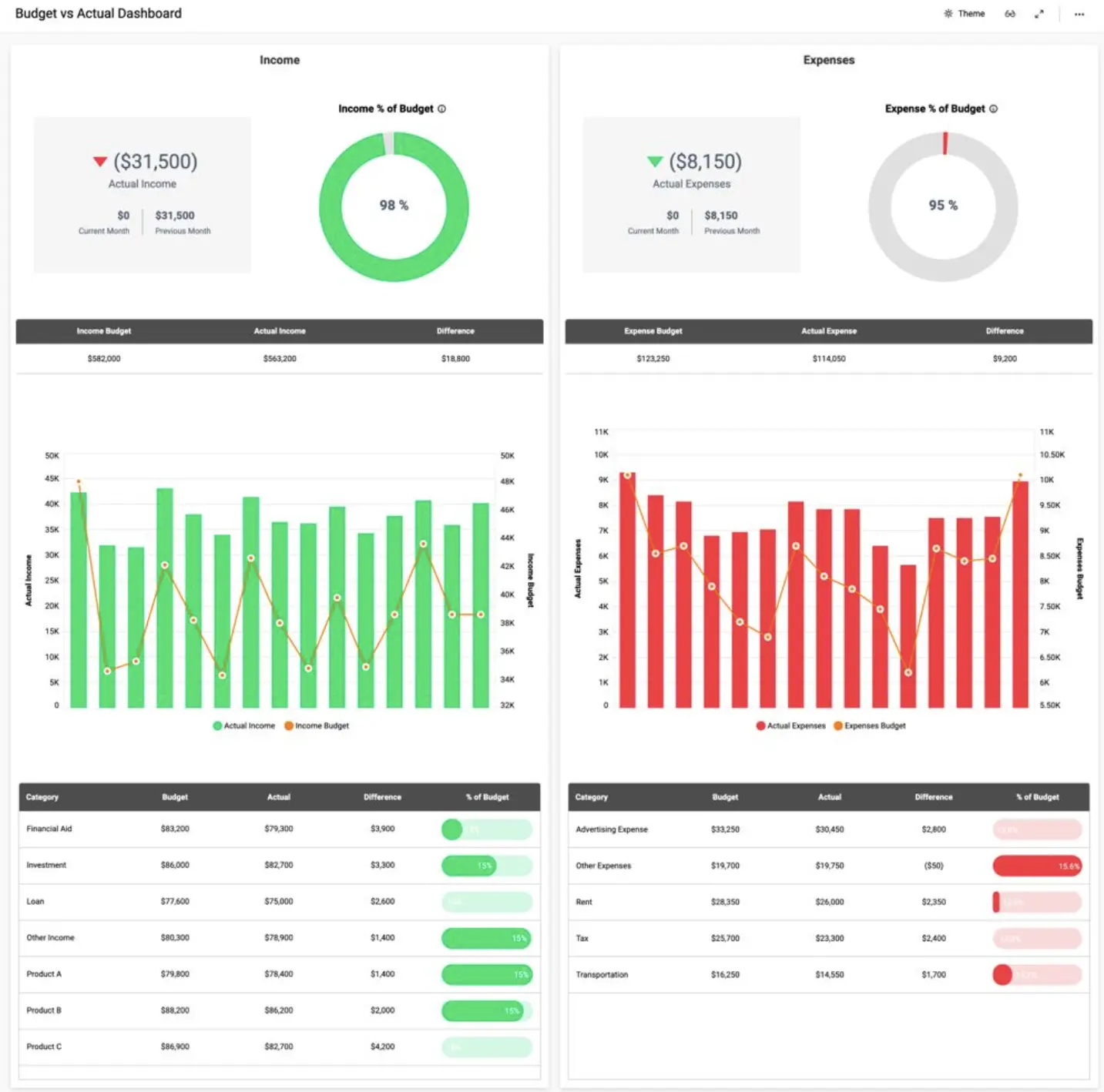
Budget vs actual dashboards compare planned financial performance with real outcomes. They help organizations evaluate whether spending aligns with expectations and where financial adjustments may be needed.
These dashboards are especially important during monthly and quarterly reporting cycles, when finance teams review departmental performance and identify budget deviations.
Common metrics
- planned budget
- actual spending
- variance analysis
- department performance
The key design challenge is making discrepancies immediately visible. Color coding, variance indicators, and comparison charts help users quickly identify where actual results differ from forecasts.
Common users
- financial controllers
- budget analysts
- management teams
When structured well, this type of dashboard supports faster financial planning and more informed resource allocation.
Accounts receivable dashboard

Accounts receivable dashboards help organizations track money owed by customers and monitor the efficiency of payment collection processes.
Because delayed payments directly affect liquidity, these dashboards play an important role in maintaining financial stability.
Common KPIs
- outstanding invoices
- aging reports
- collection rate
- Days Sales Outstanding (DSO)
The main goal is to improve collections and reduce late payments. Effective dashboards highlight overdue accounts clearly and make it easy to identify which invoices require immediate attention.
Tables, status indicators, and aging visualizations are commonly used because they help finance teams prioritize collection efforts quickly.
Financial KPI dashboard
Financial KPI dashboards focus specifically on high-level performance indicators rather than detailed reporting. Their purpose is to help users monitor the most important financial metrics in one place and support faster decision-making.
Because these dashboards prioritize speed and clarity, they usually contain fewer interactive charts and more condensed KPI summaries.
Common KPIs
- current ratio
- debt-to-equity ratio
- ROE (Return on Equity)
- ROA (Return on Assets)
- working capital
This type of dashboard is often used by executives and financial analysts who need a quick snapshot of the company’s financial condition without reviewing full reports.
Forecasting financial dashboard
Forecasting dashboards focus on future performance rather than historical reporting. They use historical financial data to identify emerging trends for revenue, expenses, and business outcomes.
These dashboards are especially valuable for strategic planning because they help organizations evaluate potential risks and prepare for different scenarios.
Common features
- revenue forecasts
- expense forecasts
- scenario analysis
- trend modeling
Many predictive dashboards also incorporate:
- AI
- machine learning
- statistical forecasting models
The design challenge here is balancing complexity with clarity. Forecasts often involve uncertainty, so data visualizations should clearly communicate assumptions, confidence ranges, and projected trends.
SaaS financial dashboard

SaaS dashboards are designed for subscription-based businesses that rely on recurring revenue models. Unlike traditional financial dashboards, they combine financial performance with customer and product metrics.
This makes them essential for understanding long-term growth and retention.
Key SaaS metrics
- MRR (Monthly Recurring Revenue)
- ARR (Annual Recurring Revenue)
- CAC (Customer Acquisition Cost)
- LTV (Lifetime Value)
- churn rate
- burn rate
- runway
SaaS dashboards often rely on cohort analysis, retention charts, and recurring revenue trends to show how customer behavior affects business growth over time.
Personal finance dashboard

Personal finance dashboards help individuals track spending, savings, and financial goals in one place. Unlike business dashboards, they are designed for everyday financial decision-making rather than corporate reporting.
Because personal finance users may not have financial expertise, these dashboards prioritize simplicity and accessibility.
Common metrics
- income
- spending
- savings
- investments
- debts
- budget goals
Popular apps such as Mint, YNAB, and Personal Capital use dashboards to help users visualize their financial situation and make more informed budgeting decisions.
A similar approach can be seen in Eleken’s work on Habstash, a fintech product focused on helping users save for buying a home. The dashboard visualizes savings progress, monthly contributions, affordability timelines, and scenario modeling, making long-term financial planning easier to understand and act on.

Features such as progress tracking and scenario modeling made financial data more accessible, showing how dashboards can be adapted to different contexts while still supporting informed decisions.
Across all these financial dashboards, one principle remains consistent: the best financial dashboards focus on clarity, not volume. By prioritizing key metrics and structuring information carefully, they help users move from data to insight — and from insight to action.
Starting with financial dashboard templates
While banking dashboard examples provide inspiration, templates help translate that inspiration into something you can actually build
Below are three commonly used financial dashboard templates, each designed for a specific use case.
1. Executive financial dashboard template

Executive dashboards are built for speed and clarity. Their main purpose is to help leadership teams quickly understand the company’s financial position without navigating through complex reports.
To achieve this, the layout must follow a clear hierarchy, where the most important metrics are immediately visible and supporting details are placed lower on the screen.
A typical financial dashboard template for executives includes:
Top section: Key KPIs
This section provides an instant overview of performance and should be the first thing users see when opening the dashboard.
- total revenue
- net profit
- cash balance
- operating expenses
KPI cards should be visually distinct and consistently formatted, making it easy to compare values and detect changes.
Middle section: Trends and performance
Once users understand the current state, they need context. This section shows how performance evolves over time and whether trends are improving or declining.
- revenue vs expense trends
- profit trends
- financial performance over time
Line charts are especially effective here because they highlight direction and momentum rather than isolated values.
Bottom section: Breakdown and details
After reviewing high-level metrics and trends, users may want to explore what drives those results. This section provides that deeper level of insight.
- expense breakdown by department
- revenue by segment
- performance by business unit
Placing these details at the bottom keeps the dashboard clean while still allowing to delve deeper into analysis when needed.
2. Cash flow dashboard template

Cash flow dashboards are designed to track how money moves through a business. Unlike profitability dashboards, they focus on liquidity and short-term financial stability.
A well-structured layout helps users quickly understand whether the company has enough cash to operate and where potential risks may arise.
Top section: Cash position
This section answers the most immediate question: how much cash is available right now, and how stable is the company’s financial position?
- current cash balance
- working capital
- liquidity indicators
These metrics should be easy to interpret at a glance, often supported by visual indicators or status signals.
Middle section: Cash flow trends
After understanding the current position, users need to see how cash changes over time. This section highlights inflows and outflows and reveals patterns in financial activity.
- inflow vs outflow over time
- operating cash flow
- cash flow trends
Charts in this section help users anticipate future issues and understand how financial decisions affect cash availability.
Bottom section: Expense and inflow breakdown
This section provides context by showing what drives cash movement and where money is coming from or going.
- expenses by category
- accounts payable
- accounts receivable
In products like PayUp designed by Eleken, similar structures help users monitor transactions and identify overdue payments, turning complex data into clear financial insights.
3. SaaS financial dashboard template

SaaS dashboards require a slightly different structure because they combine financial performance with customer and product metrics. Instead of focusing only on revenue, they help teams understand how revenue is generated and sustained over time.
This makes them essential for subscription-based businesses that rely on recurring revenue.
Top section: Core SaaS metrics
This section defines the foundation of the business model and highlights the most important indicators of growth and stability.
- MRR
- ARR
- churn rate
- customer lifetime value (LTV)
These metrics should be presented clearly, as they are often the first numbers stakeholders look at.
Middle section: Revenue dynamics
Once the core metrics are clear, this section shows how revenue evolves and what factors influence growth or decline.
- revenue growth trends
- expansion revenue
- churn impact
This helps teams understand not just what is happening, but why it is happening.
Bottom section: Cohort and customer insights
This section connects financial performance with customer behavior, providing a deeper understanding of how different user groups contribute to revenue.
- revenue by cohort
- retention trends
- customer segmentation
By combining financial and user data, teams can identify opportunities for growth and areas that need improvement.
Adapting templates to your needs
Templates provide structure, but they are not one-size-fits-all solutions. The most effective financial reporting dashboards are tailored to specific users, goals, and business models.
For example, executives need simplified views, while finance teams require detailed breakdowns. Startups focus on cash flow and runway, while SaaS companies prioritize recurring revenue and retention.
The key is to align the dashboard structure with the decisions it needs to support.

Templates help reduce guesswork, but they only work when combined with clear thinking about users and goals.
A good dashboard is not defined by how many metrics it includes, but by how clearly it helps users understand the business and take action.
How to create a financial analysis dashboard
Building a financial dashboard is not just about selecting charts or connecting data sources. The real challenge is structuring information in a way that helps users understand performance and make decisions quickly.
A well-designed dashboard answers specific questions, highlights the right metrics, and presents data in a clear, logical layout. Below is a step-by-step approach that helps turn raw data into a useful decision-making tool.
Step 1: Define the financial questions
Before selecting metrics or designing visuals, it is important to understand what the dashboard should answer. Without clear questions, dashboards tend to become cluttered and unfocused.
Think about the decisions users need to make. For example, finance teams might want to understand profitability, while executives may focus on overall performance.
Common questions include:
- Are we profitable right now?
- Where are we losing money?
- What drives our revenue growth?
- Do we have enough cash to operate?
Defining these questions ensures that the dashboard is built around real needs rather than assumptions.
Step 2: Choose the right KPIs
Once the questions are clear, the next step is selecting the key performance indicators that will answer them. This is one of the most critical steps, as too many metrics can overwhelm users and reduce clarity.
The goal is to focus on metrics that reflect the company’s financial performance and support informed decision-making.

It is important to choose metrics that align with the business model and provide a meaningful view of the company’s performance.
Step 3: Choose the right charts
Selecting the right visual representation is essential for making data easy to interpret. Different types of data require different chart formats, and using the wrong one can make insights harder to understand.
The most effective dashboards rely on a limited set of clear, familiar visualizations.
Best charts for financial dashboards
Each chart type serves a specific purpose and should be used accordingly:
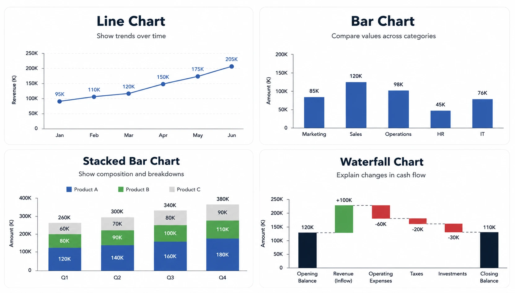
- line charts → show trends over time
- bar charts → compare values across categories
- stacked bar charts → show composition and breakdowns
- waterfall charts → explain changes in cash flow
These chart types help transform financial data into clear insights, making patterns easier to identify.
What to avoid
Not all visualizations are equally effective. Some charts make it difficult to compare values or understand relationships.
For example:
- pie charts can be hard to read when there are many categories
- donut charts often reduce clarity without adding value
In most cases, simpler charts lead to better understanding and faster decision-making.
Step 4: Design a clear layout
A dashboard’s layout determines how easily users can interpret information. Even well-selected metrics can become confusing if they are not structured properly.
Effective dashboards follow a clear hierarchy, guiding users from high-level insights to detailed data.
A typical structure includes:
- top section → key KPIs
- middle section → trends and comparisons
- bottom section → detailed breakdowns
This structure ensures that users can quickly scan the dashboard and then explore deeper insights if needed.
Step 5: Connect reliable data sources
A dashboard is only as useful as the data it displays. Inaccurate or outdated data can lead to poor decisions and reduce trust in the dashboard.
It is important to ensure that data comes from reliable sources and is updated consistently.
Common data sources include:

- accounting systems
- CRM platforms
- payment systems
- business intelligence tools
Combining data from multiple sources can provide a more complete picture, but it also requires careful validation to maintain accuracy.
Step 6: Enable drill-down insights
High-level dashboards are useful for quick overviews, but users often need to explore details to understand what drives performance.
Drill-down functionality allows users to move from summary metrics to more detailed views.
This might include:
- clicking on a KPI to see underlying data
- filtering by department, product, or region
- exploring trends over different time periods
This capability transforms a static dashboard into an interactive tool that supports deeper analysis.
Creating an effective dashboard is not about adding more data — it is about structuring the right data in a way that supports decisions.
When dashboards are built around clear questions, relevant metrics, and thoughtful design, they become powerful tools for understanding performance and guiding business strategy.
Navigating financial dashboard design best practices
Designing a financial dashboard is not just about choosing the right metrics or charts. The real value comes from how clearly the information is structured and how easily users can interpret it.
Even well-built dashboards can fail if they overwhelm users or hide important insights. The following best practices help ensure that dashboards remain clear, focused, and useful for decision-making.
Show trends, not just numbers

Individual numbers provide limited value without context. A revenue figure or expense total may look acceptable on its own, but it becomes meaningful only when compared over time.
This is why effective dashboards emphasize trends rather than static values. Line charts and time-based comparisons help users understand whether performance is improving, declining, or remaining stable.
By focusing on trends, dashboards support identifying trends early, allowing teams to react before small changes become larger issues.
Limit the number of metrics
One of the most common mistakes in dashboard design is trying to include too much information. While it may seem useful to display every available metric, this often leads to confusion rather than clarity.
A good dashboard focuses only on the most important metrics that support key decisions. Everything else should be secondary or accessible through drill-down interactions.
This is especially important for executive dashboards, where users need a quick overview rather than a detailed analysis.
Highlight anomalies and changes
Dashboards should make it easy to spot unusual patterns or unexpected changes in performance. Without clear visual cues, users may miss important signals hidden in the data.
Effective dashboards highlight:
- sudden drops in revenue
- unexpected increases in expenses
- changes in margins or profitability
Using color, contrast, and visual indicators helps draw attention to these changes, making the dashboard more actionable.
Keep formatting consistent
Consistency plays a key role in readability. When numbers, labels, and formats vary across the dashboard, it becomes harder to compare values and understand relationships.
To improve clarity, dashboards should use consistent:
- currency formats
- percentage displays
- date formats
- labeling conventions
This ensures that users can interpret data quickly without needing to adjust to different formats.
Design for decision-making
The most important principle is that a sophisticated financial dashboard should support decisions, not just display data. Every chart, metric, and layout choice should contribute to answering a specific question.
A well-designed dashboard helps users move from observation to action. It should make it clear:
- what is happening
- why it is happening
- what needs attention
This is where design plays a critical role. In Eleken’s work on products like LogitudeWorld, dashboards were structured to present operational and financial data in a way that supports quick decisions, rather than forcing users to interpret raw information.

Balance simplicity and depth
While simplicity is important, dashboards should still provide access to deeper insights when needed. A purely high-level view may not be enough for users who need to investigate specific issues.
The solution is to balance clarity with flexibility. High-level summaries should be easy to scan, while more detailed data should be accessible through interactions such as filters or drill-downs.
This approach ensures that dashboards remain user-friendly without sacrificing analytical depth.
The best financial dashboards are not defined by how much data they contain, but by how effectively they help users understand and act on that data.
By focusing on clarity, consistency, and data-driven decision-making, teams can design dashboards that are not only informative but also genuinely useful.
Designing financial dashboards that actually get used
Financial dashboards only work when they help finance and accounting teams make decisions — not when they simply display data.
The strongest dashboards share a few consistent traits:
- Clear focus over volume, so users are not overwhelmed by unnecessary information
- Key metrics prioritized, making it easy to understand what matters most
- Trends highlighted, helping users see direction rather than isolated numbers
- Decision-oriented structure, guiding users toward action instead of passive analysis
When these principles are applied, dashboards become practical tools rather than reports that get ignored.
At Eleken, we’ve seen this across projects — from fintech products like PayUp to strategy platforms like ClearPoint — where thoughtful structure turned complex financial data into usable insights.
If your dashboard feels cluttered or difficult to interpret, the issue is often not the data itself, but how it’s presented.
If you’re building or redesigning a financial dashboard, Eleken can help you structure your data and design an interface people actually rely on.


.webp)


.png)
