Network Innovations
How Eleken turned a legacy network platform into a modern, user-first product
For over 30 years, Network Innovations has kept critical teams connected, whether they’re coordinating disaster response, running offshore rigs, or navigating remote terrain. Their satellite and terrestrial communication systems power field operations in places where failure isn’t an option.
But their customer portal, the tool used to monitor and manage hundreds of active terminals around the globe, was showing its age. While long-time users had adapted to its features, new users struggled to get started.
That’s where Eleken came in.

From the start, the client was clear: this platform works. Customers depend on it daily to track terminals, review invoices, monitor network status, and respond to outages.
Visually, though, the platform hadn’t kept up. It felt like something from a decade ago, namely:
- Navigation was buried in endless nested lists.
- Tables were reused across modules but lacked visual polish.
- Key features like the map, terminal pages, and dashboard were bloated and difficult to scan.
- The interface had grown organically over time rather than strategically.
- Visual clutter made onboarding new users difficult.
So we jumped in with a trial to show what we could do.
3 days to earn clients’ trust
At Eleken, we kick off with a free 3-day trial, a low-risk way for clients to see how we work.
For Network Innovations, the trial was simple on paper: redesign the existing Home page without changing functionality or structure. But we knew from experience: these “don’t change anything” projects are often where design skill matters most.
We focused on:
- Maintaining layout familiarity.
- Applying visual structure across pages to remove clutter.
- Adding and making tables, maps, and graphs easier to read and reuse.
To prove the concept, we designed several homepage variations and demonstrated how a consistent design system could scale across the entire platform.
That short trial convinced the client: by redesigning just one component, we demonstrated how a small change could streamline development and bring visual consistency across the entire product.
Redesigning a mission-critical network platform without breaking what worked
The product had loyal users who relied on deeply ingrained interactions, such as the “clustering” toggle or map legend behavior. That meant we couldn’t just remove features or start from scratch.
The challenge was to modernize the platform without disrupting workflows. We started with the core: the Map.
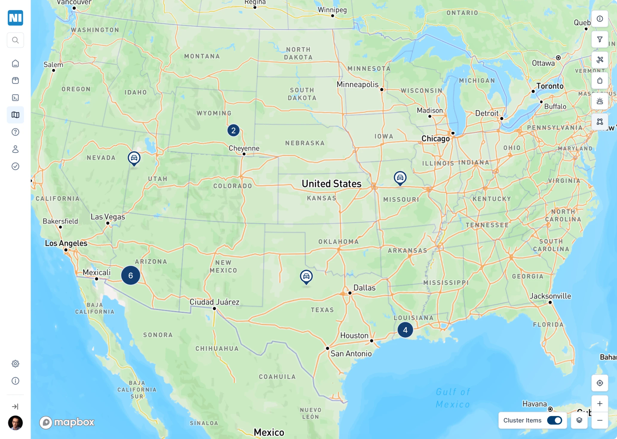
A map made for faster decisions
The old map was hard to scan, slow to navigate, and buried key information under cluttered visuals and limited interactions.

Here is what we did:
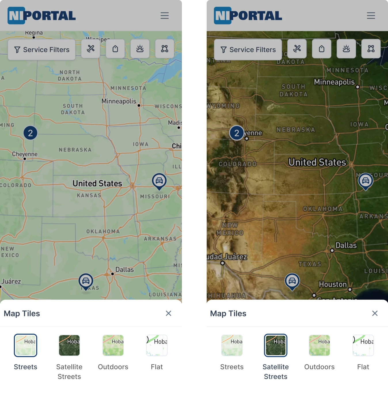
- Rebuilt it with Mapbox for smoother performance.
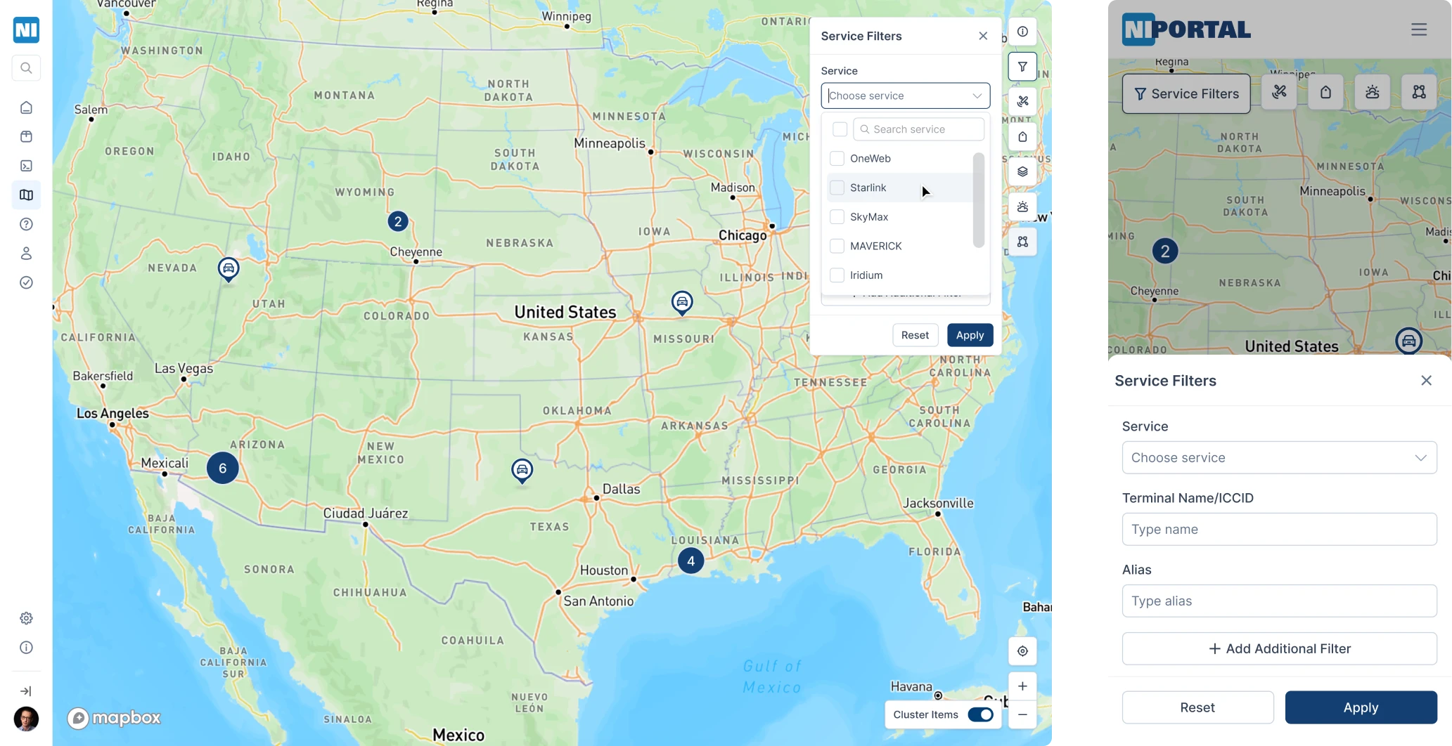
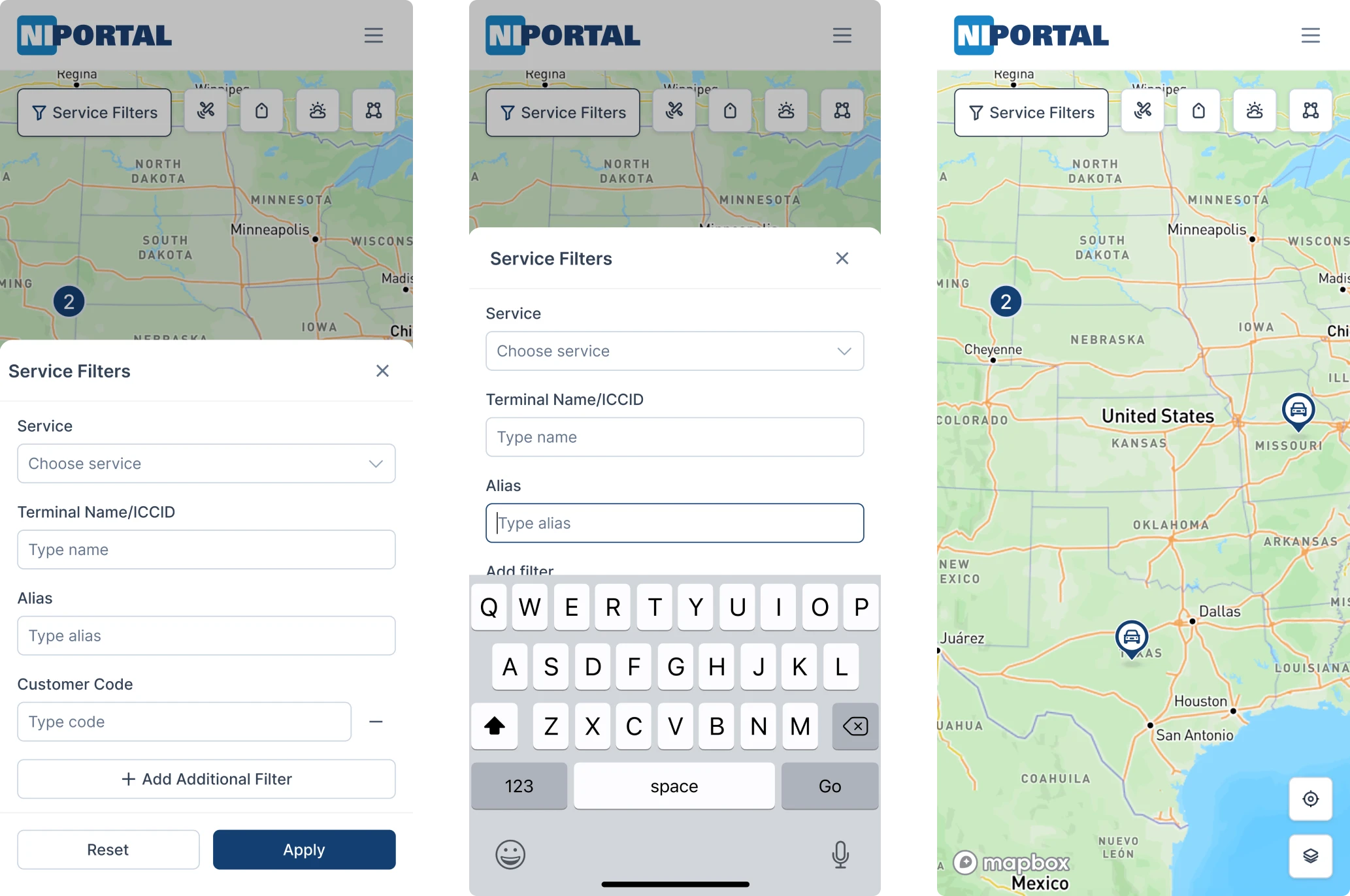
- Introduced filter logic to let users sort by terminal type, zone, or status.
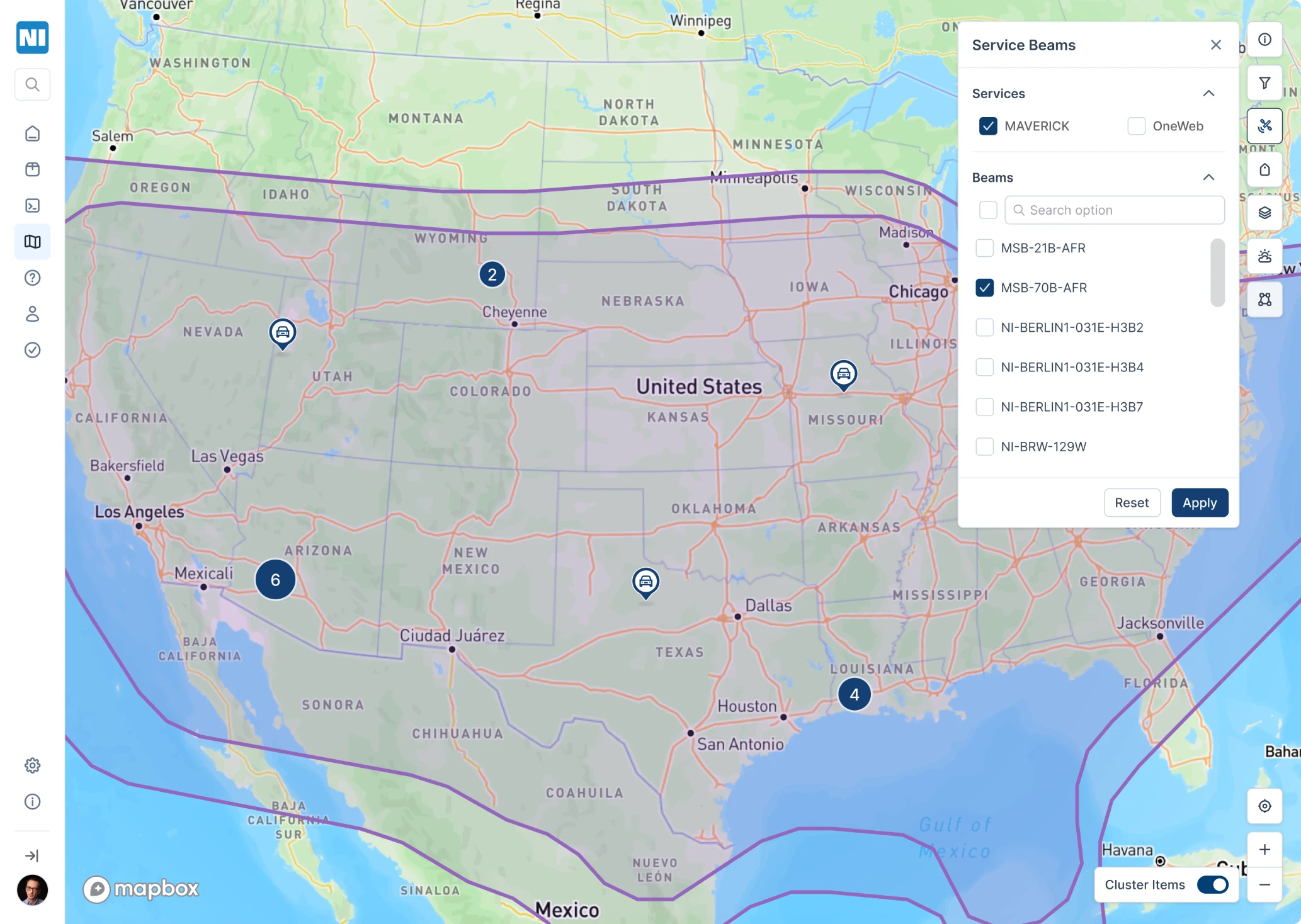
- Unified icon system for terminal types, synced with the map legend.
- Clustering redesigned, but the beloved toggle stayed (users liked it, so we listened).
Sidebar for better navigation
The original topbar navigation was overloaded with submenus, which made it frustrating for users to find what they needed.
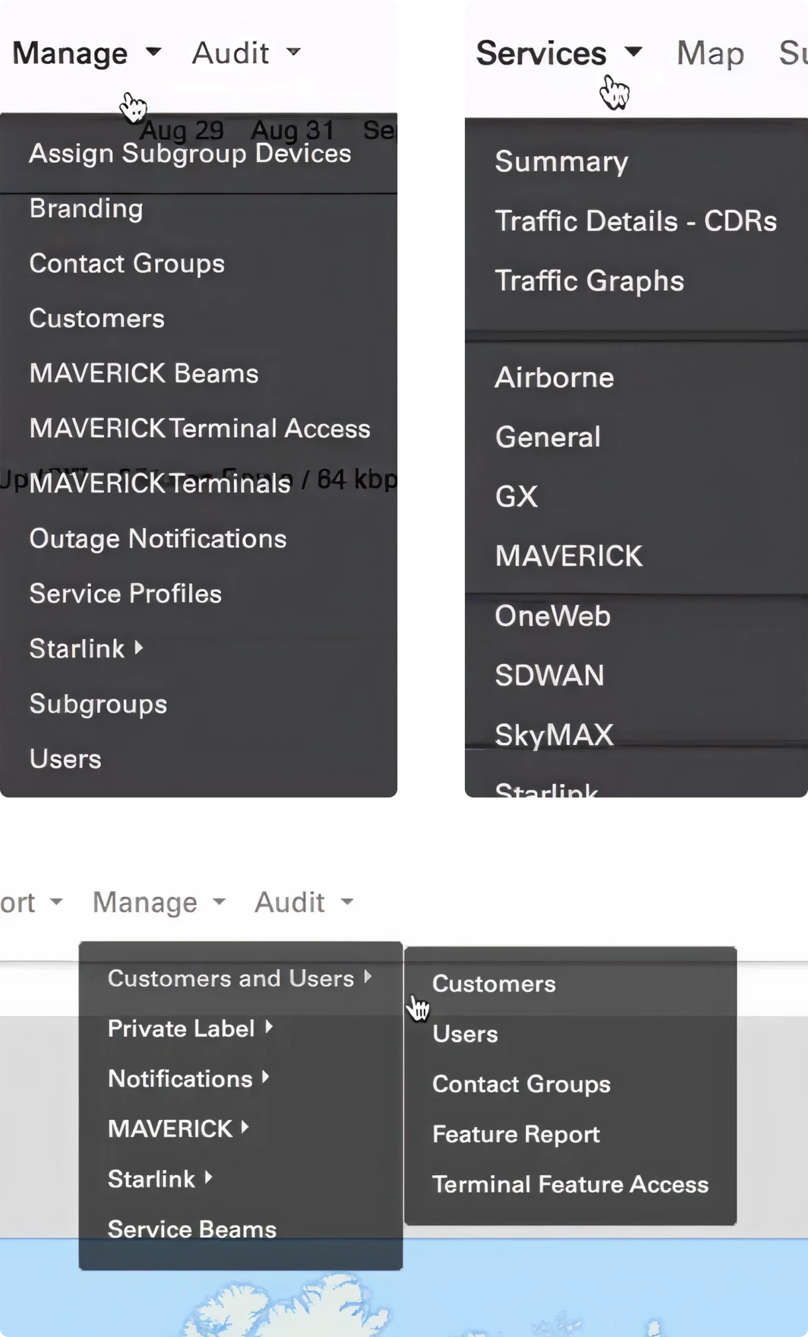
We turned the chaos into a clear sidebar, so users can now find what they’re looking for without a user manual. Here’s how we made it work:
- Flattened the hierarchy.
- Grouped related tools.
- Added smart labeling and collapse patterns.
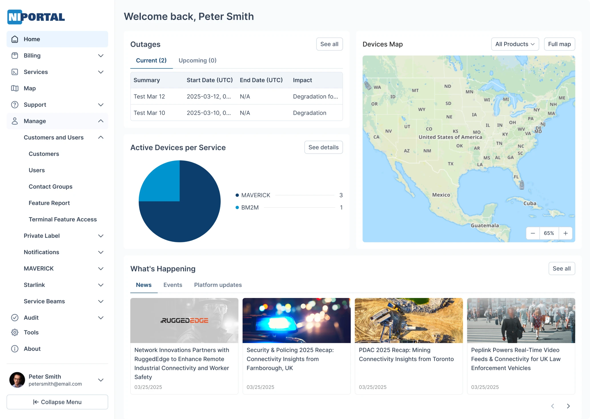
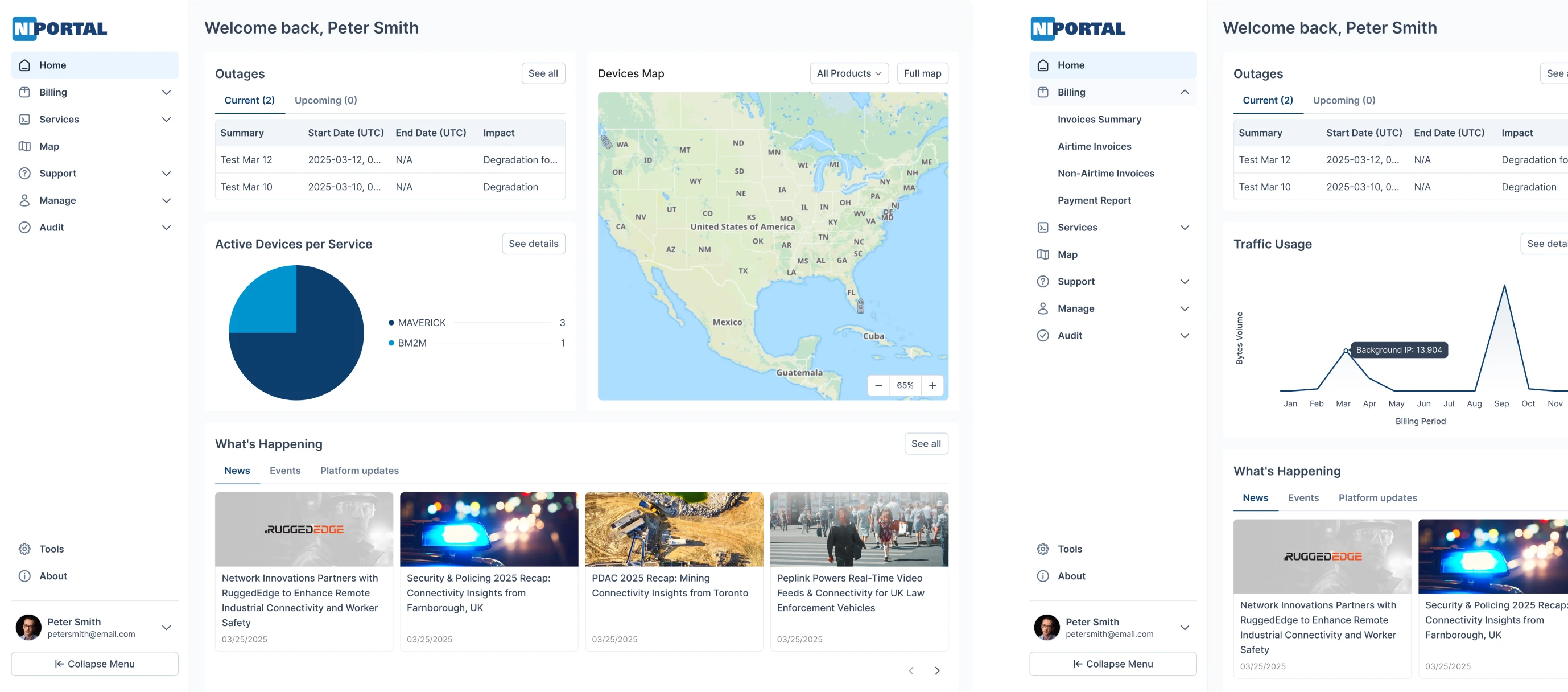
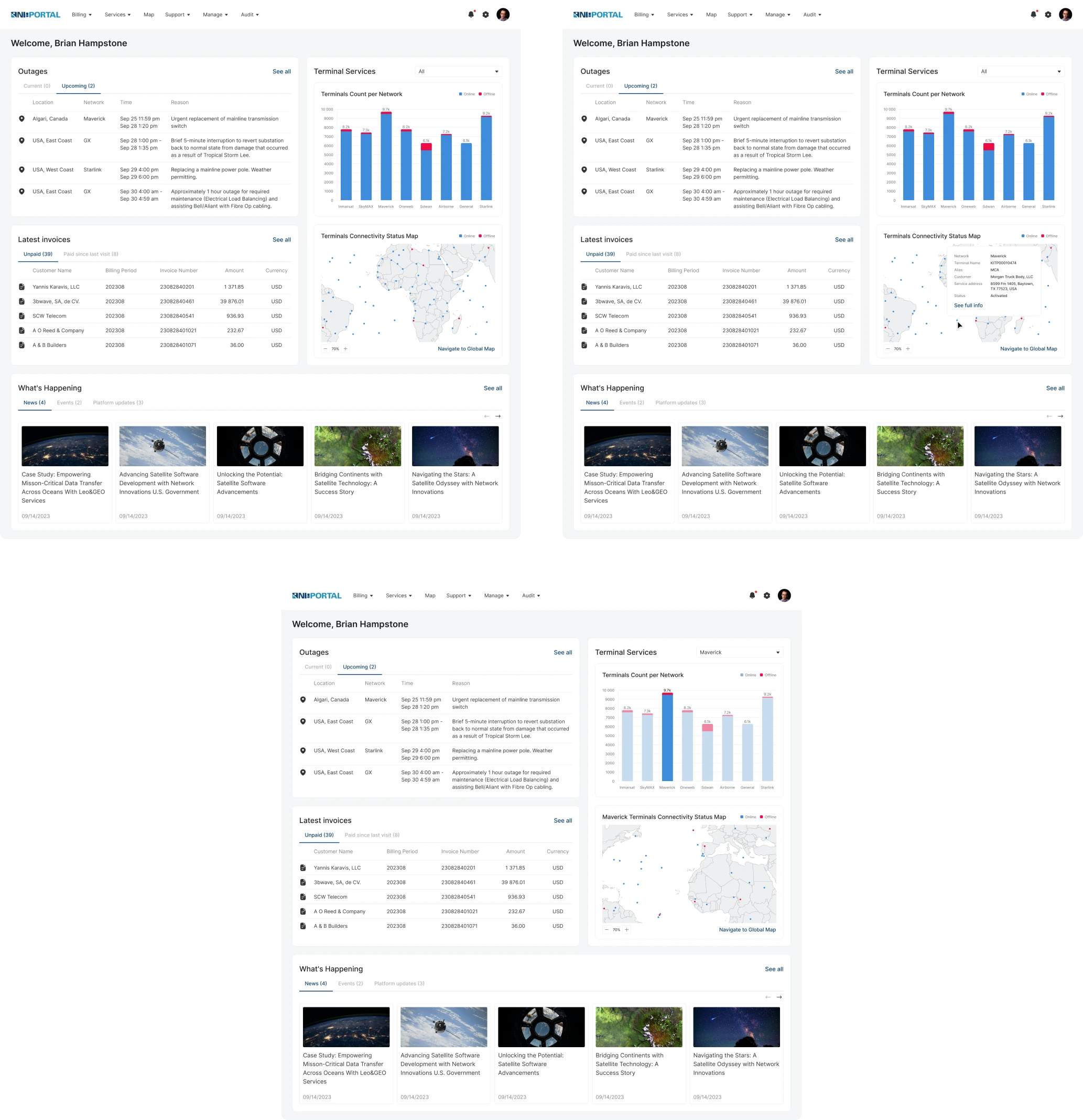
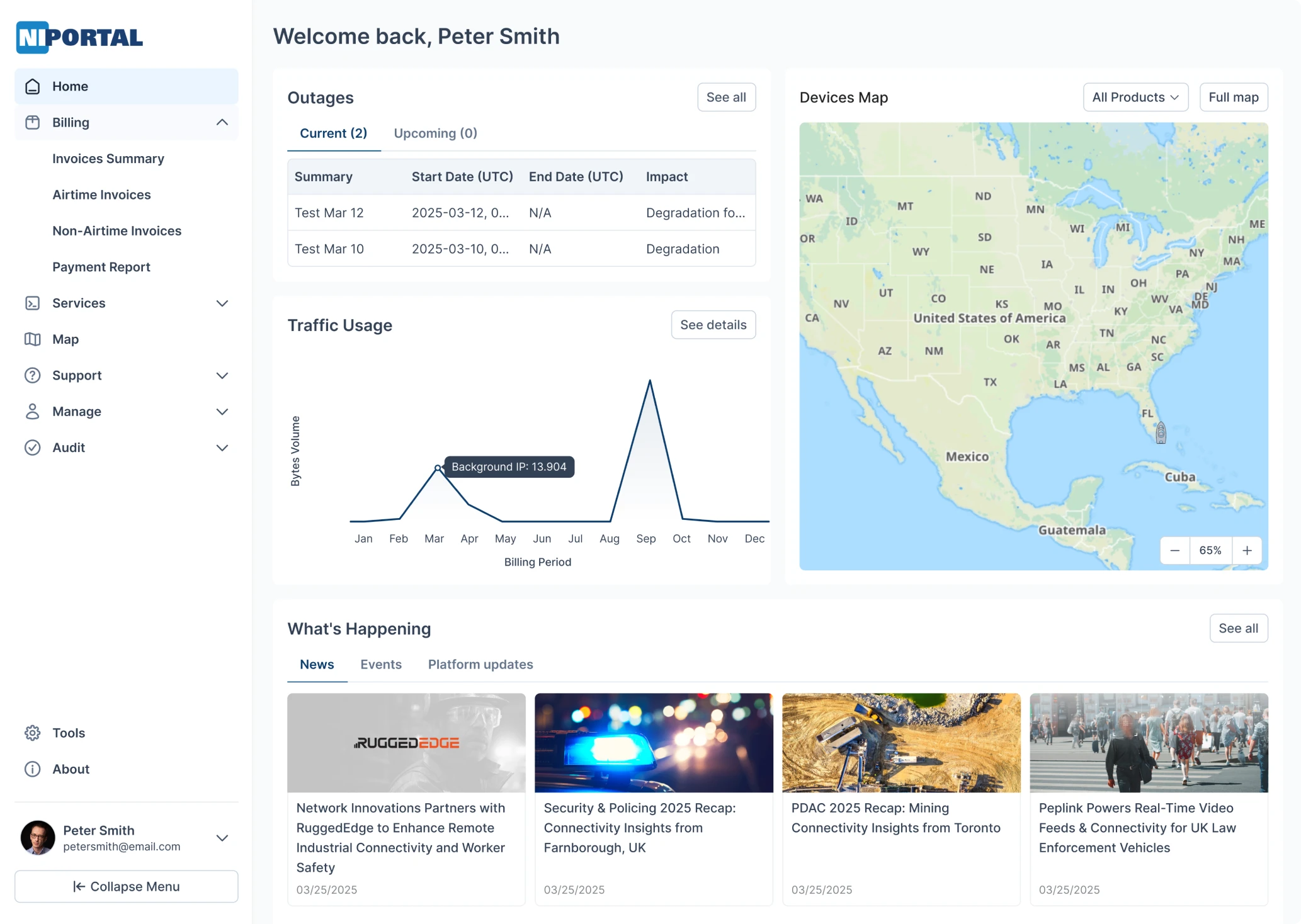
Homepage redesigned for clarity and relevance
The original homepage lacked structure. Key information was hidden among too many links, sections were confusing, and many zones weren’t even clickable. Some features were so out of sight that users didn’t even know they existed.
So we rebuilt it around real user needs.
Now, the homepage adapts based on user roles, showing only the most relevant data, whether it's traffic graphs, service alerts, or satellite stats for a cleaner, more focused experience. All essential features are surfaced up front, clearly organized, and easy to access without digging through menus.
Map pages that work the way users expect
One of the most debated features was clustering. Our designer recommended automating it: zoom out, and terminals cluster dynamically; click a cluster, and it splits. Technically, that’s the best approach.
But the client pushed back, and for good reason. Their users were used to a manual toggle at the bottom of the map to turn clustering on or off. It may not be perfect from a UX standards point of view, but it worked for them. So we kept it and refined the interaction to make it feel like a unique, intentional feature.
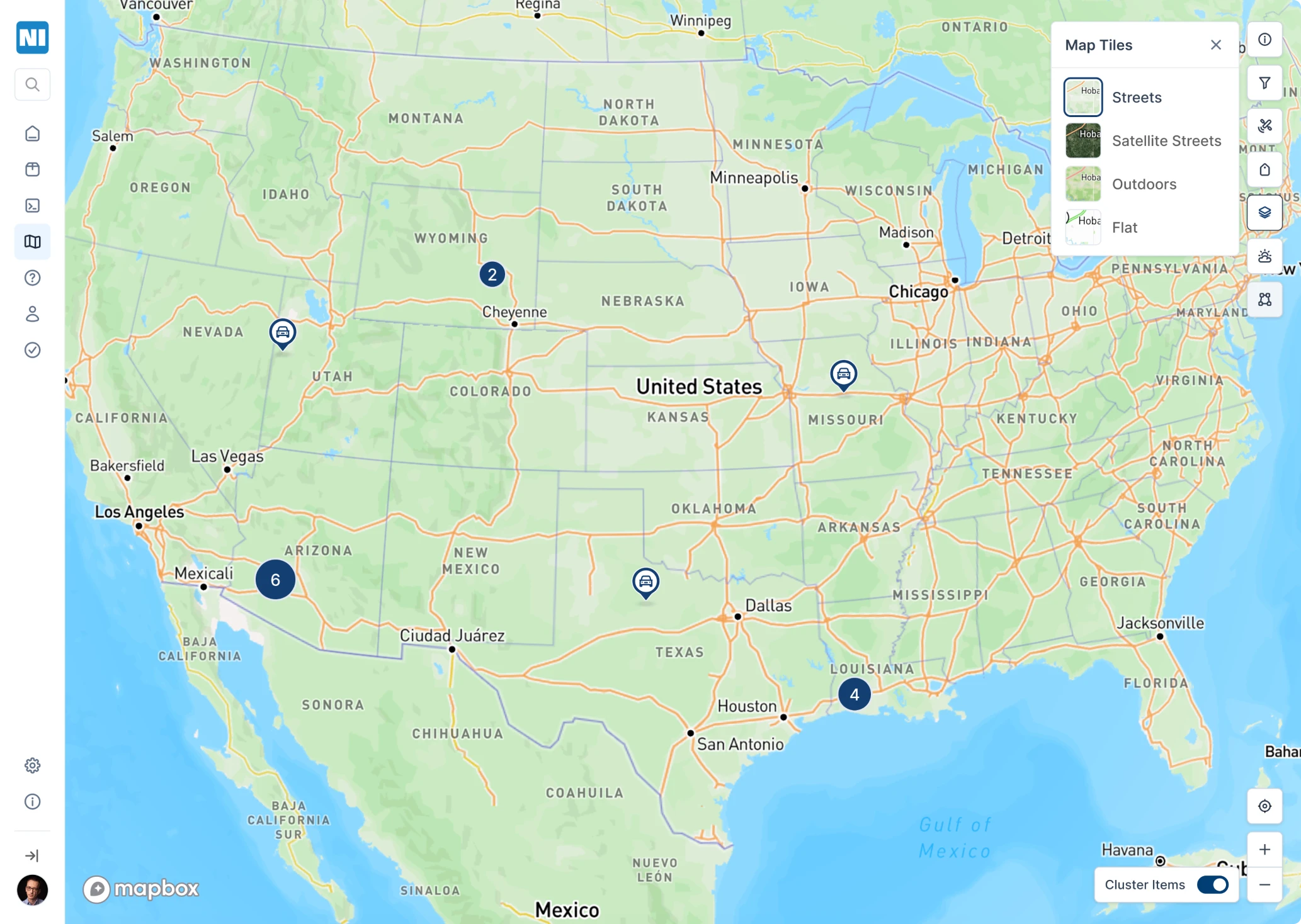
We also introduced terminal filters to make exploration easier:
- A dropdown lets users filter by terminal type (like Starlink or Maverick).
- On mobile, the filters are adapted into a compact driver-style UI for better usability.
Another key upgrade: geographic zone filtering. Users can select specific satellite-related fields and define a visual zone on the map. The map then shows only the terminals operating within that selected area. We improved the visual appearance of these zones while maintaining the smooth transitions users were used to.
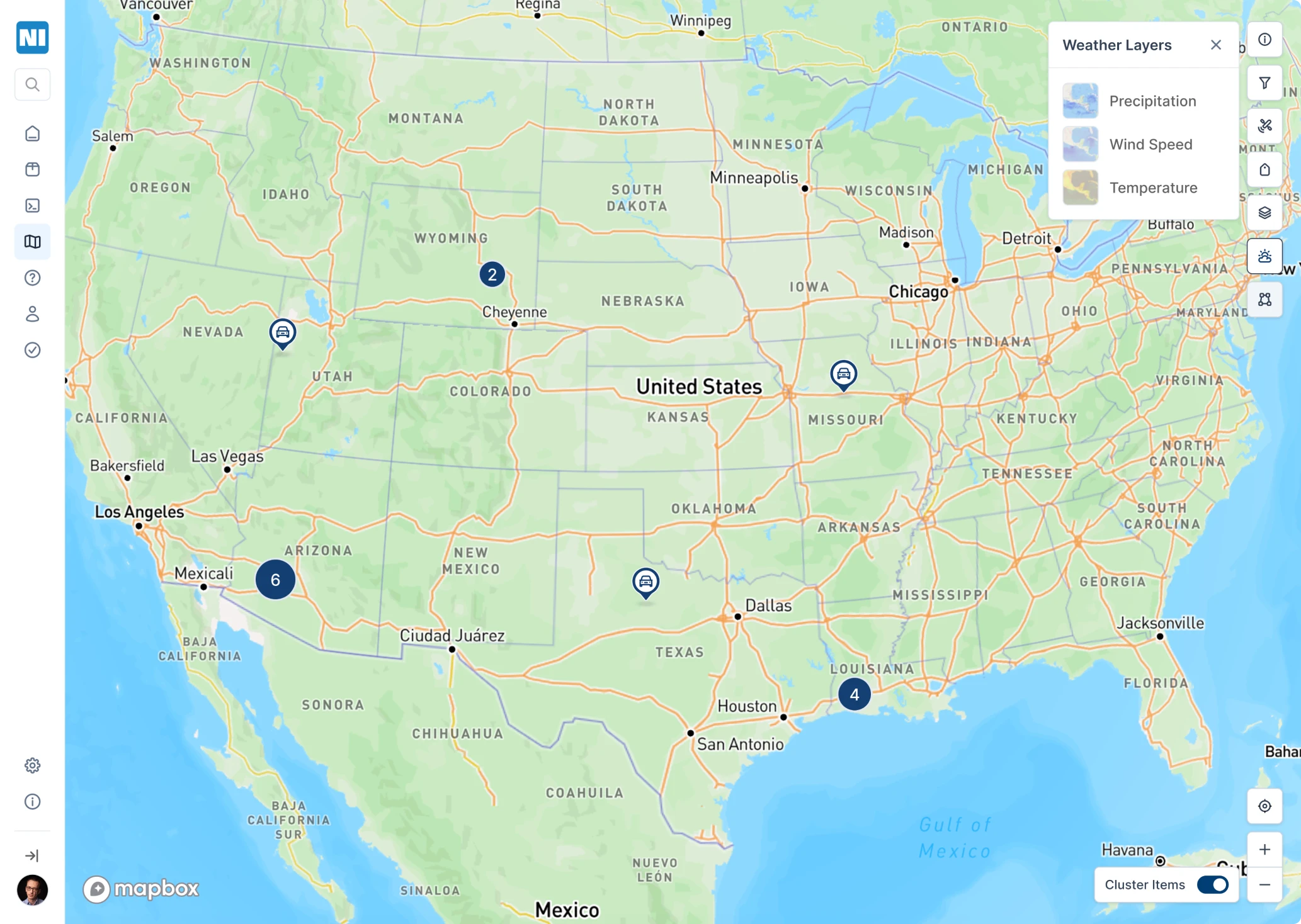
And because environmental factors matter, we also preserved satellite telemetry data, including weather impacts, wind reflections, and temperature changes, all of which can affect terminal performance and tracking.
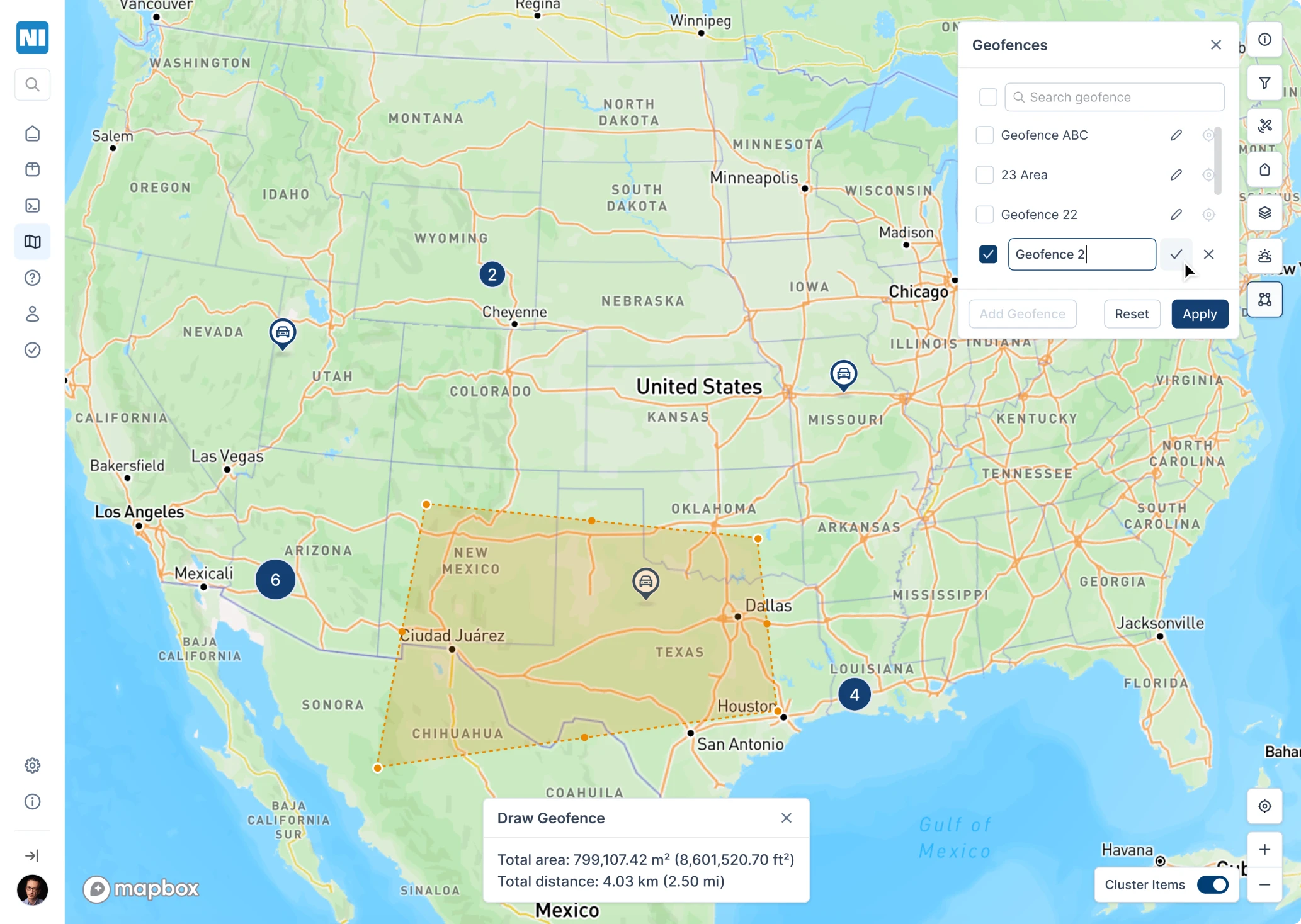
A brand-new Geofences feature for smarter zone control
Working closely with the client, we introduced a new Geofences feature, a tool that allows users to draw custom zones on the map and assign terminals to those areas.
Here’s how it works:
- Users can activate the Geofence tool, click and drag to draw a custom zone directly on the map, and save it.
- Once saved, the system links all relevant terminals within that area to the geofence, unlocking location-specific functionality.

Each geofence allows:
- Adding notifications for terminals inside the zone (e.g., connection status, movement, or activity).
- Viewing distance measurements and area size.
- Accessing this geofence from inside each linked terminal’s page.
We also enhanced terminal previews. When you click on any terminal:
- A summary card appears, showing the responsible satellite, current location, last active timestamp, and a historical trail.
- For mobile terminals (e.g., in vehicles), users can follow the movement path from point A to the latest stop.
- A playback tool visually traces the route, highlighting gaps or weak connections in yellow, and includes a timeline selector to filter activity by date or duration.
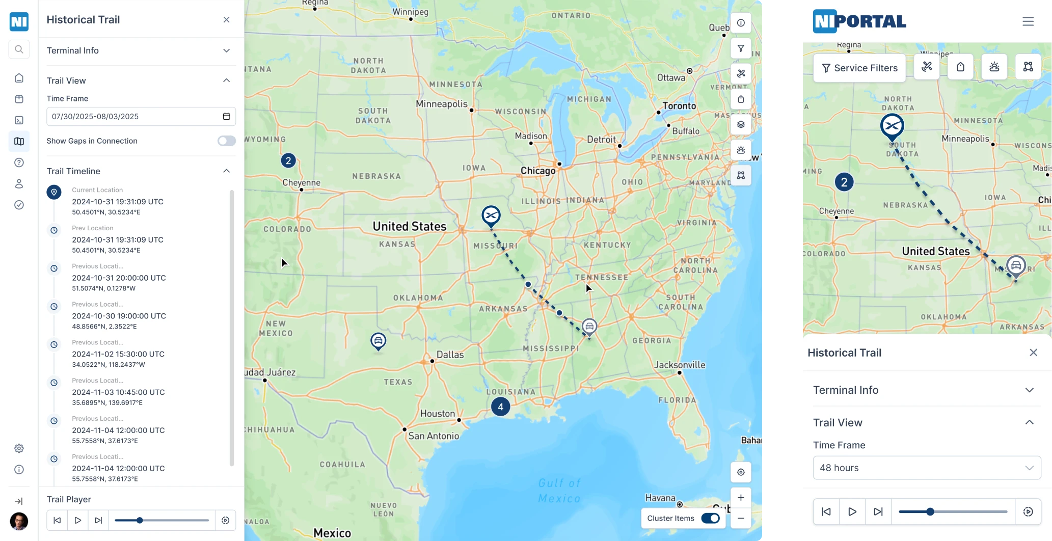
Terminal paths, geofence zones, and real-time previews are all accessible in the responsive web app, giving users full visibility wherever they are.
Responsive layouts, built for scale
The client didn’t want to launch a native app. So we made sure the web app worked beautifully on mobile. So, we:
- Rebuilt all screens for responsive layouts.
- Used collapsible components to handle dense content.
- Optimized map view, filters, and tracking for on-the-go use.
From modals to metrics, everything works on a phone.
Positive user feedback brought the client back with plans for more
After launch, the client rolled out the new design with an announcement: the portal had been updated. And users responded positively, praising the improved clarity, faster navigation, and cleaner visual structure.
Internal teams felt the difference, too. With a cleaner UX, support got easier, onboarding smoother, and the number of confused questions dropped noticeably.
One of the most promising concepts from the redesign was the Geofences feature, a new way to manage zones and monitor terminal activity.
But the clearest sign of success? Our client came back. Thrilled with how users responded, they re-engaged Eleken to keep improving the platform and to start building what’s next.
Now, with a solid design system and scalable foundation in place, they had the confidence to move faster and think bigger.
At Eleken, that’s exactly the kind of challenge we love. The platform is not just “pretty,” but also useful, usable, and something people want to come back to.
Clutch review
Eleken’s project management was excellent. The team delivered on time and was responsive.
