

Users are getting less patient. According to Google research, if a mobile page takes longer than 3 seconds to load, 53% of users leave. Microsoft once reported that the average human attention span dropped to 8 seconds. Whether that number is debated or not, the pattern is clear: people don’t tolerate unnecessary mental effort.
At Eleken, a UI/UX design agency for SaaS, we see this every day. Invisible design UX exists to remove that effort.
But invisible UX doesn’t mean “no UI” or the extreme idea of UI zero, where interfaces disappear entirely, replacing every interface with artificial intelligence, or hiding everything in the background.
It means reducing cognitive load so users can focus on their tasks rather than on your interface through things like:
- smart defaults.
- automation acting quietly in the background.
- showing a form instead of pretending everything belongs in chat.
Invisible UX doesn’t remove the interface but helps make it adapt to intent. And if you design digital products today, especially SaaS, this shift is not optional. It’s already happening.
What counts as invisible in UX design
Invisible design UX is a design philosophy focused on reducing the mental effort required to achieve a goal.
When users don’t notice the interface, it doesn’t mean there isn't one. It means the interface supports their intent so well that it fades into the background.
Layers of invisibility
There are four distinct layers of invisibility:
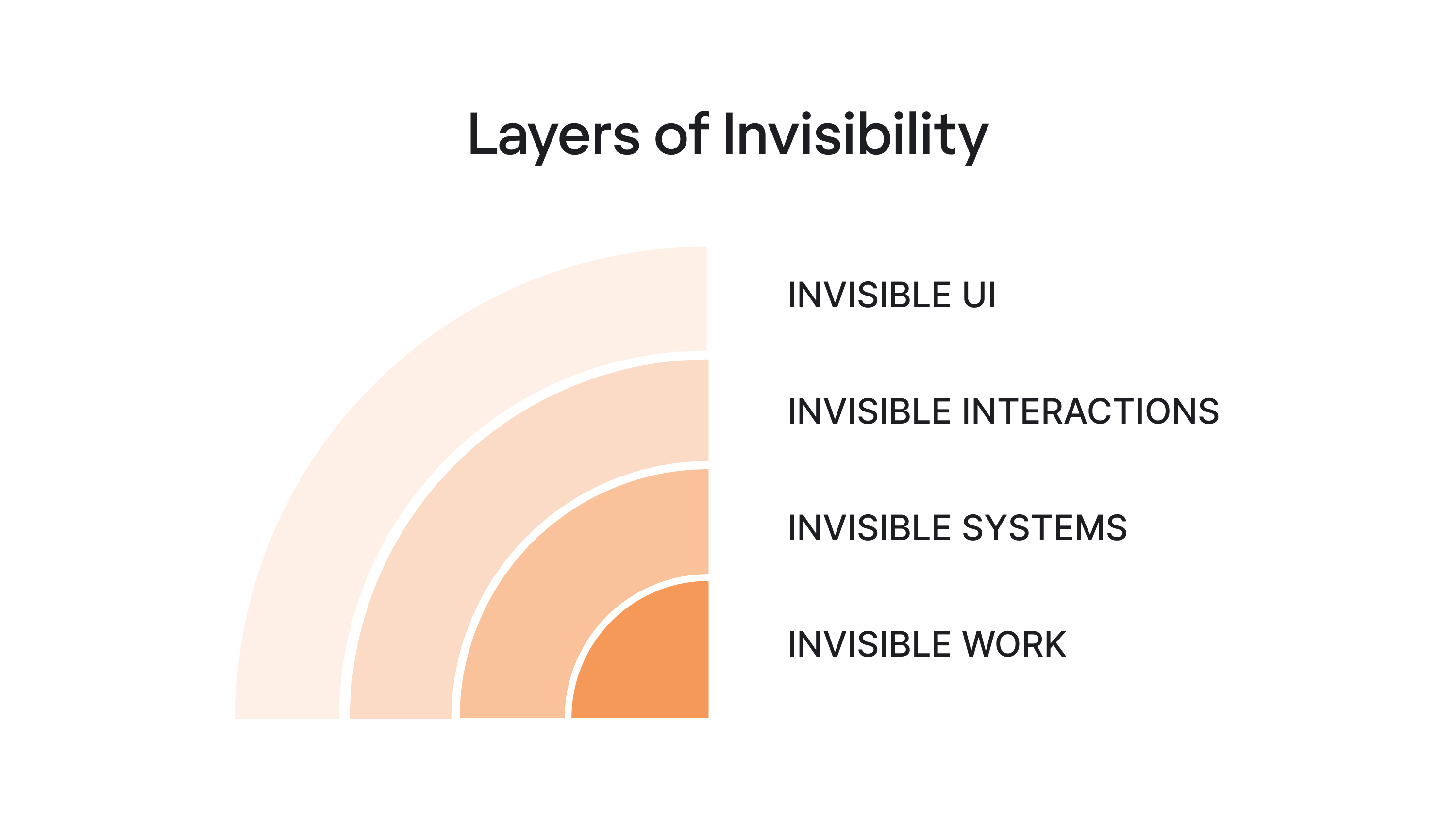
Invisible UI
Invisible UI is the layer most teams already practice, sometimes without realizing it.
Its goal is simple: reduce cognitive load without removing structure. Invisible UI is ultimately about design for simplicity, removing unnecessary steps while preserving the structure users rely on.
Instead of making users configure everything manually, an invisible user interface simplifies decisions, removes unnecessary elements, and relies on smart defaults.
Common examples include:
- Autocomplete in a search bar.
- Calendar suggestions that detect time conflicts.
- Forms that pre-fill based on previous behavior.
None of these features feels revolutionary. But they are the result of disciplined UX design.
Take PrimePro’s five-step job creation flow. Each screen contains fewer actions, the hierarchy is clear, and there’s no decorative noise competing for attention. As a result, users move through the process almost automatically, without thinking about the interface itself.
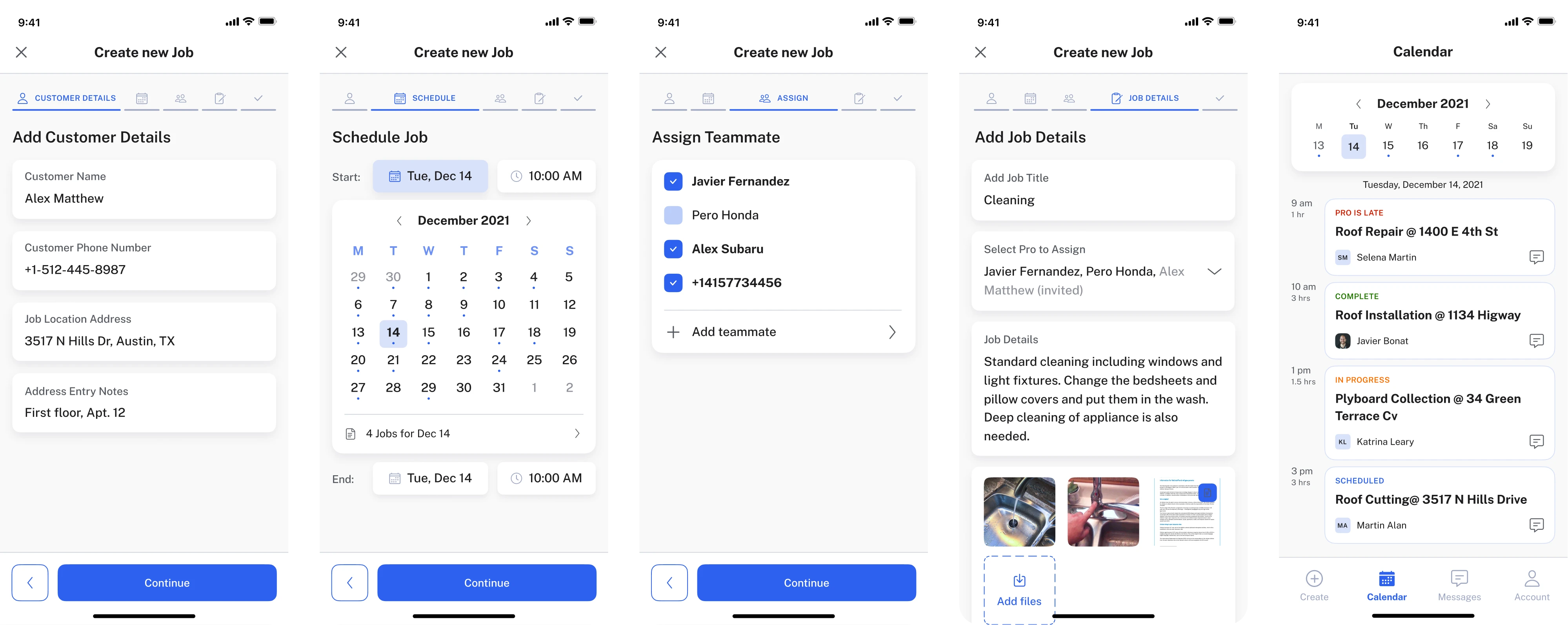
That’s invisible design at work. The guiding rule is simple: reduce steps, not control.
Users feel empowered when they can override the system. They feel trapped when automation makes irreversible decisions.
If you want to learn more ways to simplify your user interface, watch this video:
Invisible interactions
This layer moves beyond the screen. It includes interaction methods like:
- Voice commands.
- Keyboard shortcuts.
- Wearables.
- Sensors.
- Ambient computing.
Invisible interactions must also respect accessibility in UX. Voice commands, shortcuts, and automation should still work with assistive technologies and alternative input methods.
There’s an important nuance: invisible interactions work best when user intent is obvious and repeatable: turn off the lights, start a timer, log a workout.
However, they struggle when the intent is vague.
You wouldn’t browse Wikipedia through voice alone. And you certainly wouldn’t design in Figma without a visible interface. Exploration requires structure, and discovery depends on visual feedback.
This is why “no UI” is mostly hype. Even in the era of artificial intelligence, most users still need visible anchors when forming their intent. Invisible interactions are powerful but only in the right context.
Invisible systems
Invisible systems act on intent instead of waiting for step-by-step commands. AI summarizes meetings, auto-assigns tickets, suggests replies, and sometimes even executes decisions.
In this model, the interface shifts from a control center to a review layer.
Instead of asking users to complete every step manually, the system handles much of the work in the background and surfaces only what matters:
- Activity logs.
- Status indicators.
- Undo options.
- Confidence signals.
Here, invisible UX becomes strategic. But invisibility without transparency quickly erodes trust. Classic usability heuristics, like visibility of system status and user control, still apply even when automation runs in the background.
If users don’t know what the system did, why it did it, or how to reverse it, the experience stops feeling intuitive and starts feeling manipulative.
We’re already seeing backlash against over-automation. When products act without explanation, users feel a loss of control.
The future of invisible application UX is not silent automation but visible intent plus invisible execution.
Invisible work
This is the part almost nobody outside the team notices. It includes:
- Edge case mapping.
- Microcopy decisions.
- Error escalation logic.
- Testing automation thresholds.
- Aligning with developers and product managers.
- Running user research to understand real users’ mental models.
Invisible UX is built on invisible effort.
Take MyInterview. The team reduced cognitive overload in multi-select forms simply by replacing custom input patterns with standard checkboxes and fully clickable areas.
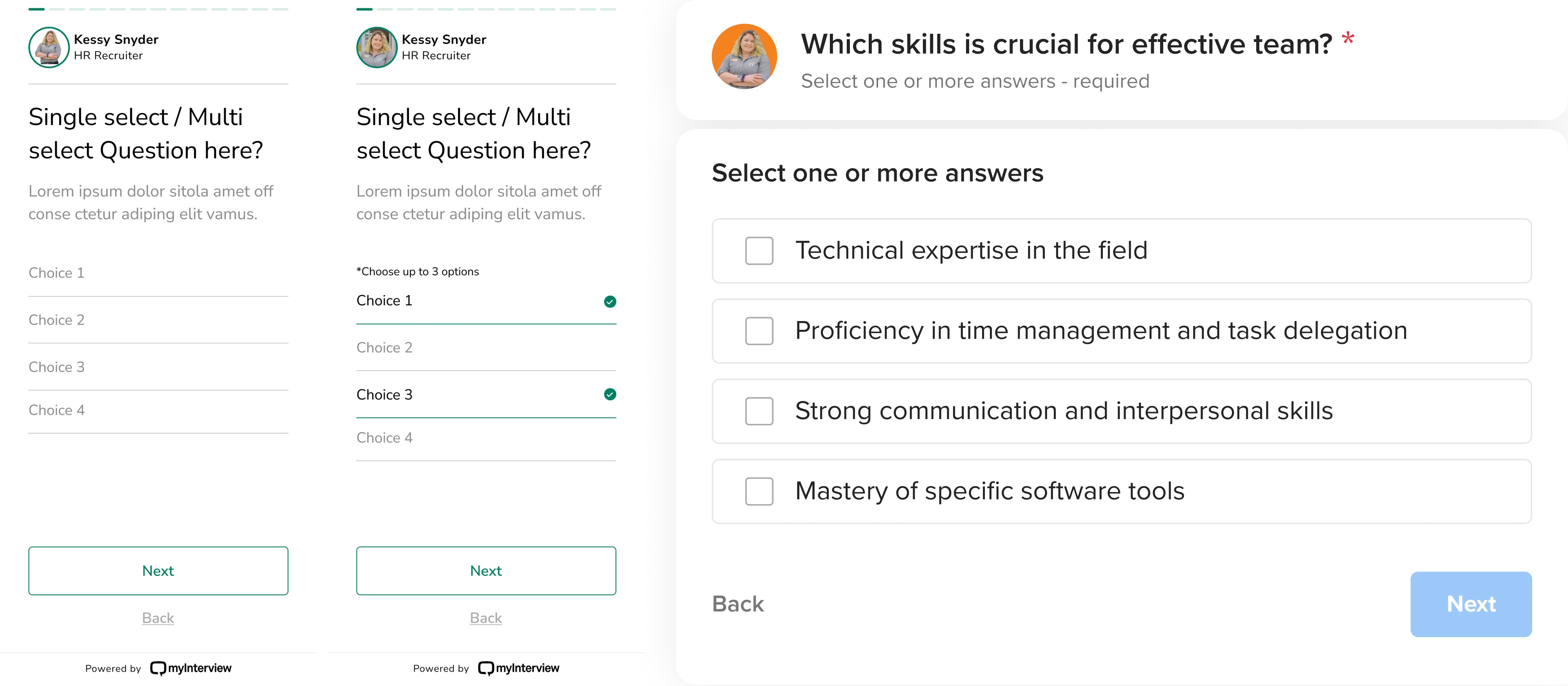
Nothing flashy happened. Users didn’t celebrate the change. They just completed the task faster.
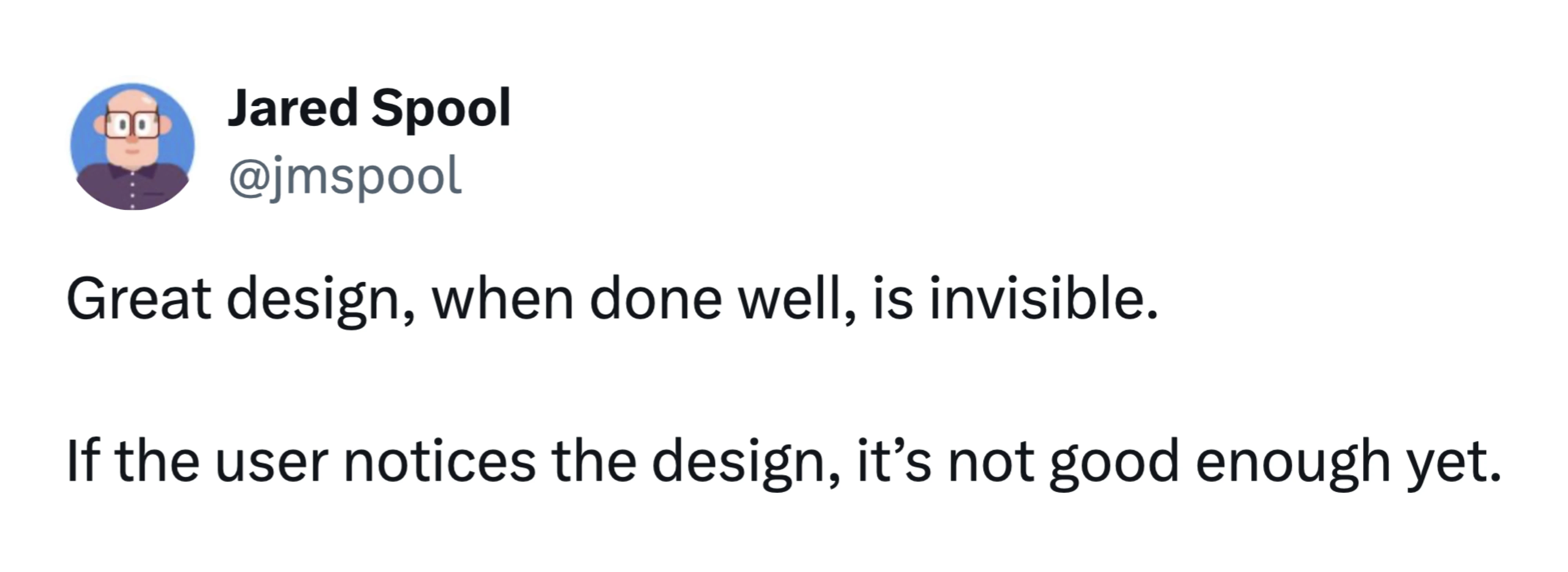
As UX expert Jared Spool often notes, best UX tends to be invisible because it removes obstacles before users even notice them:
- When users don’t hesitate.
- When they don’t ask, “Where do I click?”
- When they stop noticing the interface altogether.
And here’s the paradox: the more invisible the experience feels, the more deliberate the design behind it must be.
What is changing in the future of invisible UX, and what is just noise?
The future of invisible UX: what’s changing
You’ve probably heard statements like: “UI is dead” or “AI will replace designers.” That makes for good conference slides. But UI is not dying. It’s evolving.
As Eleken’s Head of Design, Maksym recently wrote on LinkedIn: “I've heard this dozens of times in the past year. And every time, I know the person fundamentally misunderstands what designers actually do… If your job is moving buttons up and down, you were never really designing...”
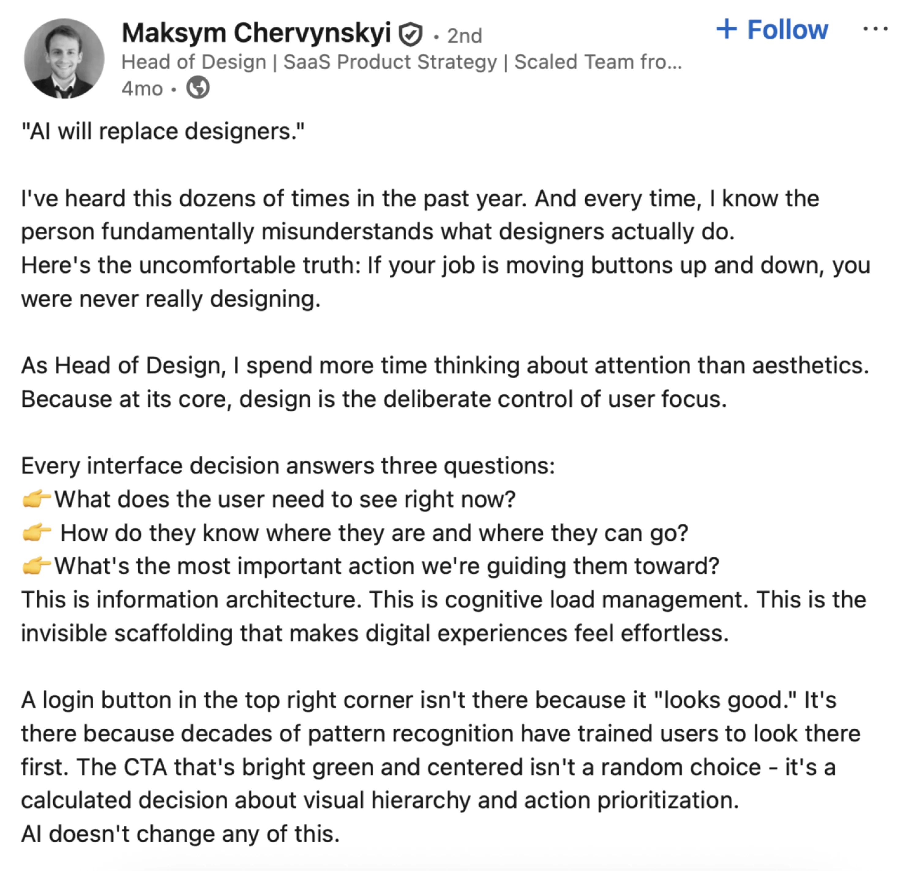
AI may automate parts of interface creation, but product design has never been just about arranging screens. It’s about shaping systems, defining behavior, and helping users navigate complexity.
So what is changing? Let’s look at the shifts that are redefining how modern interfaces work and where invisible UX fits into this transformation.
Interfaces are becoming contextual
Instead of static layouts, we’re seeing context-aware systems. The interface adapts based on:
- User behavior.
- Past actions.
- Time.
- Role.
- Device.
- History.
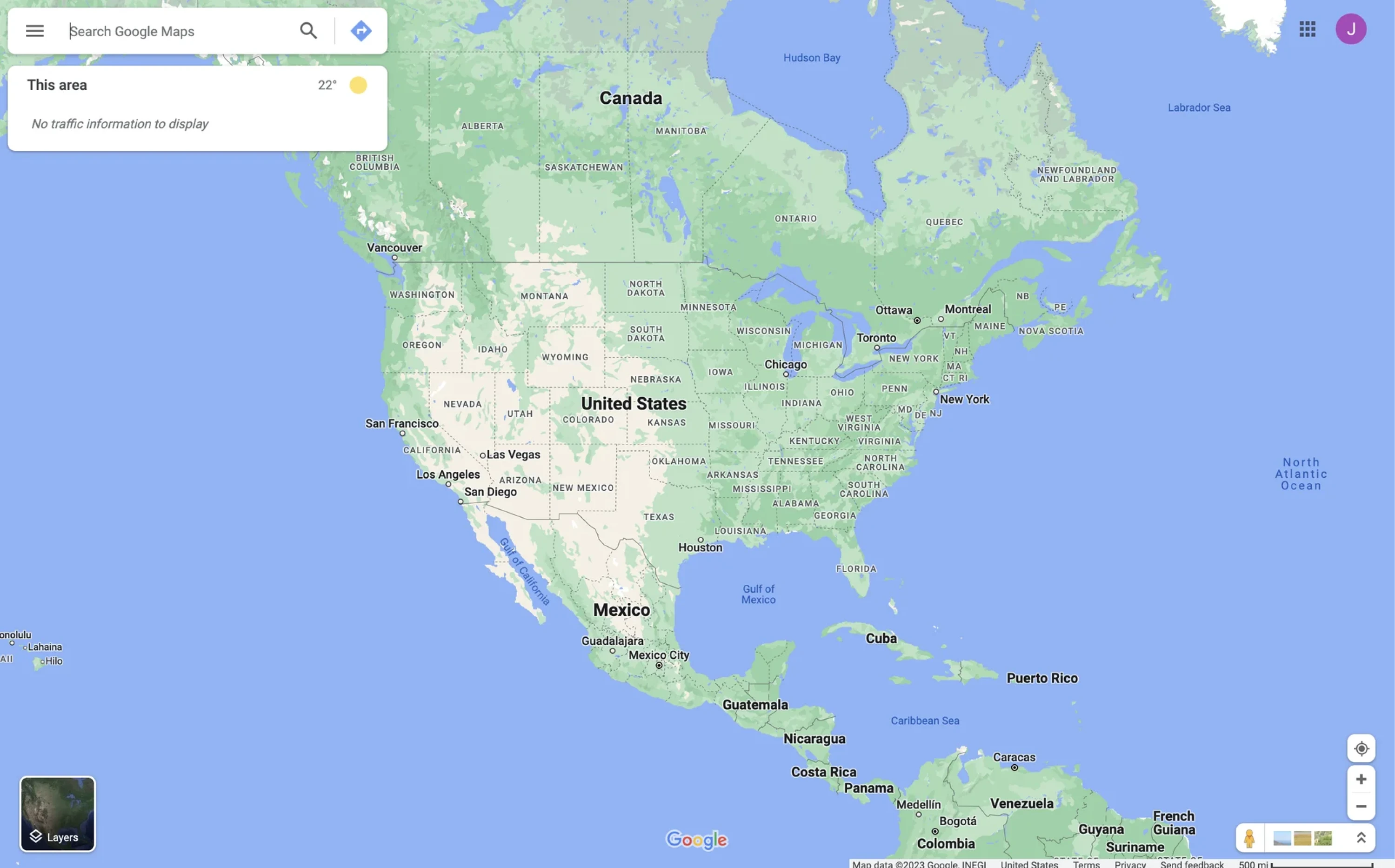
Think about how Google Maps behaves. It doesn’t show the same interface when you’re searching for a place at home versus navigating in traffic. The system understands context and reduces friction accordingly. The interface is still there. It just feels natural.
Automation is moving to the background
The biggest shift is architectural. In traditional UX design, users move through steps, click, confirm, click again, review, and submit.
In invisible UX systems, the system moves first. It predicts, prepares, suggests, and sometimes executes.
Artificial intelligence accelerates this shift. But automation itself is not the goal. The goal is to reduce mental effort.
- When automation increases uncertainty, it fails.
- When it removes clarity, it fails.
- When users feel confused, it fails.
Maksym compares some AI tools to slot machines. You write a prompt, wait for the model to “think,” and hope the result matches your intent. Sometimes it does. Sometimes it doesn’t.

This unpredictability increases cognitive load instead of reducing it.
Invisible UX should do the opposite. Systems can act in the background, but users must still understand what happened, why it happened, and how to correct it.
Automation works only when it feels predictable, transparent, and reversible.
The rise of the review layer
The interface is becoming a review and correction layer. Instead of asking users to perform every micro-step, systems now:
- Draft the email.
- Categorize the data.
- Assign the ticket.
- Summarize the meeting.
The user reviews, edits, approves, or undoes. This is a fundamental shift in interaction.
Control moves from execution to supervision. Designers now create:
- Confidence indicators.
- Activity logs.
- Undo mechanisms.
- Visibility of agent state.
If the system acts invisibly but provides visible accountability, users feel empowered. But if it acts silently with no explanation, users feel manipulated. That line is thin.
The backlash against over-automation
We are already seeing signs of resistance. When products over-automate:
- Users don’t trust results.
- They double-check everything.
- They revert to manual workflows
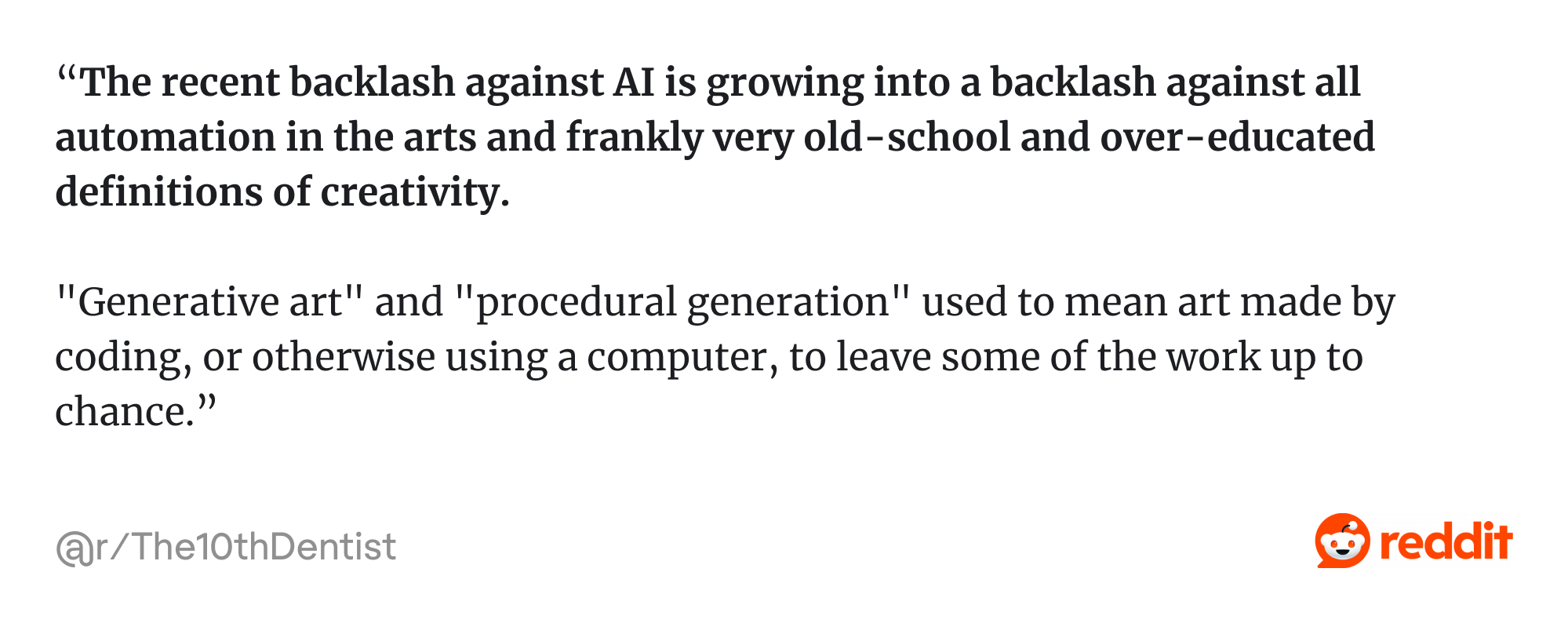
As one Reddit user shared: “The recent backlash against AI is growing into a backlash against all automation in the arts and frankly very old-school and over-educated definitions of creativity…”
That destroys frictionless experiences instead of creating them. Invisible UX only works when:
Automation × transparency × reversibility = trust
Remove any one of those, and you create friction instead of removing it.
Hybrid experiences are the real future
The future of invisible design is hybrid. Automation handles predictable tasks, while visible interfaces support exploration and complex decisions.
Think of it as a spectrum: invisible interactions suit clear intent, while visible structure helps when intent is still forming.
Modern interfaces now look adaptive. Sometimes it’s a quick conversational exchange, a form, or sometimes buttons for fast replies.
For example, Maksym recently challenged the growing idea that conversational interfaces will replace traditional UI elements. In reality, the future isn’t conversation instead of UI.
During a call with a prospective client, he saw a simple but powerful solution. Their chat interface generated a structured form inside the conversation whenever the AI needed multiple inputs. Instead of forcing users to type “1., 2., 3.” in chat, the system switched to proper form fields.

The goal here is to serve the right interface at the right moment.
This hybrid model is already shaping modern SaaS products. Agent state is visible. Confidence thresholds determine whether the system should suggest or act. Opinionated defaults speed up workflows, while memory and preferences remain transparent and controllable.

These UX design patterns don’t reduce the need for design. They raise the bar for it, which leads to the practical question: when is invisible UX effective, and when should you resist the temptation to hide everything?
When invisible UX works
Invisible UX performs best in these specific conditions:
- Clear, goal-directed tasks.
Invisible design thrives when intent is obvious:
- Pay a bill.
- Book a recurring meeting.
- Approve an expense.
- Turn off notifications.
In these low-ambiguity tasks, users know what they want, so the system can safely reduce steps. For example, auto-filling saved payment details reduces mental effort without removing control. Users can still edit fields, but they just don’t have to.

- Repetitive workflows.
Repetition is the natural habitat of invisible systems. Developers move tickets between states. Sales teams log calls. HR teams approve standard requests.
When behavior patterns are predictable, automation becomes reliable.
When Eleken designers worked on LogitudeWorld, they reorganized shipment tracking data into scannable blocks. The interface didn’t disappear. It simply stopped demanding attention.

- Hands-busy contexts.
Driving, cooking, exercising… Voice and ambient computing make sense when screens are impractical.
But even here, limits exist. Voice works for “Call John,” but struggles with “Compare three CRM vendors with filtering options.” Context matters.
When invisible UX fails
When invisible systems hide too much logic, they often create new UX issues, leaving users unsure what the system did or how to correct it.
This usually happens in scenarios such as:
- Browsing and discovery.
When users don’t know what they want, they need structure:
- Navigation.
- Filters.
- Visual hierarchy.
- Search refinement.
You cannot invisibly explore a knowledge base. If you remove visible cues too early, users feel lost.
- Complex tools and creative software.
Enterprise SaaS, design tools, or data dashboards. These environments require visible control. Users build mental models through interaction. Hiding complexity too aggressively increases cognitive load instead of reducing it.
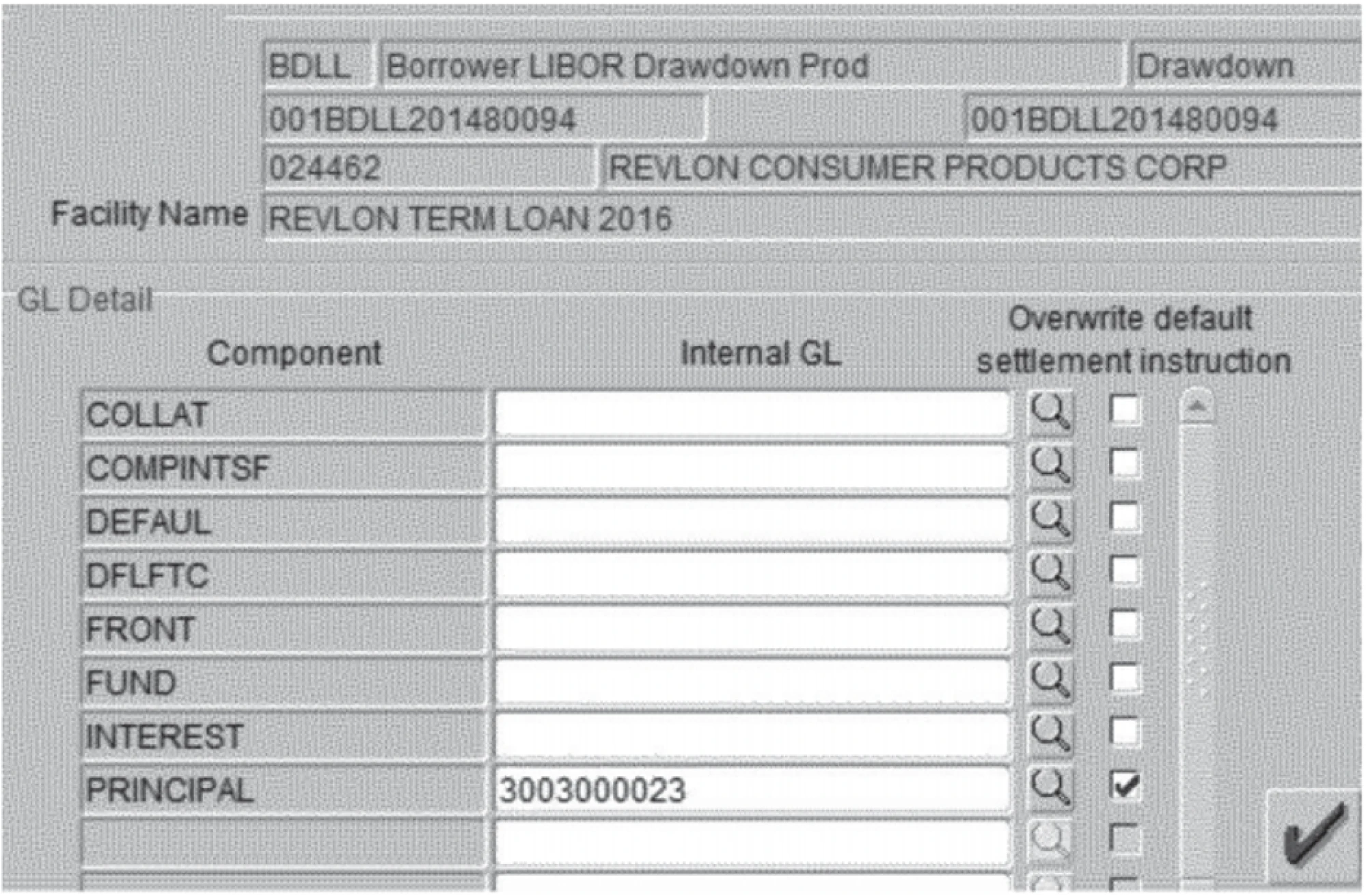
The Citibank example from security UX is a good reminder. In the 2020 Revlon loan incident, Citibank intended to send a small interest payment to creditors. Instead, due to a confusing interface in their internal payment system, employees accidentally transferred nearly $900 million of the bank’s own money. The backend systems were secure. The bad design failure happened at the interface.
Bad UX examples show that oversimplified or poorly designed interfaces in high-risk environments can lead to catastrophic errors. Invisible UX always supports the right mental effort at the right moment.
- Emerging intent.
If a user opens a product thinking, “Let’s see what this does,” invisibility is dangerous. They need:
- Onboarding.
- Visible affordances.
- Feedback loops.
Visible structure is necessary when intent is emerging. That rule alone prevents most over-automation mistakes.
- A simple rule of thumb.
Ask one question: Is user intent evident and low-risk? If yes, invisible patterns are powerful. If no, lean toward visible interface support. Clarity is our goal.
Now that we know where it works and where it doesn’t, let’s make it practical: How do you actually design invisible systems without losing trust, usability, or control?
How to implement invisible UX
Invisible design sounds elegant in theory. In practice, it can easily turn into over-automation, hidden logic, and frustrated users. So let’s break it down into concrete steps.
Pick the autonomy level
Not every feature deserves full automation. Think in levels:

- Manual: The system does nothing without user input.
- Suggested: The system proposes, the user decides.
- Auto-with-confirm: The system acts but asks for approval.
- Auto-with-undo: The system acts immediately but can be reversed.
- Fully autonomous: The system acts without intervention.
Most invisible UX should live between levels 2 and 4. Level 5 is rare. It requires extremely high trust and low risk.
Match autonomy to:
- Risk of error.
- Frequency of action.
- User trust maturity.
- Business impact.
For example, if auto-summarizing meets notes, it’s safe. When auto-sending invoices without review, it’s probably not. Reducing friction is good design, but removing control is not.
Map context signals and uncertainty
Invisible systems rely on signals, namely:
- User history.
- Location.
- Time.
- Role.
- Past behavior.
- Device.
But here’s the critical part: you must also design for uncertainty. No model is 100% confident.
So define confidence thresholds:
- Below a threshold → suggest.
- Above a threshold → act, but allow undo.
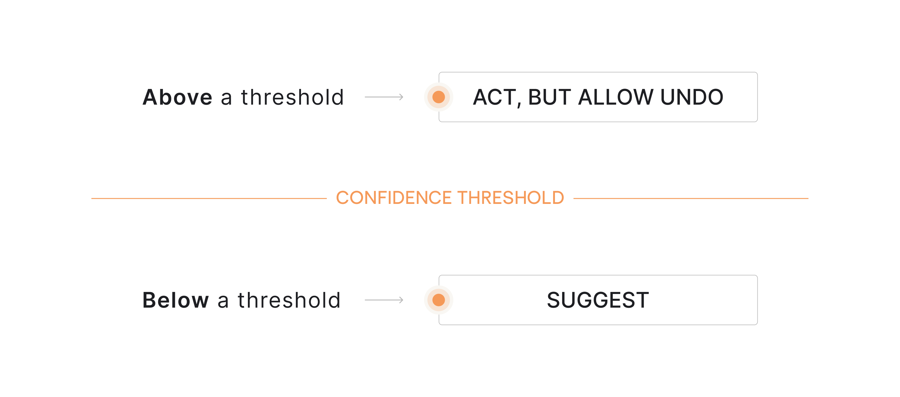
This is what makes automation feel natural instead of invasive. When users understand what the system thinks is happening, they build trust. When they don’t, they double-check everything.
And if users double-check everything, your invisible system just increased mental effort.
Design the feedback loop
Invisible systems still rely heavily on user feedback through confirmations, logs, and subtle status indicators that help people understand what the system just did.
Here is where micro-confirmations work best:
- Subtle status indicators.
- Progress hints.
- Short confirmations like “Meeting notes saved.”
- Activity timelines.
In agentic systems, the customer feedback loop becomes the backbone of trust. For example:
- “3 tasks auto-assigned based on workload.”
- “Draft generated using the last 5 reports.”
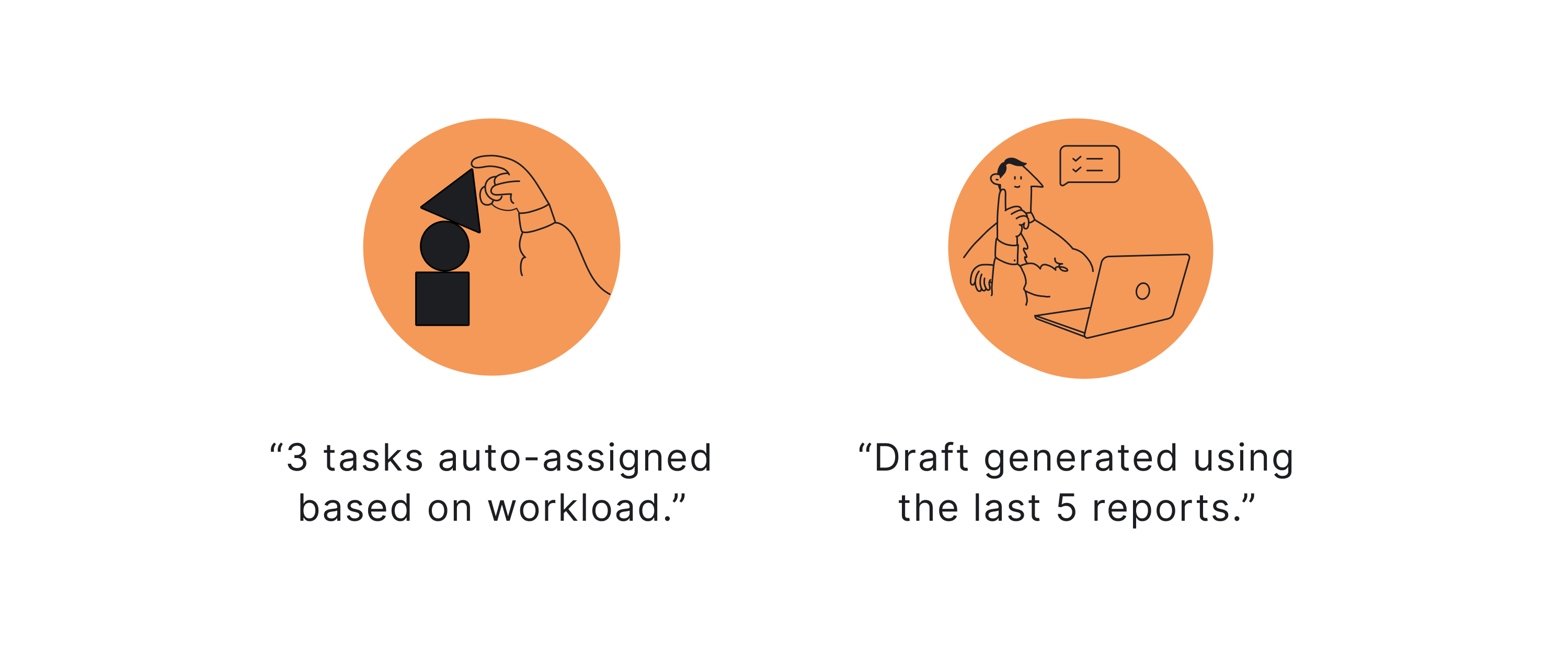
Now the system feels intelligent, not magical. The goal is simple: let users see what happened without interrupting the flow.
Design error handling for invisible systems
When a visible button breaks, users see it. When background automation fails, users feel confused. So design an escalation ladder:
- Silent retry.
- Subtle alert.
- Simple explanation.
- Fallback to the visible interface.
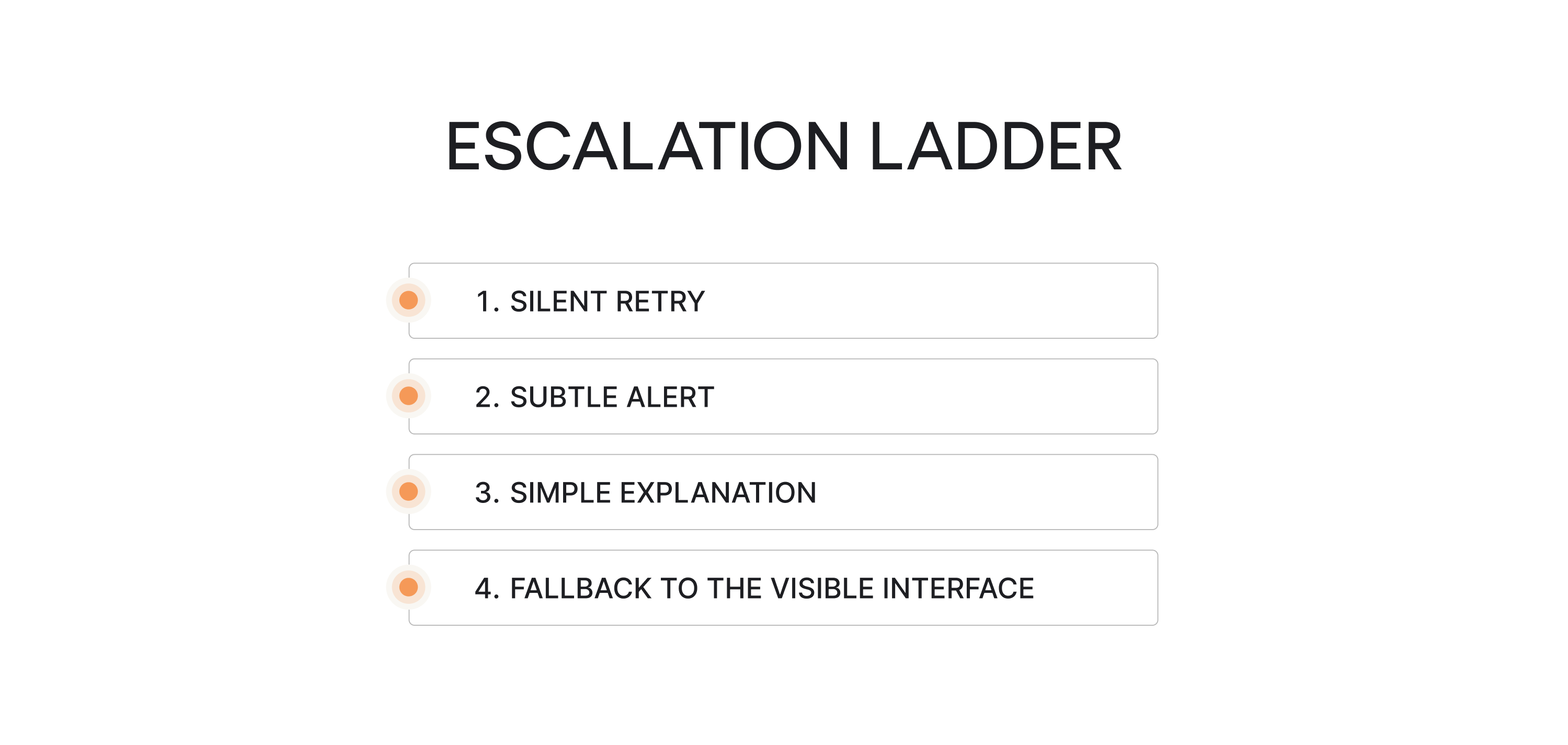
For example, if auto-categorization fails, first retry. If confidence remains low, flag the item. If ambiguity persists, ask for clarification.
Never jump straight to disruptive pop-ups. Invisible UX requires invisible recovery whenever possible.
Build trust intentionally
Invisible systems must answer five questions clearly:
- What data is used?
- What just happened?
- Why did it happen?
- Can I change it?
- Can I turn this off?
If the answer to any of those is uncertain, users hesitate. And hesitation increases friction.
As one creative director put it on Reedit: “...Every design decision, however small, communicates something; the extent to which we’re in control of that communication is the measure of us as designers…”

That principle is especially critical in SaaS products where product managers and teams rely on automation to move work forward with:
- Control settings.
- Permission transparency.
- Editable memory.
- Transparent logs.
These are core UX design components in the age of artificial intelligence.
Onboarding for invisibility
If users don’t understand the mental model, they misinterpret behavior. So onboarding should clarify:
- What happens automatically?
- What requires confirmation?
- How to override decisions?
- Where to review the activity.
Teach the boundaries early; otherwise, users assume the worst. Invisible UX only feels natural when users understand the system’s logic.
Everything we just described — autonomy mapping, confidence gates, error escalation, feedback loops — requires more design effort, not less. Which brings us to the part of invisible UX nobody talks about enough. The invisible work behind it.
Final thoughts: the invisible work behind invisible UX
Invisible UX isn’t expensive in money; it’s expensive in thinking. Designing systems that feel effortless requires careful decisions about automation, feedback, and control. Before implementing invisible patterns, ask:
- Is user intent clear and low-risk?
- Have we defined the autonomy level?
- Do users understand what the system does automatically?
- Is there a visible review or undo mechanism?
- Have we mapped edge cases and uncertainty?
- Does feedback exist without being noisy?
- Can users override or disable automation?
- Have we tested with real users, not just internal assumptions?
If the answer to most of these is no, the system isn’t ready to be invisible.
Good invisible UX follows a few simple UI/UX design principles:
- Make system actions visible: users should know what just happened.
- Always allow undo: control builds trust.
- Automate only predictable tasks: don’t hide complexity too early.
- Keep intent clear: the system should support the user’s goal, not guess blindly.
These principles of design reflect basic psychology laws behind good UX: people trust systems that are predictable, transparent, and easy to correct.
Invisible UX is mature UX. If users don’t notice the interface but move forward with confidence, the design is doing its job.
Building AI-powered SaaS? Eleken helps you design adaptive interfaces that feel effortless while keeping users in control. Let’s create an experience your users trust.


