/
Design process

Social Distancing and Beyond: How to Design a Smart Software Solution for Safety at Work

0

mins to read

Did you know that many things in our daily lives are actually brought about by a catastrophe? That is how the bicycle and canned food were invented. Pandemic is just one of those catastrophes that changed the way we live.

Social distancing has been all over the place in 2020, but this idea is not new. When Europe was suffering from pest in the 17th century, people tried to keep their distance as much as possible. This is how these little windows for buying wine appeared in Italy.

Image credit: bucchettedelvino.org

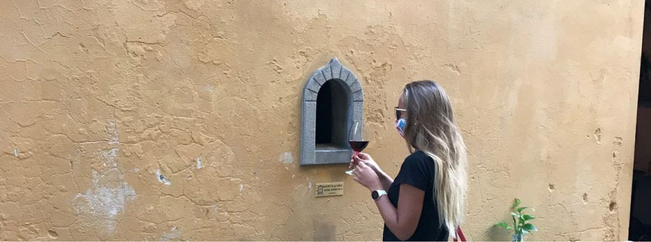
During the coronavirus pandemic, these "windows" started being used again, after centuries. The pest of 2020 brought new things to our culture, as well.

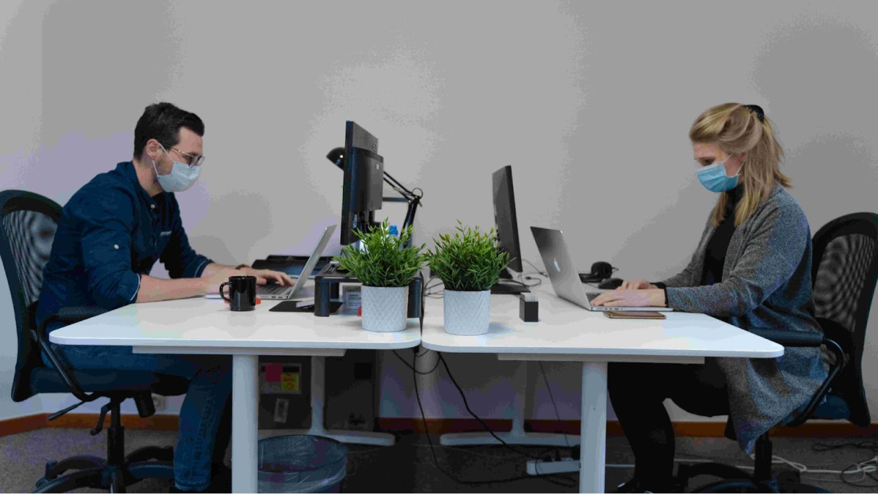
As designers, we love observing the changes that shape our environment. For the last two years, we have been watching how the floors got covered with “distance” signs, plastic walls were built in the supermarkets, and paths in the buildings became one-direction. Now, when people are getting back to offices, working spaces become subject to social distancing design, as well.

So, what is social distancing?

For those who were on a yoga retreat for the last year, social distancing is a practice aimed at minimizing close contact between people in order to reduce the number of contagions.

Image credit: Maxime on Unsplash

At the end of 2021, social distancing might seem like a hype from the worst days of the pandemic. We all got used to wearing masks and washing our hands, but the situation remained fragile before the massive vaccination started. So, is social distancing even worth the effort in terms of today?

We argue that it is indeed, and for a number of reasons. First of all, the pandemic is not over yet, and even vaccination does not provide 100% protection against the virus. Secondly, social distancing helps us to protect those who can’t be vaccinated. And third, it has benefits beyond the pandemic.

As it became clear  last year, anti-Covid measures have a very positive effect in fighting another type of disease, which is seasonal flu. We always knew that this virus gets spread in crowded places, where people gather even if they have symptoms, but now the correlation between social distancing and contagions is officially proved.

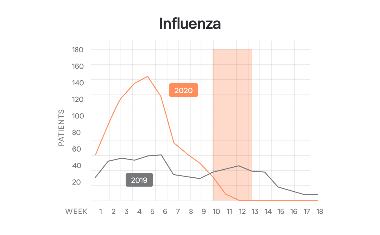
By the way, flu can be a dangerous disease, and even if most people survive it without a strong impact on health, at large scale, companies lose a huge amount of money due to all those flu-related sick leaves.

Why is social distancing important?

Social distancing was practiced in the 17th century and has been believed to be an efficient safety measure since then. 2020 gave us a basis for the studies which proved the effectiveness of social distancing. For instance, research conducted in Germany showed that social distancing helped to avoid 84% of potential contagions.

So, how do we practice social distancing? The basic rules are very simple:

  1. Don’t get closer than 6 feet (2 meters) to anyone.
  2. If you happen to be closer than 6 feet to another person, wear a mask.
  3. Wash your hands before and after touching objects that were touched by someone else.

Social distancing rules work perfectly in a group of people, who are motivated to comply with them and who are conscious of what they are doing at any moment. However, that is not always the case with offices. Even those who understand the importance of social distancing sometimes forget about distance, feel uncomfortable wearing masks for the whole day, and simply can’t comply with the rules when having a live meeting or making a speech.

Since the beginning of the pandemic, we have seen people trying to control social distance using various methods, from measuring the temperature at the entrance, placing stickers on the floor to using sensors in the office and even bracelets signaling the closeness of other workers.

Here are some of the most popular ways of solving the problem of social distancing in the offices and the tech solutions addressing them.

5 ways to make workspace safe for everyone

Office schedules 

The experience of remote working during the pandemic showed us that:

  • remote work is more feasible than we thought it was, and 
  • remote work has some downsides as well. 

When companies started bringing their employees back to the offices, it turned out that the need to have less crowded spaces is met positively by the workers that don’t feel the need to be in the office daily on a 9 to 5 basis.

Office schedules provide each worker some days of office time, while the rest of the time they work from home. This way, the density of people at the office space diminishes. Depending on the job specifics, some people may come just once a week, others — shift 1 week at the office and 1 week at home.

Image credit: appointy.com

As with many needs that appear suddenly, the first solutions were made in Excel, but soon special software came on the market, such as Appointy. This is a product designed as a response to pandemic, but actually, there have been similar products even before. For example, software that coworking spaces used to manage the occupancy of meeting rooms.

Distance-conscious space planning

Making an office truly “socially distant” requires certain changes made to the space design: the tables rearranged so that people are not sitting too closely to each other, corridors and stairs made one-way, seats in common spaces placed in distance one from another. Distance-conscious space design requires detecting the spaces that gather groups of people and finding ways to make them less crowded. 

Indoor mapping solutions like SpaceIQ offer a set of tools for pandemic-conscious facility management.

Image credit: SpaceIQ

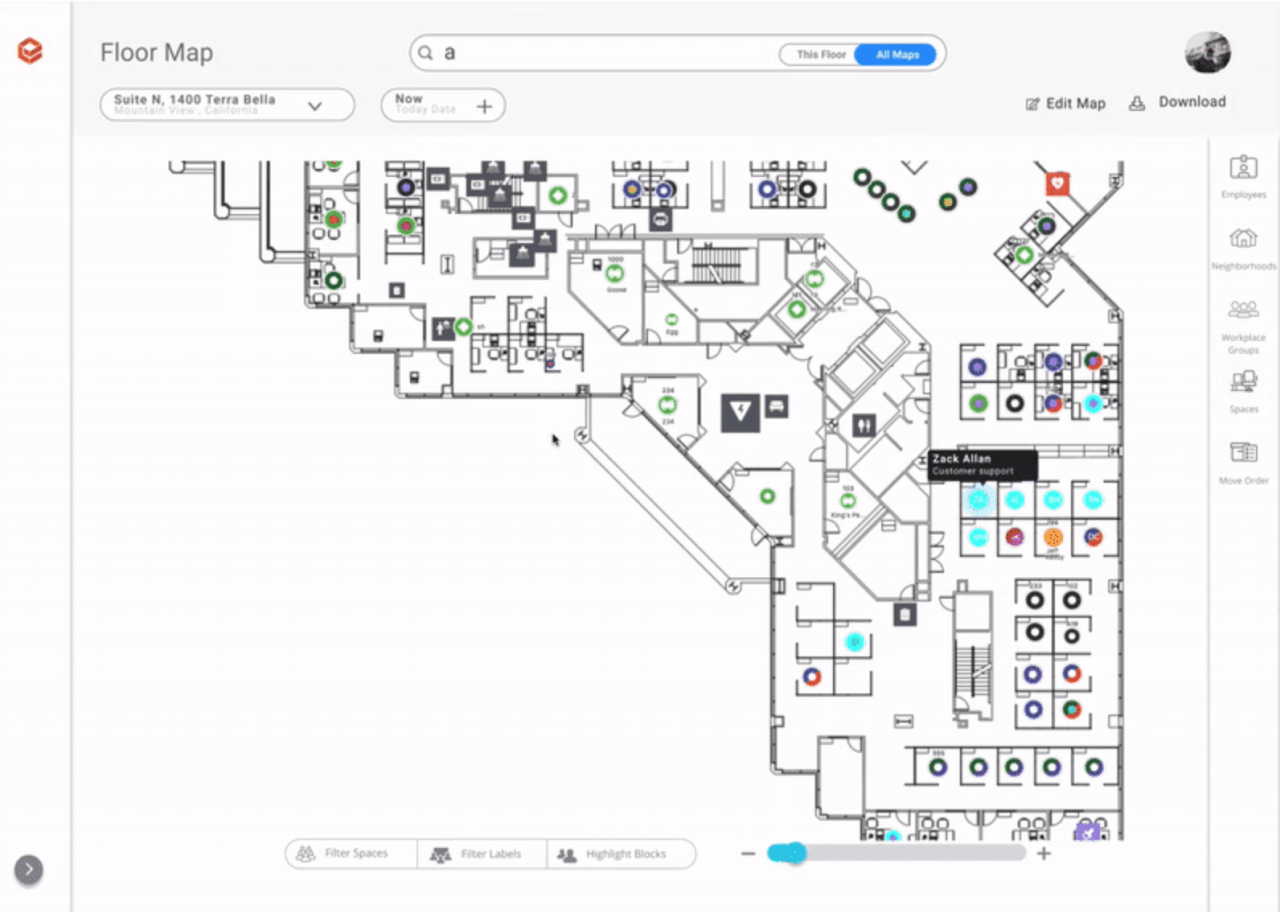
Controlling the number of people goes from a simple decrease in the number of workers in the office by 30% or 50% percent to the installation of sensors that detect those entering and signaling when there are too many people.

Small interventions in space as reminders

Warning signs are a simple way of keeping people conscious of safety measures. Instead of moving all the furniture around the office, you may just place stickers on tables, marking the places that should remain free, put signs that the use of the kitchen is limited, or hang the reminders to wear masks in common areas.

Image credit: Elizabeth McDaniel on Unsplash

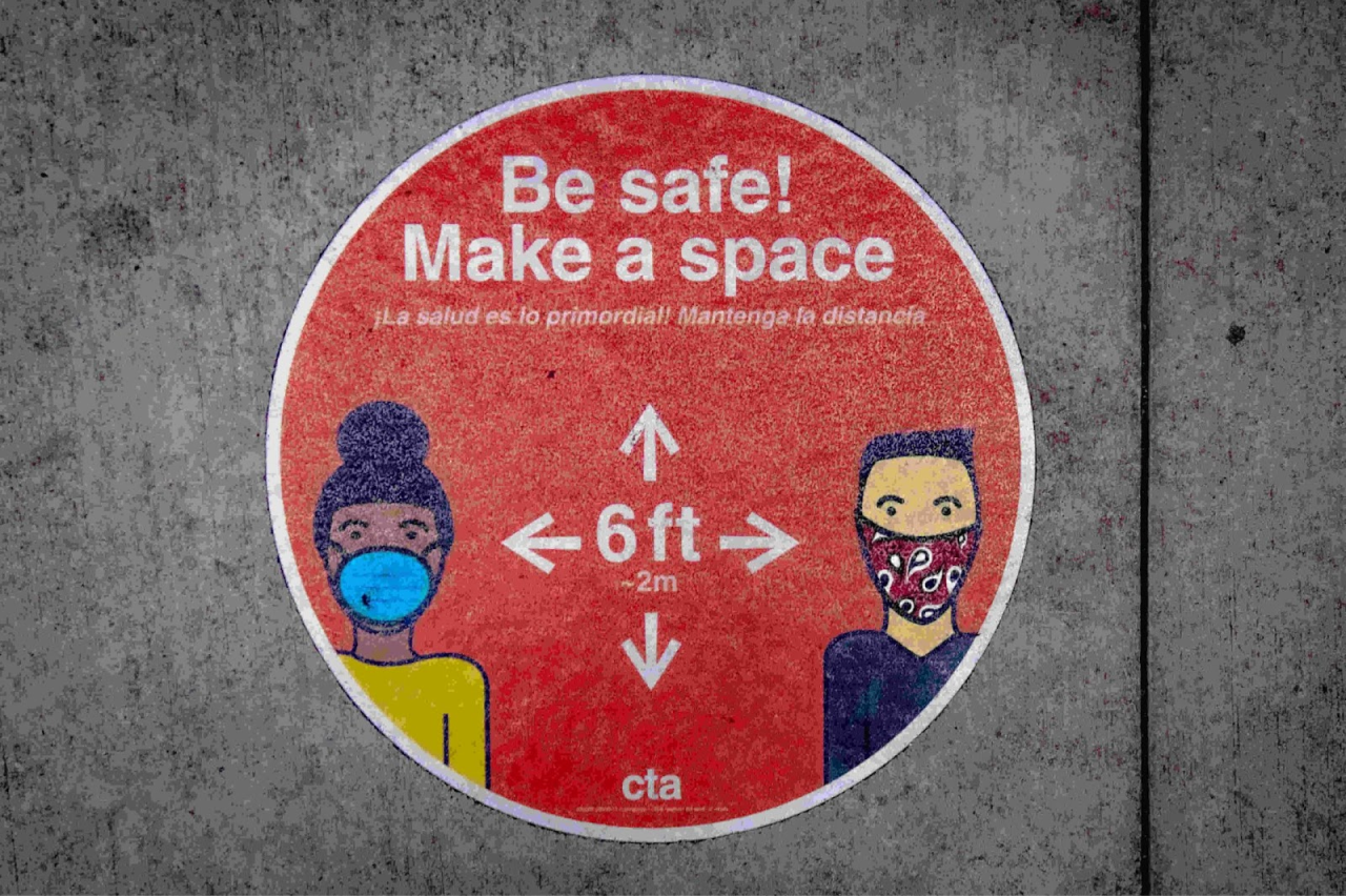
These measures will have an effect if the employees are conscious of social distancing. When these simple methods don’t work, you have to go for different safety-providing tools.

Wearables tracking distance between workers

Image credit: docoyo.com

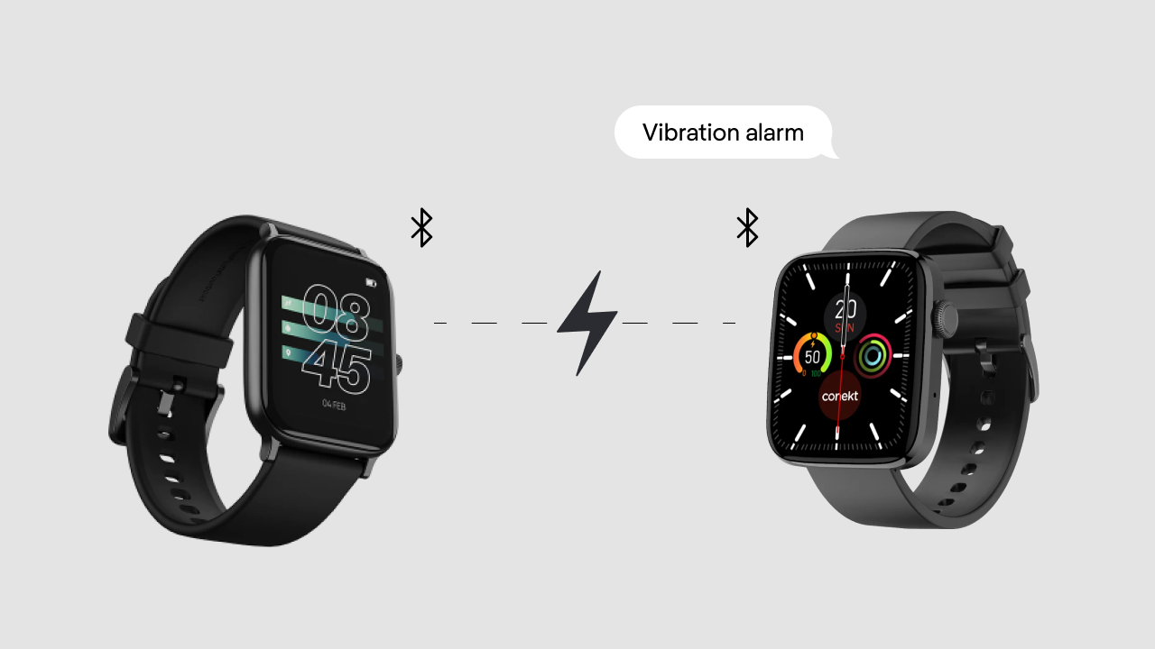
Just like the first anti-contagion apps that kept track of all close contacts, similar solutions can be used in offices. For example, Docoyo offers bracelets that vibrate when employees get too close to each other. When a positive case is detected, this app will show all people who have a risk of contagion.

Tailored office management software

Smart planning of office safety depends on many variables: office space, ventilation system, health condition of the employees, number of people in risk groups, and so on. There are some solutions that send regular questionnaires to employees asking how they feel.

Tracking health condition of the workers allows employers to warn people who were in contact with an infected person, but they won’t do anything with those who have the virus without any symptoms. What is more, obliging employees to share information about their health condition is illegal. Thus, this system is only possible when all workers agree to share their health data voluntarily.

This is just a part of the ideas that we’ve had while brainstorming on the MVP for Haven diagnostics, a product that helps people to get back to post-pandemic offices safely. Haven started with making custom plans for “going back to normal” for big companies, and at some point decided to automatize their work.

All those brilliant ideas, however,  created additional challenges that made them hard to implement for most companies. For example, having a list of employees with data about their positive Covid test results or vaccination is not feasible due to privacy protection. So, we decided to make a dashboard with a list of all the employees (no names, only corporate ID numbers) with the data that shows those who are at higher risk. 

Image credit: Eleken for Haven Diagnostics

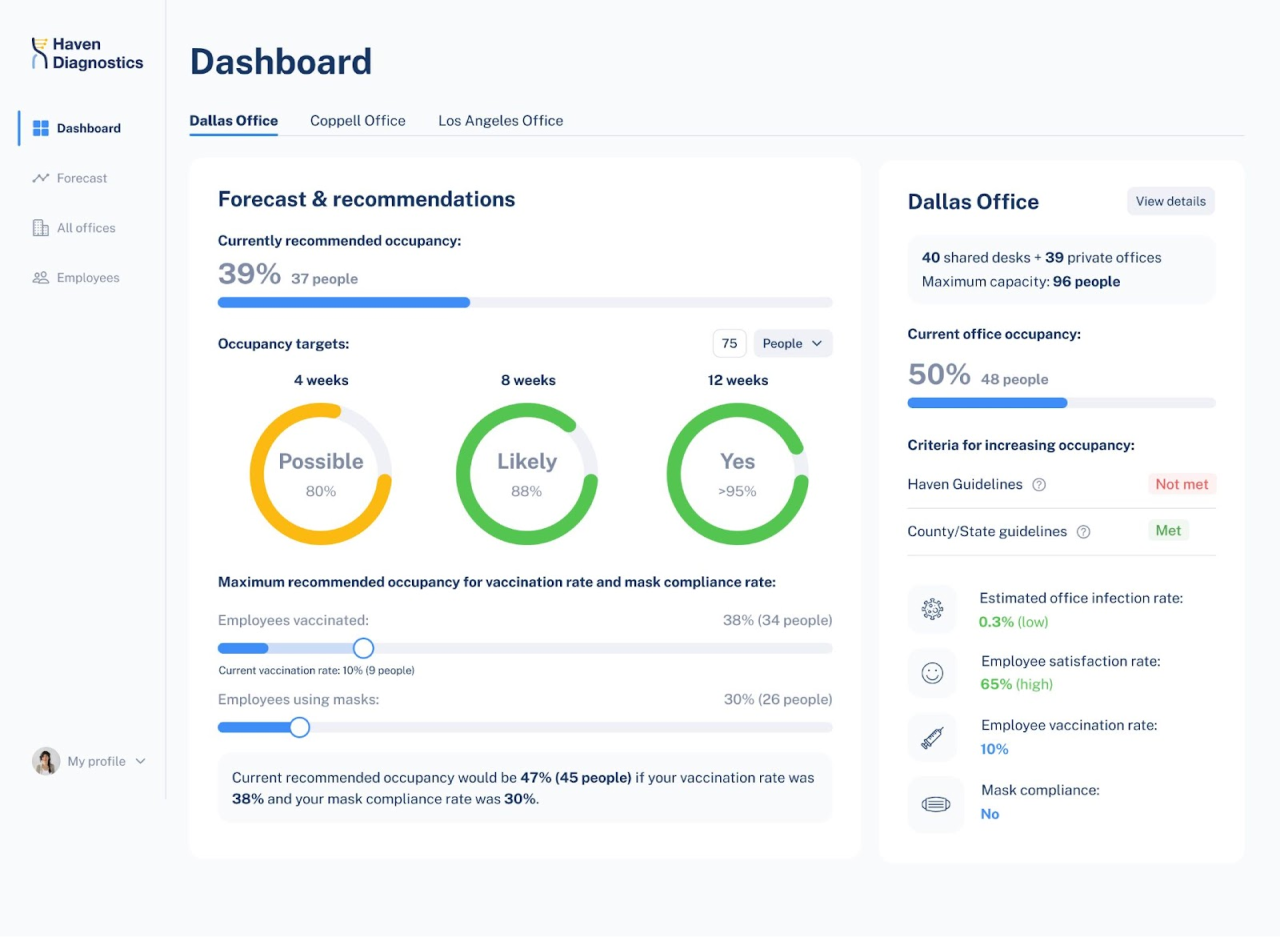
This depersonalized data combined with the information about current contagion rates in the state, where the office is located, allows the software to give recommendations regarding office occupancy.

As we could not use the sensors and other hardware technologies, we decided to use the unique expertise of Haven and offer clients something different from other offers on the market: by applying math models that are used by healthcare professionals, the software can give not only an analysis of current situation and advice on improving it, but also a projection of the future contagion rate. On the dashboard, each office would highlight in yellow or red when the projection is alarming. All the models are visualized in graphs.

Image credit: Eleken for Haven Diagnostics

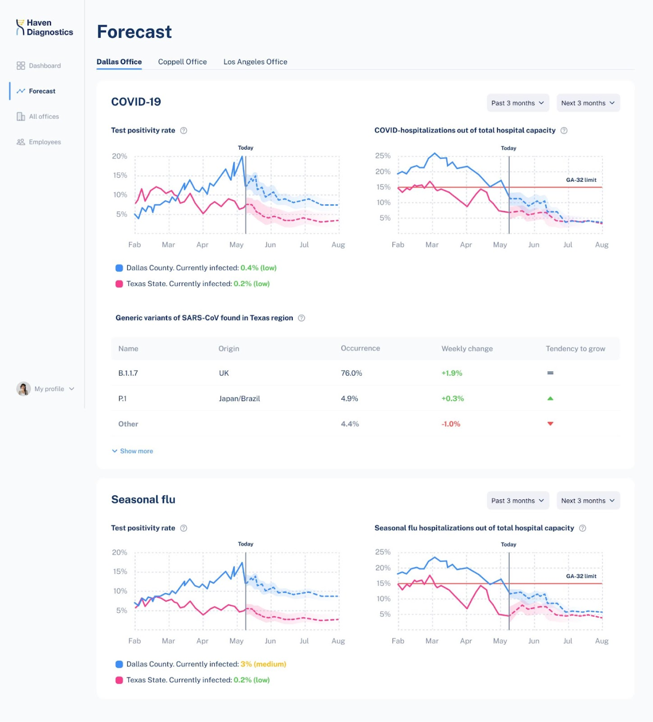
During interviews with clients, we have discovered another problem that they are facing: the companies that have offices in different states find it hard to follow everchanging confusing restrictions imposed by each state. To simplify this process for the users, Haven automatically analyses the current situation in each office and its compliance with relevant state regulations.

Final thoughts

Is social distancing there to stay? Or will we have to move the furniture in a new direction next year? Pandemic trends appeared to be more lasting than we initially expected. Offices have to adjust to the new reality, and the tech is responding fast.

Want to learn more about healthtech? Then you're welcome to read our article Healthcare UX: How Design Can Solve Biggest Challenges for Patients, Clinicians, and Institutions.

Masha Panchenko

Author

Table of contents

Top Stories

Design process
/
0
min read

Tips for better UX Readability: Dos and Don'ts

Designing the great looking user interfaces is only half the battle for grabbing and keeping users’ attention. Your design must also be readable and legible. You can have the most visually appealing user interface in the world but if users have to struggle to read or understand it, they'll quickly become frustrated and leave.

Eleken designers are passionate about flawless user experiences. That’s why we know a bit about good UX readability and would like to share some tips on how to improve it in this article. But first, let’s briefly recap what we mean by UX readability.

What is UX readability? 

In a nutshell, readability in UX answers the question whether your website elements are easy to follow, understand, and clearly recognized by all users.

But when diving into this topic it’s important to understand the difference between readability and legibility. Legibility defines how typeface characters are easy to distinguish and read, or in other words, a visual text clarity . Meanwhile readability refers to the complexity of words in written content.

From a UX designer's standpoint, however, the readability definition  is broader and applies to the clarity of both text and graphics on the page, how they work together and look on the page. With better readability, design has the power to keep users engaged or scare them away. 

The purpose of UX readability was best caught by Typographica:
The term readability doesn't ask simply “Can you read it?” or “How fast can you read it?” It also asks “Do you want to read it?”

A good UX readability also means that the content of your product is accessible to different groups of users equally. For example, color blindness affects 4.5% of the population and 2.2 billion people live with impaired vision. Every designer realizing the importance of readability should be aware of these issues when creating user interfaces. The ability to distinguish good and bad readability is also an important skill. 

How to know if the UI is unreadable?

We strongly advise testing your prototype for readability before moving on to designing the actual product. Usually experienced designers can point out fonts or graphics that look repulsive right away. And sometimes it’s so obvious that anyone can tell that a website readability could be better. For example, take a look at the image below - do you want to read it? I personally have doubts.

Image credit: Pacific Northwest X-Ray Inc.

You can go through five checkpoints to spot bad readability:

  • Size and width of the font. Imbalance in fonts is the first sign of bad readability.
  • Height and width of the line. Too long lines, or those that require scrolling, or extra effort lead to bad readability.
  • Case type. It’s best to mix capitalized or lower-case letters for better readability. 
  • Color of the text. Poor color choice or colors that mismatch the background instantly ruin the readability.
  • Contrast. High contrast between font and background colors make the text unreadable.

If the readability is poor it makes sense to reconsider the design. Changes depend on the screen size, screen technology, screen contrast, font size, color, and style of the text. Such optimizations can improve readability and user experience in general. But before that, let’s talk about typography.

The crucial role of fonts in readability

Fonts are one of the most important factors influencing readability. Typography is an art of arranging letters of the text in order to make written content readable and visually appealing. It is the whole big field in design so, unfortunately, there’s no single recipe on which fonts to use for great readability. 

Some fonts are good for longreads, others are good for titles and headings. Some work better in small or big font sizes, in printed or digital format, and some are just outdated. Skilled designers always keep the subtle balance between modern trends and user needs.

But it’s not just fonts that make your product readable. We have prepared some tips that will help you create a better experience for your users. 

10 tips on how you can improve UX readability of your product or website

These are some tips that will definitely help you increase readability and legibility. Ironically enough, we illustrate them with examples of how readable interfaces should NOT look like. Ready? 

1. Use fonts wisely. Remember that different fonts work better in different sizes. Avoid too complex fonts or too popular fonts, as they are everywhere and annoy users. For example, once popular gothic fonts or Comic Sans are way out of fashion today and easily spotted by users.

Fonts

2. Use fonts that are easy to read on your users’ screens. This is especially true for mobile devices, where screens are much smaller than those on desktop computers, and you have a lot less room to present information, so you need to pick a font carefully.

Fonts

3. Choose colors that are distinct from the background, but avoid too high contrast. Color choice is important since it allows us to highlight certain information while de-emphasizing other things.

Color match

4. Keep visual hierarchy. Break up text within each screen with headings and subheadings, as well as pictures and graphics to ease the reading experience.

5. Keep line length short enough so that users don't need to scroll horizontally across the page when reading a line of text (ideally, no more than 70 characters per line).

Image source: Adventofcode

6. Don't use too many fonts within each screen - stick to one or two at most.

7. Choose a font with both uppercase (capital) and lowercase letters and avoid capitals lock effect.

Fonts

8. Noisy backgrounds can make even the best font illegible. Be very careful with video backgrounds as they can have the same noisy effect.

Backgrounds

For example, check out the image above. It’s a Single Earth website that overall has great readability. But on this webpage, the text accidentally overlapped with the text on the speaker's hoodie creating such a noisy background and decreasing readability.

9. Spacing around text blocks is equally important. Cluttered blocks of content frustrate users. Give them some space to better digest information you are presenting.

Text blocks

10. Keep your users in mind. Take into account their background, reading skills, level of interest, an environment they read in. And don’t forget about accessibility-make sure the designs of your product can be perceived not just through color alone, that text can be read by users with imperfect vision and is accessible to senior users as well as to other groups.

Image source: Minrui Li on Dribble

In short, keep things distinct, mind spacing around text, use legible fonts and font sizes and match them with the most suitable backgrounds. You’ll know the readability is good once you see it. 

Great UX readability examples

After all those examples of bad readability in the previous paragraph let your eyes rest. Enjoy examples of good user interface readability and get inspired for your own projects.

Refera

Recently our team made a redesign for Refera, a dental management platform. The medical management digital product has quite complex functionality, so readability here is extremely important and helps users navigate the platform. 

Refera

We used delicate light green shading to highlight the buttons. Text blocks are organized with frames which helps to distinguish interface elements easier.

Refera

Eleken designers have chosen Plus Jakarta Sans font for both landing page and the platform. The test hierarchy and separate text blocks create a spacious effect. All these aspects do not overwhelm, but comfort users of the product and provide great readability. 

Mindist.io

Image source: Mindist.io

Young startup Mindist.io has built an app for mindfulness creators. Pay attention to the application’s Start page. To create a more relaxing mood, it has a nature photo in the background. The subtle dimming effect in the picture and well-chosen legible font in bright white provide perfect readability and effortless user experience as a result. 

Readable

Readable

Readable is an online tool for readability testing that works with Nasa, Netflix, Harvard University and others. No wonder their website readability is flawless. Structured, spacious, and appealing to users, starting from blocks of content to fonts and color choice, hats off to their designers!  

Readable

Conclusion

In the modern digital era, when written and graphic content are more mixed and users are overwhelmed with the number of interfaces they interact every day, good UX readability is more important than ever. 

Readability is just a part of the equation for a successful product. But it’s what your users will see first. Make everything else work in its favor. 

Our designers compromise neither readability nor aesthetics. We will help you create readable interfaces and design a product your users will love. Drop us a line and let’s discuss details.

Design process
/
0
min read

How, Where, and When to Find a Designer for Your SaaS App

Design and user experience (UX) is one of the most important aspects of SaaS. Good design will go a long way to not only convert customers but also help them engage with your product and return to it again and again. 

But how to find a person that can create a stunning UX for your SaaS customers? 

No worries! Here at Eleken, we specialize in designing for SaaS. To make your task a little easier, we will walk you through all the essential information on how to find a designer for your SaaS app. 

In this article, we will figure out what skills such a designer should have, discuss the places to look for a designer, give you tips to use during the interview, and help you define the right time to start your search.

First of all, to be able to correctly and fairly assess each designers’ portfolio, you need to understand how good SaaS design looks like.

What is special about SaaS design?

The ultimate goal of a designer is not to amaze users with an outstanding user interface of the SaaS product, but to make them say "wow" to how easily and efficiently the app helped them solve their problem.

For that reason, a good SaaS design should have the following characteristics:

Flexibility

As SaaS products tend to scale up quickly a professional designer should always take this fact into account. To be able to cope with the constant evolution and growth of a cloud app, instead of spending all time and effort on creating tailored components for the current need, a good designer makes things adaptable and scalable to future needs. That means a SaaS product designer should know how to work with design systems

After all, scalable design always pays out in the long run. For example, when we were working on TextMagic, the cloud-based company that provides a range of products for marketing, customer support, and sales, we used Wizard, a powerful design pattern to simplify the process of configuration of email marketing campaigns. In general, using the design system in this project made the whole design process faster and more productive (read more in our case study).  

The fast and simple sign-up process

The next thing that lets your customers quicker discover that your product is efficient and they need it is the frictionless sign-up process. 

Due to the specificity of the software-as-a-service model people access the product with their browser, that’s why they usually don’t feel comfortable filling in too much data straight away only for a trial period (especially billing data).

Designers that understand the essence of SaaS tend to make the sign-up process fast, clear, and brief. For that reason, they use short forms, remove all unnecessary information and create clear call-to-action buttons. 

Let’s take a look at Trello’s sign-up process. 

It is super fast and easy. The visitor sees a short fill-in form that asks only for an email address and a bright call-to-action button with a clear copy “Sign Up - It’s Free!”.

That’s how the visitor has to go through only one step to get the job done. 

Clear and noticeable call-to-action buttons 

When the customer uses the app, they should understand what they are supposed to do and what will happen after certain actions. CTAs help users quickly achieve their goals and easily complete tasks. 

The effective CTAs that convert visitors into customers are usually of appropriate size (big enough to notice), contrasting, and have a persuasive copy.   

Here is an example of a well-designed CTA created by our team for ClientJoy (former Gridle). 

The headline presents the value proposition of the Clientjoy and then logically the attention of the reader goes to the contrasting call-to-action button that says you can “sign up for free”. The size and the color of the CTA make it easy to notice. To learn more about this project, check our showcase

Intuitive and clear page architecture

The UI patterns like forms, button styles, pages, reports should hook the users. When patterns are consistent and intuitive, it makes products sticky and habit-forming. 

Minimalist and clean design is the first step to eliminate unnecessary features and clutter from your cloud app. It helps users focus on the core parts of the application and bring order to the overall layout.

The SaaS product that is known for its simplicity and clean minimalistic design is Dropbox

Even newbies for this app will easily understand how it works and what they are supposed to do. The minimalistic design and clear navigation leave no place for confusion. 

Human-centered design

Designing the SaaS products requires deep consideration of users and their behaviors as the first and foremost task of any cloud software is to bring value to the customer. SaaS UX design works like an instrument that helps to deliver value and create a user-friendly and practical product. 

Duolingo is a great example of a simple and highly intuitive application that has a main focus on its users. Duolingo’s design resembles a video game. It is full of interactive visuals but at the same time, there are no unnecessary elements that may confuse the user. 

This application for learning languages shows what human-centered design is all about. 

Optimized dashboard

SaaS products help users process big amounts of data. A good SaaS UX design essentially presents important information quickly for its users. The most frequently accessed data, updates, pending approvals, and a quick summary of key events encourage users to keep coming back. 

For that reason, a designer of cloud applications should know how to make easy-to-comprehend dashboards that provide users with all the necessary data.

Take a look at the dashboard Eleken designed for TextMagic. It allows managers to quickly understand how their team is progressing and if customers are satisfied.

Based on the above principles that contribute to effective SaaS design, we can formulate what skills a designer of cloud-based software should possess.

How to hire a SaaS designer

If you're new to the world of user experience design, it’s easy to get confused trying to find the best candidate. To understand which way to look, let’s figure out:

  • what are the responsibilities of a UI/UX designer; 
  • what skills, knowledge, and experience a designer should have to cope with those responsibilities; 
  • How to reveal the candidate’s skills, personality, strengths, and weaknesses.

Understand the responsibilities of a UI/UX designer

The position of a SaaS designer requires:

  • To understand the specifics of SaaS business
  • To own the end-to-end design process including user research, prototypes, test ideas and refine designs with data and customer feedback
  • To state clear problems based on research and data
  • To identify user needs, iterate solutions
  • To create/work with existing design system proficiently and consistently
  • To choose logical UI patterns. Deliver polished visual design and transitions
  • To know user-centered design principles
  • To be able to work using modern design and prototype tools (Figma, Sketch, Photoshop, Illustrator, and such)

Define the essential skills and background

No UX designer can be a jack of all trades, an expert in everything. But there are a number of applied skills that are essential for a candidate to tackle the responsibilities of a UI/UX designer:

  • UX research. To create a great SaaS application, designers need to understand who their users are, what are their needs, and how they are going to use the product. To figure things out, UI/UX professionals need to conduct user research before proceeding with the design itself.
  • Information architecture. UX design is not only about “making things pretty.” It also requires a designer to be able to structure the content and features of the app in a way that would work for the users.
  • Wireframing. The design process usually starts with black-and-white wireframes to concentrate on the logic behind elements. 
  • Visual design. The look and feel of the product have an enormous impact on how a user experiences an interface. That’s why a designer should be able to create pixel-perfect icons, buttons, and color schemes.
  • Prototyping and testing. To make sure your design solutions would be clear for users, a designer should be able to run user tests before the launch.

Evaluate your candidate’s background

Speaking about education, many UX designers do not have a degree in UX or a related field. It's quite possible to start a career in UX without a degree at all, replacing it with UX courses and self-education. 

Instead of requiring diplomas, ask candidates to share their portfolios. There is no better way to understand the designer’s skillset and ability to come up with solutions for varying design problems than by checking their portfolio. Moreover, the portfolio also shows the candidate’s attitude to work –– something all employers are looking at.

To give you a better understanding of what a good portfolio looks like, check out examples of popular product designers Simon Pan, Jonathan Patterson. As well, take a look at the way we organize our case studies at Eleken. 

Another chance for a candidate to demonstrate their expertise is a pre-hire test assignment. When we hire UI/UX designers at Eleken, we always ask them to do a quick test task. For example, to create a UI for a mobile AI messenger app (at least 3 screens).

Have a “live” conversation

An efficient work process and a successful final result are impossible without mutual understanding between you and the designer. That’s why it’s super-important to make sure you feel comfortable communicating with your potential hire. The best way to understand if you can communicate easily is to ask for a video interview. 

Tell the designer everything about the future application. Share your thoughts on the target audience, monetization strategy, and unique value proposition, show the moodboard with application designs you like, and so on. Share all this information and listen carefully to designer feedback to understand if you want to work with him/her.

Prepare a list of questions

We at Eleken UI/UX agency have been interviewing designers since 2015, and through all these years we made up a chart of interview questions that allow us to reveal candidates’ personalities, skills, and knowledge.

First of all, ask a candidate how great UX design differs from poor UX design. Mature professionals have their own definition of good design and can formulate a clear and specific answer to this question.

Knowing what makes good UX is one thing. Knowing how to design good UX is another. That leads us to the question about the candidate’s knowledge of UX best practices

Maksym, Eleken’s Design Director, says that simple questions are the best to reveal how a person reasons. He likes to ask candidates to explain to him what UI/UX design is, how UX differs from UI, and so on.

Technical questions are called to evaluate the level of the designer’s professionalism in the field. Here you want to know how a candidate builds their design process and what methods they use in their work. For instance, you may ask your candidate to walk you through the latest project in their CV.

If a candidate is serious about building their career as a SaaS designer, it’s always a good sign for any employer. So it’s a good idea to ask your interviewees about how they became designers and how they see their professional growth.

Here’s an example list of interview questions for SaaS designers:

  • Tell me about yourself.
  • What is the difference between UX and UI?
  • What differentiates good UX from bad UX?
  • Tell me about some of your favorite examples of good UX. 
  • Walk me through your design process for this particular project.
  • How do you see your future career in UX design?
  • Do you have any questions?

Don’t forget about onboarding once a designer is hired

After hiring a designer, take some time to onboard them and establish a proper work process. Otherwise, the whole affair is doomed to fail.

So here are some tips for how you can help your designers craft high-quality products.

Make designers familiar with your product

Any designer that is hired to develop a product needs to understand perfectly how the product works. Obviously, right? Yet, it’s not an easy task to deal with such a wealth of information in a short term. Help your designers by documenting all the guides, demos and customer interviews in one place.

Explain your work process

Walk your new employee through your working process, explain how things are working and why they are working this way. Detail what rules are flexible and what is set in stone. For the first days, it may be useful for a newcomer to shadow an experienced designer.

Devote some time for training

We at Eleken hire designers with UI/UX experience. They all have great portfolios and proven skills. But what makes them a part of a team is a monthly training that teaches them SaaS design approaches that are adopted in our agency. The pet project designers should complete during their training is a perfect onboarding tool — it teaches them to collaborate with one another, get their works reviewed by peers, and help each other to create better solutions.

Places to look for a designer

With the understanding of the specificity of SaaS design, it would be easier to look through CVs and portfolios. 

Let's check some places where you can find a designer for your application.

Upwork

Upwork is a global job search platform that offers help for employers who want to hire and manage remote professionals. Here you can find a freelancer or a freelance agency, interview them and begin to collaborate. 

Here you can find profiles of app designers with their experience, reviews, and links to portfolios.

Designhill

Designhill is a popular creative marketplace that helps companies and individuals find professional designers to perform designs of different complexity and scale. You just have to describe your needs, fill out a design brief and wait for a response from professionals to choose the one that you like the most.   

Behance

One more way to find a good specialist is to search on Behance. The site includes lists of portfolios from different designers. So you can find the samples you like, check who their creators are, and reach out to them.

We also have our works on Behance.

Dribble

Similar to Behance, Dribble provides a list of works of various designers and creatives. Filter the specialty you need ("SaaS app", "web design" "interactive design", “SaaS dashboard”, “b2b dashboard” etc.), find works you like, and contact their creators.

Check our works on Dribble.

Clutch

Clutch is a platform for B2B hiring decisions. There you can find design agencies sorted by objective client reviews, experience, client list, etc.

Eleken has a profile on Clutch as well.

Word of mouth

Asking your friends and acquaintances for advice may seem like a little outdated method, but don't neglect it. Talk with people you know, ask if they have contacts of designers that may be relevant for you. Who knows, maybe someone from your network has faced the same problem and can provide you with useful references.

Google

Don’t know where to find something? Just Google it! I guess you know how to use this tool perfectly well. Google gives access to a huge amount of information, but don't forget to carefully check the agencies or freelancers you find there.

Eleken UI/UX agency 

We at Eleken help SaaS companies overcome product design challenges every single day. We hire and nurture SaaS design professionals capable of managing those challenges. So if you want to resolve the matter with a UI/UX hire fast and securely, drop us a line.

Final thoughts

“If you give a good idea to a mediocre team, they will screw it up. If you give a mediocre idea to a brilliant team, they will either fix it or throw it away and come up with something better.” Ed Catmull

Choosing a designer for your application is a challenging and responsible task. The quotation above once again reminds us about the importance of finding a designer who not just blindly follows your instructions, but works as your thought partner, helping you overcome complex challenges.

In case you still have some doubts and questions about designing your SaaS app don’t hesitate to reach out to us for a free consultation

Don't want to miss anything?

Get weekly updates on the newest design stories, case studies and tips right in your mailbox.

Success!

Your email has been submitted successfully. Check your email for first article we’ve sent you.

Oops! Something went wrong while submitting the form.
Don't want to miss anything?

Get weekly updates on the newest design stories, case studies and tips right in your mailbox.

Success!

Your email has been submitted successfully. Check your email for first article we’ve sent you.

Oops! Something went wrong while submitting the form.