


A developer can read spacing off the canvas. What they cannot read is what the screen does when the list comes back empty, whether that link was meant to be a button, or which of your two card styles was a decision and which was a leftover. Those answers live in your head, and getting them out is the actual work of handoff.
It does not fit into a final review either, because developers are in the file long before you schedule one. This checklist is built to run beside the work. We'll cover seven essential steps you can start using today, so nothing gets built on a guess.
What is a design handoff checklist?
A Figma design handoff checklist for developers is the set of things documented in the file before anyone builds from it. It’s everything around the design, including states, breakpoints, motion values, token bindings, and what the interface does at its edges.
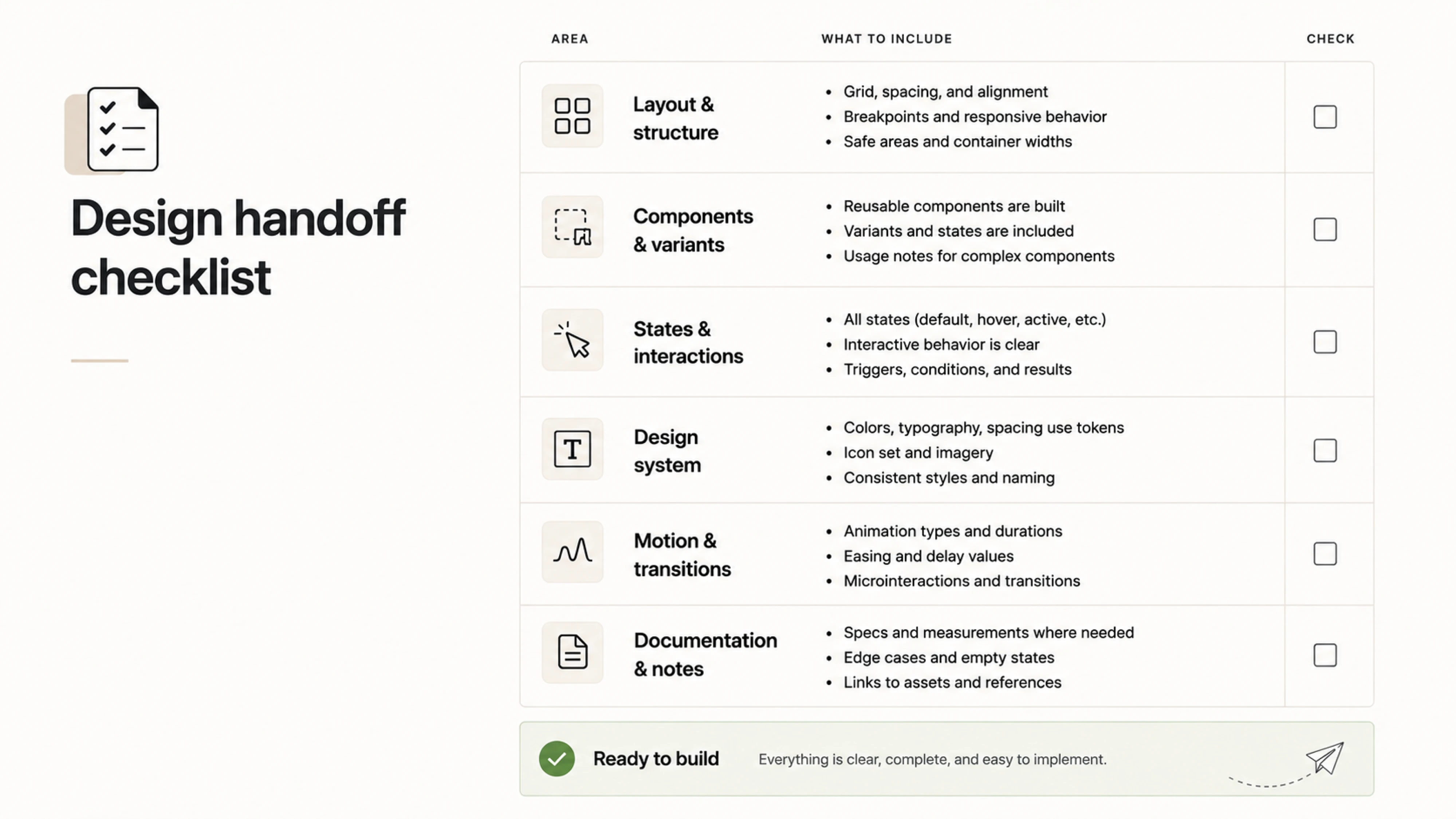
The word handoff is what causes most of the trouble. It describes a single transaction with a clear owner on each side, and that is not how anyone uses the file. Engineers open it at several points in the development process, during scoping, while estimating, mid-sprint, and again when the build stops matching the mockup.
A designer on Reddit put it well:

I don't think the handoff is a single moment. In most teams I've seen, devs are already in the file while the design is still moving, so my checklist is more about reducing ambiguity than making the file feel "final". If something requires explanation, i'd rather call it out directly than hope someone discovers it.

That ambiguity comes from a genuine difference in what each side is protecting, and neither position is careless. As a designer, you are protecting consistency, so a component behaves the same on every screen and the visual hierarchy holds.
The developer is protecting the build, so it renders fast, degrades gracefully, and does not turn into four hundred lines of conditional CSS. Those goals agree most of the time. Where they disagree, whoever notices first has to say something, and a checklist is largely a list of the places where nobody notices until it is expensive.
The payoff is visible mostly as things that stop happening. Nobody messages you asking what the disabled state looks like. Nothing gets discovered missing on the morning it was supposed to be built. No ticket gets reopened because the empty state was never designed and a blank container went to production.
What goes on the checklist?
Fourteen items, and the striking thing about them is how few concern the design itself. Nine of the fourteen are about what surrounds the design, which matches where the questions actually come from.
- Layer and frame naming. Every frame carries the name the developer will see in Dev Mode, and nothing is still called Frame 247 or Group 12 copy.
- Exports configured. Every asset that leaves the file has its scale and format set, so nobody screenshots a logo at 1x and ships it blurry.
- SVG icons. Icons are outlined vectors on a consistent grid system, not text glyphs or flattened rasters that break at other sizes.
- Token bindings. No raw hex values, no manual font size overrides, every color and type value pointing at a variable.
- Spacing and measurements. Auto layout does the spacing, so the numbers a developer reads are the numbers you meant.
- Typography. Sizes, line heights, and weights all map to named text styles, and each one matches a heading level or text role in code.
- Component states. Default, hover, focus, disabled, loading, empty, and error, drawn rather than described.
- Edge cases. Long names, truncated text, missing avatars, zero results, and whatever else the happy path never shows.
- Copy. Real strings in the design, including error messages, which are the ones most likely to get invented by whoever is building the form.
- Breakpoints. What changes at each one, and what happens in the widths between them.
- Motion. Transition type, duration in milliseconds, delay, and easing curve, written down as values rather than left to the prototype.
- Accessibility. Contrast ratios checked, semantic roles noted, tab order defined for anything interactive.
- Prototype link. A working flow the developer can click through, ideally with a short screen recording of the intended path.
- Dev Mode link. Pasted into the Figma handoff page description so nobody has to ask where to start.
Two things about how you run this list.
Do not check it all in one sitting, because a single pass reliably misses things that a split pass catches. Items 1-6 are a design review, which you can do the moment the visuals settle. Items 7-14 are a readiness review, which happens closer to the sprint.
The second thing is that this list is the article. Each step ahead takes a slice of it and shows what good actually looks like.
Step 1. Bring developers in before the design is finished
Showing the development team the work while it is still a wireframe is what prevents unintended issues. A polished mockup invites polished feedback or silence, because it looks like something already settled. A grey box layout invites the question you want, which is whether the structure survives contact with real data.
Four things are worth settling before the visuals start.
- Scope. Which product screens ship this sprint and which are being designed now but built later.
- Constraints. What the API returns, and where a value you are showing does not exist anywhere yet.
- Reuse. Which parts can be assembled from components that already exist in code rather than rebuilt.
- Cost. Anything routine in Figma but expensive in the build, like a sticky element inside a scroll container.
Then ask three questions and let the developer talk. Where does the data for this screen come from, and how slow is it? What can this screen show that I have not drawn? What breaks if a user has zero of something, or two thousand of it?
That last question is the one that pays.
Developers think in failure modes because they are the ones who handle them, and they will name gaps you would not find by reviewing your own file. A designer on Reddit described wanting a spec checklist for exactly this reason, noting that:
Things like empty states, error states, negative scenarios can be missed sometimes.
A conversation with the person who has to code the error path surfaces them earlier than any review will.
None of this requires a meeting. A FigJam board with the user flows sketched out, and developer feedback dropped in comments covers most of it. A ten-minute call handles the rest, and marking a frame ready for dev tells everyone which parts are stable enough to react to.
Step 2. Clean the design file and audit your tokens
Open your own file in Dev Mode and click a button. If the fill is bound, the panel shows something like color/action/primary. If it is not, the panel shows #2F6FED. One of those is an instruction. The other is a number a developer has to make a decision about, and the decision they make is usually to hardcode it.
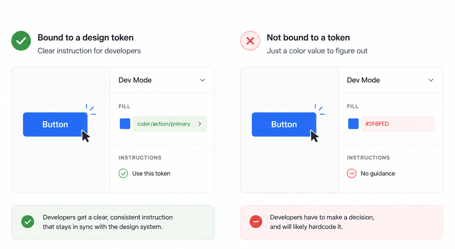
Designers tend to underestimate the consequences. Every unbound value is a decision that has left the system. Each raw hex code or manual font-size override creates another place where the design file and codebase can quietly drift apart.
The problem usually surfaces months later, when someone needs to update one value everywhere and discovers there is no “everywhere.”
This becomes costly when the product has to change, whether because of a rebrand, dark mode, or an enterprise client requesting a custom color palette.
At Eleken, we addressed this problem while working on the Newton360 design system. By structuring its tokens, we made it possible to switch themes without reopening individual screens. If an element needed a darker shade, we could update it once and apply the change everywhere that token was used.
File hygiene is the smaller half of this step, and it is mostly about what a developer sees when they open the file.
Explorations and abandoned directions must belong on a separate, clearly named page so nobody builds a version you rejected in week two. Unused layers should be deleted. Frames should have descriptive names. Export settings, including scale and format, should also be prepared before anyone needs the assets.
None of this improves the design. It removes the reasons a developer would need to interrupt you to ask about it.
Step 3. Document every state and edge case
States generate more handoff questions than anything else in the file, and the reason is simple. One screen can contain many possible conditions.
A form with four inputs and a submit button is one design and a dozen conditions.
Every input can be focused, filled, invalid, or disabled.
The button can be idle, loading, or blocked.
The form can fail at the field level or the request level.
You drew one of those, and the developer has to build all of them, so every condition you left out becomes either a question or an invention.
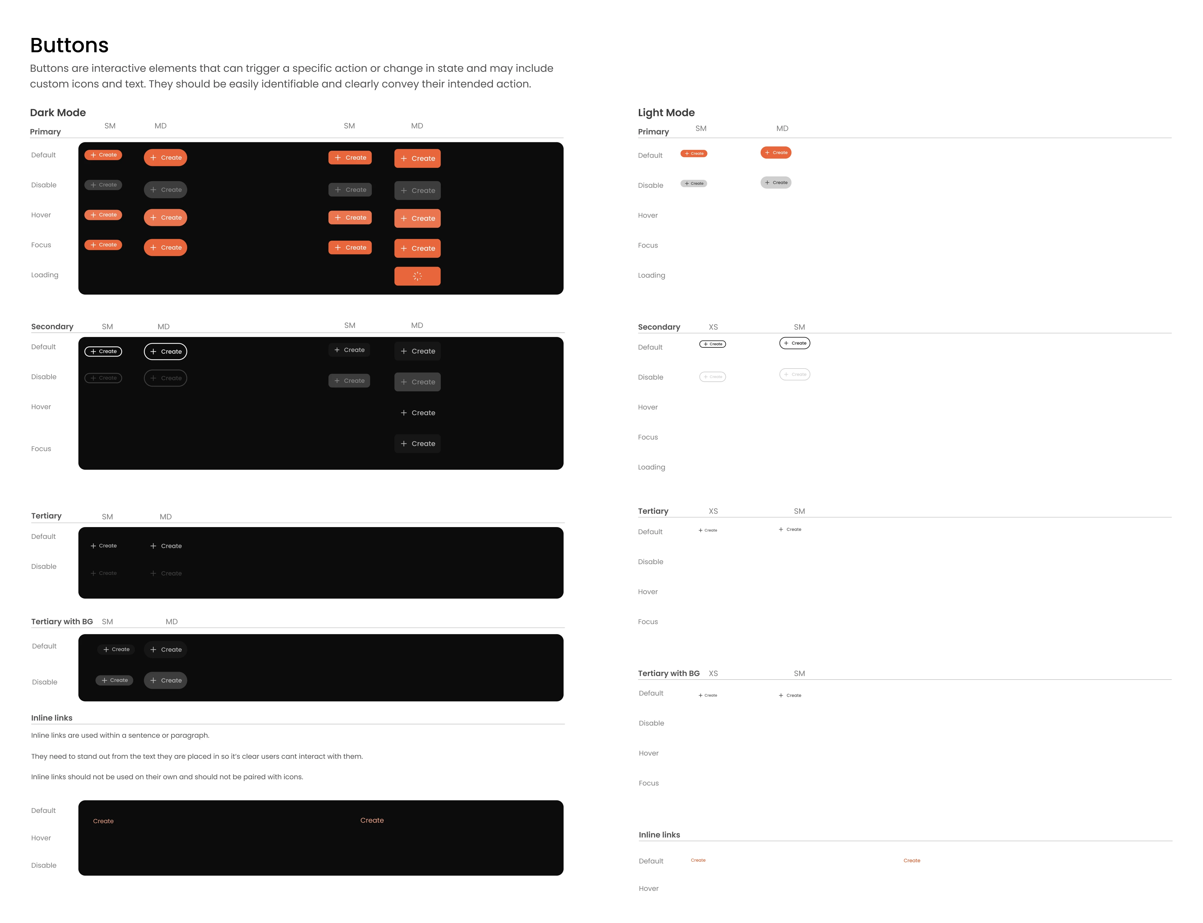
Seven states are worth drawing for anything interactive.
- Default and hover. Worth noting only that hover does not exist on touch, so if a control reveals something on hover, it needs a second way in.
- Focus. If you do not define it, a developer either leaves the browser outline or removes it, and neither of those was your decision.
- Disabled. A disabled button raises the question of why, and if the answer is not visible in the interface, users click it repeatedly and file support tickets.
- Loading. A skeleton implies the shape of the content is known. A spinner implies it is not. Pick one, and say what happens when the wait runs long.
- Empty. A new screen should guide users to start, while a no-results view should explain what happened and how to adjust filters.
- Error. Field-level errors sit next to the input and say what to fix. Request-level errors sit above the form and say what failed.
Then comes edge case documentation, covering the less common but predictable situations caused by real users and real data.
Your design may show a short name, a loaded avatar, and a list containing exactly six items. The real product will have three-line company names, users without photos, empty tables, and tables with thousands of rows.
Test your layouts with this kind of data. Take the longest real string from the product and paste it into the design. Remove an image. Add more rows than the ideal example allows. Whatever breaks is something you need to decide now. Otherwise, a developer facing an overflowing container may simply add an ellipsis and move on.
Final copy also belongs in this step, especially error messages.
When these are missing from the design, they are often written by whoever happens to implement the form. That is how products end up telling users only that “validation failed,” without explaining what happened or how to fix it.
Step 4. Specify responsive behavior
For every item on the screen, a developer needs to know whether it holds a fixed width, fills whatever space is left, or fills up to a limit and then stops. If the layout is built with auto layout, much of this logic is already encoded in the file and visible in Dev Mode. But auto layout does not explain every structural change.
Show what happens as the available space decreases. Which row becomes a stack? When does the sidebar collapse, and where do its contents go? Does a table become horizontally scrollable, or switch to another format?
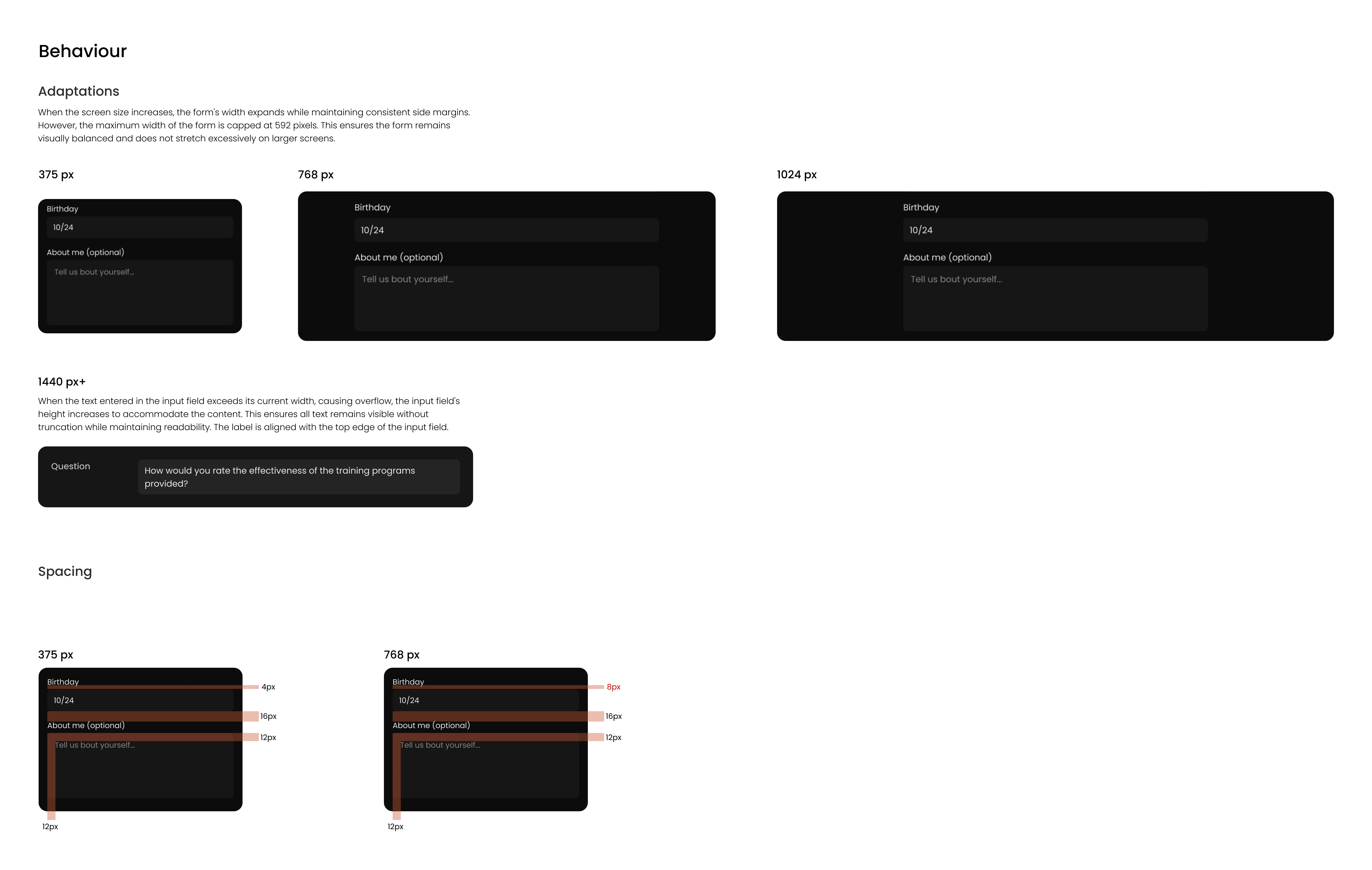
Product copy needs the same treatment. A label that fits comfortably on a wide screen may stop fitting at a narrower width. Decide whether it should wrap, truncate, resize, or disappear with the element that contains it. If truncation hides important information, explain how users can access the full text.
You do not need to design every possible screen width. What matters is documenting the logic behind the layout. What stays fixed, what can stretch, and what changes when there is no longer enough space.
This gives developers enough direction to build a responsive interface without forcing them to reproduce one screenshot at every breakpoint. It also leaves room for an implementation that can adapt when new content or requirements appear.
Step 5. Annotate what the design cannot show
Annotations explain the parts of a design that the file cannot show on its own.
Behavior covers what happens after an action. Where does a link go? Does the modal close after saving, or stay open with a confirmation? These are decisions you may have already made without realizing they need to be documented.
Constraints are the rules that shape the interface without appearing in it. A maximum of three selections. A field that accepts up to 60 characters. A control that only admins can see. None of this is visible, and all of it changes what gets built.
References point to something that already exists. This uses the same pattern as the settings page. This is the standard card component. Most usefully, this input is custom because the system version does not support multiple selections.
Motion needs its own treatment. A developer cannot measure your smart animate. Specify the transition type, duration in milliseconds, delay, and easing. Annotated interactions usually cover a whole product, since the rest inherit the same timing.
Accessibility belongs here too, mostly as short notes. Confirm that contrast ratios have been checked. Add screen reader labels for icon-only buttons. Define the reading and tab order for screens with more than a few controls.
Keep annotations in the file rather than in comments, where they can be resolved and easily overlooked.
At Eleken, we applied this approach at scale while working with ClearPoint Strategy. Before developers started working with the layouts, our designer documented user stories and the reasoning behind key component decisions.
The remaining question is where all of this goes so a developer can find it without asking.
Step 6. Set up a dedicated handoff page and Dev Mode
Everything from the previous steps exists somewhere in your file. The problem is that a developer opening it sees many pages, some of them named Untitled, and has to work out which version is real. A handoff page solves that problem.
Make it one page with an obvious name, prefixed so it sorts to the top and reads differently from your working pages. Inside it, include three frames.
Dev Mode itself needs almost nothing from you. Mark the final frames as ready for development, confirm that code snippets use CSS and pixels for the web, and paste the Dev Mode link into the page description so it is the first thing anyone sees.
Lambda is a useful reference for the mindset here. When Eleken redesigned their OptiFlow platform, delivering the full scope in Figma ready for developer handoff was one of three goals set at the start of the project. The redesign took two months, during which we built a comprehensive UI kit to ensure a smooth handoff.
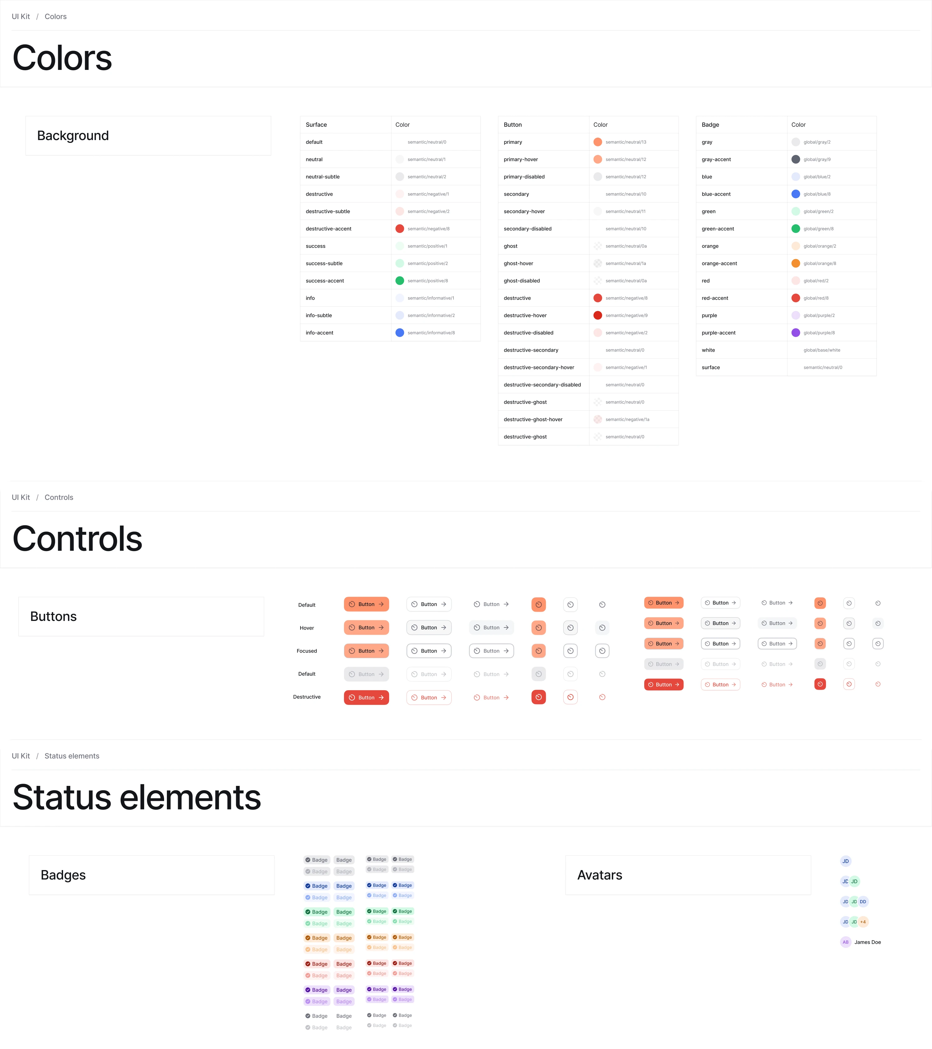
Step 7. Turn the checklist into a reusable template
A UX design handoff checklist you rebuild each project is a checklist you will eventually stop rebuilding. The work in Steps 1 through 6 only pays off if starting it next time costs nothing, and that means turning it into something you duplicate.
Start with the checklist item itself. Build one component and use it fourteen times instead of typing fourteen rows of text. It needs three things.
- A checkbox, 20 by 20, so the list scans as a list.
- A text label you can edit per item.
- A status badge with three variants: To do, In review, and Done.
The status is how you track completion. A developer looking at your handoff page can see at a glance that states are done, motion is still in review, and accessibility has not been touched.
Once one project's handoff page works, duplicate the file, delete everything specific to that product, reset every item to To do, and save it as something obvious like [Template] Design handoff checklist.
Then keep it honest. Review it every third sprint or so and make two kinds of edits. Add anything a developer had to ask you about, since a repeated question is a missing item. Remove anything nobody has used in months.
The template earns its keep most when someone new picks up the work. A designer joining mid-project, covering a leave, or taking over a product can read the template and see how your team documents things without asking anyone.
That covers what to do. The last thing worth knowing is what quietly undoes all of it.
What kills a good handoff Figma file?
You can follow all the design handoff checklist best practices above, and the handoff can still come apart. Four things account for most handoff breaks, and none of them are design problems.
The file keeps moving, and nobody says so. A developer builds a screen on Tuesday, and on Wednesday you adjust the spacing or swap an icon. By Thursday the build and the file disagree, and neither person knows which one is wrong.
The answer is not to freeze the file, because designs genuinely should keep improving. It is to make changes visible. Keep a short, dated list of edits on the handoff page and tell whoever is building the affected screen.
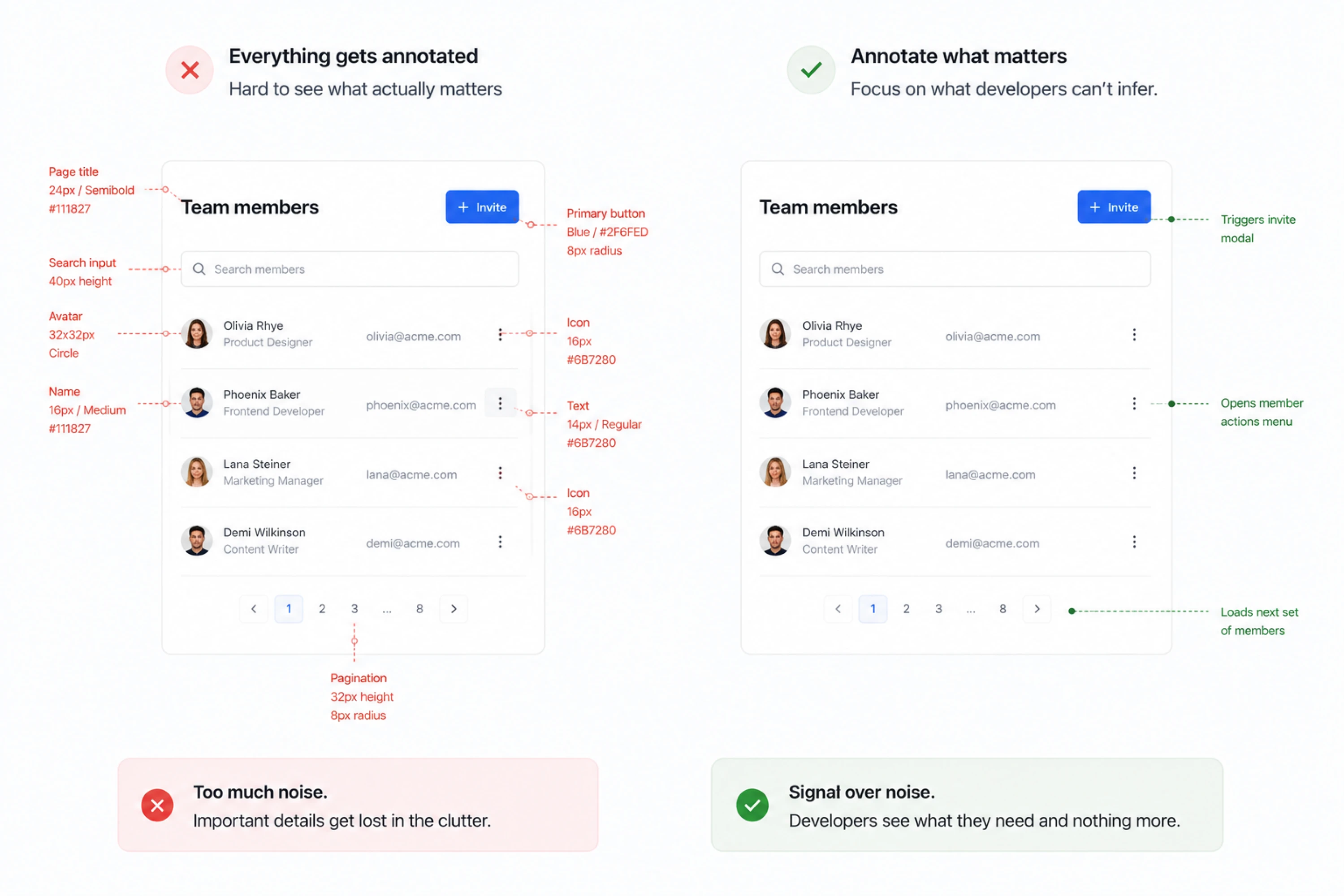
Everything gets annotated. When every element carries a callout, the three notes that matter look exactly like the twenty that restate what is already visible. Annotate what cannot be inferred and leave the rest alone.
The file gets shared instead of shown. Posting a link in Slack is not a handoff. Fifteen minutes with the person building it is. For this, open the handoff page, click through the prototype, and let the developer interrupt.
Questions surface in that quarter hour that would otherwise arrive one at a time over two weeks, each one costing you a context switch. Say when you are reachable afterwards for follow-up questions so the developer does not have to guess.
Nothing connects the design to the ticket. A Figma link pasted into Jira may point to a file that has changed several times. Link the specific frame instead, and add the ticket reference to the handoff page so the connection works in both directions.
What these have in common is that they are all failures of communication. The design to development handoff checklist handles the documentation. The rest is remembering that someone else has to work from what you made.
Wrapping up
Every item on this list exists because something can still go wrong. You check token bindings because values can drift. You document states because your components do not carry them yet. Each one is a workaround for a gap somewhere else.
A maturing design system quietly removes items from the list. A checklist that keeps growing is telling you something about your foundations rather than your discipline.
That is usually where teams bring in outside help, and it is the situation Eleken works in most often. We can build the system underneath the handoff, or embed a designer into an in-house team. If you are somewhere in that position, get in touch.