


Most startup teams believe they understand their users. They’ve talked to a few, read support tickets, maybe run a survey. That feels like enough until a feature ships, and nobody uses it, or users drop off at a step the team never thought to question.
UX research doesn’t have to mean months of studies and dedicated headcount. For early-stage startups, it means running enough tests to catch the user assumptions that would cost you the most if they turned out wrong.
This guide breaks down how to approach UX research for startups when your budget is tight, your team is small, and your next sprint starts Monday.
What UX research is?
UX research is the practice of studying how real users behave in your product. You observe what they do, where they get stuck, and why.
There are three broad types.
- Pure research explores a problem before any product exists to find out who has it, how they cope, and whether it’s painful to solve.
- Applied research tests specific product decisions to find out whether a flow works, a feature makes sense, or a step loses people.
- Design research shapes concepts, layouts, and interactions based on what you’ve already learned about user behavior.
What UX research is not is just as important to get right. It’s not proving yourself right. It’s not collecting data for its own sake. It’s not assuming more responses mean better answers.
Research answers specific questions. It doesn’t search for solutions or generate ideas on its own. The value comes from asking the right question at the right time, then acting on what you find. Everything else in this guide is built on that principle.
Why most startups skip UX research?
Most startups know UX research matters. They skip it anyway, because the constraints are real. Small teams, tight budgets, a runway that keeps getting shorter, and a backlog where everything is urgent.
When you’re under that kind of pressure, talking to users feels like the thing you’ll get to after the next sprint. And then the next one.

At my old company, we tried to catch problems early, because the cost of fixing them post launch were exponentially higher.

So teams ship based on internal discussions, founder instinct, and whatever feedback trickled in from early adopters. Sometimes that’s enough. Often the customer feedback you do have paints an incomplete picture, and you don’t find out until the damage is already expensive.
That’s what happened with MyInterview.
The team built a video interview tool without researching how candidates interacted with a specific input component. It seemed like a minor design choice, but it wasn’t. By the time they noticed, 90% of candidates were dropping out as one untested assumption created a friction point nobody on the team had experienced.
A research-backed redesign at Eleken resolved it, but months of lost candidates were already gone.
This pattern isn’t rare. According to CB Insights’ 2024 analysis of 483 failed startups, 43% shut down because of poor product-market fit. That makes building the wrong thing the most common startup failure mode.
When should you run research?
The short answer is before you commit to something expensive. But in practice, that means different things at different stages.
Before building, research helps you understand whether the problem you’re solving is real. In this case, you’re testing assumptions. Do the people you’re building for have this problem? How do they handle it today? Is it painful enough that they’d switch to something new? If the answers aren’t clear, building is a gamble.
During sprints, the focus shifts from the problem to the solution. You have wireframes or a prototype, and the question becomes whether it works. This is where a lot of startups save the most time and money, because catching a broken flow in Figma costs almost nothing compared to catching it after development.
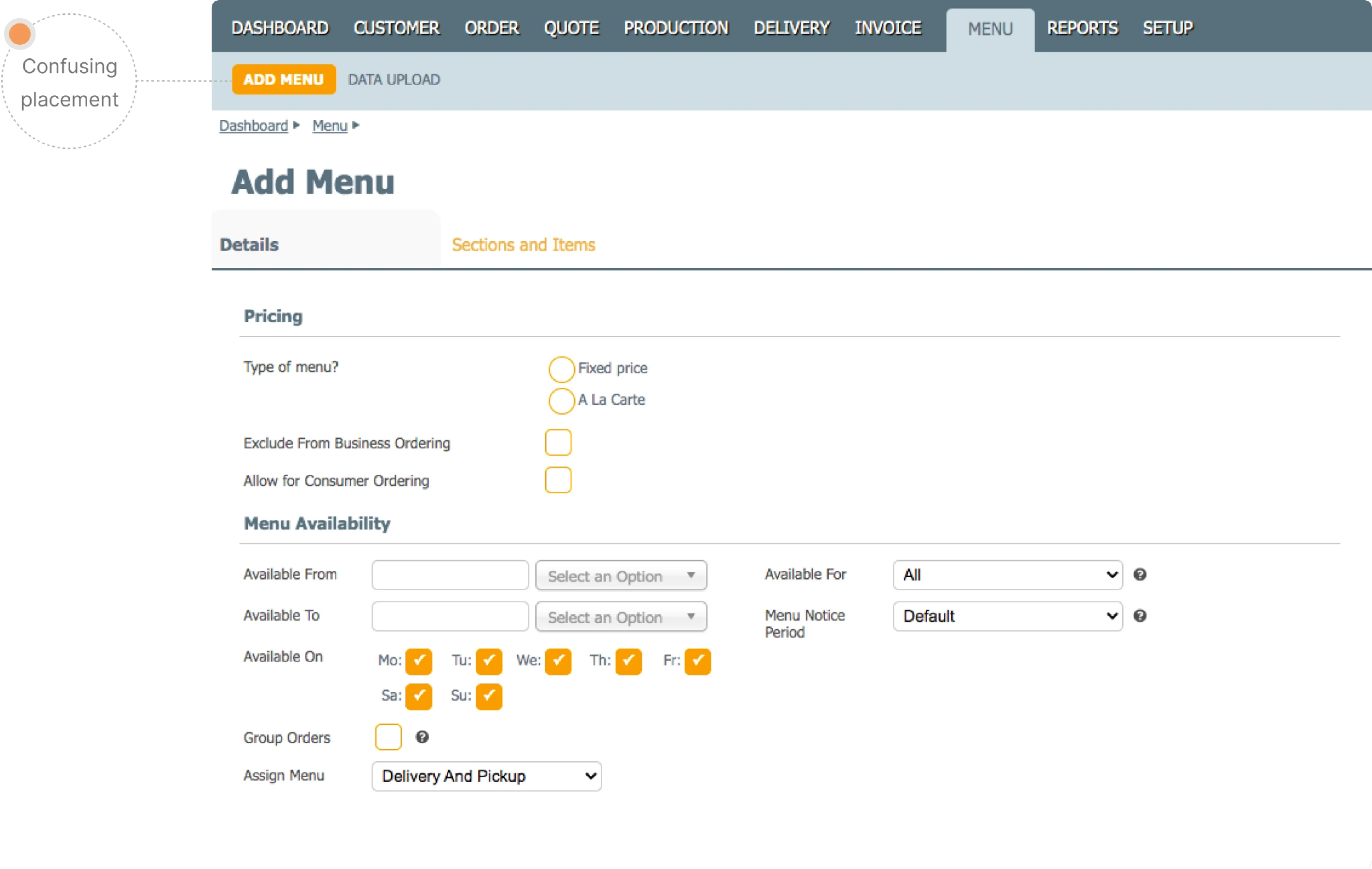
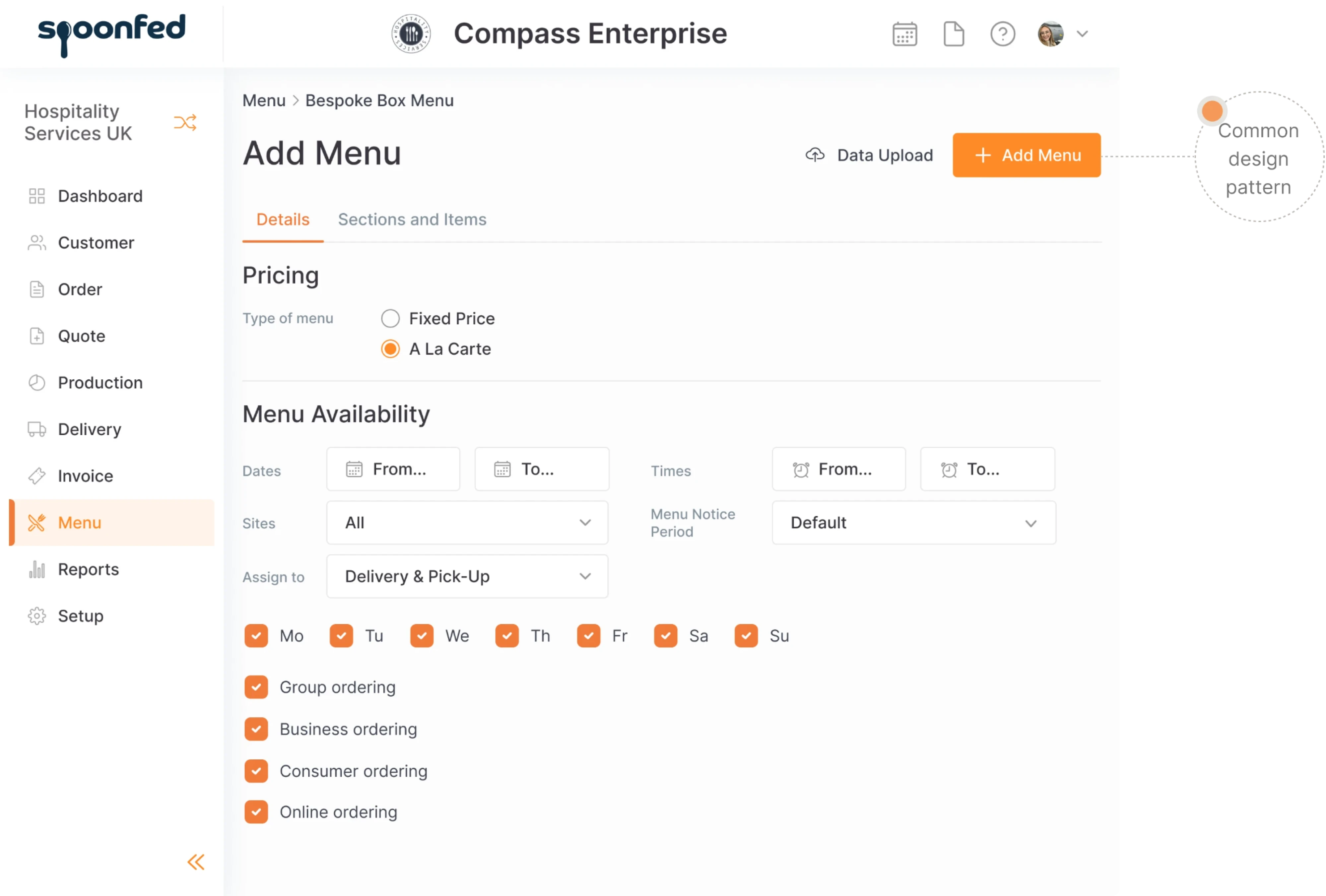
Spoonfed, for example, took a dual-track approach when they faced a full product redesign. Instead of going all-in on a months-long rebuild, Eleken’s designers ran parallel small changes that improved usability immediately while testing core ideas like navigation structure and layout with real users. What the team learned shaped the bigger redesign before the expensive engineering work began.
After launch, research shifts again. Now you have real usage data, support tickets, and drop-off rates. The question left is where your product breaks in practice and why. This is where analytics and qualitative research complement each other. Numbers tell you what is happening. Talking to users tells you why.
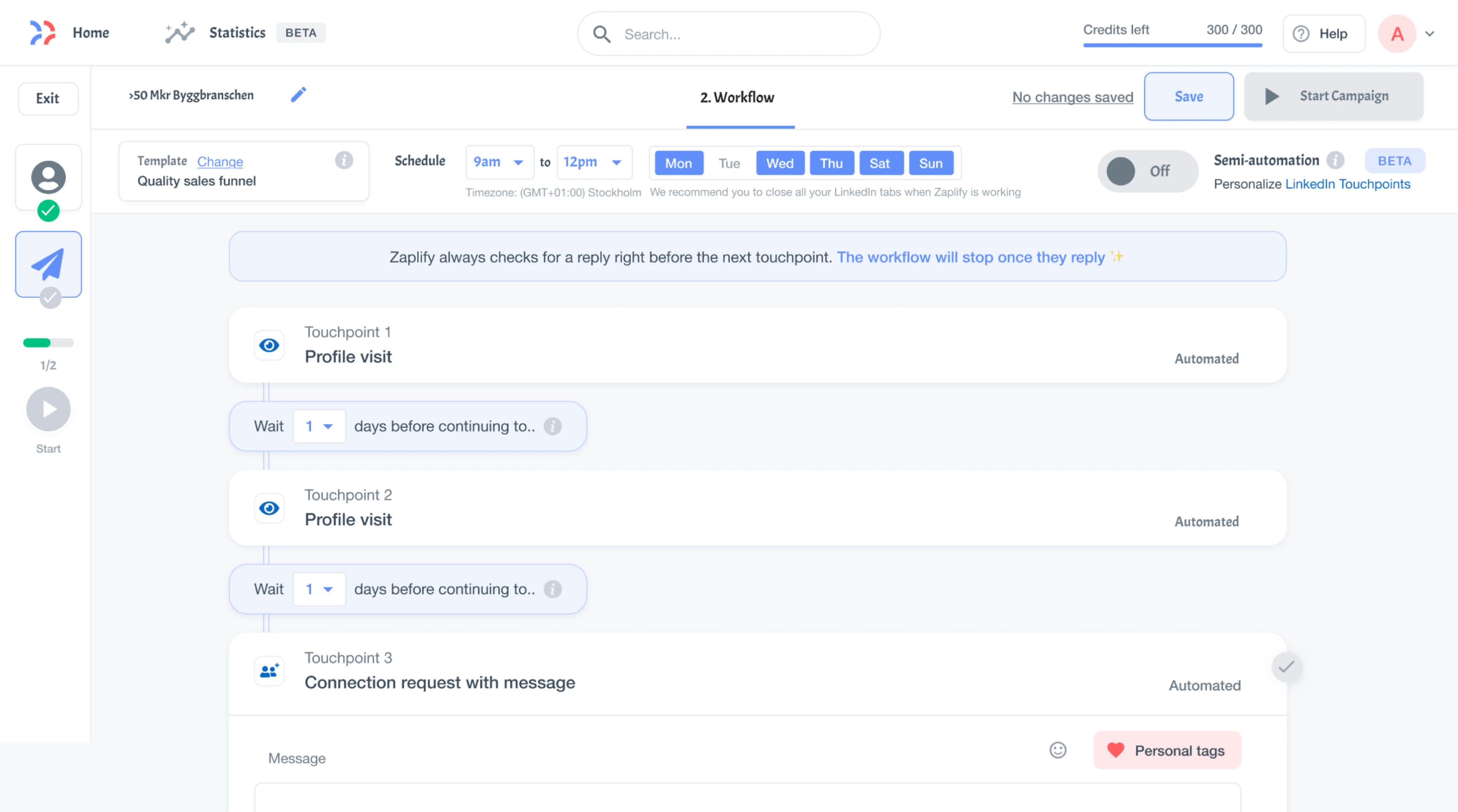
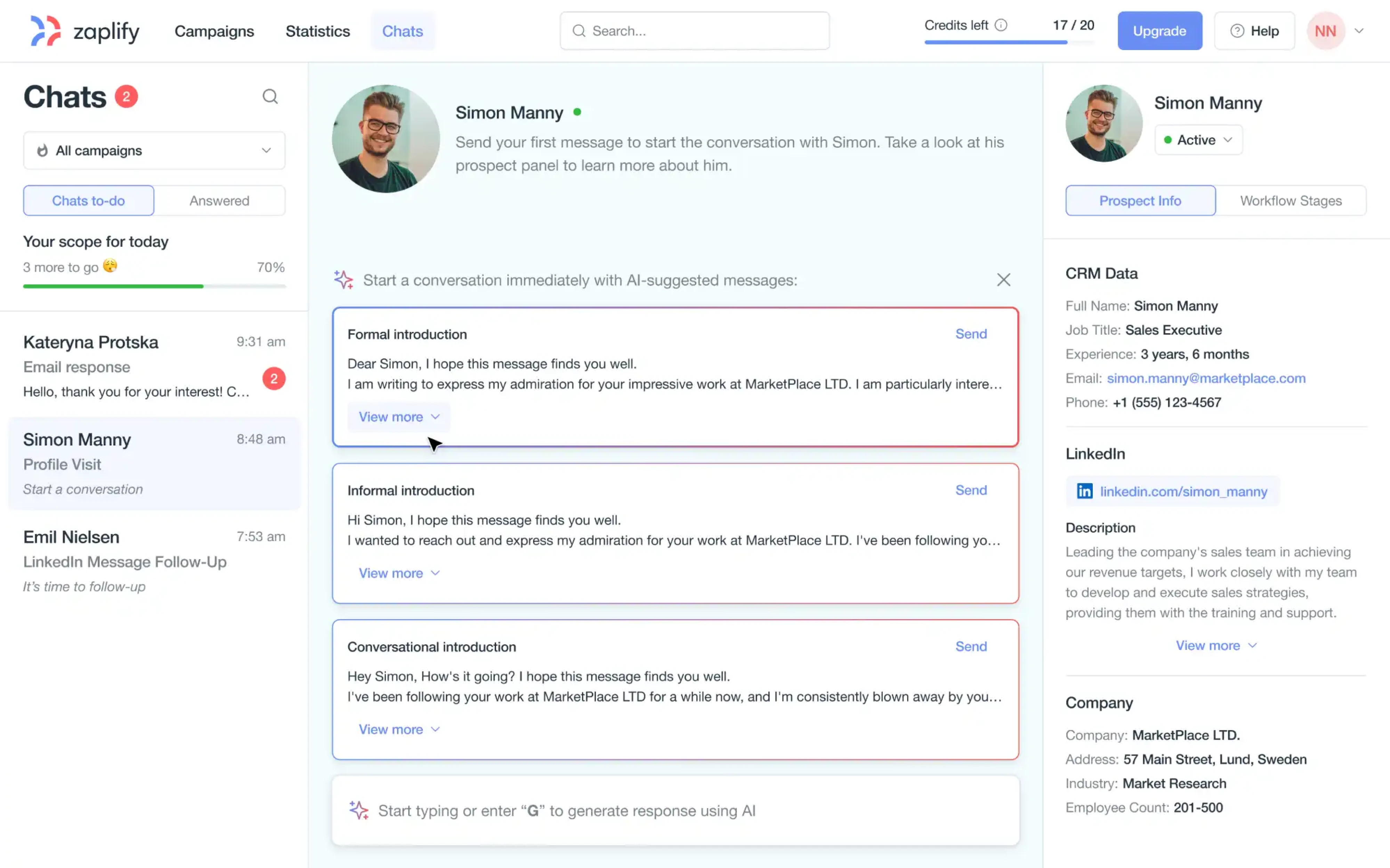
The important thing is that none of these are one-time events. Zaplify started their partnership with Eleken by asking a simple question — can we understand our users better than anyone else? That led to successive rounds of research and redesign that pushed activation from 20–25% up to roughly 40%. We didn’t conduct a one big study, but did multiple short rounds, each one building on what the last one revealed.
Based on our experience, we advise running design at least one sprint ahead of development. When designers work on the next sprint while developers build the current one, there’s built-in breathing room for research to happen. Without that gap, research gets squeezed out every time something urgent comes up.
UX research methods startups can use
There are dozens of UX research methods out there (we’ve covered 14 essential ones in a separate guide). But most startups need just a few methods they can run quickly with the people and resources they already have.
Here are the four that earn their place in almost every early-stage research process.
Stakeholder interviews
Stakeholder interviews are conversations with the people who have a stake in your product — founders, engineers, marketers, support leads. The goal is to surface the things that will shape or block your work: business constraints, success criteria, competing priorities, and assumptions the team treats as facts but hasn’t tested.
In startups, where decisions happen fast, and context lives in people’s heads, skipping this step almost guarantees misalignment later.
User interviews
This is the core research method. You sit down with real or potential users and ask them about their behavior. During interviews, ask respondents how they handled a specific task last time, where they got stuck, what workaround they used. Past behavior is a far more reliable predictor than stated preferences.
For more on structuring these conversations, see our guide to UX research interview questions.
Competitive research
Competitive research maps who else is solving the same problem, how they’re doing it, and where the gaps are. This can range from a structured audit of competitor features and positioning to something more hands-on like running usability tests on a competitor’s product with your target users.
You’re looking for two things: what the market already expects as a baseline, and where existing solutions fall short enough to create a real opening.
Support ticket mining
Support tickets are the cheapest UX research you’re already sitting on. Every ticket is a user describing a real problem in their own words, unprompted, while the frustration is fresh. Customer support staff hear these patterns daily, and they’re often the most direct source of real user pain points.
For this research method, the key is to read tickets not as operational issues to close but as behavioral signals to learn from.
How to run a research round
Running a research round sounds heavier than it is. At its core, it covers six steps, and the whole thing can fit inside one to two sprints if the scope is focused. Let’s break down the UX research process.
Plan the round
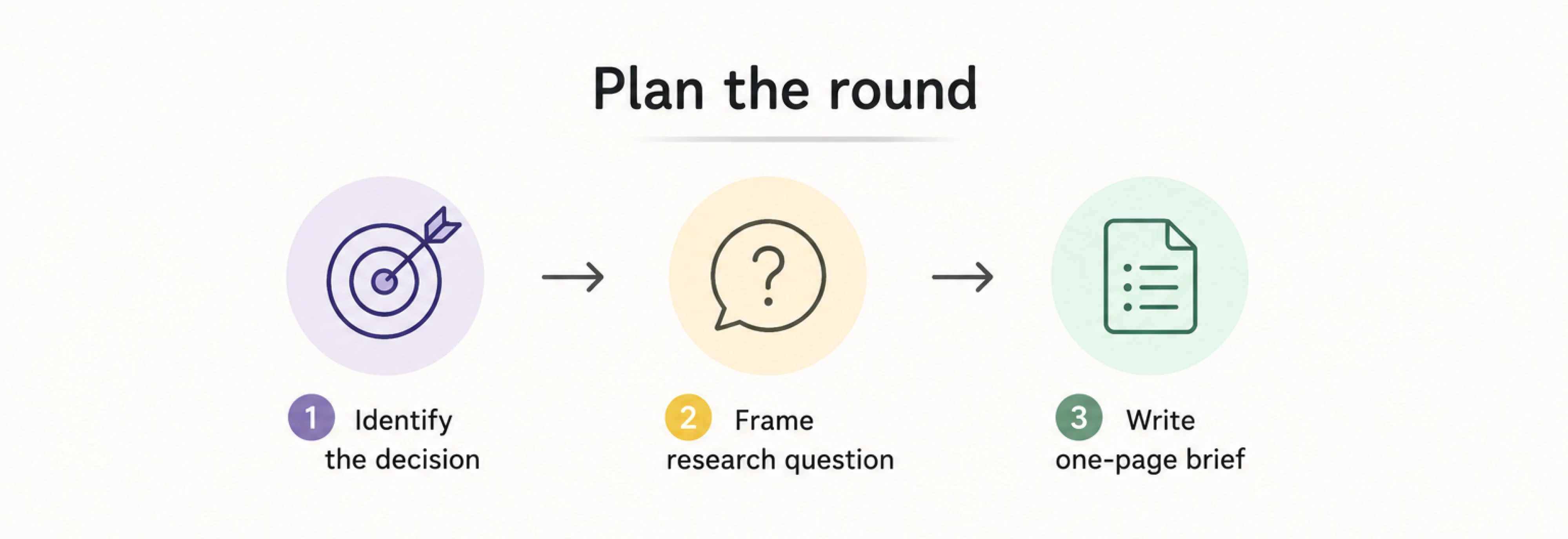
Start by identifying the specific decision your team needs to make next and work backward from there. Are you choosing between two navigation models? Deciding whether to simplify onboarding or add more guidance? The questions you ask, the people you recruit, and how you’ll know when you have enough shape everything.
Once the decision is clear, frame your research question. Good research questions describe observable behavior. “Is this design good?” gives you opinions. “Where do people get stuck trying to complete their order?” gives you something you can fix.
From there, write a one-page research brief. It could be a shared doc with five fields:
- the goal (what decision this supports),
- the research question,
- the method you’ll use,
- who you need to talk to,
- the timeline.
If you want a ready-made starting point, we’ve put together a UX research plan template that covers each field in detail.
Design your usability test
Usability testing means watching real people try to complete tasks in your product or prototype. You walk them through the design and observe what happens.
The tasks you write also determine who should take them. If you’re testing a first-run onboarding flow, you need people who’ve never seen the product. If you’re evaluating a feature used by power users, recruiting beginners will give you misleading results. Define who the test is for before you start looking for participants. It saves time and makes your findings far more reliable.
You don’t need many participants to get useful results. Nielsen Norman Group’s research shows that five to eight users per round surface around 85% of usability issues. That’s enough to spot the patterns. Beyond that, you start hearing the same problems repeated.
What matters more than headcount is knowing what to measure. At this stage, four metrics cover most of what you need:
- task success rate (did they finish?)
- time on task (how long did it take?)
- error rate (where did they go wrong?)
- satisfaction (how did it feel?).
When testing, pick usability metrics that connect to your research question. If you’re testing whether a new checkout flow is clearer than the old one, task success and error rate will tell you more than satisfaction scores.
Recruit participants
By this time, you know what you’re testing and who should test it. Now, you need to find those people.
Start with the people closest to your product. Your existing user base is the most obvious pool. They already use the product, they have real context, and most are more willing to help than you’d expect. A short email explaining that you’re improving the product and would like 30 minutes of their time works surprisingly well.

Your support team is another underused channel. Not for ticket analysis (we covered that earlier), but for connecting you with the right people. Support staff talks to users with specific problems every day. If you’re testing a new reporting feature, they can point you to the five users who complained about the old one last month.
If you don’t have an existing user base yet (which is common for pre-launch startups), look where your target users already gather. Industry subreddits, Slack communities, LinkedIn groups, and niche forums are all fair game. The key is to be active in the community and gather valuable responses.
Before anyone joins a session, run them through a five- to ten-question survey that filters for the criteria your test requires. Tools like Google Forms or Typeform work fine for this. The screener should confirm that participants match your target profile without revealing what you’re testing or what answers you’re looking for.
Finally, budget for incentives. A $20–30 gift card, a free month of your product, or early access to a new feature is usually enough. This way, you respect people’s time and keep your no-show rate low. For B2B products where participants are senior professionals, you may need to go higher, but for most startup-stage testing, modest incentives get the job done.
Run the session without leading users
The hardest part of running a usability session is staying quiet. Every instinct tells you to help when someone hesitates, to explain when they look confused, to point them toward the button they’re missing. Doing any of that destroys the data.
The best way to get useful data is to ask participants to narrate aloud what they’re doing and why as they move through the interface. A simple warm-up helps here. Before the first task, ask them to describe how many windows are in their home. It sounds trivial, but it gets people comfortable verbalizing their thought process.
Once they’re warmed up, hand them the first task and step back.
When they go silent, wait. Silence feels uncomfortable, but it usually means the person is confused, reading carefully, or deciding between options. Give it fifteen to twenty seconds before prompting. When you do prompt, keep it neutral, like “What are you thinking right now?”
The same principle applies to probing. When something goes wrong, ask “What did you expect to happen there?”
During the session, keep roles clear. One person runs the conversation and manages the flow. A second person takes notes, tracking hesitations, backtracking, re-reading, sighs. These non-verbal signals are data too, and the facilitator can’t capture them while staying focused on the participant.
When I am doing a live session then I hope to have a good notetaker who is doing what I would be doing myself (recording what happens, not a translation to what they think it means). If not, I basically have to watch all the videos and do what I just described after the fact if the interview is not rigidly structured. This is why I prefer conducting sessions remotely, honestly.
Every session in the UX research process should be recorded. Screen capture plus audio is the minimum. Video of the participant’s face is optional, but facial reactions during key moments are far more persuasive in stakeholder playbacks than any written summary. Most remote testing setups handle both automatically.
Once a task is complete, ask two or three follow-up questions immediately, while the experience is still fresh. “What was the hardest part of that?” or “Was there a point where you weren’t sure what to do next?” surface deeper insights by capturing reactions before the participant starts smoothing over what happened.
Turn findings into decisions
A finished research round produces a lot of raw material, including session recordings, notes, quotes, behavioral observations, and task completion data. None of it is useful until it’s organized around a question: what should we do differently?
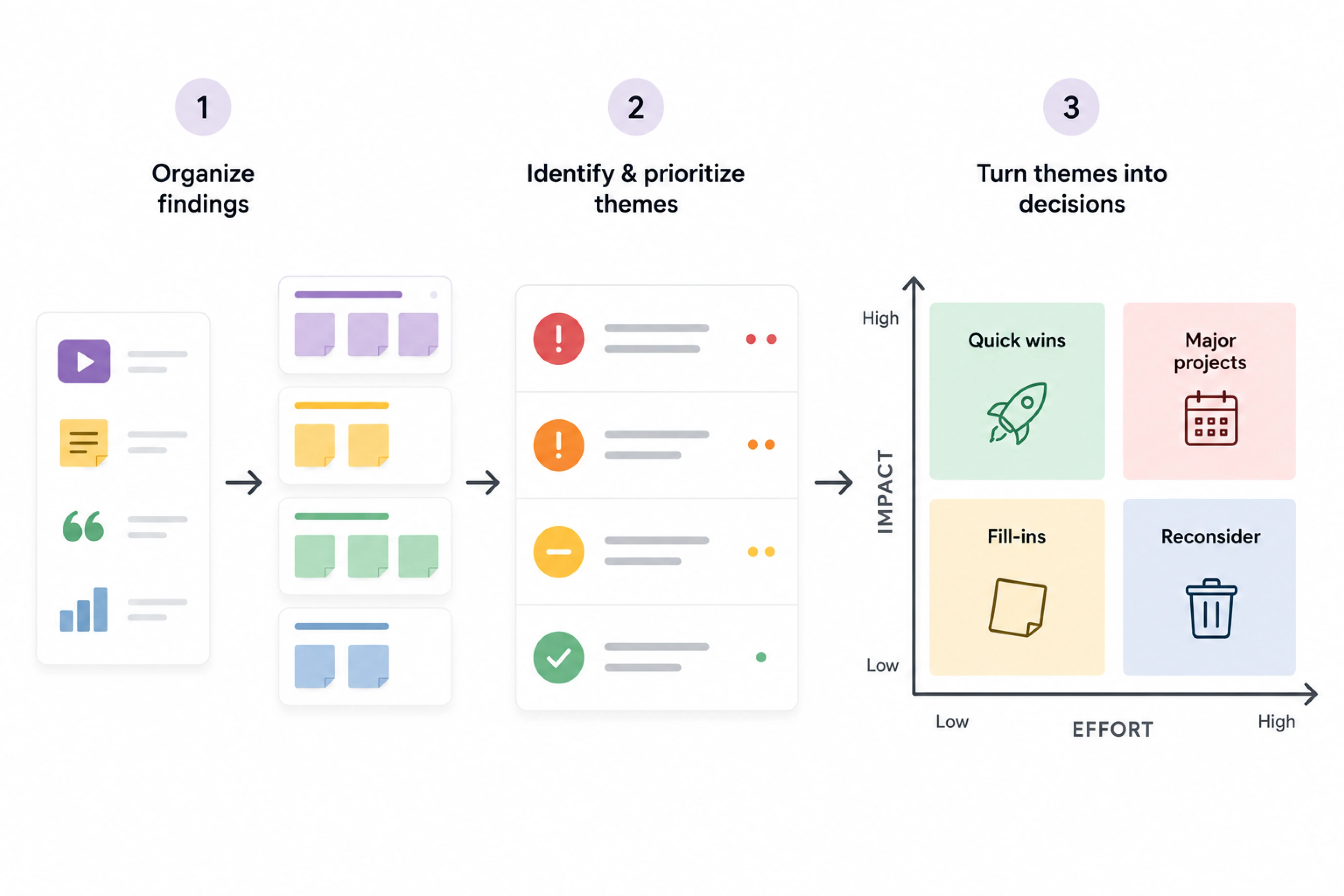
To start with, pull every observation from your notes and recordings onto individual cards and group them. You’ll see that several users struggled with the same step, multiple participants misread one label, or nobody found a new feature.
These clusters become your themes, and the themes tell you where the real problems are.
Then, prioritize themes. Put critical problems that block task completion first, and cosmetic issues that don’t affect behavior last.
Then layer in effort. A high-severity issue with a simple fix ships this sprint. A high-severity issue that requires rearchitecting a flow goes on the roadmap with a clear timeline. An impact-versus-effort matrix makes this visible to the whole team and keeps the conversation grounded in evidence.
The last step is sharing what you found. A simple Google Doc with themes, priorities, and recommended next steps works fine for most teams. But if you need to convince stakeholders who weren’t in the room, consider short video clips from your sessions.
There’s a common fact that people recall visual information significantly better than text alone. Even a two-minute highlight reel or an annotated screen recording of a problem area can do more than a detailed written report.
AI UX research platforms for startups like ChatGPT or Claude can organize session notes into themes, draft summaries, and identify patterns across transcripts. It won’t replace your judgment on what matters most, but it can cut the time.
What to do after your first research round
The first round is the hardest. Once it’s done, resist the urge to check “research” off the list and move on. One round gives you a snapshot, while repeated rounds give you a feedback loop, and that loop is where the product improvements come from.
You don’t need a heavy process to keep that cycle going. One round per sprint or a monthly check-in where the team picks one open question and runs a quick test is enough. The point is to keep research running as a steady signal throughout your development process.
Sometimes a full research round isn’t the right next step. If the product has grown complex and users are struggling, a focused UX audit can surface the friction points.
That’s what happened with BookPeep. As the platform added more features, navigation and basic flows started breaking down for users. Eleken’s team ran a UX audit, identified the highest-impact issues, and fixed them through targeted changes. The result was a meaningfully better experience without months of rebuilding.
Budget-friendly UX research tools
To run solid research, you don’t need to read every list of UX research platforms compared for startups to find the right setup. Most of the tools below have free tiers that cover everything an early-stage team needs. The right combination depends on your method, team size, and how often you’re running sessions.
Recruiting and screening
These tools handle participant recruitment and screening so you’re not spending session time on the wrong people.
~$30–60/session, free tier for own panel
The largest independent recruiting panel with over 4 million participants. You set screening criteria, and qualified people apply within hours.
$12/month (Individual), $82/per seat/per month (Pro)
Intercepts and recruits participants directly from your live product or website in real time. Useful when you want to catch people mid-experience.
Free
Handles basic screener surveys. Enough for most early-stage teams recruiting from their own user base.
14-day free trial, $28/mo (Basic), $56/mo (Plus), $91/mo (Business), $266/mo (Growth Flow)
Same job as Google Forms but with a more polished experience that tends to get higher completion rates.
Calls and moderation
The following tools handle live video sessions, screen sharing, and in some cases real-time observation by your team.
Free (Basic), $16.99/mo (Pro), $21.99/mo (Business), Custom (Enterprise)
The default for most remote research. Free plan covers 40 minutes per meeting with 100 participant seats, which is enough for a single session.
Free
Works well if your team is already on Google Workspace. Participants don’t need to install the app.
5 free sessions, $299/year (Freelance), $1,782/year (Team), $4,122/year (Insights Hub)
Participants share their screen and face simultaneously, while observers can watch live and leave timestamped notes without joining the call.
Prototyping
Clickable prototypes let you test interactions with users before writing any code, and these tools make them easy to build.
Starter (Free), $16/mo (Professional), $55/mo (Organization), $90/mo (Enterprise)
The most widely used design and prototyping tool right now. Free tier covers unlimited drafts, UI kits and templates, and 150 AI credits/day.
€13/mo (Standard), €22/mo (Professional), €44/mo (Enterprise)
A solid prototyping tool if your team already uses it. Before installing, note that it’s available only for macOS.
Recording and task testing
These capture what users do through session recordings, heatmaps, or unmoderated tasks where participants complete scenarios on their own.
Free plan, $99/mo (Starter), custom pricing (Enterprise)
The go-to for unmoderated prototype testing. Upload a Figma prototype, write task prompts, and get a usability report with heatmaps and misclick data.
Free plan, $49/mo (Growth), custom pricing (Pro and Enterprise)
The tool lets you create session recordings and heatmaps for live products, showing how real users move through your pages.
Custom pricing
Enterprise-grade platform with a large participant panel and video-based moderated and unmoderated studies.
Transcription
The next platforms are good examples of affordable UX research automation for startups so you can skip hours of manual note review.
Free (Basic), $16.99/mo (Pro), $24/mo (Business)
Real-time transcription with AI-generated summaries. The platform integrates smoothly with Zoom and Google Meet.
Free 45-minute transcript, $0.25 per audio minute
Fast automated transcription at a low per-minute rate. Good for batch processing.
Free plan, $29.99/mo (Essentials), $59.99/mo (Pro)
The tool offers higher accuracy with human-assisted transcription. Worth the premium for sessions with heavy jargon or multiple speakers.
Notes and synthesis
Once sessions are done, these tools help you organize observations, run affinity mapping, and spot patterns across interviews.
Free plan, $10/mo (Starter), $25/mo (Business), custom (Enterprise)
Infinite canvas for affinity mapping, sticky notes, and collaborative analysis. The most common choice for visual synthesis.
Free plan, $16/mo (Professional), $55/mo (Organization), $90/mo (Enterprise)
Figma’s whiteboard tool. Lighter than Miro but handles affinity mapping well, especially if your team already lives in Figma.
Free plan for individuals, Enterprise plan for custom pricing
A dedicated research repository with AI-assisted tagging, theme detection, and searchable storage for past studies.
Free plan, $12/mo (Plus), $24/mo (Business), custom (Enterprise)
Works well as a lightweight research hub where the team can access findings, briefs, and session notes in one place.
Reporting
These make it easy to share findings with your team and stakeholders without turning it into a production.
Free
Simple and accessible tool for reporting. A shared doc with themes, priorities, and next steps is often all you need.
Free (Starter), $18/mo (Business), $24/mo (Business+AI), custom (Enterprise)
Record a short video walkthrough of your findings instead of writing a report. Faster to make, easier to watch.
Quick recap
UX research comes down to the habit of checking your assumptions before they become expensive. You don’t need a big team, a dedicated budget, or months of preparation. The best UX research for startups starts with a focused question, a few real users, and the willingness to hear something you didn’t expect.
The methods and tools in this guide are a starting point. Start small, run one round, and let what you learn shape the next one. The more you do it, the faster it gets and the more natural it feels as part of how your team builds product.
If you’d rather not figure it all out alone, Eleken works with startups as a hands-on partner. We’ve helped SaaS teams turn research insights into measurable improvements without slowing down their roadmap. Contact us to make that happen.


.webp)

.png)
.png)


.png)


