When people search for UX design ideas, they usually end up looking at beautiful interfaces.
But the most impactful UX ideas aren't necessarily visible.
Skip Intro button. Verification code autofill. Pull-to-refresh. Autosave.
None of these features are visually impressive. Yet millions of people rely on them every day because they solve small, recurring frustrations.
That's what great UX/UI design ideas have in common. They don't exist to make products look better—they exist to make them easier to use.
At Eleken UI/UX design agency, we've found that the best ideas rarely come from browsing design galleries. They come from studying where users hesitate, make mistakes, abandon tasks, or repeatedly ask for help. Once you identify the friction, the design solution often becomes obvious.
In this guide, you'll find 15 UI/UX powerapps design ideasUX design ideas organized by the problems they solve—from reducing repetitive work and improving onboarding to preventing mistakes and making products feel smarter. More importantly, you'll learn how to spot these opportunities in your own product instead of simply copying someone else's interface.
15 UX design ideas that reduce friction
The best UI/UX design ideas don't add more features—they remove unnecessary effort.
Whether it's eliminating repetitive actions or helping users complete tasks faster, these patterns have become standard because they solve problems people encounter every day.
1. Skip repetitive actions
Example: Netflix's Skip Intro
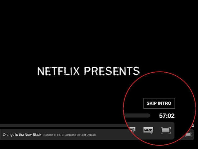
If users perform the same action repeatedly, consider automating or shortening it.
The Skip Intro button saves only a few seconds, but over hundreds of viewing sessions, it dramatically improves the experience.
Lesson: Remove recurring friction, not just one-time friction.
2. Auto-fill known information
Examples: Google Forms, Shopify
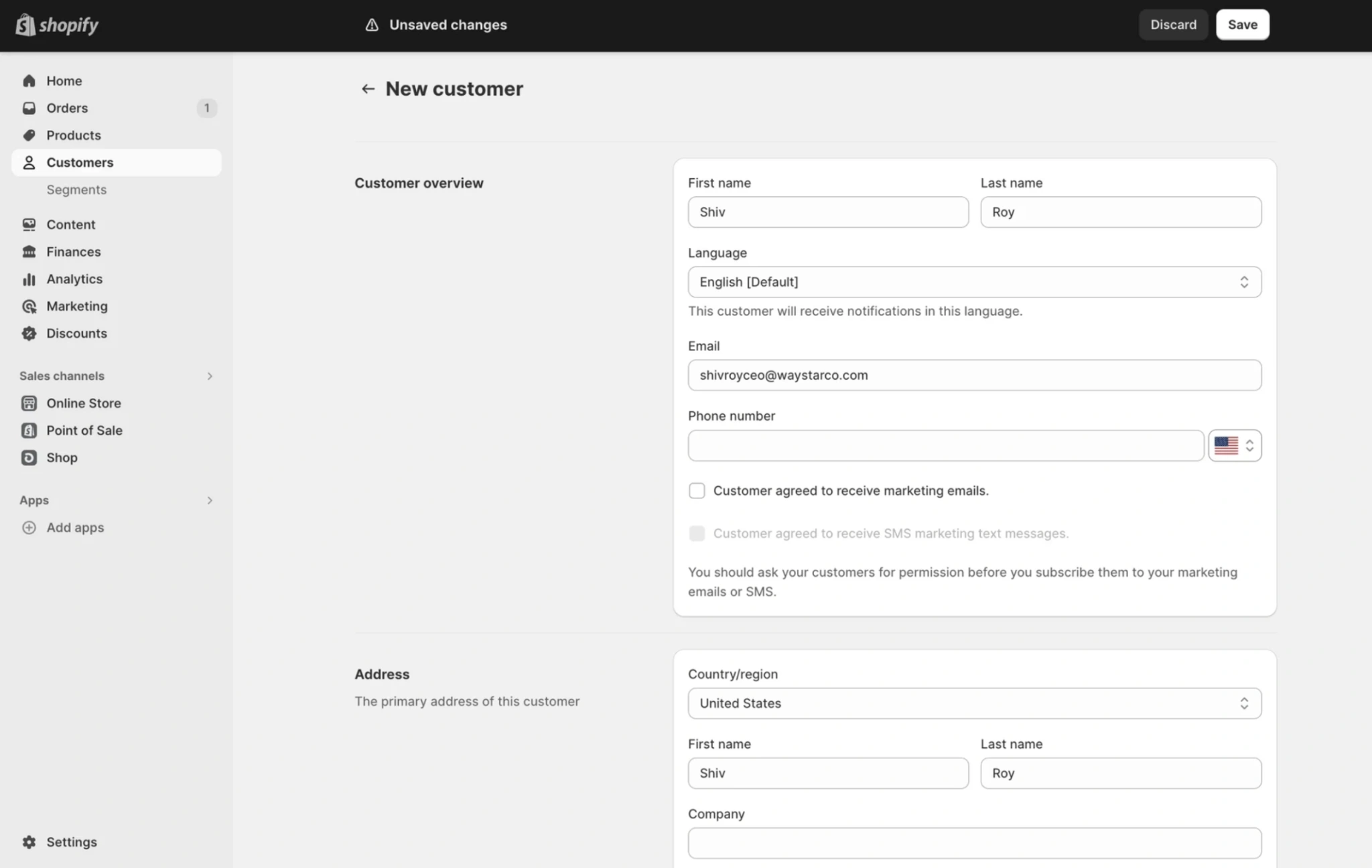
Whenever the system already knows something, users shouldn't have to enter it again.
Addresses, payment details, email addresses, and verification codes are all opportunities to reduce typing and speed up completion.
Lesson: Don't ask users for information they already provided.
3. Remember user preferences
Examples: Spotify, YouTube
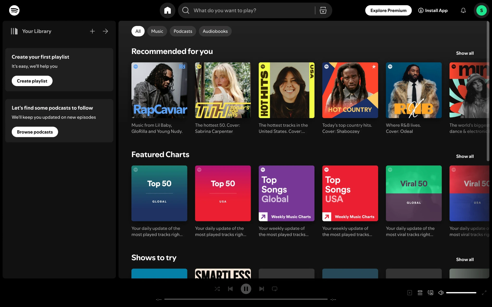
People appreciate products that remember how they like to work.
Whether it's playback speed, dark mode, language settings, or preferred filters, preserving user preferences reduces repetitive setup and creates a more personal experience.
Lesson: Good UX has a memory.
4. Save progress automatically
Examples: Google Docs, Notion
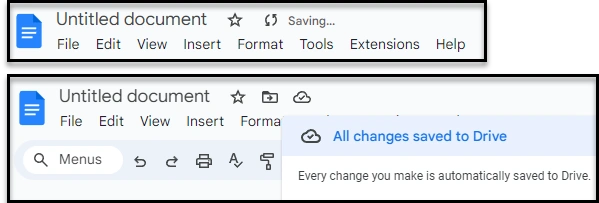
Few things are more frustrating than losing work because of a crash or accidental refresh.
Autosave gives users confidence to focus on their work instead of worrying about when to press Save.
Lesson: Protect users from avoidable mistakes.
5. Offer one-click actions
Example: Amazon Buy Now
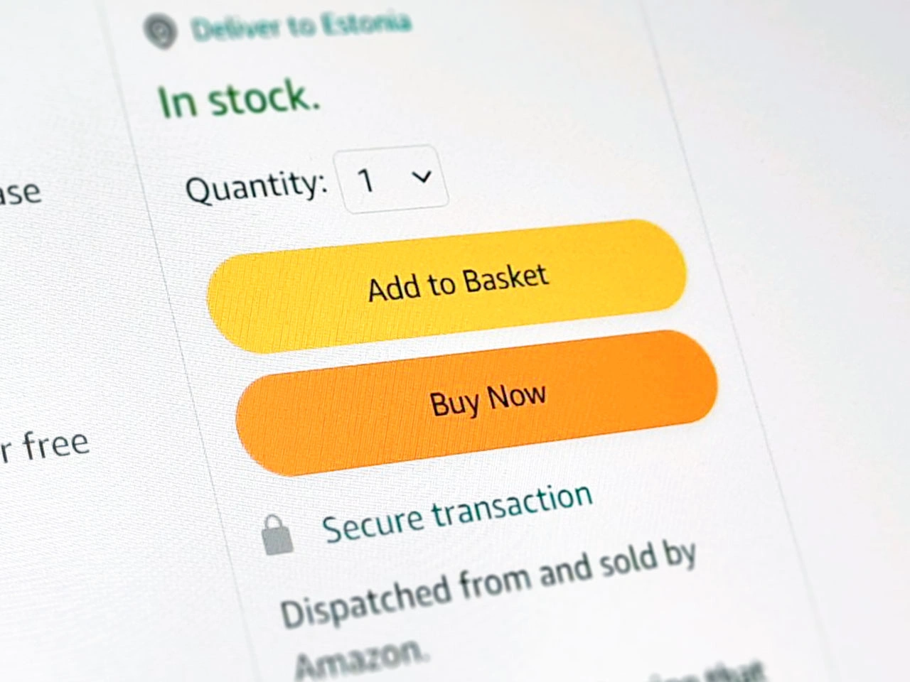
Every extra click introduces another opportunity for hesitation or abandonment.
One-click actions simplify common tasks by removing unnecessary steps for users who already know what they want to do.
Lesson: Reduce decisions for frequent actions.
6. Use smart defaults
Most users never change default settings.
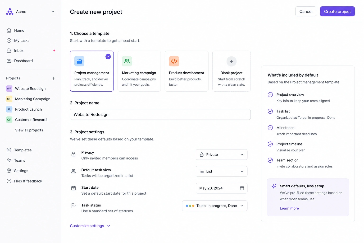
Instead of presenting a blank slate, choose sensible defaults based on common behavior while still allowing customization when needed.
Lesson: A good default is often the fastest path.
7. Surface recently viewed items
Many users revisit the same pages, documents, or products multiple times.
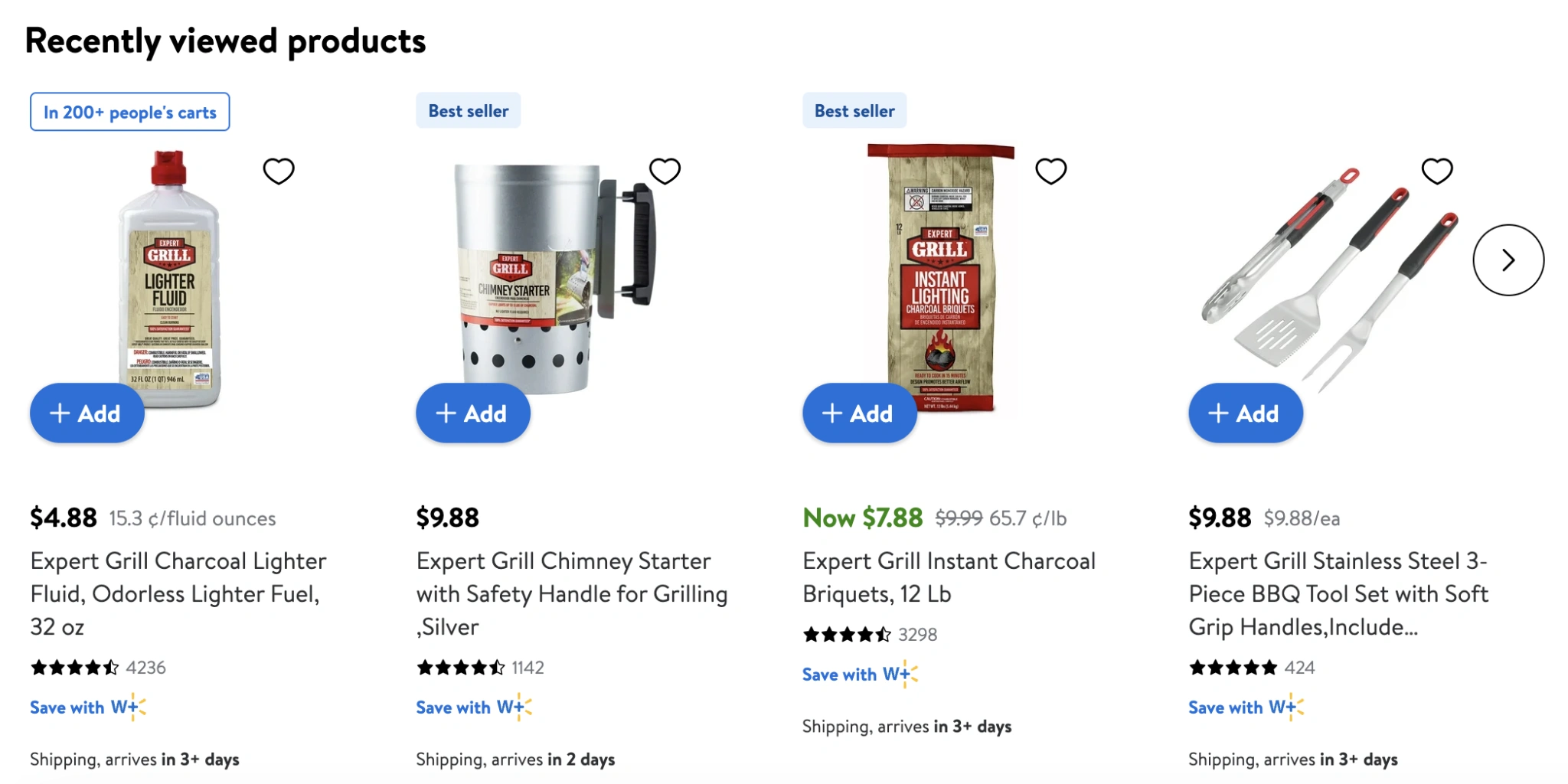
Showing recent activity saves navigation time and helps people resume their work without searching again.
Lesson: Make returning easier than starting over.
8. Keep primary actions visible
Example: Airbnb's sticky booking panel
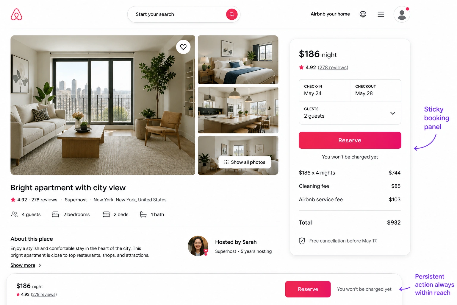
If users repeatedly need the same action, don't make them scroll back to find it.
Persistent buttons, floating action bars, and sticky side panels keep important actions within reach throughout the experience.
Lesson: Reduce navigation, not just clicks.
9. Enable inline editing
Instead of forcing users into separate edit screens, let them modify information directly where it appears.
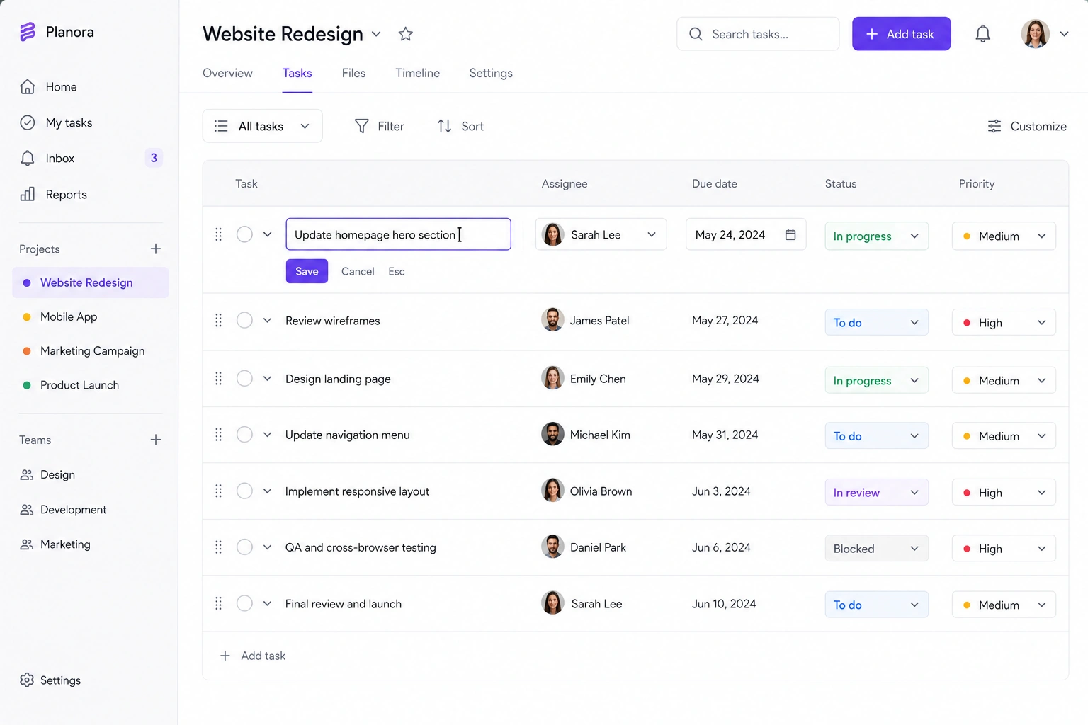
Inline editing makes interfaces feel faster and keeps users in context.
Lesson: Editing shouldn't interrupt the workflow.
10. Support keyboard shortcuts
Power users value efficiency over visual polish.

Shortcuts for common actions help experienced users complete repetitive tasks much faster than navigating menus.
Lesson: Great UX serves both beginners and experts.
11. Add a command palette
Examples: Notion, Linear

Command palettes let users search for pages, actions, settings, and commands from one place.
Instead of remembering where features live, users simply describe what they want to do.
Lesson: Navigation becomes easier when users think in actions instead of menus.
12. Make workflows draggable
Drag-and-drop interactions feel more natural than repeatedly clicking buttons to reorder lists, upload files, or organize content.
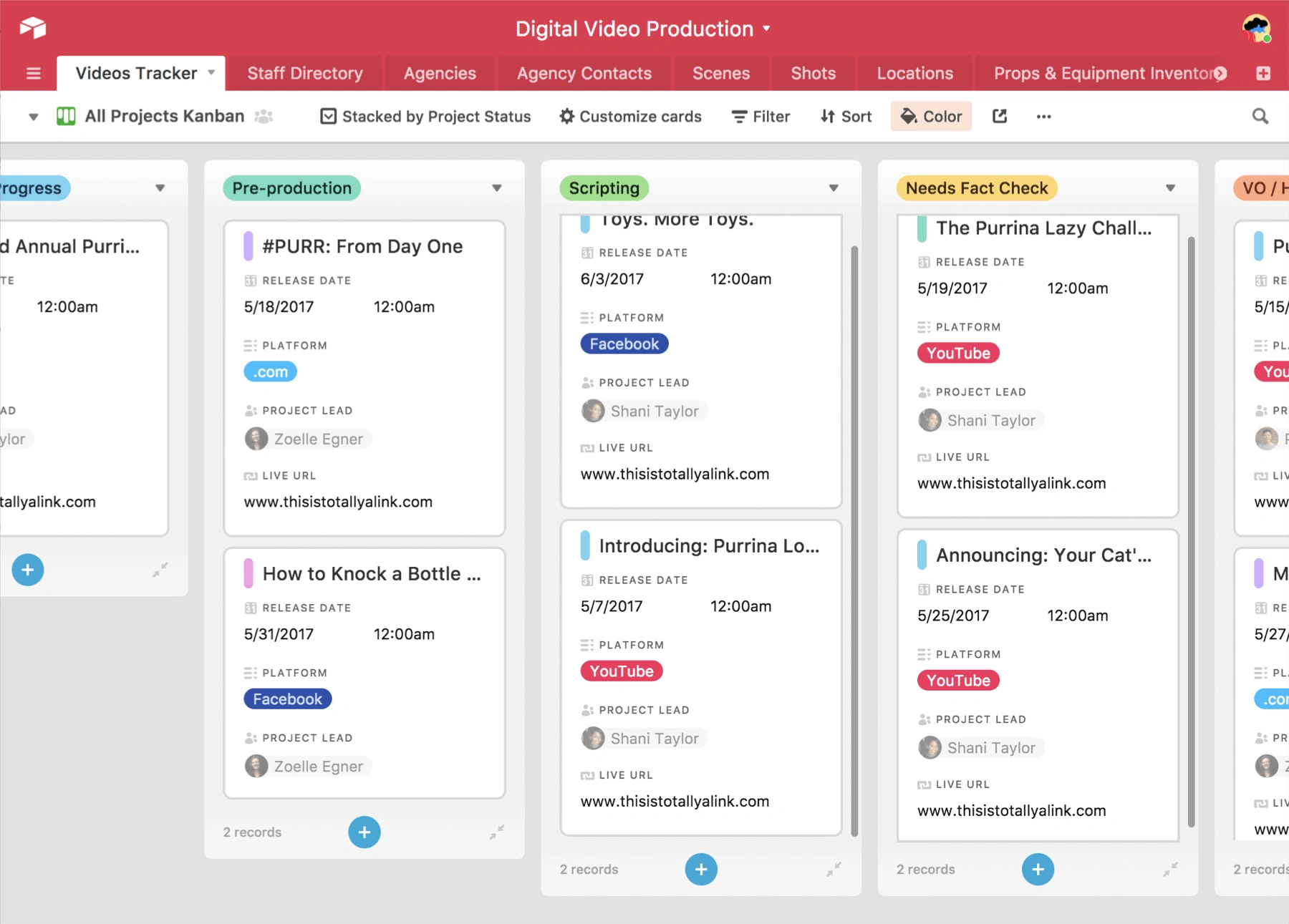
As long as visual feedback is clear, direct manipulation often reduces cognitive effort.
Lesson: Let users interact with objects instead of controls.
13. Make duplication effortless
Users frequently create new items that closely resemble existing ones.
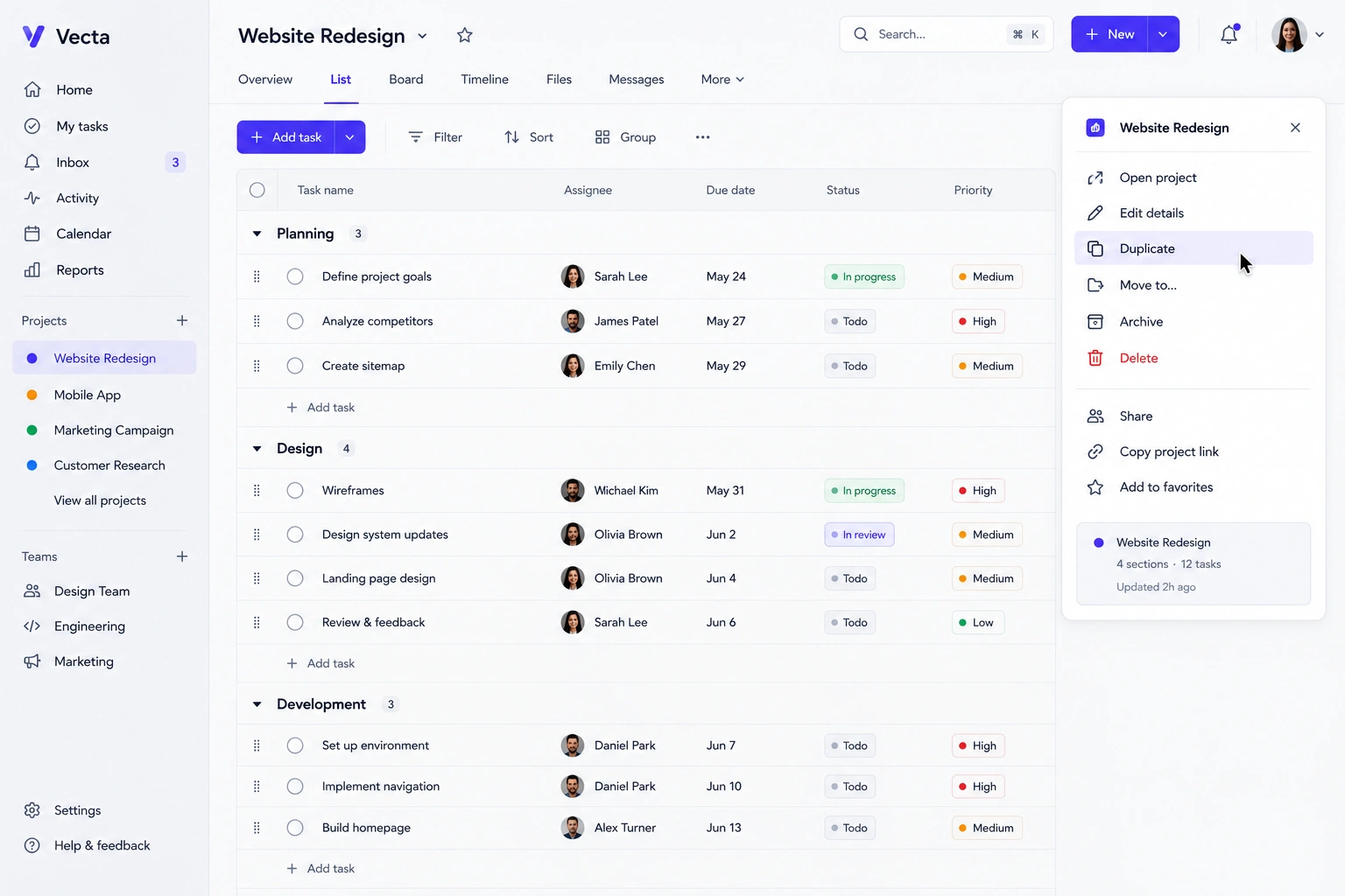
A Duplicate action is often much faster than starting from scratch, whether they're creating dashboards, projects, forms, or templates.
Lesson: Reuse is usually more valuable than recreation.
14. Recommend the next step
Rather than waiting for users to decide what to do next, suggest logical actions based on context.
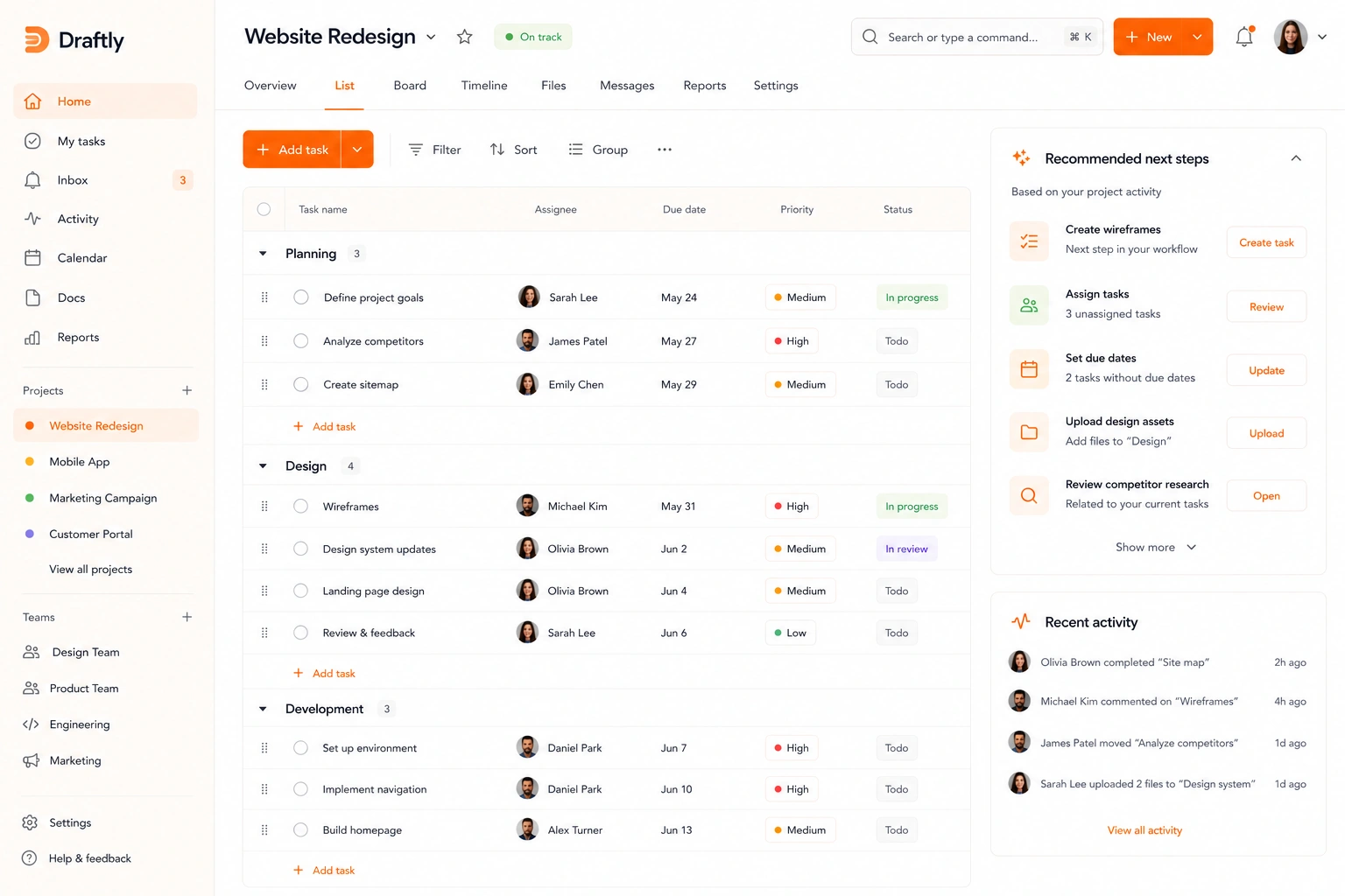
Recommendations can guide users toward unfinished tasks, related content, or commonly used workflows.
Lesson: Reduce decision fatigue whenever possible.
15. Use predictive search
Modern search shouldn't wait until users finish typing.
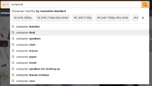
Autocomplete, recent searches, and relevant suggestions help people find what they're looking for faster while reducing typing effort.
Lesson: The best search experiences anticipate intent instead of simply matching keywords.
These patterns may seem small on their own, but together they create products that feel faster, smoother, and easier to use. And that's often what users remember most.
Here's a version that feels less like a gallery and more like an analysis of why these products are frequently referenced in UX discussions.
Real UX design examples from leading products
The best UX ideas don't come from copying screens—they come from understanding the problem each design solves.
These products are frequently referenced because they introduced patterns that millions of users now expect across digital experiences.
Netflix: Skip repetitive friction
UX idea: Skip Intro
Netflix recognized that returning viewers didn't need to watch the same opening sequence every episode. A single button removed a repetitive task that users had quietly accepted for years.
Lesson: If users repeat the same action often enough, automate it.
Amazon: Reduce decisions
UX idea: One-click purchase
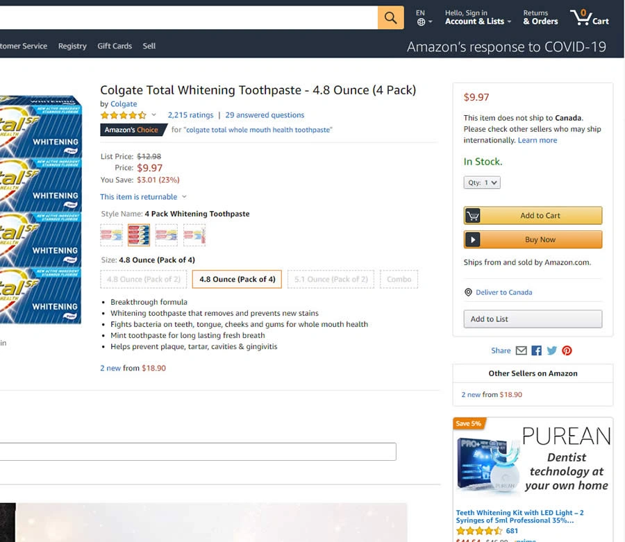
Amazon's Buy Now button dramatically shortens the checkout process for returning customers.
Instead of forcing users through multiple confirmation screens, it removes unnecessary decisions when intent is already clear.
Lesson: The shortest path is often the best experience.
Airbnb: Keep the goal within reach
UX idea: Sticky booking panel
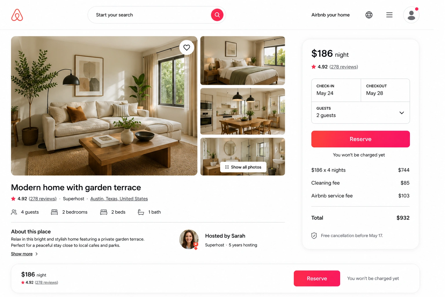
As users scroll through photos, reviews, and amenities, Airbnb keeps the booking widget visible.
This removes the need to repeatedly scroll back to the top whenever someone is ready to reserve a stay.
Lesson: Keep primary actions accessible throughout long workflows.
Apple: Make setup feel effortless
UX idea: Ecosystem onboarding
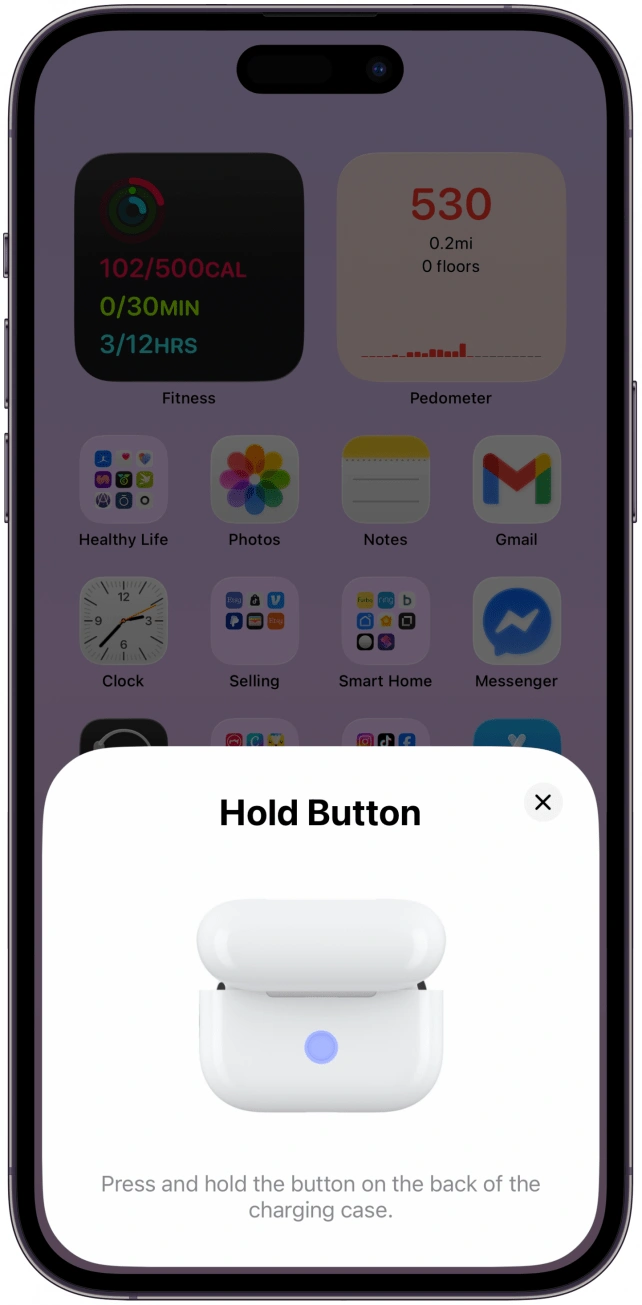
Connecting AirPods, setting up a new iPhone, or transferring data between Apple devices requires very little manual configuration.
Instead of overwhelming users with setup screens, Apple automates as much of the process as possible.
Lesson: The best onboarding often removes steps instead of adding guidance.
Notion: Replace navigation with intent
UX idea: Command palette
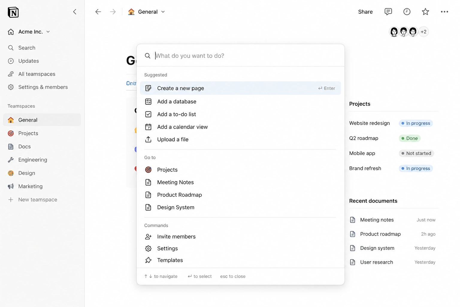
Instead of asking users to remember where features live, Notion lets them search for actions directly.
The command palette reduces navigation friction while helping power users work much faster.
Lesson: Let users describe what they want to do instead of making them hunt through menus.
Duolingo: Keep users motivated
UX idea: Continuous feedback
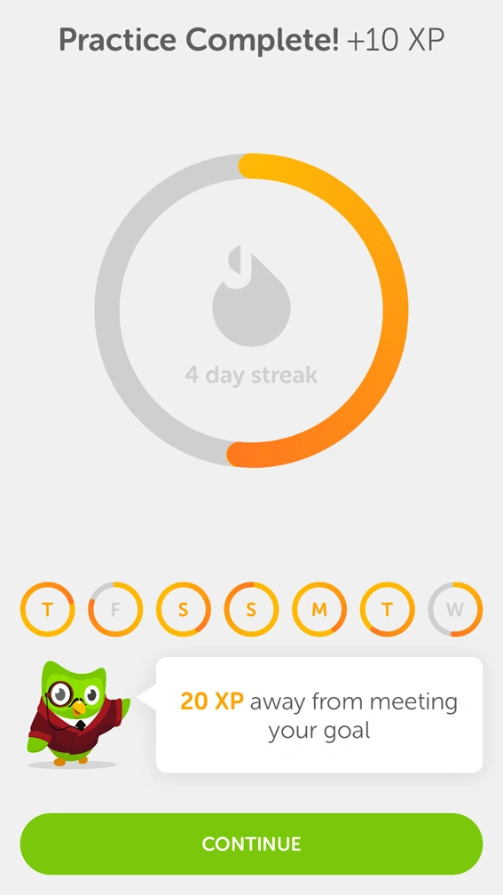
Duolingo combines progress bars, streaks, celebrations, and encouraging messages to reinforce small achievements throughout the learning experience.
Rather than waiting until the end of a lesson, it provides constant feedback that keeps users engaged.
Lesson: Good UX doesn't just help users complete tasks—it encourages them to come back and do them again.
These examples show that memorable UX ideas rarely come from decorative interfaces. They come from identifying recurring friction, reducing unnecessary effort, and making everyday interactions feel almost invisible.
Where professional designers find UX inspiration
Great UI/UX design project ideas ideas rarely appear out of nowhere.
Professional designers constantly collect references—but they don't all use the same sources for the same purpose. Some platforms are great for studying user flows, while others are better for visual inspiration or interaction patterns.
Here's where to look, and what each resource does best.
Mobbin

Best for: Real product screens and user flows
Mobbin lets you browse thousands of interfaces from popular apps, organized by features like onboarding, checkout, search, or settings.
It's one of the best places to study how established products solve common UX problems.
Use it when: You want to compare real implementation patterns, not concept designs.
Page Flows

Best for: Complete user journeys
Unlike screenshot galleries, Page Flows captures entire experiences—from signing up to completing a purchase.
Watching the whole journey makes it easier to understand how products guide users through complex tasks.
Use it when: You're designing multi-step workflows or onboarding experiences.
Pttrns
Best for: Mobile UX patterns
Pttrns organizes mobile interface examples by interaction type, making it easy to compare approaches to navigation, authentication, search, and dozens of other common patterns.
Use it when: You're designing a mobile app and want to see proven interaction patterns.
SaaSFrame

Best for: SaaS dashboards and enterprise products
If you're working on B2B software, SaaSFrame offers inspiration that's much more relevant than consumer apps.
You'll find dashboards, tables, admin panels, analytics, and workflow-heavy interfaces similar to the products many SaaS teams build.
Use it when: You're designing business software or internal tools.
Dribbble
Best for: Visual exploration
Dribbble is excellent for discovering new visual styles, illustrations, animations, and UI trends.
But remember that most shots are standalone concepts rather than tested product experiences.
Use it for: Visual inspiration—not UX validation.
Behance

Best for: Case studies and design process
Behance goes beyond individual screens by showcasing complete projects, often including research, iterations, and the reasoning behind design decisions.
Use it when: You want to understand how a design evolved, not just how it looks.
Awwwards
Best for: Marketing websites
Awwwards highlights visually impressive websites that push the boundaries of interaction and branding.
While these examples are inspiring, many prioritize creativity over usability, making them less suitable as references for SaaS products.
Use it when: You're looking for ideas for landing pages, portfolios, or brand experiences.
Remember where the best UX ideas come from
Inspiration libraries are valuable—but they're only the starting point.
As we've seen at Eleken, the strongest UX ideas usually come from watching real users struggle with a product. Support tickets, analytics, usability tests, and customer interviews reveal problems that no design gallery can.
A useful rule of thumb is:
- Dribbble teaches aesthetics.
- Mobbin teaches products.
- Your users teach UX.
The best designers use all three—but they trust users the most.
Here's a concise ending that ties back to the article's main argument—that UX ideas are discovered through user problems, not copied from galleries.
Inspiration is the starting point—not the solution
Browsing great products is one of the fastest ways to spark new UX ideas. But inspiration alone won't tell you whether a pattern will work for your users.
The best UX improvements come from combining proven design patterns with real product evidence: usability tests, analytics, customer interviews, support tickets, and observed user behavior. That's how ideas evolve from interesting concepts into measurable improvements.
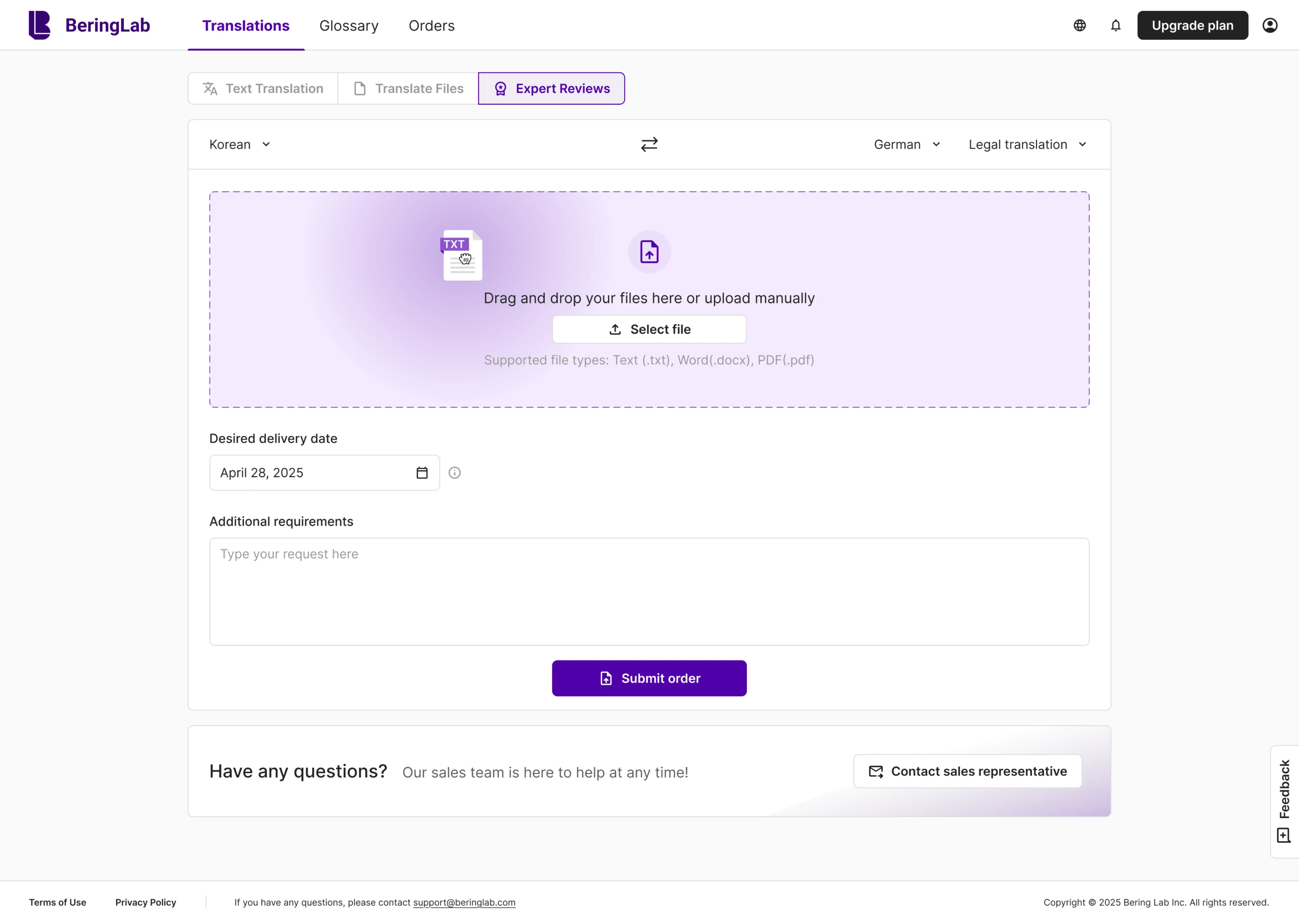
At Eleken, we've seen this firsthand. When redesigning Bering Lab, the biggest improvements didn't come from making the interface more visually appealing—they came from restructuring user flows, simplifying navigation, and removing friction. The result was an experience that helped reverse an 89% bounce rate, improve retention, achieve a 90%+ repurchase rate, and support the company's $2.3 million Pre-Series A fundraising.
Whether you're redesigning a SaaS platform or starting from scratch, don't ask, "What UI trend should we copy?" Ask, "Where are users struggling?"
That's where the best UX design ideas are found. And if you need a team that would help you with that, you know where to find us.