
A nurse rushes to silence an alarm as vitals drop. The interface is confusing, and she taps the wrong button. Nothing happens. Seconds are lost, and in healthcare, those seconds matter.
This isn’t hypothetical. These moments happen in hospitals every day, and not all end well. In medical devices, ux design medical isn’t about delight — it’s about safety and clarity under pressure. A misplaced label or a missed decimal isn’t a minor bug; it’s a risk regulators take seriously and patients may never forget.
The challenge goes beyond the stakes. Designers must account for multiple users with different skills, strict regulations, legacy systems, and complex workflows that vary from one hospital to the next. You can’t “move fast and break things” when lives are on the line.
Yet good healthcare UX design makes a difference. It reduces errors, eases clinician burnout, speeds up approvals, and builds trust. In this guide, we’ll cover:
- Why medical device UX is different from consumer or enterprise design
- How standards like IEC 62366, ISO 14971, and FDA guidance shape the process
- A step-by-step approach to research, prototyping, and validation
- Real-world challenges and strategies to overcome them
- Case studies showing both failures and successes
- Trends shaping the future, from AI to accessibility to voice interfaces
- Practical advice for breaking into healthcare user experience/interface design
The work is slow, complex, and high stakes, but when done right, it leads to safer outcomes for patients and better tools for clinicians.
Let’s dive in.
What makes medical device UX different
Designing for healthcare is a beast of its own. Compared to consumer apps or even enterprise SaaS, medical UX is:
- Slower to evolve
- Heavily regulated
- Constrained by outdated hardware
- Built for users ranging from surgeons to patients with arthritis
In consumer tech, you can patch after launch. In medtech, every mistake could trigger an FDA recall. High-quality UI design for healthcare apps is not just an advantage here, it's a critical necessity. UX here isn’t just best practice — it’s a requirement.
To succeed in UI/UX design for healthcare, your process must align with these three pillars:
- IEC 62366 — Usability engineering. You must design for real humans and prove the interface won’t cause harm.
- ISO 14971 — Risk management. Every possible misuse, even unintentional, must be identified and mitigated.
- FDA Human Factors Guidance — In the U.S., you have to show through studies that target users can operate the device safely and effectively.
It also helps to clear up some terms:
.webp)
In medtech, HFE and UX deeply overlap, especially when preparing usability validation for FDA submissions.

Understanding the unique constraints of medical UX is just the beginning. To design products that are not only safe but also FDA-ready, teams need a process that’s structured, evidence-based, and built for collaboration. Let’s walk through what that looks like in practice.
The medical device UX process (step by step)
Designing medical devices isn’t about moving fast and breaking things. It’s about following a process that satisfies both users and regulators. Each stage has to be deliberate, documented, and defensible.
User and context research
Every project starts with understanding who will use the device and where. Observation and workflow mapping reveal problems that can’t be solved from behind a desk. User shadowing in ICU settings, for example, shows how alarm fatigue drives risky shortcuts. Multi-user complexity adds another challenge: surgeons, nurses, patients, and technicians all interact differently. As one designer put it, “Each hospital is like its own government.”
We saw the same in Refera, a dental referrals platform we redesigned. Paper-based processes often lost patient data and disrupted care. Our work made referrals digital, traceable, HIPAA-compliant, and tailored to the complex, data-intensive applications needed by both general dentists and UX specialists.
.webp)
Workshops and stakeholder alignment
With research in hand, teams need alignment. Regulatory affairs, engineers, clinicians, and designers must collaborate early to define requirements and risks. These workshops build consensus and prevent painful conflicts later, when designs are already set and changes are slow and expensive. Maintaining high efficiency in these stages helps a company maintain a healthy rule of 40 for SaaS by balancing necessary development costs with long-term growth potential.
Prototyping and formative testing
Once requirements are clear, prototypes take shape. Low- to mid-fidelity models are tested with real users in realistic environments. This is where hardware constraints show their teeth. Many devices rely on slow processors or custom UI components, which limit flexibility. Testing under conditions that mimic real-world use — such as gloves, bright surgical lights, and noisy wards — uncovers flaws quickly. A button that looks fine in Figma may be nearly impossible to press with double gloves. That's why it's crucial to address UX issues early, before they escalate into compliance risks or usability failures. This specialized approach to UX for healthcare products ensures that the final device is both safe and functional in high-pressure environments.
Iterating with risk in mind
In medical device UI design, every iteration has to balance usability with patient safety. ISO 14971 requires teams to anticipate user errors and design safeguards.
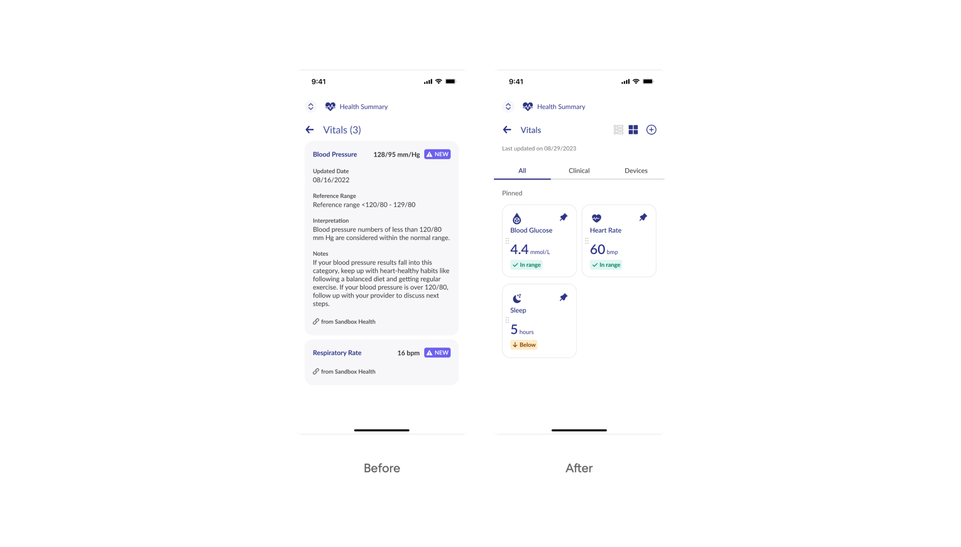
That’s exactly what Eleken did with b.well , a platform that unifies patient records. We helped redesign flows like authorization and vitals tracking, where the risk of misidentifying a provider or misreading lab results was high. By testing prototypes and refining details like hierarchy, color indicators, and confirmation steps, we improved security UX design, reduced confusion, and gave users confidence in both the process and the data.
.webp)
Summative (validation) testing
The process ends with validation. For the FDA, usability validation is mandatory. Teams must prove that intended users can operate the device safely and effectively in realistic scenarios. A strong validation plan covers three essentials: recruiting representative participants, testing all critical tasks, and defining clear success metrics. This evidence becomes part of the regulatory submission, which determines whether approval or rejection is granted.
When all of these steps are followed, the process doesn’t just satisfy regulators. It creates safer products, reduces errors, and builds trust with the clinicians and medical professionals,a well a patients who rely on them. For many teams, this journey is best understood through a healthstream UX case study, where transitioning from complex, fragmented reporting to a streamlined, user-centered interface proved that even highly regulated data can be made intuitive.
Even with a solid process, real-world constraints make medical UX tough. Here's what UX designers are up against, and how to work through it.
Practical challenges designers face (and how to overcome them)
Designing for healthcare isn’t glamorous. It’s slow, constrained, and often exhausting. But knowing the pain points up front makes it easier to handle.
1. Slow approval cycles.
In most industries, you can fix a bug overnight. In medtech, even a one-pixel tweak can take months to validate. The trick is to break changes into small, testable pieces and document every step in the Design History File. That way, regulators see a clear trail, and your work keeps moving instead of stalling.
2. Legacy systems.
Forget sleek frameworks. Many devices run on sluggish processors with no UI libraries, forcing teams to build components from scratch. You can’t modernize everything at once, so focus on the safety-critical screens first. A clear dosing screen matters more than a polished settings menu.
3. Cultural barriers.
Hospitals aren’t startups; each one feels like its own government. Clinicians are wary of outsiders and skeptical of “pretty” software that doesn’t fit their workflows. The only way to earn trust is to test in their environment. That’s what Eleken did with Spoonfed, a catering platform for hospitals. By designing with ADA-compliant patterns and accessibility in UX in mind, and validating on-site, we showed staff and patients that design could actually ease daily routines.
4. Emotional load.
User testing here isn’t sticky notes and Figma mockups. It’s ICUs, operating rooms, and stressed patients. The emotional weight can burn people out. Teams that last rotate responsibilities, debrief after tough sessions, and remind themselves why they’re there: small design wins really do prevent harm. Understanding the psychology in UX design becomes essential when testing with stressed clinicians or vulnerable patients.
These challenges aren’t just theoretical — they show up in real products. Let’s look at how UX has shaped actual outcomes in healthcare, for better and worse.
Medical device UX design: case studies & examples
The impact of UX in healthcare is easiest to see in real products — both when design process fails and when it succeeds. This highlights why strict adherence to hipaa design and safety standards is non-negotiable for medical software and hardware.
A glucose meter recall
A home-use glucose meter once displayed a decimal point so small it was almost invisible. “2.2” looked like “22.” Patients misunderstood their blood sugar levels and injected ten times too much insulin. As UXPA Magazine reported, several patients ended up in diabetic comas or required hospitalization.
The FDA responded with a recall. Manufacturers were forced to increase contrast, enlarge the decimal, and lock measurement units to prevent similar confusion. The interface also had to drop toggling between mg/dL and mmol/L, as users often changed units without realizing it — a small setting with life-threatening consequences.
This wasn’t an isolated case. In just five years, the FDA recalled over 50 devices due to poor usability, including interfaces that reversed left/right sides of the body and misconnected components in surgical equipment. The lesson is clear: "use error" is not user error — it’s design failure.
.webp)
b.well: building trust with complex health data
b.well unifies patient health records in one place. When two key designers left mid-project, critical features risked delay.
Eleken stepped in to medical device user interface/experience features like the Health Information Network, where users authorize access to their medical data. By simplifying screens, clarifying copy, and testing prototypes, we cut drop-offs and increased trust during verification.
We also revamped Vitals and Labs, replacing cluttered layouts with clear hierarchy, white space, and color-coded indicators. Patients could read their health data at a glance, clinicians trusted the information, and b.well stayed on track.
The takeaway: in healthcare UX, clarity isn’t just usability — it’s confidence and adoption.
The Sonic Window: where good UX drives clinical confidence
The Sonic Window was designed to simplify ultrasound-guided IV insertion — a notoriously tricky task for clinicians, especially with patients who have hard-to-find veins. Instead of repackaging traditional ultrasound systems, the team created a pocket-sized device with a built-in screen and radically simplified interface.
What made its UX stand out?
- One-handed use: Designed for gloved, non-dominant hands in tight clinical settings.
- Minimal controls: Tactile buttons replaced dropdowns and complex menus, reducing mental overhead.
- Direct feedback: The ultrasound image appeared right above the probe, helping users confirm needle placement without looking away.
Nurses and techs located veins faster, with fewer failed attempts, even without deep ultrasound training. The device earned FDA clearance, won a Medical Design Excellence Award, and proved that UX can be a clinical asset, not just a usability bonus.
.webp)
These examples show just how much design decisions matter, whether you're preventing fatal errors or building trust in a complex design system. But healthcare UX isn’t standing still. New technologies, from AI to ambient interfaces, are reshaping what’s possible and raising new questions for designers. Let’s look at the trends shaping the future of medical UX.
Trends and innovations to watch in medical UX
Healthcare doesn’t change fast, but it does change. And when it does, design is often playing catch-up with the technology that’s already in motion. Below are four key shifts shaping the future of medical UX, and what designers should keep in mind to keep up.
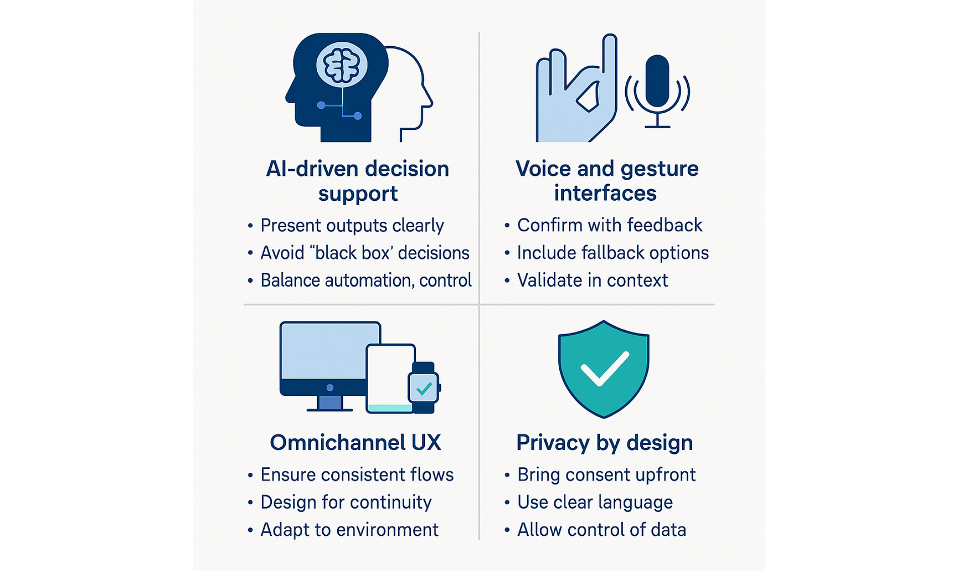
AI-driven decision support
Artificial intelligence is already influencing clinical decisions from early diagnostics to personalized treatment plans. But here’s the catch: doctors won’t follow what they don’t understand.
Designers need to:
- Present AI outputs clearly, with confidence levels and reasoning.
- Avoid “black box” decisions — add tooltips, explanations, and data sources.
- Balance automation with control. The user should never feel out of the loop.
If clinicians don’t trust what they’re seeing, they’ll ignore the AI or worse, rely on it without understanding the risks.
Voice and gesture interfaces
Touchless interactions seem ideal in sterile or high-intensity settings, but they come with serious tradeoffs.
Pros:
- Reduce contamination risk in clinical environments.
- Speed up access to critical info when hands are busy.
Cons:
- Voice commands can fail in noisy environments.
- Gestures aren’t always intuitive or visible.
- Feedback is often vague or nonexistent.
For these interfaces to work, designers must:
- Prioritize confirmation cues (visual, haptic, auditory).
- Support fallback methods — voice shouldn't be the only option.
- Validate designs in-context, not just in labs.
Omnichannel UX
Patients interact with healthcare across devices, locations, and time. A wearable, a mobile app, a hospital portal — each plays a role in the same care journey.
To create a unified experience:
- Keep task flows and terminology consistent across channels.
- Design for continuity, not duplication — context should shape UI, not break it.
- Maintain a UX design system that adapts to environment (not just device).
When users switch touchpoints, they shouldn’t feel like they’ve entered a different universe.
These principles are also key when designing geospatial data products, which often play a role in healthcare, from emergency location tracking to facility mapping.
Privacy by design
Regulatory compliance is the floor. Patient trust is the ceiling.
To design for privacy in ways users actually notice:
- Bring consent to the foreground — don’t bury it in settings.
- Use clear, human language to explain data usage.
- Offer real-time visibility into what’s being shared and why.
- Allow revocation and granular control without friction.
In healthcare, trust is a design outcome. And nothing erodes trust faster than dark patterns around data.
As the field evolves, so do the roles shaping it. If you’re looking to break into healthcare UX, here’s how to navigate the path and where to start.
Breaking into healthcare user experience design
Designing for healthcare can be incredibly rewarding, but getting your foot in the door isn’t easy. This space is niche, highly regulated, and sometimes resistant to newcomers. Still, there’s no single “correct” way to enter. Here’s how designers are doing it, and what helps them stand out.
Entry paths: where people are getting started
There are a few common ways people break into the field:
- Startups tend to be more flexible. They often hire for potential, not just experience — which means they’re a good place to build early healthcare chops. The downside? Less structure, and often limited mentorship. These teams may also look for hybrid roles like a UX engineer, especially in early-stage startups.
- Consultancies (like Eleken) are great for variety. You get to work on different types of medical products, often in fast cycles, and learn how to balance client needs with regulatory constraints.
- D2C health tech companies are growing. They need designers who can handle both clinical workflows and consumer-facing interfaces — especially around things like health tracking, scheduling, and telemedicine.
- Enterprise med device companies (think Medtronic, Philips, Stryker) are the gold standard for compliance. These teams know FDA submissions inside out. The tradeoff? Long timelines, rigid processes, and slower career progression for juniors.
Portfolio tips: what healthcare teams want to see
Even if you don’t have medical work in your portfolio, you can still stand out. Here's how:
- Show complexity. Healthcare isn’t simple, so pick projects that show you can handle dense interfaces, edge cases, and multiple user roles.
- Tell the whole story. Go beyond the graphical user interface. What research did you do? What constraints were you under? What risks were you managing?
- Highlight safety and clarity. For example, explain how your design reduced user error, or how you tested flows for accessibility and comprehension.
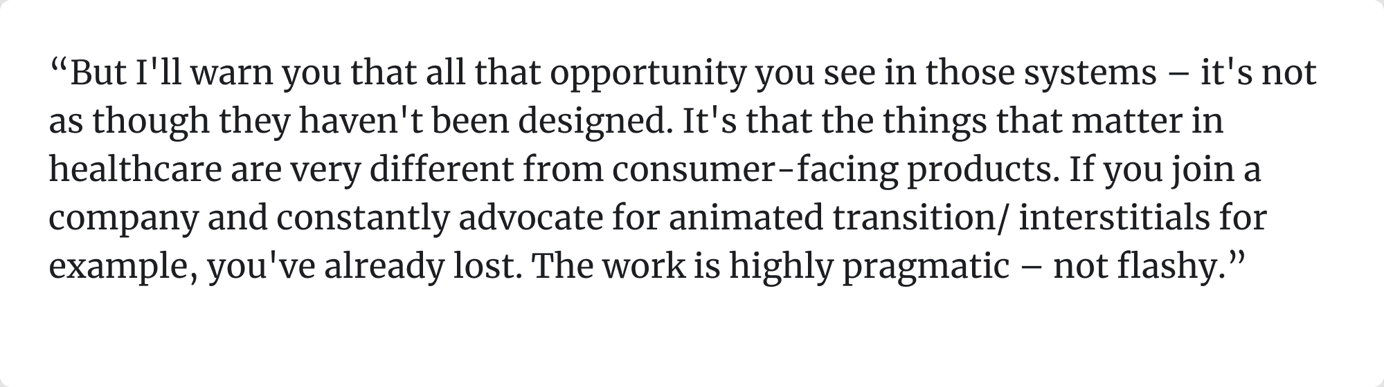
- Avoid the shiny fluff. As one healthcare UX director put it:
Many aspiring healthcare designers worry they need a medtech-heavy portfolio to break in. Not true.
Networking: who’s hiring and helping
The healthcare industry still runs partly on who-you-know. These communities are worth exploring:
- UXPA and HFES — both have specific human factors and healthcare design groups.
- Clinical UX — the Clinical UX Association runs events, courses, and networking sessions.
- Open-source healthcare projects — great for experience and credibility. One Redditor recommended this GitHub list of projects.
- Design with Care — a healthcare UX job board and active Discord community.
People in the field are often surprisingly open to mentoring. Cold DMs (when thoughtful) do work.
Upskilling: what to learn next
You don’t need a medical degree, but you do need the right language and frameworks. Start here:
- 📘 Tragic Design — a great intro to how design impacts safety and ethics.
- 📗 Design for Care by Peter Jones — deeper dive into healthcare complexity.
- 🧠 Courses in HCI, human factors, and usability testing.
- 🎓 Learn the basics of regulatory standards like IEC 62366, FDA Human Factors Guidance, and ISO 14971 — even at a surface level, they’ll help you sound informed.
You can also shadow clinicians (if possible), talk to nurses or technicians, and attend healthcare startup events. Anything that builds your mental model of the space.
Many designers assume healthcare UX is gated behind degrees or decades of experience. But much of that hesitation comes from outdated myths. Let’s clear those up before you move forward.
.webp)
Whether you're just getting started or already deep in the field, one thing remains constant: great UX in healthcare is never just about design — it’s about outcomes. Let’s wrap up with why this work matters, and where it leads.
Final thoughts on designing medical device UI and UX
Designing for healthcare is rarely fast or easy. It means navigating regulation, legacy systems, and high-stakes environments where mistakes aren’t just frustrating—they’re dangerous. But that’s exactly why UX in this space matters so much.
Thoughtful, user-centered design reduces the risk of harm, builds trust with healthcare professionals, improves adoption, and helps products move through regulatory approval more smoothly. When interfaces are clear, consistent, and tested in real-world conditions, clinicians make fewer errors, patients feel more confident, and teams avoid costly setbacks.
It’s not flashy work, but it’s deeply rewarding. And if you’re building in this space, or want to, we’d love to help. Sometimes the clearest sign of success is when users experience an aha moment that makes the interface click. At Eleken, we’ve supported healthcare startups, platforms, and medtech teams at every stage of their journey.
Let’s design something that improves patient care. → Get in touch


.webp)


