
Dashboards are built to support decisions. But many end up confusing users more than they help.
It’s rarely about bad data. The problem usually lies in the user experience. When teams try to pack in every metric, chart, and interaction, the result is often cluttered, inconsistent, or hard to follow.
An effective dashboard is clear and intentional. It organizes information so people can understand what matters, act faster, and avoid second-guessing the data. That requires strong UI UX decisions from the start.
Common pitfalls include overloading the screen, ignoring how users interact with data, jumping into visuals too early, or prioritizing aesthetics over clarity. That’s why it helps to hire dashboard UX designers who know how to guide both product and data strategy, not just make things look good.
Some, like Eleken, focus specifically on complex, data-heavy SaaS dashboards, combining speed with UX depth to improve adoption, reduce friction, and align with how people actually make decisions.
This guide is here to help product teams, especially in B2B and SaaS, choose the right agency for the job. You'll get:
- A vetted list of dashboard-focused UX design agencies
- A comparison table to evaluate fit
- Criteria to guide your selection process
- Practical tools you can use before signing a contract
The goal is to make sure your dashboard design doesn’t just look good, but actually works.
Best dashboard UX design agencies for B2B buyers
Not every design agency can build a great dashboard. Some create stunning landing pages or flashy consumer apps. But a dashboard lives in a different world. It needs to simplify complexity, support real decisions, and keep teams aligned.
These 10 dashboard UX agencies represent a mix of strategy, execution, and scale from embedded product teams to enterprise consultancies. Whether you're validating your first analytics panel or exploring SaaS app redesigns, there's a fit here for your needs.
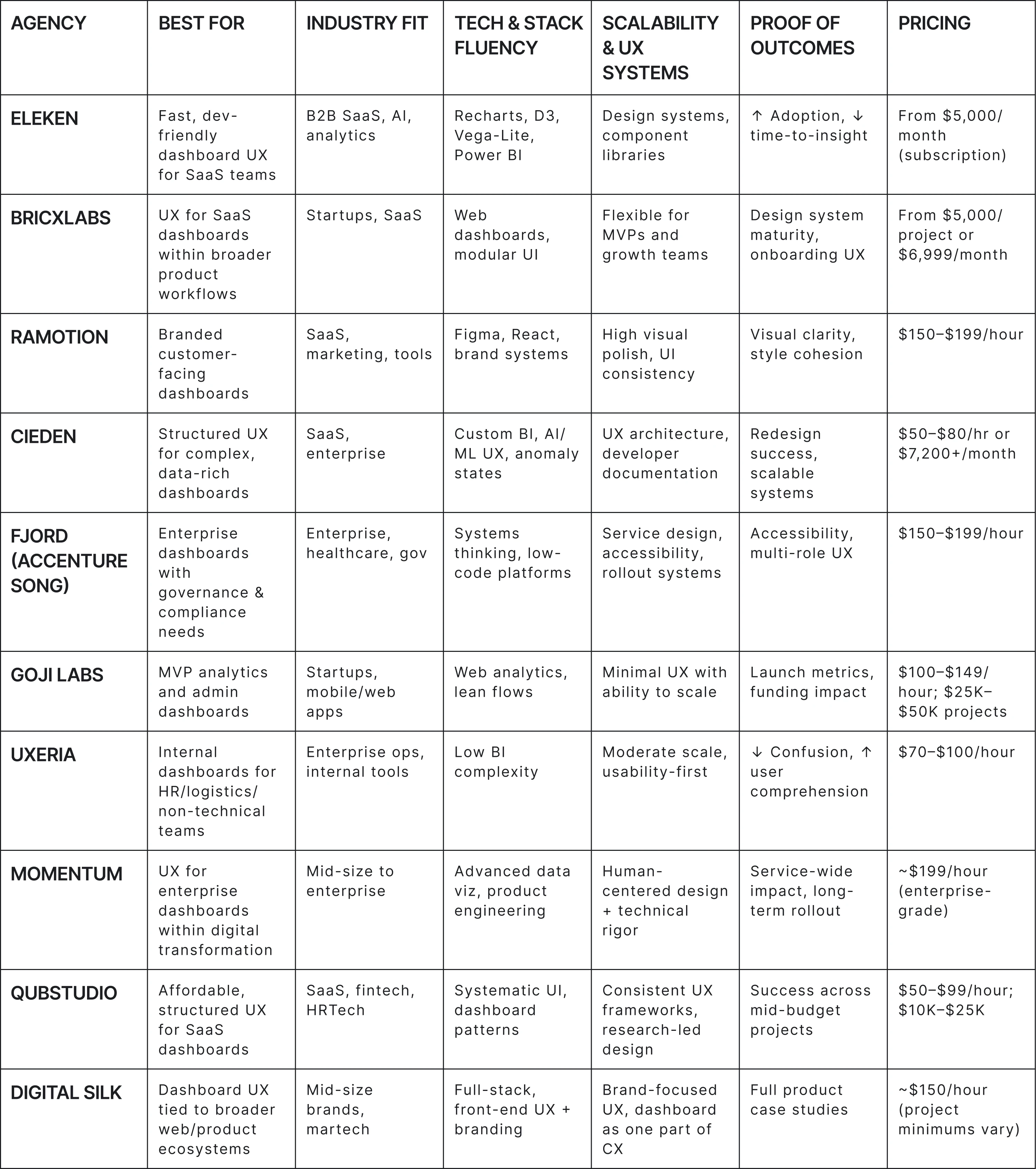
1. Eleken
Services: Dashboard UX/UI, SaaS product design, developer-ready handoff, design subscription
Pricing: From $5,000/month (subscription)
Clutch rating: 4.9 based on 110+ reviews
Best for: SaaS teams building data-heavy dashboard designs that need clarity, speed, and measurable UX impact
Eleken specializes in dashboard UI/UX for SaaS — particularly in analytics, AI, and data visualization. Their designers structure information around role-based flows and decision-to-action clarity, ensuring dashboards stay intuitive even with dense data. With 100+ experts and 200+ SaaS projects delivered, Eleken’s handoff process (KPI dictionaries, viz specs, alert states) helps developers integrate faster while maintaining usability and performance.
Why choose Eleken: A proven SaaS dashboard design partner with deep product understanding, fast iteration, and a track record of improving adoption and time-to-insight.
2. BricxLabs
Services: SaaS UX design, b2b dashboard design services, product strategy, design systems
Pricing: From $5,000/project or $6,999/month (retainer model)
Clutch rating: 5.0 based on 18 reviews
Best for: Startups and SaaS teams building dashboard designs as part of broader product UX
BricxLabs focuses on UX and interface design for SaaS platforms, with experience in data-heavy workflows and MVP product launches. While not a pure dashboard agency, they’ve worked on admin panels, analytics modules, and performance tracking tools as part of wider product ecosystems. Their site shows structured design systems, clear onboarding flows, and flexibility in scope for early-stage teams.
Why choose BricxLabs: A practical choice for SaaS companies that need strong UX design, including dashboard design services, without hiring in-house or overpaying for enterprise-level partners. Best suited for early-to-mid stage digital products that require clarity and consistency.
3. Ramotion
Services: UI/UX design, branding, interface development
Pricing: $150–$199/hour
Clutch rating: 4.9 based on 30 reviews
Best for: Customer-facing dashboards that support engagement or marketing analytics
Ramotion combines sleek interface design with brand cohesion. Though they don’t specialize in dashboards, their design work on admin panels and analytics views emphasizes consistency, hierarchy, and visual clarity.
Why choose Ramotion: Best when your dashboard design is part of a broader user-facing product that needs strong brand alignment and engaging user experience.
4. Cieden
Services: Dashboard UX/UI, SaaS product design, design systems, dev‑ready handoff
Pricing: From ~$2,800 (UX audit); ~$50–$80/hour or $7,200+/month (team extension)
Clutch rating: 5.0 based on 45 reviews
Best for: SaaS and enterprise teams wanting structured dashboard designs with UX rigor and scalability
Cieden designs dashboards for B2B SaaS and enterprise digital products by turning complex data into clear, actionable insights. They often lead full dashboard redesign agency engagements, especially when usability and architecture need to scale with growth. Their team emphasizes customizable interfaces, role‑based views, and UX deliverables that dev teams can easily implement.
Why choose Cieden: A solid choice for teams that want dashboard design services done with depth and structure, especially when you need both design quality and scalable deliverables.
5. Fjord (Accenture Song)
Services: Enterprise dashboard UX, accessibility, design systems, service design
Pricing: $150-$199/hour (enterprise consulting model)
Best for: Large organizations with governance, compliance, and scalability needs
Fjord operates within Accenture’s enterprise ecosystem, making them a strong fit as an enterprise dashboard UX agency. Their work focuses on aligning dashboards with service design and system-wide digital transformation initiatives. Expect a structured, governance-friendly process designed for scalability, accessibility, and internal adoption across departments.
Why choose Fjord: Ideal for regulated or compliance-heavy dashboards that must scale across large digital products with complex internal systems.
6. Goji Labs
Services: Product design, UX research, MVP development
Pricing: $100-$149/hour; $25K–$50K typical projects
Clutch rating: 5.0 based on 80+ reviews
Best for: Startups creating their first analytics or admin dashboard
Goji Labs focuses on MVPs and early-stage digital products. Their dashboard work begins with user research, interviews, and testing, aiming to create minimal but usable experiences that scale later.
Why choose Goji Labs: A solid pick for startups that want to validate a dashboard concept before committing to a full build and create custom dashboards tailored to actual user needs.
7. UXeria
Services: UX audits, usability testing, internal tool design
Pricing: $70–$100/hour
Clutch rating: 4.9 based on 4 reviews
Best for: Operational dashboards used by internal, non-technical teams
UXeria brings a practical, usability-first approach to dashboards, especially for internal tools. They excel as a data visualization UX agency focused on reducing confusion, improving comprehension, and ensuring that even non-technical users can act on the data.
Why choose UXeria: Choose them when ease of use and internal adoption matter more than flashy design, and when your team needs clarity to analyze data and take action quickly.
8. Momentum Design Lab
Services: Product strategy, UX/UI design, dashboard and data visualization, product engineering
Pricing: ~$199/hour (per Neudesk), enterprise-grade
Clutch rating: 4.8 based on 90+ reviews
Best for: Mid-size to enterprise platforms building dashboards as part of digital transformation
Momentum Design Lab blends dashboard design services with broader product UX, focusing on analytics tools, admin platforms, and AI-driven digital products. Their team prioritizes complex user needs, performance, and intuitive user experience, especially in enterprise environments.
Why choose Momentum: Great for teams looking for structured delivery and dashboard designs that support scale, user clarity, and engineering alignment.
9. Qubstudio
Services: SaaS product UX, dashboard design, design systems, UX strategy
Pricing: $50–$99/hour; typical projects $10K–$25K
Clutch rating: 4.9 based on 80+ reviews
Best for: SaaS and B2B teams seeking structured, high-quality UX design on a flexible budget
Qubstudio is a Ukraine-based design agency with strong SaaS and enterprise UX experience. Their team applies business analysis, user flows, and systematic UI/UX design to deliver clear, scalable custom dashboard interfaces. Their work reflects a commitment to user-centered design, clarity, and consistency across B2B tools.
Why choose Qubstudio: Great for teams needing solid dashboards and structured UX systems without enterprise pricing.
10. Digital Silk
Services: UI/UX design, dashboard design, full-stack web and app development
Pricing: ~$150/hour (project minimum varies)
Clutch rating: 4.8 based on 45 reviews
Best for: Mid-size to large brands building dashboards within larger digital products
Digital Silk offers custom dashboard design as part of broader product, UX, and web development services. They specialize in tying dashboard UX to branding and digital marketing goals, making insights more accessible across teams and customer journeys.
Why choose Digital Silk: Best for companies that see dashboards as part of a connected product experience, and want to align design with brand and marketing to achieve business goals.
If you're still weighing your options, here’s a side-by-side breakdown of all ten agencies. We’ve compared them across the core criteria that matter most when choosing a dashboard design partner, like industry fit, tech stack, scalability, and proof of results.
Now that you’ve seen what the top UI/UX design agencies offer, the next step is figuring out which one fits your specific needs. Let’s break down what to look for when choosing a dashboard UX agency, and how to avoid common missteps.
How to choose the right dashboard UX agency
Choosing the right agency isn’t just about flashy portfolios or big names. It’s about whether they can handle your data, align with your team, and actually improve how your users make decisions. Here’s how to vet dashboard UX partners like a pro:
1. Look for deep data literacy
Designing dashboards isn’t just about visuals. Your agency should understand how KPIs are defined, where the data lives, and what makes a metric actionable.
Ask: “Can you walk us through your process for defining KPIs before designing visuals?”
2. Evaluate their UX process, not just the portfolio
A great-looking dashboard can still fail if no one knows how to use it. Instead of focusing on Dribbble shots, ask about their design process, especially how they define and iterate on the UX flow that guides user decisions. Look for agencies that:
- Conduct thorough user research to uncover user needs and pain points
- Create wireframes and interactive prototypes to explore user flows early
- Test for an engaging user experience and clarity, not just visual polish
3. Verify technical fluency
Dashboards live at the intersection of data, design, and development. Your partner should be fluent in:
- BI tools like Tableau, Power BI, or Looker
- Front-end libraries like Recharts, Vega-Lite, or ECharts
- Responsive layout, accessibility, and performance optimization
4. Ask about deliverables and artifacts
A good agency won’t just hand off Figma files. Unlike a UI/UX designer vs front-end developer, the right partner bridges both sides with structured materials that make development smoother:
- KPI dictionaries
- Visualization spec cards
- Data state documentation (loading, empty, error, anomaly)
- Component or token mapping
5. Demand proof of outcomes
Avoid vague “we improved UX” claims. Ask for real metrics from previous projects, such as:
- ↓ Time to insight
- ↑ Dashboard adoption
- ↓ Misclicks, confusion, or support tickets
Ask how the design improved user engagement or helped teams optimize operations. Bonus if the agency shows how their dashboard helped clients achieve business goals with clear ROI.
6. Test the collaboration fit
This isn’t a one-time handoff — it’s a working relationship. A good fit means:
- Clear, regular communication (Slack, Loom, Notion)
- Defined ownership and next steps
- Willingness to connect design decisions to business outcomes
Choosing the right agency is only part of the equation. You also need to understand what affects cost and timelines, and how to scope a dashboard project realistically. That’s where expectations often break down.
Let’s look at what actually moves the needle when it comes to pricing and delivery.
Pricing & timelines: what really moves the needle
So, how long does a dashboard project take? And what should you expect to pay?
The honest answer: it depends, but not randomly.
The scope, complexity, and context of your dashboard will directly shape the timeline and budget. Here are the key factors that usually drive effort up or down:
- Data readiness: Is your data model clean, centralized, and queryable—or are you stitching together spreadsheets from five departments?
- Stakeholder alignment: Are three people making decisions, or twelve?
- Compliance requirements: Enterprise-level security, accessibility, or audit trails will increase scope.
- Platform constraints: Designing for tools like Power BI or Tableau comes with built-in limitations, unlike a custom dashboard built in React or Vue.
Here’s a rough outline of typical engagement types and how long they take:
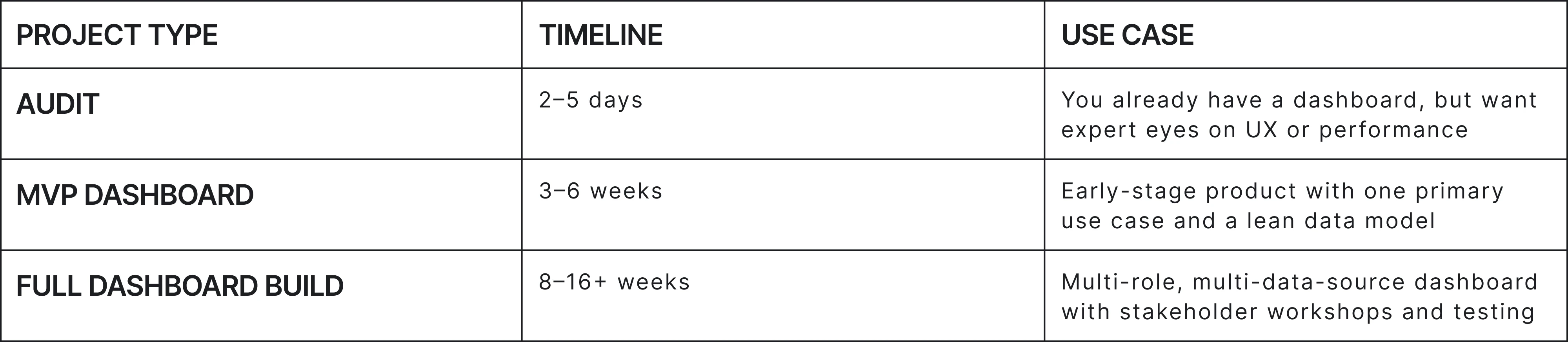
Dashboard agencies typically offer one of the following models:
- Fixed-scope: You agree on specific deliverables and timelines up front. Best for defined dashboards with minimal change risk.
- Sprint-based: You work in agile cycles, adjusting priorities as you go. Great for evolving needs and MVPs.
- Retainer: Ongoing collaboration with a product-minded team that grows with your dashboard over time.
For example, Eleken uses a monthly subscription model with a free trial, fast onboarding, and no long-term lock-ins — a fit for SaaS teams that need both speed and flexibility. Their clients typically see value in the first few weeks through quick UX audits, like the one shown in this SaaS UX audit case study, accessible design, and handoffs that help dev teams move faster.
Knowing which model fits your situation helps you choose an agency that works at your speed with the flexibility you need.
Before you sign with anyone, make sure your team has the right tools in place to scope clearly, stay aligned, and avoid surprises.
Buyer’s toolkit
Before you commit to an agency, make sure your team is prepared.
Even a top-tier partner can’t salvage a project that starts with vague goals, scattered input, or poor documentation. This toolkit helps you scope clearly, stay aligned, and avoid costly surprises.
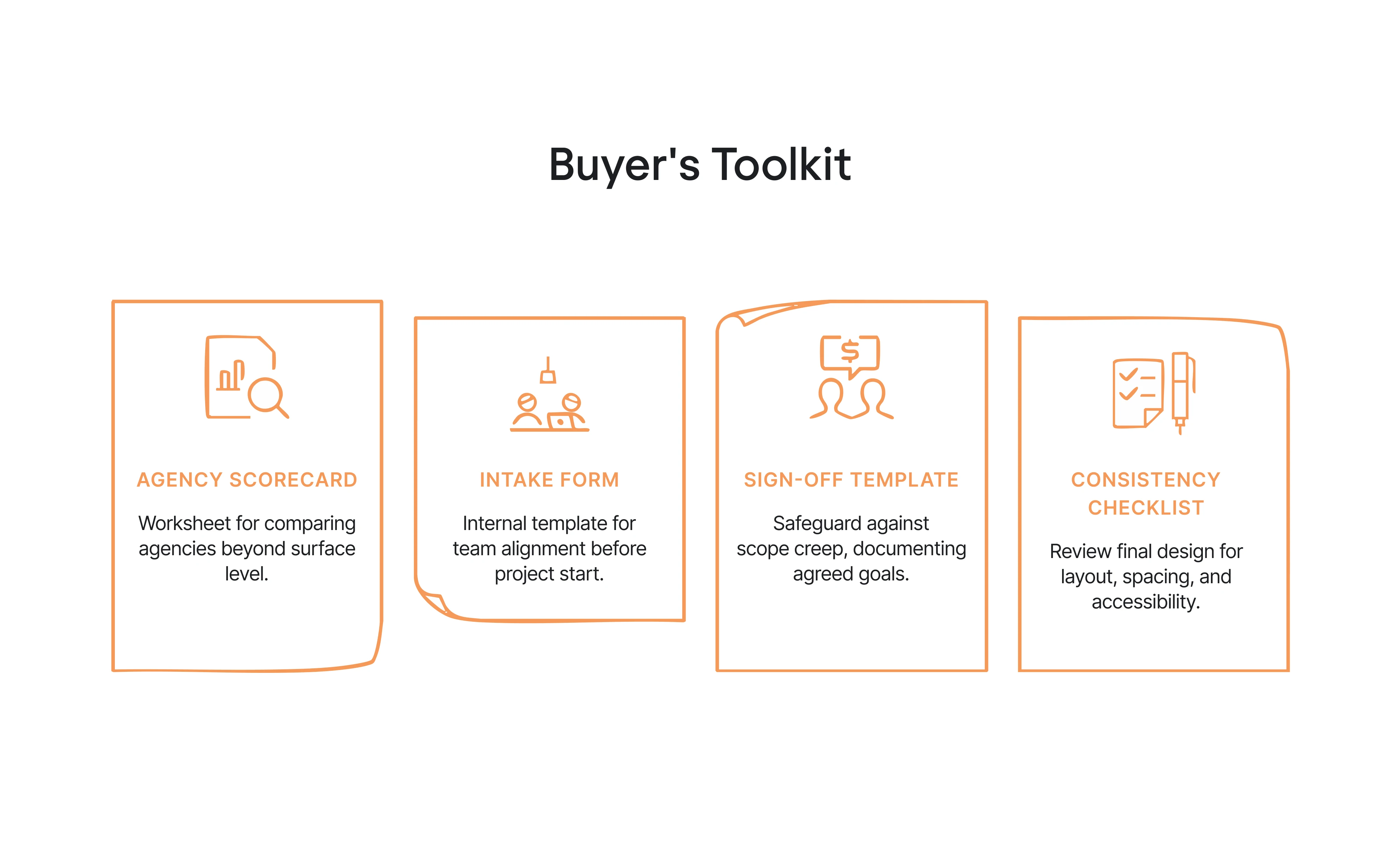
Agency scorecard
A simple worksheet for comparing agencies beyond the surface. Use it to assess their UX process depth, data and BI fluency, handoff quality, communication style, and actual results from past projects. It’s a quick way to move past pretty portfolios and get a sense of fit.
Intake form
This internal template helps your team get aligned before the project starts. It defines your primary users, what questions the dashboard needs to answer, where your data lives, and any technical or compliance limitations. Clear answers here lead to faster starts and fewer misunderstandings later.
Sign-off template
This is your safeguard against scope creep. It documents agreed goals, KPIs, deliverables, timeline, and dev handoff expectations. When questions or changes come up mid-project, you’ll have something solid to refer back to.
Consistency checklist
Before you hand anything off, use this to review the final design. It covers layout, spacing, chart styles, UI states, interaction patterns, and accessibility standards. Especially helpful when multiple designers or developers are involved, or when the dashboard will evolve over time.
It’s your insurance against design entropy, especially if multiple people will maintain or extend the dashboard later.
With the right tools in place, you're better equipped to choose an agency and set your project up for success. Now let’s bring it all together.
Conclusion: Dashboards that drive action
A useful dashboard doesn’t just sit on the screen. It helps your team make sense of complex data, prioritize what matters, and act with confidence.
Whether you build in-house or bring in a partner, strong design should be seen as a functional layer, not an optional polish. Clarity, consistency, and design-driven development practices are what turn passive reporting into active decision-making.
A good dashboard agency understands this balance. They focus not only on visual appeal, but on how real users navigate, interpret, and respond to data. That’s where the real value lies.
At Eleken, we work with SaaS and AI teams to build dashboards that reduce time-to-insight, increase adoption, and scale with your product. We offer a free 3-day trial so you can see how our process works, with no pressure or long contracts.
If you're ready to move from cluttered charts to meaningful, actionable design — let’s talk.