
Bad graphs are everywhere. From your team’s weekly dashboard to that viral infographic your boss sent with the note “looks cool,” bad data visualization examples shows up in places where clarity should matter most.
Bad charts often get dismissed as just a design problem — one of many bad design examples you’ll find in the wild. Something that could look nicer. But the real issue is much deeper. When data is shown the wrong way, it creates confusion. It hides patterns. It shifts attention away from what matters. And most of the time, the person who made the chart didn’t even realize they were doing it.
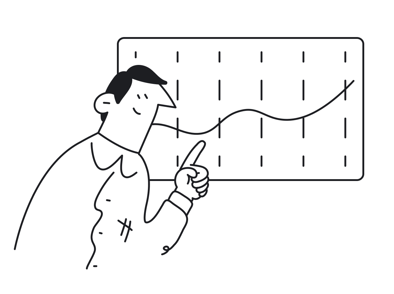
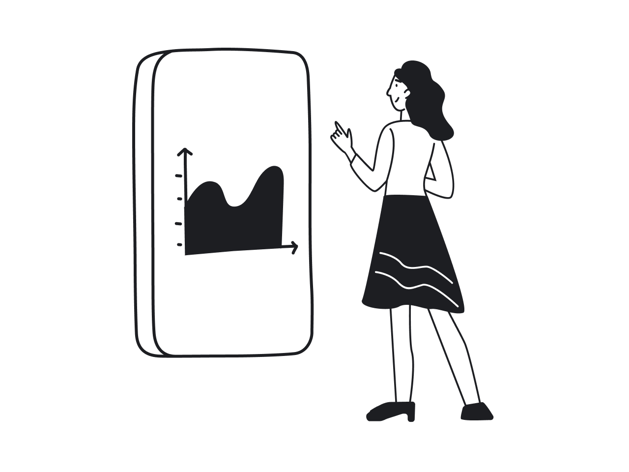
We’ve seen it firsthand at Eleken. Our design agency has designed 200+ SaaS products since 2015 — think dashboards for AI platforms, healthcare systems, or finance tools, where effective data visualization design is essential. When visual clarity breaks down, users stop trusting the product. And when that trust erodes, so does engagement, adoption, and even funding.
Here’s what we’ll cover:
- The most common data visualization mistakes (yes, including tragic pie charts)
- Why these mistakes happen, and how they mislead users
- Real life examples of bad data visualization from dashboards, maps, and infographics
- How to fix each issue with simple, clear design choices
- Pactical tips to make your own charts more trustworthy and effective
What makes a data visualization bad?
Bad charts usually don’t come from bad intentions. Most of the time, Someone just grabbed a default template or added too much to please the boss, often without shared UI UX terminology between stakeholders and designers. The result is something that looks technical but doesn’t actually help anyone understand the data.
A bad graphical representation of data does more than waste space. It erodes trust, wastes time, and can lead people to completely wrong conclusions.
Here’s how that happens.
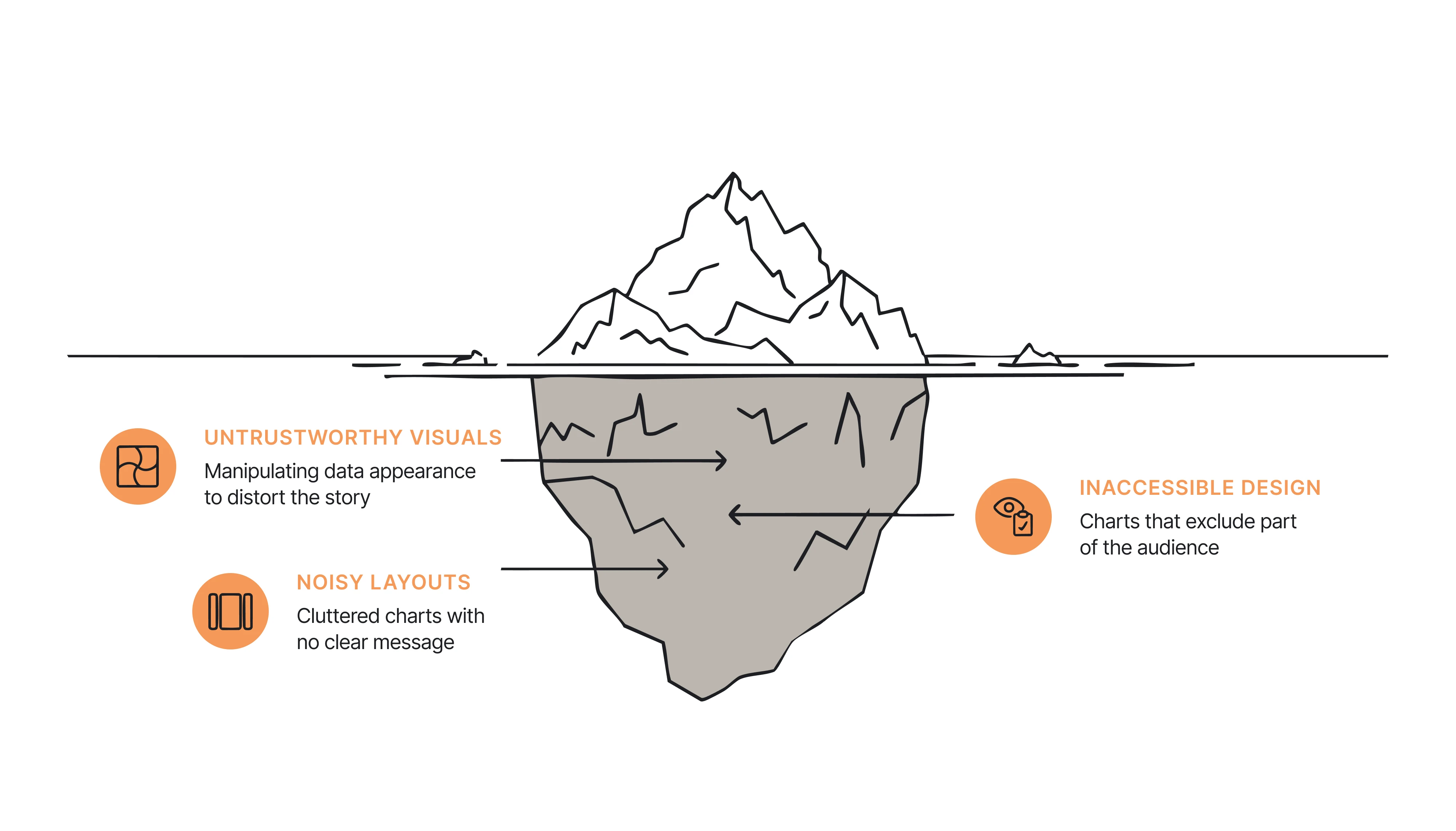
Untrustworthy visuals
These are the kinds of misleading data visualization that manipulate how data looks. Maybe the y-axis doesn’t start at zero. Maybe the scale jumps without warning. Or the colors create a sense of urgency that isn’t in the numbers.
Even when the data is accurate, small visual tweaks can push people toward the wrong story — a pattern often explained by the psychology laws behind UX design. It’s a design problem with real consequences.
Inaccessible design
Some charts are impossible to read unless you already know what they say. Poor contrast, unclear labels, color-only differences, or no support for screen readers all fall into this category.
When a chart excludes part of the target audience, it doesn't just fail in style. It fails in function, and the solution often starts with a thoughtful design for simplicity. You can't expect people to trust what they can't read.
Noisy, cluttered layouts
Then there are charts that technically “show everything” but still feel like a mess. No visual hierarchy. No clear message. Just a pile of numbers, labels, and boxes shouting at the same volume.
These visuals don’t lie, but they don’t help. They make the viewer work too hard to find anything meaningful.
These are the most common ways charts go wrong. But theory only takes you so far. Let’s look at some misleading data visualization examples that missed the mark, and why they failed.
The bad visualization examples hall of shame
If you’ve spent more than five minutes on Reddit’s r/dataisugly or sat through a product demo with eight dashboards crammed on one screen, you’ve seen how messy data visualization can get. Some charts are confusing, others are misleading, and a few are just plain ridiculous.
Let’s break down the most common offenders, with real examples of bad data visualization and simple fixes.
1. Misleading timeframes

This tariff chart compares two administrations using mismatched formats and cherry-picked timelines. Trump's data is shown as bars over several years, while Biden's appears as a red line chart starting later. It creates the illusion of a dramatic increase without context.
Fix: Keep comparing categories visually consistent. Use the same chart type and timeframe, and clearly label any shifts in scale or projections
2. Meaningless Color Palettes
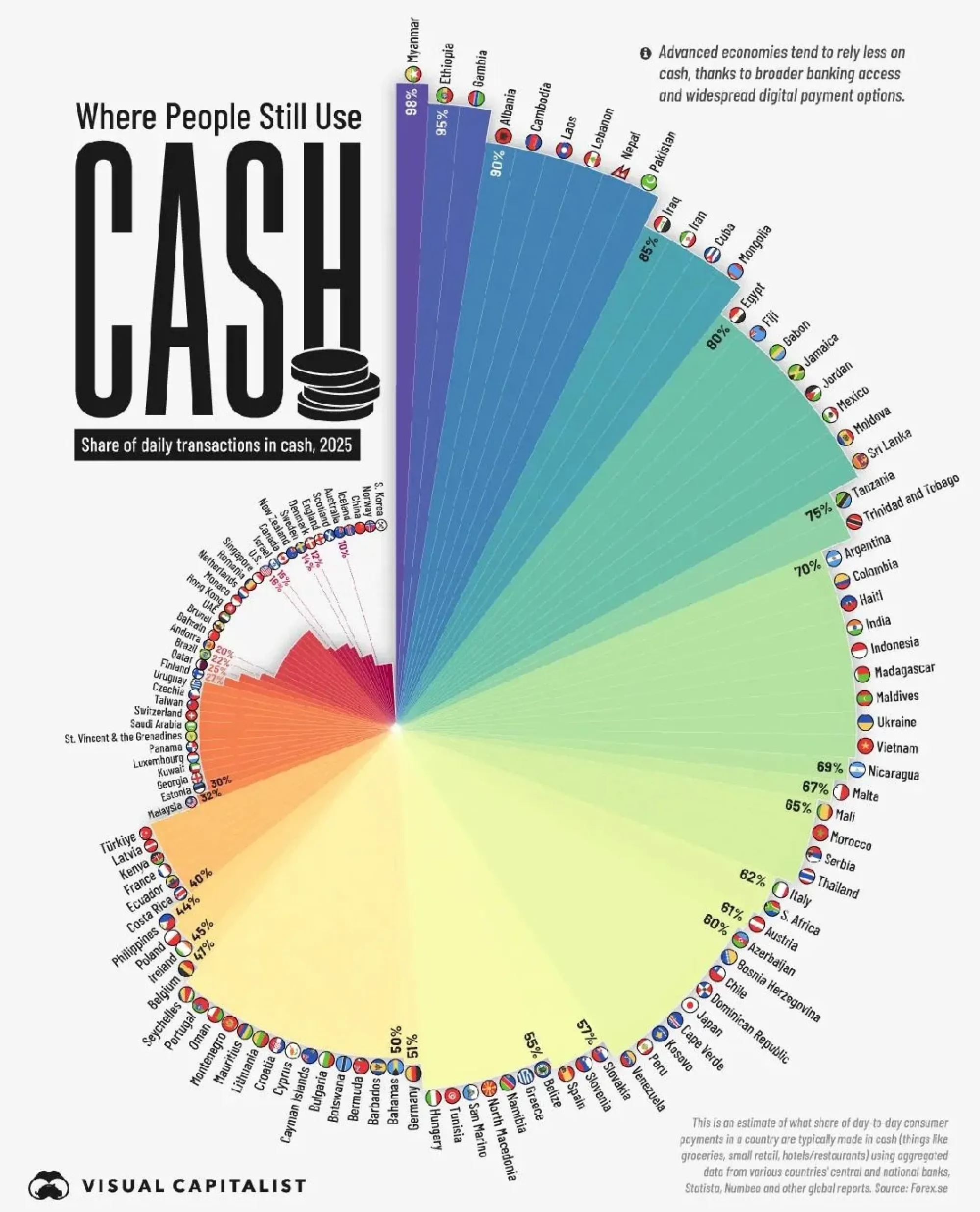
This radial chart shows cash usage by country with each segment in a different color, but the colors are purely decorative. There's no grouping, no pattern, and no legend explaining what the hues represent. The rainbow palette overwhelms the eye and distracts from the actual values. Plus, arranging it in a circular layout makes comparisons between countries much harder than it needs to be.
Fix: Only use color to encode data when it adds meaning, like grouping regions or highlighting ranges. Avoid using every shade in the crayon box just for aesthetic effect, especially in a chart that’s already hard to scan.
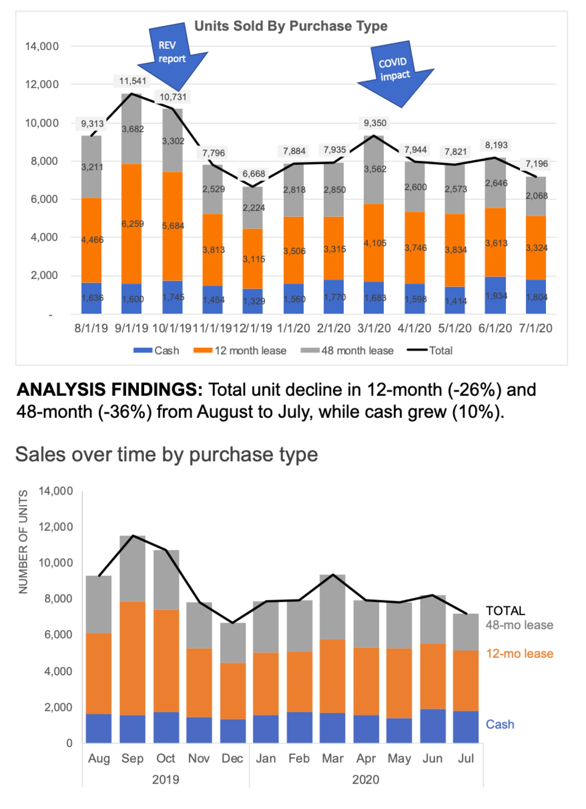
3. Dashboard clutter
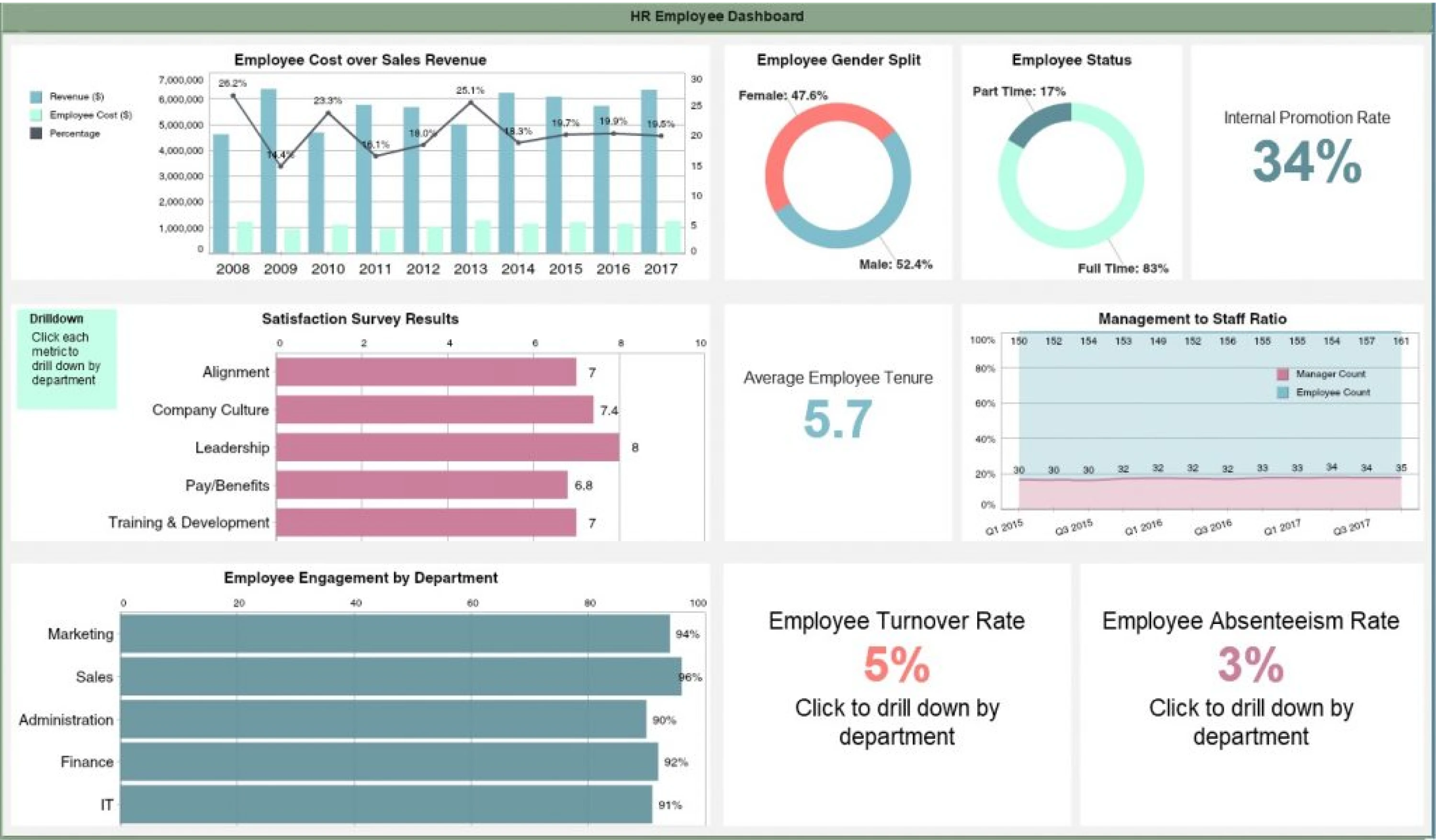
This HR dashboard crams multiple charts, KPIs, and text blocks into one crowded screen. With no visual hierarchy or focus, every visual element competes for attention, making it hard to spot what matters most. Instead of guiding decisions, it overwhelms with noise.
Fix: Prioritize 2–3 key metrics per view, group related charts, and use drill-downs for details. Let insight, not volume, lead the design.
4. Low contrast maps
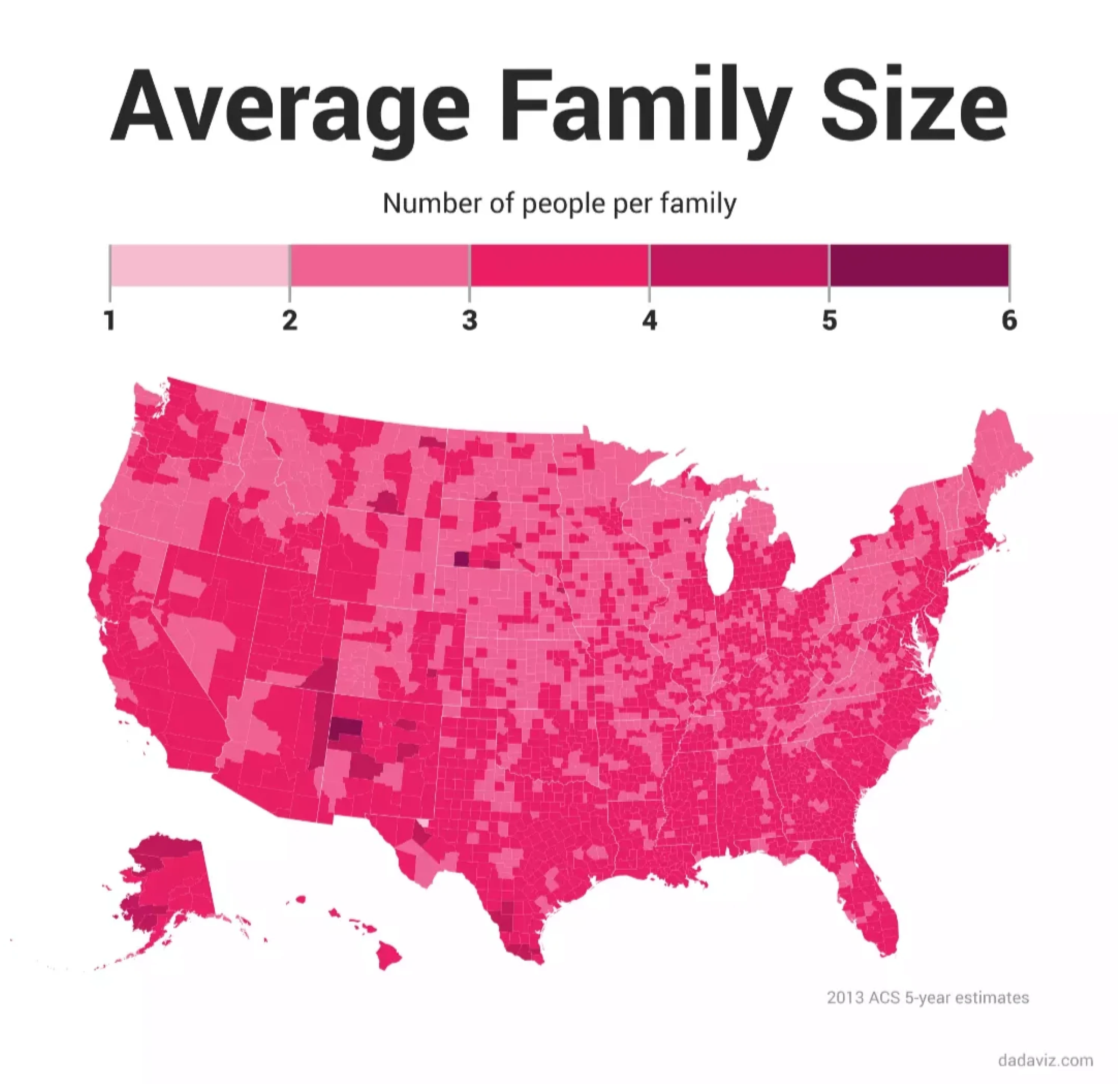
This choropleth map uses shades of pink to show family size by county, but the gradient is so subtle, it’s nearly impossible to spot meaningful differences. The result? Most of the country looks identical, even though the data ranges from 1 to 6 people per family. It’s technically accurate but visually useless.
Fix: Use a higher-contrast color scale or break the data into clearer bins. When working with small ranges, even small design tweaks — like stronger hues or smart annotations — can help make the differences actually visible.
5. Distorted visual scale

The image compares pop stars' heights but scales their figures inconsistently. Iggy Azalea (5’11”) looks twice as tall as the others, even though the tallest and shortest people differ by less than a foot. The proportions are off, making the comparison completely unreliable.
Fix: If you're visualizing measurements like height, scale everything to the same baseline. Distorting proportions, even slightly, can lead to exaggerated or totally false interpretations.
6. Overloaded network diagrams
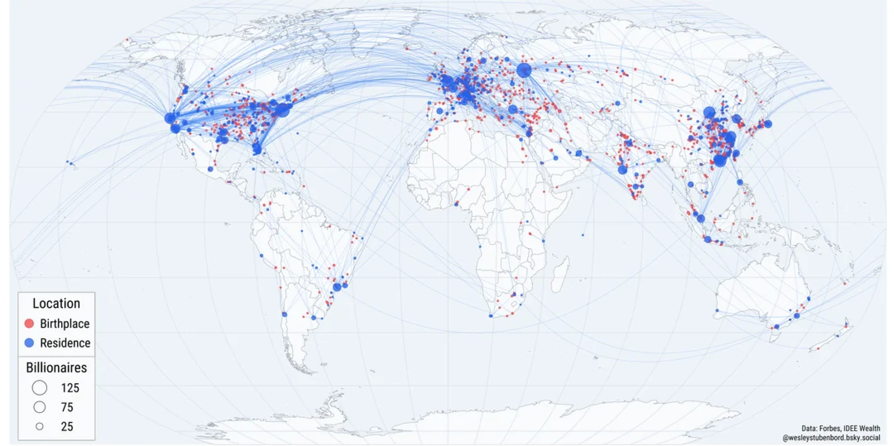
This map tries to show where billionaires were born vs. where they live now, but ends up tangled in hundreds of crisscrossing arcs. It’s difficult to follow individual flows or even interpret patterns by region. The overlapping paths and tiny points make it feel like a data spiderweb, not a chart meant to inform.
Fix: If your network has this many nodes and paths, consider simplifying it. Show fewer categories, aggregate the flows, or use interaction to break it into smaller parts. A complex topic doesn't need a complex data mess.
7. Exaggerated differences

The chart suggests dramatic generational gaps in attitudes toward communism, but the y-axis starts at 0% and ends at just 25%. That compresses the chart vertically, exaggerating the differences between bars. The result looks like the younger generation is overwhelmingly pro-communism, while older groups are nearly unanimous in opposition, when the actual margins are less dramatic.
Fix: Set your y-axis to zero and extend it to the full scale of the data sets. Visual exaggeration undermines trust and misrepresents the size of the differences you're trying to display.
8. Overpopulated scatter plots
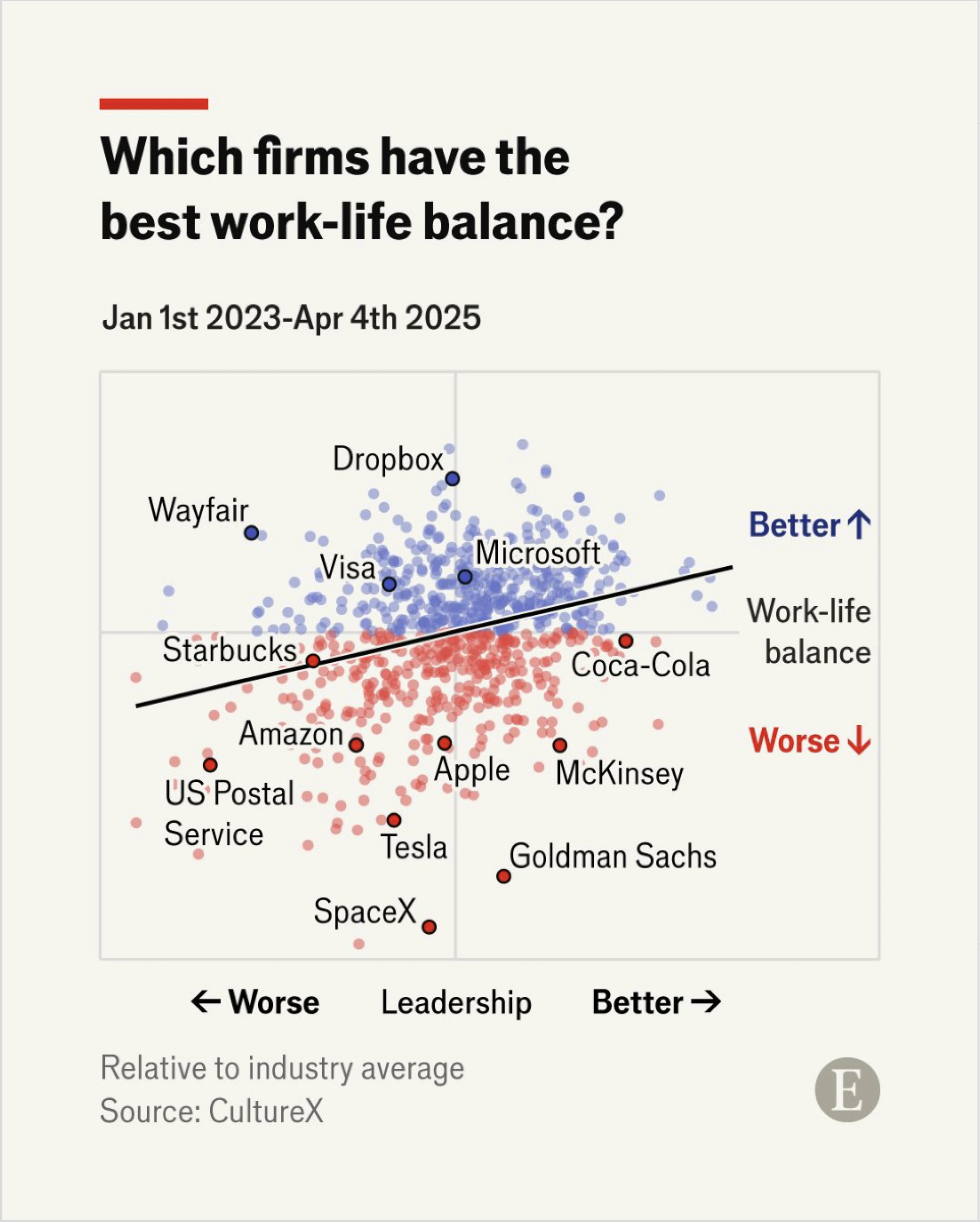
The scatterplot compares leadership vs. work-life balance across companies, but it's overloaded with tiny dots and only a handful of labels. Without hovering or interaction (which this static version lacks), most of the chart is visual noise. The takeaway is buried under too many data points.
Fix: If you're showing lots of data, highlight what's important. Use clear labels, grouping, or filters to guide the viewer. Charts should tell a story, not just dump the data and hope we figure it out.
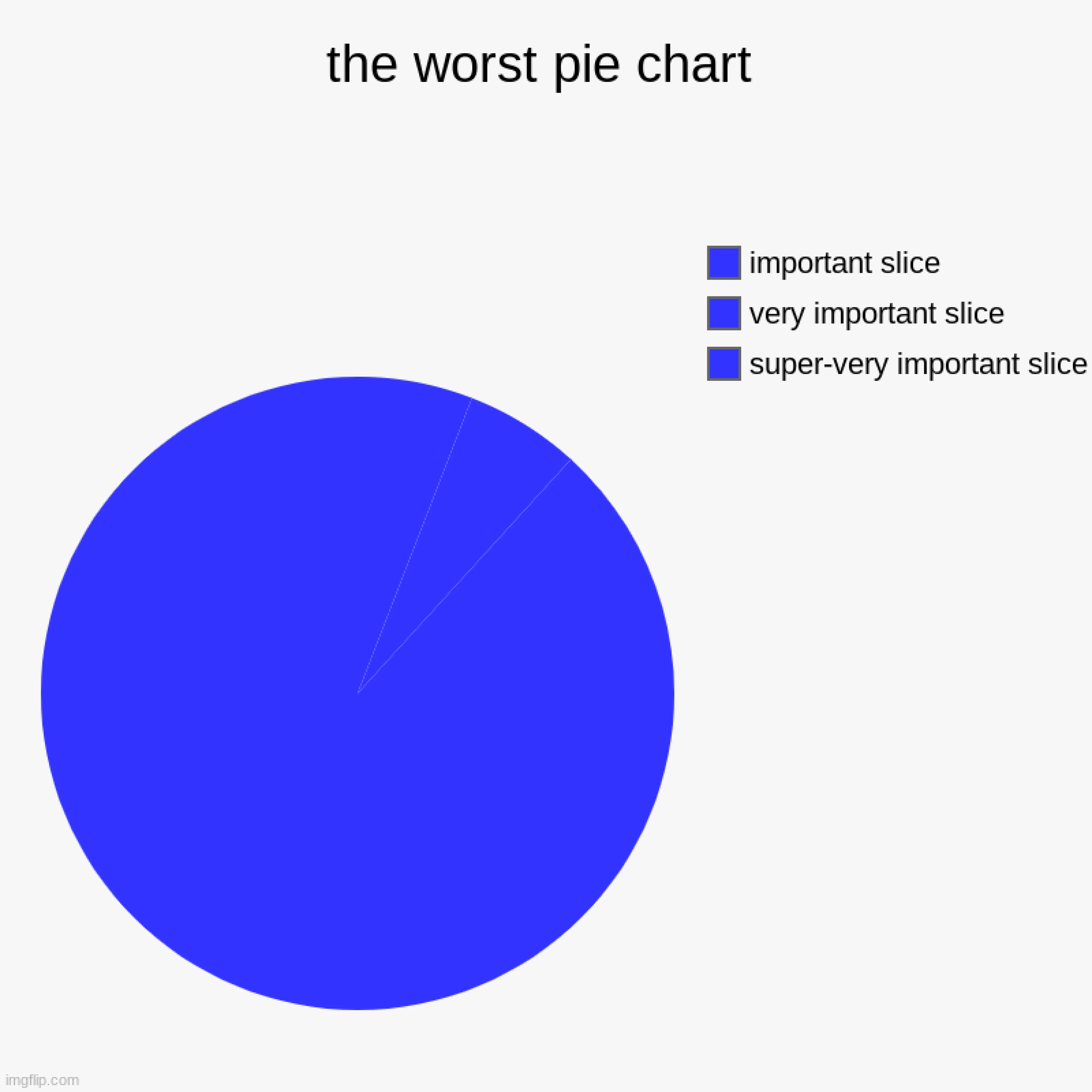
9. Misleading pie visuals
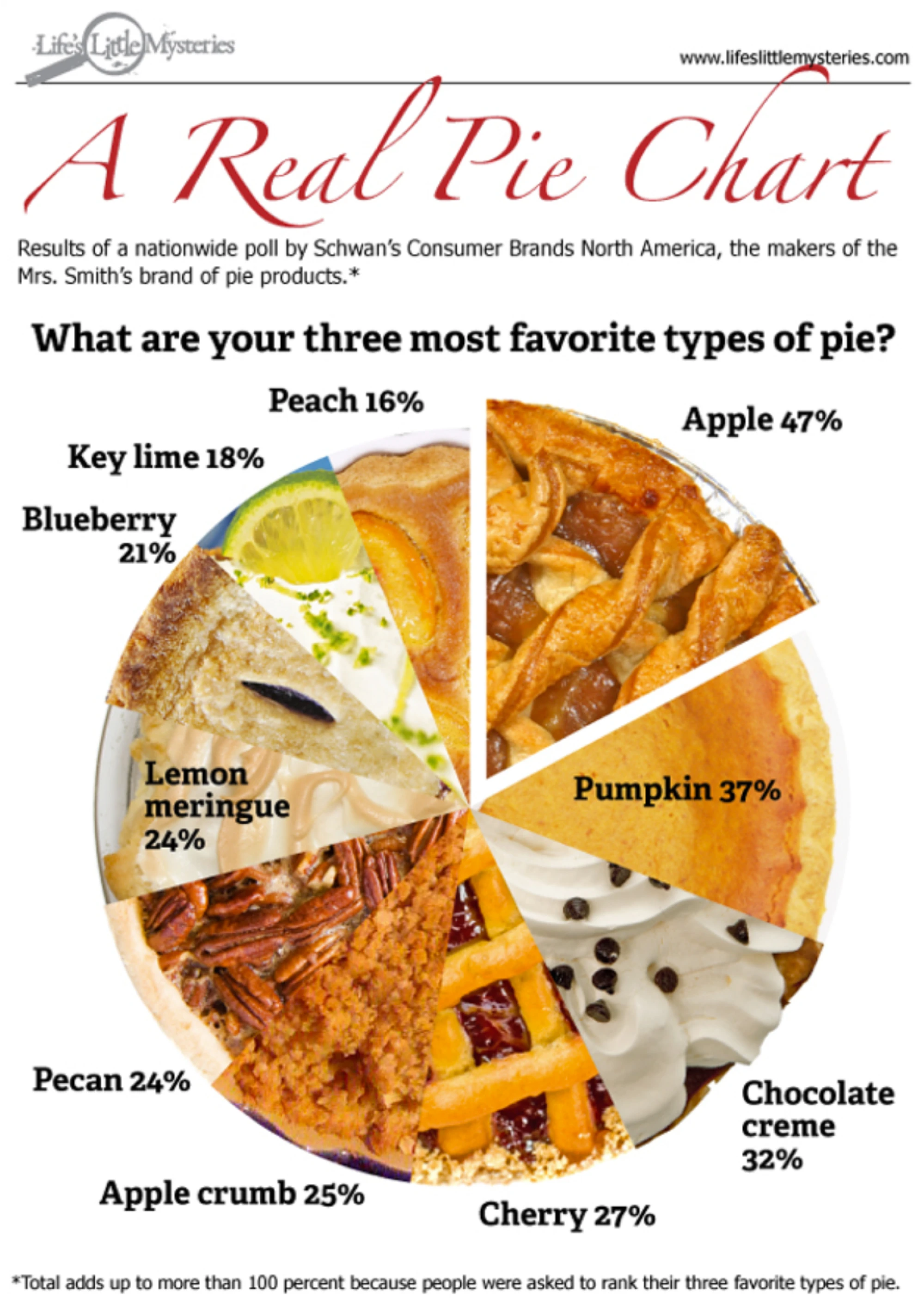
This chart is funny and creative, but from a data perspective, it's a mess. Real pie images make it hard to compare slice sizes. And the total exceeds 100%, which makes this data visualization misleading unless you read the footnote. Viewers might assume the slices represent parts of a whole when they don't.
Fix: If you’re tempted to reach for a quirky layout, remember that a bad chart often hides more than it reveals. A bar chart or stacked bar (with a clear explanation) works better. Save the pie crust for the bakery, not the legend.
10. Radial layout confusion
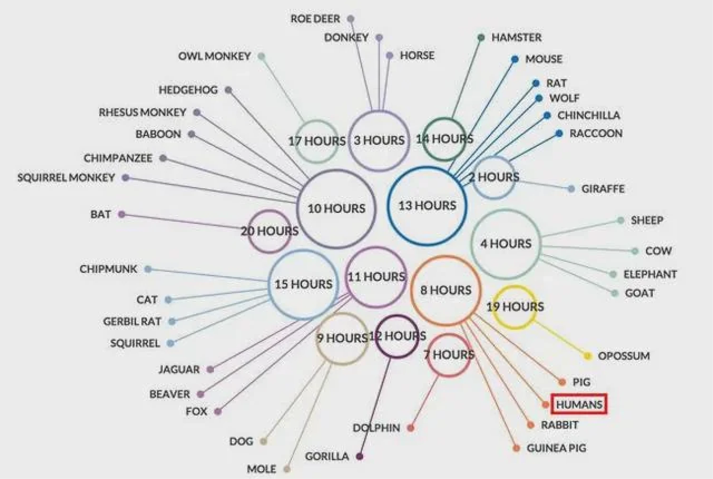
This chart uses a circular starburst layout to display animals and their average sleep hours. But the lines shoot out in every direction, labels are scattered, and there's no clear order. You have to constantly rotate your head (or the image) to read names and understand groupings.
Fix: Stick to simpler layouts like bar graphs when comparing values. If you must go circular, sort values logically (e.g. by sleep duration) and keep label orientation consistent.
11. Visual overkill
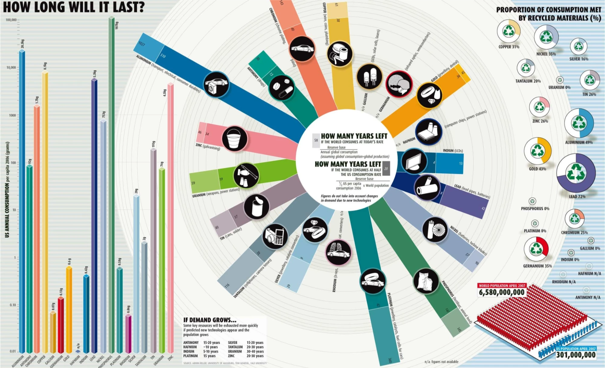
This infographic tries to communicate multiple datasets: years left for resources, U.S. consumption, recycling rates, and population — all at once. It uses bars, radial charts, pictograms, icons, gradients, and tiny labels. The visual clutter makes it hard to find a single, clear takeaway. The more you stare, the less you learn.
Fix: Break complex stories into multiple visuals. When everything competes for attention, nothing wins. Choose a primary message and design around that, and then offer details in secondary charts if needed.
12. Missing context
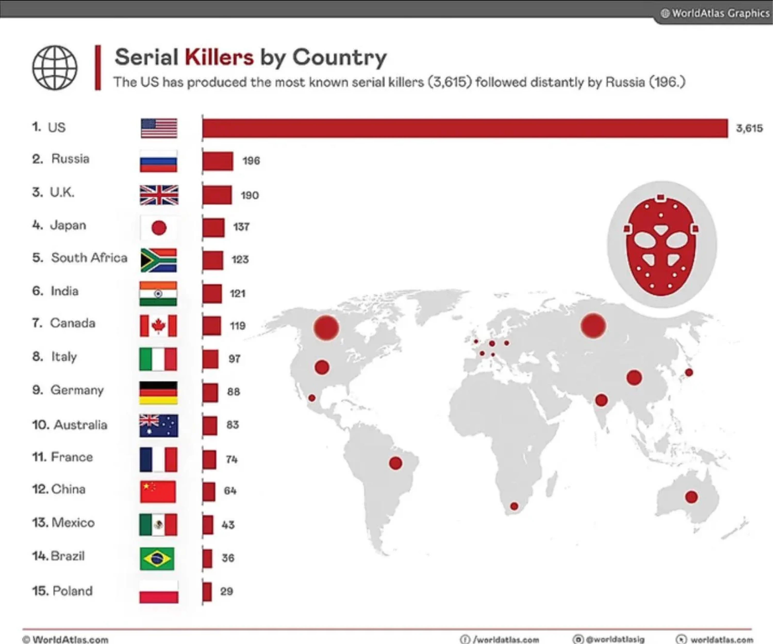
The chart shows total serial killers per country, making the U.S. look dramatically worse. But it ignores population size — bigger countries naturally have bigger totals. The added map is vague and unlabeled, adding confusion.
Fix: Use per-capita data or clearly note population differences. And skip visuals that don’t add clarity. Context matters.
13. Poor chart type choice
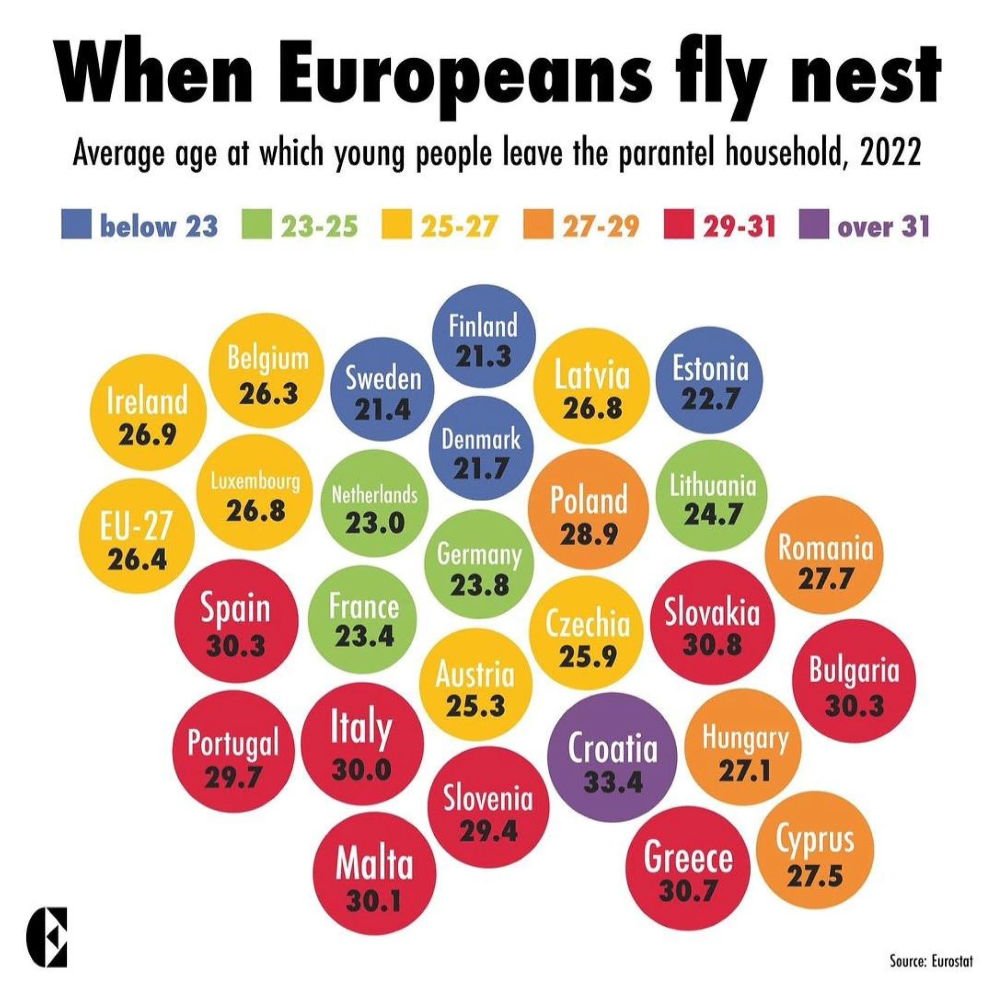
This bubble chart uses colorful bubbles to show the average age at which young Europeans leave home. Visually, it's charming, but functionally, it makes comparison unnecessarily complex. The spatial layout has no clear logic, and the circles don't help us understand scale, distribution, or ranking.
Fix: When presenting data ranked numerically, go with something that helps people scan and compare easily, like a bar chart or a dot plot. Don't let the aesthetic get in the way of clarity.
We’ve seen the worst. The rainbow gradients, broken baselines, exploded pies, and charts so cluttered they’d make your data cry.
But spotting bad chart examples is just half the job. Now comes the part that actually makes your charts better.
Let’s walk through the most common mistakes and, more importantly, how to fix them.
How to fix poor data visualization examples
We’re not just here to laugh at 3D donut charts (though… fair). This section breaks down the most common issues from the Hall of Shame and shows exactly how to fix them — or better yet, avoid them entirely.
Fix color semantics
Color isn’t just decoration. It carries meaning — or it should. When red signals growth or five similar pastels blur together, the message gets lost. One data practitioner put it bluntly:

Some of the biggest problems:
- Random rainbow palettes
- Red = gain, green = loss
- No colorblind-safe contrast
- Legends that explain nothing
Here’s what helps:
- Stick to intuitive color logic — red for negative, green for positive
- Use monochrome gradients to show magnitude
- Test your palette with ColorBrewer or Chartability
- Label your legend like it’s the only thing people will read — because it might be

Take the EU growth map on the left. It shows negative growth in green, visually softening the bad news. Compare that to a risk-level map that uses green for safety and red for danger. Whilenne confuses, the other communicates.
Fix visual clutter
Clutter doesn’t mean complexity — it just means noise. When your chart tries to say everything at once, it usually ends up saying nothing at all.
You’ll often see:
- More than three chart types in one view
- Pictograms, values, and labels stacked together
- Annotations fighting for attention
The fix is simple:
- Remove anything that doesn’t serve the story (drop shadows, 3D, glow)
- Use white space as structure, not decoration — a principle that underscores the complexity of simplicity in design.
- Let one main metric lead, and support it with the rest
In our example, the first version piles everything on — dense labels, mixed styles, visual effects. The cleaner version strips it all back to a single chart type with clear gridlines. The message finally lands.
Fix misrepresentation
Some charts lie on purpose. Most lie by accident. When the y-axis doesn’t start at zero or a timescale skips inconvenient years, even truthful data can deceive.
Typical red flags include:
- Truncated y-axis baselines
- Cherry-picked timeframes
- Dual axes suggesting correlation
What helps:
- Always start the y-axis at zero (especially in bar charts)
- Keep time comparisons consistent
- If you must use dual axes, label them clearly and honestly
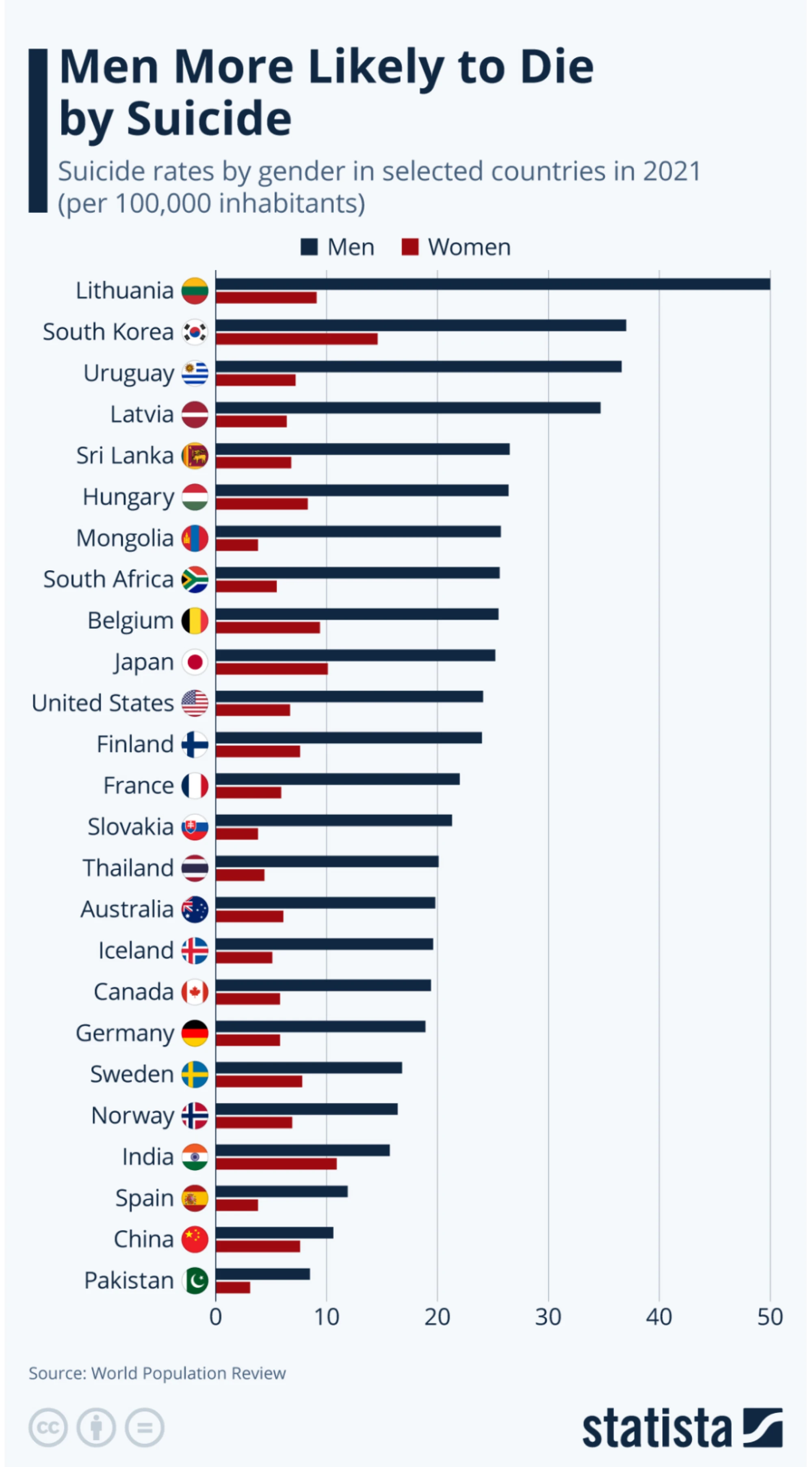
This Statista chart gets it right. The y-axis begins at zero, the bars are cleanly aligned, and each gender is clearly separated and labeled. The result is an honest, digestible visualization that prioritizes clarity over drama.
Fix accessibility
If your chart isn’t readable, it isn’t usable. And if it isn’t usable, it fails — no matter how pretty it looks.
Common accessibility issues:
- Relying on color alone
- Low contrast or tiny fonts
- Missing alt text or keyboard support
Here’s how to make it work for more people:
- Pair color with icons, patterns, or text
- Use high-contrast fonts and proper sizing
- Add alt text, data tables, or keyboard nav
- Test it in grayscale or with a screen reader
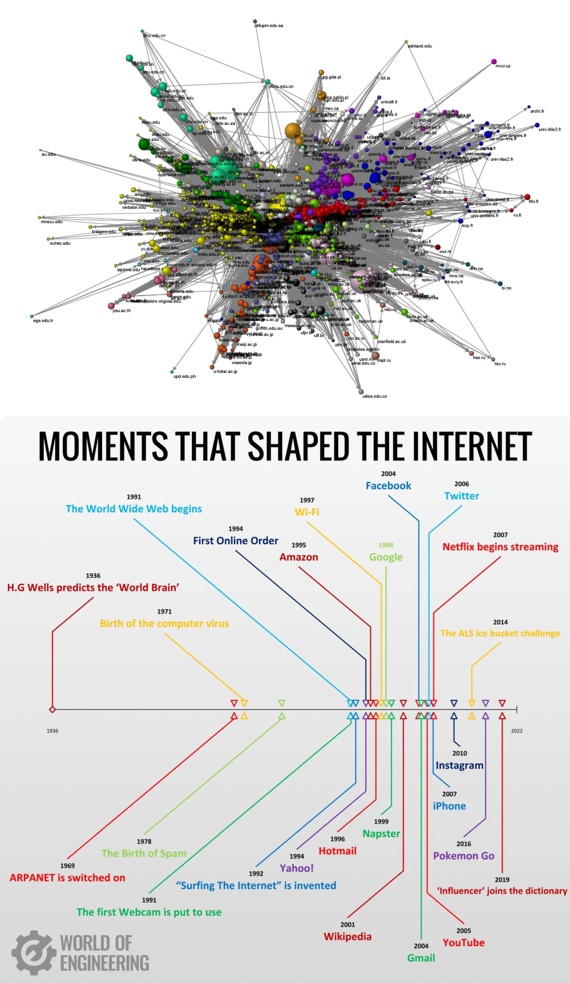
The tangled network graph? It’s visual overload — hard to read, hard to follow, hard to access. The internet timeline, on the other hand, uses color, layout, and spacing to communicate clearly. No guesswork required.
Fix dashboards
Dashboards should tell a story, not host a shouting match between metrics. Here’s how to design a dashboard that guides instead of overwhelms.
The usual culprits:
- Ten charts with equal visual weight
- KPIs scattered randomly
- No visual hierarchy
Make your dashboard work harder by:
- Prioritizing 1–3 key KPIs
- Using drill-downs to reveal detail only when needed
- Arranging charts with intention (e.g. left-to-right = process, top-to-bottom = priority)
This dashboard gets it right. It prioritizes just a few key metrics, groups them logically, and uses consistent colors and chart styles throughout. With clear hierarchy and zero clutter, it proves that a well-designed dashboard doesn’t shout, but guides.
We’ve looked at what goes wrong, and how to make it right. But beyond the fixes, there’s a bigger idea to keep in mind: good design builds trust.
Let’s wrap up with what that really means, and why it matters.
Conclusions: Design for Trust
Good data visualization isn’t about making charts look prettier. It’s about delivering the value of great design through clear, actionable insight. When your visual design supports understanding instead of distraction, you turn data into decisions.
If you’re ready to stop guessing what works and start building dashboards that actually drive insight, we’re here to help.
Partner with Eleken. We design SaaS dashboards that speak clearly, look sharp, and get results.