
Ask someone to name a bad product design example, and they'll probably say Facebook Beacon, or maybe Clippy. If they're a designer, they'll mention dark patterns or infinite scroll.
But the truly damaging failures aren't always dramatic. Sometimes bad design looks like a notification you didn't ask for, or a comment you typed out and then lost because the app refreshed, or an alarm you have to reset every single morning.
At Eleken, we've redesigned enough SaaS products to know that bad design rarely announces itself. It hides in the details, in the features that ship without enough thought, in the metrics that reward engagement over usefulness, in the defaults nobody ever questioned.
That's what this article is about: the everyday frictions that quietly cost products their users.
We'll break bad product design into three levels:
- Level 1: Catastrophic failures: products that didn't survive their own design decisions.
- Level 2: Market rejections: products users tried and walked away from.
- Level 3: Everyday micro-frictions: bad design we've somehow learned to tolerate.
Let's get into it.
Level 1: Catastrophic failures, when bad design ends products
These are the ones that made headlines. The bad design products that had real investment, real teams, and real ambition still failed because the design missed something fundamental.
1. Microsoft Clippy and Copilot (and why the lesson never landed)
Clippy is practically a meme at this point, but it's worth revisiting why people hated it so much. It wasn’t just annoying. It was consistently wrong. It interrupted users in the middle of tasks, offering help they hadn’t asked for, based on assumptions that were almost always wrong.
Clippy was supposed to help, but it mostly interrupted. It didn’t read context and just kept popping up again and again, no matter how often users ignored it. Microsoft removed Clippy in 2001 after years of complaints.
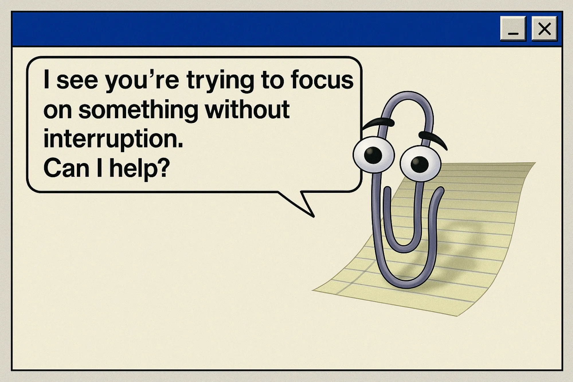
Then, in 2024, Microsoft launched Copilot. It is far more capable. It can write emails, summarize documents, and generate code. But the underlying pattern feels familiar. Users describe it as an intrusive coworker who is always present, often wrong, and hard to ignore.
It’s been embedded across Windows, Word, Edge, Teams, sometimes by default, sometimes without users fully realizing it. And even when turned off, it tends to come back after updates.
The reaction has been telling. On Reddit and TikTok, users joke about Copilot as that coworker who keeps interrupting with bad suggestions. Some explicitly compare it to Clippy, just more powerful and more persistent. The technology improved, but the pattern didn’t.
The lesson: Any assistant, human, digital, or AI, has to earn the right to interrupt. If your product's "helpful" feature is wrong more often than it's right, it becomes the enemy. Design assistance that users can trust, or don't design it at all.
Quibi
Quibi raised $1.75 billion. Its founders had run Disney, DreamWorks, and Hewlett-Packard. Its content featured Steven Spielberg, Jennifer Lopez, and LeBron James. By any reasonable measure, this product should not have failed, but it shut down six months after launch.
Quibi was built around a hypothesis: people want premium, short-form video content on their phones during commutes and spare moments. The design followed the hypothesis perfectly. Content was sliced into ten-minute segments. A proprietary feature called Turnstyle let videos rotate seamlessly between portrait and landscape. Everything was engineered for the on-the-go viewer that Quibi's team had imagined.
But there was one problem: that viewer didn't behave the way Quibi expected.
Quibi blocked screenshots entirely. On a platform designed for mobile, the device most people use to share things with their friends, you couldn't capture a moment, create a meme, or clip a scene to send someone. Screenshots of Quibi appeared as a blank black screen, which means no memes. And if people can't turn Quibi scenes into jokes they'll share elsewhere, its shows won't ever become fixtures of the cultural zeitgeist. Adam Fard Studio Organic sharing, the engine that made Netflix's Tiger King a cultural moment, was completely disabled by design.

The lesson: A product built for an imagined user will fail even when the technology is flawless, and the budget is unlimited. Before designing the experience, validate that the behavior you're designing for actually exists. Quibi didn't ask whether users wanted to share clips. It assumed they didn't, blocked it by design, and eliminated any chance of viral growth in the process.
3. Skype
Skype was once so dominant that it became a verb. "Skype me" entered the language the way "Google it" did. By 2006, it had over 100 million users. It pioneered consumer video calling before most people knew what that meant. And then, in May 2025, Microsoft shut it down entirely.
The proximate cause was competition as Zoom, Teams, and Google Meet appeared. But the real story is what happened between dominance and death, and it's a design story.
In 2017, Skype launched a major redesign. The goal was to attract younger users by adding Snapchat-style stories, bold color schemes, and animated emoji reactions. The result was a product that had buried its core functionality under features nobody had asked for. App store ratings collapsed from 3.5 to 1.5 stars almost immediately. Users described the app as "convoluted," said performance had deteriorated, and complained that "the whole thing lost the ease of use it used to have." Skype had to publicly apologize and roll back many of the changes.
The lesson: Feature additions that ignore what users value don't strengthen a product but weaken it. Every unnecessary layer you add is a place where your core experience can fail. Skype had one job that users loved it for. It stopped doing that job well, and when the moment came to prove itself, it had nothing left.
Level 2: Market rejections: products users tried and walked away from
These examples of bad product design aren't as dramatic as a product being discontinued. They're subtler. Users showed up, gave it a real shot, and then quietly left. Usually, because the design made them feel manipulated.
4. Notion's blank canvas problem
Notion is one of the most powerful productivity tools ever built. It's also one of the most abandoned.
Here is Notion's core UX tension: the same flexibility that makes it powerful for expert users makes it paralyzing for new ones. The product is so customizable that it offers no opinionated starting point and no answer to the most basic question a new user has: Where do I begin?
The experience is surprisingly consistent. Some users spend weeks setting things up before doing any real work. Others discover key features months later that would’ve changed everything. For a tool meant to reduce friction, Notion often adds it, not because the features are bad, but because users are left alone with all of them at once.
You can feel this even in small moments. As one Reddit user put it, tools like Notion or even Apple Notes can “...feel too heavy when you just want to write one raw thought. I've even started typing ideas directly into the Safari search bar on my phone, just because it’s faster than opening an app…” That says a lot.
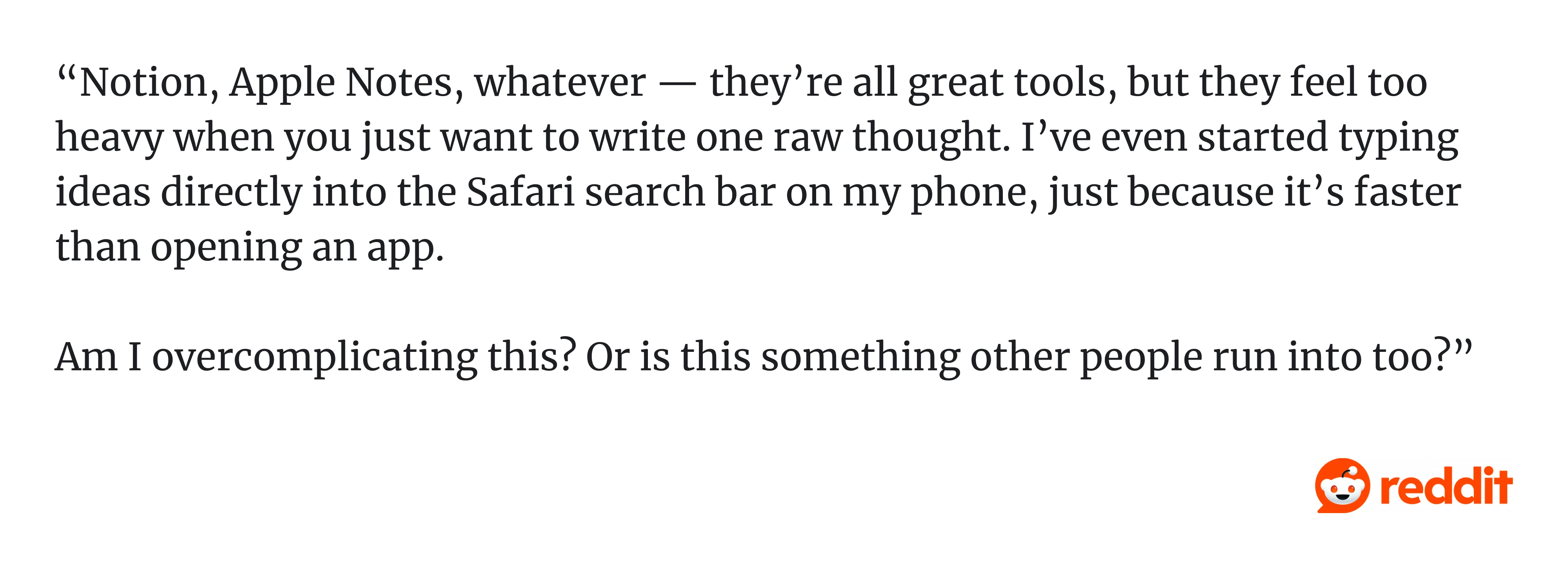
The blank canvas is intentional. Notion is built for people who want full control. But new users don’t yet know what system they need. Dropping them into an empty page is like handing someone architectural software and asking them to design a house before they can live in it.
Templates helped. But the core issue remains: when the first step is “figure it all out yourself,” many users simply won’t.
The lesson: Flexibility is not a substitute for guidance. The more powerful your product, the more responsibility you have to give new users a path in — not just a canvas. An empty starting state isn't neutral. For most users, it's a reason to leave.
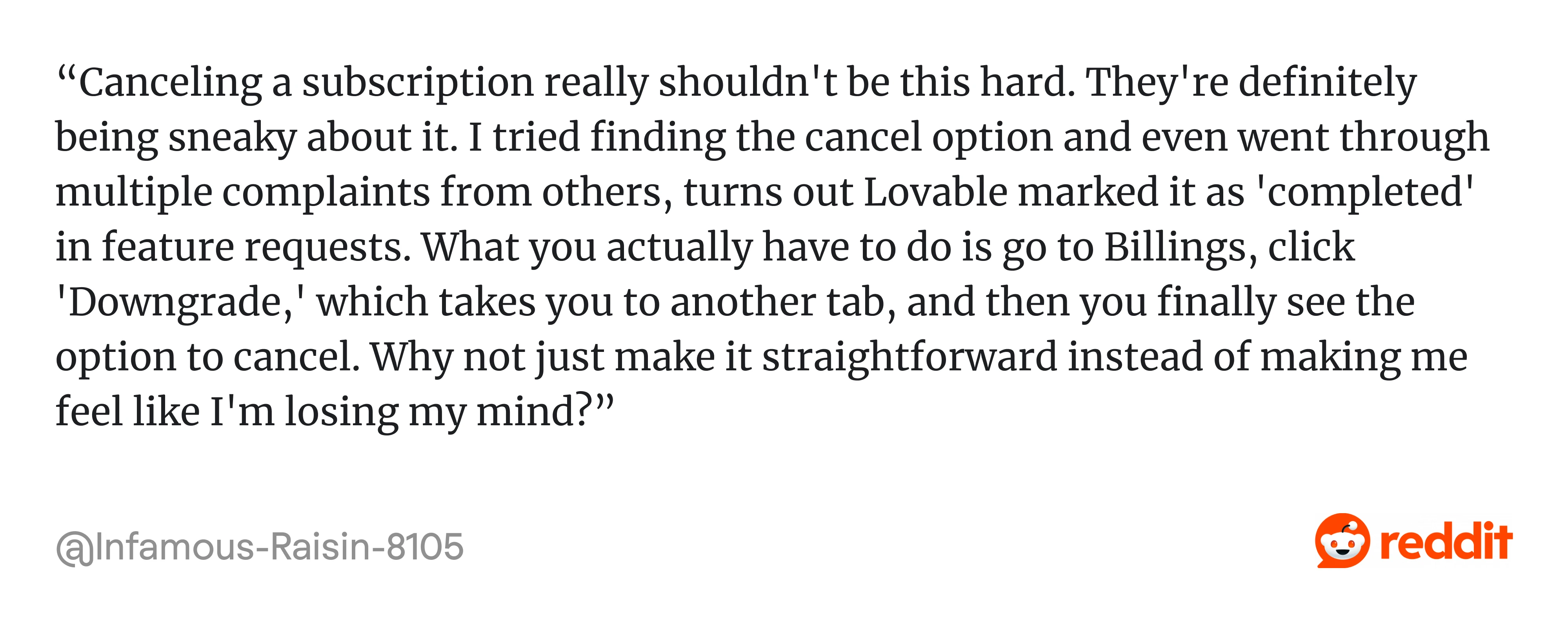
5. Subscription cancellation flows
You know this one: you decide to cancel a subscription, click "Cancel plan," and then you're taken to a screen explaining what you'll lose. Then another screen offering a discount. Then one asks if you want to pause instead. Then a final screen with guilt-trip copy like "Are you sure? Your progress will be lost forever."
This pattern has a name: roach motel design. Easy to get in, nearly impossible to get out.
It might reduce short-term churn, but it definitely destroys long-term loyalty. Users who feel trapped don't come back.
A recent example is Lovable, which has been getting pushback for its cancellation flow. A video circulating online shows multiple steps, repeated prompts, and persuasive messaging that many users call dark patterns. Some argue it’s a smart retention design, while others say it crosses the line.
What’s telling is where the complaints show up, even on Lovable’s own Reddit community, users are openly frustrated with how hard it is to leave.
Adobe took this pattern further than most and paid for it in federal court. When users signed up for Adobe's software, the company pre-selected the "annual paid monthly" plan, which put subscribers on the hook for a full year of payments made in monthly increments without clearly explaining that commitment at signup. The monthly price display made it appear to be the cheapest option on the page, but it wasn't. It was a 12-month contract.
The plan carried a hidden early termination fee if a user tried to cancel after the free trial. Still, before the year elapsed, the fee details were only visible if users clicked a small information icon, which still didn't disclose the exact amount. When users finally tried to cancel, some who had contacted customer service believed they had successfully canceled, only to find Adobe was still charging them.
In June 2024, the U.S. Department of Justice filed a complaint on behalf of the FTC, and Adobe ultimately settled for $4.95 million, a figure critics noted was modest relative to the company's $21.5 billion in annual revenue, likely representing only a fraction of what the practices generated.
What makes the Adobe case significant for SaaS designers is the signal. A Forrester analyst called it "an industry-wide malpractice," and noted that the lawsuit was intended to spook other companies into abandoning coercive design. Adobe is an example of where the entire SaaS subscription model ends up when short-term retention metrics consistently outweigh user trust.
The lesson: Don't build churn reduction through hostility. If a user wants to leave, let them leave cleanly. The ones worth keeping will come back on their own terms. And if your cancellation flow has ever been described as a dark pattern, even once, even by one user, that's enough reason to redesign it.
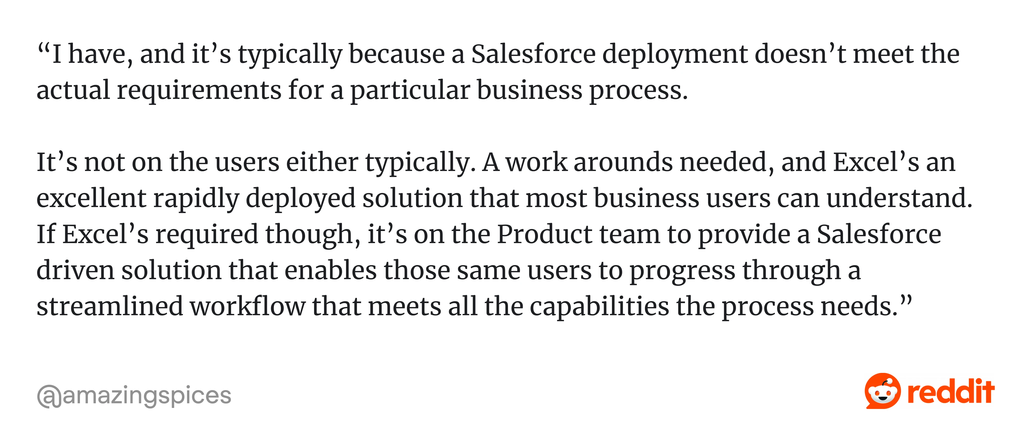
6. Salesforce Parallel Spreadsheet
Ask sales teams how they use Salesforce, and many will tell you they also keep a spreadsheet. Not instead of Salesforce, alongside it. A separate file to track deals in a way that actually makes sense to them.
That extra spreadsheet is a design failure. Not a catastrophic one, Salesforce is still dominant. But it shows users solving a problem your product should have solved.
As one practitioner put it on Reddit: “...it’s typically because a Salesforce deployment doesn’t meet the actual requirements for a particular business process.
It’s not on the users either typically. A work arounds needed, and Excel’s an excellent rapidly deployed solution that most business users can understand. If Excel’s required though, it’s on the Product team to provide a Salesforce driven solution that enables those same users to progress through a streamlined workflow that meets all the capabilities the process needs.”
The reason is simple: years of feature growth have made the interface heavy and inconsistent:
- Different modules behave differently.
- Fields pile up.
- Layouts get messy.
- Even simple tasks, like creating a quick report, come with unnecessary steps.
As a result, sales teams spend more time managing the CRM than actually selling, the exact opposite of what the tool is supposed to do. When users start working around your product instead of with it, something fundamental is broken.
The lesson: A product can be dominant and still have serious design debt. When users maintain parallel systems alongside your product — spreadsheets, Notion docs, Slack threads with key info — they're not being difficult. They're showing you exactly where your product's design stops working for them.
Level 3: Everyday micro-frictions: bad design we've learned to tolerate
This is where the worst product designs live. These poorly designed products examples are the small, daily frustrations that users adapt to instead of complaining about. That adaptation is dangerous. It means the problem never gets fixed.
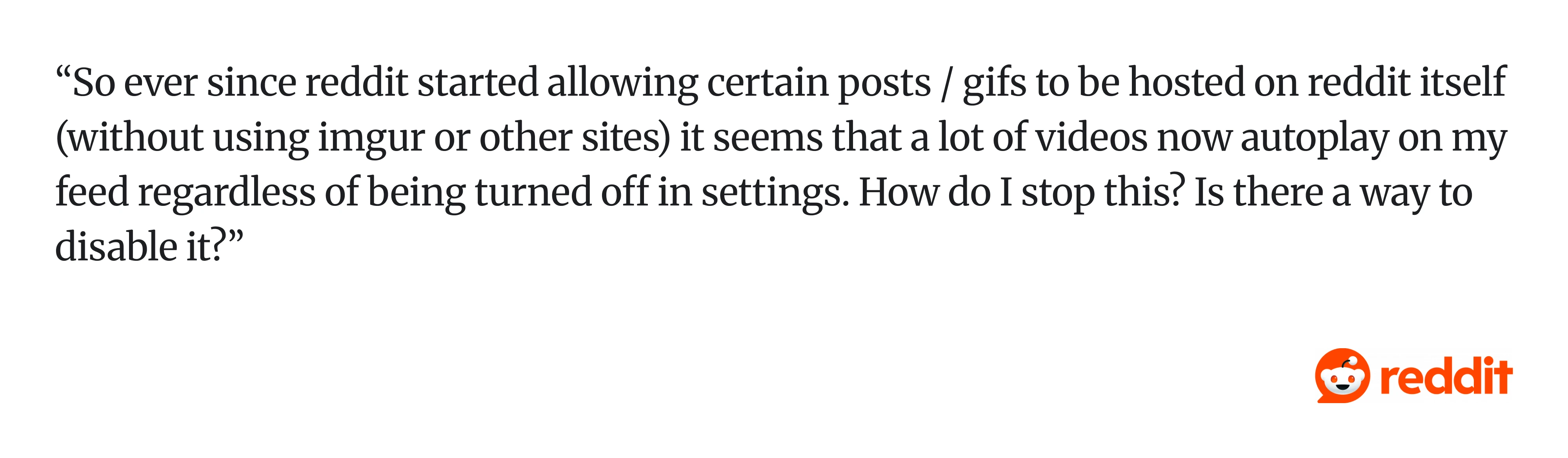
7. Reddit app (autoplay + draft loss)
The Reddit app autoplays videos even when you've scrolled past them. It also has a habit of losing comment drafts mid-edit if you switch tabs or the app refreshes. These are paper cuts.
But paper cuts accumulate. Losing a comment you spent five minutes writing is infuriating in a way that's hard to articulate and easy to just... not come back from.
Autoplay might boost engagement, but it also introduces interruptions, unexpected refreshes, and loss of user control. For example, this Reddit user shared how autoplay is difficult to stop: “...It seems that a lot of videos now autoplay on my feed regardless of being turned off in settings. How do I stop this? Is there a way to disable it?“
The lesson: Protect user effort at all costs. If a user has invested time in your product (typing, scrolling, building), your job is to protect that investment. Autoplay and draft loss both signal the same thing: the product wasn't designed with user effort in mind.
8. LinkedIn navigation and feed UX
LinkedIn has a navigation problem. There are too many surfaces competing for attention, such as feed, jobs, posts, messaging, notifications, learning, events, and none of them are quite where you'd expect them to be. Users frequently can't find things they've found before.
This happens when products grow by addition rather than by design. Every new feature gets its own tab. Nobody goes back to question whether the overall structure still makes sense.
Each feature competes for attention, as this LinkedIn user put it: “The biggest problem with the LinkedIn feed is that it is cluttered with irrelevant updates, ads, and stale content. It’s definitely not built for how most of us want to use it…”
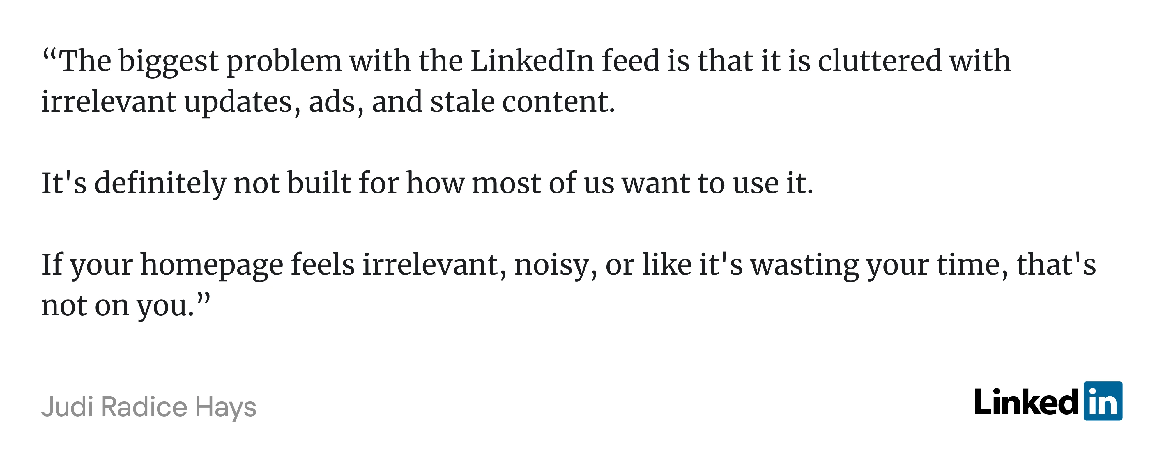
The lesson: Information architecture matters more than feature count. A product with ten well-organized features is easier to use than one with thirty scattered ones. Growth should come with pruning, not just adding. This is a good UI bad UX problem in its purest form.
And if you want to see even more bad UX examples, consider watching this video:
9. Jira's workaround culture
Jira was built around a single-assignee model. One ticket, one owner. It's a reasonable default for individual task tracking, but in practice, collaborative work rarely fits that shape. Design reviews, cross-functional tickets, shared research tasks — these involve multiple people with shared accountability. Jira doesn't natively support that, so teams build around it.
That's the tell. When a team of professionals has to maintain an internal wiki page explaining how to use a core feature of a tool they pay for, that's not a power-user quirk. That's a missing feature wearing a workaround as a disguise.
The Jira example is particularly pointed because the workarounds themselves cause problems. Custom fields don't show up on boards. Accountability splits in ways that reporting can't track. New team members inherit undocumented conventions that feel arbitrary because no one can quite remember why they were invented.
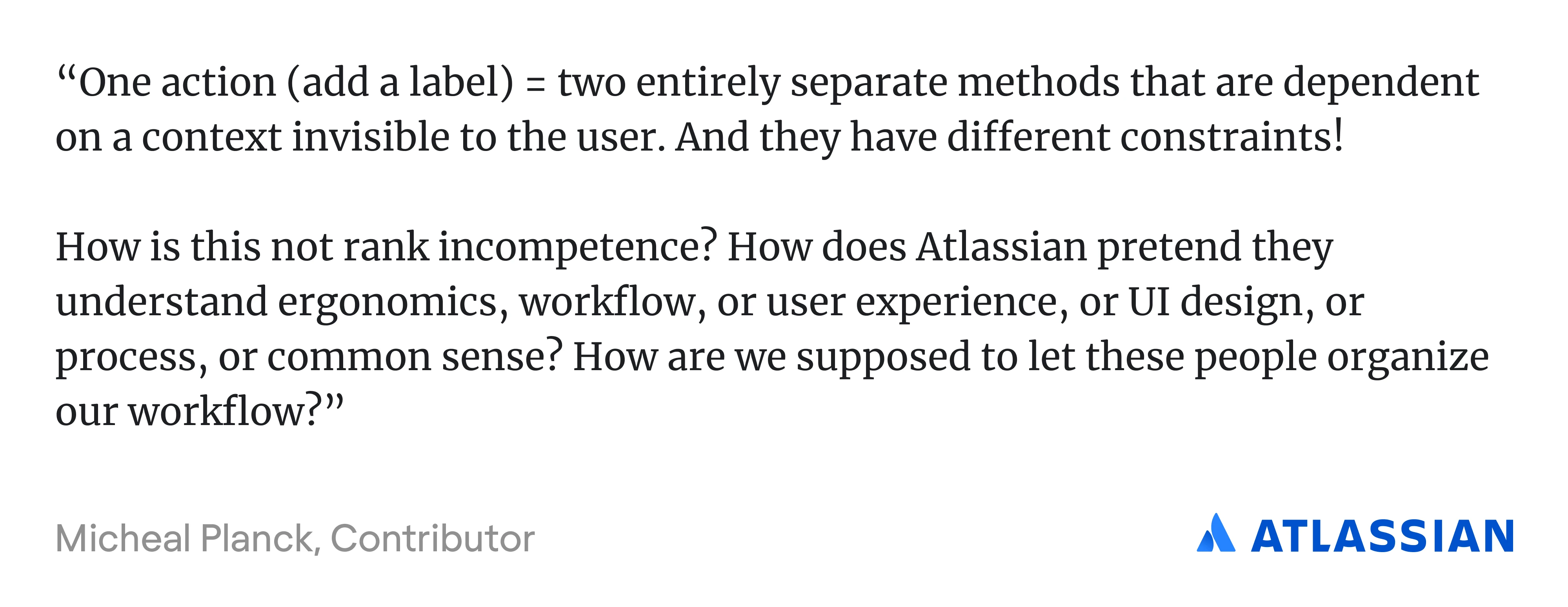
As one Atlassian community member put it: “…One action (add a label) = two entirely separate methods that are dependent on a context invisible to the user. And they have different constraints!” Memorizing every context-dependent hack becomes the job.
The lesson: When users consistently build their own systems to compensate for something your product doesn't do, that's not creativity — it's friction in disguise. Workarounds are the most honest product feedback you'll ever get, because users never file them as bug reports. They're the most honest UX design requirements research you'll ever get.
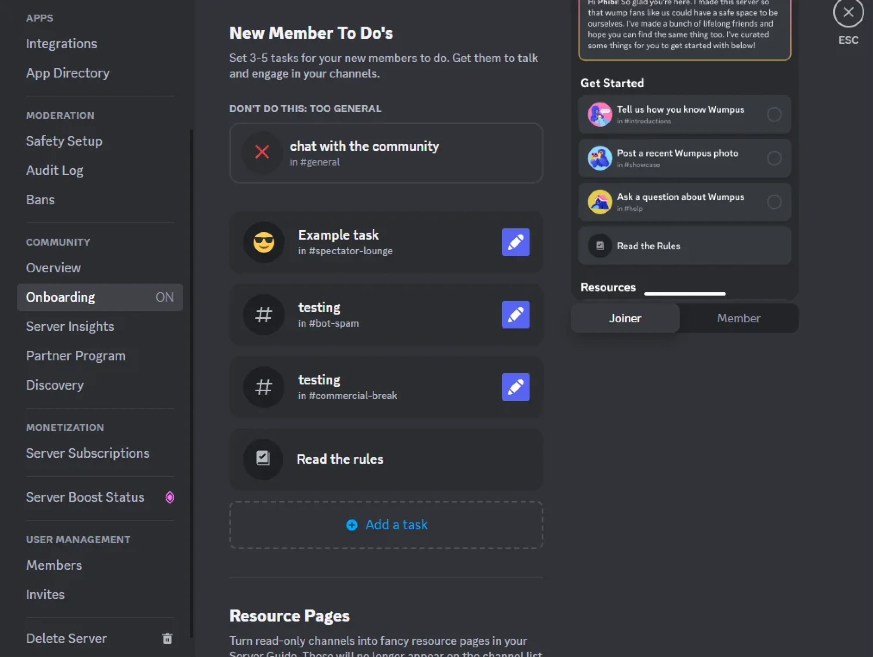
10. Discord onboarding confusion
Discord is powerful but also overwhelming. New users are immediately dropped into a world of servers, channels, roles, and permissions with little guidance on what to do first:
- Where do you click?
- What is a server?
- Why can’t you post here?
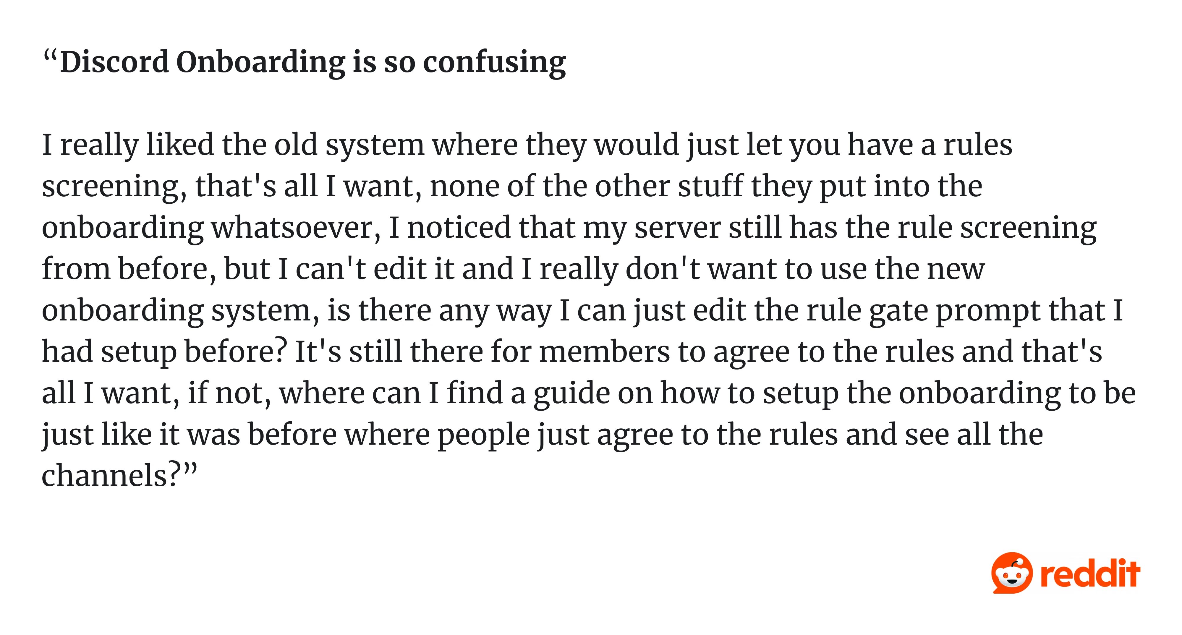
One Redditor wrote in a comment: “Discord Onboarding is so confusing. I really liked the old system where they would just let you have a rules screening, that's all I want, none of the other stuff they put into the onboarding whatsoever, I noticed that my server still has the rule screening from before, but I can't edit it and I really don't want to use the new onboarding system…
The interface reflects how the system works, not how people think. This is a classic case of power-user design punishing beginners.
The lesson: A product isn’t intuitive just because it’s logical. If users can’t get started, the design has already failed.
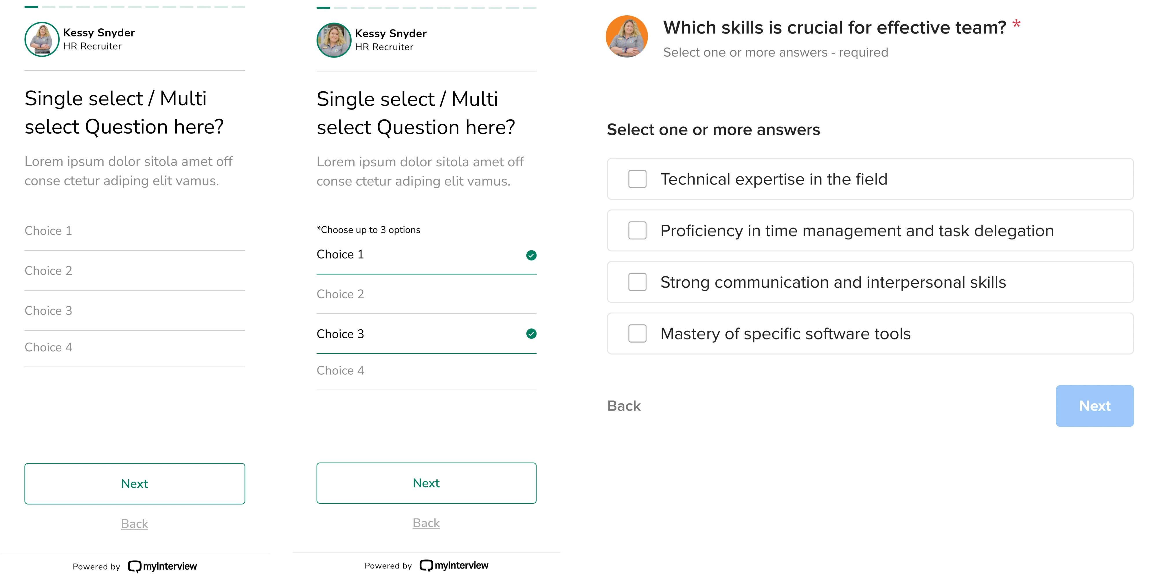
11. SaaS dashboards with low information density
There’s a strong trend in SaaS UI toward minimalism: lots of whitespace, large typography, clean cards. It looks great in a Dribbble shot. In practice, it often makes products harder to use.
We saw this in a SaaS app redesign for myInterview, where the candidate flow had a 90% drop-off rate.
The issue wasn’t the product. It was the interface.
Inputs were unclear. Patterns were unfamiliar. Users had to figure out how things worked instead of just moving forward, so they dropped off.
We fixed it by restoring clarity and hierarchy:
- used familiar patterns (like checkboxes);
- Followed UI/UX design principles;
- made interactions obvious;
- simplified layout and instructions.
The lesson: Minimalism is not usability. In SaaS, users don’t need more whitespace; they need less friction. So, it’s time to redesign your product.
12. Notification spam
Most apps turn every notification on by default. Badge alerts, push notifications, email digests, weekly summaries, all of it, on, from day one. The logic is straightforward: more notifications mean more re-engagement. More re-engagement means better retention metrics.
Except it doesn't. It means users learn to ignore everything, or worse, turn off notifications entirely, or delete the app.
As one Reddit user shared: “I am trying to tone down the number of notifications I receive daily because I am starting to feel overwhelmed by all the buzzes. Assuming most of us here are tech enthusiasts and own multiple devices on different platforms…
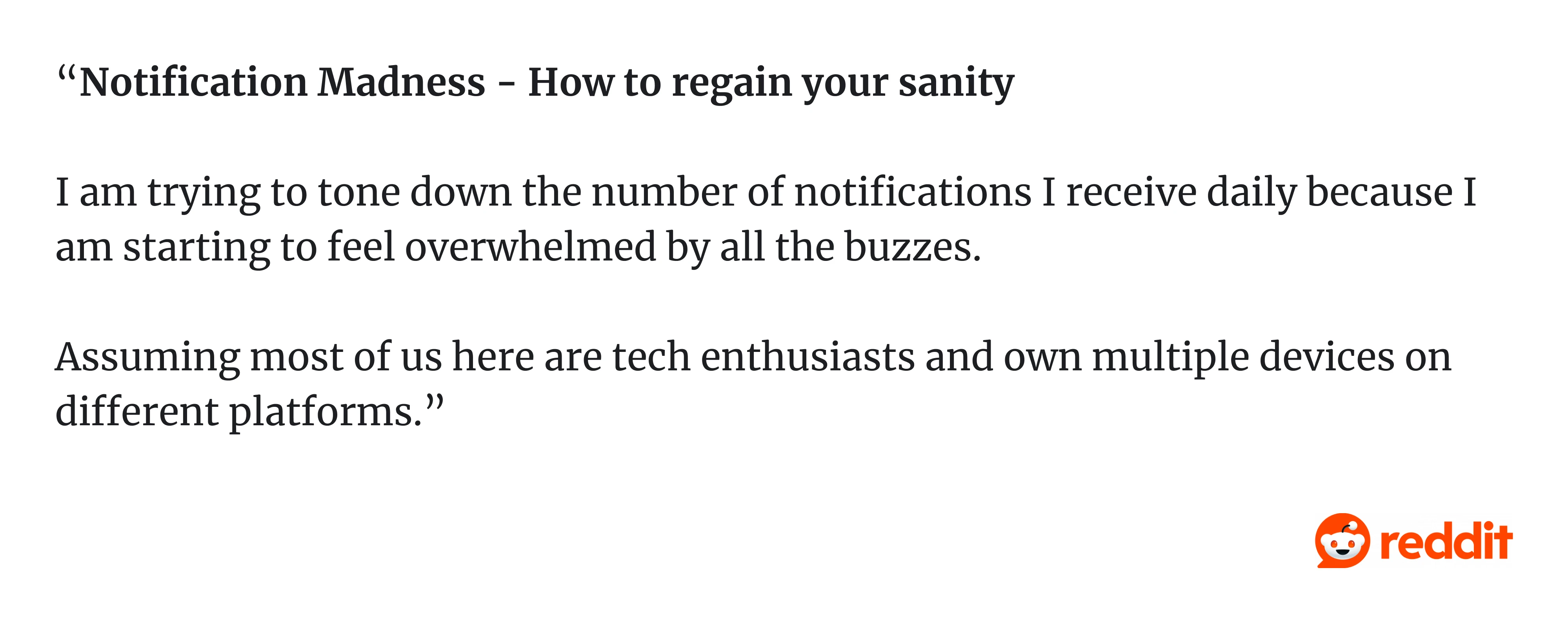
The lesson: Engagement metrics and user experience are not the same thing. Designing for sessions often means designing against users. Notifications should be earned, not assumed.
13. Infinite scroll with no "done" state
TikTok, Instagram Reels, YouTube Shorts. All of them use infinite scroll, a feed that never ends, a signal that never says "you're caught up." There's no natural stopping point, no moment of completion. Just more content.
This is intentional. It's also a bad design example that the industry has largely normalized. Addictive UX is not the same as good UX. And the best designers are starting to push back, building "you're all caught up" states, time-spent reminders, and session limits into products that actually respect users' time.
As one Redditor put it: “The affect of the endless scroll available on the internet seems to be destroying my life... I don't know how to disconnect. I despise the internet and don't know how to leave it behind.”
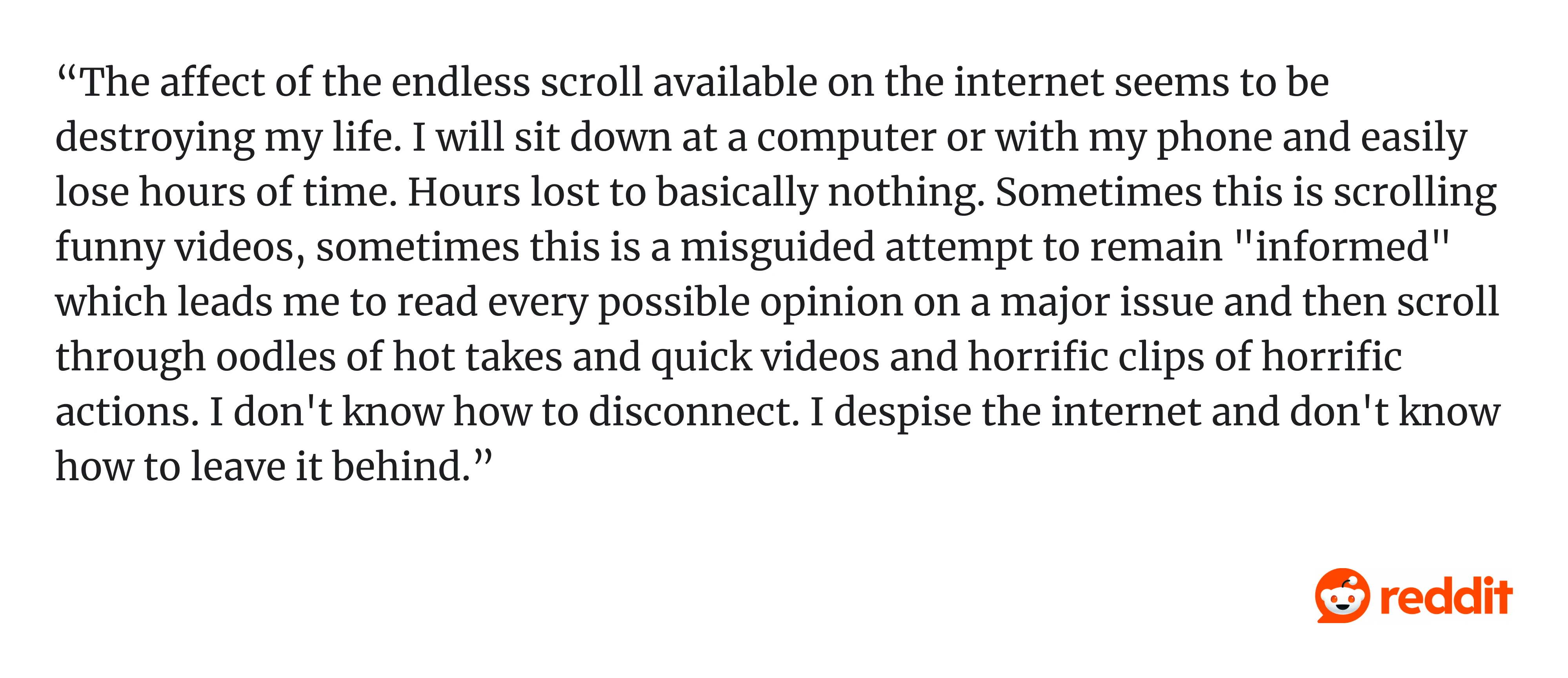
The lesson: Ethical design means giving users a way out. Designing a product that users can't stop using isn't a success. It's a warning sign.
14. HubSpot SaaS settings pages that feel like a junk drawer
Open the settings page in many B2B tools, and you’ll find everything: notifications, billing, permissions, integrations, random toggles, etc. All in one place.
This is settings sprawl, when every new feature adds another option, but nothing gets reorganized. Over time, the settings page becomes a dumping ground. Users stop exploring and start guessing.
A good example is HubSpot. Its settings area reflects years of feature growth, dozens of categories, deeply nested menus, and overlapping concepts. Even experienced users struggle to find simple options because everything lives in settings, but nothing is clearly organized. On Reddit, one user directly asks: “Why is Hubspot is so impossible to use?”
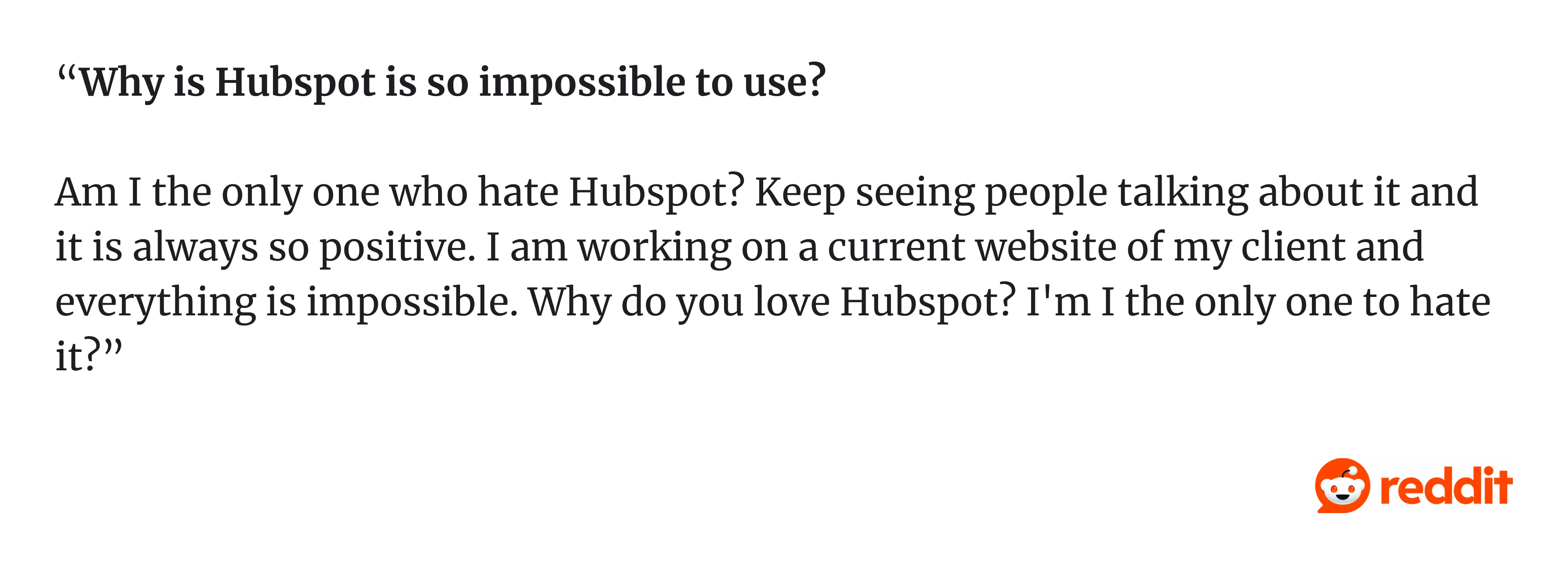
The lesson: Settings are not storage. They’re part of the experience. If everything lives there, nothing is discoverable.
15. CAPTCHA UX
You’re trying to sign up. Instead, you’re solving puzzles:
- “Select all squares with bicycles.”
- “Try again.”
- “Now traffic lights.”
CAPTCHAs are meant to stop bots, but they often block real users instead. They interrupt the flow, fail unpredictably, and rarely explain what went wrong. This creates friction at the worst possible moment, right before conversion.
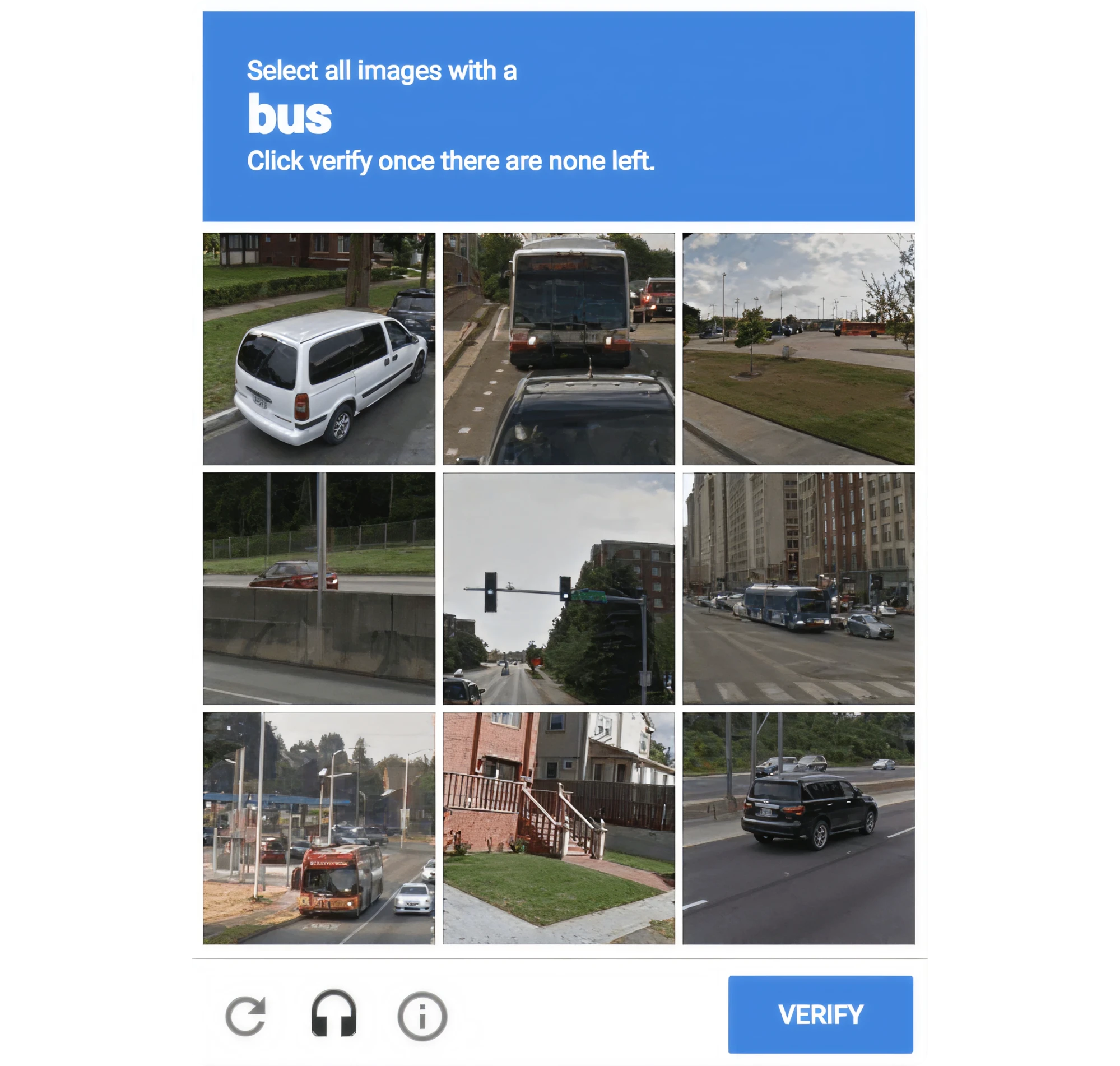
The lesson: Security UX should be invisible. If it must interrupt the user, it should at least explain itself clearly.
16. AI assistants that don’t explain confidence
AI tools generate answers that sound confident, even when they’re wrong. Users see clean, polished responses with no indication of uncertainty, sources, or warnings.
The interface suggests certainty where none exists. This is especially dangerous in tools used for research, writing, or decision-making.
The lesson: AI UX must communicate uncertainty. If the system is guessing, the user should know.
The bad UX checklist
Before you ship, run your product against this list. If more than two or three of these apply, you have work to do. And to get started, create your website redesign project plan.
A digital product is badly designed if:
- Users memorize steps instead of recognizing UI cues.
- Errors are irreversible or hard to undo.
- Important actions are hidden or require multiple steps to reach.
- Users lose progress: drafts, forms, filters, selections.
- Settings feel like a junk drawer.
- There's no clear next step after completing a task.
- It prioritizes engagement over user goals.
- Users have invented workarounds for things the product should handle.
This isn't a complete UX design audit, but it's a fast way to surface the most common friction points.
How to fix bad product designs: a mini-playbook
Identifying bad design examples is the easy part. Conducting UX audit and fixing it requires some discipline. Here is what you can do:
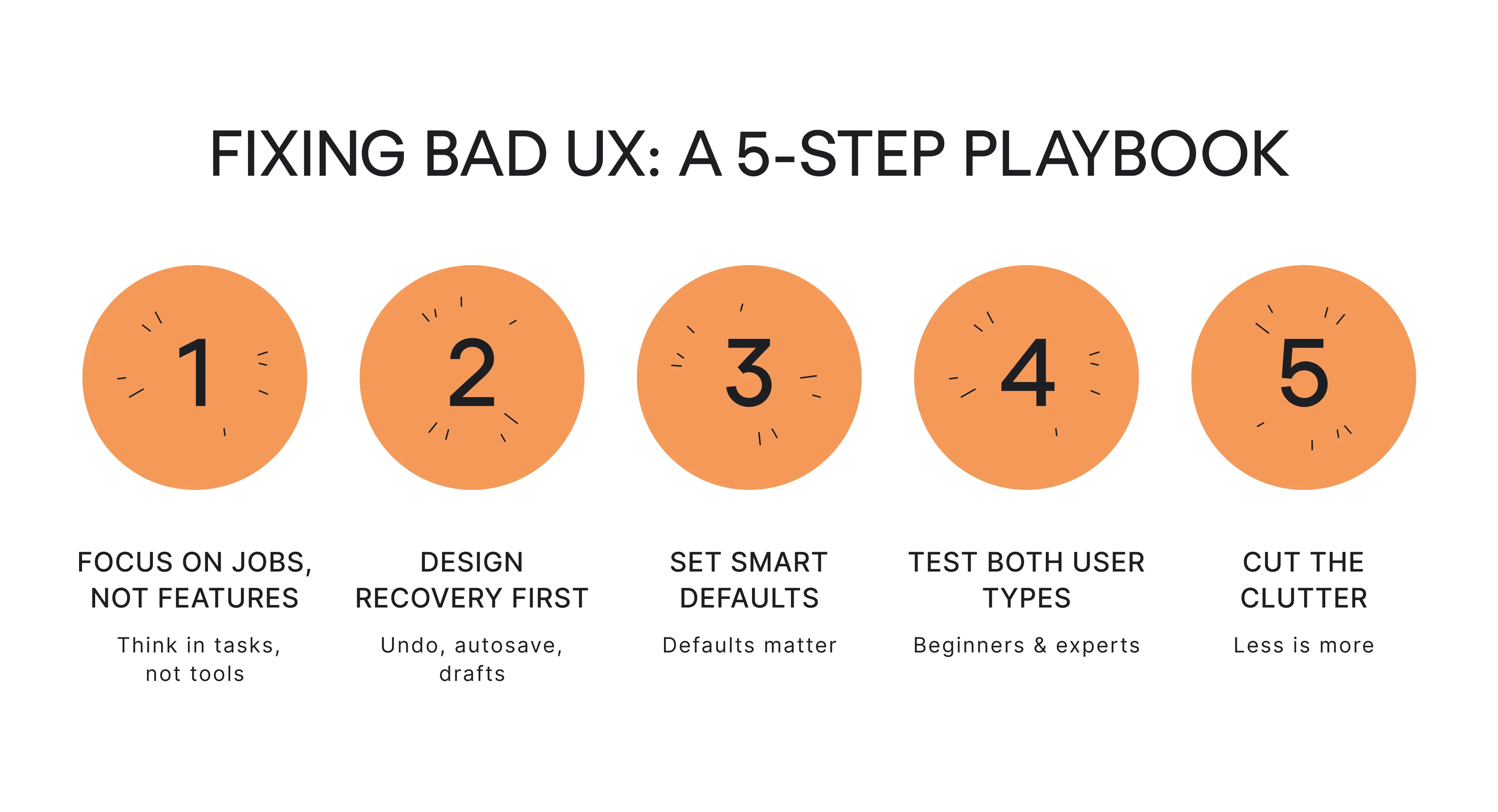
- Fix #1: Replace feature lists with jobs-to-be-done.
Ask what the user is trying to accomplish, not what feature they're using. This reframe catches a lot of the "novelty over utility" failures early.
- Fix #2: Design error recovery first.
Undo, autosave, drafts… Build these before you build the feature itself. If a user can't recover from a mistake, the feature isn't finished.
- Fix #3: Use defaults responsibly.
Defaults are design decisions with outsized impact. Whatever you ship on by default, the majority of your users will never change. Make sure you're comfortable with that.
- Fix #4: Test with beginners and power users separately.
A design that works for an expert is not necessarily good. A design that works for a beginner might frustrate an expert. You need to know where your product lives on that spectrum and design accordingly.
- Fix #5: Cut features.
This one hurts. But a product with fewer, better-designed features will always outperform one that tries to do everything. Complexity compounds. So does simplicity.
If you want to go deeper, a structured UX design audit is the most reliable way to find what's broken before your users do. If you need more details, you can explore UX audit report examples.
Conclusion
Most badly designed products just weren't designed with the user as the first priority. They were designed to hit metrics, ship features, reduce churn, and maximize session time. And users feel that the moment they open the app.
But bad design is fixable, usually faster than teams expect, and with more impact than they anticipate.
If you recognized your product in any of these examples, that's a good sign. It means you're paying attention.
Eleken works with SaaS teams to find and fix UX issues before they cost growth. If you're ready to take a closer look at what's slowing your users down, let's talk.


