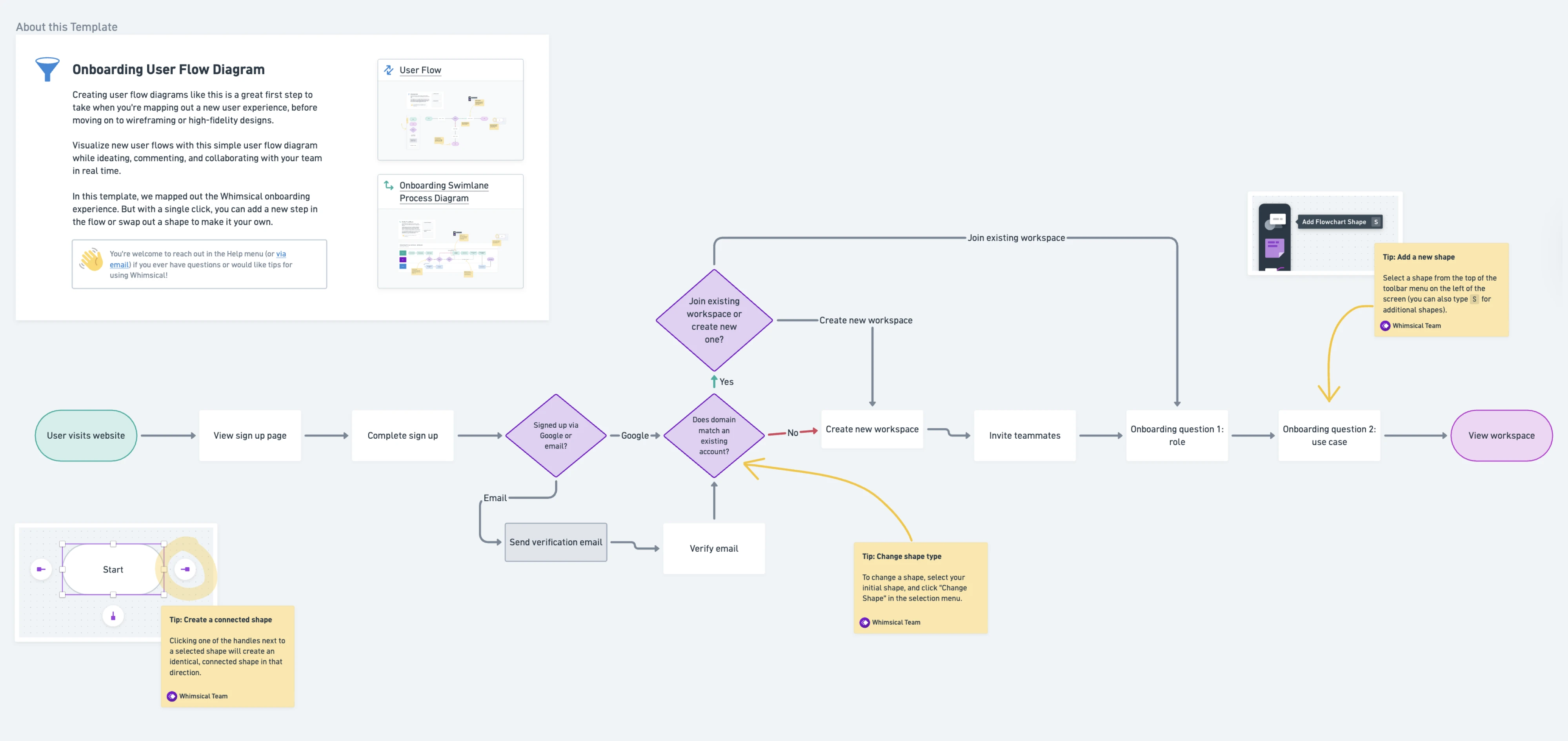
A UX workflow is the process teams use to move from a problem to a shipped experience. On paper, it flows neatly from research through design to handoff.
But in practice, it bends around deadlines, stakeholder input, and tickets that often lack context, leaving many designers wondering if they’re doing UX or just producing screens.
Most guides show an ideal sequence, which is useful, but incomplete. They don’t answer what happens on real teams: when you’re the only designer, when solutions come pre-defined, or when there’s barely time for proper flows.
In this article, we’ll break down what a UX workflow is, how it differs from user flows and UX processes, and what it looks like in practice across different team setups. We’ll also show how Eleken approaches UX workflows in SaaS, balancing structure with the messy realities of product development with concrete examples you can use.
What is a UX workflow?
A UX workflow is the sequence of activities a design team uses to understand a problem, explore solutions, validate them, and ship a product experience. It connects user needs, business goals, and technical constraints into a repeatable yet adaptable working rhythm.
Most UX design workflows include some combination of discovery, UX research, analysis, information architecture, wireframing, prototyping, usability testing, handoff, and iteration. What varies and what matters is how deeply each stage gets practiced, who's involved, and what artifacts get produced.
A two-designer SaaS team working out of FigJam doesn’t need the same workflow as an enterprise org with compliance gates and distributed teams. And a solo designer juggling research, strategy, and UI design workflow operates in yet another reality.
UX workflows are shaped by context: product complexity, timelines, access to users, team size, and design maturity. That’s why the gap between the “ideal process” and what actually happens is where real workflow UX design begins.
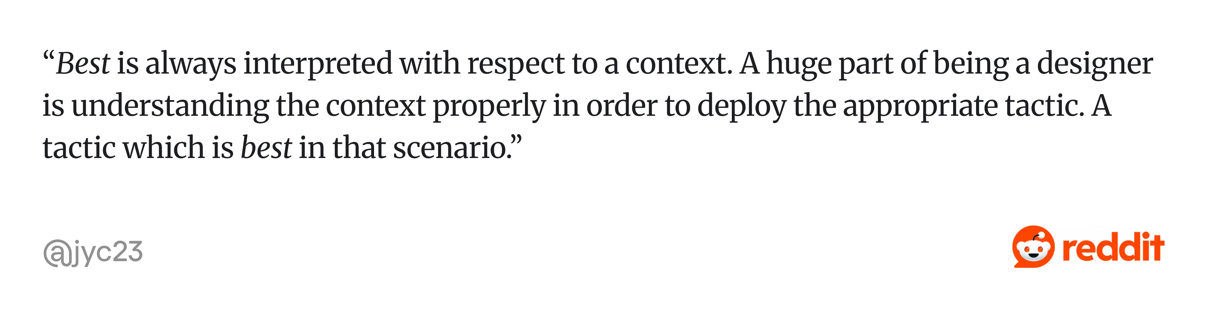
As one experienced designer put it, “Best is always interpreted with respect to a context. A huge part of being a designer is understanding the context properly…”
Theory vs. reality: where workflows fall apart
Classic UX is sequential: research, alignment, design, validation, handoff, build, iteration. Each step is intentional, resourced, and connected.
What teams deal with is different. In designer communities, a common frustration is feeling like a "UI production line" rather than a UX practitioner, receiving solutions to execute rather than problems to solve. Many designers describe spending more energy managing stakeholders and navigating internal politics than doing actual design work, especially in larger organizations.
That’s why designers often feel stuck in execution mode, not because they lack process, but because the conditions don’t support it.
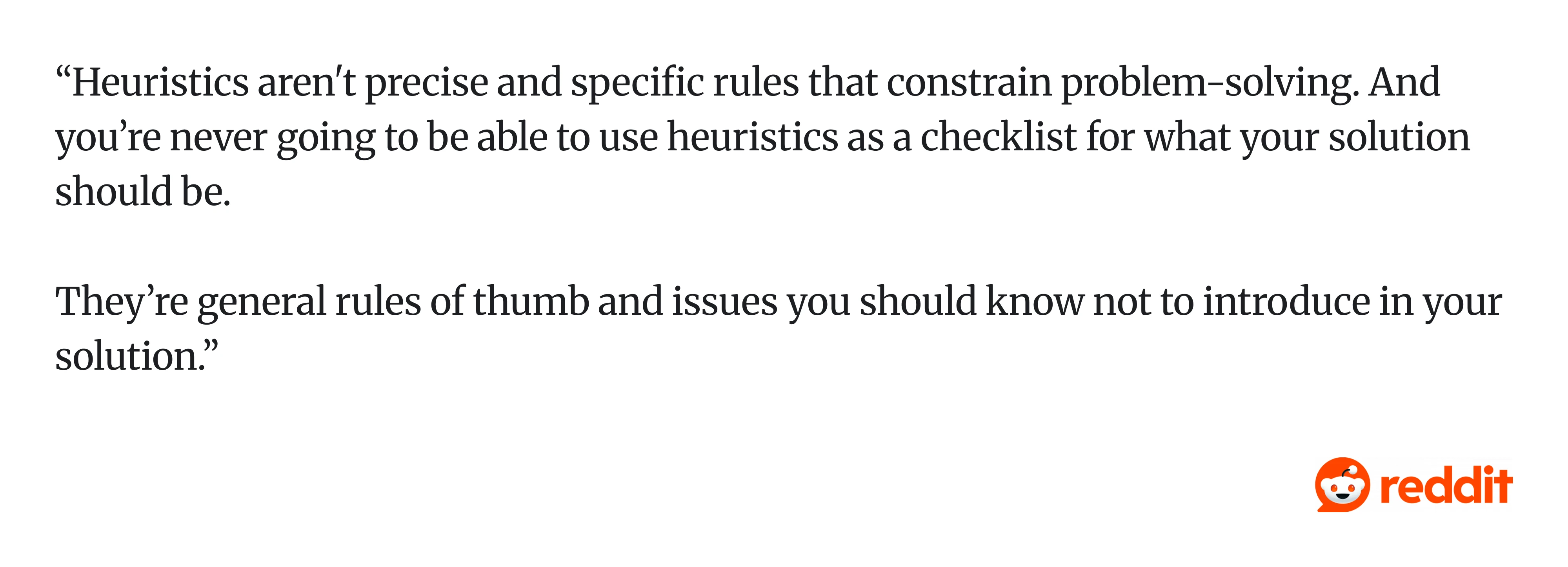
As one practitioner put it, “Heuristics aren't precise rules… you’re never going to be able to use them as a checklist for what your solution should be.”
In other words, workflows aren’t meant to be followed step by step. They’re adapted.
Strong teams don’t try to “do UX right” in every situation. They protect the highest-leverage steps:
- A few user conversations instead of a full study.
- Quick validation instead of formal testing.
But one thing consistently breaks products: moving forward without a clear understanding of the problem. It doesn’t belong to a single step. It cuts across multiple layers, such as workflow UX, process, and artifacts like user flows.
UX workflow vs. UX process vs. user flow: what's the difference?
These three terms get swapped constantly, even by experienced practitioners. Getting them straight prevents miscommunication with stakeholders and avoids building the wrong deliverable.

A UX workflow is how your team works internally: the specific activities, their sequence, the collaboration touchpoints, and the artifacts produced. It's operational. "We do a kickoff, then a research sprint, then sketches, then prototype testing" is a workflow.
A UX process is the broader methodology or philosophy guiding those activities. Design thinking, lean UX, and the double diamond are all examples of UX processes. They give you a mental model. Your workflow is how you actually execute within that model, given your constraints.
A user flow is the path a user takes to complete a specific task inside your product, such as signing up, upgrading a plan, or canceling an account. It's a design artifact, typically a diagram, not a team process.

Related terms worth clarifying: information architecture is how content and screens are organized across the product. A wireframe is the structural layout of a single screen, think bones, no skin. A prototype is an interactive version of the design, ranging from clickable Figma frames to coded front-end demos, that lets you test how users interact with it before development begins.
5 UX workflow examples for different team setups
Most UX workflow guides describe one generic process and treat it as universal. But a designer at a Series A startup and a designer at a Fortune 500 company live in completely different operational realities. Here are five ux workflow examples that reflect how teams work, including the unglamorous version that most guides pretend doesn't exist.
1. Startup UX workflow
Here is a typical rhythm: The founder or product lead describes a problem in a Slack message or a 15-minute call. The designer (often the only one) does a quick competitor scan, like 30 minutes on Mobbin or studying 3-4 similar products.
Wireframes happen in FigJam or directly in Figma within a day. A clickable prototype goes to 3-5 users for informal feedback, sometimes beta users, sometimes the founder's network. Iteration happens through direct conversation with the engineer sitting two desks away.
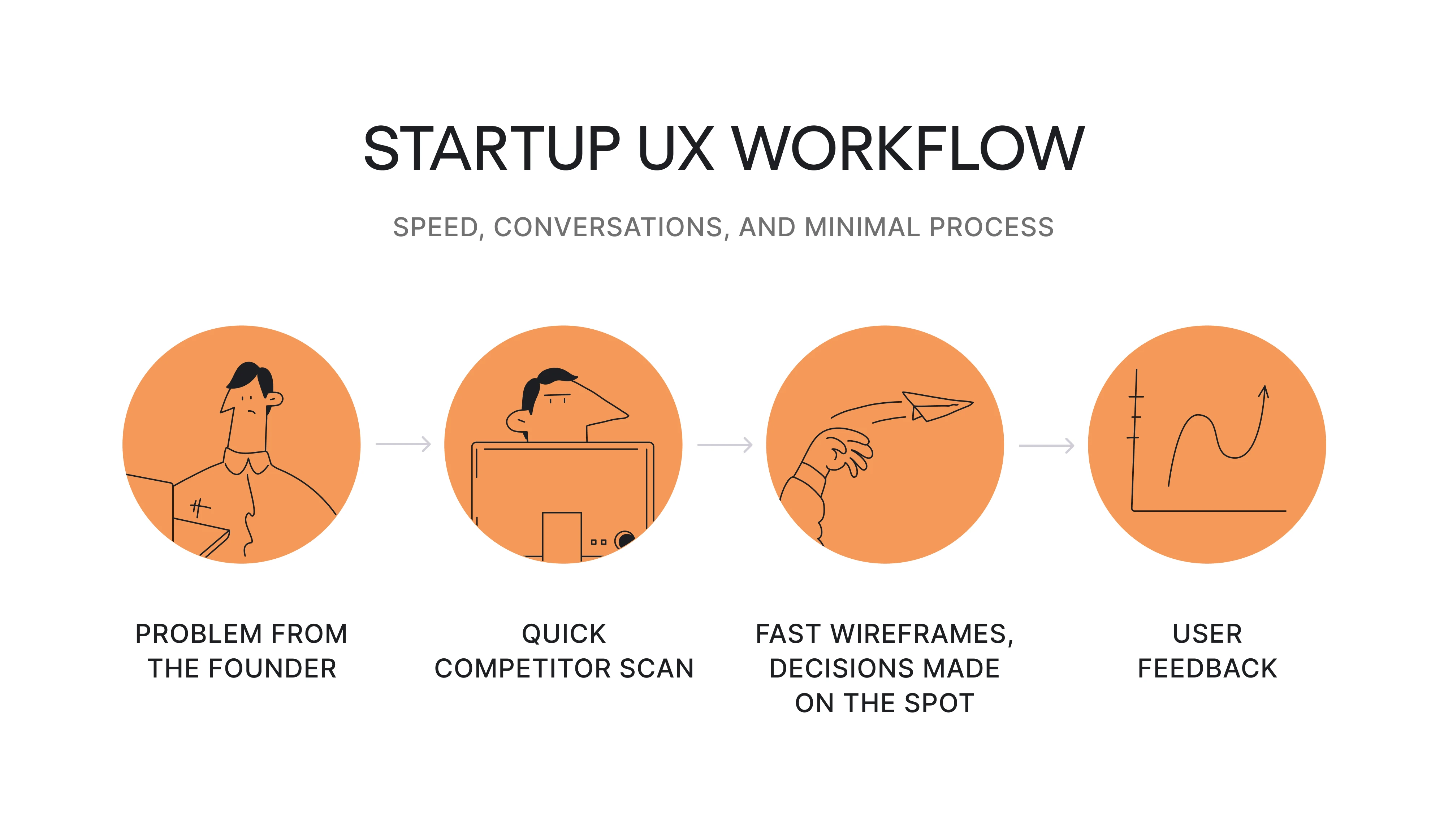
What defines it: Speed over polish. Documentation is a shared Figma file and Slack threads. Decisions happen fast because there are fewer people to align. The solo designer often plays researcher, information architect, visual designer, and prototyper in one sprint.
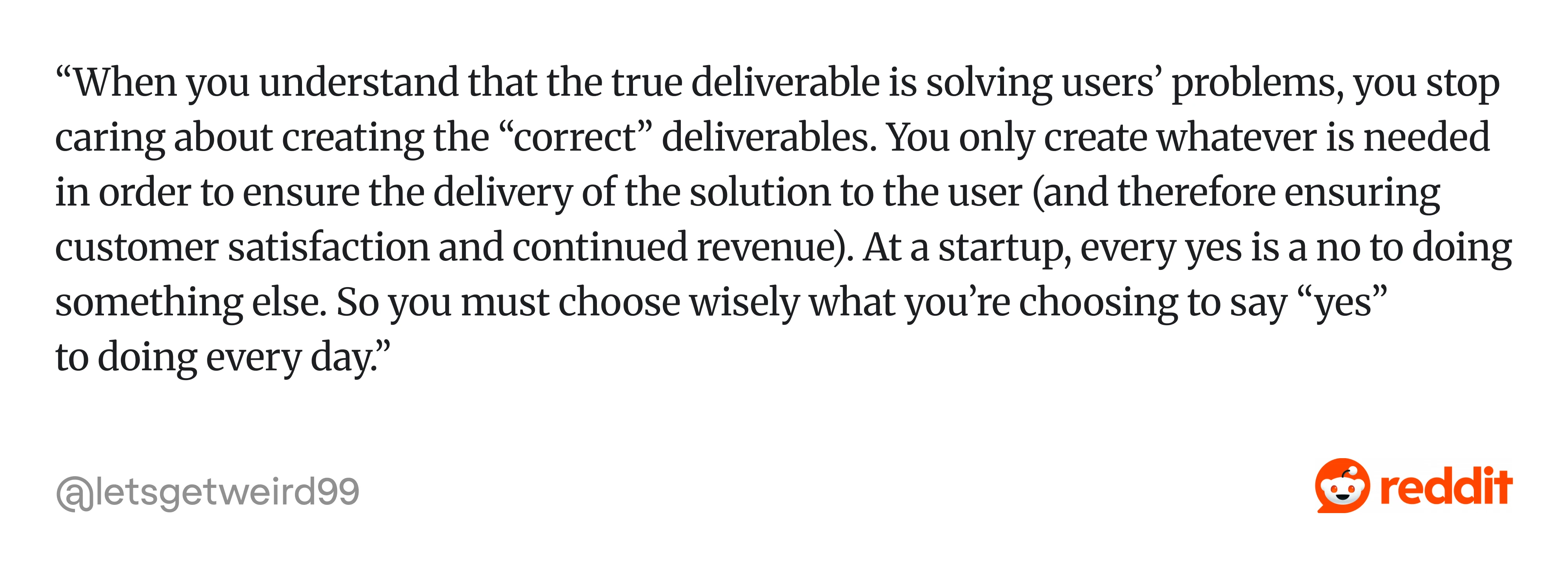
And the mindset shifts with it. As one designer described it, “...You only create whatever is needed in order to ensure the delivery of the solution…”
The risk here is in skipping user evidence entirely because "we're moving too fast." Even 30 minutes of informal testing changes outcomes. Building trust with the founder by demonstrating that a quick user check saves dev rework later is how startup designers earn the space for more UX activities over time.
2. SaaS product team workflow
This workflow starts from a specific metric or friction point, like onboarding completion dropped 12% last quarter, or the support team keeps reporting that users can't find the export function.
The designer pulls analytics from Mixpanel or Amplitude, reviews user feedback from Intercom or support tickets, and frames the problem. Design exploration happens in Figma. User flows get refined and tied directly to activation, retention, or expansion metrics. A prototype gets tested with 5-8 existing users through Maze or moderated sessions. After handoff, the team monitors post-launch data and runs A/B testing to optimize.
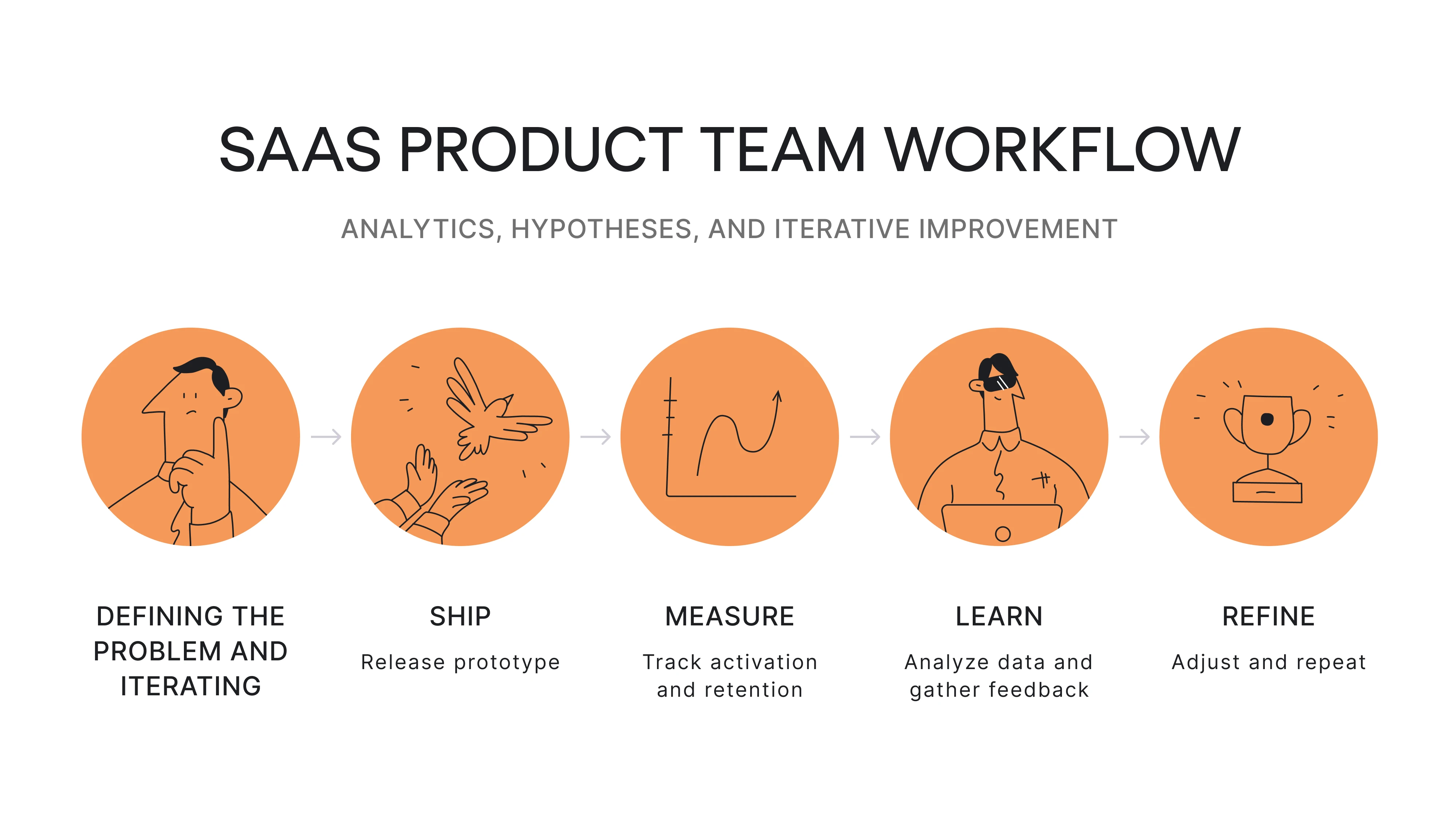
What defines it: Continuous iteration over big-bang redesigns. User flows connect directly to business metrics. The product design process in SaaS is a loop, not a line: you ship, measure, learn, and refine. User retention and feature adoption are the scoreboard. Designers on mature SaaS teams often describe their work as a mix of data-informed exploration and rapid hypothesis testing, not the neat stage-by-stage process shown in textbooks.
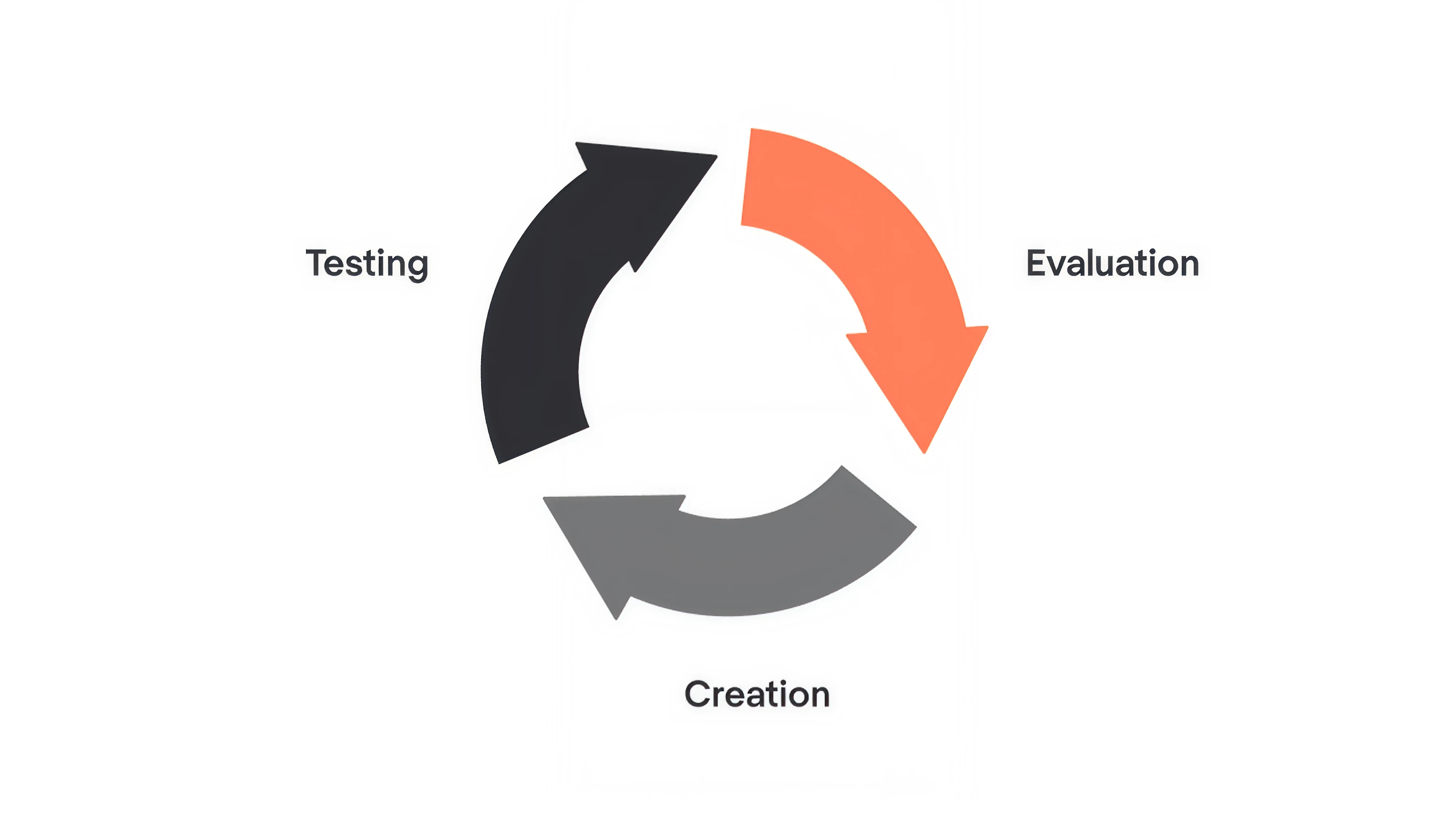
At Eleken, the iterative design process is the default. We break complex problems into smaller, testable pieces and move through rapid cycles of creation, testing, and evaluation. Not because it sounds good in theory, but because it consistently reduces risk and improves outcomes.
3. Agency UX workflow
Discovery starts with stakeholder interviews, a workshop to align on business goals and user assumptions, and a review of existing analytics or research the client can share. The design team synthesizes findings into a strategic direction, often presented as a customer journey map or concept deck.
Then comes client approval (round one). Wireframes and user flows follow, then another approval cycle. Hi-fi design and prototyping come next, with final handoff to the client's dev team or a partner studio. For more on how structured methodologies shape agency work, see these design thinking examples.

What defines it: Approval gates are baked into the timeline. Artifacts need to persuade as much as inform; you're selling the direction to clients who aren't designers. Communication overhead is higher than in product teams. The biggest risk is scope creep through revision cycles that slowly erode the original research-backed direction until you're designing the client's gut feeling instead of what users need.
This creates a familiar tension. As one designer described it: “... Get ignored/overruled and just build whatever the PM wants. Receive customer complaints. Fix those potential problems…
Repeat.”

4. Enterprise UX workflow
A project kicks off with multiple stakeholders from product, engineering, legal, compliance, and sometimes marketing. Requirements go through a formal scoping process. Research may involve a dedicated UX research team running multi-week studies.
Workflow design happens within a design system: component libraries, token standards, accessibility requirements baked in. Wireframes and prototypes go through formal review boards. Handoff includes detailed specs, redlines, and documentation because development teams may be distributed, outsourced, or working across multiple product surfaces.
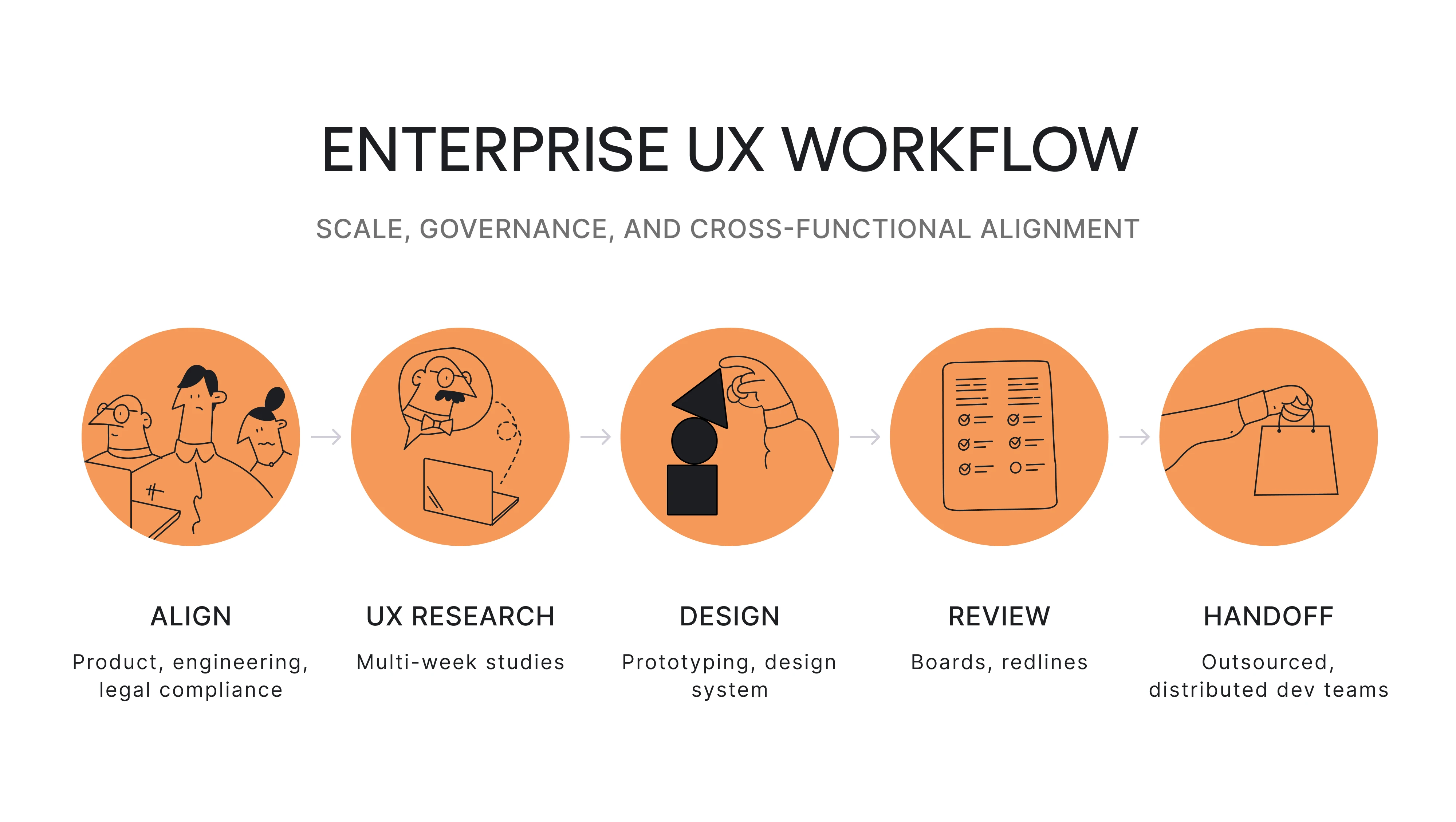
What defines it: Scale, governance, and risk management shape every step. Approval cycles are longer. Cross-functional coordination is complex. Designers in enterprise settings consistently describe spending a significant portion of their time navigating internal politics, such as getting buy-in across departments, attending alignment meetings, and managing competing stakeholder priorities.
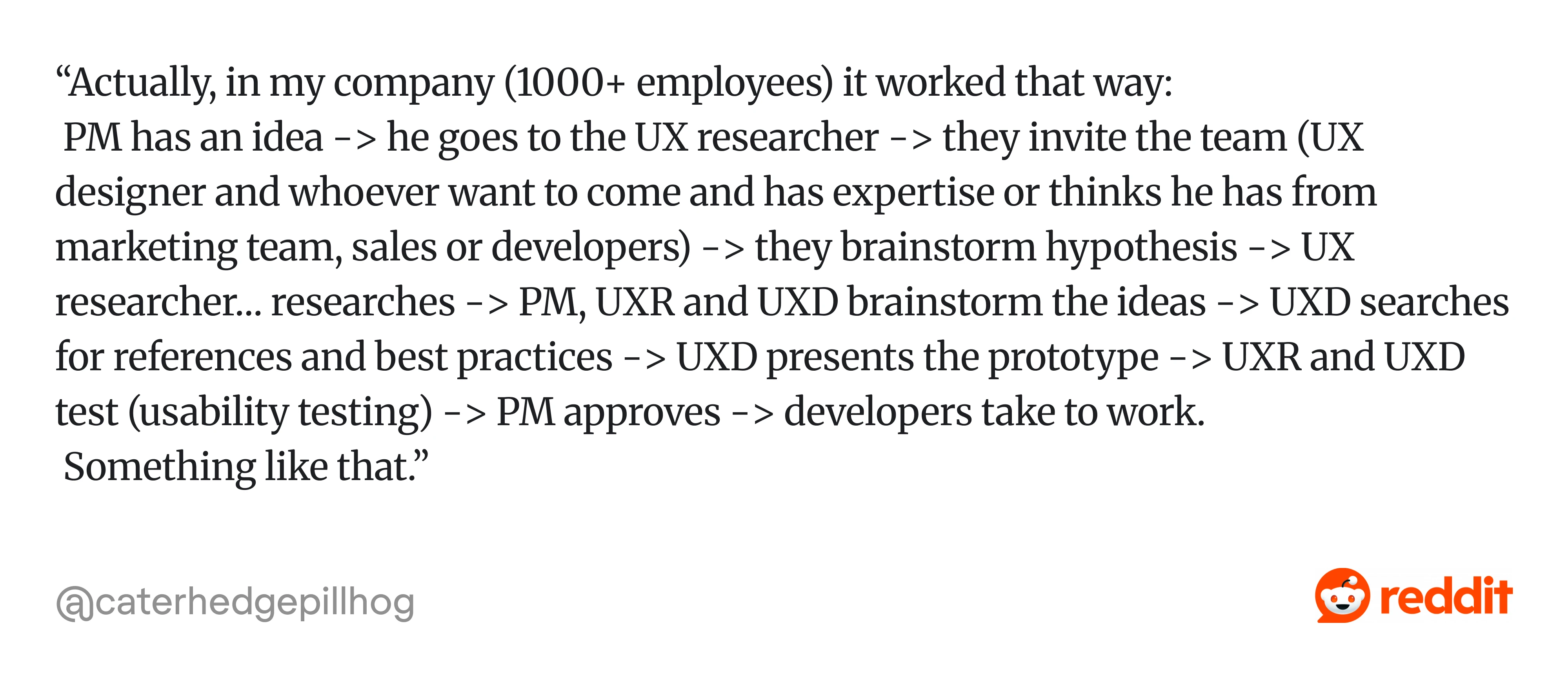
A common reality is that alignment takes longer than design itself. As one practitioner shared it: “PM has an idea → goes to UX researcher → they invite the team (UX designer and whoever want to come and has expertise or thinks he has from marketing team, sales, or developers) → they brainstorm hypothesis → UX researcher...”
In practice, the design work might take two weeks, but getting everyone aligned can take much longer.
Security reviews, compliance checks, and accessibility audits add review layers that don't exist in smaller organizations. The payoff is that when enterprise workflows function well, they produce consistent, scalable experiences across massive product ecosystems.
5. Low-maturity or ticket-driven workflow
A Jira ticket arrives from a PM that says something like "Add a filter to the reports page" or "Design a modal for the new feature." The designer clarifies requirements through a quick sync or comment thread. There's no formal discovery, maybe a glance at how competitors handle it.
The designer produces wireframes or jumps straight to hi-fi using the existing component library. The PM or stakeholder approves.
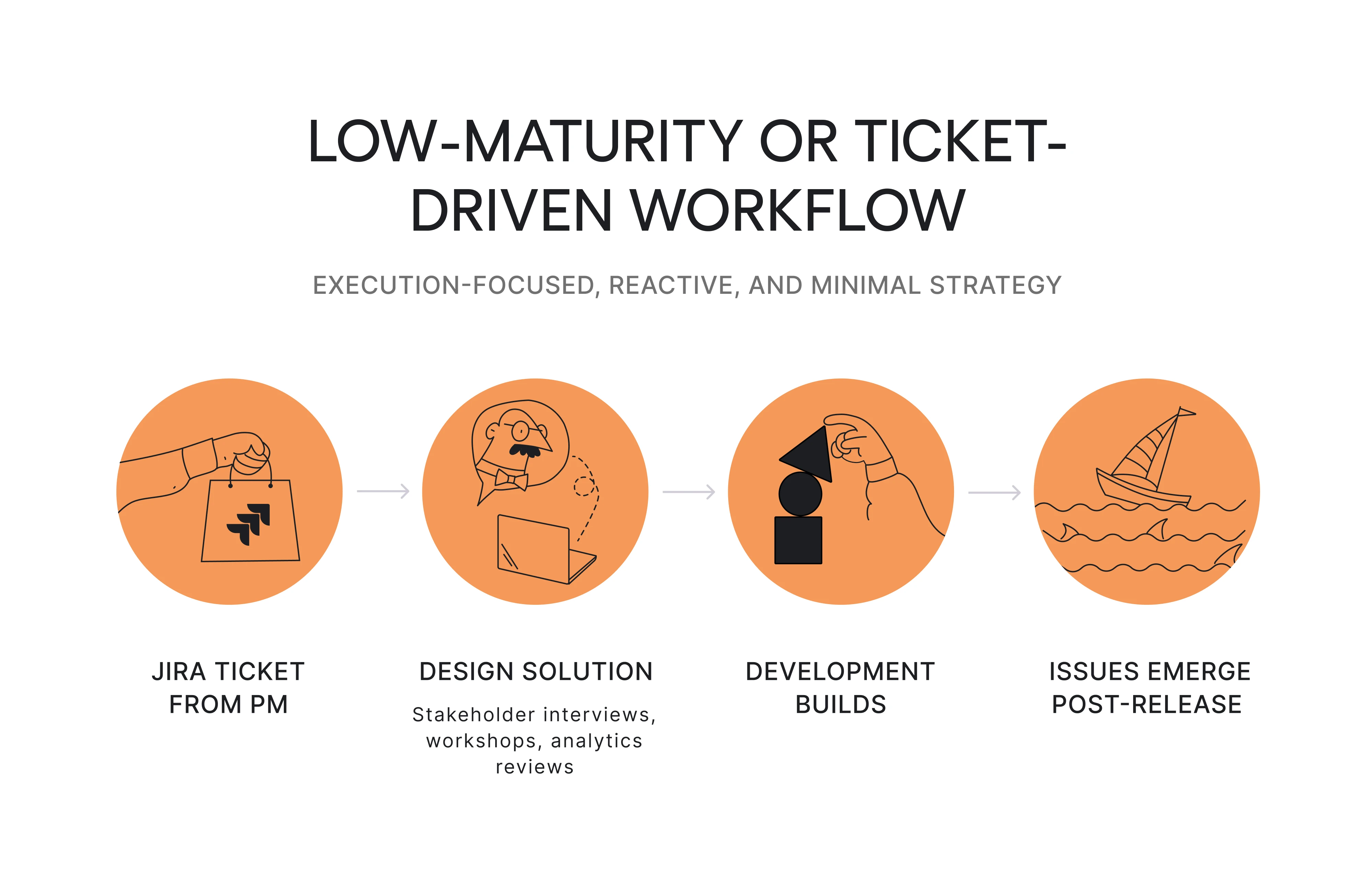
Gaps surface late:
- What happens with no results?
- How does it work on mobile?
- Is it accessible?
These get patched reactively, often after release. As one practitioner described it: “...Testing is done in a live environment… Something breaks and we wait some more…”

What defines it: This is the workflow most guides pretend doesn't exist, but it's where a large number of designers spend their days, especially in organizations where design maturity is still developing.
Many designers describe feeling stuck as "pixel pushers" or a "UI production service" in this environment, receiving solutions to execute rather than problems to solve.
Improvement here doesn’t come from introducing a full UX research process overnight. That usually fails.
It comes from small, strategic upgrades:
- Reframe the ticket: what user problem does this solve?
- Spend 15 minutes reviewing support tickets.
- Run one quick test before handoff.
- Share what you learned.
When stakeholders see that a 30-minute research investment caught a problem that would have cost a sprint to fix in code, they start giving designers more room to work upstream. Building trust incrementally is how practitioners in low-maturity orgs expand their workflow over time.
As teams mature, their workflow becomes less reactive and more intentional.
At that point, the same core stages start to emerge.
The core stages of a UX workflow
Here's an eight-stage model that captures what most UX workflows share. It's presented as a sequence, but teams constantly loop back, skip ahead, or run stages in parallel.
1. Define the problem, goals, and scope
Before opening Figma, get alignment:
- What user problem are we solving?
- What does the business need from this?
- What are the technical constraints?
- What's out of scope?
A 30-minute kickoff that answers these four questions prevents weeks of rework.
In many organizations, designers receive tickets that describe a solution ("add a filter to the reports page") rather than a problem ("users can't find relevant data in reports"). Learning to reframe tickets into problems is one of the highest-leverage skills a designer can develop, and it starts here.
You can learn more about UX flow in the video below:
2. Research users and context
This is where you learn what's happening versus what stakeholders assume is happening. UX research methods include user interviews, surveys, support ticket analysis, analytics deep-dives, competitor audits, and synthesis of existing research the team already has.
Still, nobody's looked at it in six months. A complete UX research process blends qualitative insights (the "why") with quantitative evidence (the "how much").
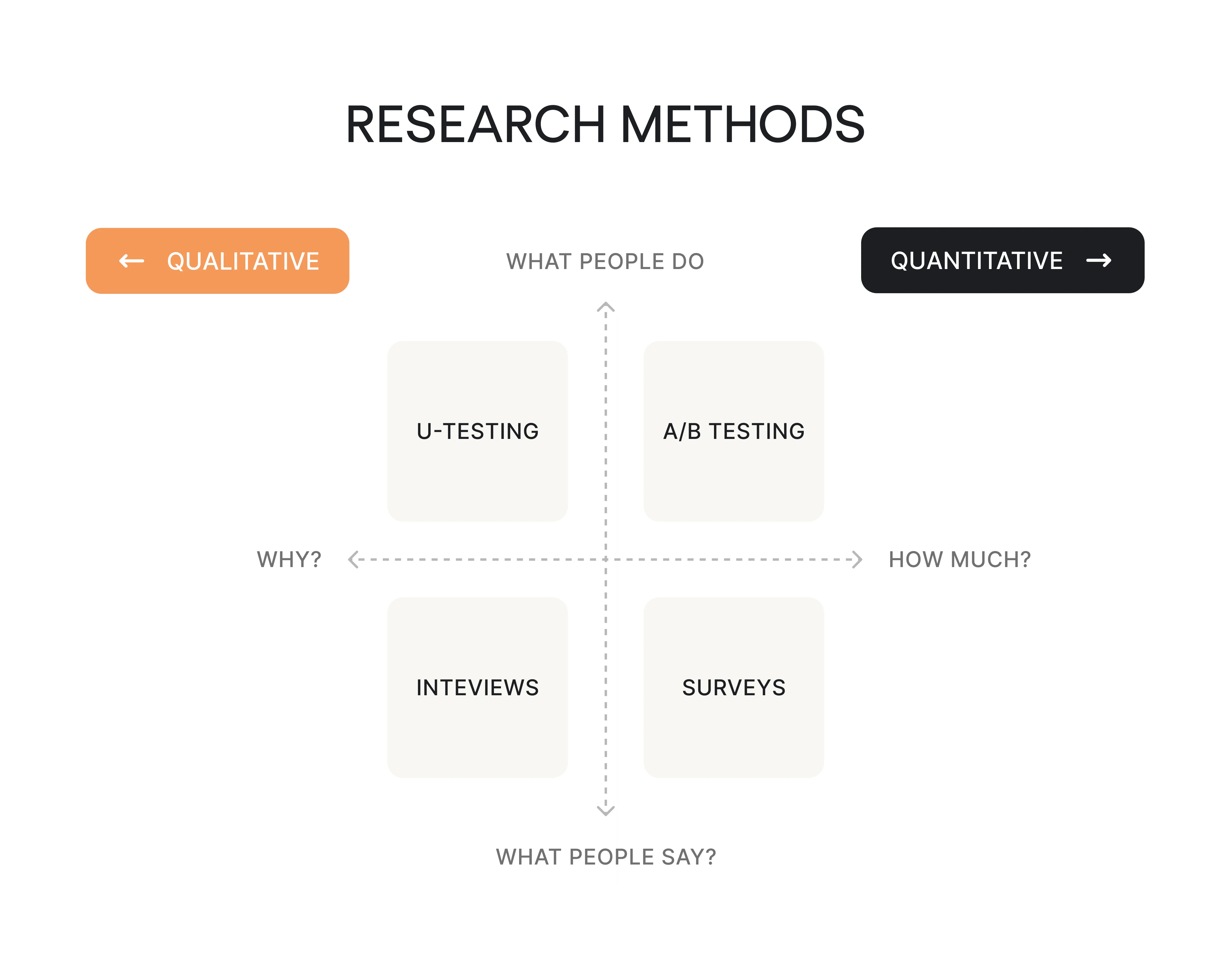
The depth should match the stakes. Redesigning onboarding for a product with 50,000 users? Do the full research. Tweaking button copy? Check support tickets and move on.
However, formal research isn't always sanctioned by the organization. When that happens, experienced practitioners "sneak in" lightweight research: spending 20 minutes reviewing support tickets, doing a quick competitor scan on Mobbin, or having a 15-minute call with a customer success manager who talks to users daily. These aren't substitutes for proper user research, but they're dramatically better than designing from assumptions alone.
3. Analyze findings and identify opportunities
Raw research data isn't useful until it becomes patterns. Instead, you can:
- Cluster findings into themes.
- Identify recurring pain points, unmet needs, and behavioral trends.
This is where creating user personas or jobs-to-be-done frameworks earns its place, but only if those artifacts drive decisions downstream. A persona deck that lives in a Notion page nobody opens is wasted effort.
The output should be clear opportunity statements: "Users abandon onboarding at step 3 because they don't understand what the tool does until they've invested 5 minutes, they're not willing to spend." Specificity like this gives the rest of the workflow a clear target.
4. Shape the experience structure
Now you map how users will move through the product. This means designing user flows, task paths, navigation logic, and overall information architecture. A UX flow diagram at this stage, even a rough one sketched in FigJam or Miro, helps the entire team see the user's path before anyone starts laying out screens.
In our work on Data Streams, a data management product, we continuously analyzed competitors to understand which features users expected and how similar tools structured them.
Instead of jumping straight into screens, we started with key user scenarios, built flows for each, and then mapped them into a new information architecture.
This approach helped us define not just what the product should include, but how everything connects, essentially creating a “guide” for both design and development to move from the old structure to a new one without breaking the experience.
This is also where structural problems surface early. If your flow requires six steps before users reach value, that’s a design issue worth solving before you wireframe six screens. Aligning on flows with product and engineering at this point prevents the classic “this isn’t technically feasible” conversation later.
5. Create wireframes and prototypes
Start with low-fidelity wireframes to lock down structure, hierarchy, and content placement. Move to mid-fidelity when you need to explore interaction patterns and screen transitions. Use high-fidelity interactive prototypes when you need realistic validation with users or sign-off from stakeholders who struggle to evaluate grayscale boxes.
Not every project needs all three fidelity levels. For a small feature addition to an established product with a design system, you might jump straight to hi-fi because the components already exist.
For a new product area, starting low-fi prevents premature attachment to visual details. One common workflow pattern designers describe: jumping between fidelities within the same project, starting hi-fi for screens that map to existing patterns, going low-fi for screens that need structural exploration.

6. Test and iterate
Usability testing is where you watch real people fail at things you thought were obvious. Five participants will typically surface around 80% of major usability issues. You can run sessions in Maze, UserTesting, or a Zoom call with screen sharing and a $25 gift card.
Beyond usability testing, this stage includes tree testing for navigation, prototype feedback sessions, and internal design critiques. The key is refining based on evidence rather than the loudest stakeholder's opinion. This is where the iterative design process becomes concrete.

Practitioners consistently point out that even minimal testing changes outcomes. If your org doesn't support formal usability testing, you can:
- Show the prototype to a colleague who isn't on the project.
- Ask the customer success team to walk through it.
- Get any outside perspective.
The difference between zero user input and even a little is enormous.
7. Handoff and collaborate with development
Handoff is a collaboration zone. In Figma, this means annotated frames, documented states (default, hover, loading, empty, error, success), interaction specs, accessibility notes (contrast ratios, focus order, ARIA labels), and component references from the design system.
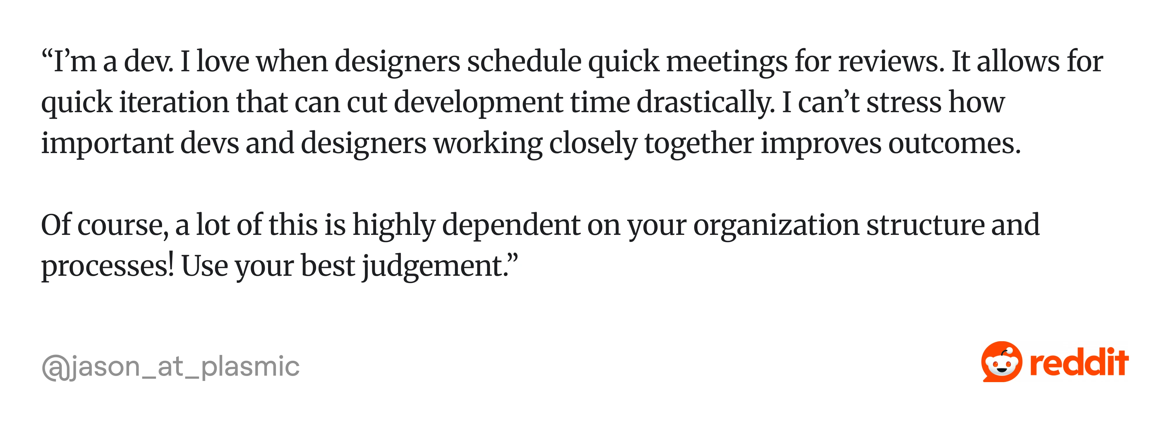
The most common handoff failure isn't missing screens; it's missing states. Developers hit edge cases that designers didn’t account for, and the UI workflow gets improvised under pressure.
That’s why strong teams don’t treat handoff as the end of design. As one developer put it, “...I can’t stress how important devs and designers working closely together improves outcomes...”
8. Measure, learn, and improve after launch
Shipping is checkpoint one, not the finish line. After launch, monitor usage patterns through tools like Mixpanel, Amplitude, or Hotjar.
Track drop-off points, task completion rates, support ticket themes, and feature adoption curves. Use usability metrics and A/B testing to validate whether your design decisions are producing the outcomes you expected.
This stage feeds directly back into stage one. The best workflows are circular, not linear. What you learn after launch shapes the next round of problem definition.
Now let’s see how these stages come together in real user flow examples.
User flow examples that support UX workflows
Here are six user flow examples with the actual decision logic worth mapping.
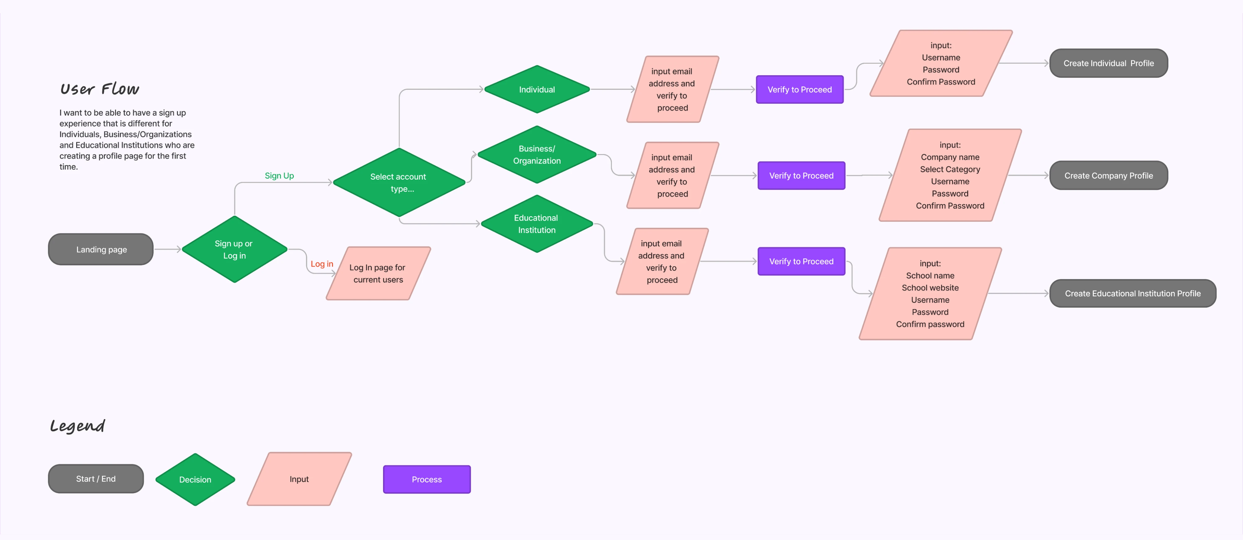
Login and sign-up flow
This flow splits immediately at the entry point: is this a returning user or a new one?
Returning users branch into password login, social auth (Google, Apple, SSO), or magic link. Each branch has its own error recovery: wrong password triggers a reset flow, expired magic links need re-sending, and SSO failures may need IT escalation.
New users go through account creation with email verification, and you need to decide: do they set up their profile now or after first use? Map every authentication branch and its failure state. Designing only the happy path here guarantees support tickets within the first week.
Onboarding flow
After sign-up, the user needs to reach their first moment of value, the "aha" that makes them come back.
So, map the welcome screen, then the guided setup: does the user choose a use case, invite teammates, connect integrations, or import data?
Each step needs a skip option for users who want to explore first. Define clear activation milestones. For example, for a project management tool, that might be "created the first project and added one task."
The flow should also show what happens when users skip setup and arrive at an empty state, because many will.
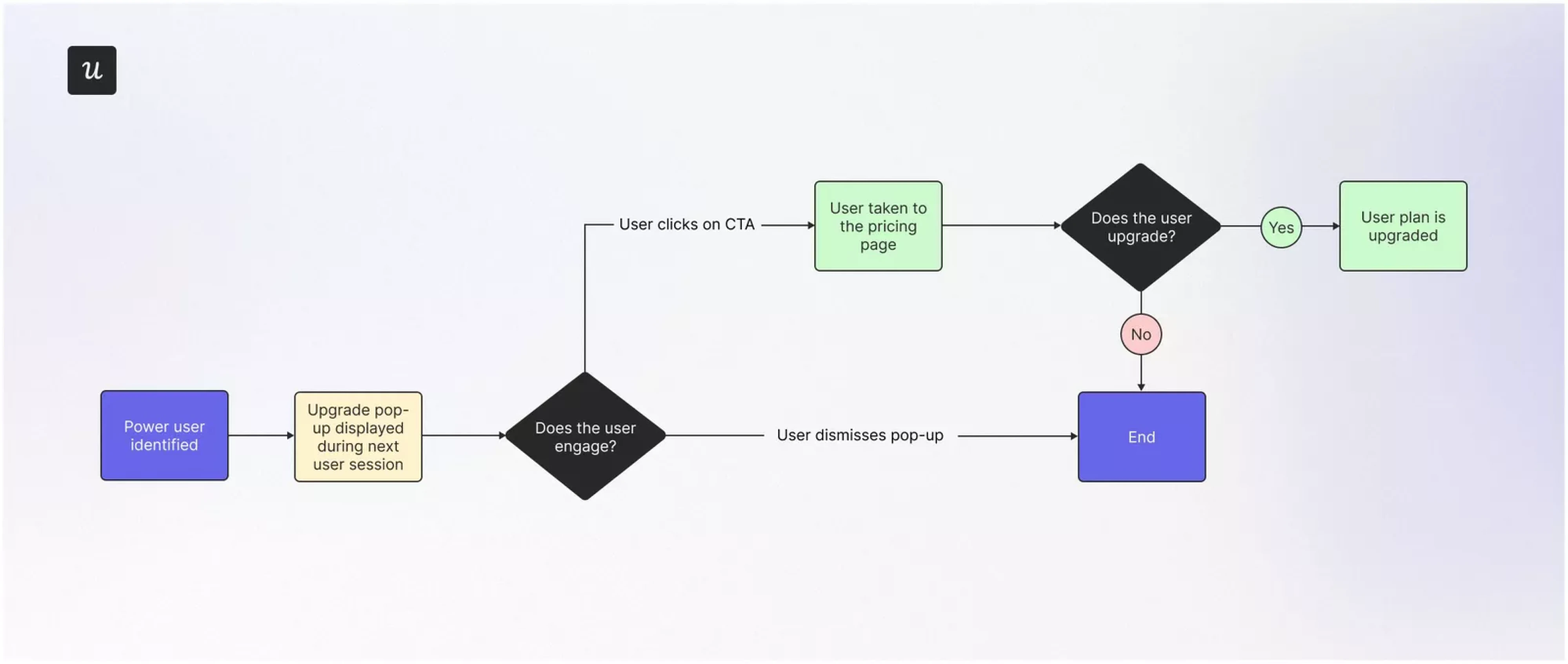
Plan upgrade flow
This starts from a trigger: the user hits a usage limit, encounters a feature gate, or clicks a pricing link. The flow maps to the upgrade page (plan comparison, feature breakdown), then to payment entry, confirmation, and provisioning.
Critical to map: exit points where users abandon (comparing plans, seeing the price, entering payment details), and what happens when payment fails. This flow ties directly to revenue, so mapping drop-off points gives product and marketing data they can act on.
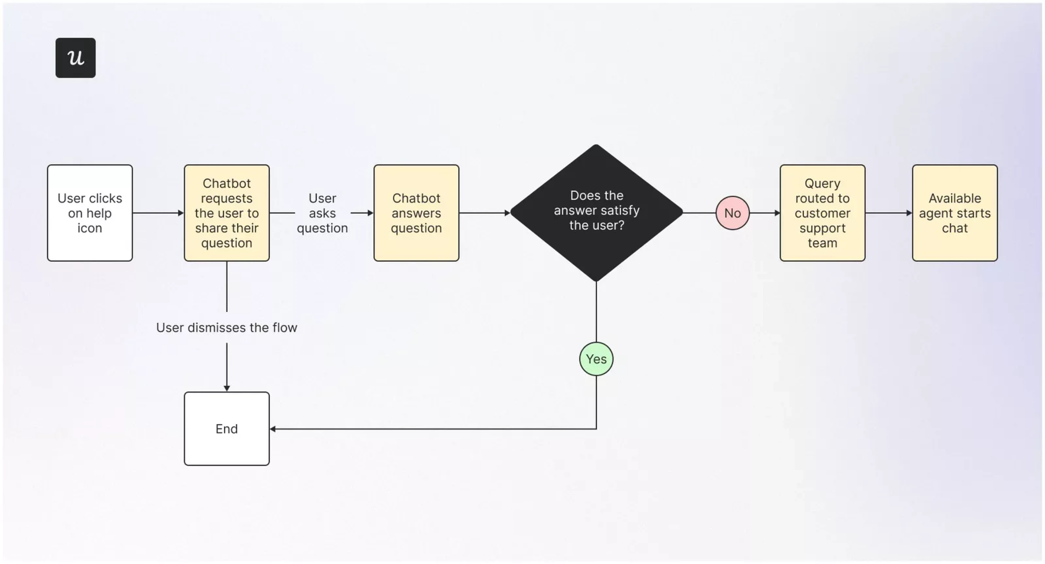
Customer support flow
Entry point is a help icon, support link, or contextual tooltip. From there, users may search a knowledge base, browse categorized FAQs, interact with a chatbot, or request human support.
Map the escalation logic:
- When does self-serve fail, and how does the user transition to a live agent?
- What context carries over so they don't have to repeat their problem?
This flow reveals whether your self-serve content resolves issues or just delays escalation.
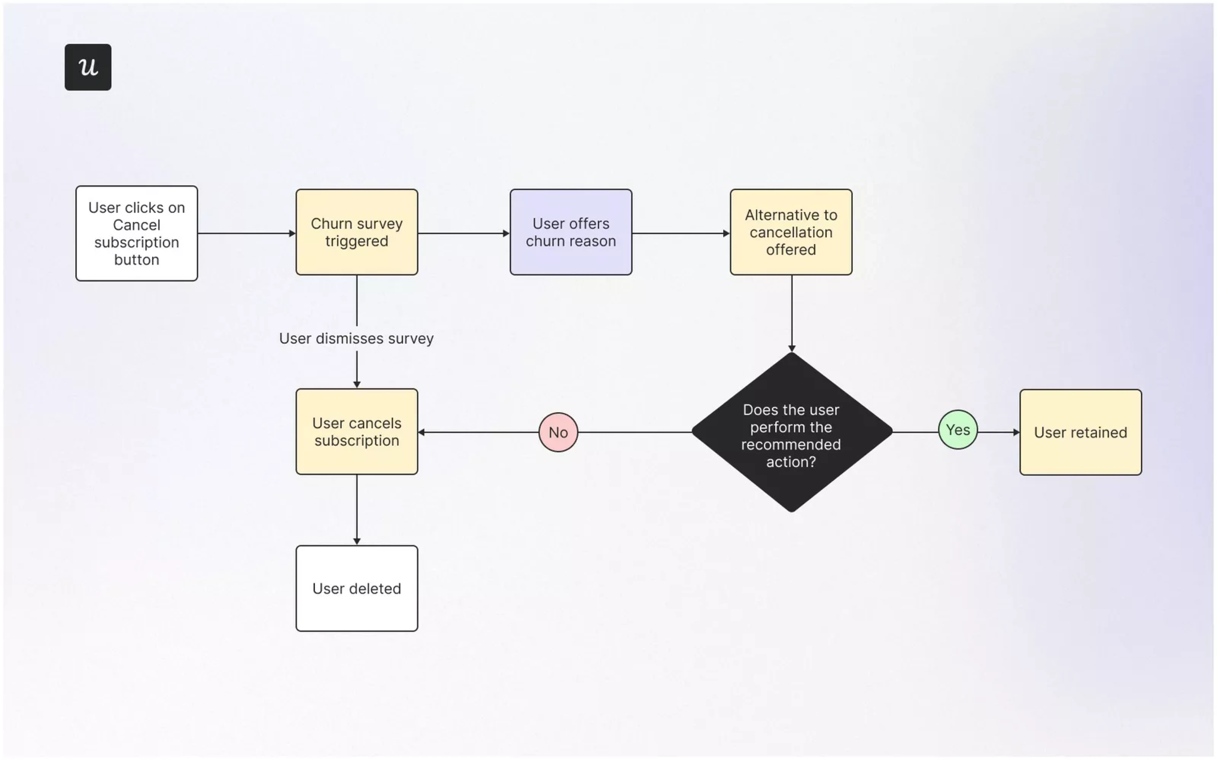
Account cancellation flow
Starts from a settings link or a direct "cancel my account" action. The flow includes a churn survey (why are you leaving?), a save offer (downgrade, discount, pause), and a confirmation path.
Map what happens to the user's data: Is it deleted immediately, archived, or recoverable within a window?
This flow is where retention strategy meets UX ethics. Making cancellation frustratingly difficult might reduce churn numbers in the short term, but it damages trust and generates negative word-of-mouth. Design it to be clear and honest while giving the business one genuine chance to address the reason.
Feature adoption flow
When launching a new feature, users need to discover it, understand it, and use it. The flow starts with a nudge: an in-app banner, a tooltip on the relevant page, or an email.
Next is an education step: a brief walkthrough, a short video, or a contextual guide. Then comes first-use, which should be as low-friction as possible.
The success point confirms the feature worked ("Your first report was generated"). Feature adoption flows tie directly to user retention and are often overlooked in workflows that stop thinking at "ship it."

How UX artifacts connect: from research to flow to prototype
UX artifacts aren’t isolated deliverables. They form a connected system: UX research informs insights, which shape user workflows and information architecture, leading to wireframes, prototypes, and validation. Skip a step, and you’re creating UX issues that surface later in development.
The same applies to workflow. There’s no single “correct” version. The right user experience workflow fits your team, product complexity, and constraints, while still giving you enough structure to understand users and make informed decisions.
If your UX workflow feels messy, the issue is usually misalignment, missing context, or a weak handoff. Fix those, and everything gets easier, including development.
Here is what you can do:
- Start with the problem, not the feature. When someone says, “We need a dashboard,” pause. Ask what decision the user is trying to make and where it fits in the broader customer journey map. Most bad UX starts with solving the wrong thing very efficiently.
- Use the lightest process that still gives you confidence. Not every task deserves a full UX ceremony. A small tweak might need a quick support review. A new product area needs deeper research. Match effort to risk, not to how “proper” the process looks.
- Create a shared source of truth. If your team keeps asking, “Is this the latest version?” That’s your bottleneck.
- Use a clear design system, structured Figma files, and decision logs. This alone removes a surprising amount of friction.
- Bring engineers in early. This one is painfully underrated. A quick feasibility check during wireframing can save weeks of redesign later. If you’ve ever heard “we can’t build this,” you already know the cost of skipping this step.
- Match workflow depth to stakes. Changing button copy ≠ , redesigning navigation.
Define what “light” vs “full” workflow is in your team. Otherwise, you’ll either overthink everything or rush the things that matter most. - Document interactions, not just screens. Static designs lie. Real products move.
If you skip states like loading, errors, or edge cases, developers will fill the gaps. And they won’t always guess what you intended. - Keep testing lightweight when needed. You don’t need a full research setup to learn something useful. Even a quick 20-minute session or a rough prototype test will surface issues. Shipping without any feedback is always the worst option.
The strongest UX workflows help teams make better product decisions not by adding process for its own sake, but by creating just enough structure to understand users, align stakeholders, reduce ambiguity, ship better experiences, and keep learning after launch.
Need help turning your UX workflow into a product that users love? Let Eleken's UX team help you design, test, and ship faster.