

Almost everybody wants to launch a startup, but knowing how to launch a successful SaaS company is a different story. The good news? You don't have to learn everything through painful trial and error. Other people's mistakes and wins are a perfectly good teacher. That's what this article is for.
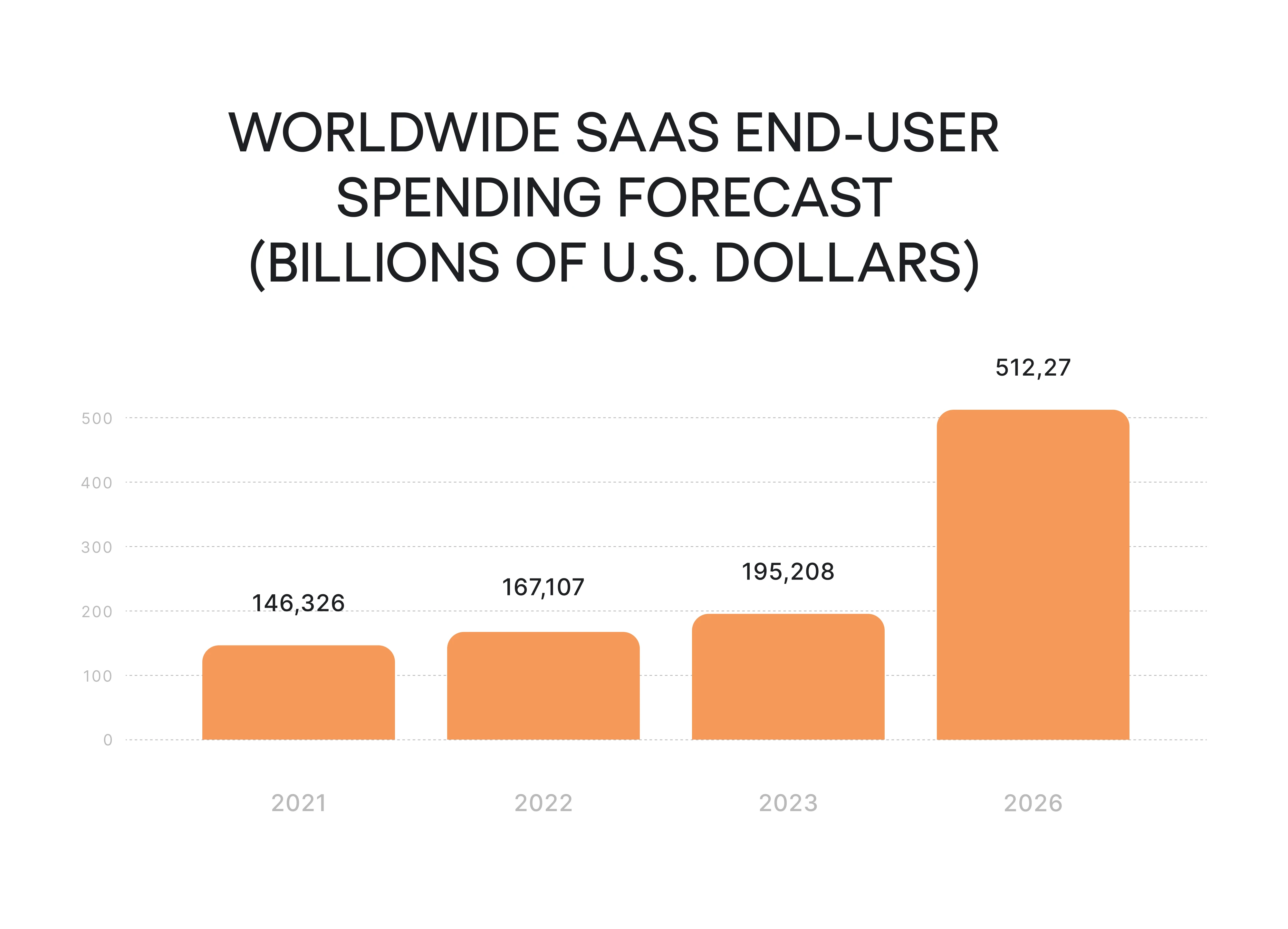
The SaaS market is accelerating. According to Statista, global SaaS revenue is projected to hit $512+ billion in 2026, with a 14.71% annual growth rate expected to push that figure to $887 billion by 2030. That's a structural shift in how software gets built and sold. If you're building a SaaS service company, you're entering a generational opportunity, but only if you get the fundamentals right.
As a SaaS design agency, we watch many SaaS grow from a prototype to scaled products with large market shares. That’s why we have a lot to say to the question “How to launch a SaaS business?”.
We’ve tried to squeeze all the steps of launching a SaaS product into one article and it was hard. So, we started thinking of the factors that make a product successful instead. Let’s say these are the basic ingredients of a good SaaS soup.
Clear value proposition like Slack
A classical value proposition is a short phrase that people place on landing pages. But to attract serious clients and market your product correctly, you have to know the real value that your product brings to users. Creating a clear value proposition is a must before launching a new SaaS product.
Let’s take Slack as an example: everybody knows it’s a great chat for teams and once you tried it, you understand whether you like it or not (though I am yet to meet people who don’t like Slack).
But Slack takes a serious approach to the business. Have a glimpse at this document where they describe the business value of Slack in more than 10 pages. They show very concrete numbers that explain how the performance of different departments (sales, HR, marketing) increases when they use Slack.

Before you write a single line of code, talk to potential users and identify their pain points. The clearest value propositions come directly from understanding what's genuinely broken in people's workflows, not what you assume is broken.
Your value proposition should answer: What specific problem do I solve, for whom, and how do I prove it?
By showing how you help successful SaaS businesses or people, you demonstrate the value of your product. We highly recommend following Slack’s example: consider thoroughly studying the benefits they bring to potential customers and how they communicate them relentlessly. For another example, check out our e-book on business value of design.

Measurable goals
You can't improve what you don't measure. That is why goal-setting is important. Start with the market investigation. Conduct market research and competitor analysis, predict the timeline of your product development, and establish the metrics to check up on your project at different stages.
You must have already heard about the SMART concept. It means that the goals you set should answer five criteria, such as specific, measurable, attainable, realistic and time-bound. How does it work with software as a service (SaaS)? Here’s an example.
Imagine, you are ready to launch your product and want to increase your sales by the end of the quarter. This goal meets only one SMART criterion - it is time-bound and you have chosen your deadline to review the results. Nevertheless, this goal is neither measurable nor specific. And it is quite difficult to define if it is specific or attainable.

What would SMART goal look like?
Before your launch phase, establish key performance indicators that will tell you whether things are working or quietly failing.
The SMART framework is the right starting point:
S is for accuracy what you want and how much you want it.
M is for specific numbers that would allow you to determine if you have achieved your goals and analyze your results.
A is for the real market situation that allows your product to grow.
R is for your internal situation, resources you have and abilities of your team.
T is for establishing checkpoints to review the results.
So, circling back to our example, the SMART goal will look like this: “I expect a 20% increase in customers, 50% website traffic growth, and 15% conversion growth by the end of the quarter, resulting in $100,000 revenue.”
During the launch phase, track customer acquisition cost (CAC) and customer lifetime value (CLV/LTV) from day one. If your CAC is higher than your LTV, no amount of growth will save you. These two metrics tell you whether your business model is working.
Build a Minimum Viable Product First
Before investing heavily in a full product, build a minimum viable product (MVP), the simplest version that lets early adopters experience your core value. This is how you validate assumptions cheaply.
Notion is a perfect example. The founders initially built a no-code app-building tool. Almost nobody used it. Rather than doubling down on a broken hypothesis, they pivoted toward a cleaner user experience and eventually created one of the most beloved productivity tools on the market. The MVP revealed the real problem worth solving.
Your MVP should be embarrassingly simple. If you're not at least a little uncomfortable shipping it, it's probably over-engineered.
Once you have initial users engaging with your MVP, collect customer feedback systematically. Don't just ask "do you like it?" Ask what they tried to do, where they got stuck, and what they'd pay for. That's the data that shapes a product people want.
Right monetization strategy
Freemiums and free trials are specific SaaS business customer acquisition models that help you show the benefits of your product to your target audience. But before you decide whether to choose freemium or trial, let’s have a closer look at both.
Freemium allows your first customers to receive part of your product functions free of charge, while a free trial gives full access to all of the functions for a limited time period. Depending on your product specifics and the go-to-market strategy you choose, you can mix these two models.
Tiered pricing is one of the most effective ways to capture revenue across different customer segments. A three-tier structure (basic, professional, enterprise) lets you serve potential users with lower budgets while monetizing power users at higher margins. It also anchors perception, the middle tier almost always converts best.
Beyond freemium and trials, consider flat rate, usage-based, or feature-based pricing. If you want to learn more about them, read our article on SaaS pricing models. The right model depends on your product's value metric, what scales with the customer's success.
Competing on low price is a trap. You'll attract price-sensitive users who churn the moment a cheaper alternative appears. Compete on value instead.
Picking the right pricing strategies is a hard part of SaaS product launch strategy, but changing set pricing is even more daunting for emerging SaaS founders. Experiments with multiple pricing models seem like a huge risk in case it doesn’t work out. For instance, it first seemed crazy that a company with huge revenue such as Adobe decided to shift to subscription at some point. But, it worked out well for them.
So, how do companies dare to risk and change pricing? The secret lies in testing.
Let’s take Front, a customer communication platform, as an example. A long time ago, they were also intimidated by changing pricing. And then, they realized that to be more secure and well-informed they need to… change it more often.

Front started changing pricing every three weeks. They could handle the risk because they did it with small cohorts. This way, one can see the results with each price change and adopt the successful ones. Adobe was following a similar strategy. They didn’t go all-in without doing some testing with the subscription model, and you shouldn’t, too.
A lot of SaaS businesses try to compete in their target market, establishing low prices either directly through cheap services or indirectly through sales and discounts. This allows attracting more users, but on the other hand, you will struggle to win their loyalty. It means that in order to retain them, you will have to constantly stick to a low pricing strategy.
Competing on value implies producing the best quality products. The opportunities to add value to your product are endless. All you need is a strong team and enough investments. On the other hand, this may be quite challenging and requires lots of resources.
Great user experience
There are very few products that succeeded while providing a bad user experience. To do that, they must be extremely genius, disruptive, and unique. Doing some effort to provide a better user experience through design and customer service is easier than being genius, disruptive, and unique. Focusing on UX can leverage the SaaS launch strategy and give a strong competitive advantage.
Each of us has some products that we just enjoy using. In most cases, this is due to a good user experience. Some famous examples are Dropbox, Mint, and Notion. It works especially well for products that are dealing with complicated things, for example, finance management.
Let’s consider Notion as an example: planned initially as a tool for no-code app building until it got close to failure and founders realized that few non-developers actually want to code. From that point, they started to focus more on user experience. Designing hard, Ivan Zhao, one of the founders, was noticed by Figma as one of the top users, spending 18 hours a day in the app.
It brought results: Notion reached millions of users who don’t think of it as just a no-code developing app and enjoy using it. The distinct visual style of Notion that Zhao describes as “if TheNew York Times made Legos”, became popular in a matter of months. Complex functions are hidden behind the minimal design and don’t scare the users.

Most of our clients are complex B2B products, and a smooth user experience is what makes them easier to use. That is a serious competitive advantage in a saturated market.
So, if you want your product to be successful, start by asking yourself: do you enjoy using it? Would other people enjoy it? And don’t hesitate to invest in research and UX.
Great team
Some founders manage to launch a product and get investment while working alone, but nobody managed to become a top player on the market without a great team. According to researches, issues with teams are among the most common reasons why products fail.
On the contrary, most successful startups can say they have great teams, and many of them introduce special strategies for team development. For example, let’s take a look at Zoho, a cloud software suite for businesses.
One of the secrets to gaining success for them was investing in their team. By creating the best conditions for the employees, they ensure that they remain in the company longer and bring better results.

Getting a great team includes a lot of work: establishing healthy team culture, good communication and valuable feedback, and of course, efficient processes. No need to do all of it at the SaaS product launch stage, but laying the foundation early will do a big favor to your company.
In the early stages, focus on hiring people who are comfortable with ambiguity and can move fast. The launch phase demands generalists who can wear multiple hats. Specialists become more important as you scale.
If hiring feels overwhelming (it always does), remember: the goal is to get things done, not to accumulate headcount. Agencies, contractors, and fractional hires are legitimate options, especially for design, marketing, and development where output quality matters more than full-time presence.
In the case of SaaS web design, finding an agency can be a solution. We provide the shortest time from the first call to the start of the work. Also, we provide a 3-day free trial so that you can decide fast instead of wasting lots of time on the hiring and onboarding processes.
Summary
Launching a successful SaaS company doesn't require a perfect plan; it requires getting the fundamentals right and learning fast. Here's the short version:
- Define a clear value proposition rooted in real pain points.
- Set measurable goals with key performance indicators from the start.
- Build a minimum viable product and learn from early adopters.
- Choose the right monetization model — experiment with tiered pricing.
- Invest in user experience; customer feedback is your compass.
- Build a deliberate marketing strategy using the right marketing channels, including content marketing and relevant online communities.
- Assemble a team that can move fast and iterate.
If you are still lost, think of getting some help from a business developer or someone else. Don’t know where to start? Read our article on how to hire a SaaS dream team.


