
You can set up the best UX analytics software, and rigorously track user behavior – and still struggle to understand what's actually wrong with your product experience. Meanwhile, some of your users hit friction points and leave, while others push through issues that figures alone can't explain.
Without clear questions guiding your work – like "what are users trying to accomplish here?" or "why does this pattern signal confusion, not exploration?" – UX analytics becomes busy work that doesn't lead your team to meaningful product fixes.
The problem is that UX analytics goes beyond tooling and data collection, and should be approached intentionally – don't expect the process to take shape by itself.
In this guide, we’ll help you set up a UX analytics process that makes sense – so you know what to measure, and how to do it the right way, so your team can efficiently gather user behavior insights and act on them. Plus, we’ll provide a list of case-driven tools to support you along the way.
What UX analytics is – scope and limitations
Essentially, UX analytics is a way to analyze user behavior patterns to understand how people experience your product. For example, it can show where users drop off in a signup flow, which features they use most, or what actions they take before converting.
But UX data rarely gives you a neat “answer.” Instead, it points you toward the parts of the experience that need attention.
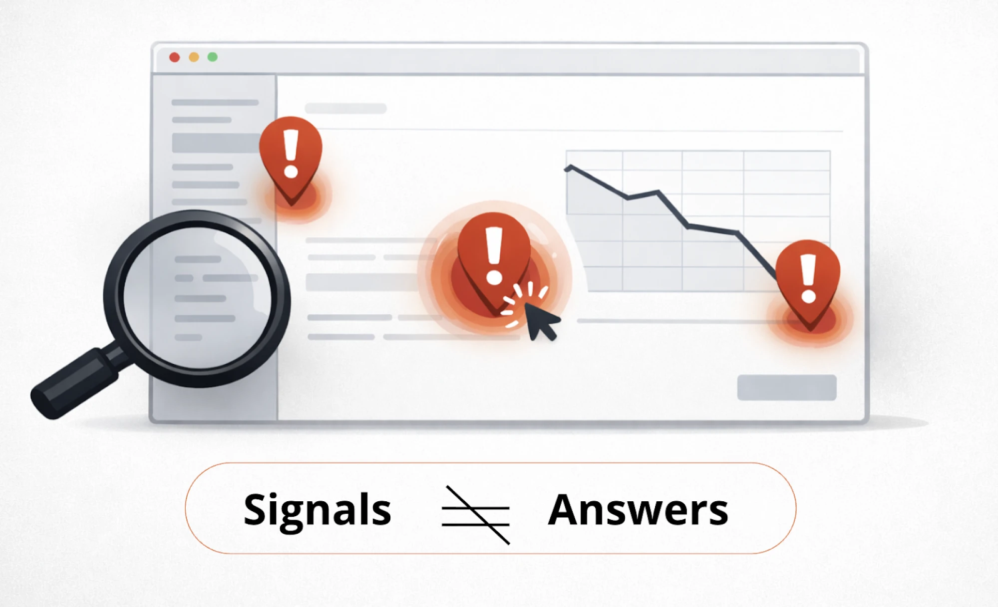
A spike in exits, repeated clicks on a non-clickable element, or a sudden drop in activation doesn’t explain the full story – but it does highlight points where something feels confusing, slow, or harder than expected.
And your job is figuring out what that friction means, so your team can make better product decisions.
For example, in Eleken’s work with Nworx, a B2B edtech SaaS project, UX analytics helped reveal a gap: while buyer feedback was strong, end users still faced multiple friction points. These signals guided the redesign toward clearer hierarchy, smoother user flows, and a simpler goal-tracking experience for more exceptional user experiences.
Understanding UX analytics boundaries
UX analytics often gets mixed up with other areas of product work. Yes, it can answer a lot – but not everything. When you know what it can (and can’t) tell you, it becomes much easier to choose the right approach and avoid wrong conclusions.
Here’s a clear breakdown:
As you see, UX analytics is just one piece of the puzzle. Looking at it alongside UX research, product analytics, and A/B testing is key to solution success throughout its entire product lifecycle.
From strategy to metrics: building your UX analytics foundation
UX analytics only works when it's deliberate. You can't measure everything, and you shouldn't try. The key is building a logical path from what your business needs to what user behavior tells you.
Here's how to build that path.
Starting with business goals, not available metrics
The common advice is "your UX metrics are the business's metrics." That sounds clean in theory, but what really works in practice is getting specific about business priorities first.

Without that clarity upfront, you'll end up measuring what's easy instead of what matters.
It works like this – imagine your business goal is customer retention. You can't just track "retention" directly. You need to translate that goal into specific user behaviors that lead to it. This is where analytics ux design becomes intentional – connecting business outcomes to measurable user actions.

So if the business goal is retention, then UX behavior might be users returning to complete key workflows. If the goal is revenue, the UX behavior might be users reaching the “aha” moment faster.
After you've outlined the behavior, set out to piece together which signals to measure, so you know if those UX behaviors are happening.

Getting specific about signals you're measuring
After you define the user behavior tied to your business goal, the process of choosing signals worth tracking can get messy sometimes.
To crystallize the right signals, map them back to specific capabilities that must work for users for the behavior to succeed:
One way to break this down is by looking at different aspects of what users need to be able to do:
Without considering all four, you may get stuck with vague problems like 'retention is low'. But with them, you can pinpoint specifics: users can't orient themselves after login, so they never reach the workflows that would bring them back.
Making Sense of UX Signals
Once you're all set with tracking the right signals, you’ll have to interpret what that user experience data actually means. The tricky part is that the same signal can indicate different problems depending on context.
Take a high bounce rate. It might mean:
- The page didn't match their expectations → UX issue;
- The page loaded too slowly → technical issue;
- They arrived from the wrong traffic source → targeting problem;
This is why analytics gives you clues, not answers. The signals point you toward where to investigate further – through session replays, user interviews, or usability testing.
Case in point: HealthStream, an Eleken’s client, saw users struggling with reporting and assumed they needed highly customizable reports. After Eleken ran user interviews, it turned out customers wanted standard reports with only minor adjustments — plus better filtering and scheduling. The signal was real, but user research revealed the right solution.
Quantitative vs qualitative UX analytics, and why you need both
UX analytics isn’t one type of data. In practice, it’s a combination of two different lenses: quantitative signals and qualitative data. Each one is useful on its own – but neither gives you the full picture.
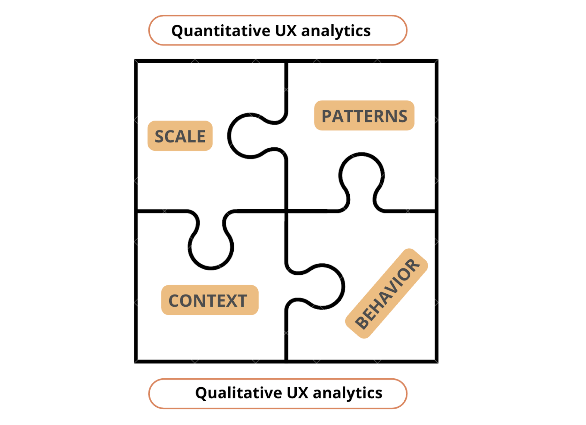
Quantitative UX analytics scale and patterns
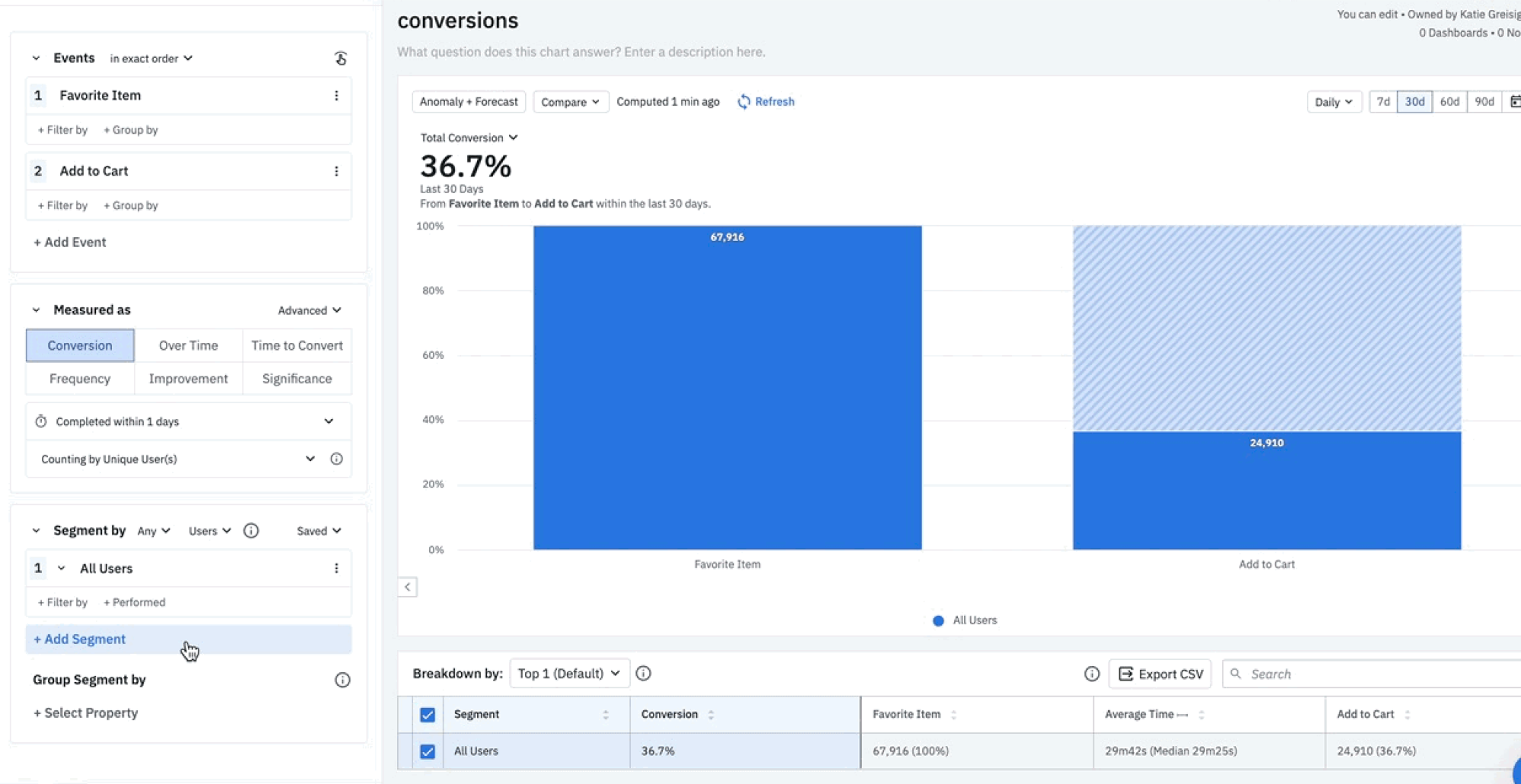
Quantitative UX analytics shows what’s happening across your product in numbers. It helps you answer questions like:
- Where do users drop off in key flows?
- Which features get adopted (and which are ignored)?
- How long does it take users to reach a key action?
- What behavior separates retained users from churned ones?
This is where platforms like Google Analytics, Mixpanel, Amplitude, and similar proven UX analytics tools are typically used. They’re especially useful for identifying patterns you can’t spot manually – because they aggregate thousands (or millions) of interactions into something measurable.
Strengths of quantitative UX analytics:
- Works well at scale
- Helps prioritize issues by impact (how many users are affected)
- Makes trends visible over time (before/after releases)
- Useful for tracking funnels, paths, and usage frequency for spotting future trends
Limits to keep in mind:
Quantitative analytics can tell you what happened, but it often can’t tell you why. A drop-off might be caused by confusion, a technical issue, pricing hesitation, or a mismatch in expectations. The chart won’t explain the cause – you still need interpretation and context.
Qualitative UX analytics context and behavior
Qualitative UX analytics gives you context behind the numbers. Instead of telling you how often something happens, it shows you what it looks like when it happens.
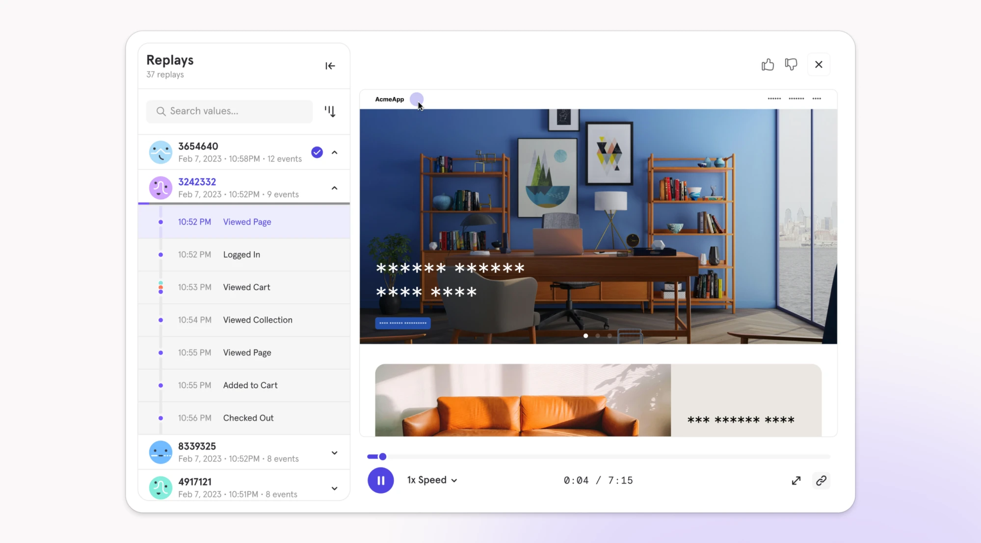
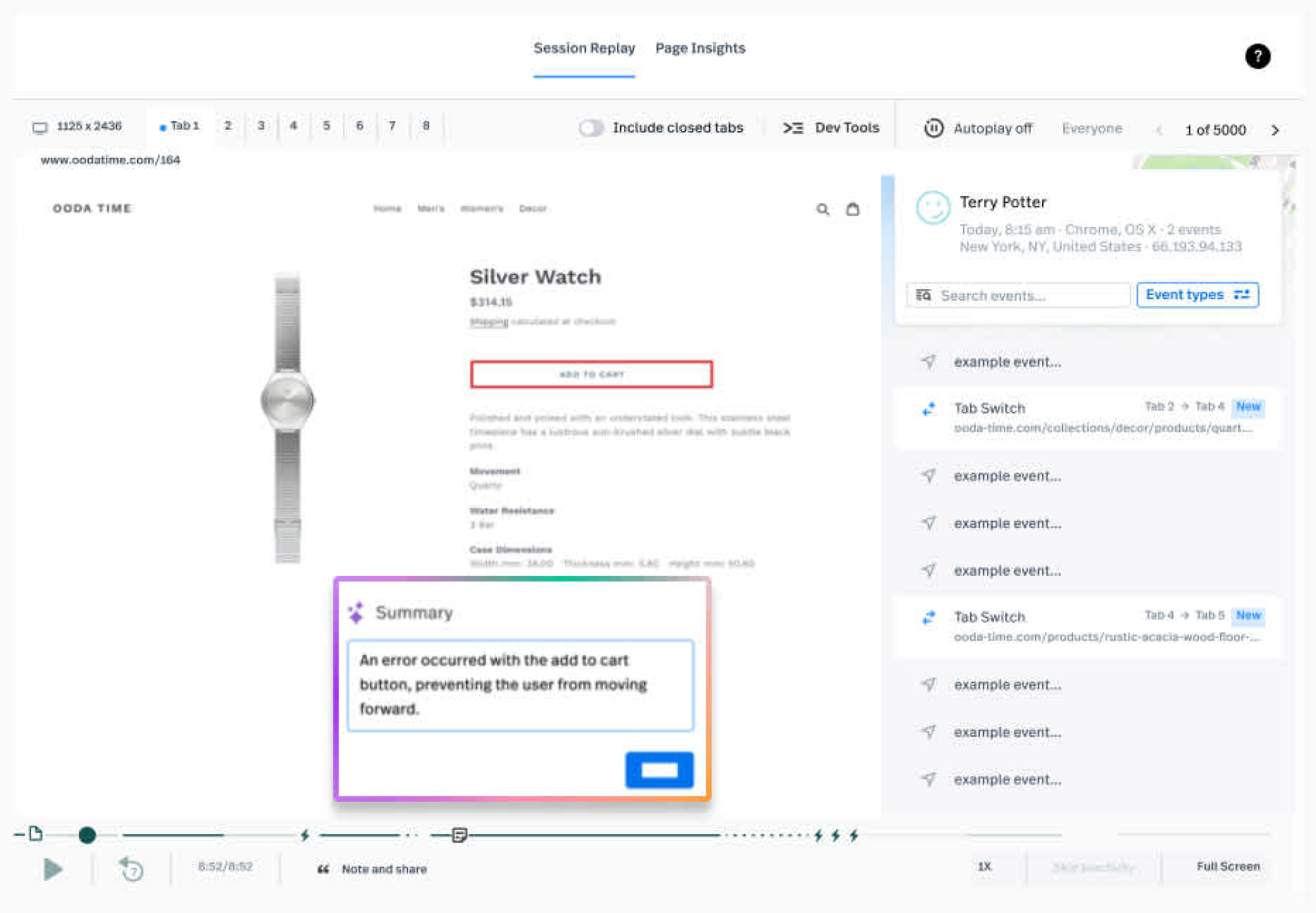
This is where tools like session replays, heatmaps, and micro-surveys become useful. They help you see moments of friction more directly, such as:
- users clicking the same element repeatedly
- scrolling without finding what they need
- hovering, pausing, or looping through screens
- abandoning forms midway through
- misunderstanding what a chart, label, or button means
What qualitative signals show well:
- how the experience “feels” in motion (hesitation, confusion, friction)
- where users get stuck in real flows
- misleading UI cues (things that look clickable but aren’t)
- UX breakdowns that don’t show up in funnels
This layer of usability analytics helps you see friction that numbers alone can't capture – the moments when users pause, backtrack, or abandon flows because something feels wrong."
What they don’t show well:
Qualitative signals don’t tell you how widespread an issue is. One replay can reveal a real problem – but it can also be an edge case. That’s why qualitative user insights are strongest when they’re connected back to quantitative patterns.
The triangulation rule or why don’t trust one signal
If you want UX data analysis to lead to real improvements, you need diversity for cross-reference. Nielsen Norman Group describes this as triangulation – the practice of using multiple sources of data or approaches to analyzing data to enhance the credibility of your findings.
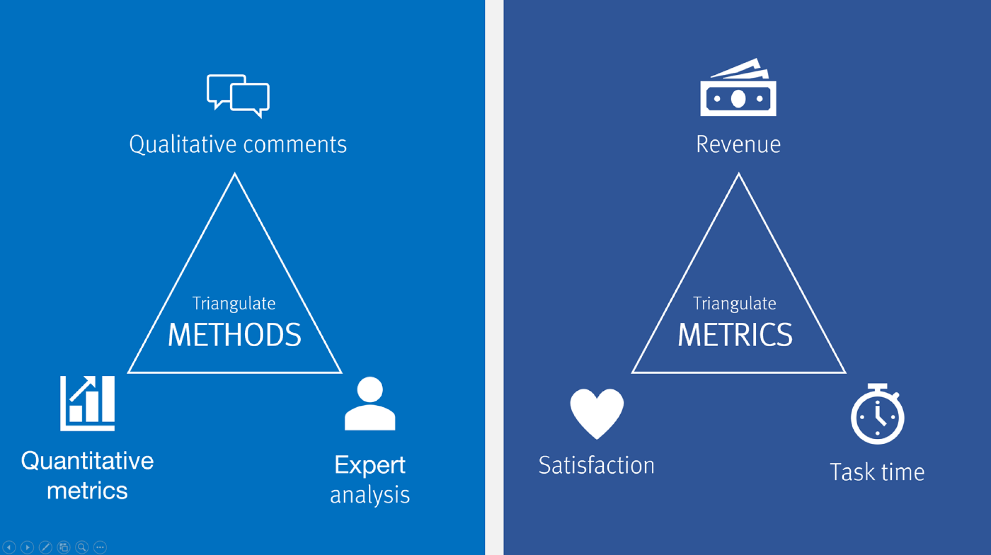
The idea is simple: look at the same question from different angles, and you'll see parts of the answer that weren't apparent from a single view:
- Start with quantitative data to spot patterns: a drop-off point, an unusually high error rate, a feature nobody uses.
- Proceed with qualitative tools to grasp what's actually happening: watch session replays of users who dropped off, run a survey asking why people don't use the feature, review heatmaps to see where attention goes.
One signal might mislead you. But multiple signals pointing to the same problem give you confidence to act. A good example is Eleken’s partnership with myInterview, where 90% of candidates abandoned the interview mid-flow. The data showed the breaking point, but it couldn’t reveal the deeper friction behind it.
By going beyond dashboards and validating solutions through prototyping, Eleken streamlined the interview journey, clarified confusing multi-selection fields, and improved desktop responsiveness. These changes turbocharged retention and usability, helping myInterview win enterprise clients with quick yet impressive demos.
All in all, how much triangulation you need depends on the stakes. As Nielsen notes, the more significant the decision, the more it pays to triangulate. Expensive choices, like redesigning a whole product, need robust validation from multiple sources. Simple, easily reversible decisions may need less – but even then, a quick check of whether other available data supports your approach is always worth the time.
Building a UX analytics toolkit that fits your product
It’s tempting to look for one perfect UX analytics tool that does everything. But trying to force one platform to cover all needs usually leads to either blind spots — or a messy setup no one uses consistently.
Don’t chase the biggest stack. Build the leanest set of tools that helps your team learn, troubleshoot, and improve the experience – and choose that mix based on what you’re actually trying to learn.
Debunking the “all-in-one tool” myth
Most analytics platforms excel at one thing but may fall short elsewhere:
- Google Analytics tracks traffic and conversions at scale but offers limited visibility into individual user friction and the reasons behind drop-offs.
- Hotjar captures session replays and heatmaps well, but it isn’t a full-featured funnel analytics tool.
- Mixpanel handles event tracking powerfully but doesn't show you visual behavior.
This isn't a failure of the tools – it's the nature of UX analytics. Different questions require different types of data collection. And trying to force one tool to answer every question means either missing critical insights or spending excessive time on workarounds.
That’s why a good UX analytics setup rarely relies on just one tool. It works best as a small system of tools that cover different types of questions.
Understanding UX analytics tool categories by core job-to-be-done
UX analytics tools can look overwhelming because many of them overlap. The easiest way to make sense of them is to stop comparing features and focus on the core job-to-be-done: what you’re trying to learn, diagnose, or improve.
Once that point is clear, tool selection becomes more straightforward:
Each category supports a different layer of understanding. Product analytics UI helps you track usage patterns and drop-offs, session replays uncover friction points in real context, and surveys surface user sentiment. Combining these categories is what leads to complete answers.
Choosing a minimum viable UX analytics stacks
When it comes to choosing tools, there's no one-size-fits-all combo – everything depends on team maturity, resources, and what you're optimizing for. Here are practical combinations for common scenarios:
Early-stage startup / no dedicated analyst
At this stage, oftentimes, you need just basic visibility without complex setup or ongoing costs. Your key essentials should be:
- Traffic and conversion tracking – showing where users come from and whether they complete key actions (check out – Google Analytics)

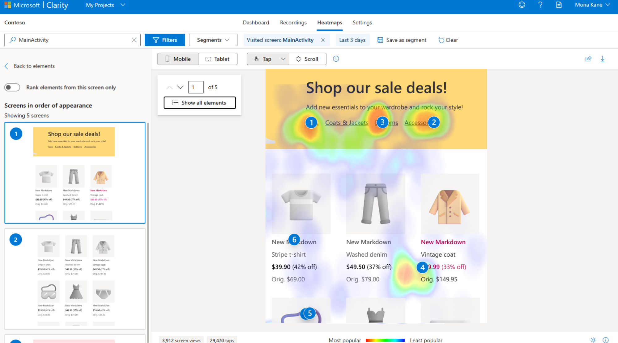
- Session replays and heatmaps – letting you watch how individual users navigate and where they click (check out – Microsoft Clarity)
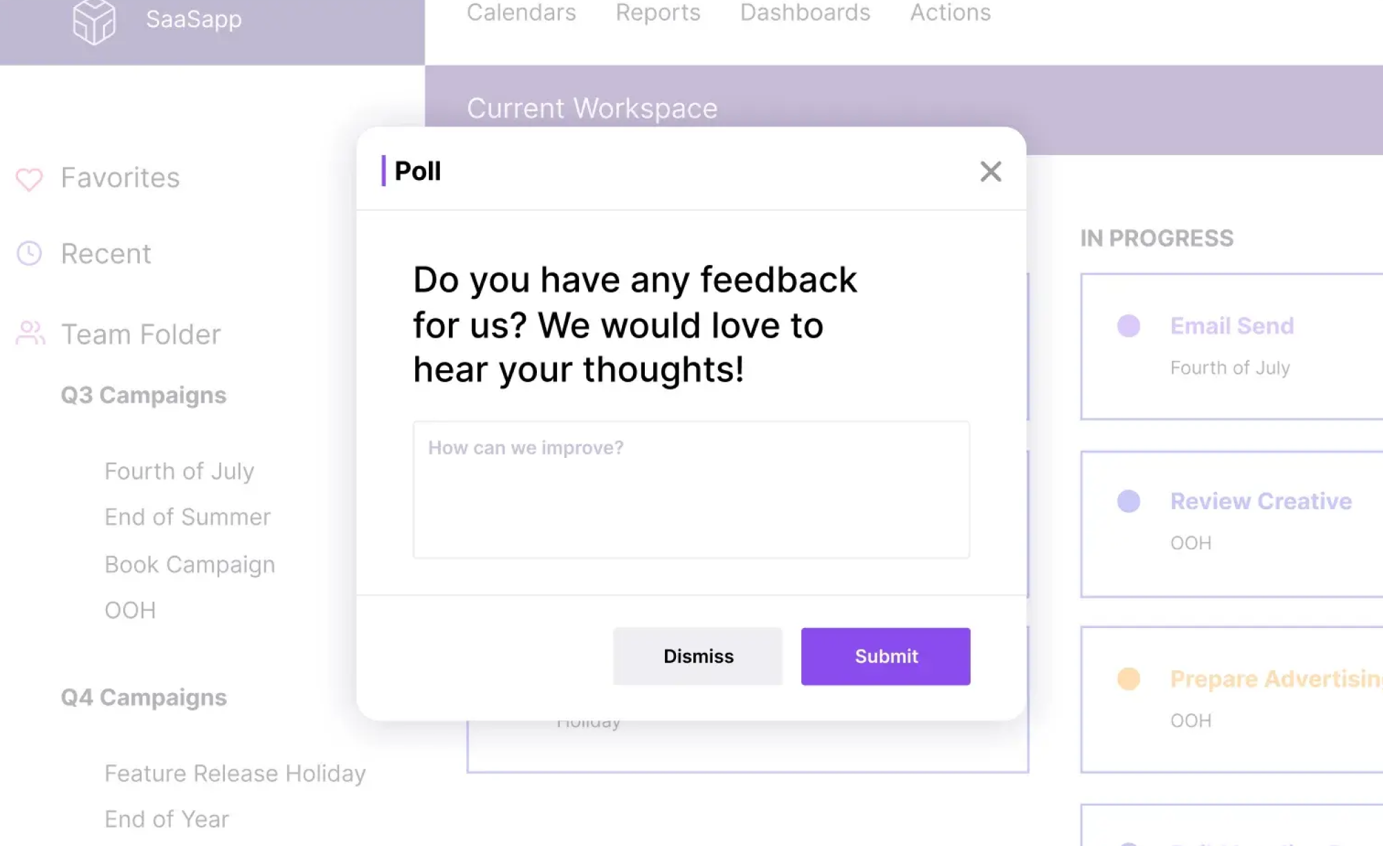
- User feedback surveys – capturing users’ real impressions (check out – Typeform or Google Forms)
Why: Free or cheap, covers basics, doesn't require technical setup. Combines quantitative tracking (where users go) with qualitative insight (how they navigate + what they think).
Product-led SaaS
In this context, your tasks are to track in-app behavior and feature usage over time. Here are your must-haves:
- Event tracking and funnel UX analysis – tracking specific user actions within your product and highlighting where users drop off in key flows (check out – Amplitude or Mixpanel)
- Session replay with technical details – showing you exactly how users interact with features, including console errors and technical issues (check out – FullStory)
- In-app survey tool Collects feedback at the moment users experience something, without taking them out of the product (check out – Survicate, Pendo)
Why: Deep product usage data, ability to diagnose technical issues, direct user feedback. Built for tracking behavior within applications, not just page views.
Marketing site + product
Consider the suggestions below if you need separate tracking for different purposes – site visitors vs. product users.
- Website traffic analytics: tracking how people find and navigate your marketing site (check out – Google Analytics)
- Product analytics: monitoring how users actually use your product features. (check out – Amplitude or Mixpanel)
- Heatmaps and surveys: working across both marketing pages and the product to gather visual behavior data and user feedback. (check out – Hotjar)
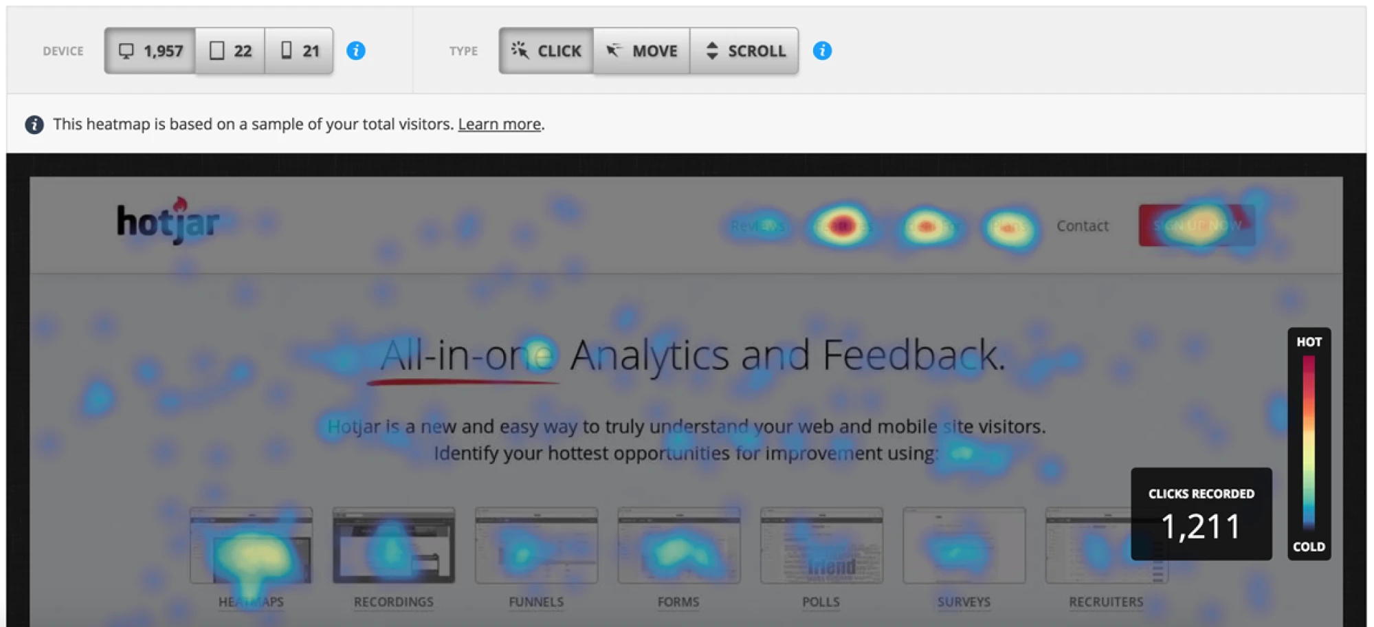
Why: One tool tracks website conversions, another tracks in-product behavior, and Hotjar adds qualitative context (heatmaps, replays, surveys) across both.
Enterprise / compliance-heavy
For such a case, you need tools that perfectly meet security, compliance, and vendor requirements.
- Enterprise analytics platform: providing the compliance certifications, data governance, and vendor support your organization requires. (check out – Adobe Analytics, enterprise-tier Google Analytics)
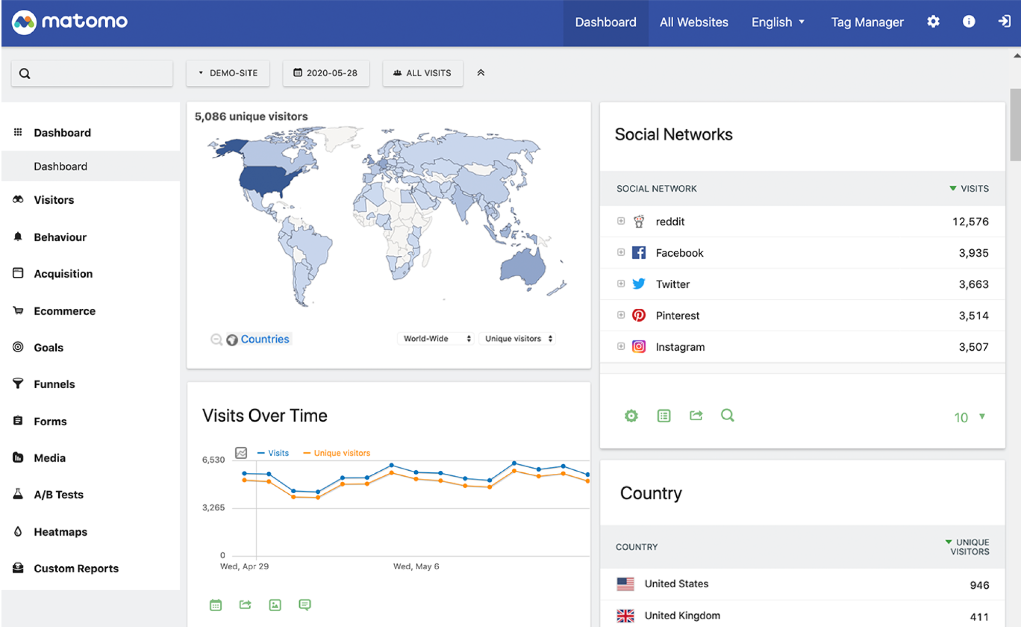
- Self-hosted analytics: keeping data on your own infrastructure when data residency matters. (check out – Matomo)
- Enterprise survey platform: combining security requirements while collecting user feedback. (check out – Qualtrics)
Why: Meets security and compliance needs, vendor support, data control, and audit trails your organization requires.
Turning UX analytics into a continuous process
User experience analytics works best when it’s not treated as a one-time audit. SaaS products change constantly and strong teams treat UX data analytics as an ongoing practice – not something they check only when numbers drop.
What UX analytics cycle looks like in practice
A reliable analytics for UX process follows a clear loop:
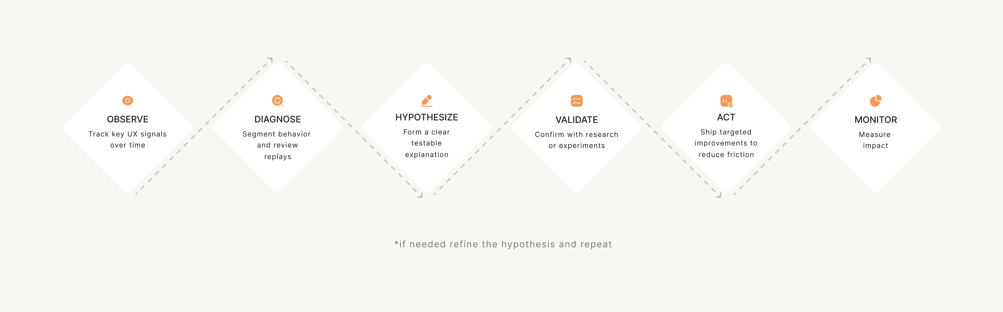
- Observe (dashboards & alerts): monitor key signals over time and set simple alerts so changes don’t go unnoticed.
- Diagnose (replays, segmentation): when something looks off, dig deeper; segment users, compare behaviors, and review replays to pinpoint where friction appears.
- Hypothesize: turn patterns into a testable explanation; not “users are confused,” but “users drop off because step 3 is unclear.”
- Validate (research or experiments): confirm the hypothesis with quick research, usability checks, or lightweight experiments – especially before major redesigns.
- Act: ship a targeted change – copy improvements, UI tweaks, better guidance, or flow restructuring.
- Monitor: check whether friction signals improve after release. If not, repeat the loop with a refined hypothesis.
Such a workflow keeps analytics from becoming a reporting exercise. Each cycle should answer: "What did we learn?" and "What are we changing because of it?"
Setting a UX analytics routine that sticks
You don’t need daily dashboard-checking to do continuous analytics UX work. Always aim for a rhythm your team can maintain. A simple, yet sustainable routine is usually enough to stay on top of UX issues:
Weekly friction review
- Set up a weekly alert or dashboard in tools like GA4, Mixpanel, or Amplitude to spot spikes in error rates, drop-offs, or rage clicks compared to the previous week.
- Filter and watch 5–10 session replays in Hotjar, FullStory, or LogRocket specifically for users who triggered those errors or dropped off at key steps.
- Write down recurring patterns (same screen, action, or confusion point) in a shared doc or Notion page, using short “problem → evidence” notes.
- Flag high-impact issues in your backlog or ticketing tool (Jira, Linear) with links to replays and metrics so they’re ready for deeper investigation.
Monthly journey review
- Pull the full end-to-end journeys and screenshot/export the funnel + main paths so you can review them without jumping between tabs.
- Compare month-over-month funnel performance for the key user journeys and mark which steps improved vs worsened to focus the review.
- Watch session replays (Hotjar, FullStory) and cross-check friction points with qualitative input (support tickets, sales calls, feedback forms) and tag the issues that show up in both.
- Convert findings into backlog-ready items (Jira, Linear, Notion) and prioritize them with a simple scoring method (Impact × Frequency × Effort), so the team can focus on highest-value fixes first.
Quarterly metric reset
- Revisit whether your core metric set is aligned with current business priorities (activation, retention, expansion, revenue) and update dashboards so everyone is looking at the same “source of truth.”
- Move metrics that don’t drive decisions to an “archive / reference” section so dashboards stay focused on what the team actively uses.
- Add metrics for newly launched features to validate value (track adoption, successful completion, repeat use, and drop-offs) to decide if the feature should be improved, repositioned, or deprioritized.
And remember that consistency is key. A weekly 30-minute review beats a quarterly deep-dive that gets postponed indefinitely.
Common UX analytics failure modes, and how to avoid them
UX analytics can be incredibly useful — but it’s also easy to get wrong. The biggest mistakes don’t come from “bad tools.” They come from misreading what the data means, or building a tracking setup that looks impressive but doesn’t lead to better decisions.
Below are the most common UX analytics failure modes – and what to do instead.
1. The trap of endless tracking (busy work)
It’s easy to end up tracking more and more over time – until dashboards keep growing, reports keep shipping, and nothing in the product actually changes. In that situation, analytics becomes a ritual, not a tool for action.
What to do instead:
Tie every metric to a UX question and a decision. If a dashboard doesn’t help you prioritize a fix, validate a hypothesis, or monitor change – it doesn’t belong in your core UX analytics routine.
2. Interaction metrics ≠ understanding
Not every measurable signal reflects real understanding. Metrics like time-on-page, clicks, or scroll depth can be useful, but they’re often treated as proof that users “get it” or feel satisfied – when they may simply be stuck, hesitating, or exploring.
What to do instead:
Treat metrics as signals, not conclusions. Pair them with context (replays, surveys, usability checks) and define what “good” looks like for your product instead of relying on generic assumptions.
3. “Rage clicks” don’t always mean frustration
Rage clicks can point to frustration – but they don’t automatically mean something is broken. Sometimes users click rapidly because they’re fast, repeating a common action, or interacting with UI patterns that naturally invite multiple clicks.
What to do instead:
Treat rage clicks as a flag, not a verdict. Check where they happen, whether they correlate with drop-offs or retries, and review sessions from multiple users before deciding it’s a UX issue.
4. Sampling bias (seeing only a slice of reality)
UX analytics is especially vulnerable to overgeneralization. When insights come from a few session replays, one user segment, or a single traffic source, it’s easy to assume you’re seeing “the truth” – when you might only be seeing one slice of reality.
What to do instead:
Segment and compare. Look at behavior across device types, entry points, new vs returning users, and high-value vs churned users. If you can’t estimate scale, don’t treat the insight as universal.
5. Instrumentation debt (tracking that no one trusts)
Even the best analytics setup breaks down if no one maintains it. Once events become inconsistent, naming gets messy, and funnels stop matching how the product actually works, the team slowly stops trusting the data — and that trust is hard to win back.
What to do instead:
Keep tracking simple and maintained. Document key events, clean up legacy tracking quarterly, and prioritize a small set of metrics you can rely on. A smaller, accurate dataset beats a huge unreliable one.
6. Privacy blind spots (tracking risks you didn’t plan for)
Analytics can also introduce risk if privacy isn’t treated as part of the system from day one. Teams may record sessions they shouldn’t, collect sensitive inputs unintentionally, or build tracking that becomes a compliance issue later – especially in enterprise and regulated products.
What to do instead:
Treat privacy as part of UX analytics design. Mask sensitive fields, limit recordings, set clear retention rules, and involve legal/security early. The best UX analytics setup is one your organization can safely keep using long-term.
Making user experience analytics work
UX analytics isn’t something you “set up once” and then let run in the background. It’s a practice – a way of continuously learning how users experience your product and what gets in their way.
The best UX analytics setups work like a loop:
- define the behavior you want
- track the signals that reflect it
- discover what changed
- monitor whether your fixes actually reduce friction
That’s how analytics becomes a long-term advantage—not just a reporting layer.
Done right, analytics for UX designers serves as a robust tool for better decisions. With the help of qualitative and quantitative data, it helps them move from assumptions to evidence, and from vague concerns to clear, actionable fixes.
If you want UX decisions grounded in real user behavior, Eleken can help you turn analytics insights into clearer flows, better onboarding, and smoother user journeys that drive product growth.