Experience map and customer journey map are two interrelated concepts that can be easily confused. Nevertheless, as there are two terms for these two notions there is definitely a need to study the matter of experience map vs customer journey map deeply.
At Eleken, we’ve designed 200+ SaaS products across AI, data-heavy, geospatial, and B2B platforms. And we often address UX mapping in our design process to find effective user-centered solutions for projects we work on. Both experience and customer journey maps allow you to walk in your customer's shoes and they both focus on customers' emotions and experiences, still, they serve different purposes.
In this article, we will analyze and compare experience map vs journey map, so that you can understand which tool serves your needs better.
What is a customer journey map?
So, first thing first, let's get our terminology right.
A customer journey map (CJM) is a powerful tool that helps to visualize certain user’s paths and customer interaction with the product. It is a story of communication between the user and the company that takes into account the customer’s thoughts, emotions, goals, and motives. The map is composed from the buyer’s perspective and looks like a graph with points and channels of customer interaction with the product.
A customer journey map consists of the following components:
- Timeline graph
- Different stages of customer’s interaction with the product (for example, discovery, research, evaluation, conversion, post-sale engagement)
- Customer’s objectives and actions taken during each stage
- The thoughts and emotions the customer has as they complete certain actions
CJM reflects the way a customer moves towards a certain goal, identifies problem areas at each customer journey touchpoint, and allows you to understand how to solve those issues. With the help of the CJM, you can manifest the main customers’ fears, pain points, and expectations and gain insights that will inform your further design decisions.
To make a map, it is necessary to track customer behavior at all points of intersection with the product. For a good analysis, you need to collect enough information about the buyer and the product itself. Then, you should correctly record it on the map (with customer journey mapping tools this process seems easier).
Main features of a CJM
A customer journey map is characterized by:
- Linear timeline. CJMs present customer actions in chronological order.
- Presenting information from the customer’s perspective. The customer journey map tells little about how the product works, but is offering insights on the customer's thoughts, feelings, and emotions when interacting with your brand/product.
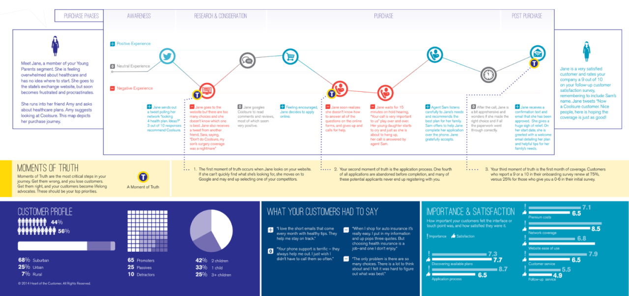
- One CJM depicts the journey of one buyer persona. If you look closely at the above customer journey map example, you will notice the description of a buyer persona before interacting with the product on the left side, and their feelings after completing the goal on the right side. That’s how CJMs work: one type of customer per one map.
- A map tells a customer’s journey within one product or service. Customer journey maps are quite specific as they show the buying journey of one target customer for one product.
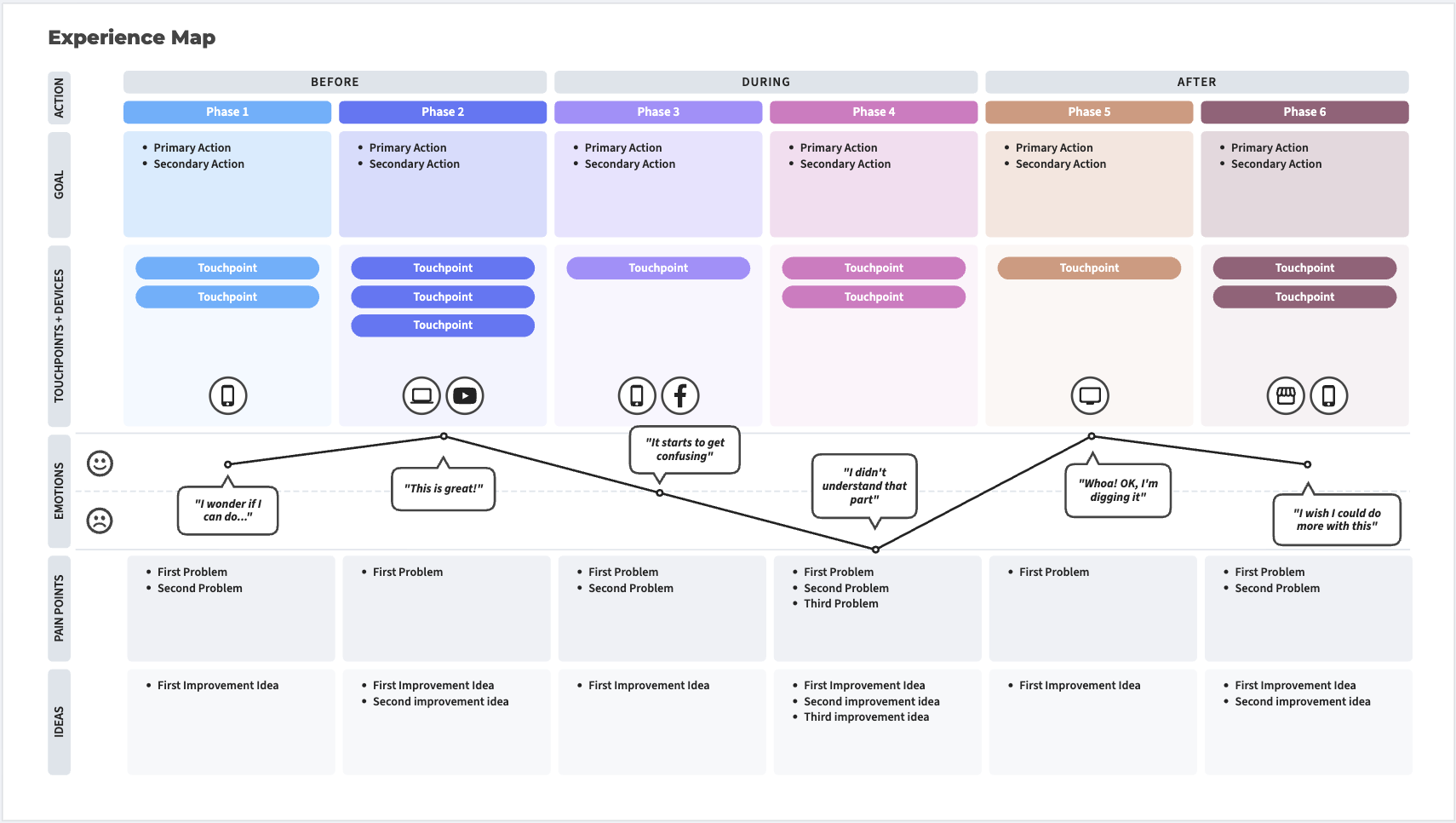
What is an experience map?
An experience map shows the entire journey customers take when they interact with a product or service.
Similar to the customer journey map, experience mapping depicts the user's path from the product discovery stage to evaluation, initial contact and purchase (until a person becomes a customer). But the experience map goes wider, it also shows what your competitors and your business are doing in the context of this journey, taking into account reviews, references, referrals, support, and so on.
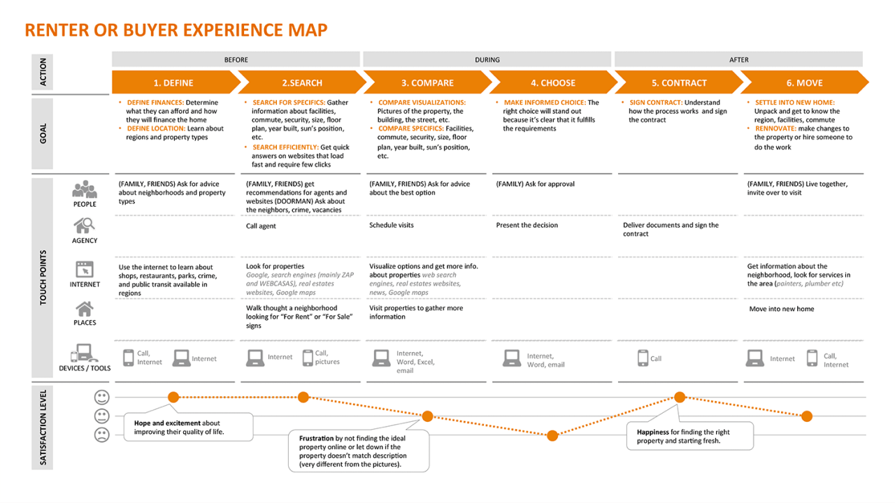
As you can see in the above example, the experience map also visualizes stages, timeline, emotions, and feelings but it doesn’t focus on some specific customer type. UX map shows the overall experience of all customers. As well, it presents the customer journey with various touchpoints that are not tied to one specific product or service (the customer is searching for a house with the help of an Internet, agency, by asking friends and family for advice, and so on).
Capturing the full picture of experiences from a customer perspective helps organizations identify strategic opportunities, customer pain points, and launch innovative projects.
Main features of a UX map
Here are some main characteristics of an experience map :
- It generalizes the experience of different types of customers. UX ma is not tied to a certain customer type.
- A map tells the entire customer journey. Experience maps are not tied to a specific product/service.
- It has a chronological order.
- It depicts stages of a customer journey, customer actions, thoughts, and emotions
Purpose and benefits of customer journey maps (CJM)
A customer journey map helps you see the entire user's path and immediately identify the gaps in the user flow - the pain points that the design team will need to resolve to create a service or product that improves users’ lives.
To better understand how helpful a CJM can be, let’s take a look at the example below.
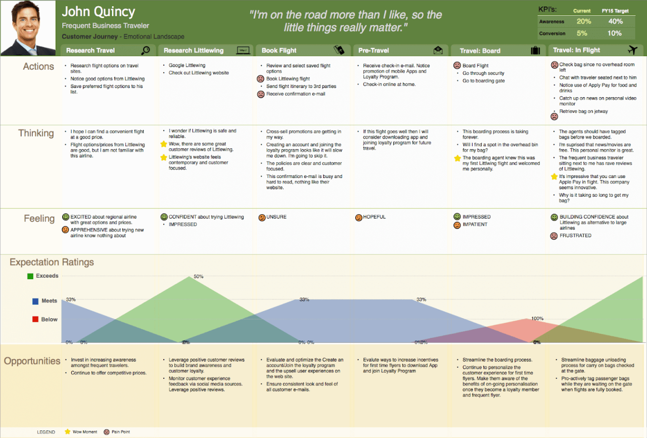
Let’s suppose, you understand that very few customers join the loyalty program, but can’t figure out the reason for this issue. As CJM contains real thoughts of the target audience, you look at the “book flight” stage of the customer journey, check the “thinking” block and learn that creating an account takes too much time and your customers prefer to skip it. Now it’s much easier to find an effective solution to the problem.
As well, CJM works perfectly for visually demonstrating problems to stakeholders (or any company representative) who is confident that their service is working great. The good thing about a customer journey map is that it immediately shows negative thoughts and emotions which makes all team members read those comments attentively, and start thinking about how to fix this negative experience.
At this point, it’s time to move to the explanation of the customer experience map.
The purpose of the experience map
An experience map helps organizations see the big picture and make decisions about what to focus on based on research. When you see the whole picture, you can:
- Inform your design decisions aimed at increasing customer satisfaction, brand loyalty, customer retention, and so on.
- Identify opportunities for innovation.
- Understand where the user experience is currently well supported and in which points it needs improvement.
- Compare different customer’s paths to purchase.
- Help all team members stay on the same page about customers’ needs.
The main objective of an experience map is to identify each possible channel a customer can use to interact with your company.
What differs customer journey map and experience map?
If you read the article up to this moment, you could already understand why people confuse the discussed map types, as well as you could identify some major differences between these tools.
To make the picture clear for you, in this section, we will single out the main distinctions between the customer journey map and experience map.
Multi-channel vs single channel perspective
Experience map depicts the complete picture of the customer experience with the brand at multiple channels, while CJM focuses on the experience the customer gets when interacting with one specific product/service.
Specific customer type vs overall customer experience
Another key distinction arises from their target audience. CJMs are tailored to a specific buyer persona, mapping out the journey of a particular customer type as they engage with a specific product or service. On the other hand, UX Maps take a broader approach, representing the collective experience of all customers interacting with your brand. While CJMs delve deep into the specifics of individual personas, UX Maps provide a holistic view of the overall customer experience, allowing for more generalized insights.
Diving into details vs understanding the broad picture.
The differentiation in their problem-solving capabilities is significant. CJMs excel in pinpointing specific issues within a customer journey, making them ideal for those already aware of problem areas and seeking targeted solutions. In contrast, UX Maps are better suited for organizations facing broader challenges and uncertainties. They serve as a tool to identify overarching strategic opportunities, customer pain points, and areas for innovation. Depending on your project's context, choosing between these two approaches can be instrumental in achieving your goals.
How people actually use these maps in practice
Another sign of how closely related these two methods are is what you’ll notice in UX communities: many experienced designers admit that the distinction between experience maps and customer journey maps isn’t always rigid in practice.

Some teams use the terms interchangeably. Others treat experience maps as the more holistic view and journey maps as a deeper dive into a specific phase. In real-world product environments, what matters less is the label and more whether the artifact helps the team understand the problem.
As one experienced UX professional put it in a discussion:
“As long as the resulting artifact helps the intended audience better understand the problem you are trying to solve, there are really no rules.”
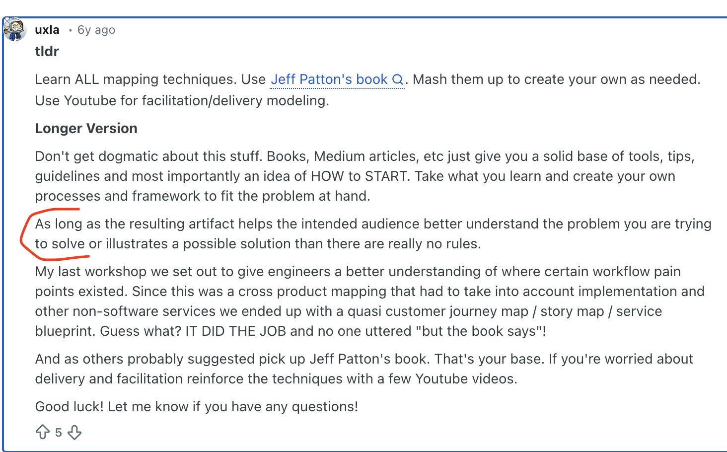
This doesn’t mean the tools are identical. It means that the context of your project, your team’s maturity, and your goals will shape how you use them.
When mapping might be too early
Another recurring theme in UX discussions is this: teams often jump into mapping before doing enough research.
If you’ve only spoken to internal stakeholders or you’re working from assumptions, creating a detailed journey map may give you a false sense of clarity. Maps are only as strong as the research behind them.
Before investing time in experience or journey mapping, ask yourself:
- Have you spoken to real users?
- Do you understand their motivations and decision criteria?
- Are you mapping real behavior or internal assumptions?
For early-stage projects, especially when designing from scratch, discovery interviews and problem validation may be more valuable than immediately building a mapping artifact.
In many cases, mapping becomes significantly more powerful once you’ve gathered insights from actual customers — not just business owners.
Choosing the right tool for your project
So, how do you choose your fighter?
Integrating CJM into Experience Mapping
While CJMs and UX Maps have distinct purposes, they are not mutually exclusive. In many cases, integrating CJMs into the broader framework of an Experience Map can provide a comprehensive understanding of the user journey. By combining the detailed insights from CJMs with the broader context offered by UX Maps, you can create a more holistic view that caters to both specific issues and the overall customer experience. This integration allows for a well-rounded approach to improving user-centered solutions.
Tailoring your choice to project needs
Ultimately, the decision between using a CJM or a UX Map depends on the specific requirements of your project. Consider the scope of your challenges, the level of detail needed, and the overall objectives. If you're seeking to address targeted issues within a particular product or service, a CJM might be your tool of choice. Conversely, if you aim to gain a comprehensive understanding of your customer's journey across multiple touchpoints, an Experience Map (UX Map) is the way to go. By aligning your choice with your project's needs, you can effectively utilize these mapping techniques to drive user-centered design and business-oriented solutions.
Final thoughts
I guess we won’t reveal to you some shocking truth by saying there is no one right choice for each situation. To choose between a customer journey map and a customer experience map, you should know if you need to fully understand the current state of your experience, or you need to find a solution to a specific issue to improve the overall situation.
In general, a customer journey map can be a necessary part of experience mapping, but both approaches can be used apart. It all depends on the project's needs.
At Eleken we work with SaaS customer journeys to explore the experience of each type of customer so we don’t miss anything important when designing a product. This way we can give all types of customers a solution they're looking for. Drop us a line if you want to learn more about the way we help creating user-centered and business-oriented products.