Photobooth Supply
Redesign of Web and iOS Applications for a Company that Helps People Capture Their Precious Moments
About
Photo booths for special events are a growing niche. People want to have fun and save their special memories easily and in good quality. American company Photobooth Supply has been providing such an opportunity for over a thousand creative entrepreneurs around the world.
The company produces photo booths, portable devices that take gorgeous photos during people’s special events. But it is also more than just a smart gadget. Photobooth Supply also helps launch a small event business. In addition to the device they have purchased, users can download supporting iPad software as well as count on support and marketing templates.


However, iOS and web applications of Photobooth Supply used to have quite different designs, which confused users who switched between devices. The client wanted to unify the design and user experience for both apps. Another important request was to create a bundle page that would better communicate the product's benefits.
Hoping to fix some crucial UX problems and refresh the UI the company has turned to Eleken. With our expertise in the field and many successful redesign projects we were the right guys for the job. And from here we have started our work.
Product’s bundle page design
One of the tasks in our cooperation with the Photobooth Supply was redesign of the marketing website page. The page has an offer bundle, where prospects see the product and consider photo booth purchase. The main goal of the redesign was to make sure that potential customers won’t miss the benefits they get along with the main product.
The app has tracking, analysis, and team & project management capabilities. We intended to cover all these features while not overwhelming the interface. In a nutshell, we wanted to let design breathe.
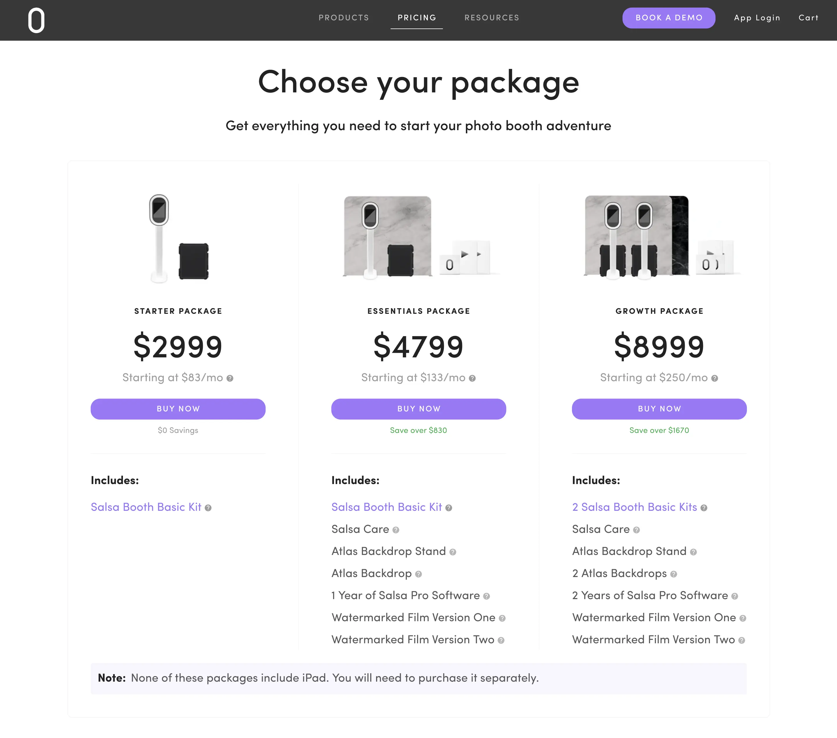
In the old design lots of information about the offers was hidden. We restructured the page completely to highlight what is included in the package. Here’s how we implemented it:
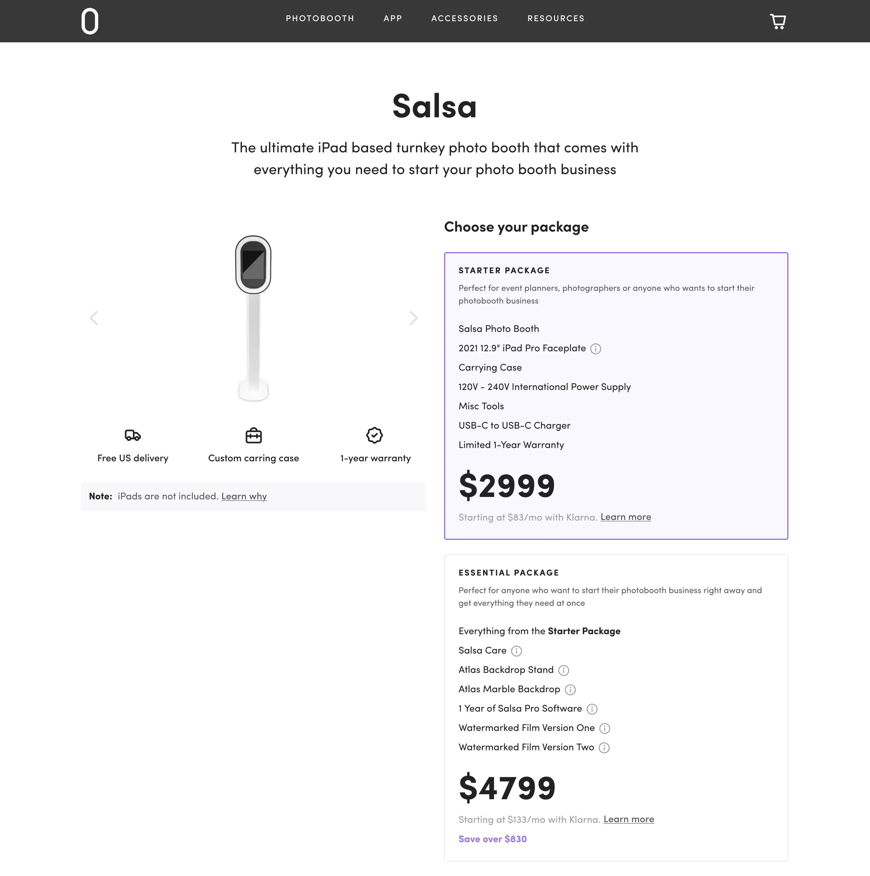
When the user picks a product, the box with information about the package opens up. The specification changes according to the package picked. Such a decision allows keeping the page neat and at the same time informative.
Our designers understand how important such design details are for product’s success as they help to manage users expectations and keep potential customers informed and satisfied.
Application UX design
Previous design of Photobooth Supply apps was visually appealing but had some crucial user experience bugs. The redesign aimed to solve such problems as messy functionality, confusing user flow, and overwhelming UX. To ensure an effective app redesign, we had to comprehend the logic of the product and structure the functionality in order to build a more attractive and logical user experience.
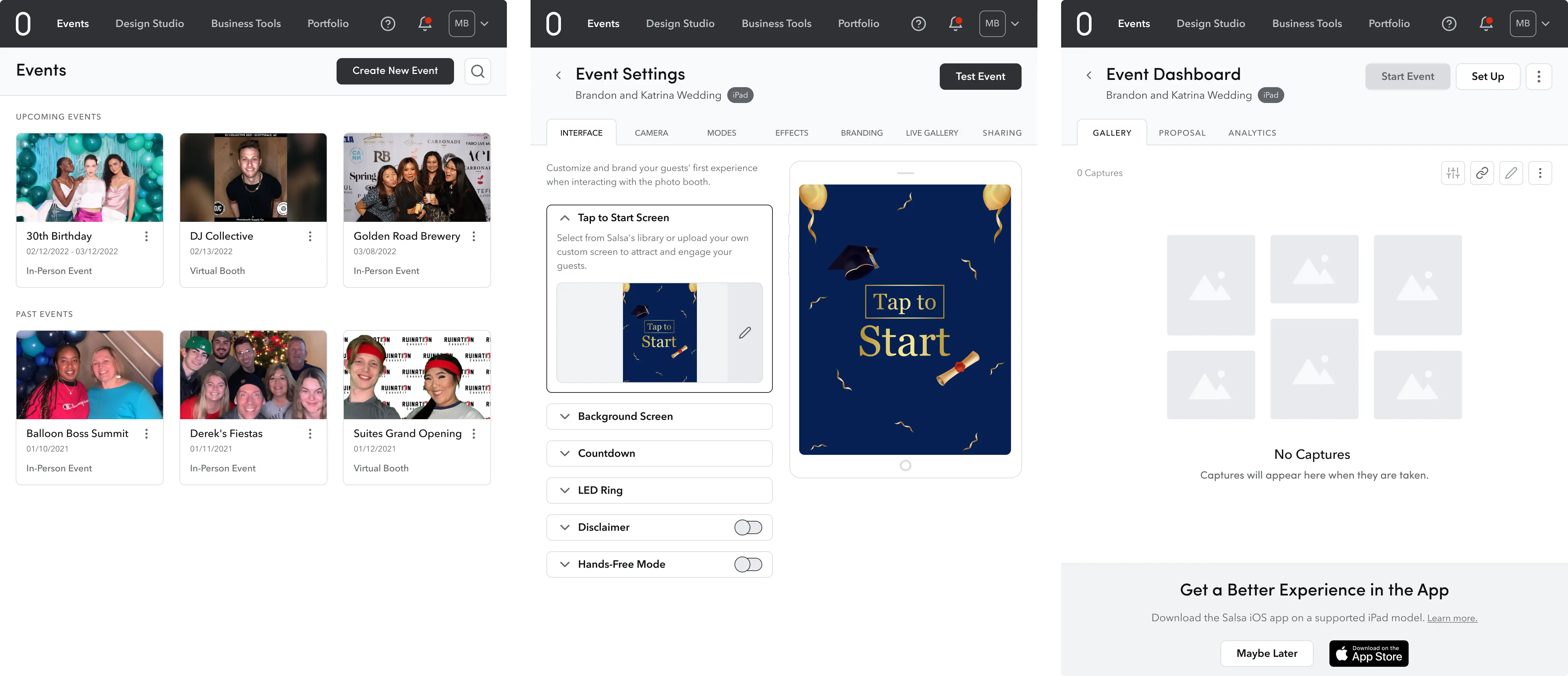
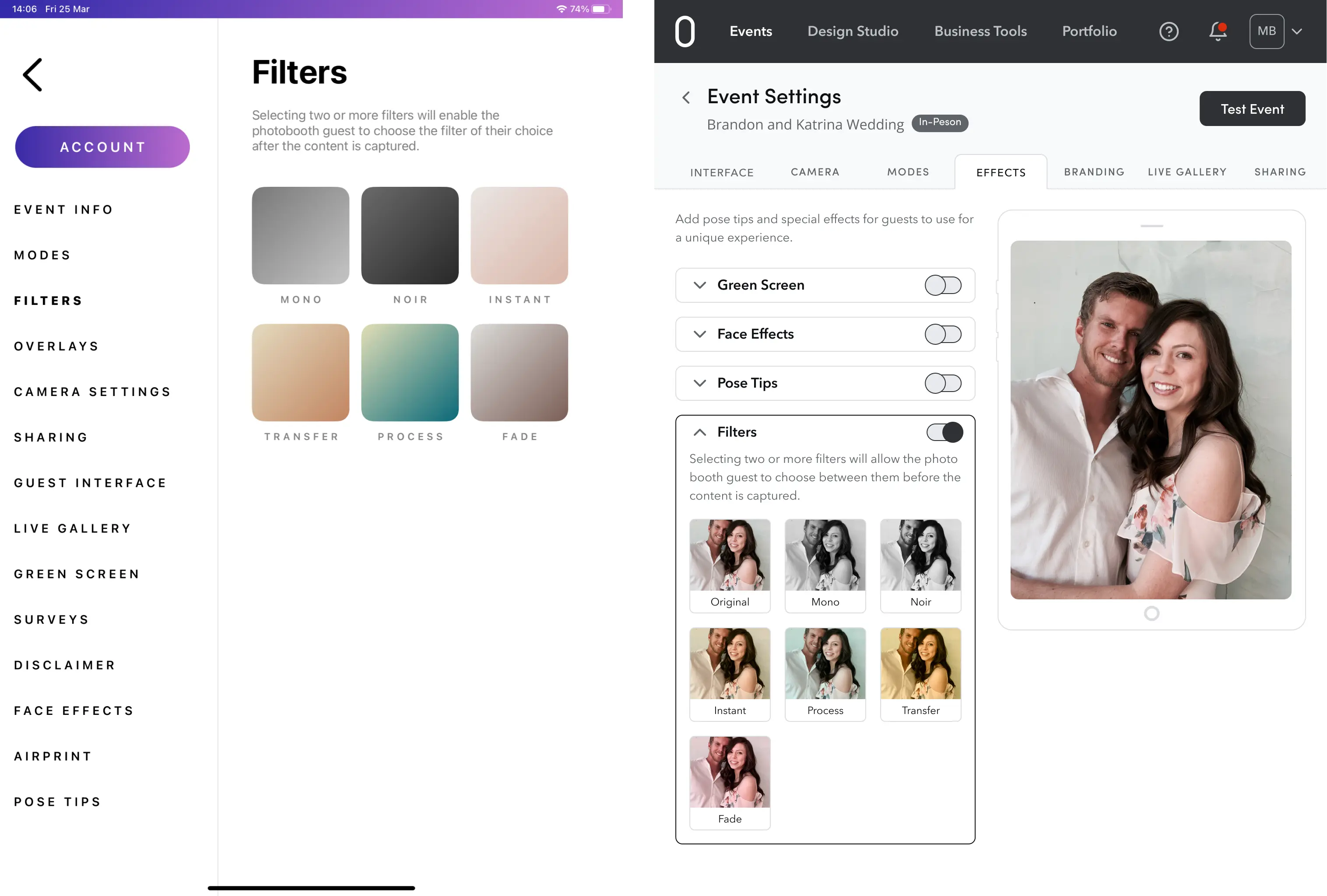
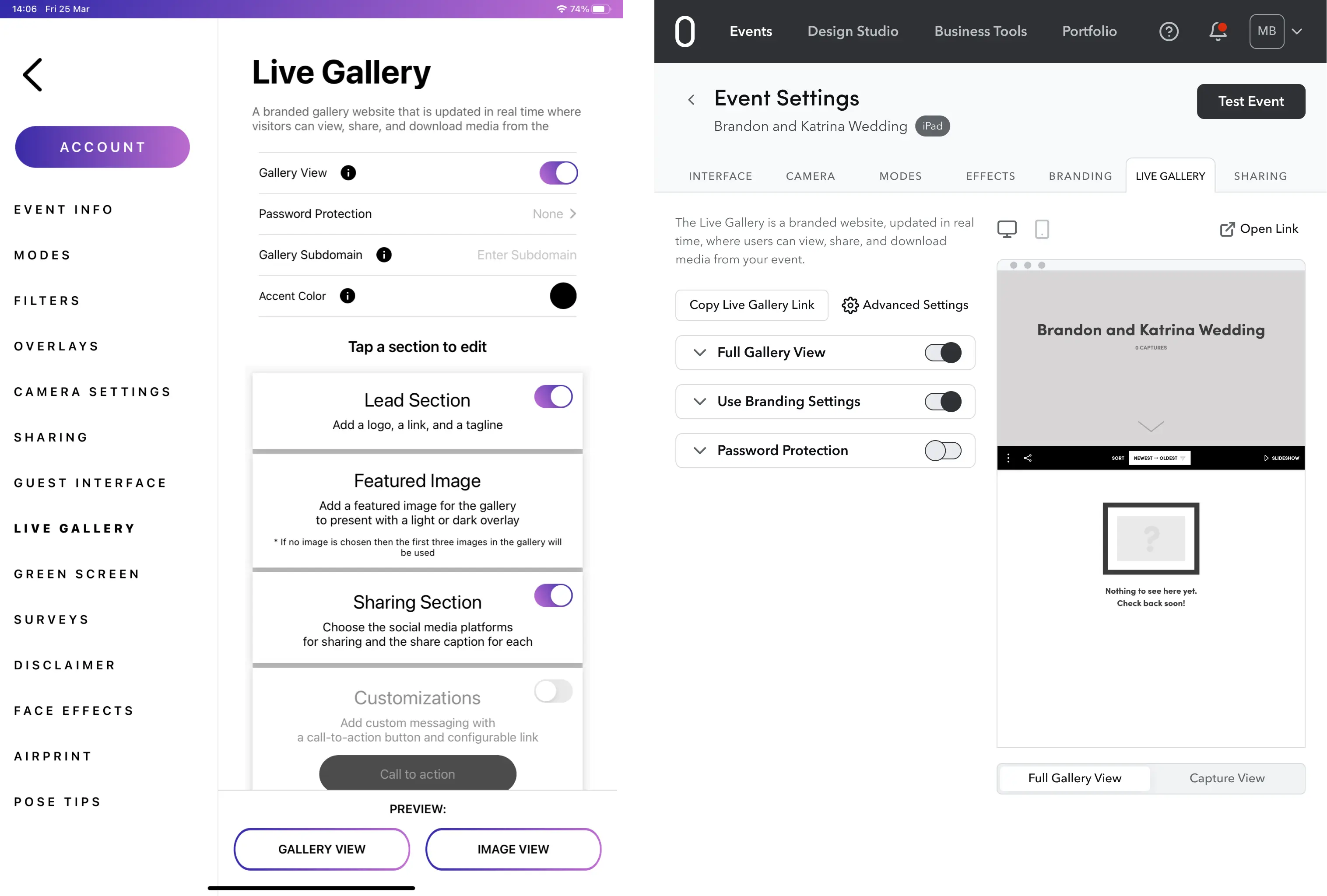
One of the very important changes was the preview option on the Event Settings page. Before users had to pick filters almost blindly. In the new design preview option was implemented, so that users can pick filters and see the result right away.
The preparation for the event was also improved on this page. Users can now save desired settings for the event beforehand and make test photos.
Our designers suggested several other changes that helped to achieve better UX logic. For instance, we have changed the user flow of sign-in, cancellation, and event settings in order to make it more intuitive and unified for iPad and web applications.
Check out before and after designs:
For example, on the left, you can see cluttered boxes and a long sidebar where settings of all events and for one particular event were mixed together. Implementing extended sections (on the right) helps to keep the steps structured and better organized compared to the previous design.
To compare, the new monochrome palette brings users' attention to important functions, while the old UI version seems more distracting.

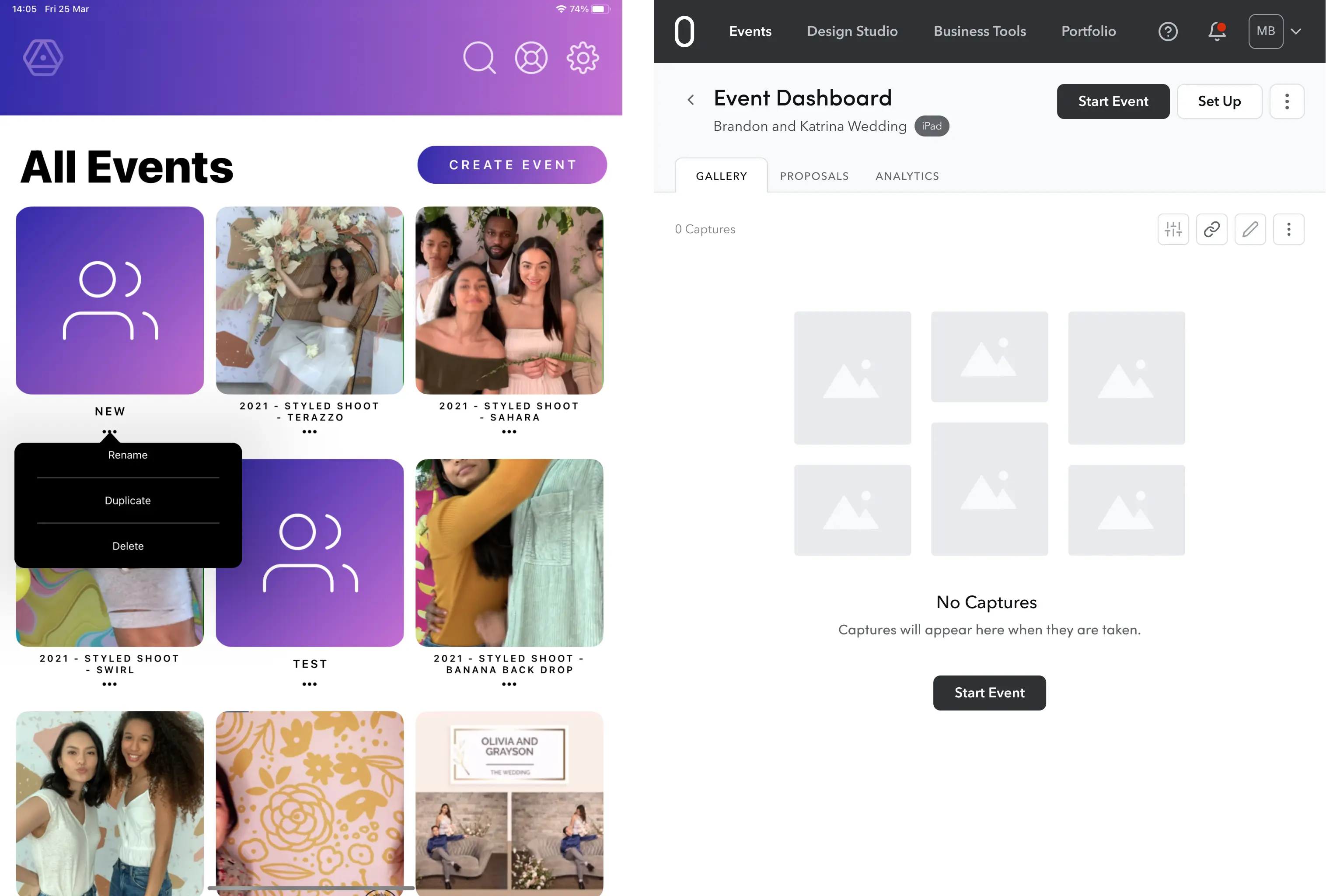
In the previous design (on the left) to delete or rename the event users had to exit from the event section to All Events connection. The new design (on the right) with a clear and tidy event dashboard lets users manage events more intuitively.
These are just a few examples of how Eleken redesigned Photobooth Supply UX for user's sake. What about the user interface?
UI decisions
The main highlight of the platform UI redesign was the minimalistic approach and monochrome color palette. The previous purple theme was abandoned because it distracted users from the main functions. The new more minimalistic interface design brings users’ attention to the app’s functionality.
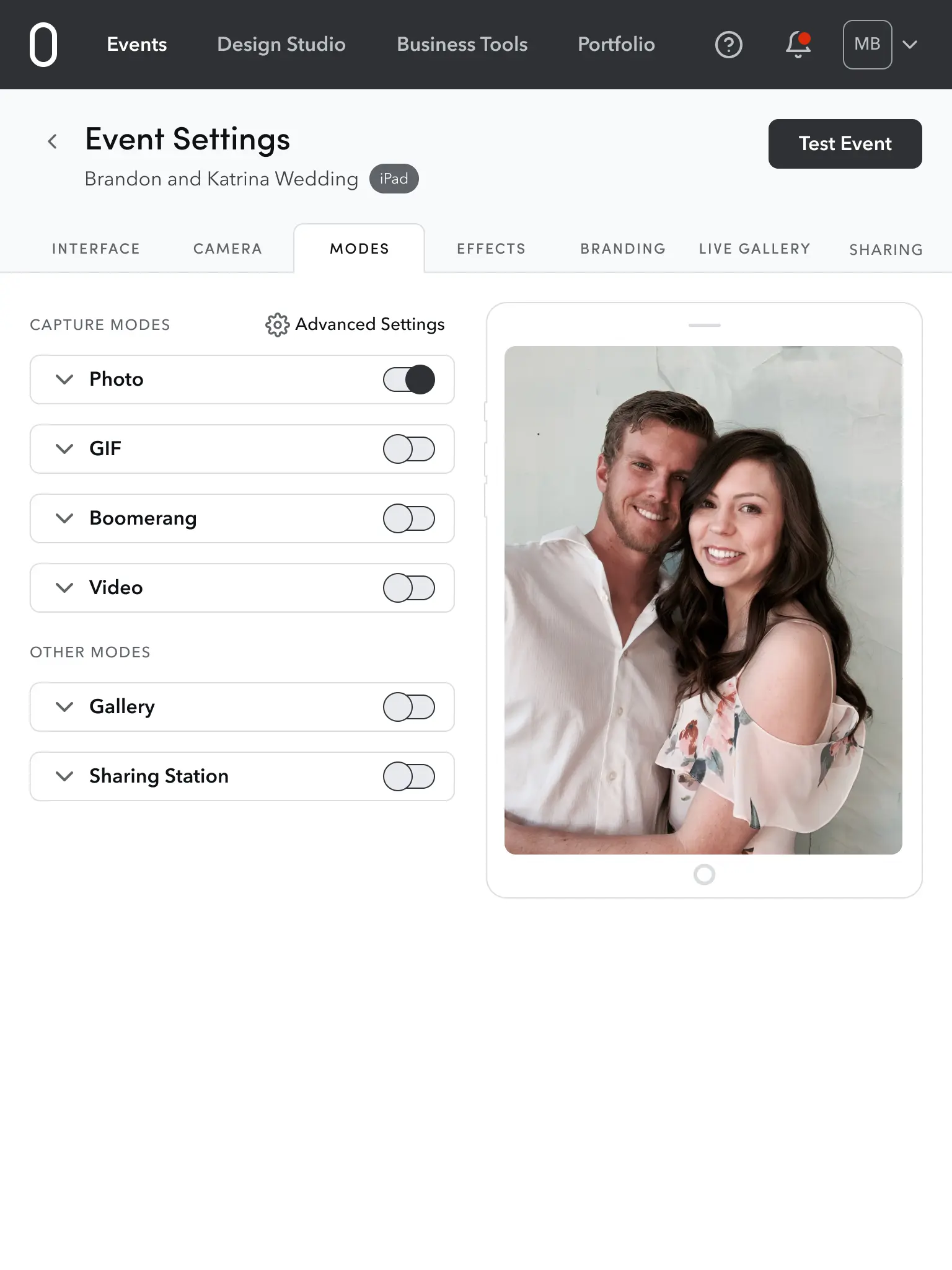
We have designed the menu bar on the top of the screen. It improves the users navigation through the product by highlighting the main functions.
The UI kit was designed from scratch. Our designers created the new button design and picked feather icons that harmonize well with our UI kit. The color palette was also hand-picked. It is monochrome for the main functionality and bright colors for technical details and notifications.
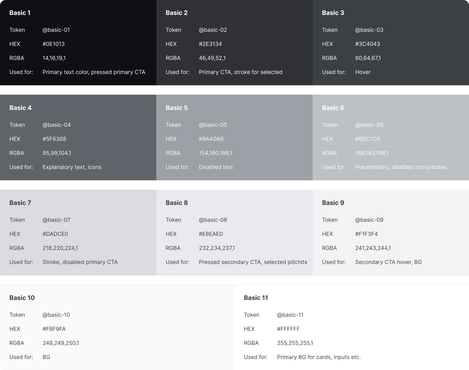
Used for text, icons, buttons and backgrounds
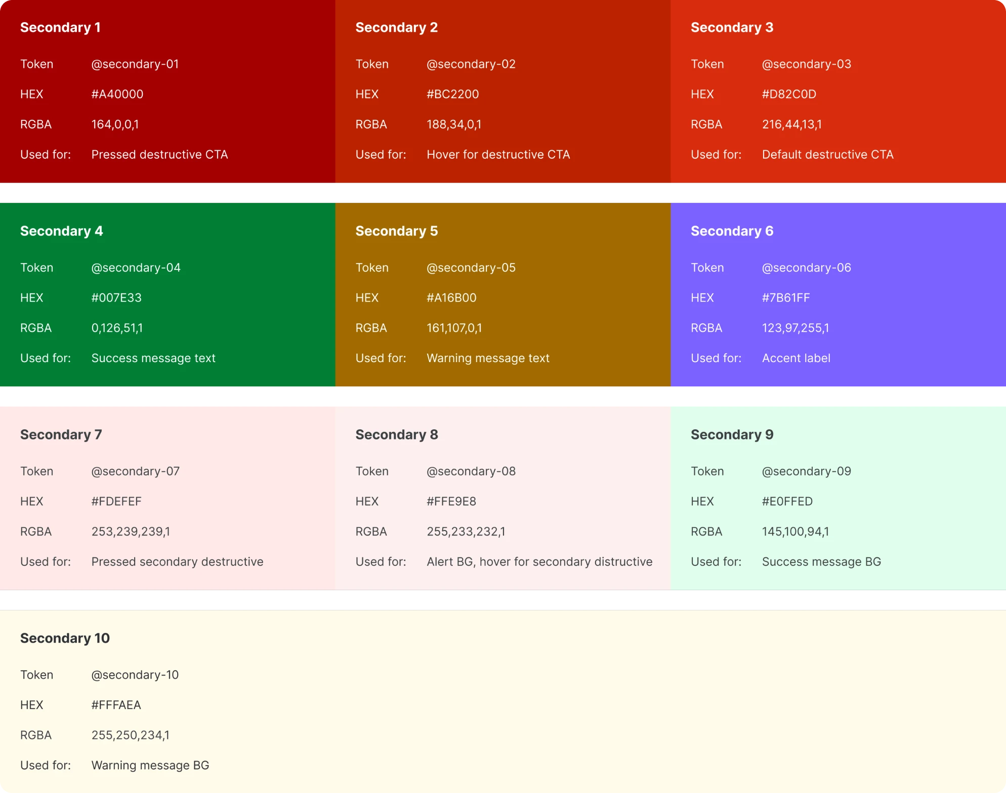
Used for destructive buttons, alerts and as an accent color
To achieve great readability our designers chose Avenir Next Font for the text and well-matching Sofia Pro Font for titles to create a perfect visual hierarchy. It all resulted in a pleasant and friendly UI that is responsive on all screens.
Cooperation and results
It was a smooth and effective cooperation of Eleken and Photobooth Supply teams that made such great results possible.
Our designers worked closely with the photo booth experts in order to deeply comprehend user needs and nuances of the niche. Weekly meetings with stakeholders also helped to manage expectations on both ends and set common goals.
We also cooperated closely with the customer success team of Photobooth Supply immersed our designers in the user experience of the product and users' most common pain points. Transparent communication with CTO was most effective as it helped to bring design decisions and deliver exceptional results.
If you are looking into redesigning your product, don’t hesitate to contact the Eleken team. We are excited to hear your vision and work together on another great user experience.