Habstash
Designing an MVP for a startup that helps people navigate savings needed to buy homes
Millions of people dream of buying a home, but for the majority, this goal seems unattainable due to a lack of capital. And very often the process of saving money for your own house turns into an exhausting marathon.
You need to consider and calculate how quickly you will be able to buy a home with your current income, how much money you need to save up monthly to reach your goal, what real-life prices for the house in the location you like are, how much taxes you will have to pay, and much more.
Other apps and services on the market that help to solve the above issues are usually complicated or focus on solving one specific task only. In this regard, our client, Hubstash, came up with the idea of building an app aimed at simplifying the process of buying a house, and showing people in Britain that everyone can become a homeowner.

Your universal solution in one app
The main idea of the software was to collect all the needed information and tools for users that want to buy a dwelling in one place.
Habstash is an application that, based on the user’s data and preferences, such as income, home type, amount of savings, location, and so on, shows what house/apartment a person can afford with their current budget or how much more money they have to save up to buy a better variant while giving a piece of advice on how to do it.
The thing that differs Habstash from other apps on the market is that it defines the optimal amount of savings per month or how long it’d take to save the amount selected by a user, while other software supposes that users have to know and account for such things themselves.
Progressing the existing prototype to an MVP
As Habstash is an early-stage startup, our clients wanted to test their idea by building a minimum viable product and check how potential users react to its different features.
When they came to Eleken, the company already had some basic materials for a prototype that they were looking to develop into an MVP. Our task was to design a fresh user interface and create a more intuitive user experience based on the previous customer feedback.
The sections Eleken worked on included designing both desktop and mobile-friendly screens for a sign-up process, onboarding flow, and an interactive dashboard.
Design process
Since our clients came with the ready prototype and defined user personas we started our design process by discussing the objectives of the project, both from a user and business perspective.
After analyzing the flow of the existing prototype together with a client and independently we reviewed the existing designs and findings from the previous user research and tests and came up with an alternative and more logical user flow.
As our clients were open to new ideas, it allowed us to create a little more sophisticated product than was originally planned.
Here’s what we got:
Sign-up flow
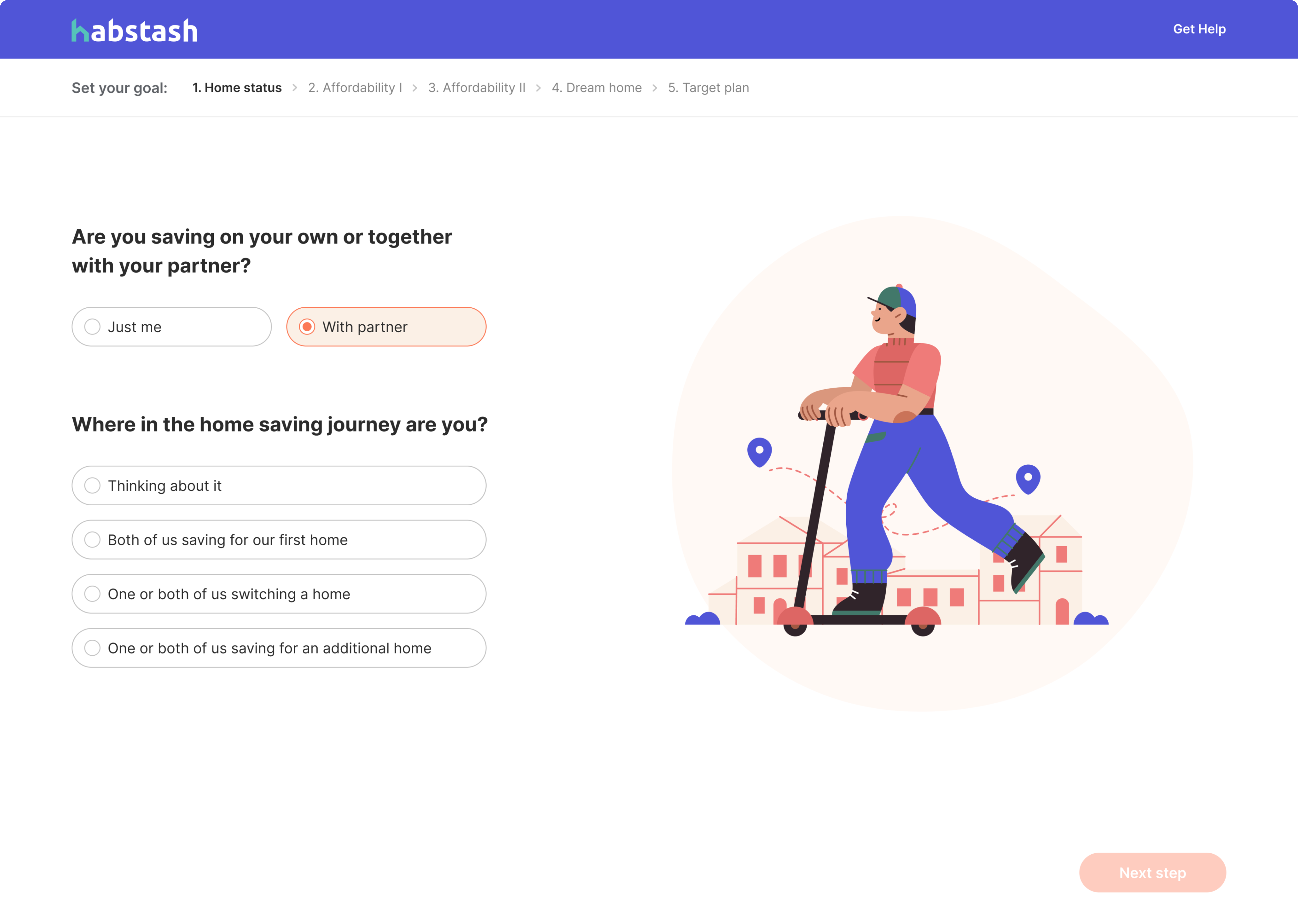
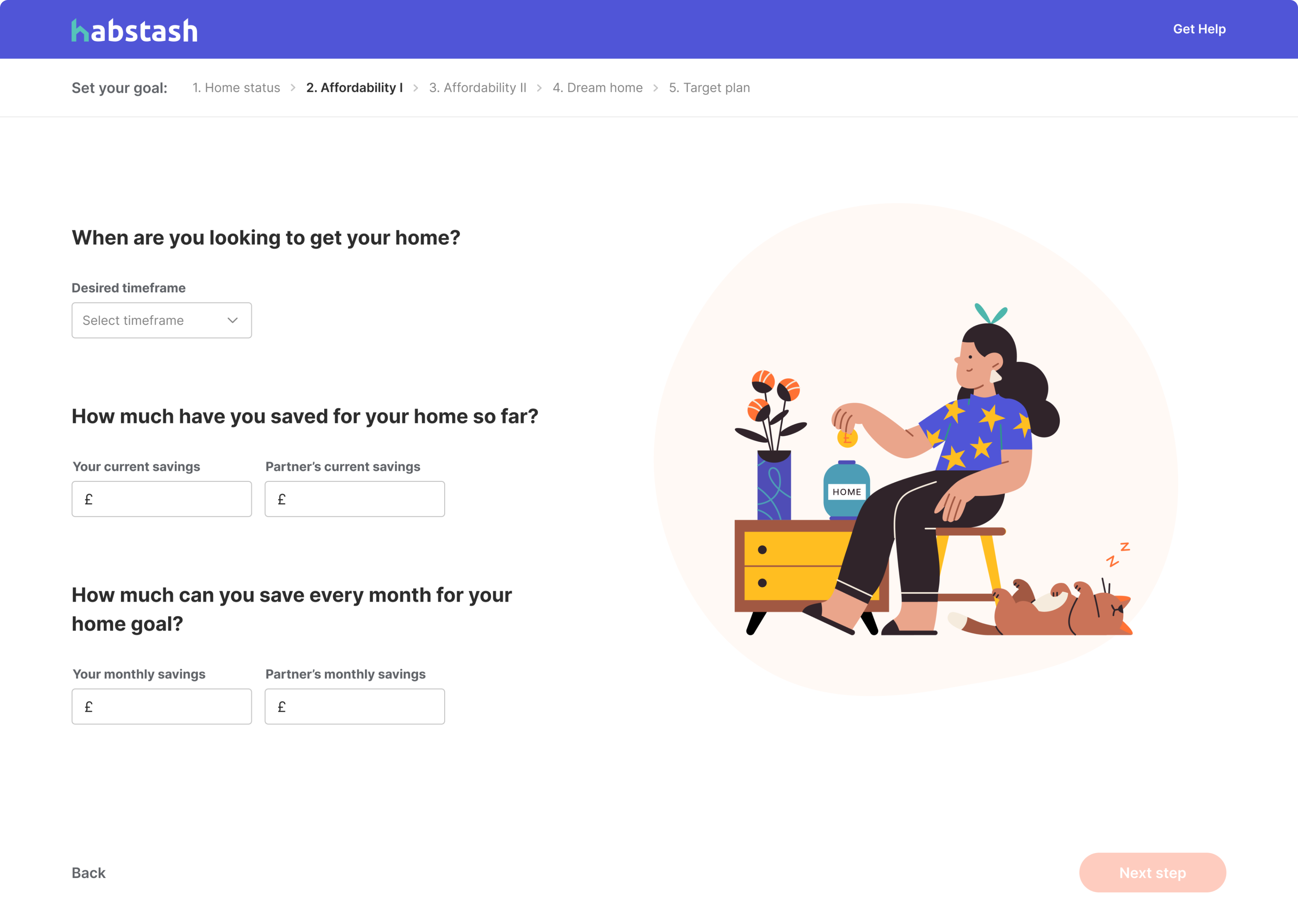
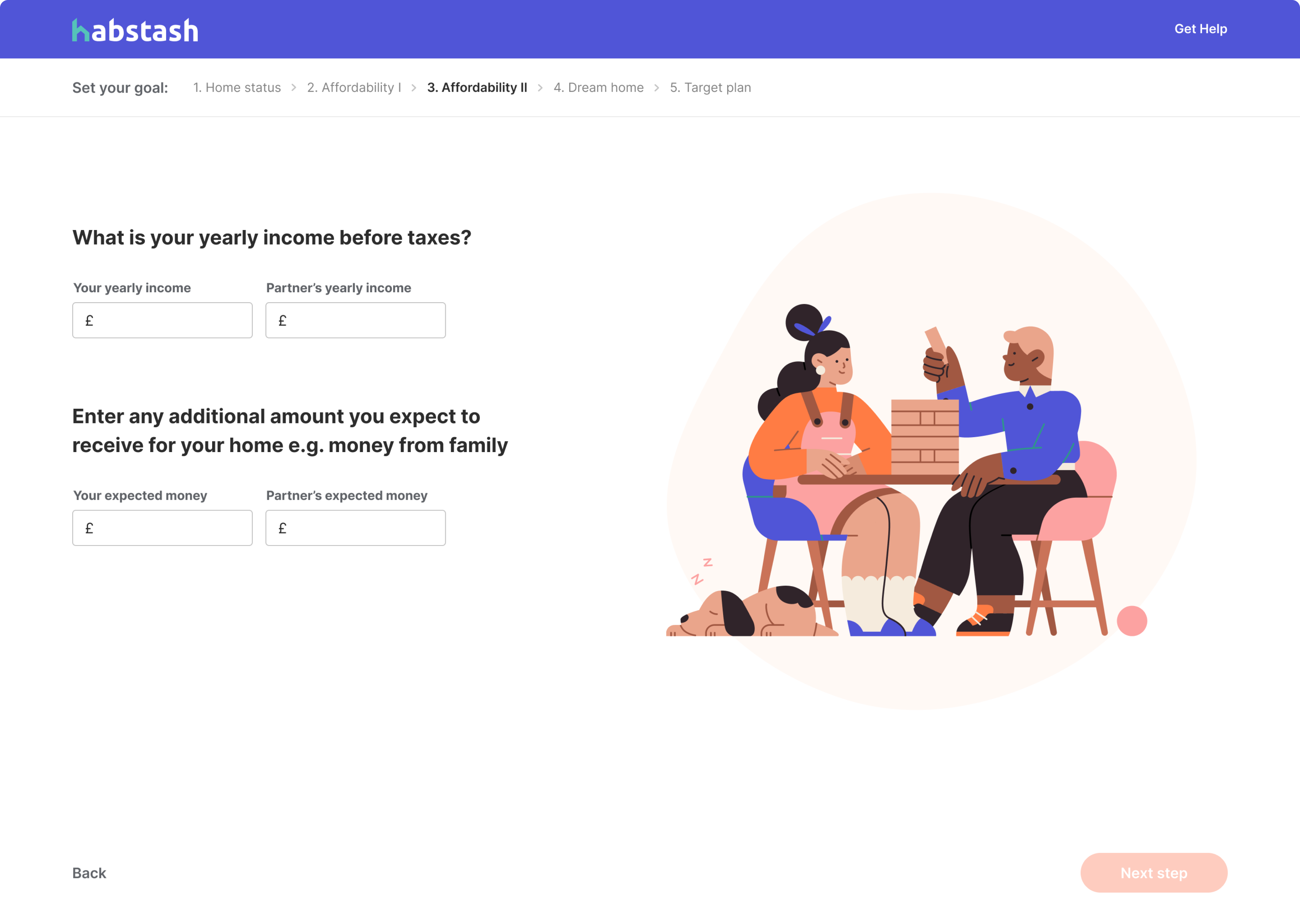
In the prototype, our clients planned to design the sign-up process that resembles a calculator. But to be effective, Habstash requires gathering a lot of user information, and placing all the needed fields in the form of a calculator would make the interface cumbersome and confusing. Besides, not all users are willing to go through a long and complicated path of registration.
To avoid users bouncing at the very start of interacting with the app we used Wizzard, a powerful design pattern that aims at simplifying complicated processes. With its help, we broke the sign-up process into several separate screens with questions and fields. It made it much easier for the audience to perceive the information.
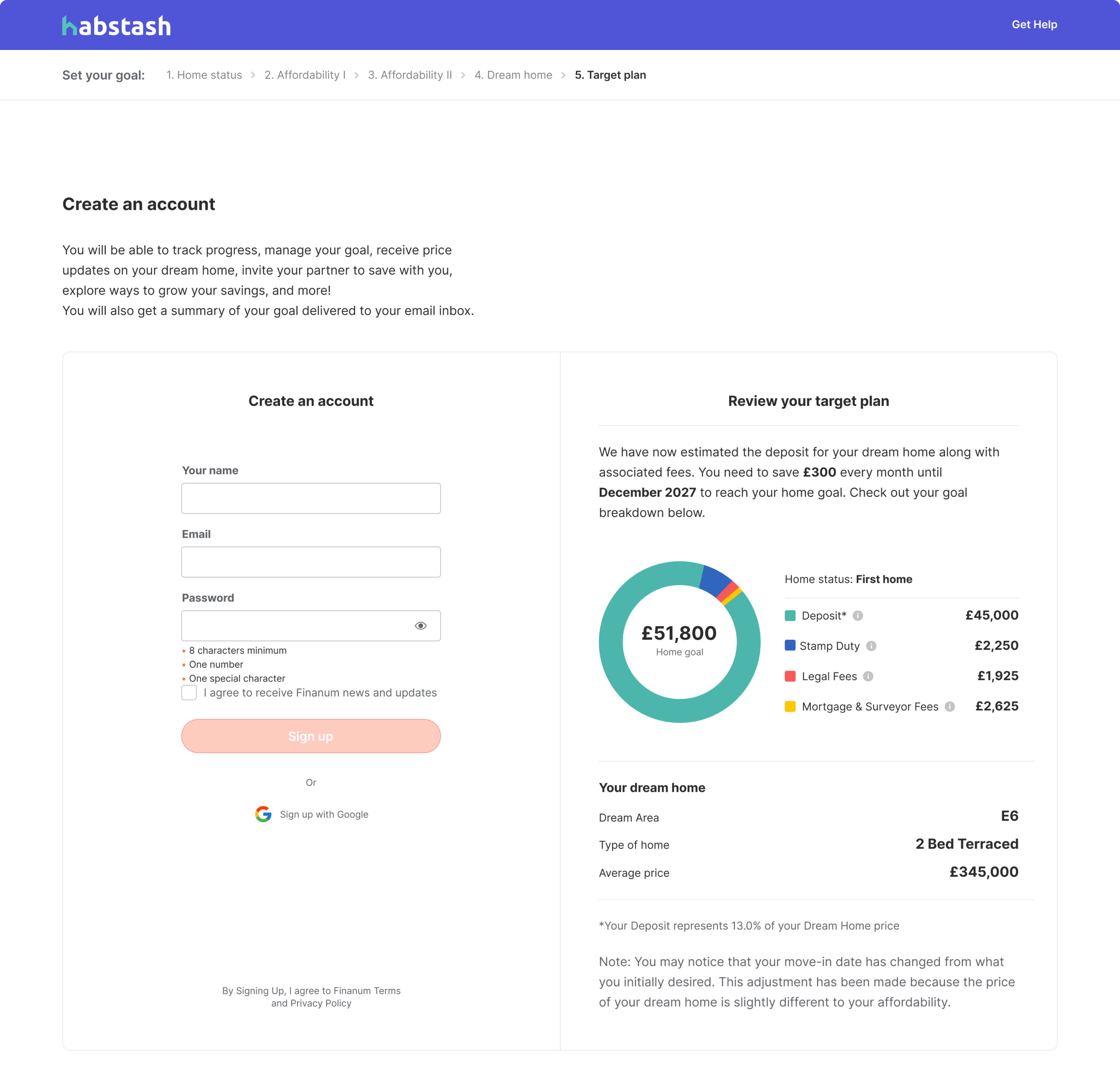
Below you can see a step-by-step sign-up process.
Save alone or with your partner:
Put the information about your financial situation to keep track of what type of housing you can afford:
Pick the location you like and explore home prices there:

Check the short report of your target plan and make some final steps to start using the app:
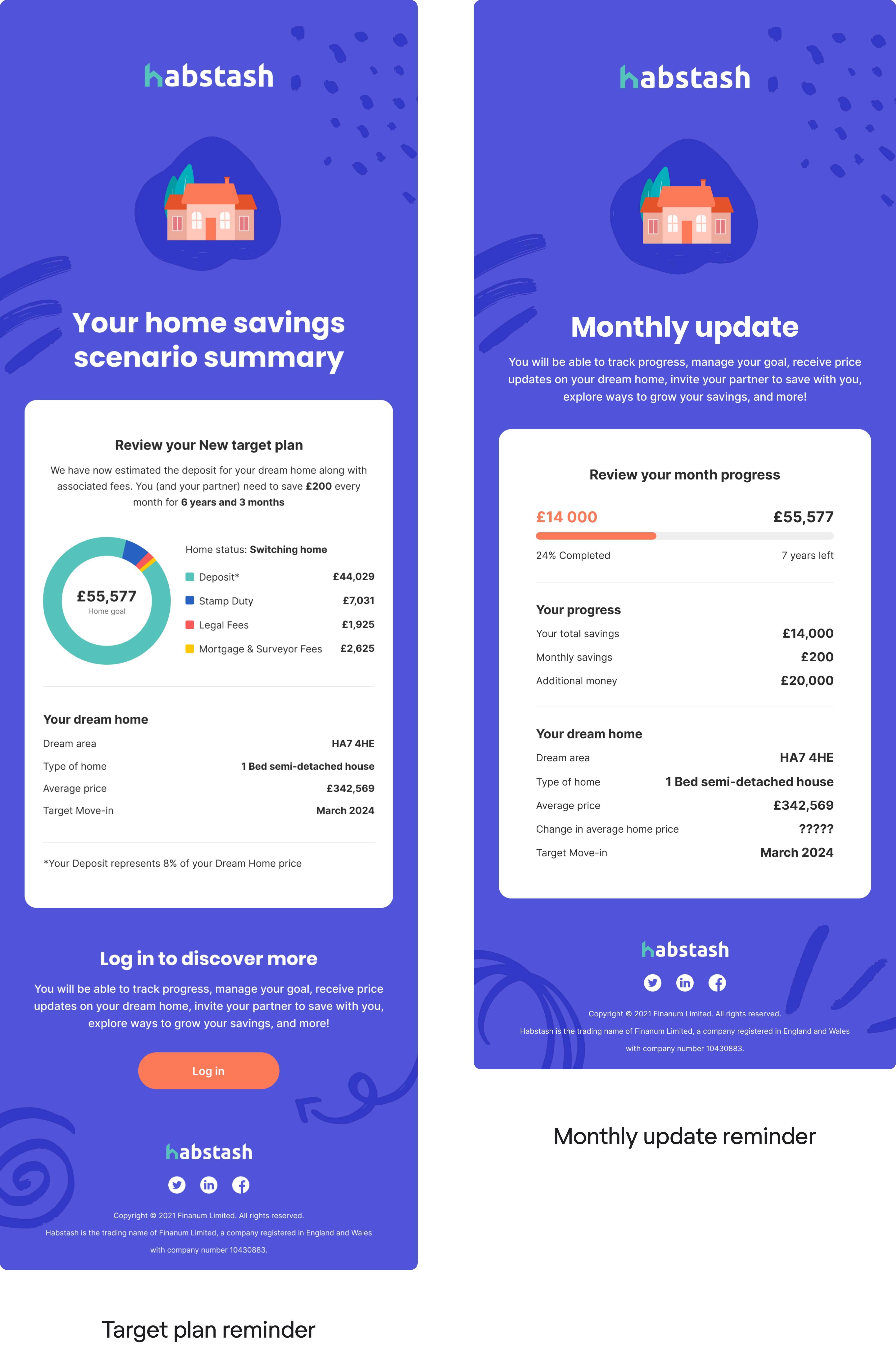
Email reminders
We understood that breaking the sign-up process into several steps may be not enough to retain all users. The solution Eleken came up with was to add the “save exit” button.
The user fills out their email address and can come back to the software later and continue the registration from the same point where they left. And here’s one more thing that our team suggested: using users’ email addresses, we can now remind leads about Habstash and move them through the sales funnel.
We designed several email templates with the help of which we can remind users to finish the registration, view recent updates or monitor their progress.
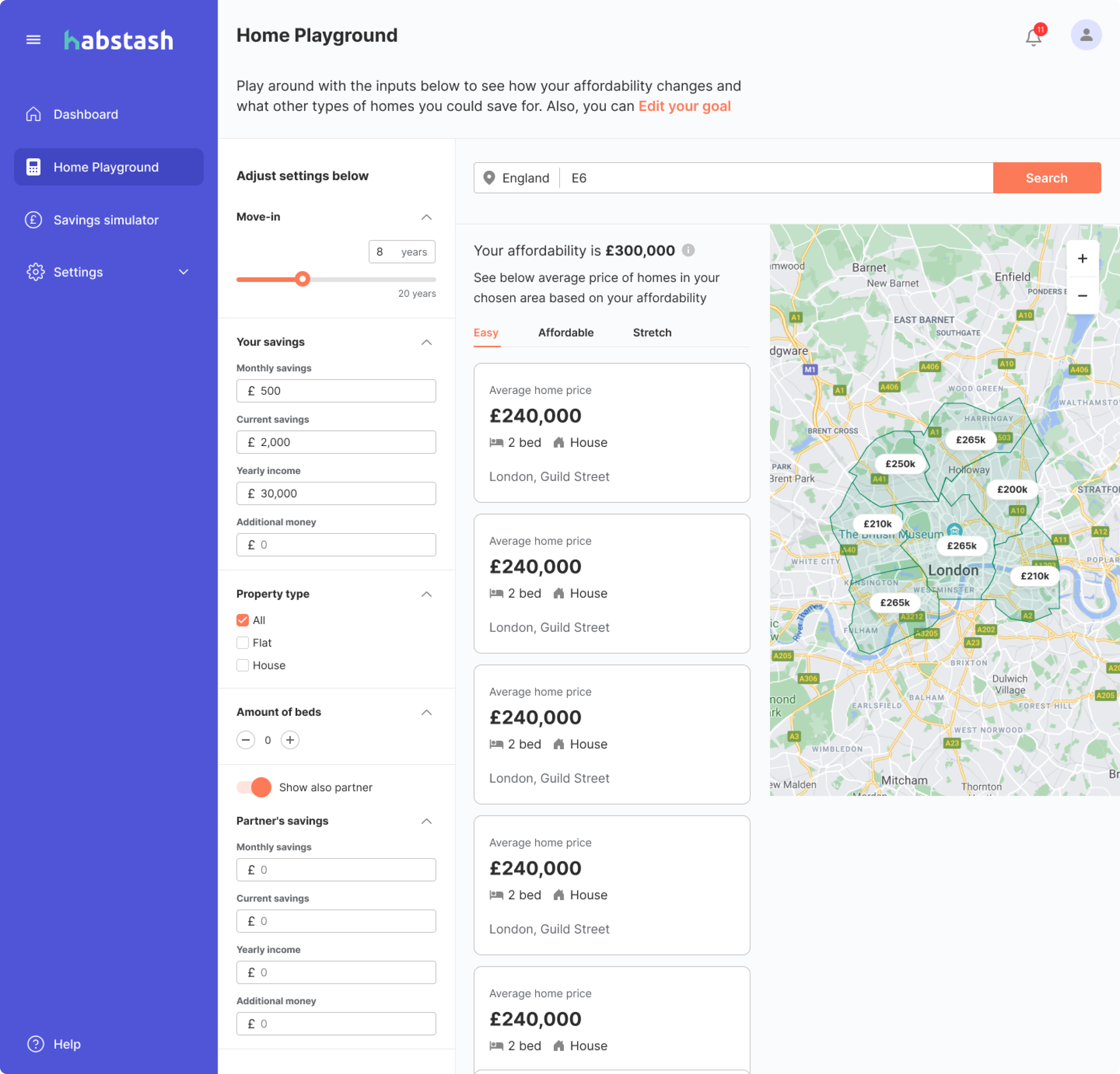
Home playground
In the Home playground, a user sets filters such as desired timeframe, monthly savings, current savings, yearly income, type of property, and such, and starts searching the average price for a type of dwelling in a certain category.
To make Habstash not just a calculator, but more like a housing search application, we decided to add a map that allows users to search the exact location they want to live in.
As well, to make the app more adaptable to changes in user’s initial data (for example, monthly savings, desired timeframe) we divided the shown home results into three groups:
- Easy - homes you can easily afford with the current data within the desired timeframe
- Affordable - homes that are also within your budget
- Stretch - homes that you can afford in case you change the timeframe, increase monthly savings, and so forth.
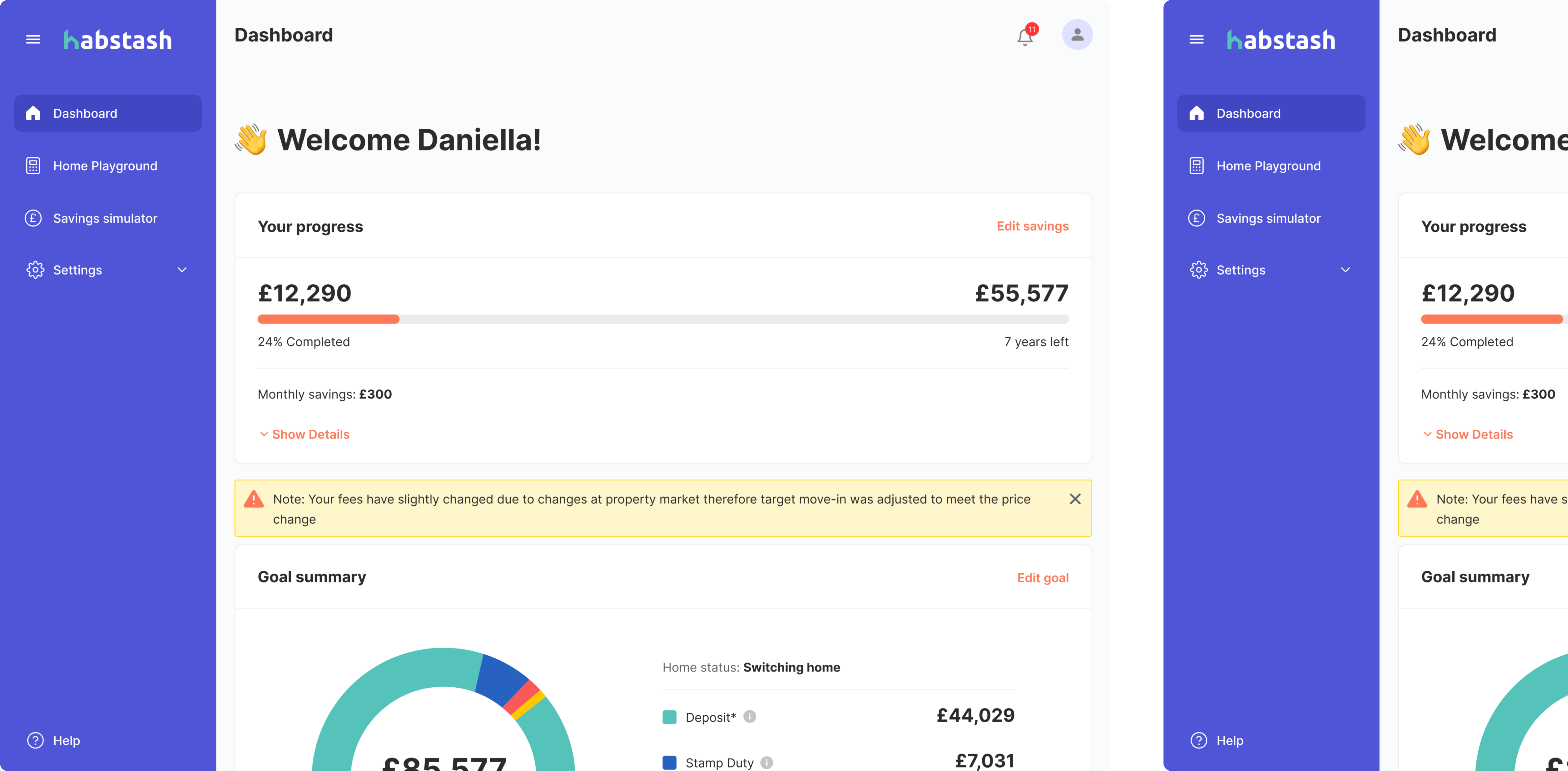
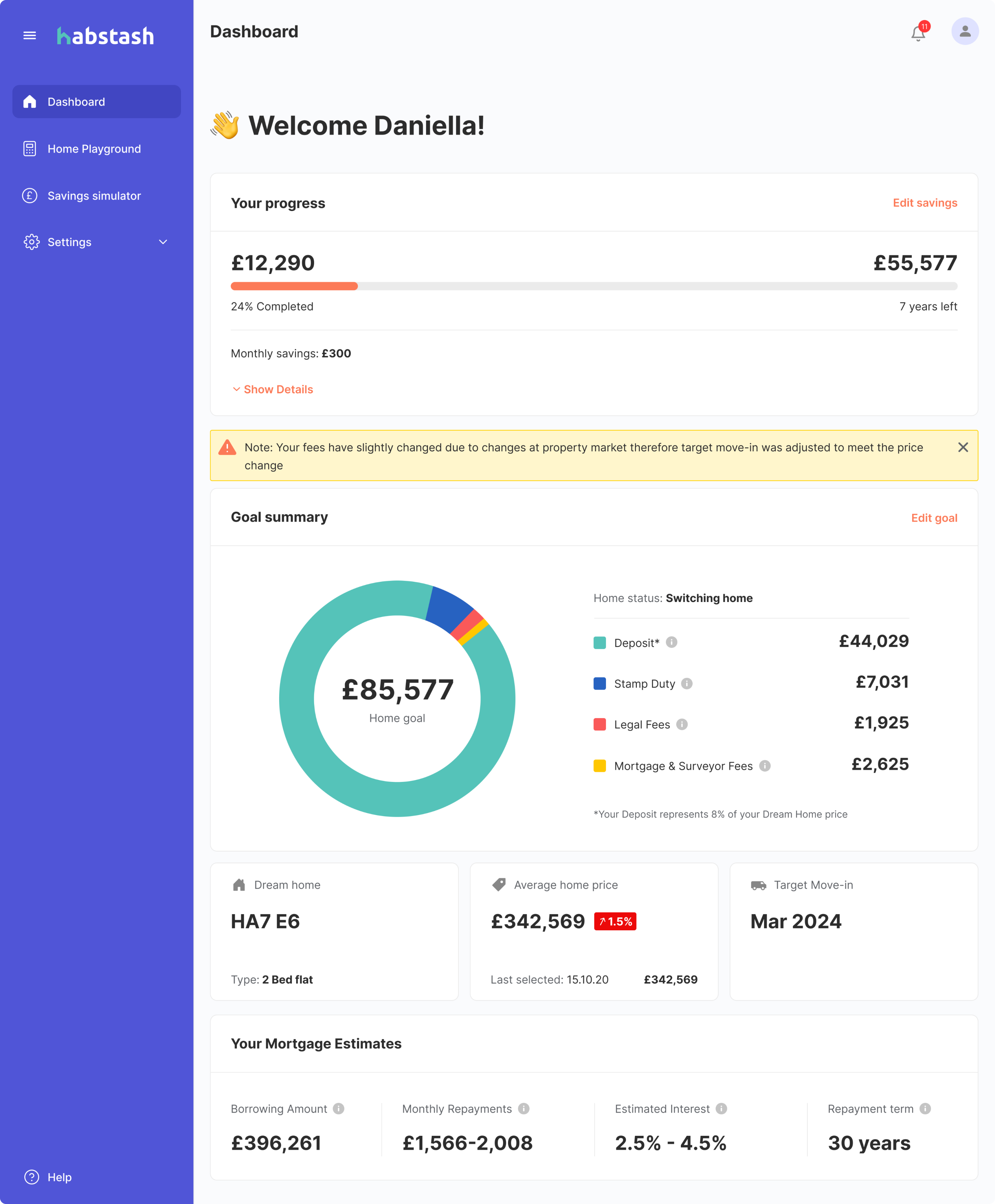
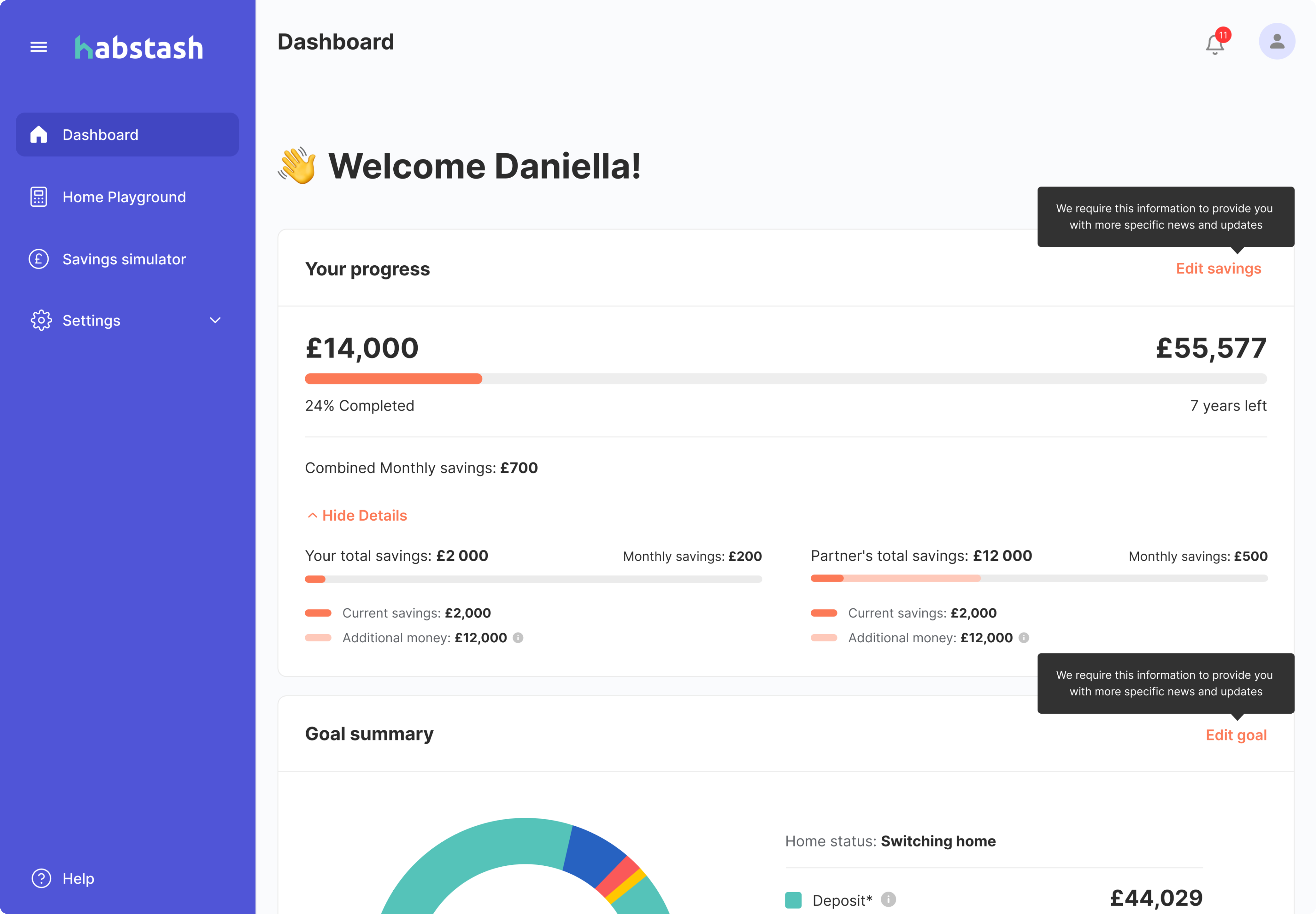
Dashboard
Dashboards organize, store and display the most important information from the whole app into one easy-to-access place.
That’s why we designed a clean and clear dashboard that shows essential indicators that allow users to quickly understand at what point of their journey to a dream house they are.
As well, we improved the look and feel of a progress bar that allows users to check how much is left to their goal in a glance.
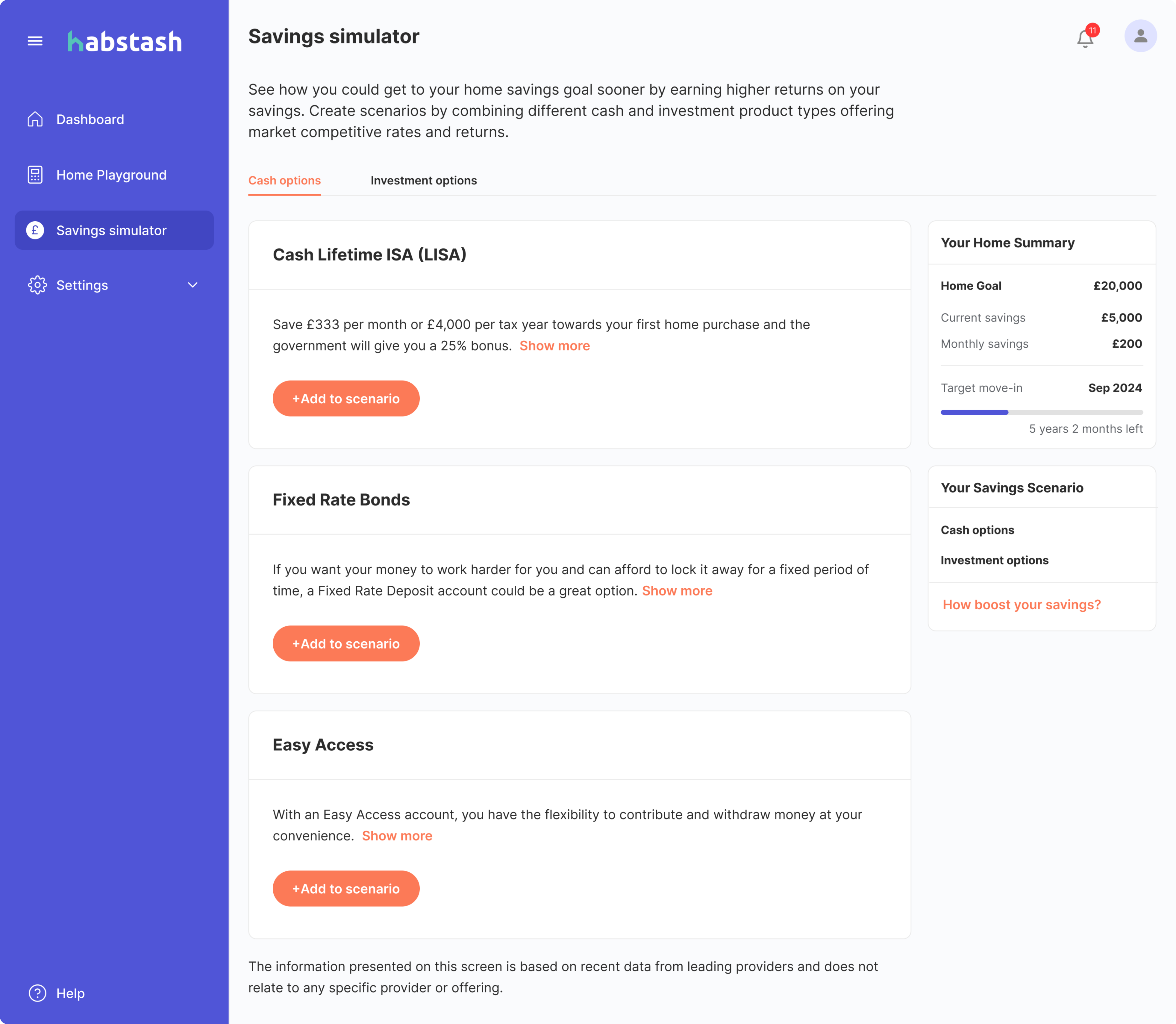
Savings simulator
To help users get to their home savings goal faster Habstash offers a calculator for deposits and investing money in stocks, shares, and securities.
It is a test variant that doesn’t show real offers, but relies on the average market indicators and shows users how they could affect their current financial situation. It allows creating scenarios by combining different cash and investment product types, offering market competitive rates and returns.

Save with partner
After conducting another user testing of the prototype, we suggested our clients add one more feature - “Save with your partner”. Saving together makes users reach their home goal faster and easier.
The team of Habstash liked the concept and now the first question in the sign-up process is “Are you saving on your own or together with your partner?”
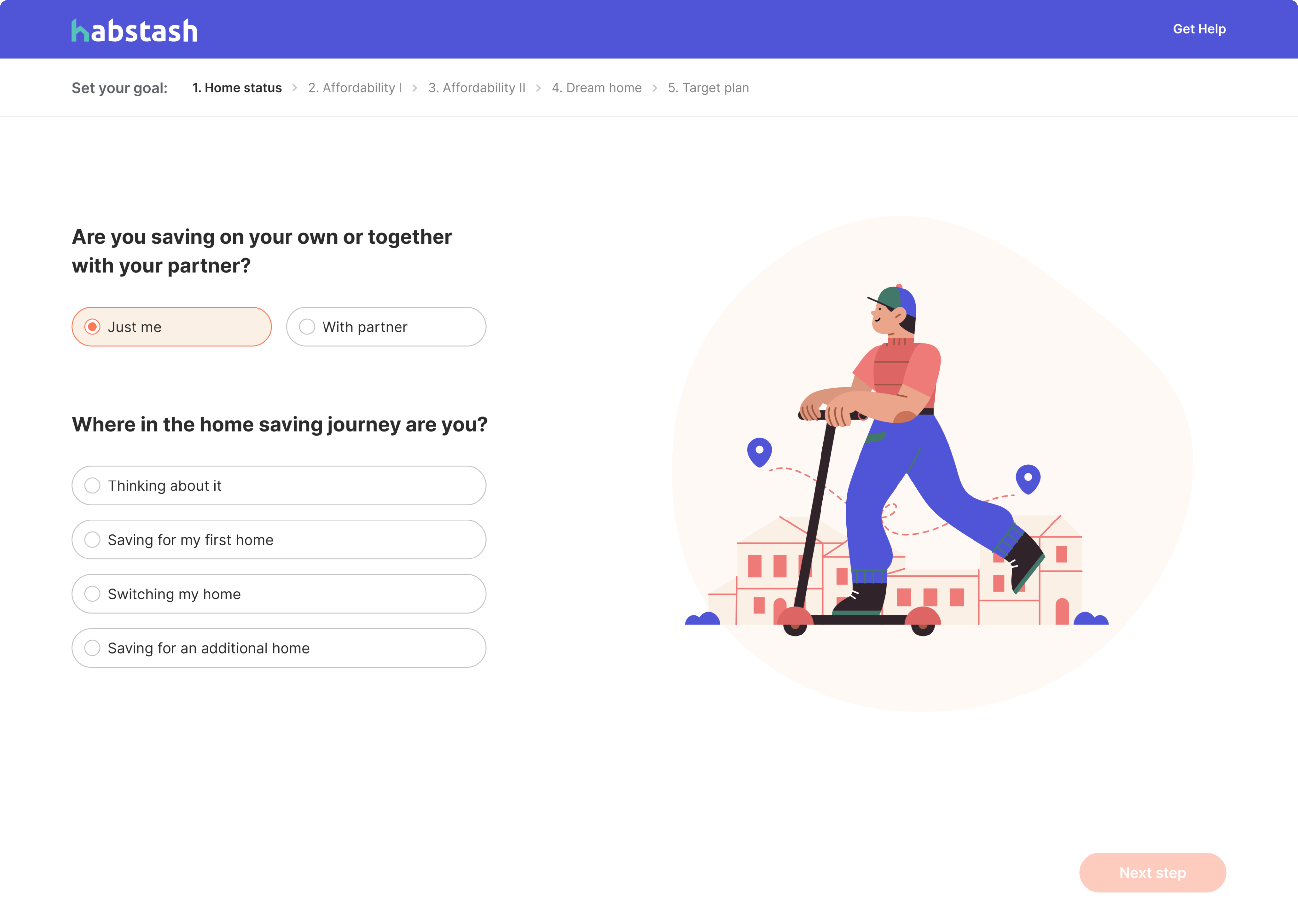
In case the user chooses the “with partner” option they will have an opportunity to fill out the partner’s information as well.
The dashboard, in that case, will also represent your progress together with a partner.
The result
When the design was ready we made a clickable prototype that was tested on several users, after which we received feedback and made some final improvements.
Constant communication with the company’s internal team that included tight collaboration, discussions, and suggestions on how to optimize both the look and feel of the product helped us not only to meet project requirements but also add new useful features which resulted in an effective app that provides an intuitive user experience and makes you one step closer to your dream home.