
Most articles about paywalls are collections of screenshots.
Useful for inspiration? Absolutely. But screenshots alone rarely explain why one paywall converts while another gets dismissed in seconds.
After reviewing dozens of paywall libraries, analyzing real subscription screens, and digging through discussions from app founders, designers, and developers, one thing becomes clear: the best paywalls aren't necessarily the most beautiful ones. They're the ones that reduce friction, build trust, and help users make a decision with confidence.
That's why this guide goes beyond visual inspiration.
We'll look at real paywall examples from mobile apps, SaaS products, AI tools, wellness apps, media platforms, and subscription businesses to understand what makes them effective. More importantly, we'll dive deep into the UX patterns, pricing strategies, and psychological principles behind them—from free-trial offers and annual-plan anchoring to feature previews, social proof, and personalized upgrade prompts.
Because a paywall isn't just a monetization screen. It's often the moment where app users decide whether your product is worth a paid subscription.
A very brief look into paywall types
Before looking at real examples, it's worth understanding that not all paywalls work the same way. Different products use different approaches depending on their business model, audience, and monetization strategy. Some aim to maximize subscriptions, while others focus on generating leads, balancing advertising revenue, or encouraging users to experience value before committing.
Here are the most common types of paywalls you'll encounter.
Hard paywalls
Hard paywalls place all content behind a subscription, requiring users to pay before they can access content, articles, or premium features. This approach works best when the product offers unique value that users can't easily find elsewhere.
Metered paywalls
Metered paywalls allow users to access a limited number of articles or pages for free before prompting them to subscribe. They give readers an opportunity to experience the product before reaching the paywall, making the upgrade feel more justified.
Freemium paywalls
Freemium paywalls operate on a freemium model, which means offering some features or premium content for free while reserving advanced functionality for subscribers. This allows users to experience value before deciding whether to upgrade.
Dynamic paywalls
Dynamic paywalls adapt what users can access based on factors such as reading behavior, engagement, location, or likelihood to subscribe. Instead of showing the same paywall to everyone, they personalize the experience to improve conversion rates.
Registration (lead-capture) paywalls
Registration paywalls require users to create a free account before accessing content. Rather than generating immediate subscription revenue, they help businesses build an audience, personalize experiences, and nurture users toward future upgrades.
Adblock walls
Adblock walls restrict access unless users disable their ad blocker or subscribe to an ad-free plan. Publishers commonly use this approach to recover advertising revenue while still offering an alternative for users who prefer not to see ads.
While these categories describe how access is restricted, the paywall examples below focus on something different: the strategies products use to encourage upgrades. A trial-focused paywall, for example, might also be freemium or dynamic. That's why we've organized the examples by conversion strategy rather than paywall type.
35+ Paywall Design Real Examples by Strategy
Before we dive into examples, it's important to understand that there is no single "best" paywall.
The highest-converting paywalls can look completely different from one another. What works for a meditation app may fail for an AI tool. What converts in a news publication may feel out of place in a SaaS product.
That's because paywalls solve different problems. Some reduce risk with free trials. Others rely on social proof, feature previews, personalized timing, or pricing psychology.
To make sense of these differences, we've organized the good examples by strategy rather than visual style. As you browse them, pay attention not just to how they look, but to the conversion principles behind each approach—and why they work.
1. Trial-Focused Paywalls
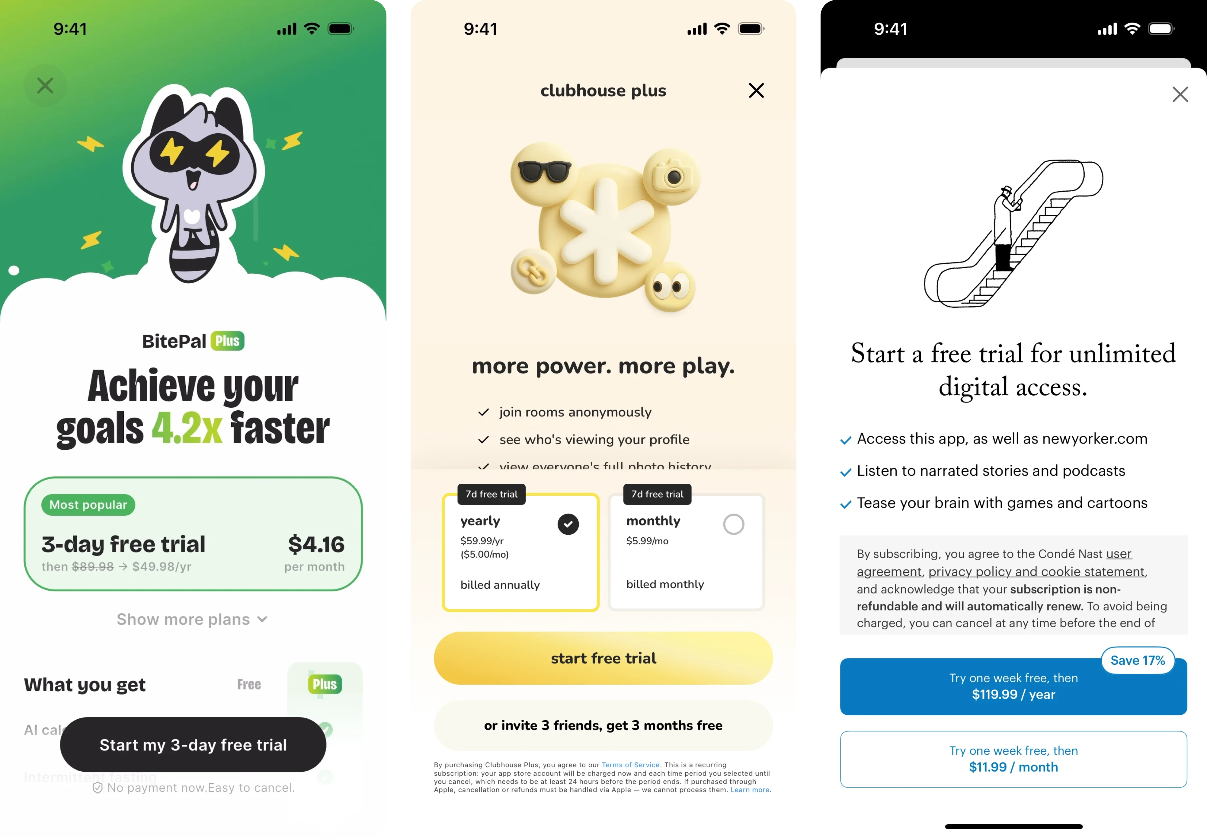
If there’s one paywall pattern that dominates subscription apps, it’s the free trial.
Apps like Headway, Forest, and Opal all use variations of the same idea: reduce the perceived risk of subscribing by letting users experience premium features before paying.
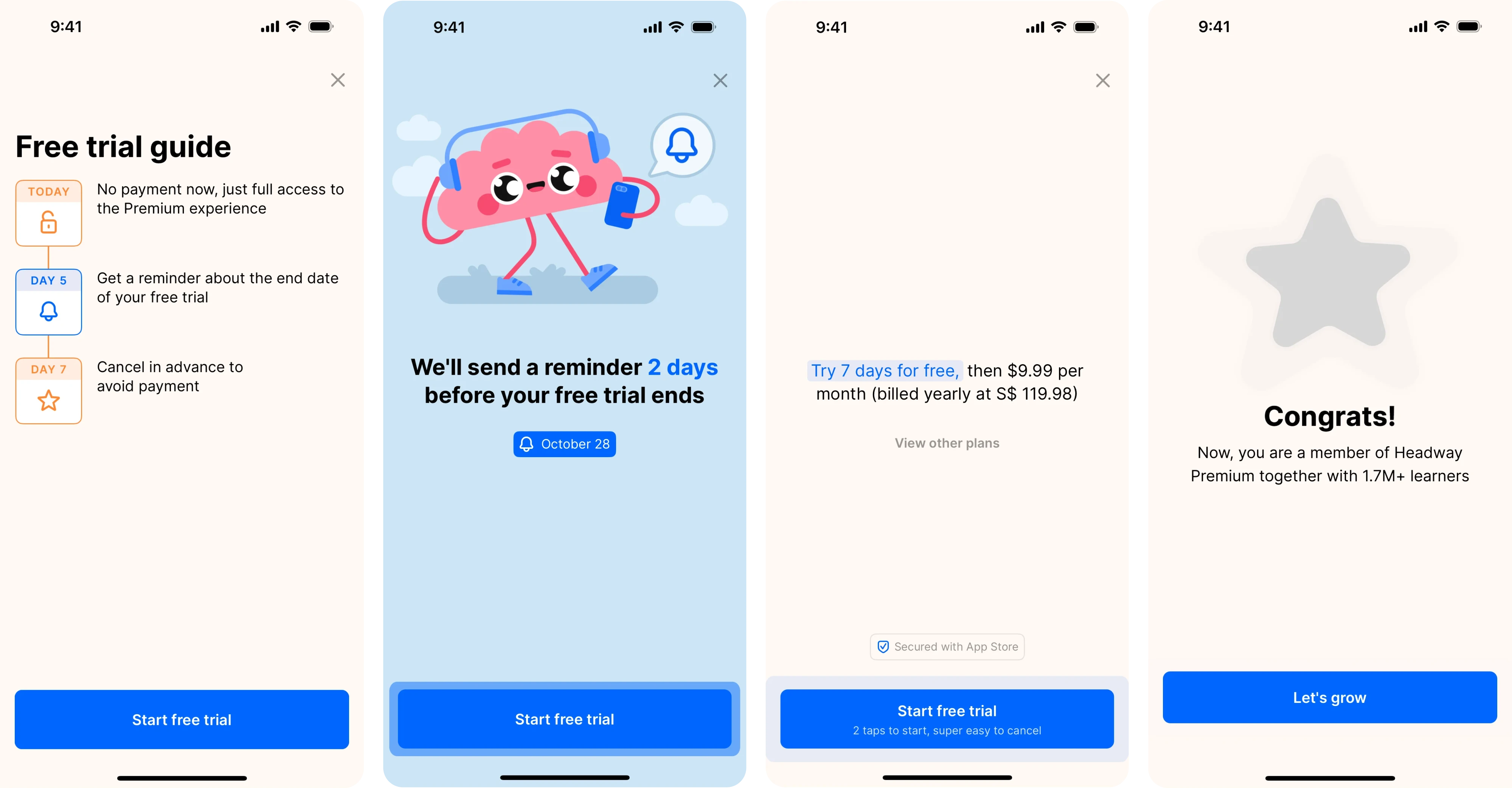
A trial shifts the decision from: "Is this worth paying for?" to "Am I willing to try this?" The psychology is straightforward – committing to a free trial feels safer than committing to a subscription.
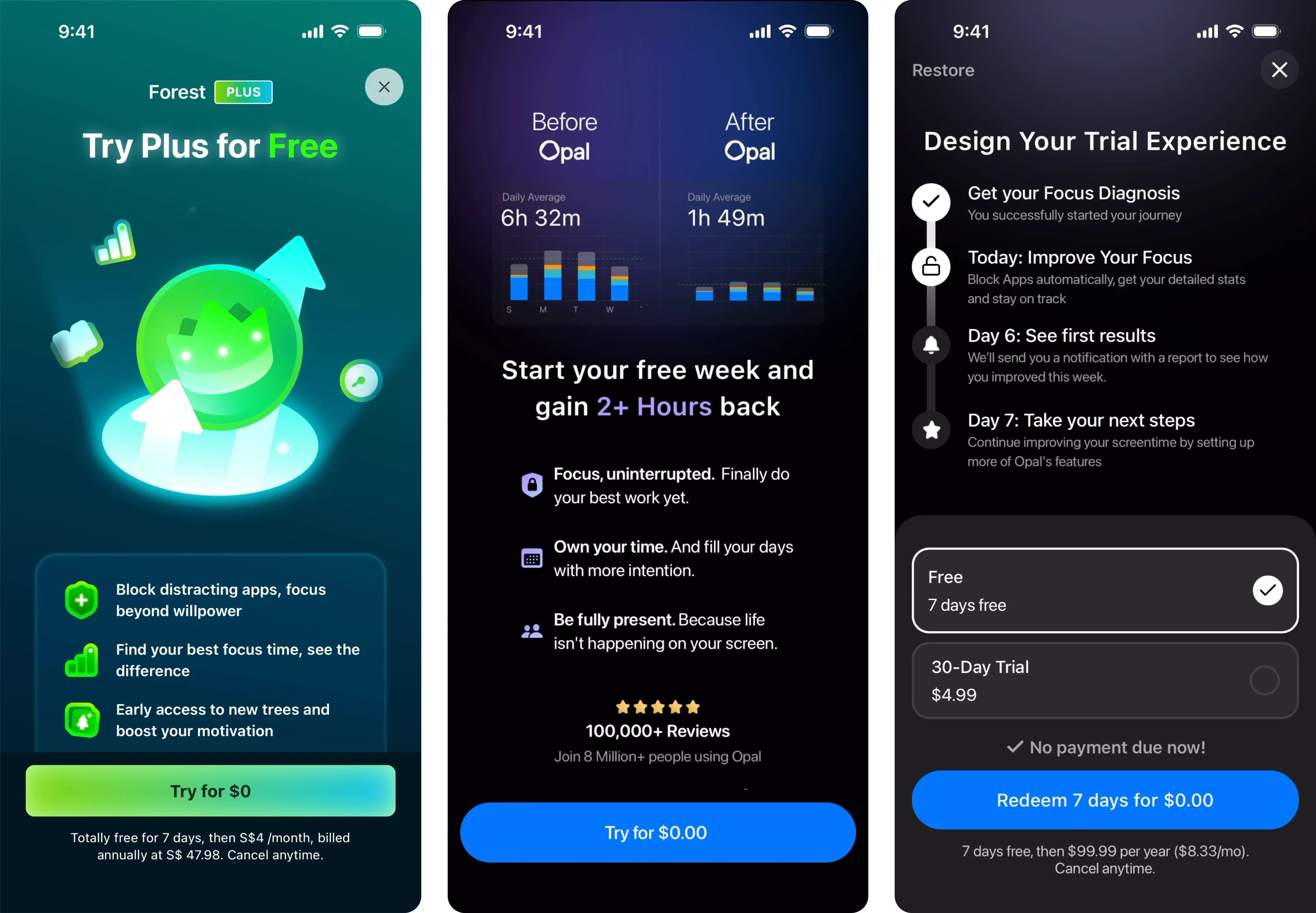
Users get time to evaluate the product, while companies get an opportunity to demonstrate value before charging.
But successful trial paywalls don't just offer a trial. They carefully frame it.
A strong value proposition is essential for small to mid-sized businesses who must build their audience, clearly communicating why users should pay for content.
What these paywalls often have in common
Across categories, the strongest trial-focused paywalls typically include:
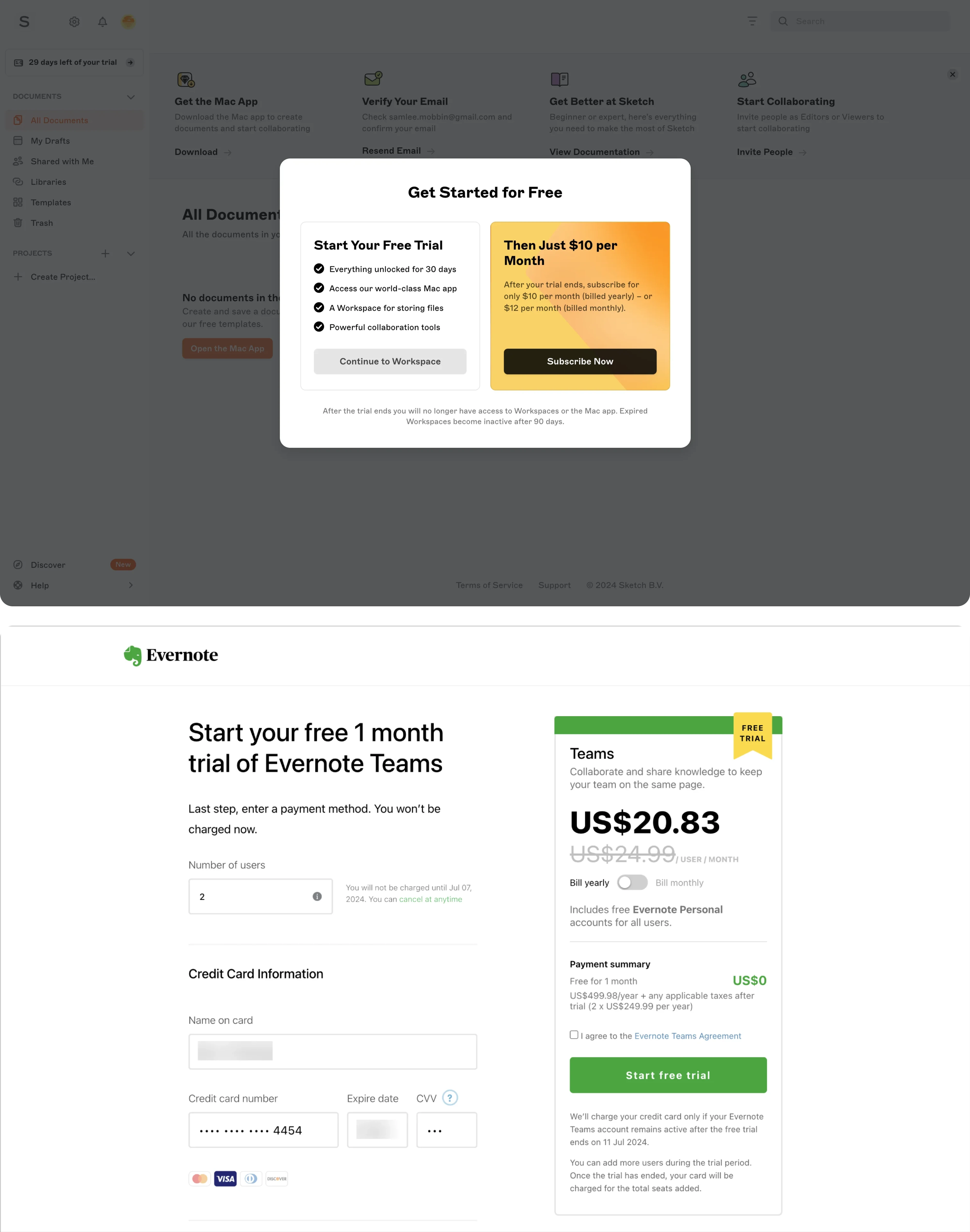
- A clearly visible trial period ("3 days free", 'free week', "14-day trial", etc.)
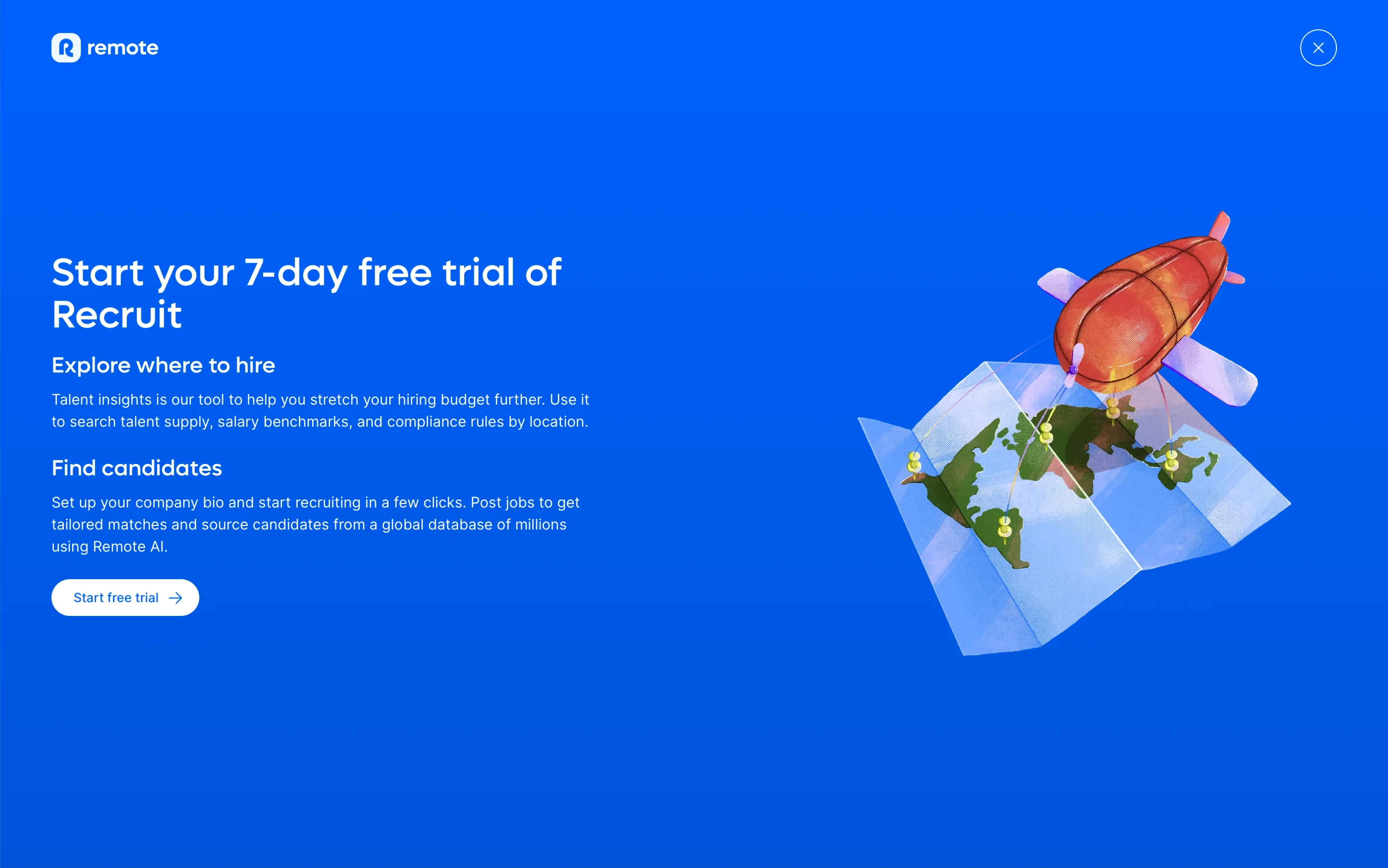
- Reassurance such as "Cancel anytime"
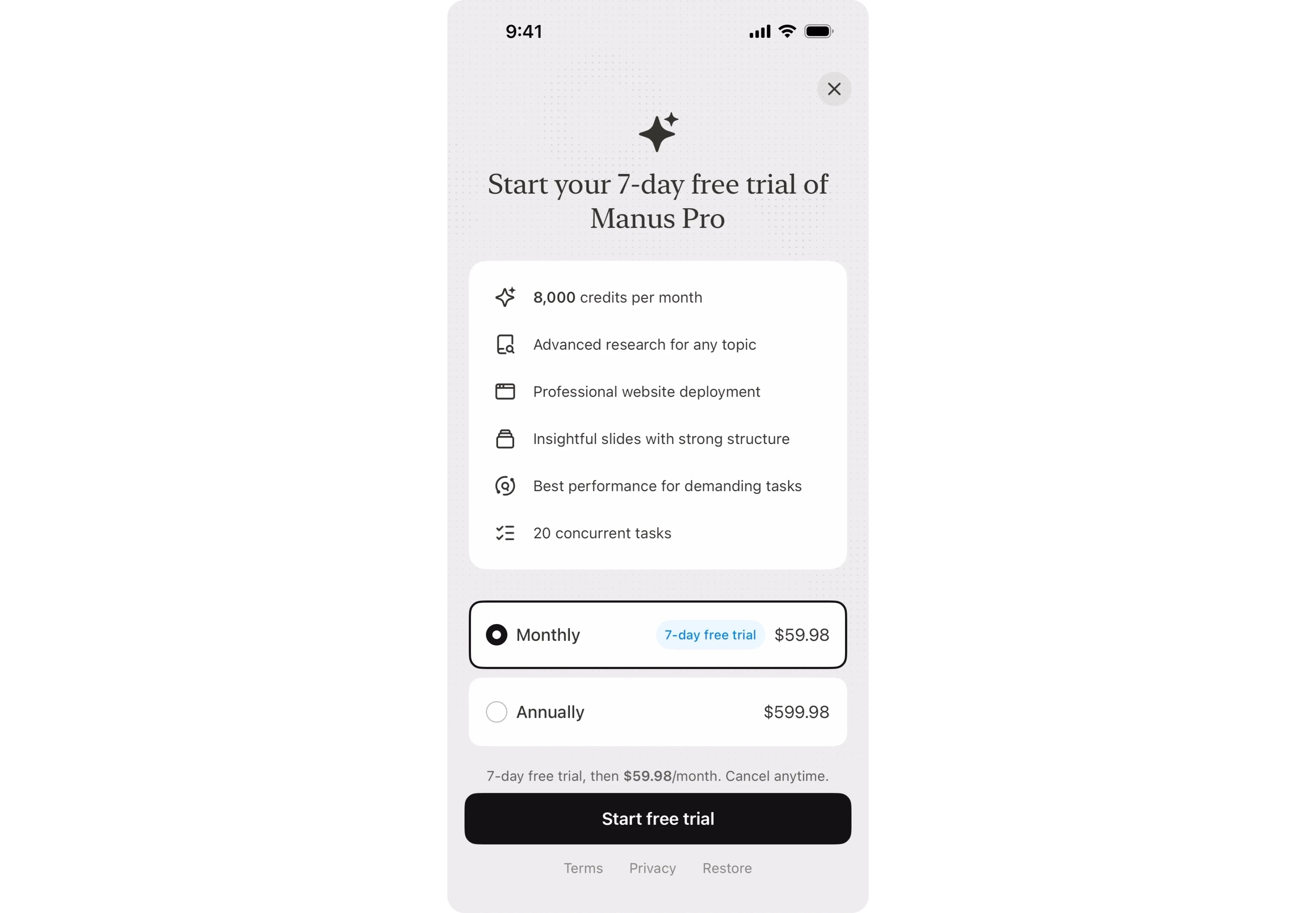
- A primary CTA focused on starting the trial rather than purchasing
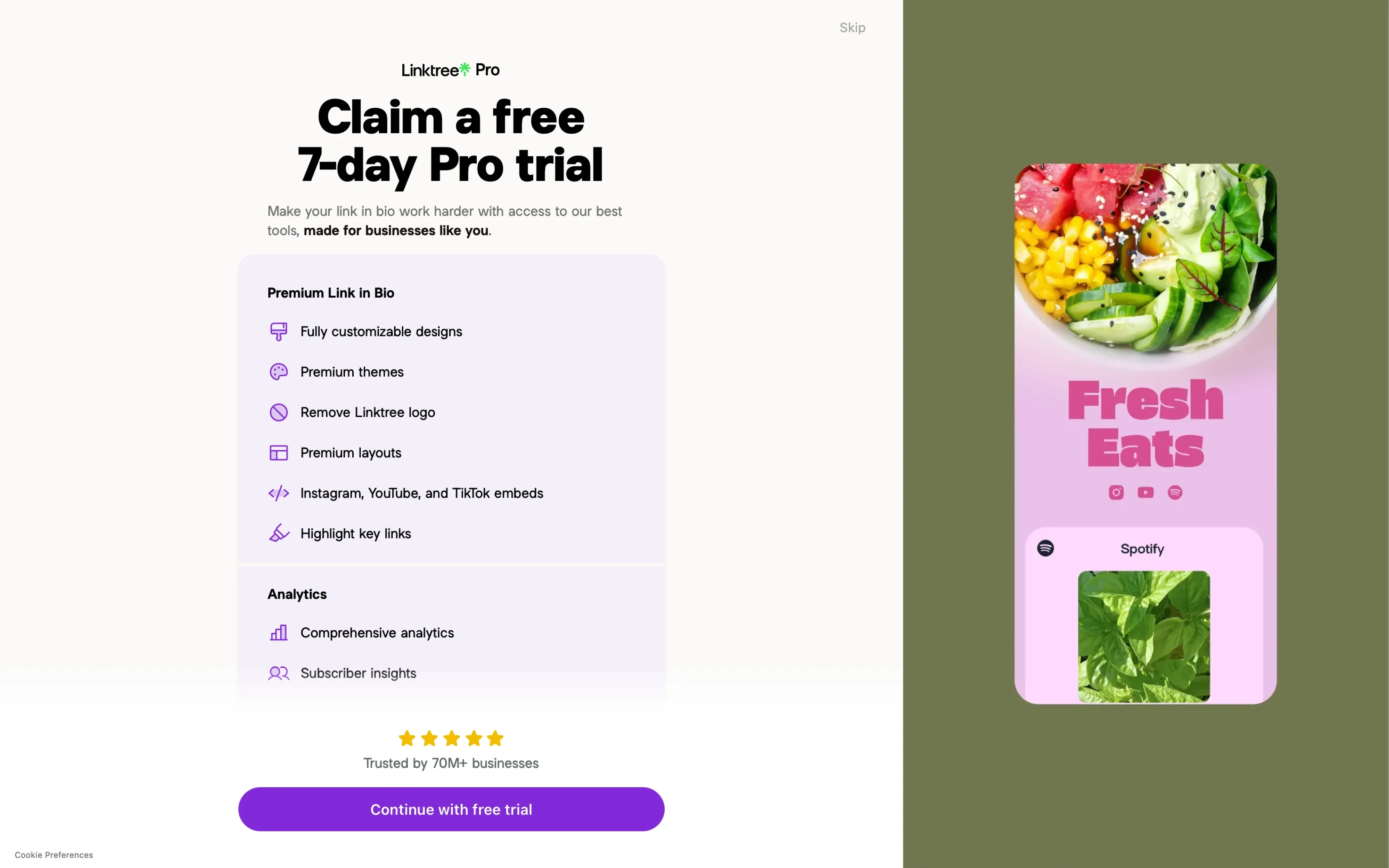
- Transparent pricing after the trial ends
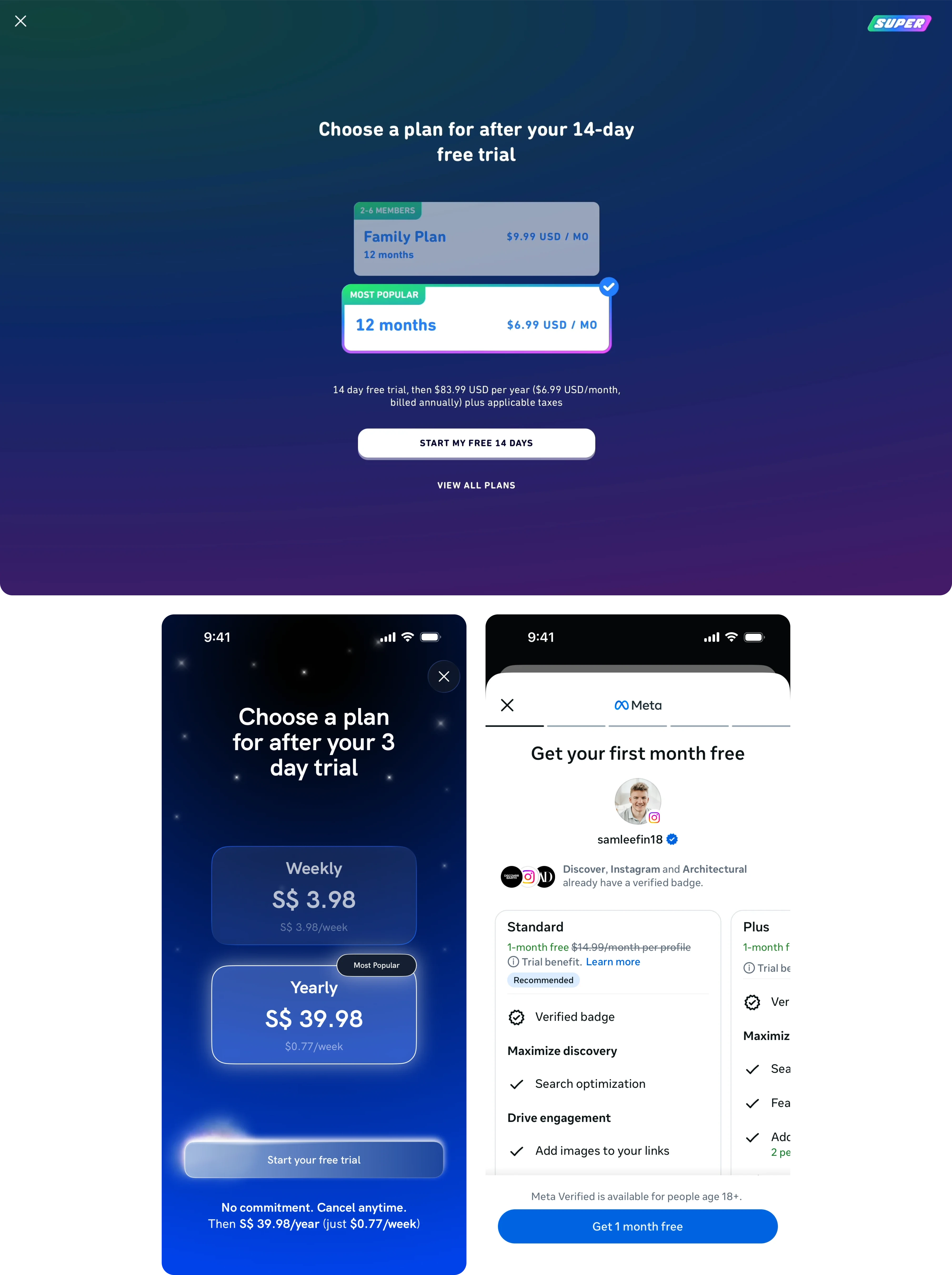
- Simple plan selection
Notice what's missing: lengthy explanations and complicated pricing structures.
The goal isn't to convince users to buy immediately. It's to convince them that trying the product is low risk.
When the trial works, users experience the product's value before making a financial commitment, making the upgrade feel far less risky.
Best For
- Habit-building apps
- Wellness and fitness products
- Language learning platforms
- Productivity tools
- AI assistants
2. Simple One-CTA Paywalls
Some of the highest-performing paywalls contain surprisingly little information.
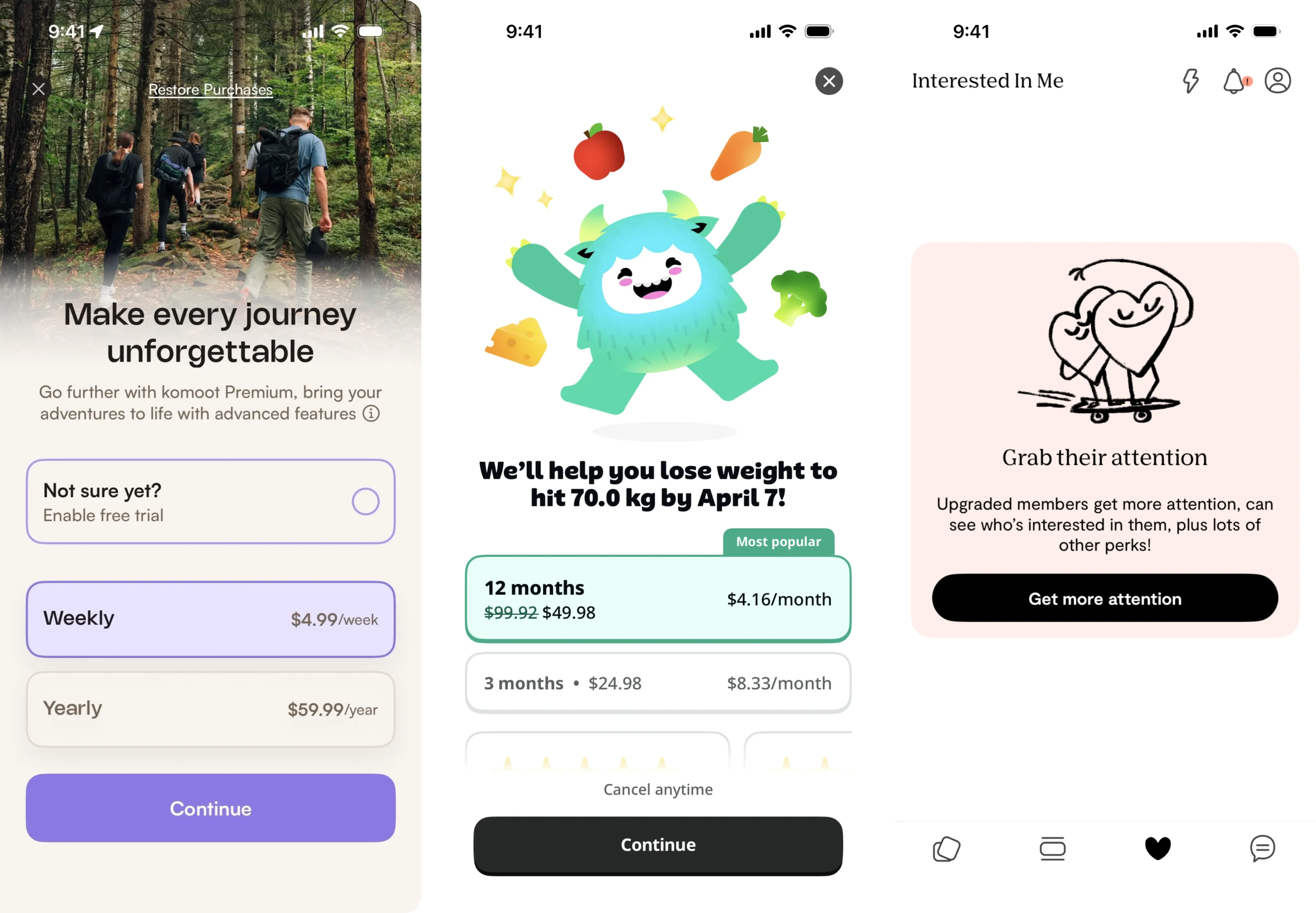
Instead of offering multiple plans, comparisons, and feature tables, the interface guides users toward a single, prominent call to action button that reflects the primary goal of the screen.
The screen is simple, the message is clear, and the user knows exactly what to do next.
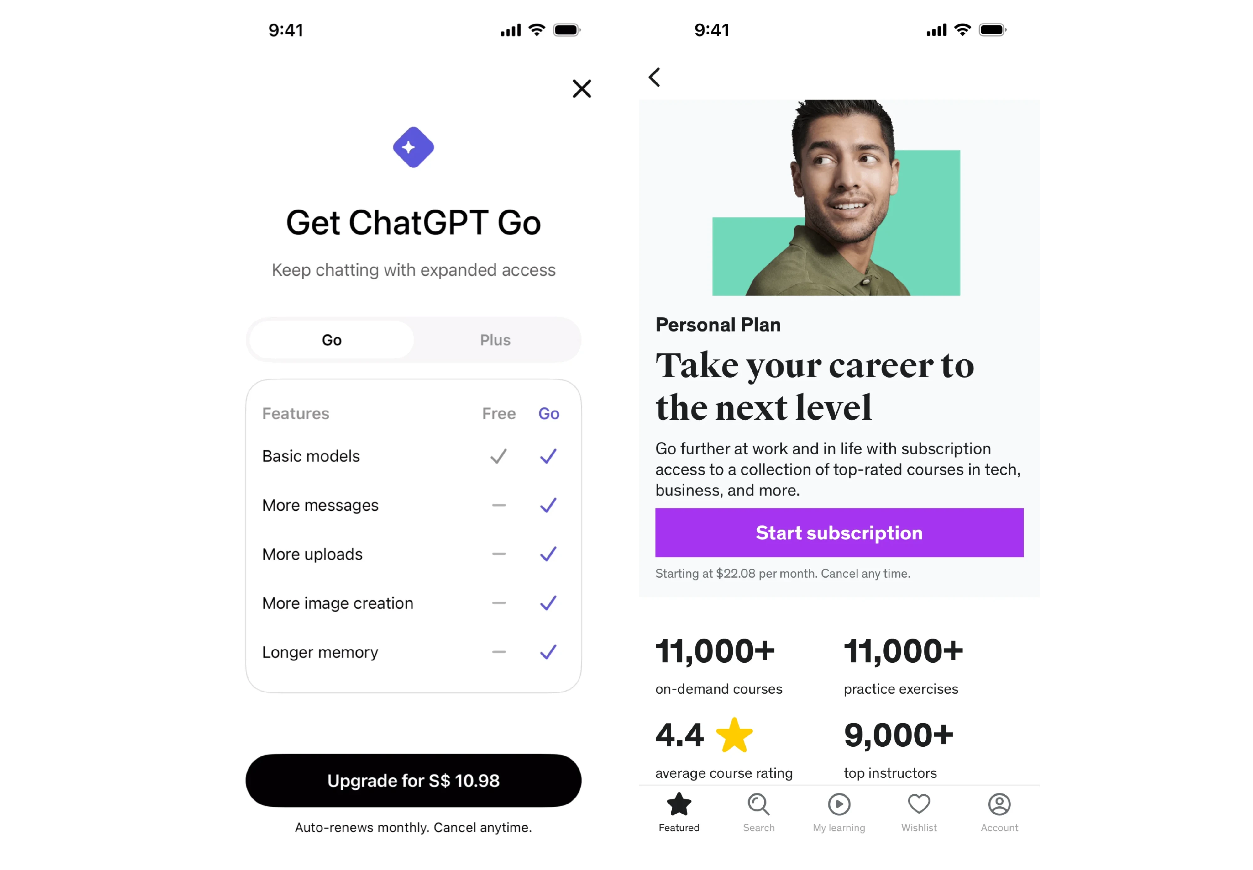
Decision fatigue is real.
Every additional plan, feature list, or pricing option creates another decision users must make before subscribing.
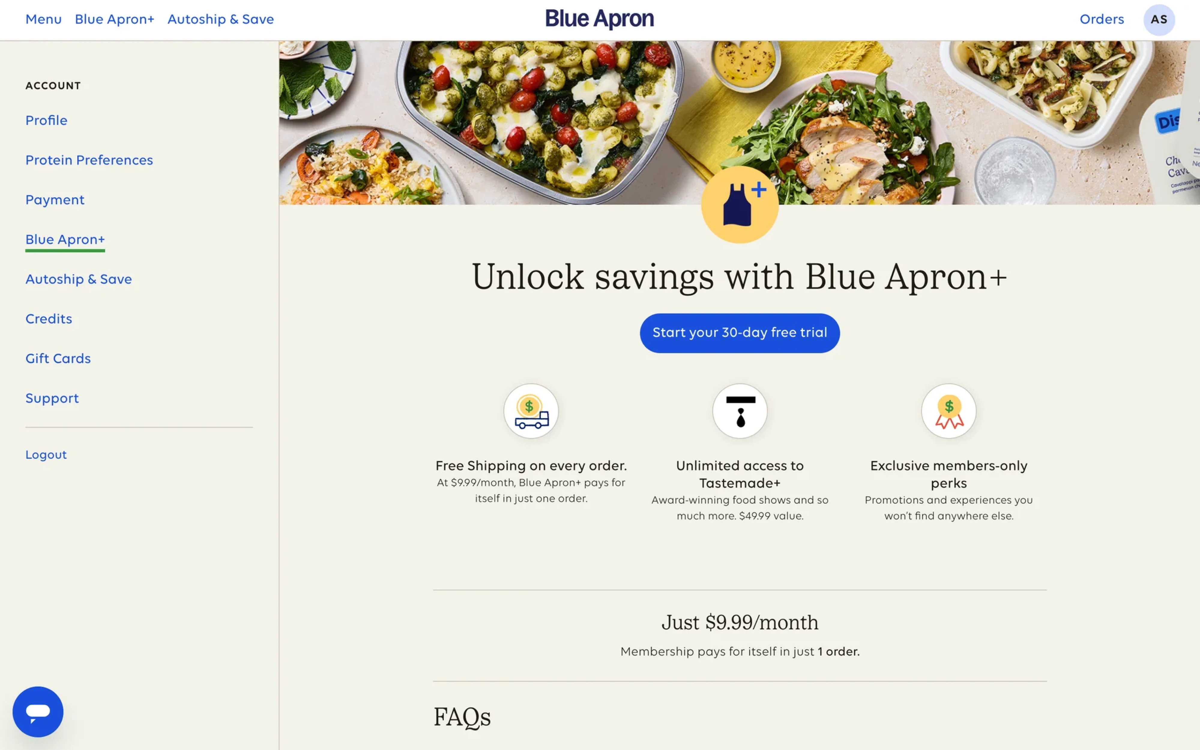
One-call to action (CTA button) paywalls remove that burden.
Rather than asking users to evaluate several choices, they guide attention toward one recommended path.
The goal is to eliminate distractions so users focus on one clear decision instead of searching for the right buy button.
This approach aligns with a common observation shared by founders and developers: users rarely read every detail. They scan, form an impression, and decide.
What these paywalls often have in common
- One primary subscription option
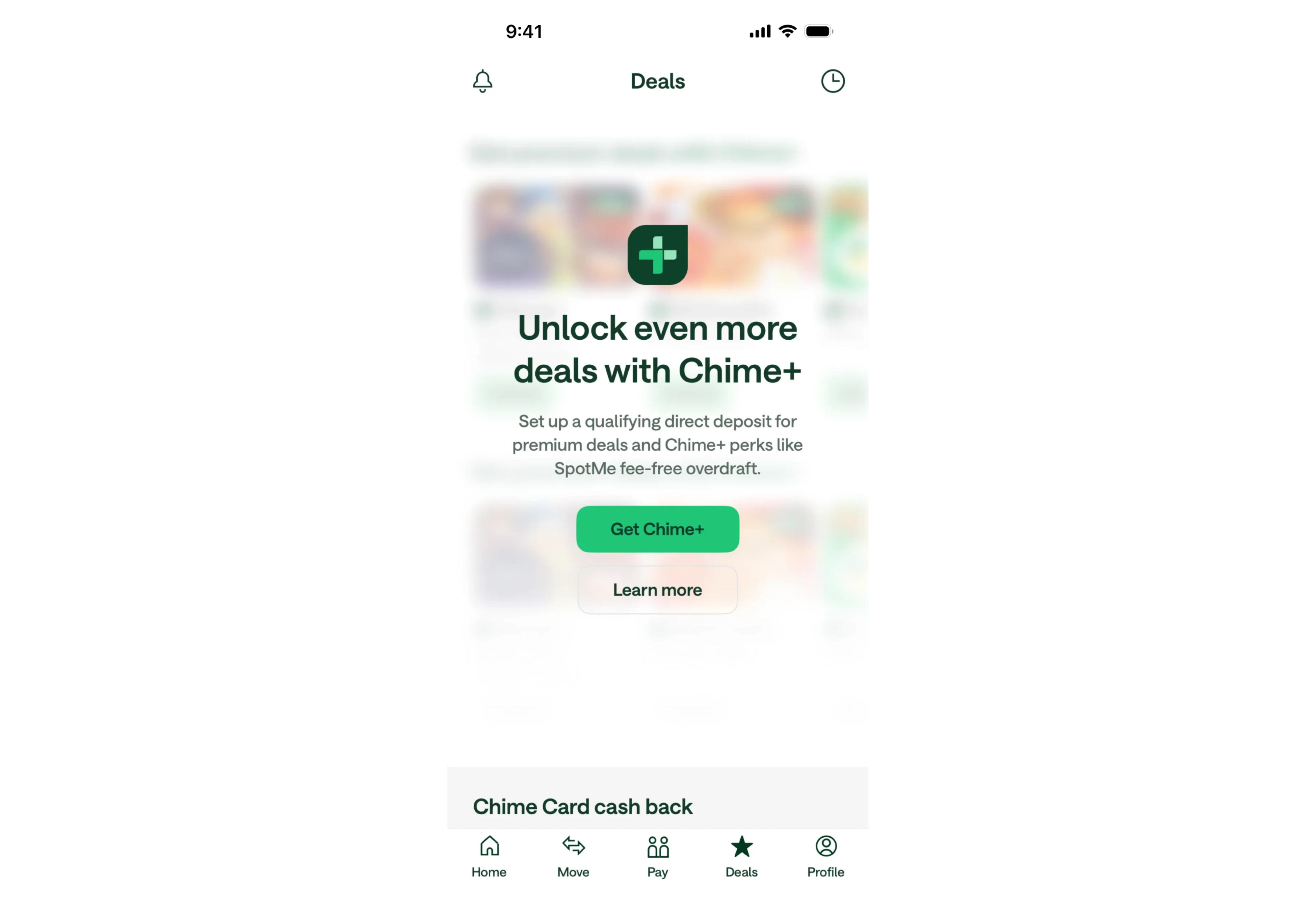
- Minimal copy
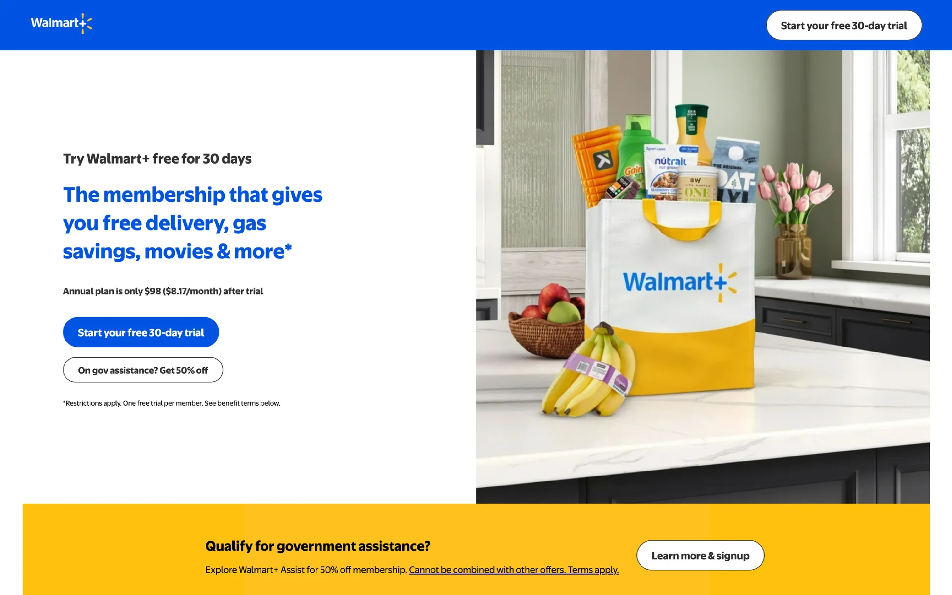
- Few or no feature comparisons
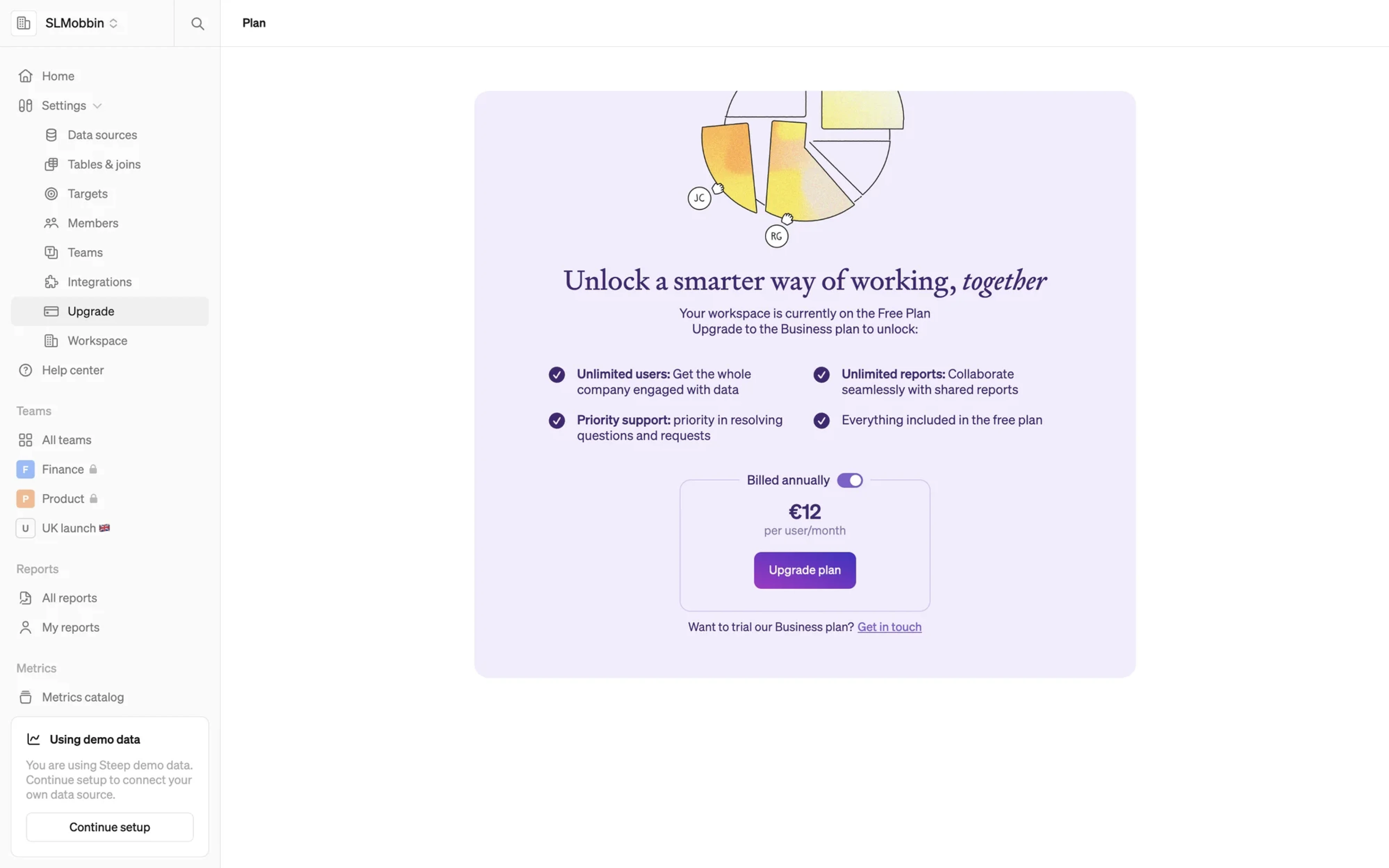
- Strong visual hierarchy
- One dominant CTA

Best For
- Wellness apps
- Meditation products
- Consumer mobile apps
- Products with a strong brand reputation
Watch Out For
Simplicity only works when value is already understood.
If users don't know what they're paying for, removing information can create uncertainty instead of clarity.
3. Feature Preview / “Show the Product” Paywalls
One of the fastest ways to increase conversions is to stop explaining value and start showing it.
That's the idea behind feature preview paywalls.
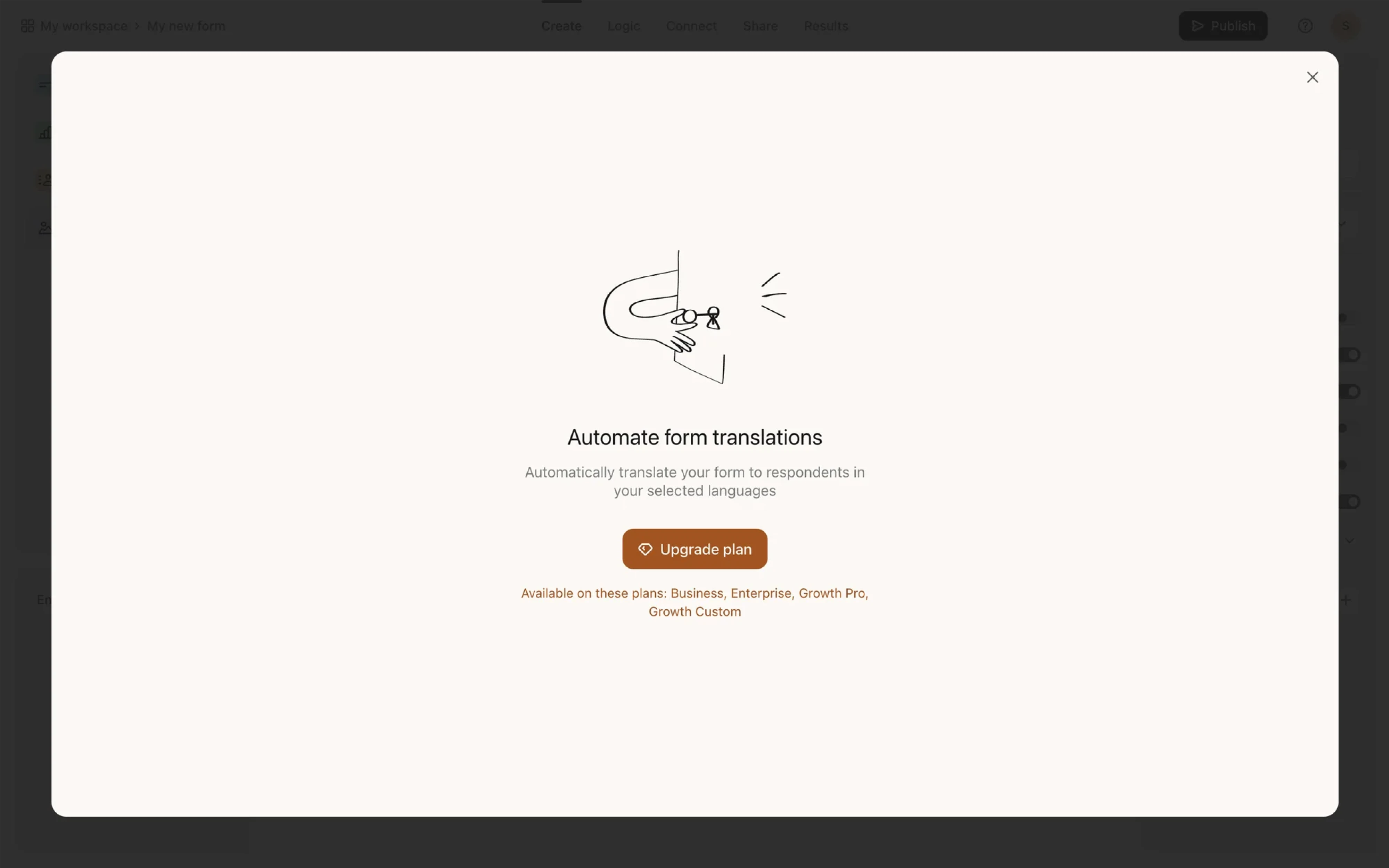
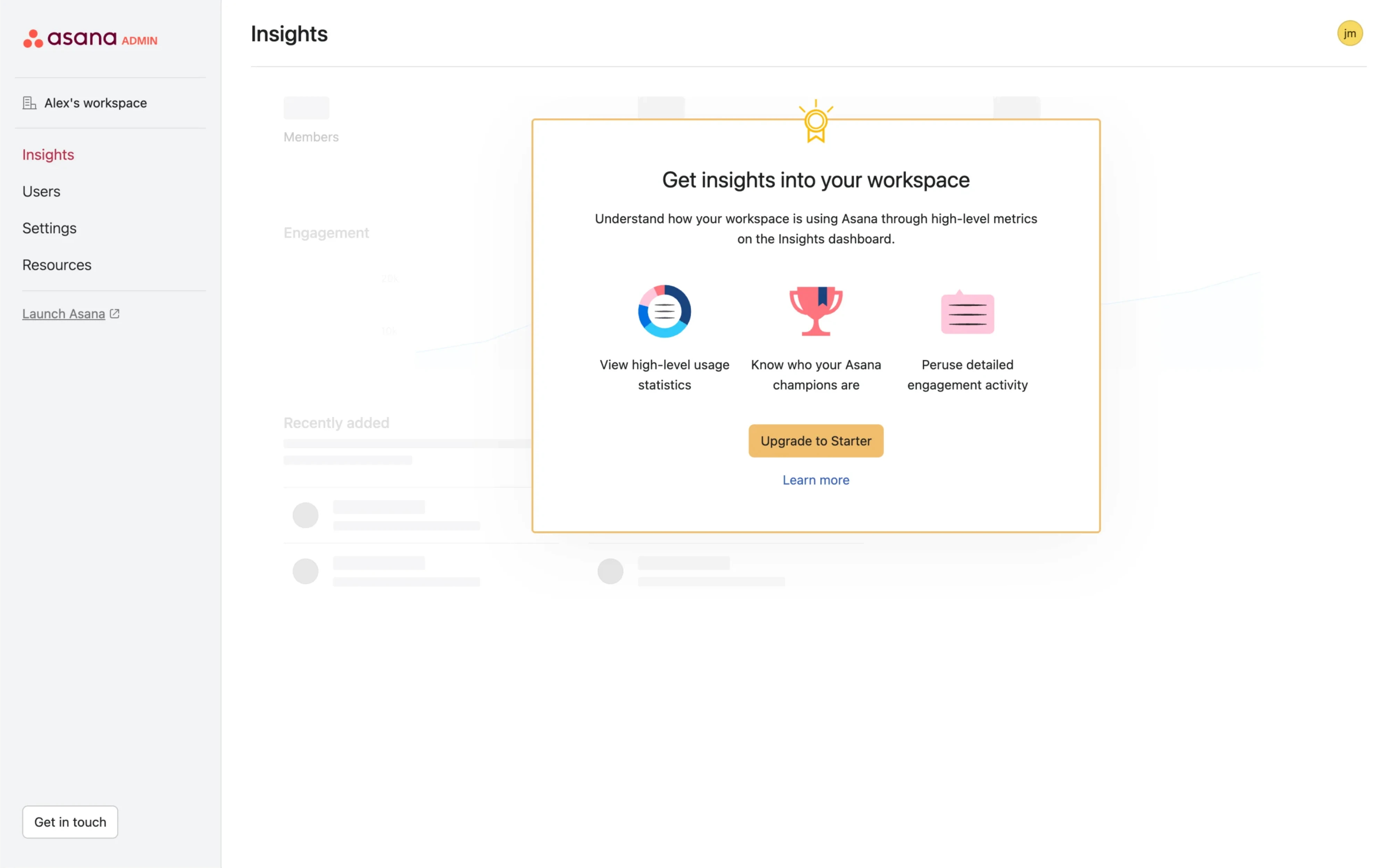
Instead of presenting a list of benefits, these paywalls give users a glimpse of what they're missing. Think blurred AI outputs, locked analytics dashboards, premium insights hidden behind an upgrade screen, or advanced features displayed but unavailable.
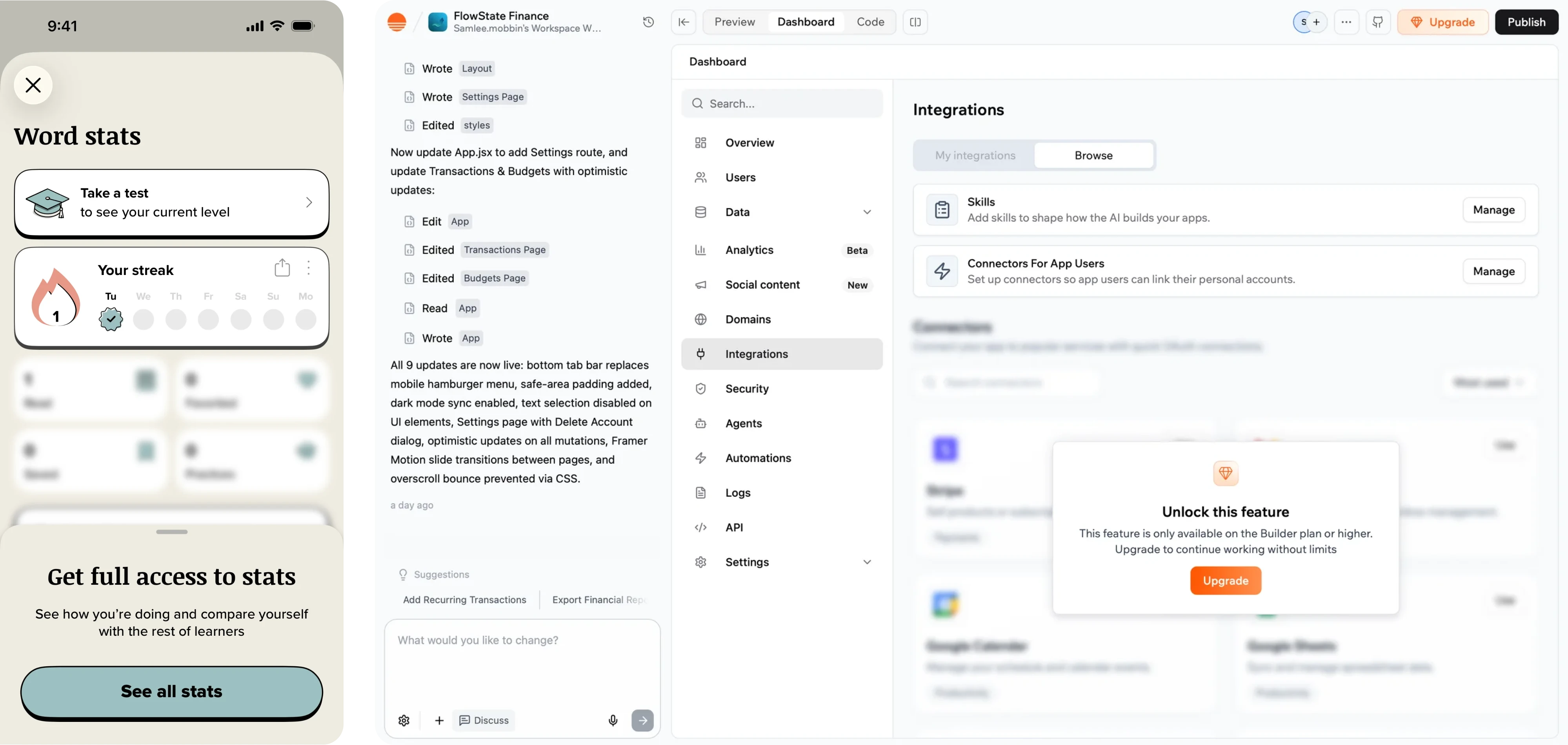
Products like AI assistants, analytics platforms, productivity tools, and modern SaaS products increasingly rely on this approach because it connects the upgrade directly to the value users want.
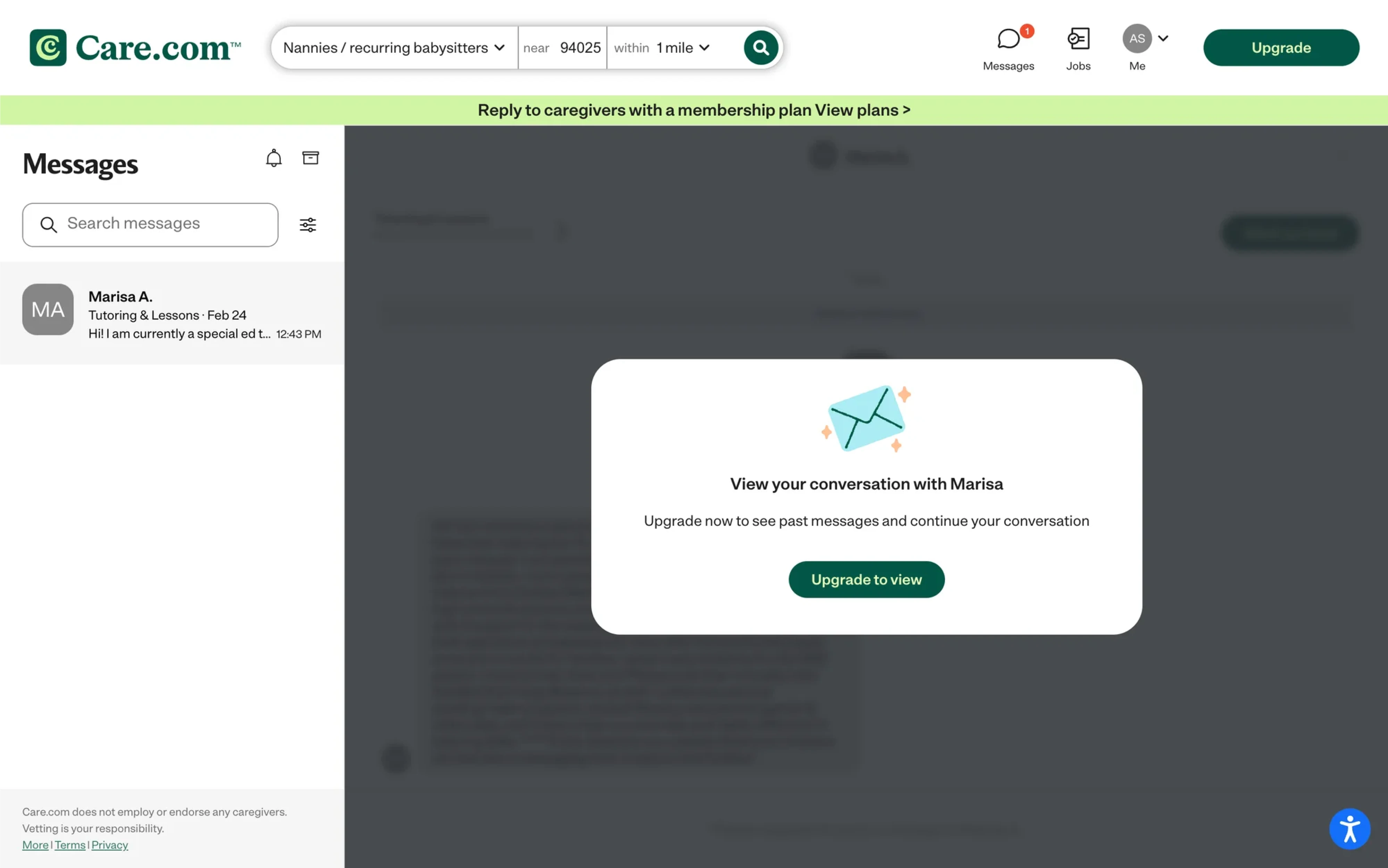
People find it easier to evaluate something they can see than something they have to imagine.
A feature list requires users to mentally translate benefits into outcomes. A feature preview removes that step.
Instead of saying:
- Unlimited AI generations
- Advanced reporting
- Premium insights
the product shows:
- the generated content waiting to be unlocked,
- the analytics dashboard they could access,
- the report they almost completed.
The value becomes apparent because users can already imagine themselves using the unlocked functionality and enjoying its tangible benefits.
What these paywalls often have in common
The strongest feature-preview paywalls often include:
- blurred or partially visible outputs,
- locked premium sections,
- before-and-after comparisons,
- premium feature callouts inside the product,
- upgrade prompts triggered after usage limits.
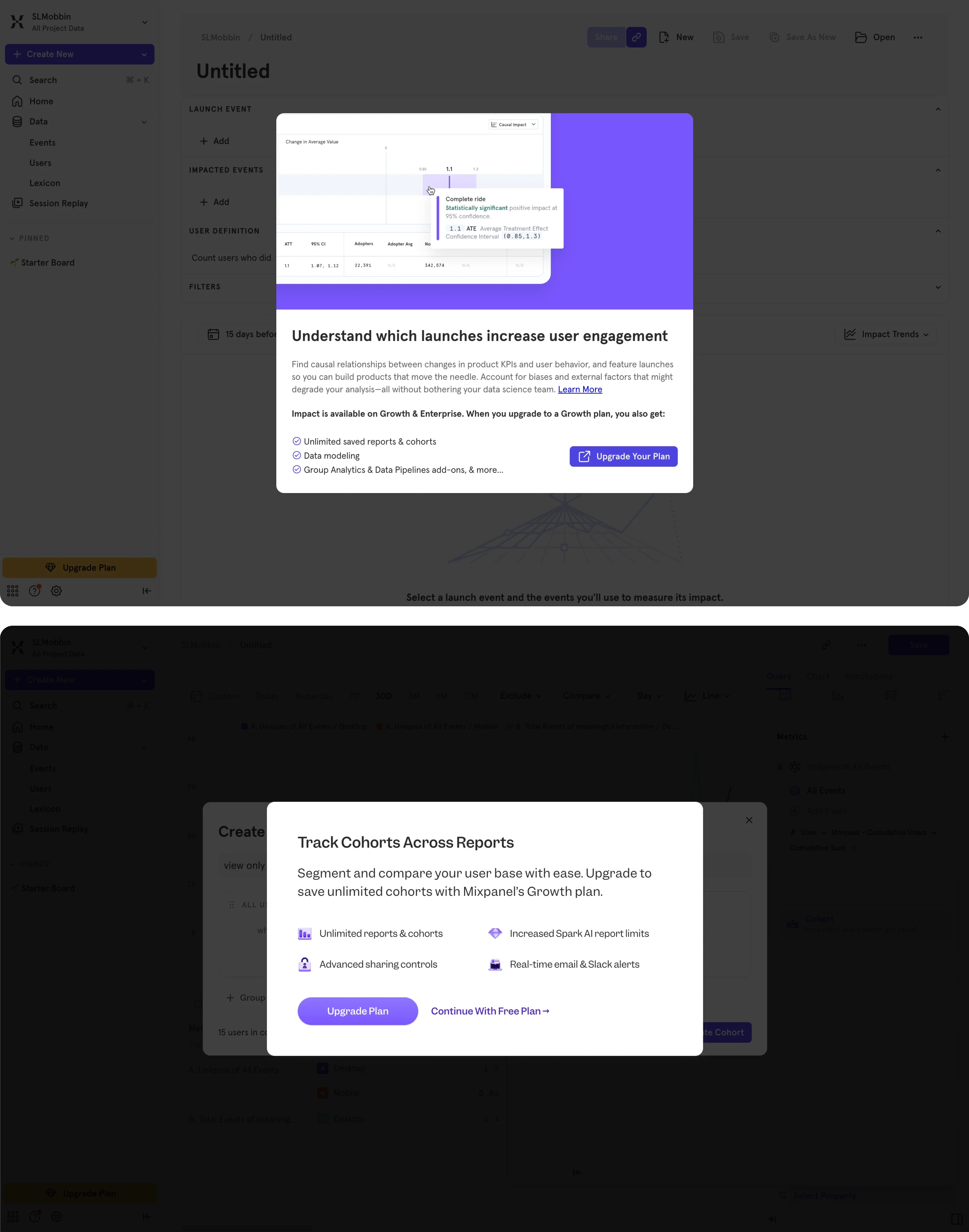
The goal isn't to interrupt users. It's to reveal what becomes possible after upgrading.
Best For
- SaaS products
- AI tools
- Analytics platforms
- Productivity software
- Creator tools
Watch Out For
A preview only works when users already understand its value.
Showing a locked feature too early—or before users experience the core product—can feel like a sales pitch instead of a helpful upgrade path.
The most effective previews appear after users have already invested time, effort, or attention. At that point, the upgrade feels like progress rather than a purchase.
Watch Out For
Trial-based paywalls lose trust quickly when pricing isn't transparent.
Avoid:
- hidden renewal terms
- pre-selected expensive plans
- unclear billing language
- misleading countdown timers
Users may forgive a weak design. They rarely forgive feeling tricked.
4. Social Proof Paywalls
Even when users understand the value of a product, one question remains: Can I trust it?
That's where social proof comes in.
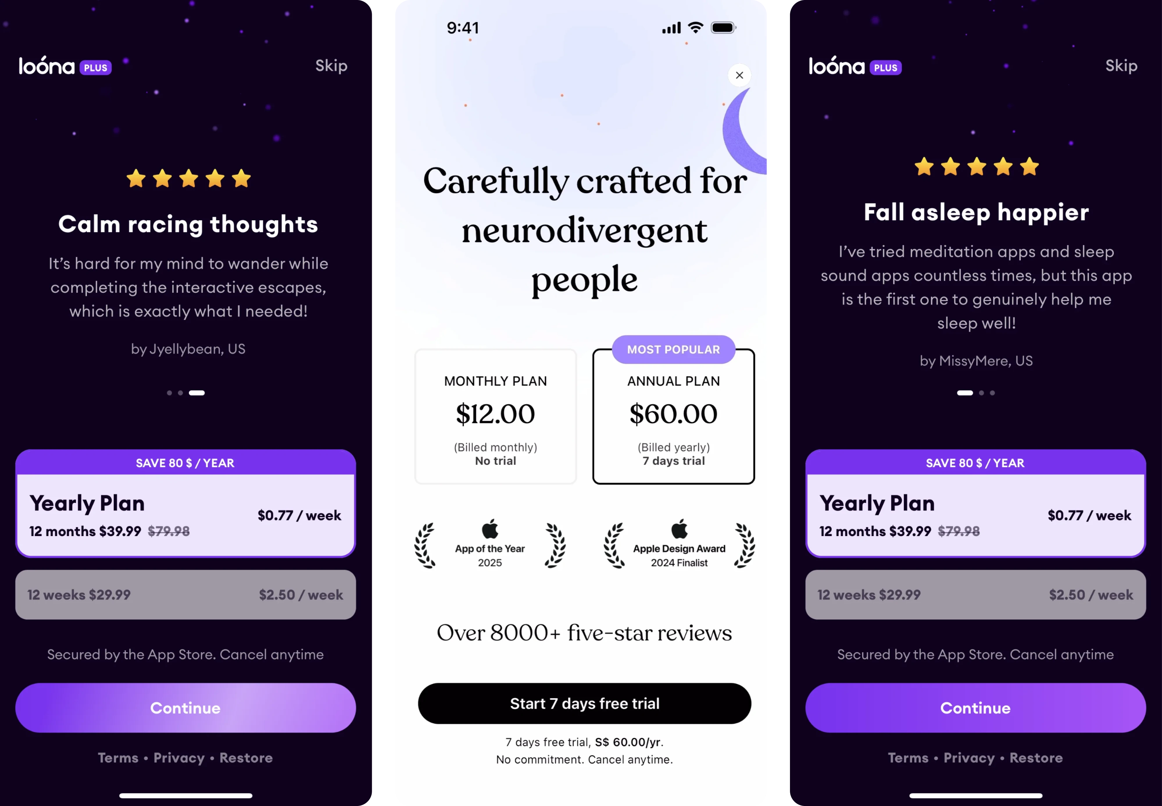
Many subscription products reinforce their paywalls with ratings, testimonials, user counts, awards, or media mentions.
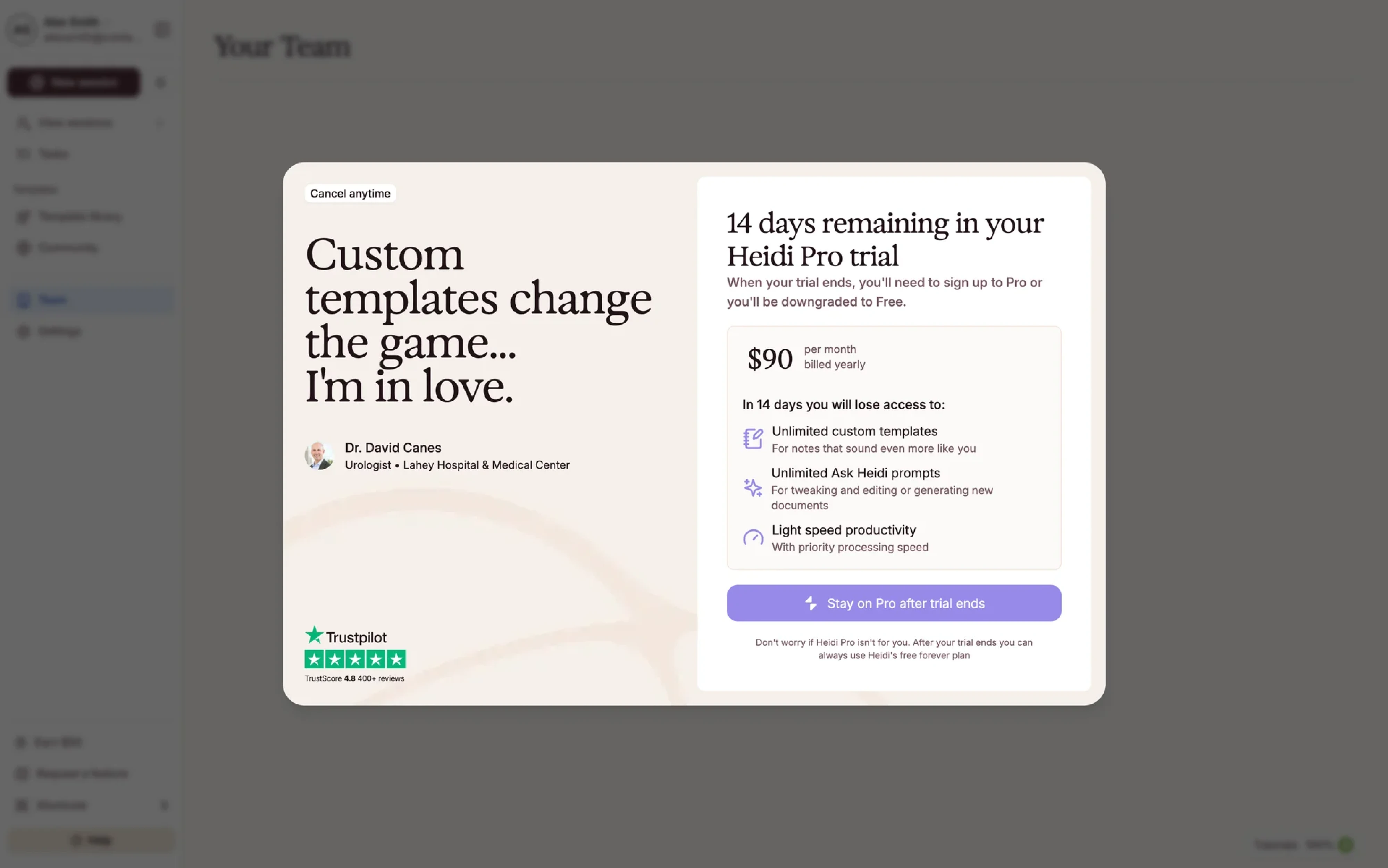
Subscriptions involve risk.
Users are committing money, sharing payment information, and trusting that the product will continue delivering value over time.
Social proof helps reduce that perceived risk.
A strong review, a recognizable brand mention, or evidence that thousands of people already use the product can make the decision feel safer. This is particularly important for new users, who haven't yet built enough trust in the product to subscribe confidently.
What these paywalls often have in common
- App Store ratings
- Customer testimonials
- User counts
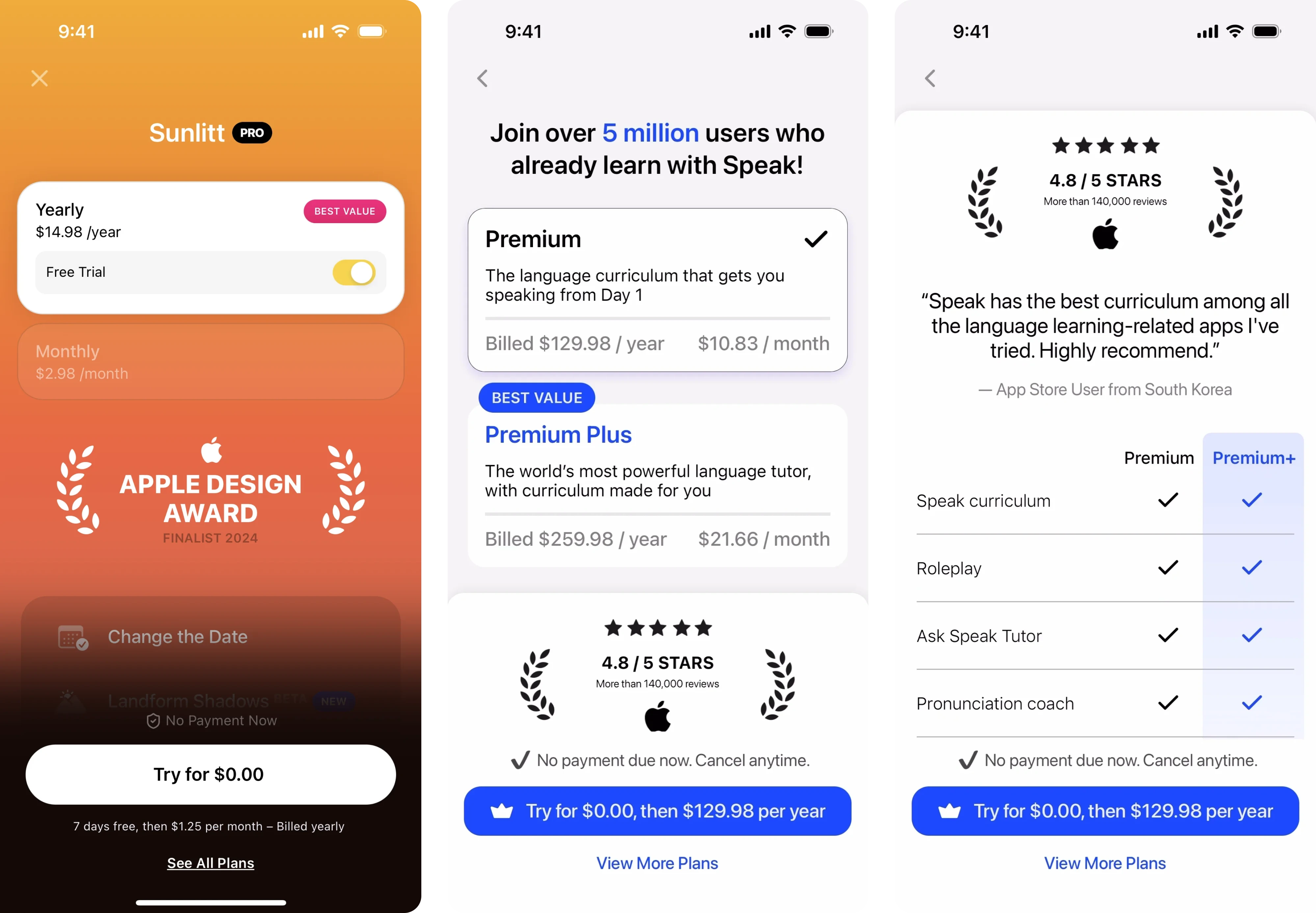
- Success stories
- "Featured by Apple" or media mentions
Watch Out For
Social proof only works when it feels authentic.
Generic testimonials, stock photos, and vague claims can have the opposite effect, making users question credibility instead of increasing it.
Specificity builds trust. Marketing clichés rarely do.
5. Annual Plan Anchoring Paywalls
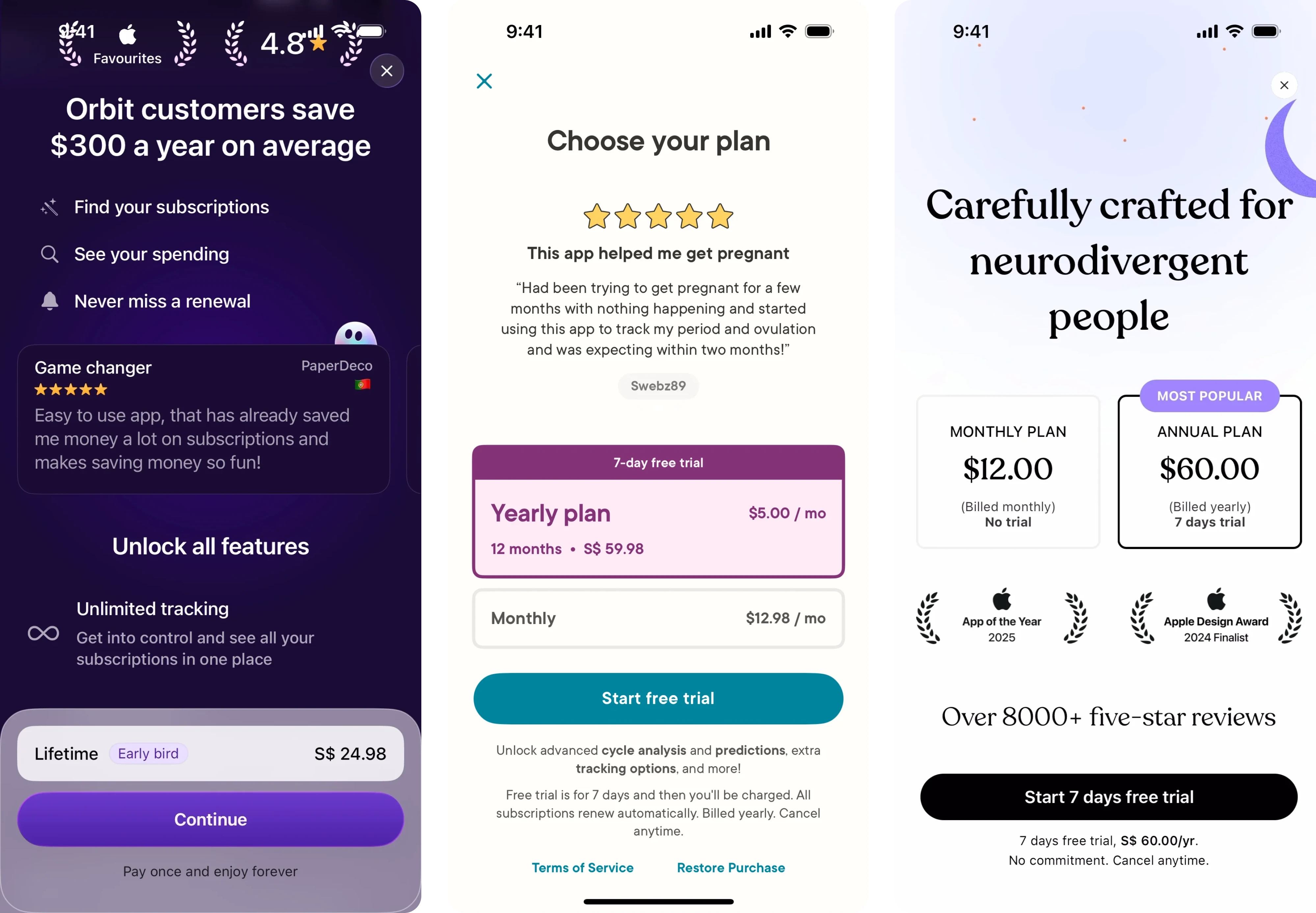
Many subscription products don't just encourage users to subscribe—they encourage them to subscribe annually.
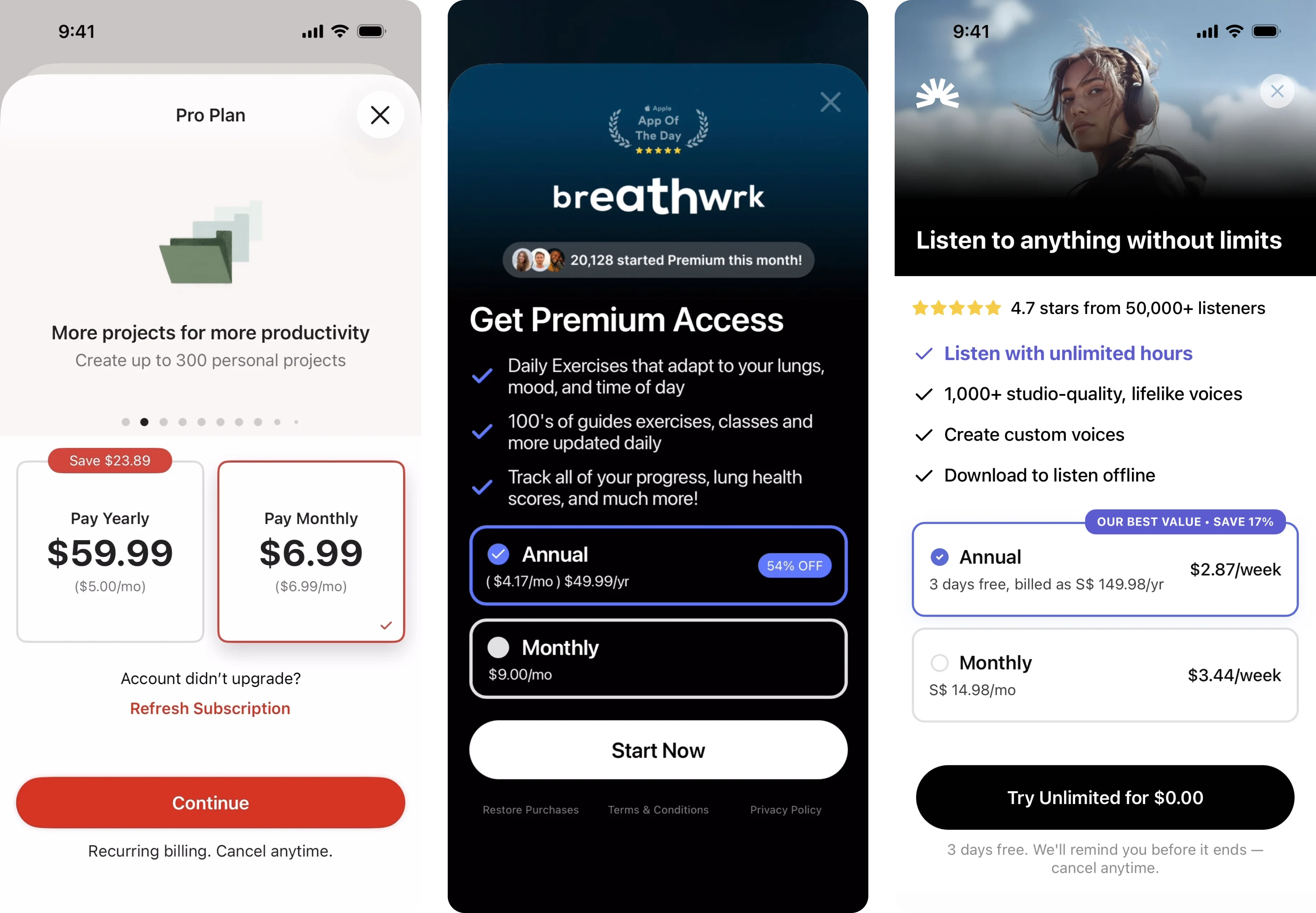
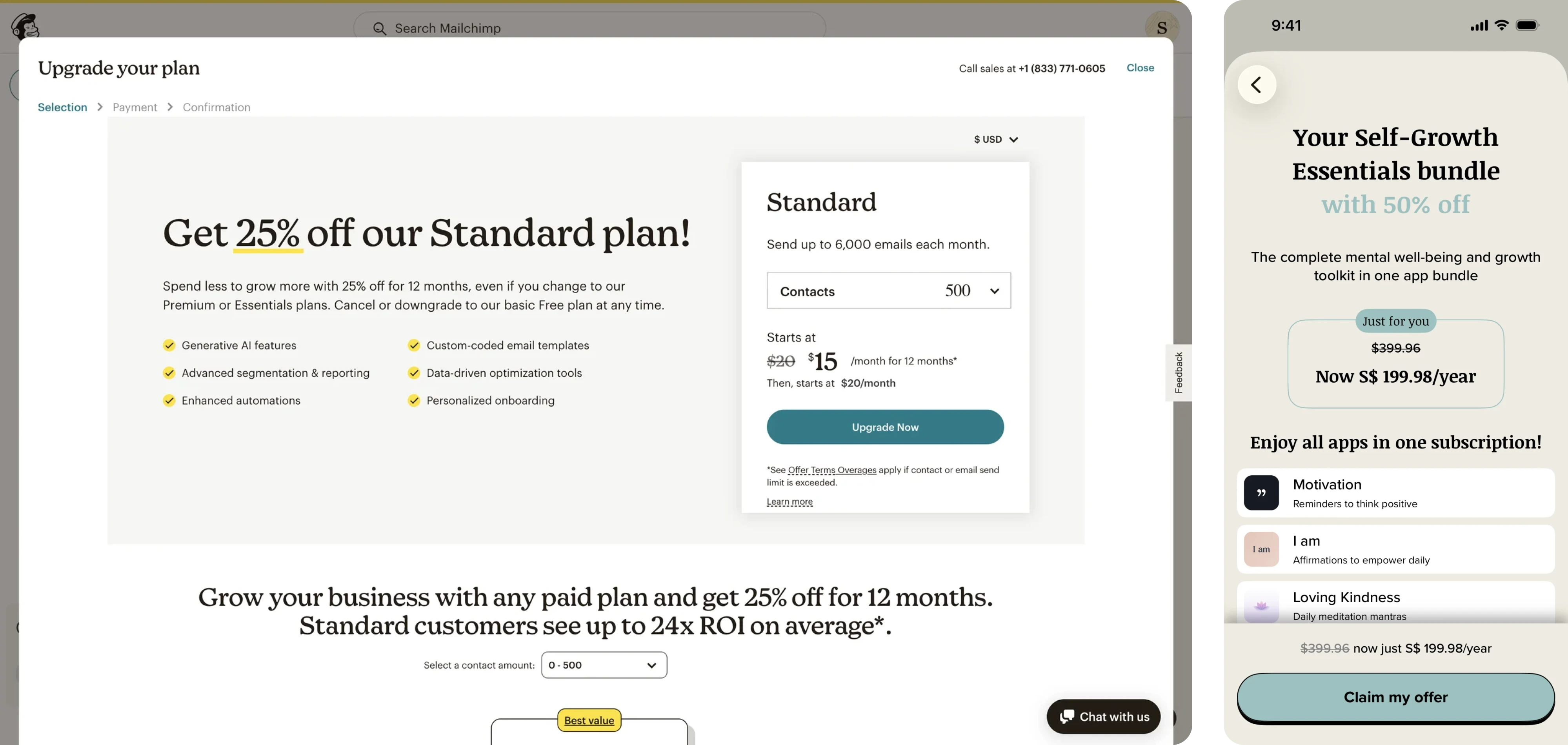
Several subscription products use pricing anchors, savings badges, and monthly-equivalent pricing to make annual plans feel like the obvious choice.
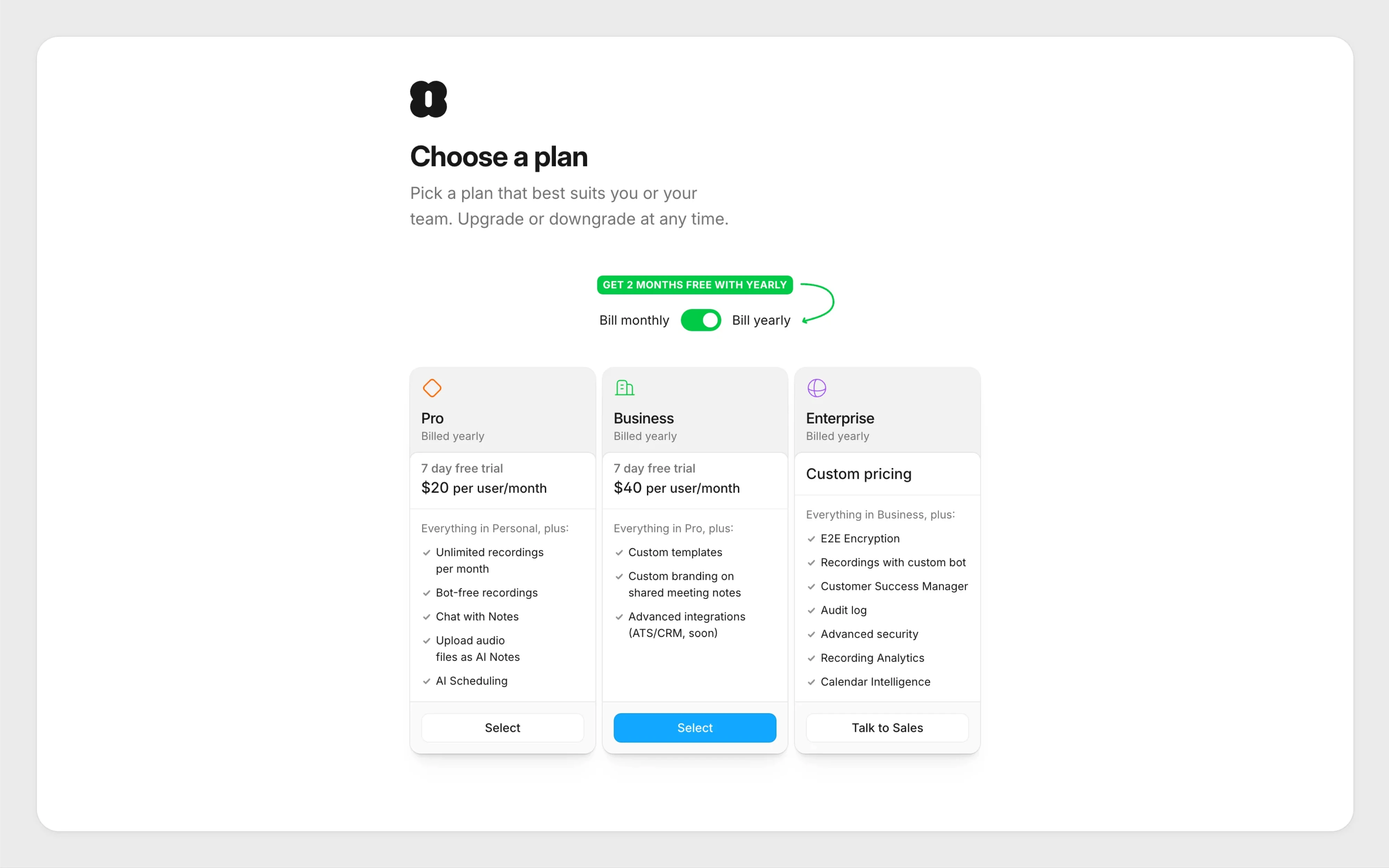
Most users evaluate prices relatively, not absolutely.
A $59.99 yearly plan may feel expensive on its own. But when it's presented next to a $9.99 monthly plan and framed as "Save 50%," the comparison changes.
Instead of asking: "Do I want to spend $59.99?", users start asking: "Why would I pay more over time?"
This shift in perception is what makes pricing anchors so effective.
What these paywalls often have in common
- "Best Value" badges
- Highlighted annual plans
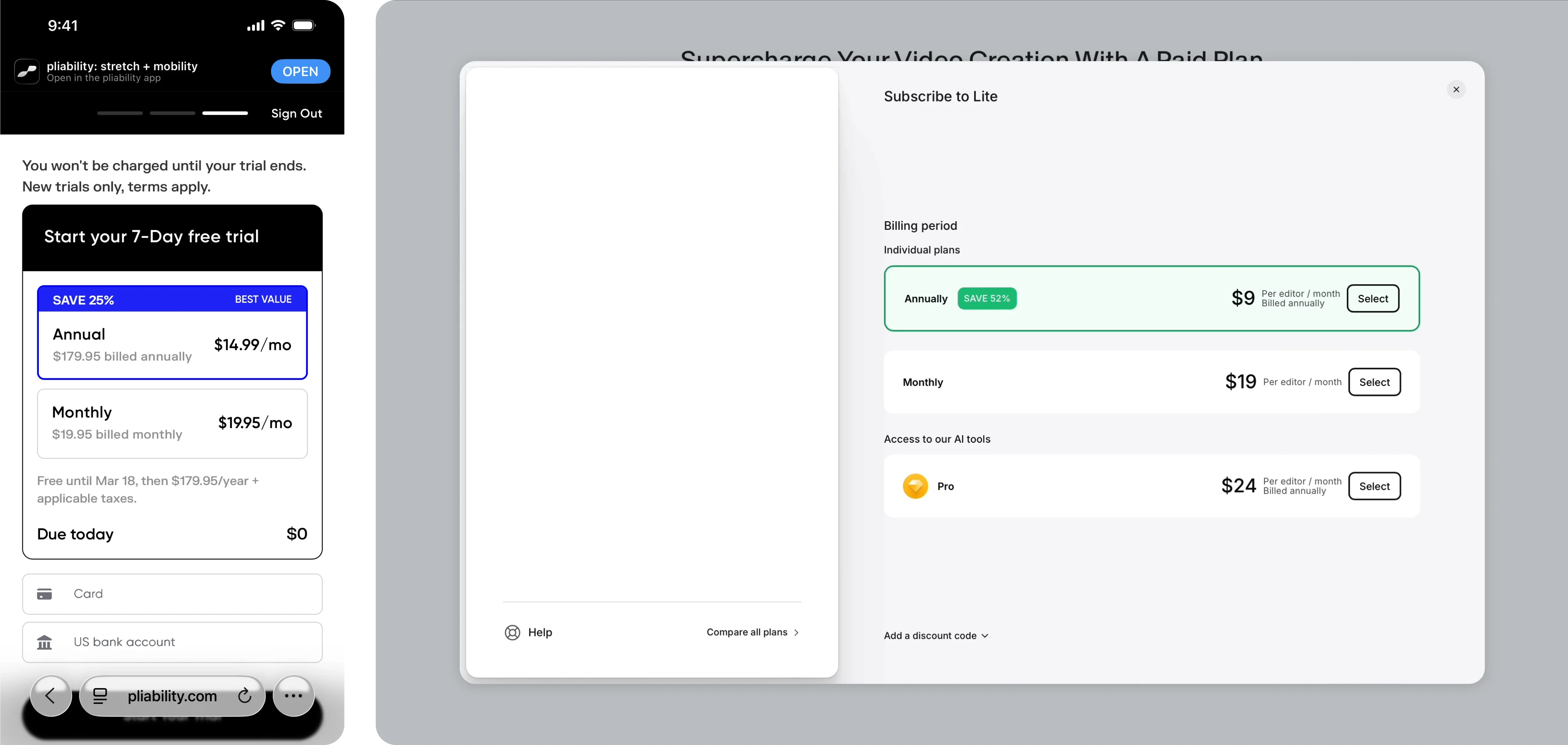
- Monthly-equivalent pricing
- Savings callouts ("Save 70%")
- Visual emphasis on the recommended option
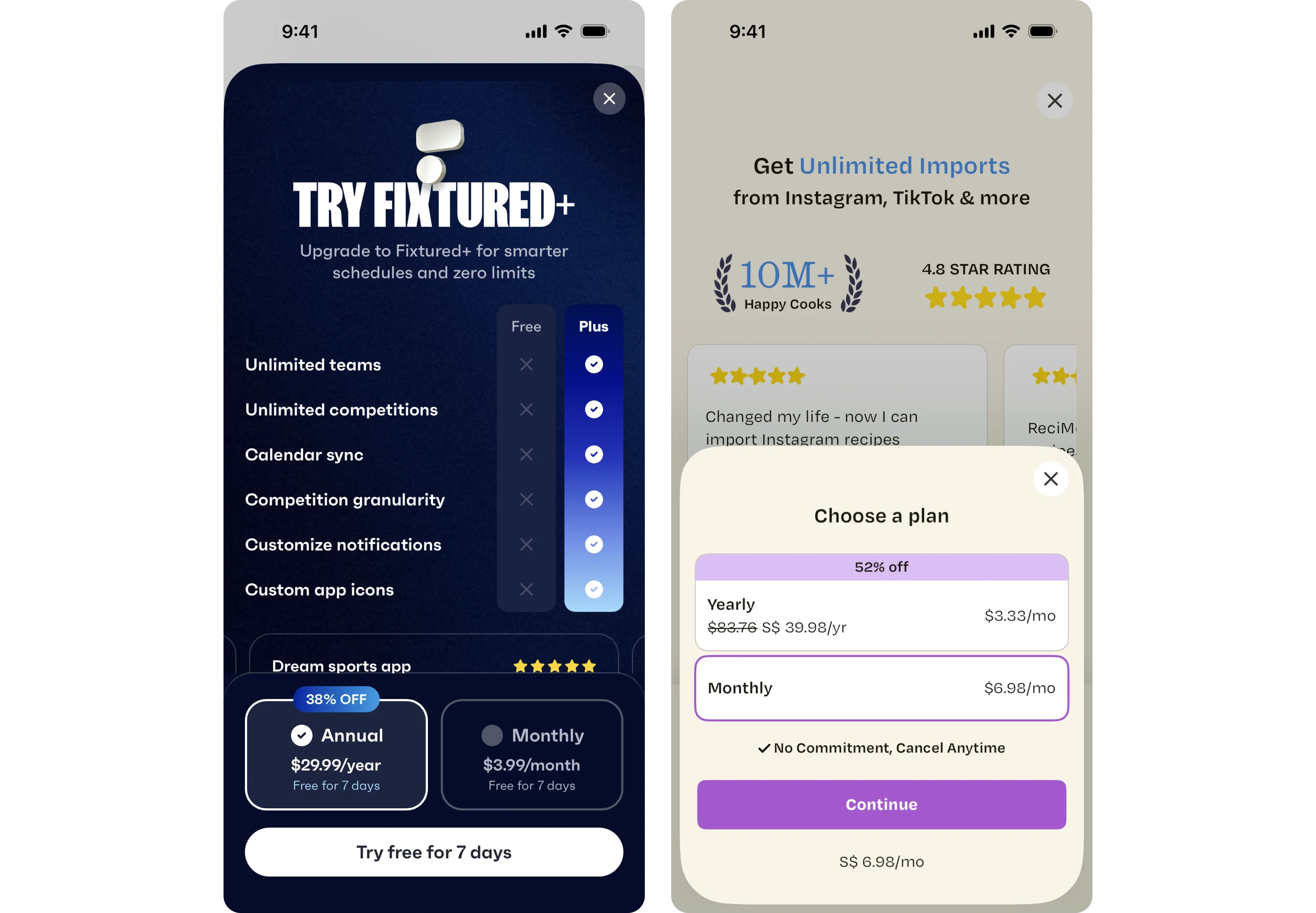
These patterns don't change the price itself—they change how users evaluate it.
Best For
- Subscription apps
- Wellness products
- Education platforms
- Consumer SaaS
- Habit-forming products
Watch Out For
Savings claims should be transparent and easy to verify.
If users need to do mental math to understand the offer—or discover hidden conditions later—the trust you've built can disappear quickly.
Good pricing framing clarifies value. Bad pricing framing feels manipulative.
6. Personalized / Contextual Paywalls
A beautifully designed paywall shown at the wrong moment will often lose to a simple paywall shown at the right one.
That's why many of today's highest-performing subscription products focus less on visuals and more on timing.
Instead of appearing immediately after signup, contextual paywalls are triggered after users experience value, hit a limit, reach a milestone, or complete a meaningful action.
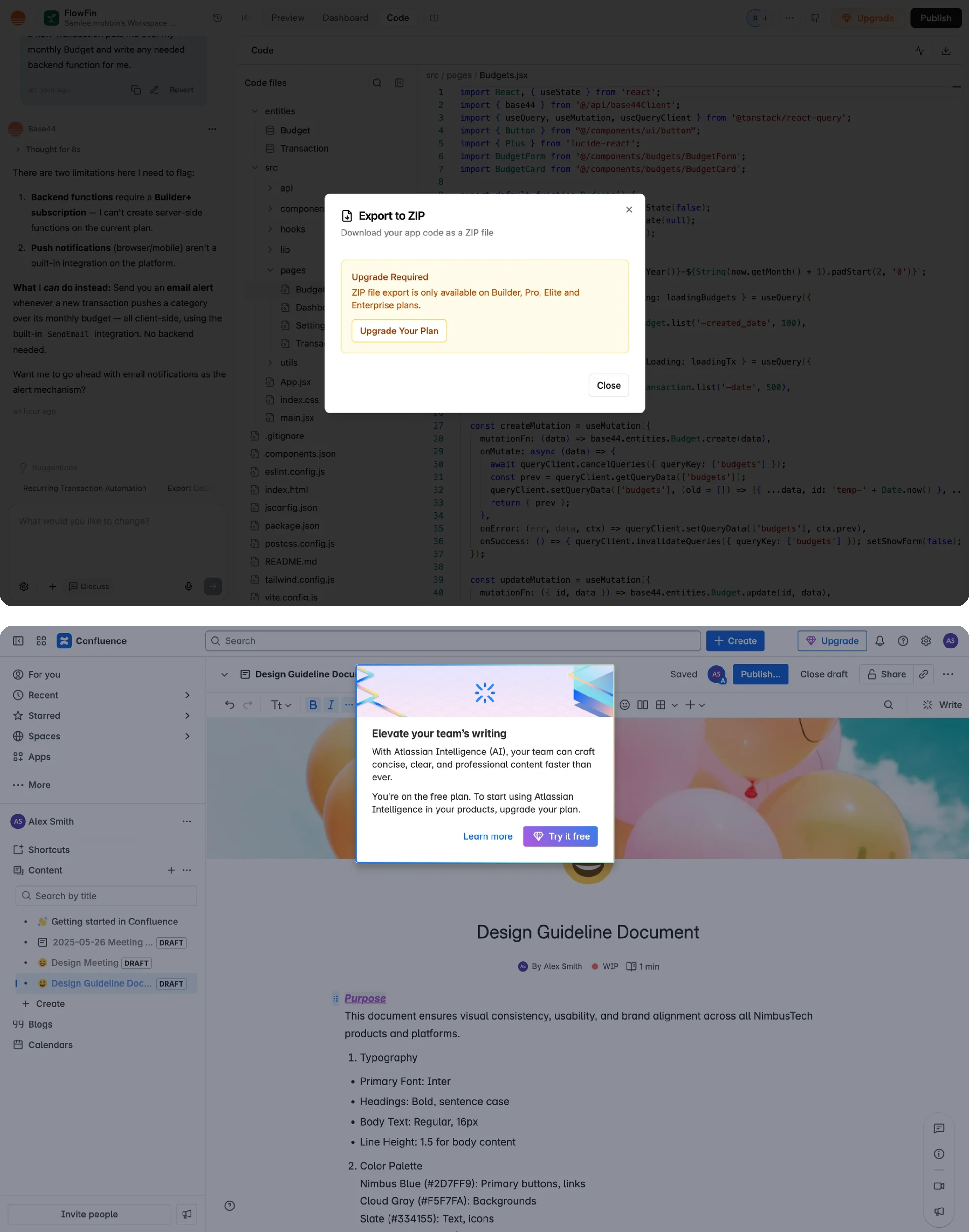
Users are far more likely to pay for something they've already experienced.
A productivity app may show an upgrade prompt after users create several projects. An AI tool may introduce a paywall when users reach their generation limit. A fitness app may ask users to subscribe after they've completed onboarding and defined their goals.
In each case, the paywall feels connected to the user's journey rather than imposed on it. Instead of interrupting everyone, products present upgrade prompts to the target audience most likely to benefit at that specific moment.
Common Design Patterns
- Usage-limit prompts
- Goal-based messaging
- Personalized upgrade copy
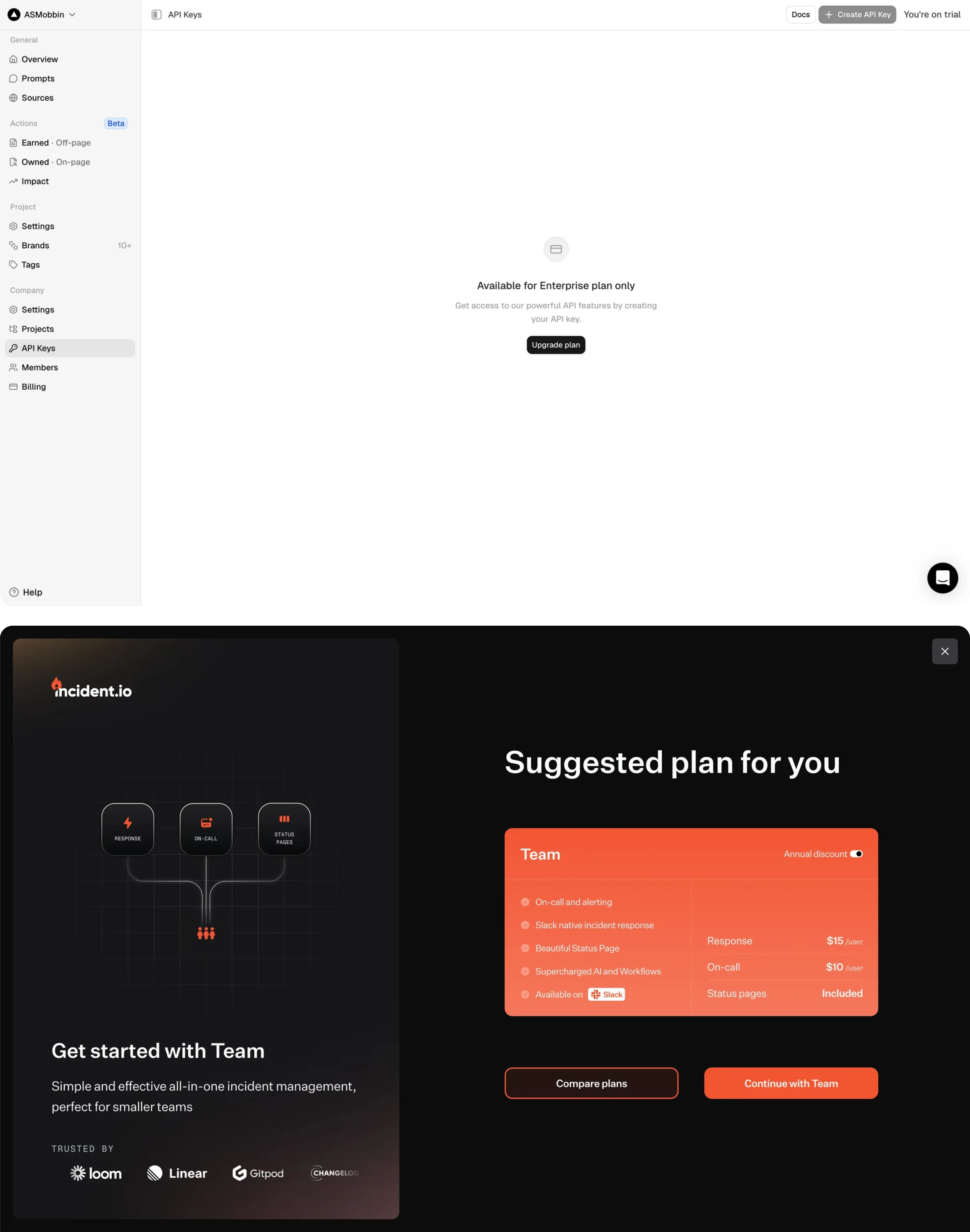
- Progress-based paywalls
- Feature unlocks tied to user behavior
Best For
- SaaS products
- AI tools
- Productivity software
- Fitness and wellness apps
- Subscription platforms with onboarding flows
Watch Out For
Timing is everything.
Introduce a paywall too early, and users haven't experienced enough value.
Wait too long, and users may become comfortable with the free experience.
The most effective contextual paywalls appear at moments of momentum—when users already care about the outcome they're trying to achieve.
What Makes a Good Paywall?
There’s no universal formula for a great paywall, but the strongest ones tend to follow the same underlying principles. They make value easy to understand, reduce uncertainty, and help users move forward with confidence.
Let's look at what that means in practice.
The Best Paywalls Feel Like Invitations, Not Barriers
Users don't open an app hoping to encounter a paywall. They come to solve a problem, achieve a goal, or get value from a product. That's why the most effective paywalls don't feel like interruptions—they feel like the natural next step.
The difference is subtle but important.
A weak paywall focuses on what users can't do, but a strong paywall focuses on what users gain:
- Save time with unlimited access
- Unlock advanced insights
- Continue your progress without limits
This shift from restriction to value changes how users perceive the offer. Instead of feeling blocked, they understand why upgrading might be worth it.
For instance, a reassuring copy like "Cancel anytime" reduces perceived risk without changing the actual offer.
The highest-converting paywalls aren't just asking users to pay. They're helping users connect the subscription to a meaningful outcome.
Users scan paywalls – they don't read them
Most users spend only a few seconds deciding whether a paywall deserves their attention. They're not studying every feature, comparing every bullet point, or carefully reading paragraphs of marketing copy.
They're scanning.
Typically, users look for a few key signals:
- What am I getting?
- How much does it cost?
- Is there a trial for my account?
- Can I cancel it?
- Which option should I choose?
Anything that makes those answers harder to find creates friction.
That's why many high-performing paywalls look surprisingly simple. They rely on strong visual hierarchy, concise benefit statements, and a single clear call to action rather than lengthy explanations.
A useful rule of thumb: if your paywall reads like a landing page, it's probably trying too hard. The goal isn't to answer every possible question—it's to give users enough confidence to take the next step.
Why "boring" paywalls often outperform beautiful ones
Designers naturally want to create memorable experiences. But when it comes to paywalls, familiar often beats impressive.
Many of the highest-converting subscription screens use layouts that feel almost predictable: a short headline, a few benefits, a highlighted plan, and one primary CTA.
Why?
Because familiarity reduces cognitive effort. Users instantly understand where to look, what to compare, and what action to take. They don't have to learn a new interface before making a purchase decision.
This is especially true on mobile, where attention is limited and every additional decision increases the chance of abandonment.
That doesn't mean paywalls should be generic. Strong branding and thoughtful visuals still matter. But the best paywalls use design to reinforce clarity—not compete with it.
In many cases, the safest path to higher conversions isn't a more creative paywall. It's a simpler one.
The psychology behind high-converting paywalls
When teams optimize paywalls, they often focus on visuals, pricing, or button colors.
Those details matter—but they're rarely the reason users subscribe.
High-converting paywalls work because they reduce uncertainty at the exact moment users are deciding whether your product is worth paying for. The most successful examples consistently rely on the same psychological principles: trust, familiarity, simplicity, and momentum.
Let's look at how they work.
Trust Reduces Friction
Every subscription asks users to take a risk.
They're sharing payment details, committing to recurring billing, and trusting that the product will continue delivering value after the purchase.
The more uncertainty users feel, the harder that decision becomes. The goal is to turn an interested visitor into a confident paying user by removing unnecessary uncertainty.
That's why successful paywalls make trust-building information impossible to miss:
- transparent pricing,
- clear trial terms,
- visible billing frequency,
- cancellation reassurance,
- straightforward subscription language.
Notice how many top-performing paywalls include phrases like "Cancel anytime" or "No commitment." These aren't filler copy. They're friction-reduction mechanisms.
When users understand exactly what they're agreeing to, they're far more likely to subscribe.
Familiarity Increases Conversions
One of the most surprising findings from paywall testing is that users often prefer interfaces they've seen before.
This doesn't mean copying competitors. It means respecting expectations.
Most successful mobile paywalls follow remarkably similar structures:
- a value proposition,
- a short list of benefits,
- pricing options,
- one primary CTA.
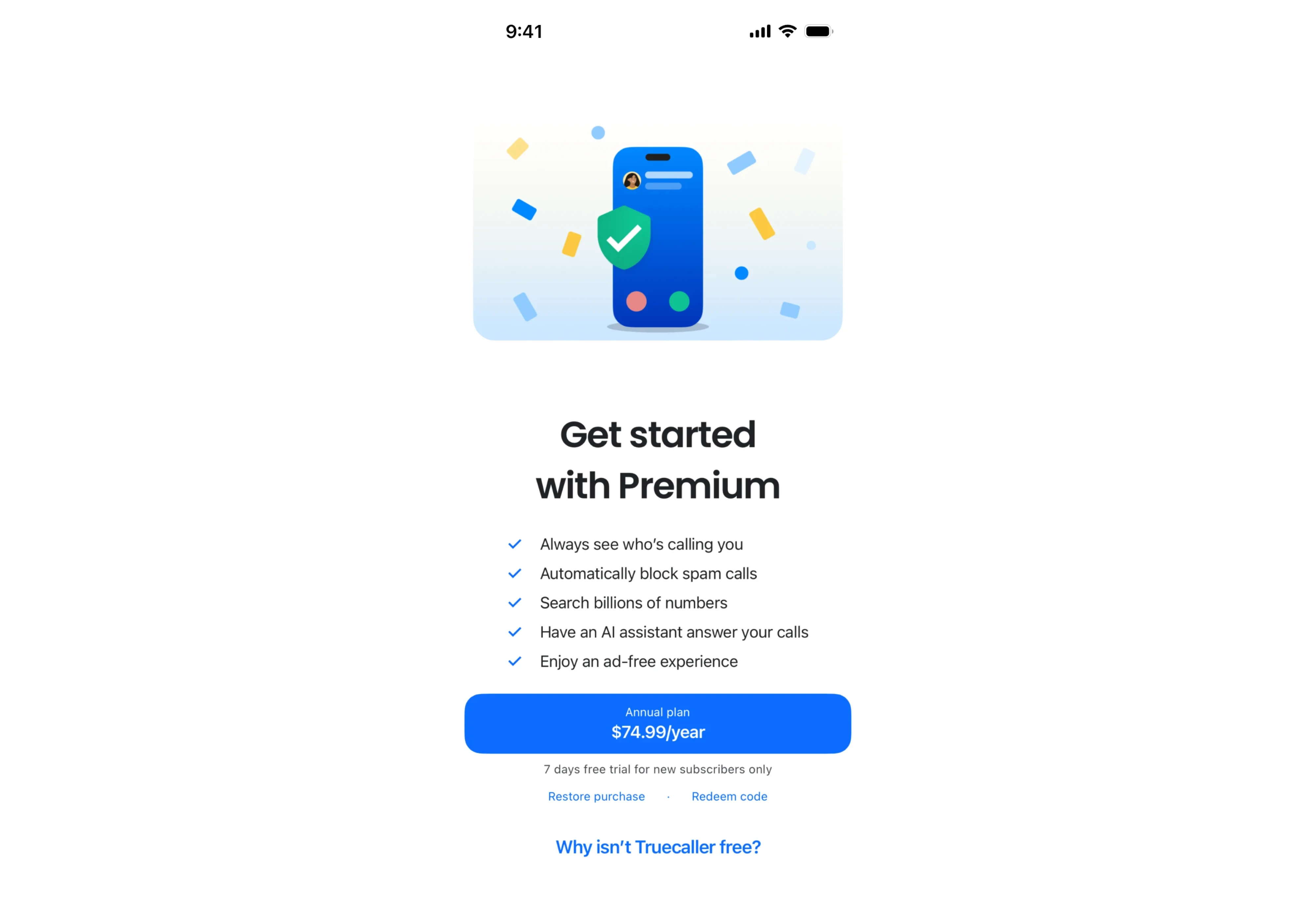
The layout feels familiar because users already know how to navigate it.
When teams introduce unconventional interactions, hidden pricing, or overly creative layouts, users spend more time figuring out the interface and less time evaluating the offer.
In other words, every moment spent understanding the paywall is a moment not spent considering the value of the product.
Decision Fatigue Lowers Conversions
More options don't always create more conversions.
In fact, one of the most common paywall mistakes is assuming that users want more choices. More plans, more discounts, more feature comparisons, more copy.
What users actually want is confidence.
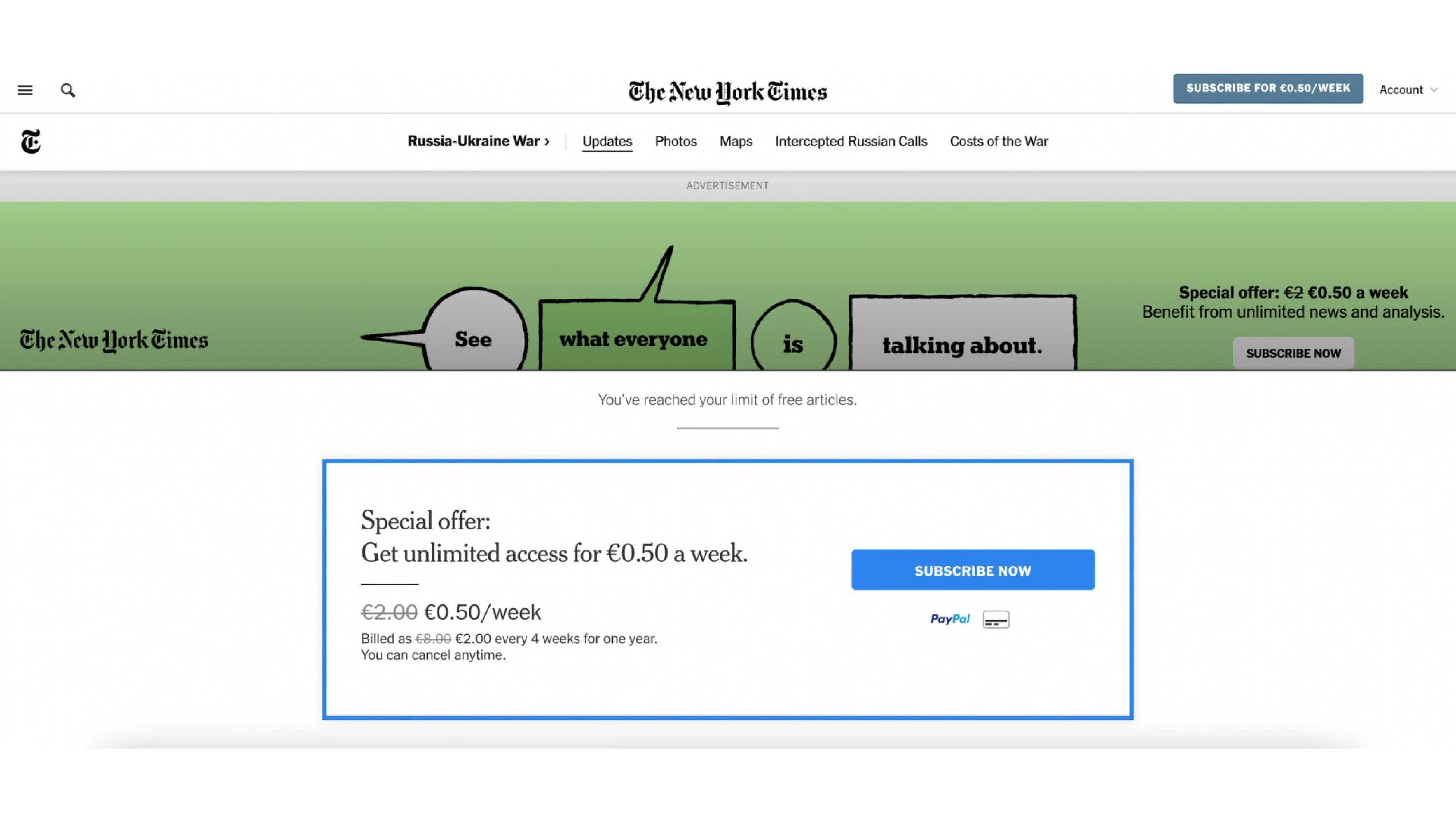
Every additional decision adds cognitive effort:
- Which plan is right for me?
- Should I choose monthly or annual?
- Do I need the premium tier?
- Am I missing something?
As uncertainty grows, action slows down.
That's why many of the highest-converting paywalls limit the number of decisions users need to make. Instead of presenting five plans and a wall of features, they guide attention toward one recommended option and one clear next step.
A useful way to think about it: the goal of a paywall isn't to present every possible choice. It's to help users make a choice. This is one reason the best apps often rely on surprisingly simple subscription screens.
The easier that decision feels, the more likely users are to complete it.
Emotional Momentum Matters
The best paywalls don't appear randomly. They appear at moments when users already understand the product's value.
Think about when a user completes onboarding, reaches a milestone, generates their first AI result, finishes a lesson, or builds a streak. At that moment, they're invested. They've experienced progress.
Interrupting that momentum with a well-timed upgrade prompt often feels natural.
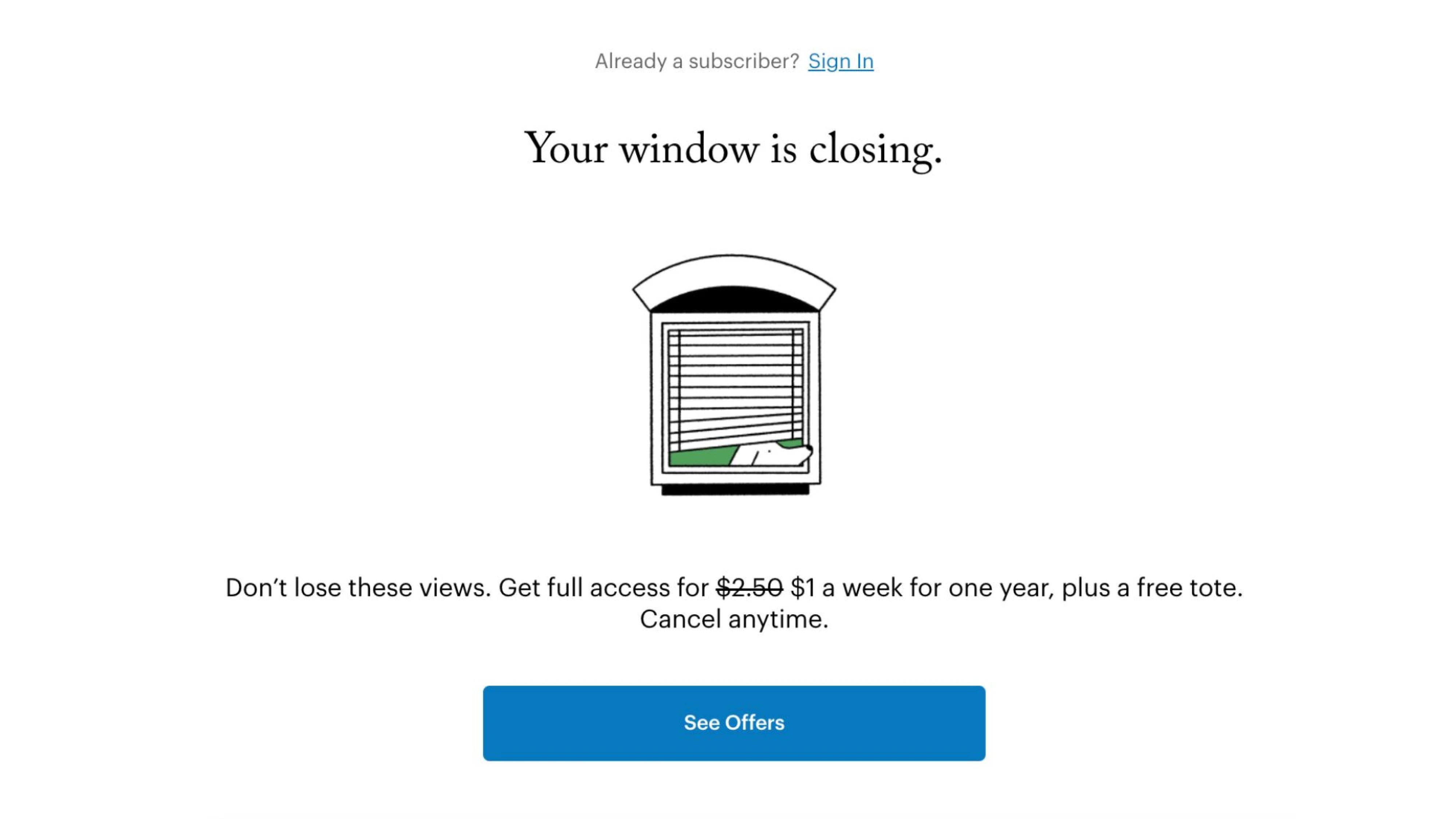
Interrupting it too early feels like a cash grab.
This is why timing frequently matters more than visual design.
A beautifully designed paywall shown before users experience value will struggle to convert. A simple paywall shown after a meaningful success moment can outperform it significantly.
Many of the best subscription products don't sell access—they sell continuity.
The message isn't "Pay now." It's "Keep going." That's an effective way to connect payment with progress instead of interruption.
Final Thoughts
The best paywalls don't win because they're flashy.
They win because they reduce uncertainty, clarify value, respect users' attention, and make upgrading feel like the natural next step.
That's why many of the highest-converting paywalls look surprisingly simple. They're not trying to impress users with clever tricks or aggressive tactics. They're focused on helping users make a confident decision.
Whether you choose free trials, feature previews, social proof, annual-plan anchoring, or contextual upgrades, the goal remains the same: effectively monetize your product by connecting the subscription to value users already understand.
Measuring success doesn't stop after launch. Teams should continuously monitor conversion rates and other key data points, such as trial activation, upgrade completion, and retention. These metrics reveal whether your paywall screens are helping users make confident decisions or introducing unnecessary friction. Even small adjustments can improve how premium users perceive your subscription experience.
At Eleken, we design onboarding, monetization, and subscription experiences that balance conversion, clarity, and trust—without relying on dark patterns. If you're looking to improve your paywall, pricing flow, or upgrade experience, we'd love to help.