WireFilter
How we redesigned the UX of a cybersecurity platform filled with complex metrics
The cybersecurity industry can be considered one of the most high-stakes environments. Network administrators must monitor massive volumes of traffic, detect anomalies, and configure security rules without missing a critical signal.
WireFilter operates in exactly this field. The company develops enterprise-grade cybersecurity solutions, including firewalls and deep packet inspection (DPI) systems that protect and serve more than 68 million users daily worldwide.
Alongside their core technology, the team had a console for configuring devices, monitoring network activity, and managing system rules from a single interface.
Built by engineers for internal use, the product’s design was its biggest pain point.
The WireFilter team realized their platform needed better usability and reached out to Eleken. Their console contained a lot of monitoring data, but the way it was presented made it difficult for administrators to interpret system status.
During our first conversations, we identified several key challenges:
- Navigation didn’t scale well as the product grew.
- Some functionality was missing for key workflows.
- System metrics were poorly visualized.
- Creation and configuration flows were difficult to follow.
From there, we began our collaboration with a 3-day design trial.

In three days, we redesigned two core screens
Because the product operated in the cybersecurity domain, we assigned a designer who had previously studied cybersecurity.
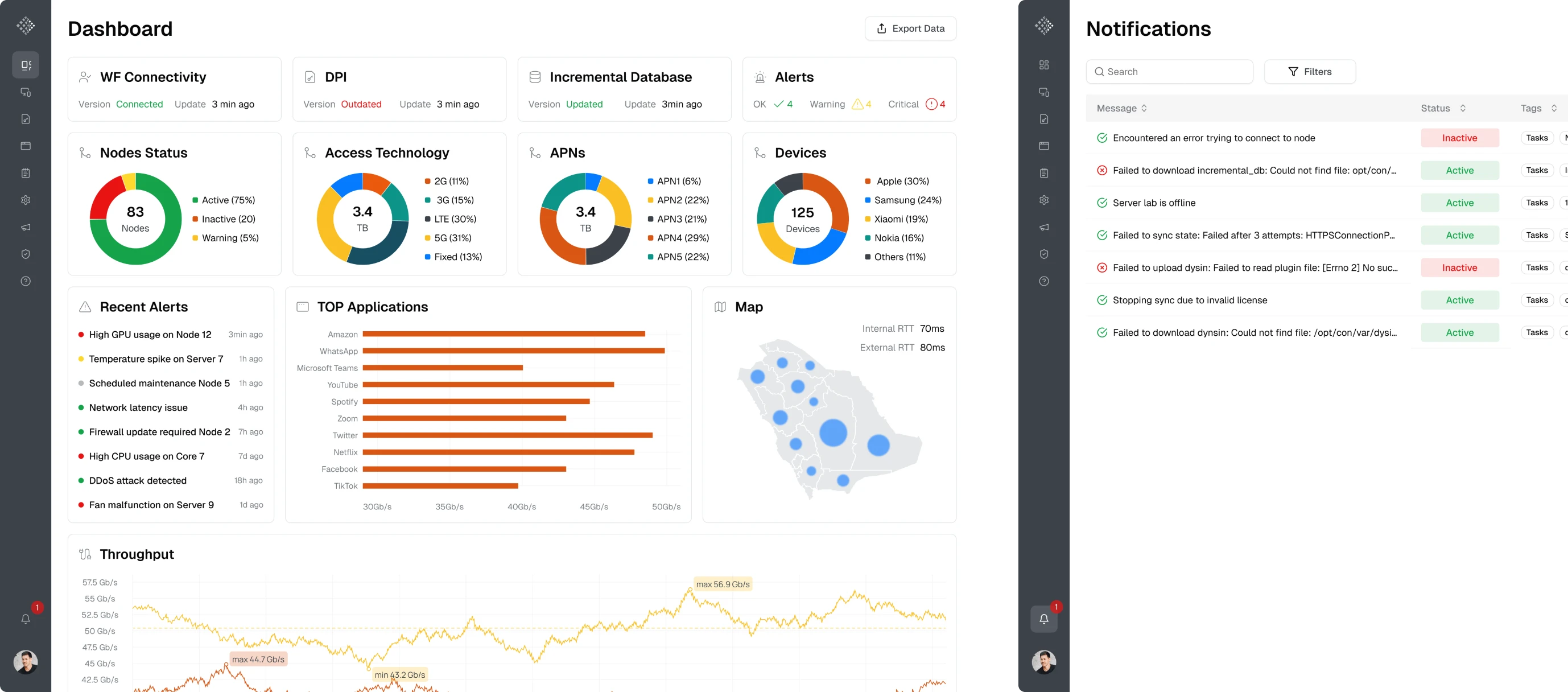
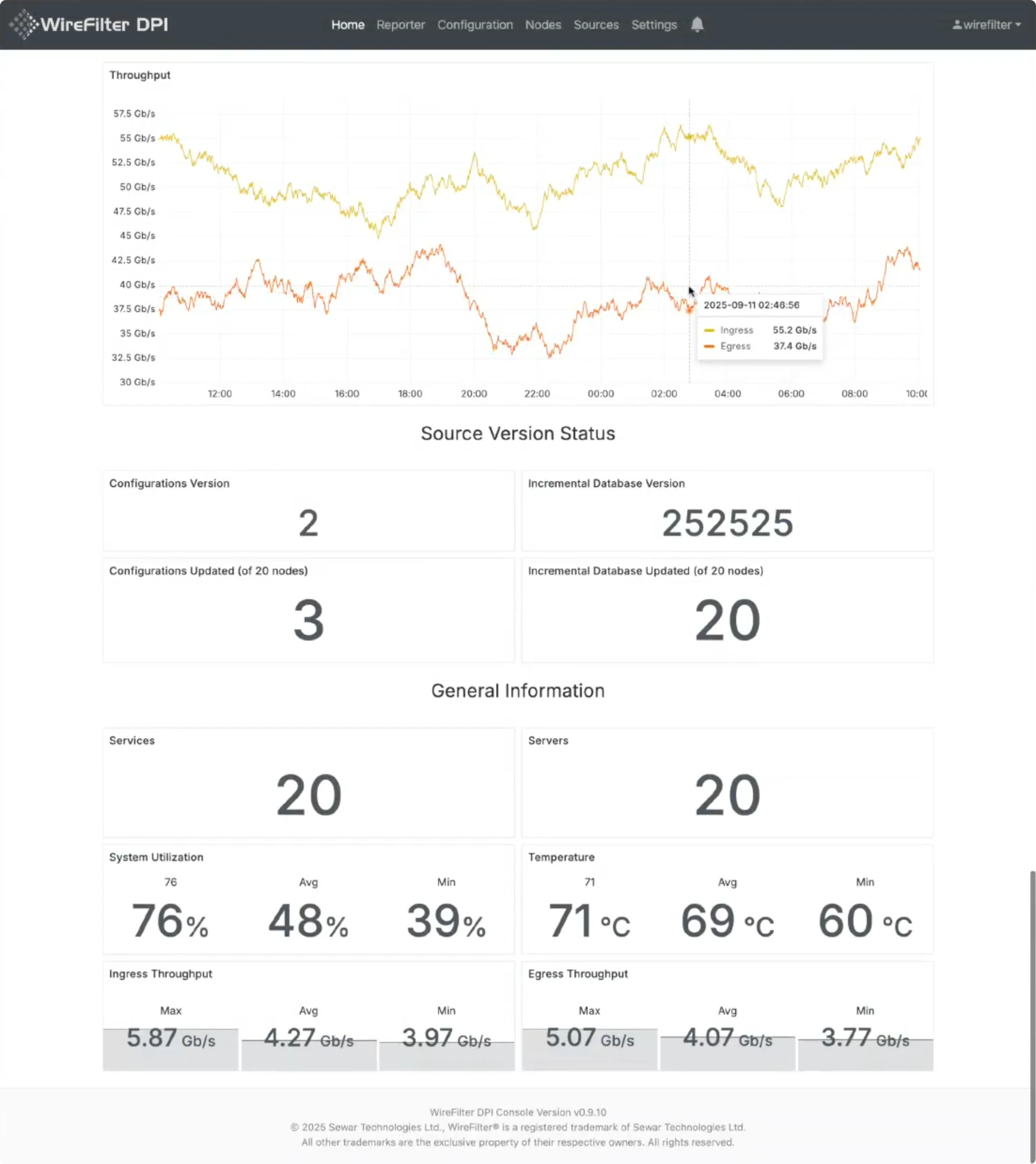
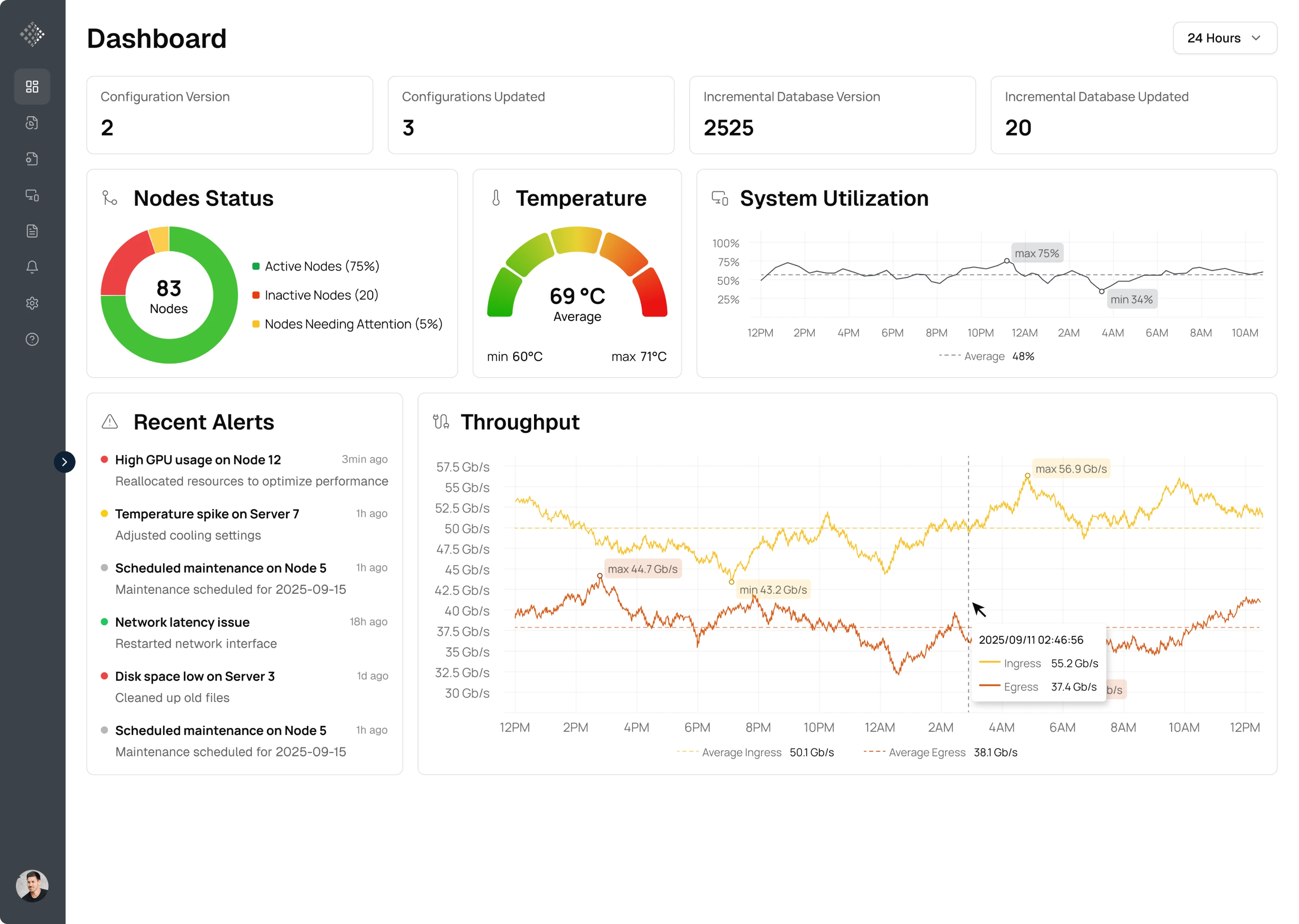
The first screen we worked on was the Homepage. Originally, it was packed with inconsistently placed monitoring data, making it difficult to understand the system status. Keeping the critical functionality, we focused on organizing the data hierarchy.
During the redesign, we:
- Prioritized the most important KPIs at the top of the dashboard.
- Reduced visual noise by grouping related metrics.
- Replaced some raw KPI blocks with charts and visualizations.
- Preserved critical elements the client relied on.
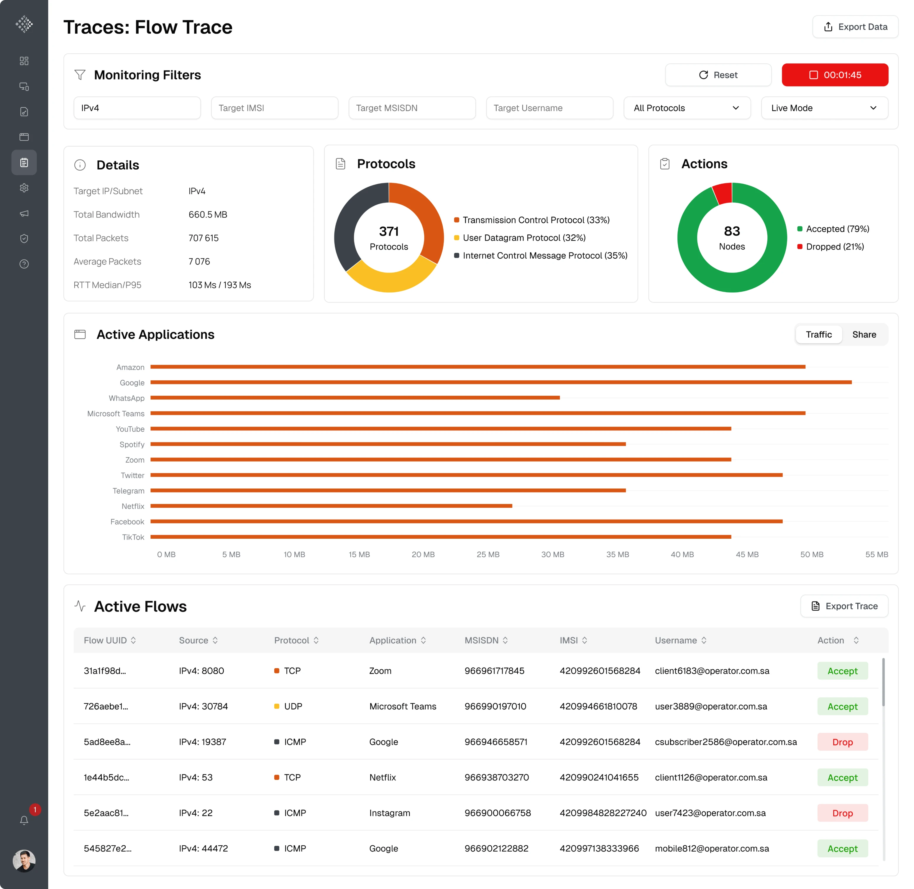
Since we still had some time left during the trial, we decided to redesign the second screen — LifeFlows, a page used for real-time system monitoring.
Here, the main UX challenge was helping users move from an empty state to actionable insights. The initial design also lacked proper visualization: many metrics were displayed as raw text, which made the information harder to interpret.
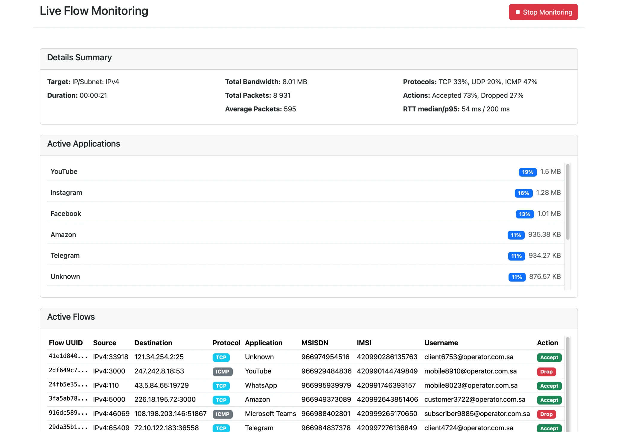
To improve this, we:
- Added a filter bar at the top of the page.
- Improved the structure of the monitoring results.
- Introduced charts for clearer data visualization.
- Added tabs to help users navigate between datasets.
The client was impressed with the results of the trial. The updated interface made it much easier to understand what was happening in the system at a glance. After that, we immediately moved forward to a full-time collaboration.
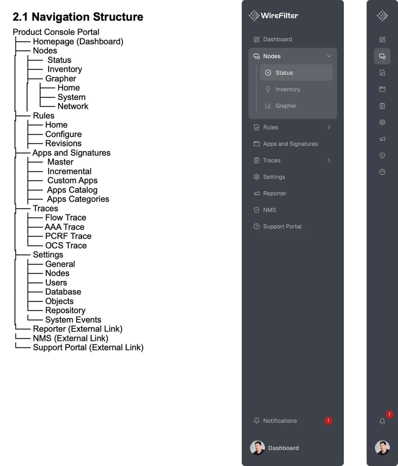
Using sidebar navigation, we freed up space for the dashboard
We discovered that the platform’s top navigation limited screen space, so we rethought the structure based on the client’s outline.
To solve this, we explored several navigation concepts and introduced a sidebar navigation pattern. This approach freed up horizontal space for charts and tables while also making it easier to scale the product as new sections were added.
We added features that administrators needed most
As we continued working on the platform, it became clear that some seemingly small but important functionality was missing from the product.
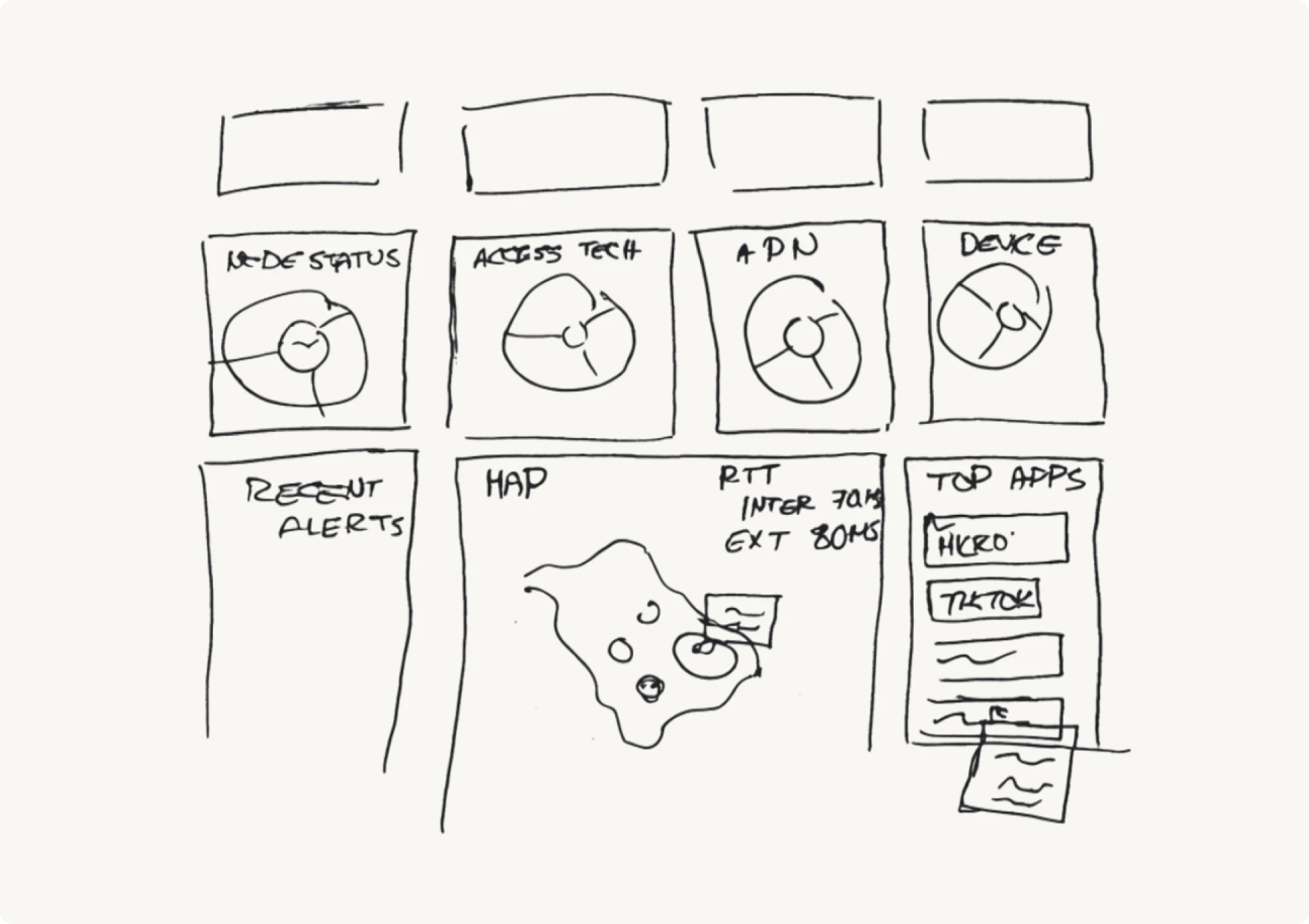
To better explain what they wanted to see on the main screen, the client sketched a rough dashboard layout on paper. Using this outline, our designer reorganized the dashboard to highlight the key metrics administrators rely on.
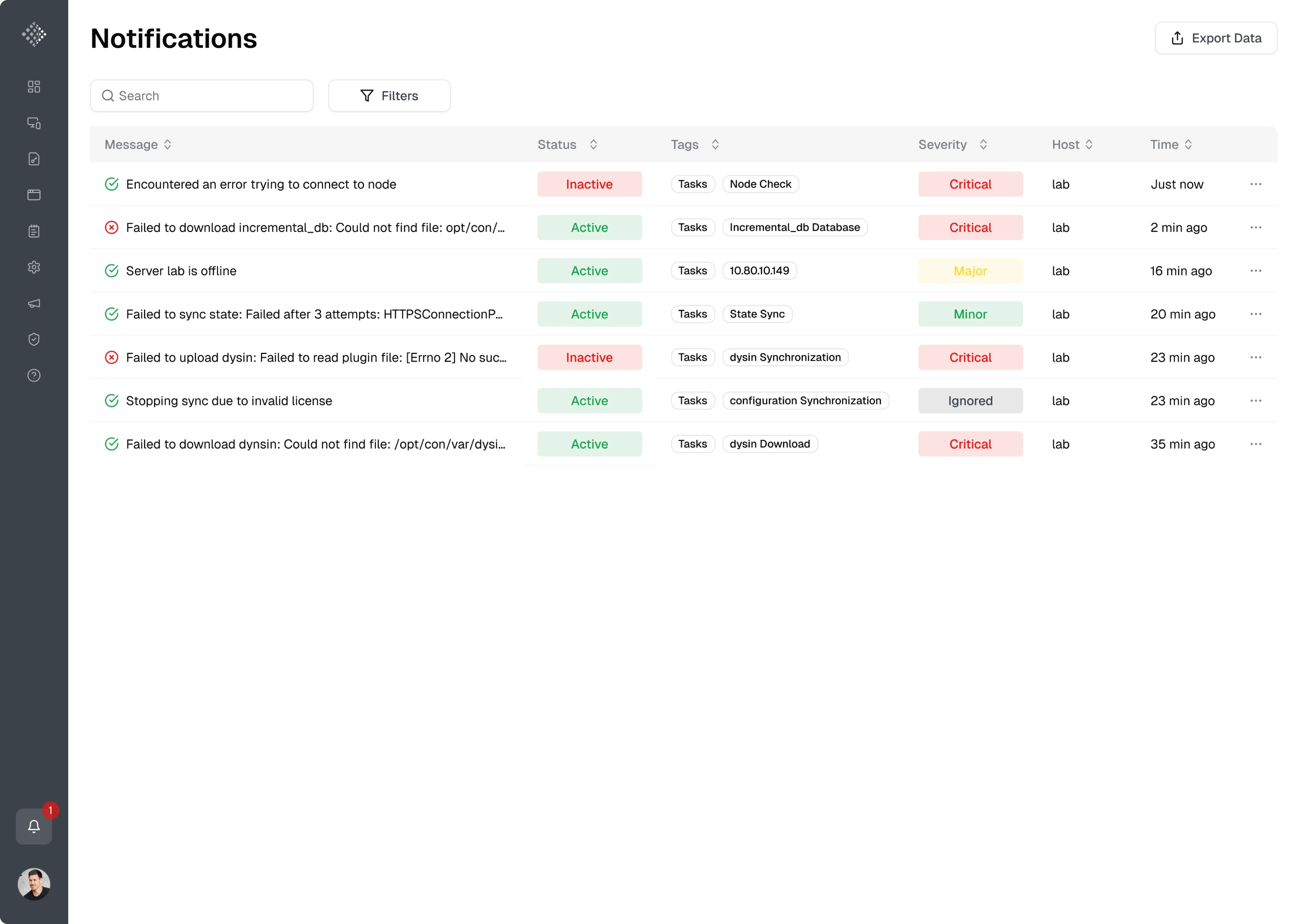
During this iteration, we highlighted that administrators were required to store monitoring data, but the interface didn’t support this workflow. As a result, we added an “Export data” button that lets users save the metrics they need.
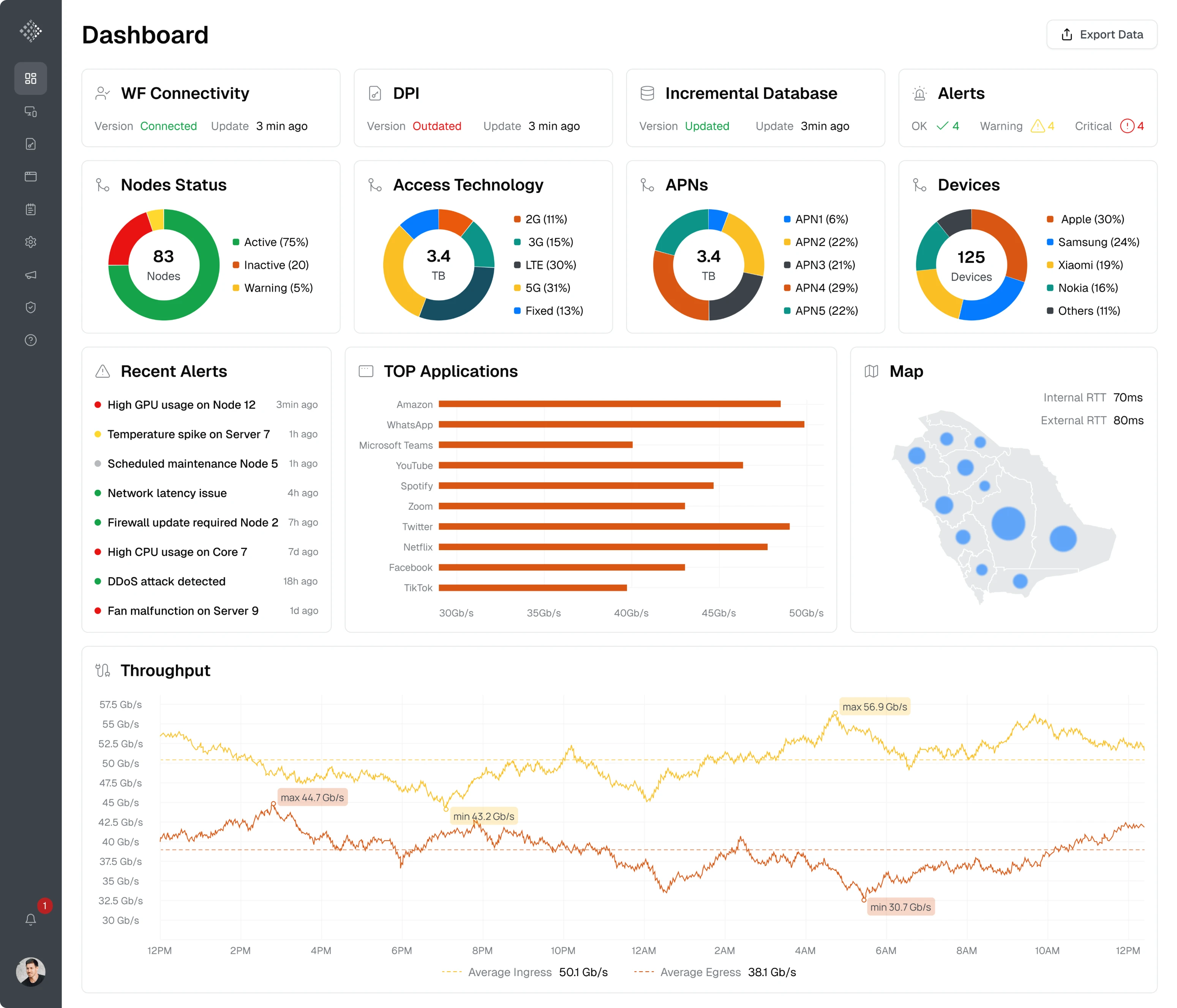
Another important improvement was related to system notifications. Since alerts and updates are critical for administrators monitoring network activity, we designed a dedicated notifications page that displays system events in a table view.
Using graphs and charts, we simplified complex system data
We noticed a major issue — many metrics across the platform were difficult to interpret.
The Nodes screen, for example, was built almost entirely around a single table listing individual device names, tags, and statuses. While technically informative, this layout made it difficult to analyze overall system performance.
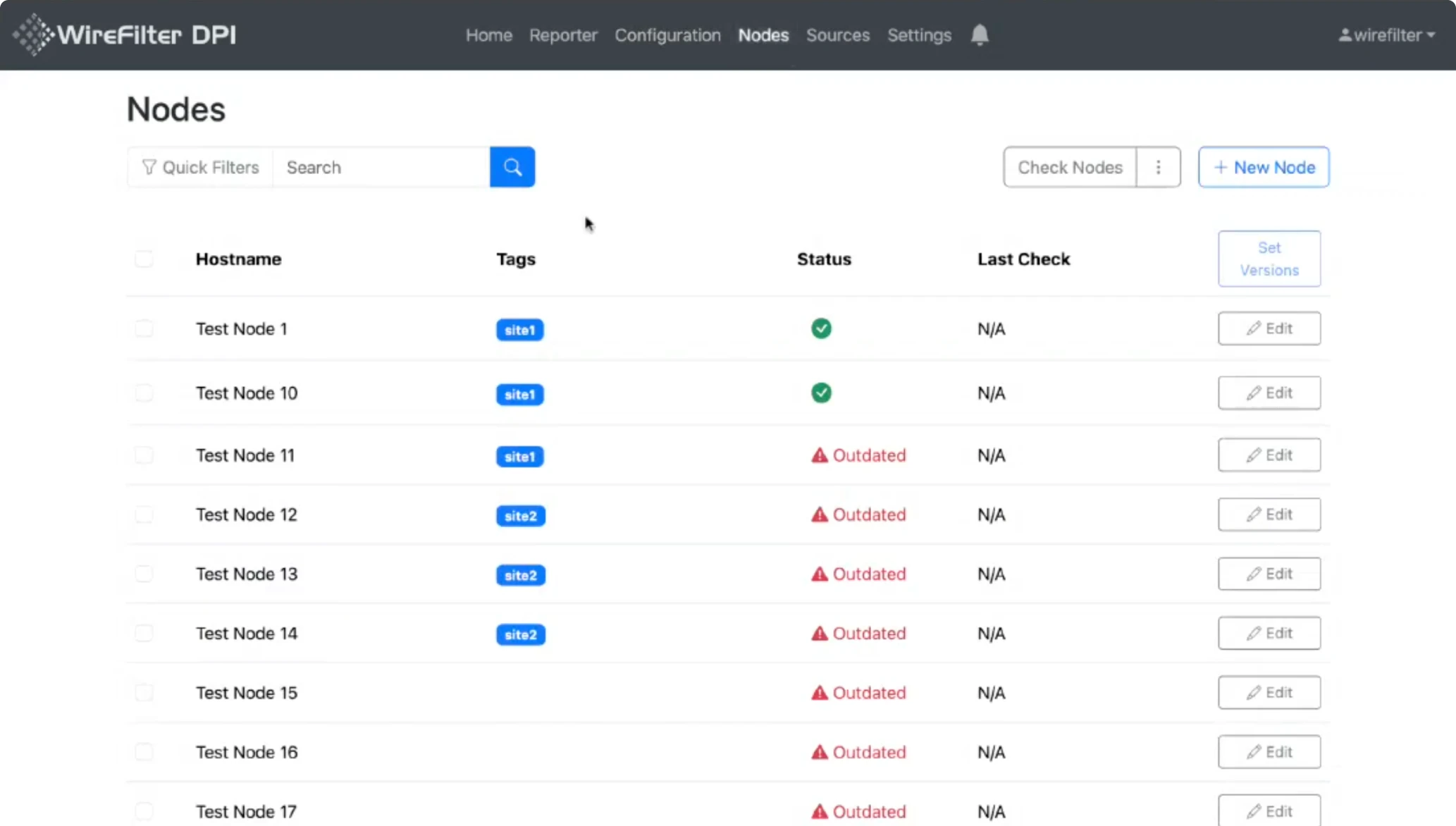
The new design introduced several improvements:
- Summary charts at the top of the page.
- A detailed breakdown in a table below.
- Tabs for navigation between subcategories.
- Improved copy for better understanding.
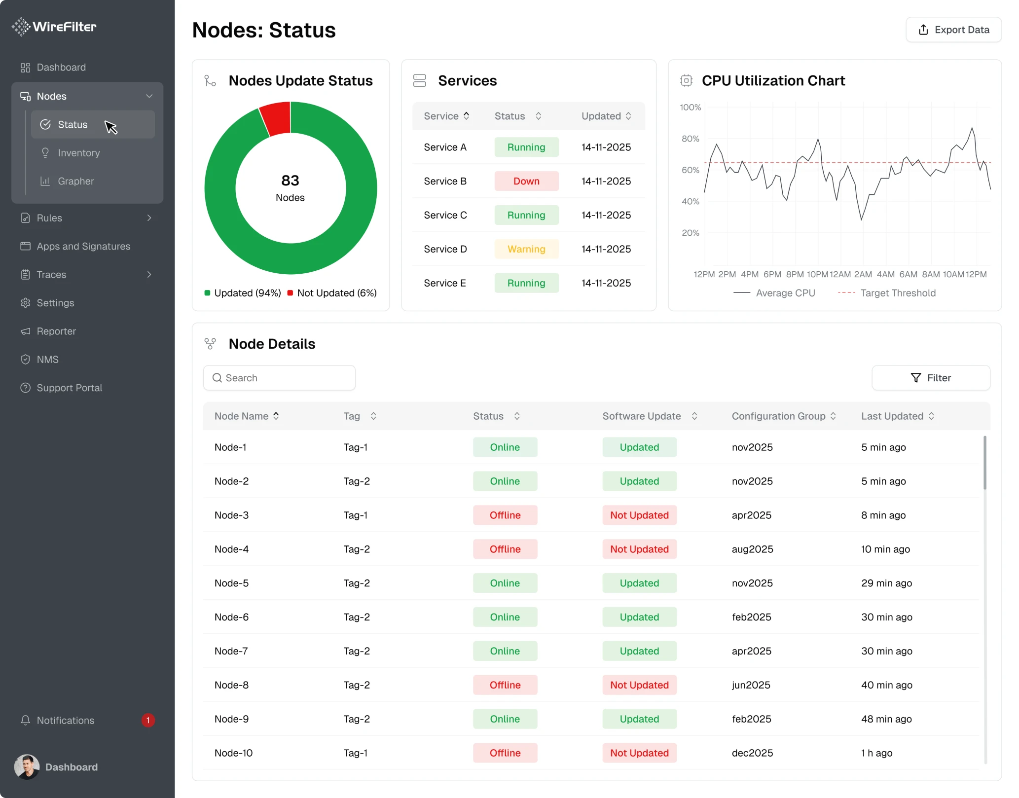
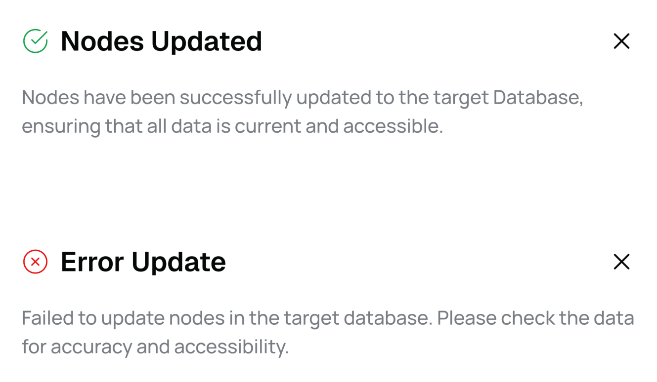
To make the interface more informative, we introduced clear success and error states across the platform. These visual indicators help administrators understand system status and notice when something requires attention.
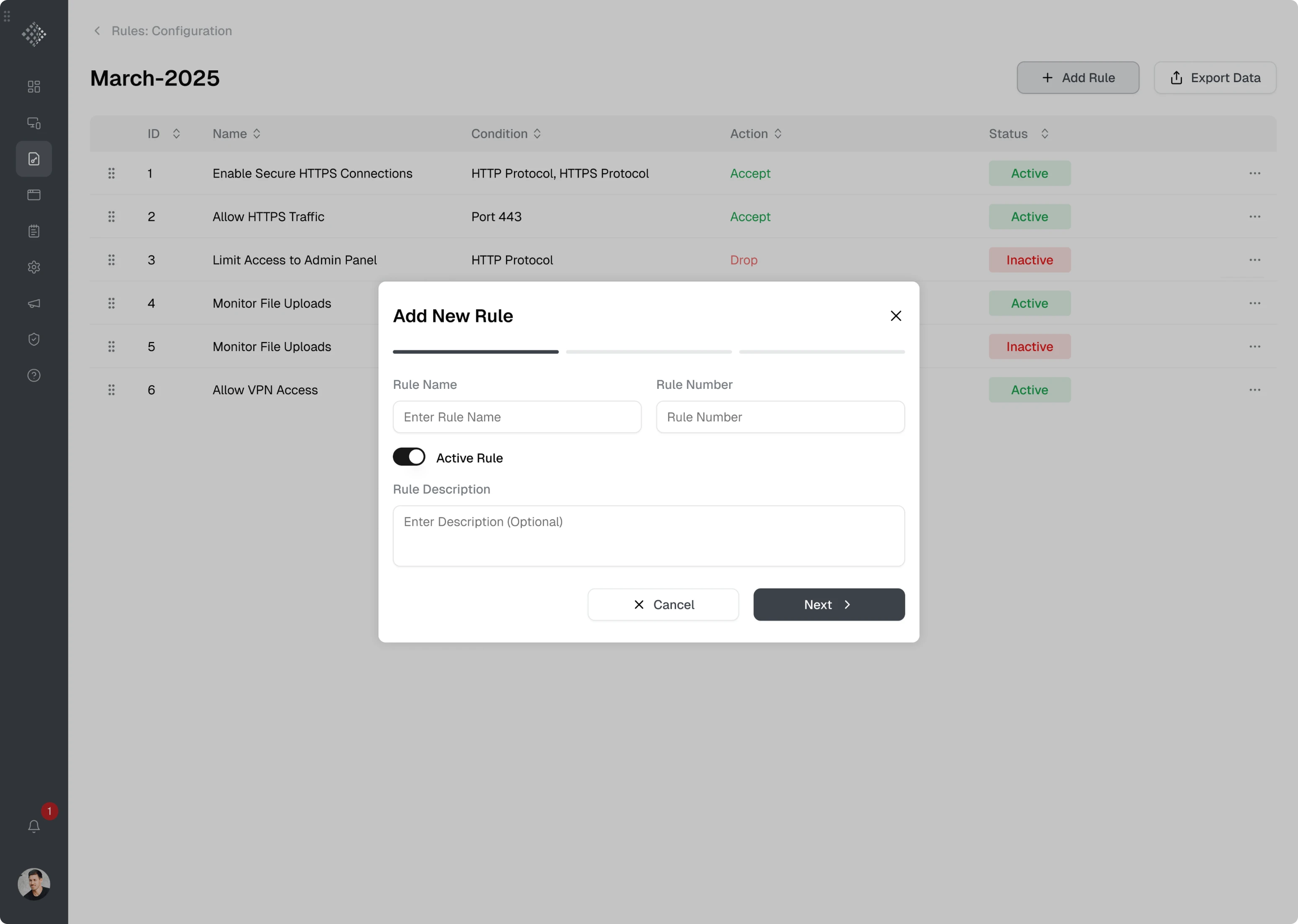
Updated configuration UX made system settings easier to manage
Working with configurations, nodes, rules, and other system data required administrators to update existing settings or create new ones. These actions were available in the WireFilter platform, but they were difficult to perform.
Editing screens occupied the entire workspace and introduced unclear tab navigation with unlabeled icons. The interface forced users to guess how the system worked.
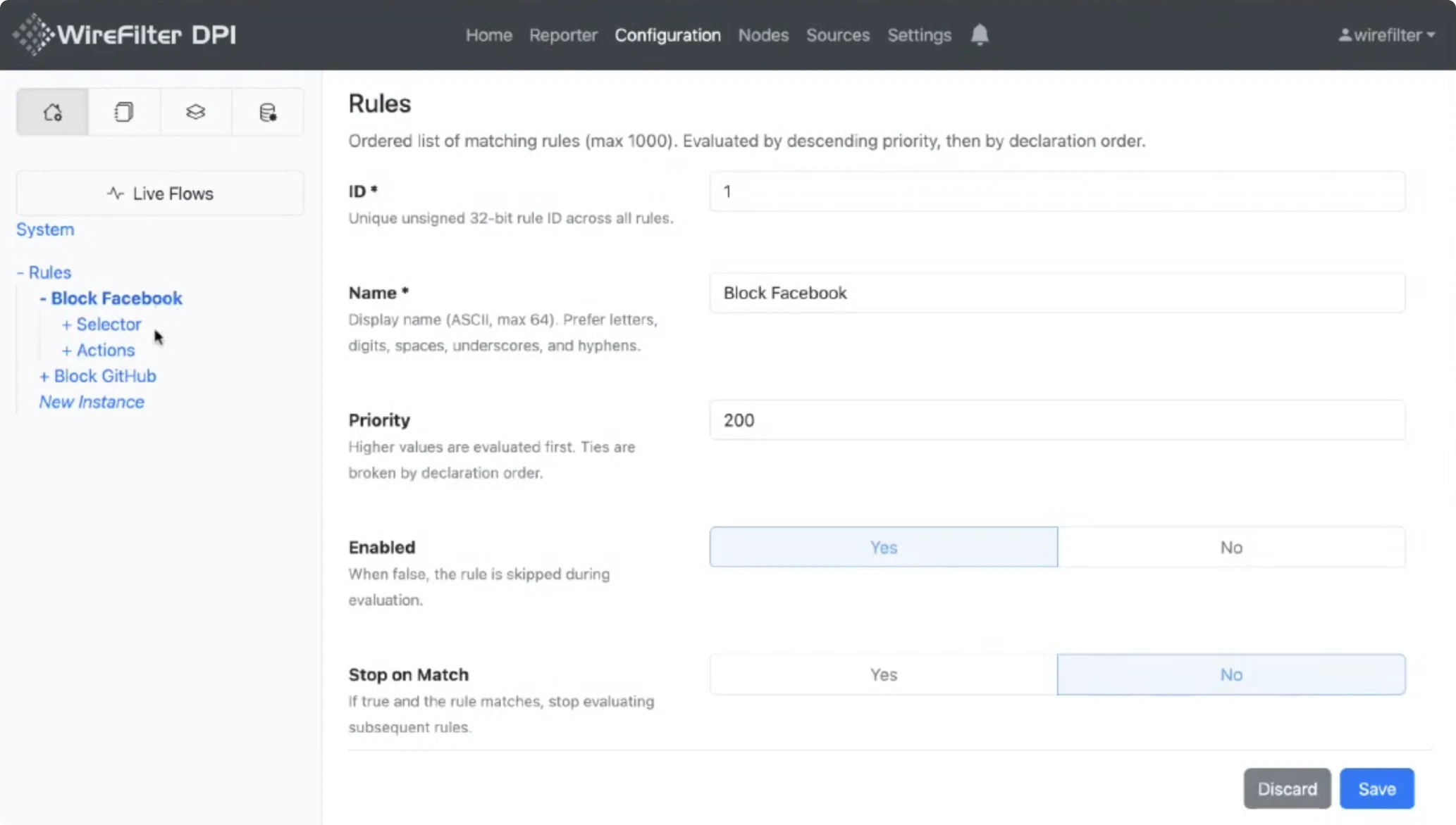
We redesigned these workflows to make them more manageable.
First, we moved editing and configuration actions into modal windows. This approach allowed administrators to focus on the task without losing context.
For creating new rules and configurations, we introduced a wizard-based flow to guide users through the setup process.
For editing existing items, we used tabs inside the modal, allowing administrators to switch between sections.
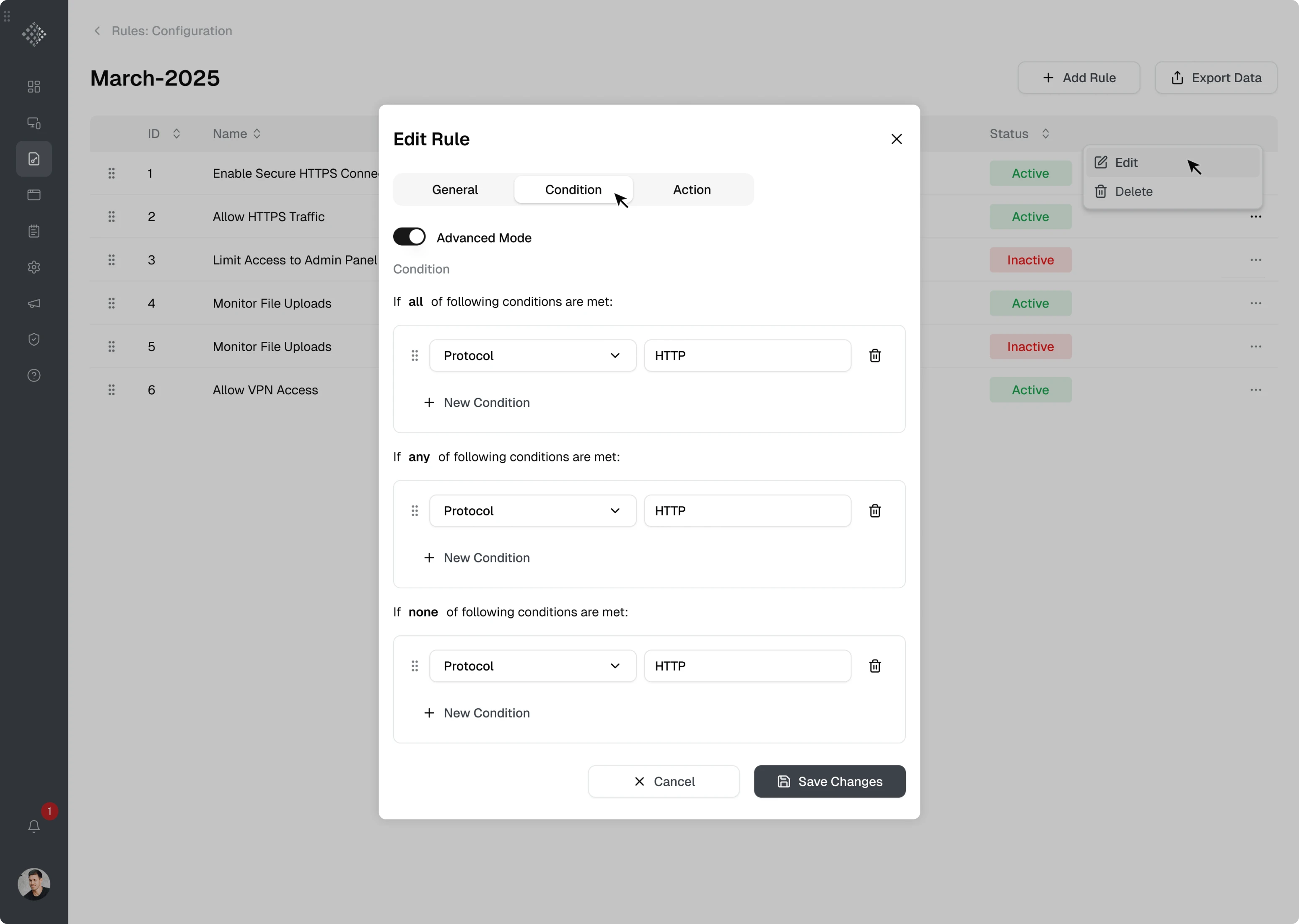
Both flows relied on clear interaction patterns such as:
- toggles for enabling or disabling settings;
- input fields for manual values;
- dropdown menus for selecting predefined options;
- Save actions that become available once required fields are completed.
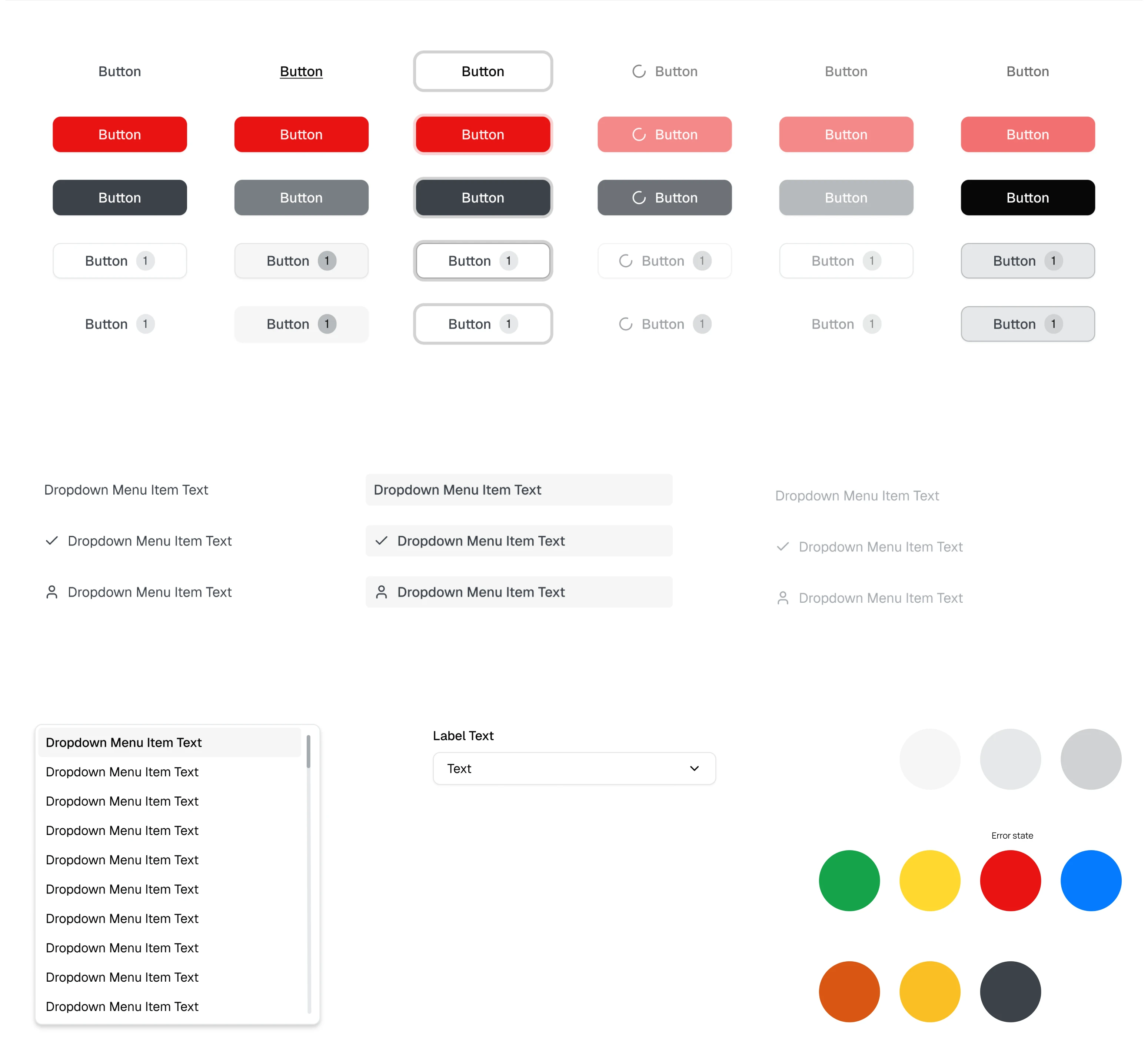
We built a UI kit to support faster development
As part of our design process, Eleken designers always create a basic UI kit for every project, and we did the same for WireFilter.
This approach made the design-to-development handoff much smoother. With Figma’s Dev Mode, developers could easily inspect components and access the necessary styles, spacing, and CSS-related properties directly from the design files.
In 2 months, we delivered a clearer UX for a complex cybersecurity platform
Across the WireFilter platform, almost all screens contained large sets of technical metrics. Our Eleken designer made the information easier to scan using clearer layouts, stronger visual hierarchy, charts, and filtering options.
Throughout the project, our designer communicated directly with the client. This allowed both sides to quickly discuss ideas and iterate on designs more efficiently.
As a result, we successfully redesigned the WireFilter management console in 2 months and made it much easier for administrators to monitor system activity, analyze metrics, and manage configurations without fighting the interface.